
UI for WinForms
WinForms Panel
- The Telerik Panel comes with all the standard panel features with added HTML-like text formatting, full appearance customization, Smart Tags and more.
- Part of the Telerik UI for WinForms library along with 165+ professionally-designed UI controls.
- Includes support, documentation, demos, virtual classrooms, Visual Studio Extensions and more!

-
Supports Themes and Transparency
The Panel control in Telerik UI for WinForms supports themes and transparency and is an alternative to the standard Windows Forms panel control. In addition, it supports gradient background and applying a shape, such as rounded corners, to the panel.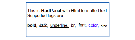
All Winforms Components
Data Management
- CardView
- CheckedListBox
- DataEntry
- DataLayout
- FilterView
- GridView Updated
- ListControl
- ListView
- PivotGrid
- PropertyGrid
- TreeMap
- TreeView
- Validation Provider
- VirtualGrid Updated
Office
Data Visualization
- BarCode
- BindingNavigator
- BulletGraph
- ChartView
- Diagram
- HeatMap
- LinearGauge
- Map Updated
- RadialGauge
- RangeSelector
- Sparkline
- TaskBoard
Interactivity & UX
Forms & Dialogs
- AboutBox
- ColorDialog
- DesktopAlert
- File Dialogs
- Flyout
- FontDropDownList
- Form
- MarkupDialog
- MessageBox
- Overlay
- RibbonForm
- ScrollBar
- ShapedForm
- SplashScreen
- StatusStrip
- TabbedForm
- TaskDialog
- TitleBar
- Toast Notification Manager
- ToolbarForm
- Wizard
Scheduling
Editors
Navigation
- ApplicationMenu
- BreadCrumb
- CommandBar
- ContextMenu
- Menu
- NavigationView
- NotifyIcon
- OfficeNavigationBar
- PageView
- Panorama
- PipsPager
- RibbonBar
- SlideView
Layout
Document Processing
Tools
Framework
