UI for WinForms
WinForms PageView
- The Telerik PageView gives you enormous flexibility in building paging navigation into applications and allows you to create complex custom user interfaces featuring text boxes, combo boxes, or other custom elements within the page area.
- Part of the Telerik UI for WinForms library along with 165+ professionally-designed UI controls.
- Includes support, documentation, demos, virtual classrooms, Visual Studio Extensions and more!

-
Layouts Pages of Sub Controls in Different Views
Wondering how to organize endless content in neatly displayed information? The Telerik PageView for WinForms is your answer. You can create slick-looking tabstrip/panelbar through the countless RadPageView configurations; create vertical, hierarchical or overlapping tabs, mimic Outlook’s NavPane, insert images in your items, add templates, etc. Thanks to its extended architecture, RadPageView guarantees excellent performance behavior when having lots of page views.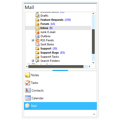
-
ExplorerBar Mode
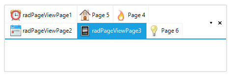
The ExplorerBar mode of RadPageView is designed to handle multiple visible pages at once by implementing a scrolling mechanism, as well as extended keyboard navigation. This mode introduces three types of content sizing—FixedLength, AutoSizeToBestFit and EqualLength—as well as two types of stack position—Top and Left.-(1)-(1)-(1).png?sfvrsn=249b249d_4)
-
Item Editing
RadPageView also features item editing, which enables you to change the text of a page item (tab). The accompanying API provides the ability to modify editor properties, initiate and cancel the process, and validate user input.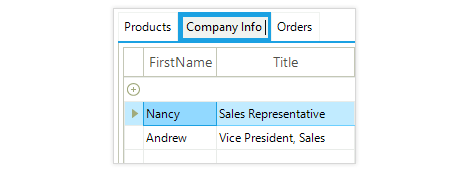
-
Architecture
RadPageView provides a set of views for presenting a collection of pages. Each page is a stand-alone panel where controls may be added through Visual Studio’s Designer. As such, RadPageView consists of pages and items where each item is associated with a page and it can be used to display that page. A specific layout strategy arranges the pages and the items so that the final look-and-feel is achieved:

This simple architectural approach is based on a very flexible and extensible platform that is fully compatible with the Telerik Presentation Framework. It allows for implementing different layout scenarios (tabstrip, panelbar, navpane, etc) quicker than ever before and is greatly optimized for memory consumption, user interaction times, and unbeatable performance with many pages.
This architecture also provides for extensibility, scalability and ease of use. With the semantic that lies behind RadPageView, it is very easy to create custom views over a collection of pages.
-
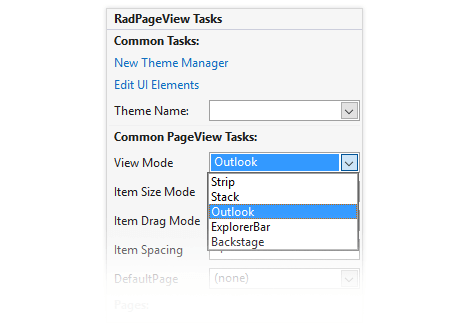
PageView Modes
You can nest any Control and custom element within Telerik UI for WinForms PageView. This feature gives you enormous flexibility in building paging navigation into applications and allows you to create complex custom user interfaces featuring text boxes, combo boxes, or other custom elements within the page area. If you nest another PageView, you get hierarchal appearance.
RadPageView supports six different navigation modes, which can be chosen through a single property. Each mode implements a different layout strategy, making the presentation unique:
- NavigationView Mode (Hamburger Menu)
- OutlookView resembles Outlook’s NavPane
- StripView is essentially a TabStrip
- StackView is a ListBar
- ExplorerBarView is designed to display multiple visible pages at once
- BackstageView is designed after the Office 2010 backstage mode
-
NavigationView Mode (Hamburger Menu)
The NavigationView Mode comes in handy, when you want to recreate the popular and modern Hamburger Menu navigation (seen in Windows 10 and in the mobile world) in your WinForms application resulting in a convenient & intuitive way for your users to browse through the app, while also providing for a clean and simple UI. The mode consists of a collapsible navigation pane, which automatically adapts the display mode to the different control sizes.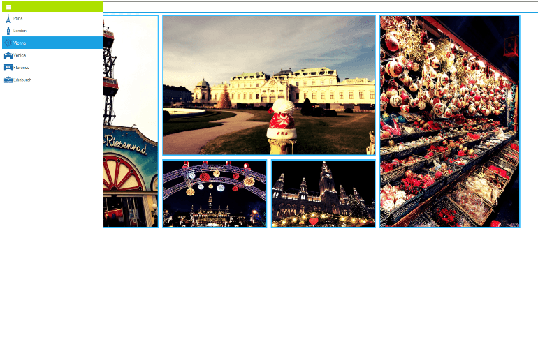
-
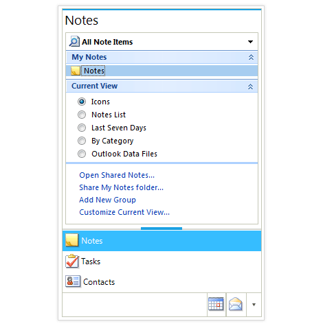
OutlookView Mode (PanelBar’s OutlookNavPane)
OutlookView mode offers a professional and flexible Outlook 2007/2010©-style navigation menu where items are stacked vertically and their content is displayed on top of the stack. An overflow strip lies below the items, which displays the collapsed items and provides an overflow drop-down menu from which the user can modify the item's visibility:
.png?sfvrsn=0 "PageView_OutlookView (1)")
-
Backstage Mode
The Backstage view of RadPageView is designed as an answer to the introduced in Microsoft Office2010 view mode. This is an extended StripView mode, which means all customizations that apply to strip view apply here, as well. In this mode, the items (RadPageViewPage items) are displayed on the left side (by default), but this can be easily customized. Orientation supports all four modes and defines the relation between the content and the item area. You can also place items in groups to better describe their context.-(1)-(1)-(2)-(1)-(1).png?sfvrsn=78c9bd2_4)
-
StripView Mode (TabStrip)
The StripView encapsulates the TabControl view, which supplies the basis for building tabbed interfaces with rich formatting and behavior. It offers a myriad of settings which allow for deep customization of the items’ strip and content area, such as:
- Strip alignment/position (Top, Right, Bottom and Left) and Text orientation (Horizontal and Vertical)
- Animated drag and drop support with visual pointers, allowing for tab reordering:

- Extended automatic scrolling and overflow support, if there are more tabs than can be displayed on the estate. Use the arrow buttons for left and right navigation, or navigate to the needed tab by using the ItemList overflow menu which lists all available tabs:

- Dedicated close button for each tab/page, which allows for closing of the currently selected page. The close button can be positioned in the tab itself, or with the rest of the navigation buttons.
- Dedicated Create New Tab functionality, in case you want to allow your users to create new tabs dynamically.
- Hierarchical strips to easily build a multilevel tabstrip by defining the structure in design-time.
-
A variety of ways to fit the page items (tabs) in the tabs area, including None, Shrink, Fill, ShrinkAndFill, FillHeight, Muiltiline

-
Support for pinning tabs and preview tab, as in Visual Studio 2012+, so users can see their most important pages
-
Support for preview tabs, as in Visual Studio 2012+, so some temporary information can be displayed to users, enabling them to choose whether to keep the tab (promote it) or discard it
-
StackView Mode (PanelBar’s ListBar)
The StackView mode resembles the PanelBar’s base view, but extends the default functionality with fully customizable header and footer, giving you extra flexibility in the presentation. The Items in StackView mode are organized in a stack (either vertical or horizontal) and the content area/page is either centered or aligned at the top/bottom within each stack, depending on the orientation..png?sfvrsn=e68d9be9_6)
-
Keyboard Support
Telerik Windows Forms PageView delivers convenience with integrated keyboard support. Once the tab gets into focus, you can use the arrow keys to navigate through the tabs.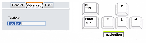
-
Localization Support
Telerik PageView provides full Localization support and support for Right-to-left languages. See Localization and Right-to-Left Support for the full list of Telerik WinForms controls supporting Localization and RTL languages. -
Extensive VS.NET Design-time Support
Telerik Windows Forms PageView provides rich design-time support functionality making customizations and configurations very easy. Some of the key capabilities are:
- Set the PageView view mode and adjust the properties of the specific view from the smart tag;
- Add/remove pages;
- Drag and drop of items within pages;
- Applying themes in design time and easily switching between them - the ThemeName property in the Smart tag automatically detects the present themes
- Visual Style Builder, Element Hierarchy Editor, and Shape Editor productivity tools for full control over the UI
- Options to search the forums or open the control online documentation are also available in the Smart Tag
- Easy to use, rich event model provides for endless customization capabilities in case you want more control over RadPageView’s behavior
-
Hierarchy Support in Navigation View Mode
R3 2021 introduces the popular hierarchy functionality, or hamburger menu, in the navigation view of the Telerik UI for WinForms PageView. If you’ve always wanted to build Windows-10-Start-menu-inspired navigation in your applications, now it’s easier than ever with hierarchy support.
For more information on how to build the hierarchy check out the Telerik UI for WinForms PageView documentation -
Appearance
The control is shipped with a rich set of themes that allow you to easily build slick interfaces with the look-and-feel of some of the latest Windows and Office versions. The themes can be easily switched using a single property.
Our framework also features support for custom themes, which can be built from scratch to fit your exact visual demands by using the Visual Style Builder productivity tool.
Telerik TabStrip is also capable of displaying images, text, multiline text, and rich text by using standard HTML tags, such as <i>, <b>, and <u>.