
The WinForms Control Library Developers Trust
Build modern, high-performance desktop apps faster with a consistent API, pro-grade themes and a powerful Data Grid, now accelerated by the Telerik AI Coding Assistant.
30-day FREE trial. Free technical support and training during your trial. No credit card required.
WinForms components are also included in Telerik DevCraft bundles. Learn more.

165+ Enterprise-Grade WinForms Controls
Build data-rich, interactive and visually polished desktop apps with a complete UI library designed for speed, scalability and Windows excellence.
Featured Components
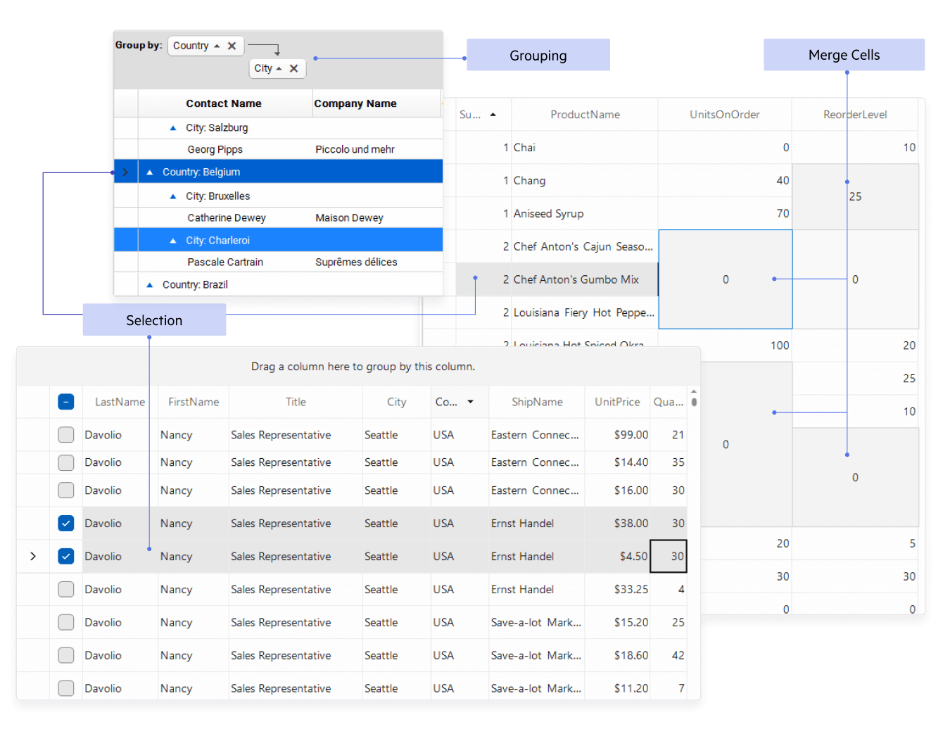
Display and manage large, complex datasets with high performance and full interactivity.
- High-performance rendering, virtualization & smooth scrolling
- Inline editing with full CRUD support
- Sorting, filtering, grouping, search, and aggregates
- Paging and multiple selection modes
- Custom cell templates, frozen columns, column reordering & drag-and-drop
- Export/import to CSV, Excel, PDF
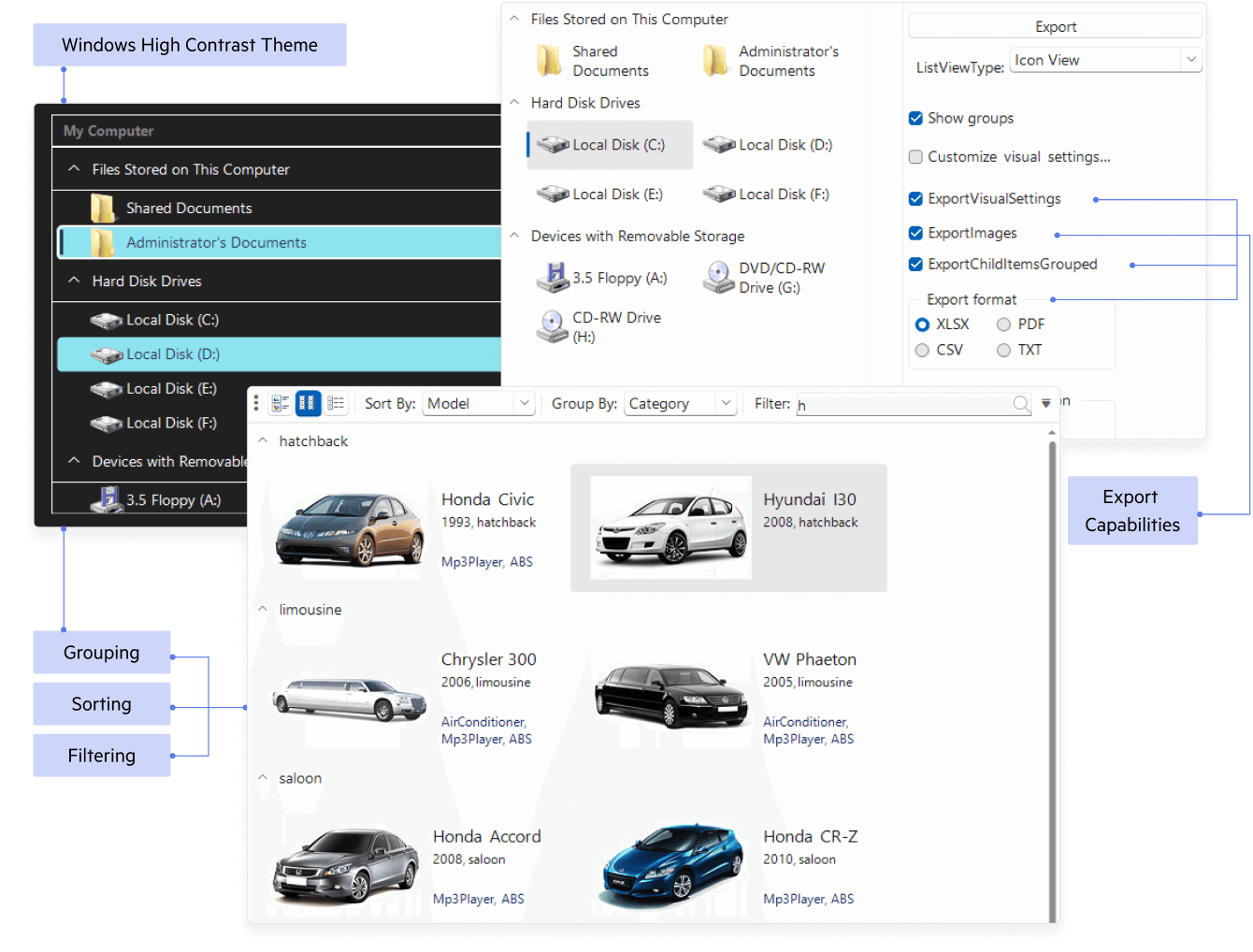
Present lists, tiles, and cards with flexible layouts and blazing-fast UI.
- Large data virtualization with smooth scrolling
- Multiple view modes: list, icons, tiles, details
- Grouping, sorting, filtering, and search
- Checkboxes, selection modes, and item drag-and-drop
- Custom item templates with images, badges, and actions
- Keyboard navigation, accessibility, and High-DPI support

View, search, and interact with PDF documents directly in your WinForms app.
- Fast rendering with text selection & copy
- Search, thumbnails, bookmarks & document outline
- Zoom, fit-to-width/page, rotate, and page navigation
- Annotations, links, and form fields (fill & submit)
- Print and export options without external dependencies
- Password-protected documents & digital signature support
- AI-Powered PDF Querying and Summarization
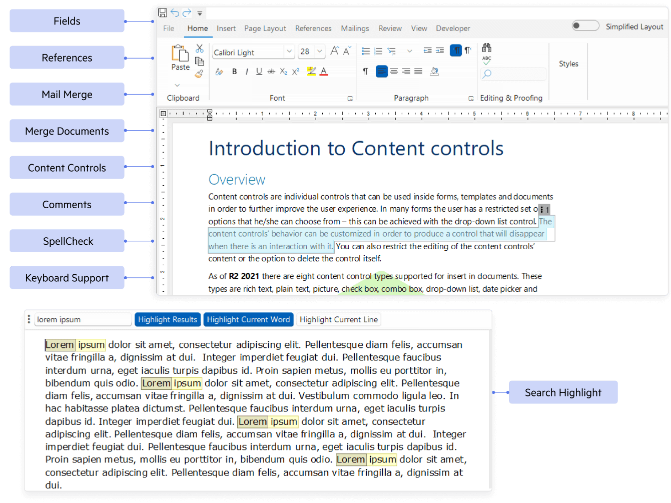
Create and edit rich documents with familiar, Word-like experiences.
- Full formatting: fonts, styles, lists, tables, images
- Track changes, comments, hyperlinks & bookmarks
- Headers/footers, sections, page setup & numbering
- Import/export: DOCX, RTF, HTML, TXT, PDF
- Spellcheck, undo/redo, clipboard, and find/replace
- Ribbon UI integration & custom toolbars
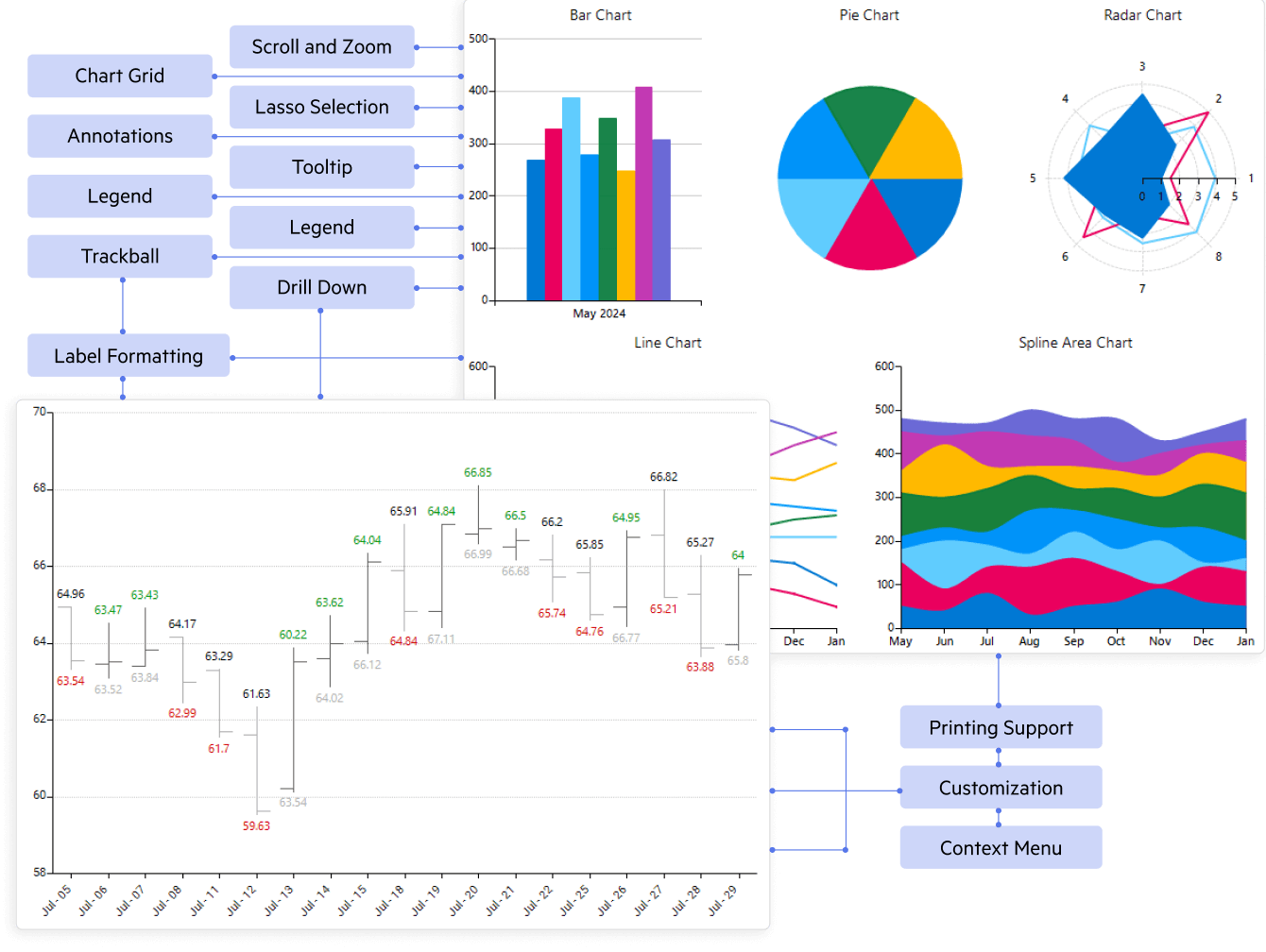
Visualize data with modern, interactive charts for analytical apps.
- 20+ chart types: line, bar, area, pie/donut, scatter, financial, etc.
- Large data performance with sampling & virtualization
- Pan, zoom, tooltips, trackballs & crosshairs
- Multiple axes, logarithmic scale, annotations & strip lines
- Data binding, live/real-time updates & custom palettes
- Export to image and print support
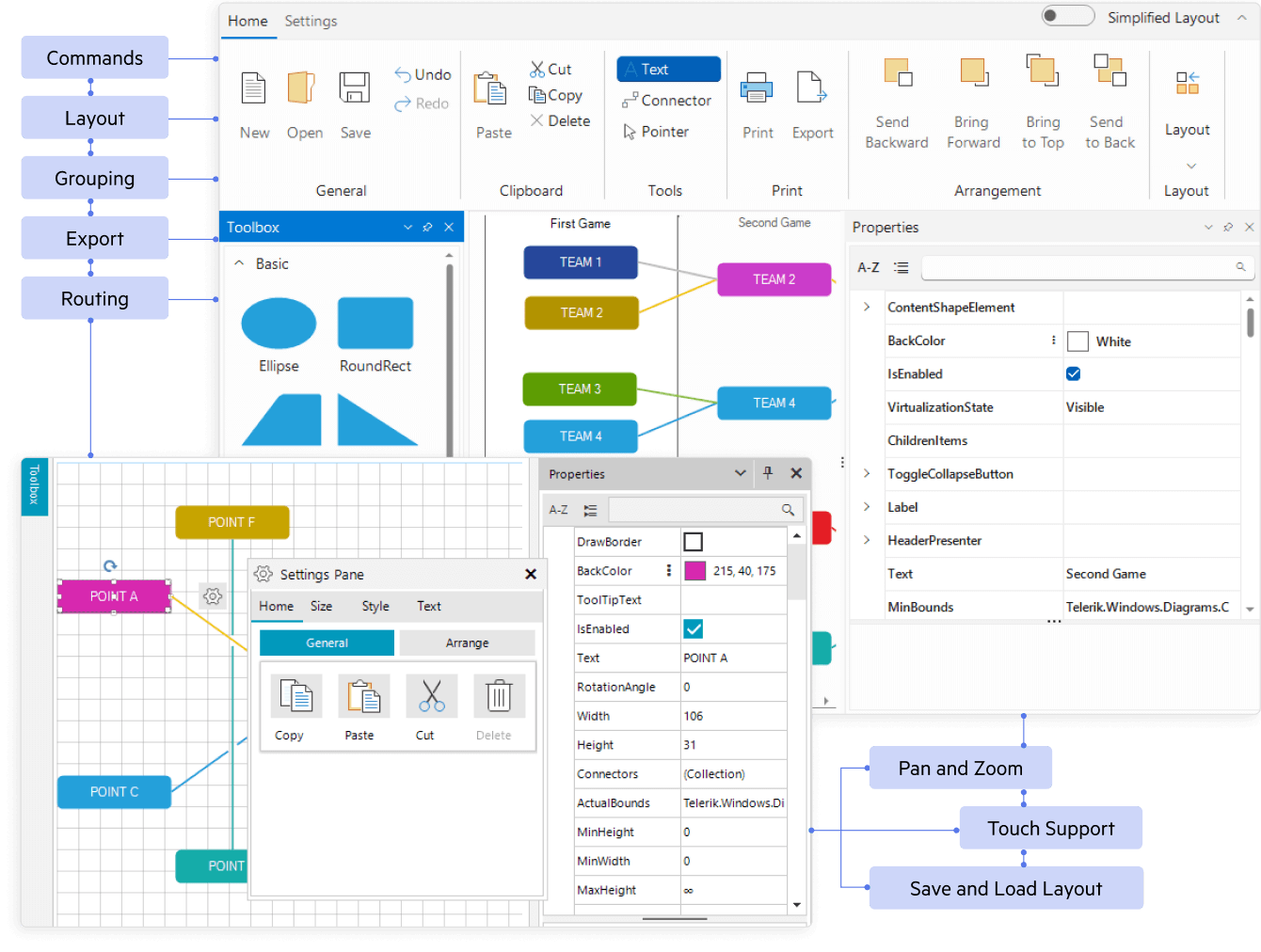
Build interactive diagrams, flowcharts, org charts, and network maps.
- Drag-and-drop shapes, connectors, and auto-routing
- Built-in shape libraries & custom shapes/templates
- Snap-to-grid, alignment guides, and auto-layout (tree, layered, radial)
- Editing: resize, rotate, group/ungroup, z-order & keyboard shortcuts
- Serialization, import/export & printing
- Pan/zoom, selection modes, and hit testing API
Collect accurate user input with consistent, customizable form controls.
- AutoCompleteBox with filtering, suggestions, and tokens
- MaskedEditBox for input masks, validation & formatting
- DateTimePicker with calendars, time picking & culture formats
- Numeric, Currency, Percent, and Spin editors with rules
- Multiline text, dropdowns, color & file pickers, and toggles
- Keyboard navigation, validation API, and localization
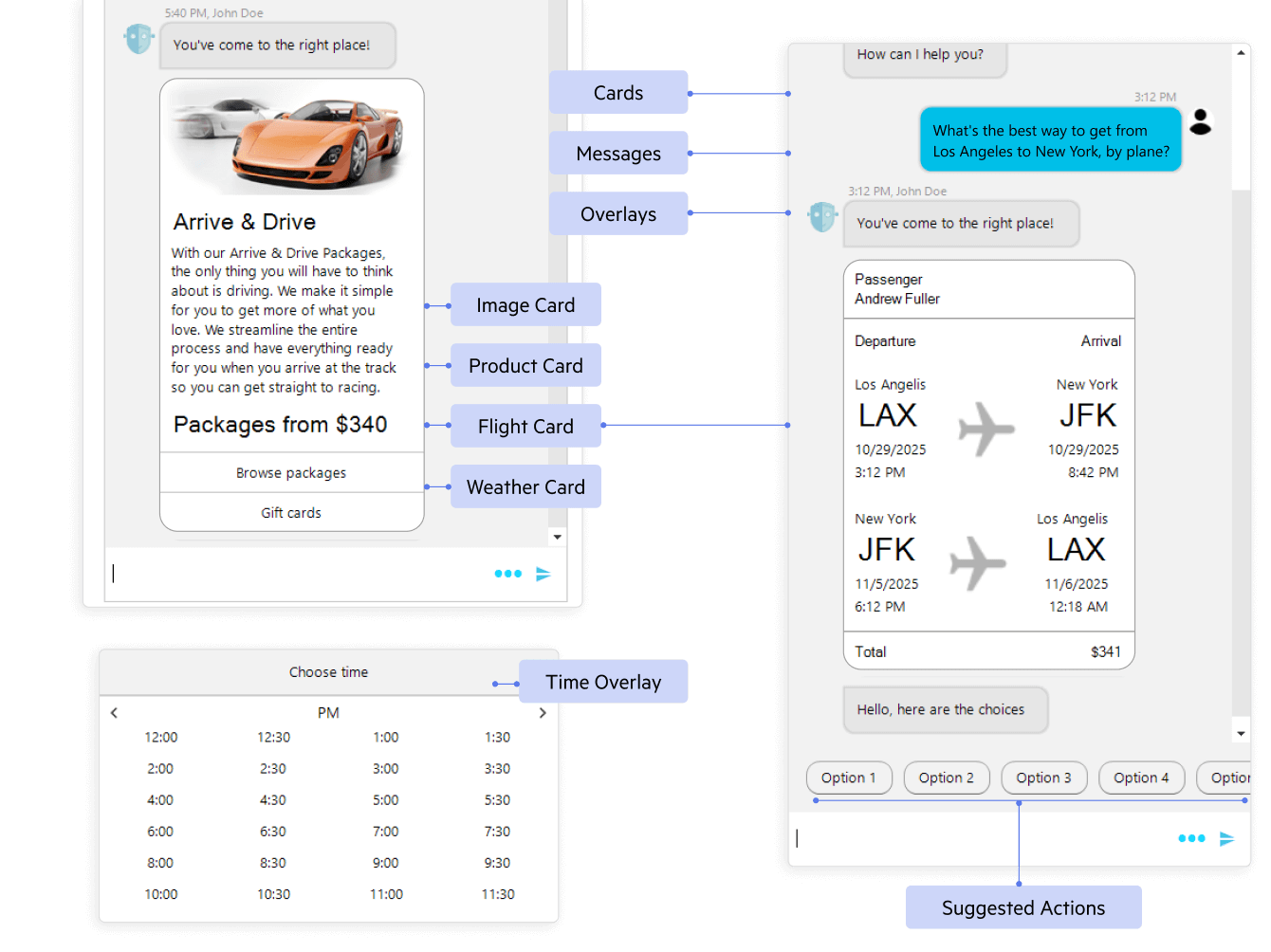
Add modern conversational UI for support, bots, and in-app messaging.
- Conversation view with avatars, timestamps & message status
- Rich messages: text, cards, images, quick replies & attachments
- Typing indicators, message templates & context menus
- MVVM-friendly data binding and custom message types
- Load-on-demand, virtualization & smooth scrolling
- Theming to match your app + RTL & localization
Accelerate Development with AI
Improved Predictability
Modernize WinForms applications into Telerik UI with a deterministic, Roslyn‑based conversion engine delivering consistent results and full visibility.
- Upgrade applications faster with reliable, end‑to‑end conversion in direct mode.
- Convert standard WinForms controls, APIs, grids, and UI patterns into Telerik equivalents using structured rules.
- Reduce manual migration and refactoring work so teams can focus on testing and UX improvements.
- Minimize risk in large codebases with accurate control mapping, dependencies, and designer handling.

Unprecedented Productivity With AI Coding
The Telerik UI AI Coding Assistant is specifically trained on the Telerik UI for WinForms component library to ensure developers get production-quality code when working in their favorite IDE. It’s like having an extra team member who:
- Automates repetitive tasks such as generating code for adding new and configuring existing components.
- Finds answers to questions from the API documentation and other knowledge repositories.
- Troubleshoots problems related to the component libraries.
Go straight to the AI Assistant Getting Started article if you are ready to try.

Telerik AI Coding Assistant - Overview
Why Developers Choose Telerik UI for WinForms
Get speed, stability and fewer headaches. Build faster, look great and work everywhere.
Extensive, Consistent UI Suite (165+ Controls)
Leverage 165+ polished, fully-featured WinForms controls - grid, charts, editors, schedulers, ribbons, and more, crafted with a consistent API for quick learning and easy customization. Ship rich, desktop-grade experiences without reinventing standard UI.
Modern Themes, Accessibility & Enterprise Reliability
Give your app a modern, professional look with Office/Windows/Visual Studio-inspired themes. All controls follow leading accessibility and UI-automation standards and are backed by rigorous testing, comprehensive docs and industry-leading support.
High Performance, Touch & High-DPI Ready
Deliver snappy, optimized apps that feel great to use. Built-in multi-touch support handles gestures out-of-the-box, while automatic High-DPI scaling keeps your UI crisp on 4K and ultra-wide displays.
Powerful Data Grid & Document Processing
Tackle data-heavy scenarios with an advanced Data Grid (filtering, grouping, sorting, virtualization and 100+ features). Create, read and export the most common Text, Spreadsheet and PDF formats without external dependencies.
Telerik UI for WinForms Demo Applications
Explore desktop demo apps that showcase what you can build with our 165+ controls. Download the demo to try real features, then open the included source code for every example.

WinForms Demo Application
This application demonstrates a variety of WinForms controls and features.


Hotel Management App
This is a demo WinForms application mimicking a hotel reservation system. It shows the controls and capabilities of the suite in a real-life scenario.
Explore All 165+ WinForms UI Controls
Explore 165+ WinForms components optimized for speed, scalability and great user experiences, perfect for data-intensive desktop apps.
The companies that trust Telerik and Kendo UI products include:


What Users Say
Having used both the WinForms and Blazor UI packages for a few years now, the great thing about that (plus all of the additional packages that I have access to) is the ease of implementation and the support/documentation (which is extensive to say the least). Pretty much everything has a mini-demo which makes it easy to utilize that particular component. Due to the subscription I'm on, the customer support for tickets is usually 24 hours - I've had to contact them a few times over the years when I was querying rather obscure issues and the team are more than happy to generate projects to try and replicate the problem or will suggest code snippets for me to try (which usually fixes the issue). Overall, very happy with everything they offer and they show no sign of slowing down with updates etc.
Being able to build an entire solution around their UI packages allows me to focus on building the business solutions into the code without having to worry about creating the visual elements from scratch - it saves weeks (if not months) of time.
The support is excellent. They even solve problems when the fault is in the code and not the control. The response time is excellent and they are almost always very accurate in their answers.
Allows for rapid development of native applications in WPF and WinForms (the two main platforms I use). It reduces complexity particularly when formatting and customizing the controls.
Very powerful tools to build your UI in .NET WinForms application. We had a problem after Telerik changed its licensing mechanism. After a few days there was an update available that solved the problem. Very satisfied with the support!
Awards
Greatness—it’s one thing to say you have it, but it means more when others recognize it. Telerik is proud to hold the following industry awards.


Industry-Leading Support
Expert and Timely Response
Get answers to any question you have, even during your trial, directly from the developers who build Progress Telerik UI for WinForms.
Contact SupportNeed Evaluation Help?
If you are not a developer or don't have time to thoroughly evaluate our product, send us your project requirements. We will evaluate your required features for you and let you know how our controls fit your needs.
Send Us Your RequirementsMore Than Just a WinForms Component Library
Visual Studio Extensions
The Telerik UI for WinForms extensions handle the following major points in the development with Telerik UI for WinForms:
- Project creation, conversion, and configuration
- Project upgrade
- Common scenario page creation
- Toolbox configuration
Embedded Reporting
Transforming raw data into actionable insights is the core function of reporting. Simplify development workflow with an intuitive embedded reporting tool that helps developers enable business users to easily create, edit and view reports on their own. Embed Reporting into WPF, WinForms, ASP.NET Core, Angular, React, Blazor, and more apps. You can buy Telerik UI for WinForms and Reporting in DevCraft Complete and Ultimate bundles.
Learn more about Telerik Reporting Explore Embedded Reporting for Business Users Check out Report Designers Check out Report Viewers
Video Course
Telerik courses on YouTube provide step-by-step video tutorials for a variety of .NET and JavaScript products. It is the perfect place to get started with Telerik UI for WinForms and accelerate your onboarding process.
From installation to advanced features, this video course equips you with the essential skills and knowledge to kickstart your WinForms journey.
Learn More
Converter Tool
The Converter Tool helps to convert an application with the standard Microsoft Windows Forms controls to Telerik UI for WinForms by Progress counterparts. For example, System.Windows. Forms.Button will be converted to RadButton, DataGridView to RadGridView, and so on.
An easy-to-use wizard in Visual Studio takes you through the conversion process and allows you to select of variety of options. The tool scans all projects in your solution and converts the controls automatically.
Learn More

Ready to Level Up Your WinForms Game?
30-day FREE trial. Free technical support during your trial. No credit card required.
WinForms components are also included in Telerik DevCraft bundles. Learn more.