
UI for WinUI
WinUI TimePicker
- Part of the professionally-designed Telerik UI for WinUI library controls.
- Includes support, documentation, demos, Visual Studio Extensions and more!
-
Keyboard Navigation
Just like the rest of the picker components that are part of the Telerik UI for WinUI suite, the TimePicker control comes with built-in keyboard navigation support. Once the control has focus, you can press the Down Arrow key to show the calendar. The users can go forward/backward over the individual days by pressing the arrow keys. Pressing the Tab key will move the focus to the time-picker where you can navigate further. -
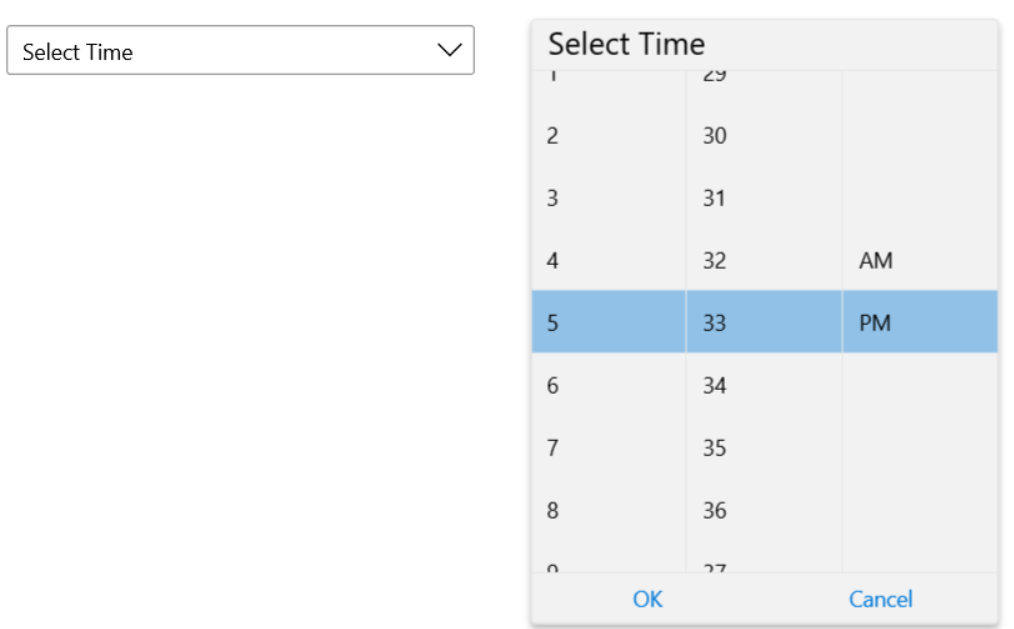
Overview
The TimePicker control for WinUI enables you to implement a stylish and user-friendly way for users to select a time. The time values cam be easily visualized in different display modes for a seamless experience for your WinUI application end users.
Getting Started with Telerik UI for WinUI TimePicker control.
-
Display Modes
With Telerik UI for WinUI TimePicker component you can chose between two display modes: standard and inline. The Standard mode is the default representation, whereas the Inline mode is a excludes the TextBlock part with the button and directly initializes the Time Selector Popup part.
