
UI for WinUI
WinUI Badge
- Build intuitive applications easily with thе Telerik WinUI Badge. Your users can visualize statuses, notifications, short messages, and receive additional contextual information for other elements with the Badge.
- Part of the professionally-designed Telerik UI for WinUI library controls.
- Includes support, documentation, demos, Visual Studio Extensions and more!
-
Overview
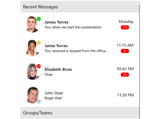
The Badge component is a visual indicator for UI elements. It enables you to easily show statuses, notifications and short messages in your app. Badges provide additional contextual information for other elements on the page. -
Badge Position and Alignment
The Telerik WinUI Badge allows for full configuration of its position and alignment. You can align the badge vertically or horizontally, position it below or above the element it’s attached to, and at its beginning, middle or end.
Visit the product documentation for more information on how to change the position and alignment -
Different Badge Types
The Badge ships with several predefined badge types that are ready to use as is or can be customized according to business needs. The following values are predefined:
-
Default
- DotOnly
- Available
- DoNotDisturb
- Rejected
- Remove
- Offline
- Away
- OutOfOffice
- Add
- ContentOnly
-
-
Animation Support
The Telerik UI for WinUI Badge allows you to display the badge indicator with an animation. The type of animation, its duration and easing can be specified.
Visit the product documentation for more info on how to customize the animation -
Flexible Customization
You can easily customize the look of the Badge by changing it's shape, color, text color, position, alignment and more.
Visit the product documentation for more in depth info on how to customize the control
All UI for WinUI Components
Data Management
Scheduling
Interactivity & UX
Navigation
Document Processing
