
UI for WinUI
WinUI DatePicker
- Part of the professionally-designed Telerik UI for WinUI library controls.
- Includes support, documentation, demos, Visual Studio Extensions and more!
-
Overview
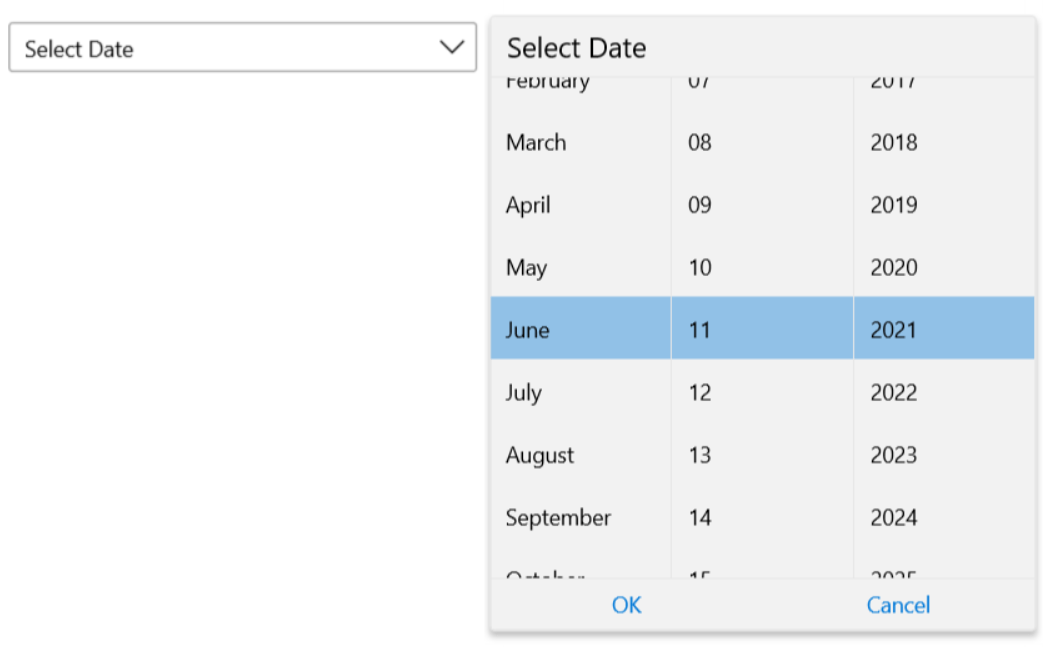
The Telerik DatePicker control for WinUI provides the end users of your desktop application with the ability to easily and intuitively select a date via a display mode that lets them pick the month, day and year of the desired date. This simple, yet essential component ensures a seamless user experience for date parsing and data validation.
-
Display Modes
The Telerik UI for WinUI DatePicker component comes with two display modes: standard and inline. The Standard mode is the default representation, whereas the Inline mode is a excludes the TextBlock part with the button and directly initializes the Date/Time Selector Popup part. -
Keyboard Navigation
The DatePicker control for WinUI supports the standard browser navigation paradigm. Once the control has focus, you can press the Down Arrow key to show the calendar. The users can go forward/backward over the individual days by pressing the arrow keys. Pressing the Tab key will move the focus to the time-picker where you can navigate further.
