
UI for WinUI
WinUI DateTimePicker
- Professionally designed, high-performance WinUI DateTimePicker control featuring multiple input and display modes, flexible customizations, value ranges, keyboard navigation and more.
- Part of the professionally-designed Telerik UI for WinUI library controls.
- Includes support, documentation, demos, Visual Studio Extensions and more!
-
Overview
Telerik’s DateTimePicker for WinUI is a flexible control designed to provide the end-users of your desktop application with an easy and institutive way to pick a date, time, or both. Depending on the requirements of your app, the control can be easily re-programmed to function as a date or a time picker.
Documentation on Getting Started with WinUI DateTimePicker Control
-
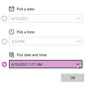
Ultimate Flexibility with Input Modes
You can easily change the DateTimePicker control behavior depending on your WinUI app's requirements – the out-of-the-box value has both calendar and clock views. Still, if you need to utilize only one or both, you can easily specify your requirements via the Input Mode property of the control. Ultimately, the Telerik DateTimePicker for WinUI gives you a 3-in-1 experience – you can use it either as a DatePicker, TimePicker or both, hence why the Input Modes correspond to these three scenarios.
Documentation on Input Modes for WinUI DateTimePicker Control -
Display Modes
The Telerik DateTimePicker for WinUI comes with two display modes that enable you to define how the control will be visualized inside your WinUI application. The Standard display mode is the default representation of the DatePicker and TimePicker, whereas the Inline mode excludes the TextBlock and directly initializes the Date/Time Selector Popup
Documentation on Display Modes for WinUI DateTimePicker Control
-
Define an Interval Value
Another feature of the DateTimePicker for WinUI is the ability to configure a date/time amount used as an interval for the selectable options.
-
Localization
Just like all other controls of the Telerik UI for WinUI suite, the DateTimePicker comes with built-in localization support.
Documentation on Localization Support for DateTimePicker Control
-
Value Range
The Telerik DateTimePicker for WinUI allows you to define minimum and maximum values.
-
Order of the Components
The flexible customization capabilities of the control allow you to chose with components to display and in what order.
-
Define Header Content
Provide the users of your WinUI app with more context by displaying specific header content in the drop-down menu.
-
Keyboard Navigation
The WinUI DateTimePicker supports the standard browser navigation paradigm that includes using arrow keys to expand the calendar and navigate through individual days.
Documentation on Keyboard Navigation Support for DateTimePicker Control
