UI for WinUI
WinUI Tab Control
- Create tabbed navigation in WinUI applications with the Telerik UI for WinUI Tab Control.
- Part of the professionally-designed Telerik UI for WinUI library controls.
- Includes support, documentation, demos, Visual Studio Extensions and more!
-
Overview
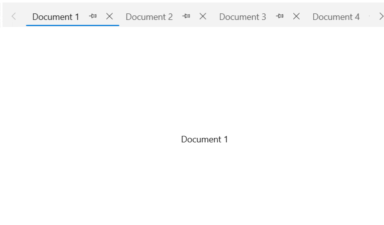
The Tab Control for WinUI allows the creation of tabbed navigation user interfaces in WinUI applications. Controls are placed in the content area of the tabs and the user can switch between multiple tabs and access more features of the app.
-
Data Binding
The tabs can be defined in both data-bound mode and unbound mode. Using the data-bound mode, the control is connected to a collection of objects, XML or WCF services and DataTemplates to define the content of each tab.
-
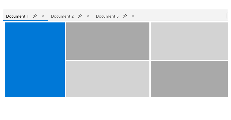
Layout
Tabs can be arranged in a single row or in a multi-line fashion.
-
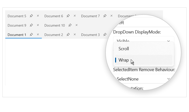
Tab Scroll
When the available space is not enough to fit the open tabs, two scrolling buttons appear in the Tabstrip area to allow the user to navigate between the tabs. The scroll mode can be configured to scroll per pixel, per item or with the viewport width.
-
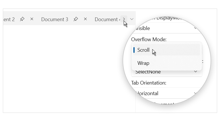
Overflow
Another feature to use when the tabs width exceeds the tab strip area is the Wrap overflow mode, in which case tabs will be placed on multiple lines.
-
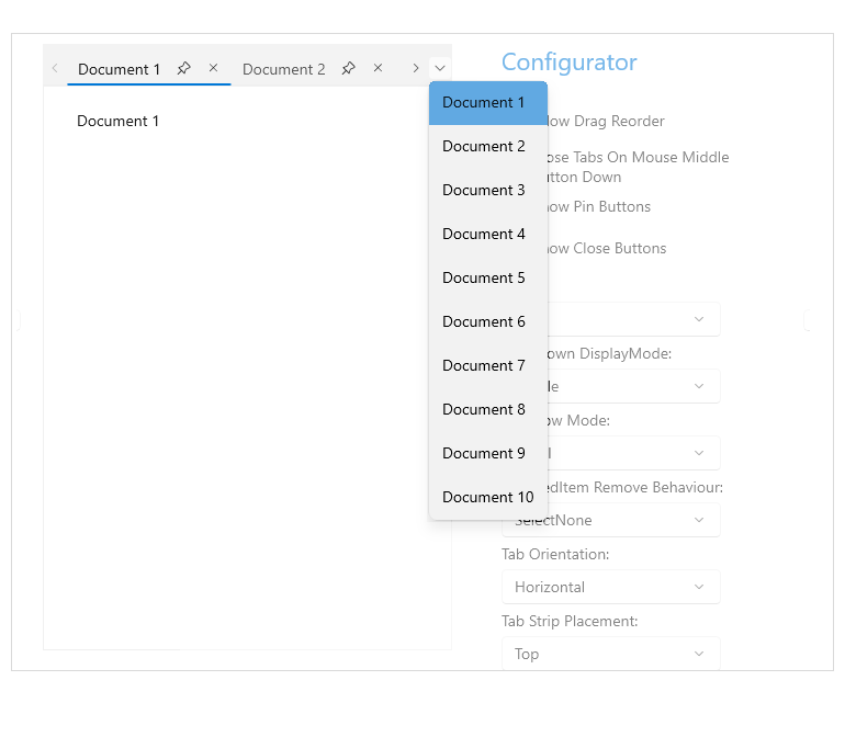
Accessing Tabs
The RadTabControl features a configurable drop-down button displayed at the end of the tab strip, where it lists all open tabs, making it easy for the user to access all tabs at any time.
-
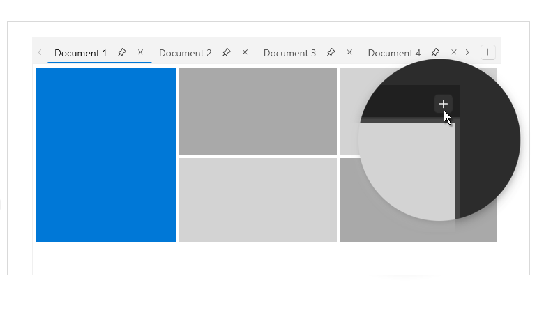
Additional Content
The tab header area of the control features a special area where additional content of your choice can be placed, e.g., a new tab button, status indicator or anything else that may be needed.
-
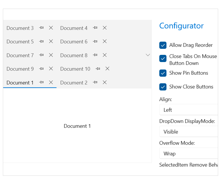
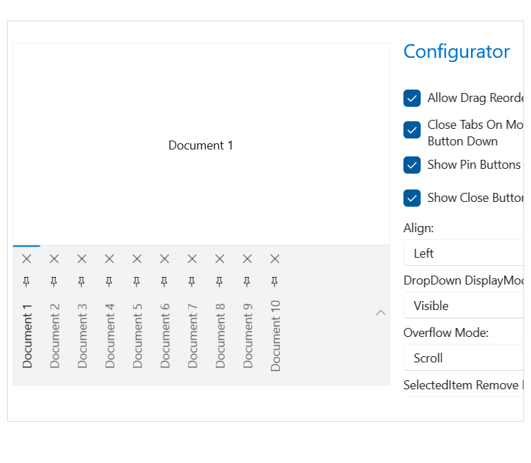
Flexible Customization
The control is extremely customizable—from defining the tab items position, alignment, orientation, size and style to customizing the close, pin, left, right and overflow buttons. The TabStrip color, position and text orientation properties are also readily configurable.
-
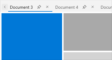
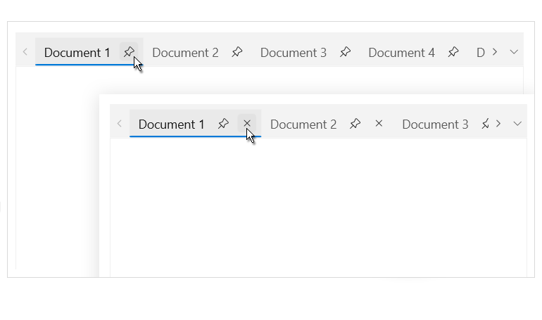
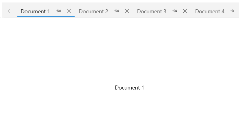
Pin and Close
Each tab features a pin button that will pin the tab in the beginning of the header area, as well as a close button to remove the tab from the control.
-
Drag Reorder
Tab reordering can be easily enabled with a single property, allowing users to rearrange the order of the tabs in the tab area.
-
Selection
The Tab component for WinUI features selection capabilities, enabling users to change the selected tab via a mouse click. Alternatively, the tab can be programmatically changed with the available API. Configuring the control behavior when the user closes a tab is also readily available.