

Summarize with AI:
Our Progress Telerik JavaScript libraries for Angular, React, Vue and jQuery all got a boost with the R1 2023 release. Read on!
Common Release Items
New Data Grid Sizing Options
The Data Grid in Progress Kendo UI for Angular, KendoReact and UI for Vue now allows for customization of its density to improve visibility on smaller devices or to show larger volume data. The new size parameter supports two values: small and medium. To achieve a compact appearance, you can change the size parameter to small. This will decrease the padding in cells and also affect the inner components such as the Toolbar, Pager and editors, making them smaller and consistent with the overall styling of the Kendo UI Data Grid.
See examples of:
- KendoReact Data Grid sizing demo
- Kendo UI for Angular Data Grid sizing demo
- Kendo UI for Vue compact Data Grid demo

Sizing Options in Toolbar and Pager Components
Another common update across the Kendo UI for Angular, KendoReact and UI for Vue libraries is the option to customize the appearance of the Toolbar and Pager components using the new size property. It allows you to configure the dimensions to “Small,” “Medium,” “Large” or “None.”
The size option supports the following values:
- Small – sets the padding of the elements to 2px 8px.
- Medium (default) – sets the padding of the elements to 4px 8px.
- Large – sets the padding of the elements to 6px 8px.
- None – removes the styling related to the sizing option.
See an example of the Pager UI component sizing options in Kendo UI for Angular.
Heads-up for our Progress Kendo UI for jQuery customers that the Data Grid, Toolbar and Pager sizing options will be available with the next release in mid-March.

Accessibility Improvements
Ensuring the accessibility (A11Y) of all user interface components has been a priority for Progress and our Kendo UI products in recent years. The R1 2023 release includes enhancements to attributes and keyboard navigation to meet compliance standards such as WAI-ARIA, Section 508 and WCAG 2.1, and a new color swatch called Ocean Blue A11Y (an enhanced version of the already existing Ocean Blue) for Kendo UI for Angular, KendoReact and Kendo UI for Vue! For those eager to use the new Ocean Blue A11Y swatch with Kendo UI for jQuery, it will be available in the next product release in March.
To learn more about the specific A11Y improvements in each of the Kendo UI libraries (UI for jQuery, UI for Angular, UI for Vue and KendoReact), please refer to the relevant product section below.

Chart Enhancements
The data visualization library has been enhanced with a couple of new and handy chart features, bringing subtitle and bullet chart label options to all Kendo UI libraries.
Label Support for Bullet Charts
You can now easily add labels to each of the data series within the Bullet Chart UI component. Furthermore, you can configure its visibility, apply background formatting and even render custom content by using templates.

Subtitle Support for All Charts
Another enhancement to the DataViz library is the ability to add an additional title (subtitle) below the chart title and apply individual style to it.

ThemeBuilder
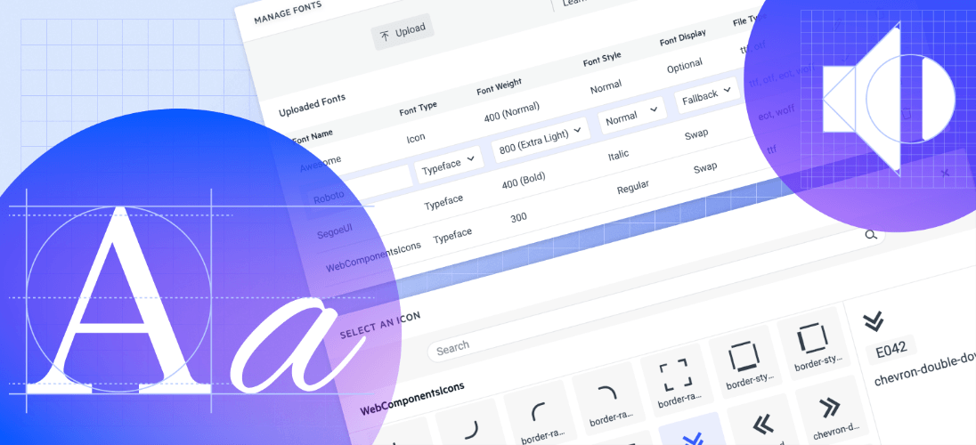
Custom Fonts Support
Progress ThemeBuilder now allows you to upload, use and manage custom fonts, font icons and more! You can use custom fonts to match your company style guide and create a unified experience across the application. Using custom font icons comes with a visual icon picker that enables you to screen faster over all available icons and pick the correct one instead of remembering each by name or code.
See all new R1 2023 features in ThemeBuilder.
Kendo UI for jQuery
The Kendo UI for jQuery library reached a major milestone—its 10th anniversary! We are excited to celebrate a decade of UI goodness and collaboration with you, our customers! Kudos to the Progress Kendo UI for jQuery team for continuously delivering more than expected and giving their best every day!
New jQuery Chip and ChipList Components
With this update, we are happy to introduce the UI for jQuery Chip and ChipList components. The Chip represents a complex piece of information in a compact form and contains text, avatars, images, letters and close icons. The component can be clicked or removed and supports various styling options.
In addition to the jQuery Chip component, with this update the Kendo UI team has also added the jQuery ChipList component. This component is used when developers need to manage a collection of jQuery Chip components, providing ways to data bind and manipulate a list of Chip elements.
A common usage of the Chip and ChipList components are the so-called tags when adding/removing contacts and mail inbox, selecting single or multiple choices from available options and providing input to an application.

New jQuery TimeDurationPicker Component
The Kendo UI TimeDurationPicker component allows users to select a duration as configured by the developer. The developer can control the number of columns, format and allowable values, and add shortcut buttons for repetitive durations. The component also includes built-in keyboard navigation, events for handling logic and options for customizing appearance, such as size, fill mod and border radius.
See the jQuery TimeDurationPicker UI component demo.

CSP Compliance
Pursuing the goal to be Content Security Policy (CSP) compatible and ultimately ensure strict CSP compliance for all Telerik and Kendo UI products, we have taken the first step in R1 2023 by removing any “eval” and “new Function” usages within our Kendo UI for jQuery source code with dynamic functions that are CSP compatible. Additionally, we have rewritten internal usages within the Kendo UI Templates. To ensure your template and apps are CSP compatible, check out the updated article Kendo UI for jQuery CSP templates.

Floating Label Support in Multiple Components
Based on your feedback, we enhanced multiple UI components with a shiny new floating label property. By setting it to true, the label will “float” above the component when it is focused. The new floating label feature is available in the following list of components:
jQuery Select-Type UI Components:
- DropDownlist floating label demo
- ComboBox floating label demo
- MultiSelect floating label demo
- AutoComplete floating label demo
- DropDownTree floating label demo
- MultiColumnComboBox floating label demo
jQuery Date Inputs & Pickers

ECMAScript Modules (ESM) Support
With R1 2023, the Kendo UI for jQuery team has transformed the source code from AMD to ECMAScript modules (ESM), bringing actual benefits from the ESM modules not just to UI for jQuery, but also to Telerik UI for ASP.NET Core and MVC server wrappers as well.
If you are relying on the AMD modules, you can continue using them as we managed to come up with a solution that allows moving to the new ESM module system without breaking changes for anyone who might want to continue AMD/UMD modules with the Kendo UI bundles distributed.
You can learn why we transformed our own source code from AMD to ECMAScript modules and see how you can use dynamic script imports with modern browsers and get huge benefits in your applications.
Accessibility Improvements Support
We continue to further improve the accessibility compliance level in Kendo UI for jQuery and have implemented multiple keyboard navigation and WAI-ARIA attribute features in the jQuery Drawer, ActionSheet and Signature UI components. Additional improvements have been made in the PDFViewer, Gantt, Menu and the TileLayout.
Another highlight from the R1 2023 A11Y improvements is that the jQuery ToolBar UI component now allows two separate modes of keyboard navigation—via the arrow keys and Tab-based. The dual keyboard mode is also valid in cases where the ToolBar is used as an inner component within the PDFViewer, FileManager, ImageEditor, Spreadsheet and TaskBoard.
Deprecation of LESS Themes
Last year with R1 2022 we announced that Kendo UI for jQuery, Telerik UI for ASP.NET MVC and Telerik UI for ASP.NET Core would be moving completely to the Sass-based Default, Bootstrap, Material and Fluent themes. This means that the LESS themes, created when LESS was the most popular CSS pre-compiler (this is no longer the case), are officially going to be deprecated.
Well, the day is here, and R1 2023 is the last version of Kendo UI for jQuery will support the LESS-based themes.
Thanks to the hard work done over the last year or so, R1 2023 contains a lot of new features and components, and lots of improvements to the LESS themes. This should give teams that have been hesitant about the migration a stable release to hold out on until they can make the change to the Sass-based themes.
Kendo UI for Vue
New Native Vue AppBar Component
The Kendo UI for Vue AppBar is a versatile UI component that can be used for navigation in any Vue application. It offers a range of building blocks for creating menus and navigations, such as text links, search bars, icons with dropdown menus and more. The Vue AppBar can be configured to be either fixed at the top of the page or to disappear when the user scrolls down.
The Kendo UI AppBar for Vue offers several key features:
- Positioning: The component can be positioned relative to the page content using built-in options.
- Content Arrangement: You can use sections, spacings and separators to customize the layout of the appbar content.
- Appearance: The AppBar includes predefined options for setting the theme color.
- Responsive Design: The component’s layout adapts to different devices and screen sizes.
See the Vue AppBar UI component demo.

New Native Vue BottomNavigation Component
The Kendo UI BottomNavigation for Vue is a companion component to the Vue AppBar and provides a convenient way for developers to create a navigation element that is always displayed at the bottom of the screen. This component is commonly used on mobile devices but can also be useful on desktop web applications.
The Kendo UI BottomNavigation for Vue allows you to specify the icons and text labels for the rendered buttons based on their content and choose whether the icon and text are on the same line or below each other. Additionally, you can choose between fixed and sticky position modes, set theme colors and fill options, use the BottomNavigation as a container for navigational components with any router library, override the default rendering of the BottomNavigation items, and use built-in globalization support.
See the Vue BottomNavigation UI component demo.

New Native Vue ExpansionPanel Component
The Kendo UI for Vue ExpansionPanel is a component that allows for easy expansion and collapse of content in a Vue application. It consists of two sections: a title area that is always displayed and controls the expansion and collapse functionality, and a content area which can contain any custom Vue template. The ExpansionPanel component provides an intuitive interface to expand and collapse content within a Vue application.
The ExpansionPanel allows you to:
- Animate the expand and collapse actions
- Customize the expand and collapse icon indicators
- Disable the whole group of buttons or a single button
- Support accessibility for screen readers and WAI-ARIA attributes
- Use built-in support for keyboard navigation
See the Vue ExpansionPanel UI component demo.

New Native Vue Signature Component
The Signature component allows users to create handwritten signatures and submit them as part of a form. It includes features such as the ability to customize the appearance settings, smooth out the user’s drawing for improved appearance, control the value of the signature using built-in options, and render a disabled signature until certain requirements are met.
See the demo of Vue Signature UI component.

New Native Vue ListBox Component
The Kendo UI for Vue native ListBox allows for the display, reordering and transfer of items between multiple lists. The data items can also be selected, deleted and dragged and dropped.
The ListBox can be connected with one or multiple other ListBoxes, and the items and toolbar can be customized to fit the requirements of the project. The position of the toolbar can also be controlled, and the messages of the toolbar’s tool buttons can be customized.
See the demo of Vue ListBox UI component.

New Native Vue ChunkProgressBar
The Kendo UI for Vue ChunkProgressBar component displays and tracks the progress of a task using a predefined number of chunks. It supports horizontal and vertical orientation and different directions. The component allows you to set the value and value range, disable the component, set the orientation to horizontal or vertical, reverse the direction, style the component using predefined styling options, and has built-in globalization support for creating apps that can be implemented worldwide.
See the demo of Vue ChunkProgressBar UI component.

New Native Vue ListView Component
The native UI for Vue ListView component brings a perfect alternative for visualizing data in a custom layout format. The UX offered by the Vue ListView is super flexible thanks to relying on developers to provide a customized template for the items to be displayed while at the same time offering built-in data binding, paging, items selection, editing and scrolling mechanisms. The List View UI component for Vue also includes out-of-the box keyboard navigation and right-to-left support.
See a demo of the native UI for Vue ListView component.

New Native Vue TileLayout Component
The Kendo Vue TileLayout is a flexible container component which makes the building of dashboards a breeze. It can be configured to include multiple Tiles of various sizes, and you have full control over the information and component that visualizes the data in the tile—from simple plain text to advanced controls like Data Grid, Chart or ListView. Within the native Vue TileLayout, end users can resize and reorder tiles to their preference with simple drag and drop operation.
See a demo of the native UI for Vue TileLayout component.

Data Grid State Management
We have added a detailed example of how to persist Data Grid state in your Vue applications. The native DataGrid for Vue. The updated demo includes sample code for how to save the DataGrid’s current state, including its data, columns, applied filters, groupings, expanded rows, etc., and restore it precisely the same way when the user returns to the same page.
See a demo of Kendo UI for Vue DataGrid persist state.
Vue TreeList Component Enhancements
The Kendo UI for Vue TreeList was further enhanced with the following features:
- Editing – The built-in editing option allows users to place an entire row in edit mode, edit individual cells one at a time or showcase all fields that can be edited in a modal dialog.
- Column Resizing – Lets users resize the width of a column using built-in resizing handlers.
- Reordering – Lets users rearrange the order of the displayed columns.
- Column Menu – Provides a menu with actions that can be taken for each column, including items like showing or hiding a column, filtering, sorting and much more.
- Multi-Column Headers – Allows developers to define headers that span multiple columns which can be useful to group related columns and fields.
- Locked Columns – Also known as frozen columns, this feature lets columns be locked to either side of the TreeList as users scroll through the list of available columns.
- Column Virtualization – Improves performance for scenarios where a TreeList contains a large collection of columns and optimizes when and how to display columns to make a buttery smooth scroll experience.
- Row drag-and-drop – Provides the option to move its rows to an inner or outer tree node.
- PDF export – The built-in PDF export allows for easy export of data to a PDF file. The exported data can be modified to fit the specific needs of the targeted scenario, such as: exporting the visible data, exporting all items loaded in the data and exporting data from selected columns.
See the Vue TreeList Column Operation demos.

Accessibility Improvements
In Kendo UI for Vue, the WAI-ARIA attributes accessibility improvements are across all UI components and, as a next step, will aim to enhance the keyboard navigation and aim further boost the compliance with A11Y best practices.
Support for SVG Icons
As of R1 2023, Kendo UI for Vue provides a large variety of Scalable Vector Graphics (SVG) icons in addition to the existing font icons, providing developers with more choices. SVG icons are vector images that use XML to define them, which allows them to be easily scaled and customized. They can be utilized in webpages to display vector graphics and have benefits such as clear rendering at any resolution, the ability to control individual parts with CSS and accessibility through semantic elements and attributes.
Getting Started with Nuxt 3
The official release of Nuxt 3, “the intuitive open-source web framework,” was announced just a few days ago and we are happy to share that Kendo UI for Vue already provides official support for it. We have created a dedicated article Get Started with Nuxt 3 that will help you start right way with Kendo UI for Vue and test how simple and powerful it is.
Kendo UI for Angular
New Angular ActionSheet Component
The Kendo UI for Angular ActionSheet presents a list of options, or “actions,” in a modal popup that appears at the bottom of the screen. This ActionSheet UI component is commonly used in mobile apps, but can also be used in desktop apps. Each item in the list can have its own icon, text and event that is triggered when the user interacts with the ActionSheet.
Key features of the UI for Angular Actionsheet component include:
- Items – allows you to easily configure the items based on specific project requirements.
- Templates – provide customization options for the content of the ActionSheet items using templates.
- Accessibility – the ActionSheet component is accessible for screen readers and supports WAI-ARIA attributes.
- Built-in keyboard navigation – support for a number of keyboard shortcuts for processing various commands.
You can refer to the Angular ActionSheet demo for an example.

Gantt Year View
In addition to the already existing Day, Week and Month views in the Kendo UI for Angular Gantt, we have now added the Year configuration view. This lets end users easily zoom out and see an entire year of tasks and their timeline.
In the Year view mode of the Gantt, tasks are allocated on a monthly basis, along the timeline part of the component. The Gantt main header renders the corresponding year, and the secondary header shows the respective month name.
See the Angular Gantt Year View demo

Scheduler Enhancement: Multi-Week View
The Multi-Week View of the Kendo UI for Angular Scheduler allows users to view and manage their schedule over a period of multiple weeks. This view includes the option to configure the number of weeks to be displayed (numberOfWeeks setting) and the starting week period, which is determined by the selectedDate option of the SchedulerComponent. If this option is not set, the current date is used. Additional configuration options can be found in the MultiWeekViewComponent.
See example of the UI for Angular Scheduler multi-week view.

Angular Data Grid: Column Menu Auto-Size Option
The Kendo UI for Angular Grid has been updated to include an option for end users to automatically resize a column through the built-in column menu. The column menu can be accessed from the column header of each column. This feature allows the column to automatically adjust its width to fit the content within the column.
See the Angular Data Grid Column Menu Demo.

Accessibility & Keyboard Navigation Improvements
As announced previously, the Kendo UI for Angular library is undergoing an accessibility review using the latest industry-standard testing process. In the current release, we have addressed and improved the WAI-ARIA attributes best practices for multiple components including, but not limited to, the UI for Angular TreeView, Scheduler, Toolbar, PivotGrid, Pager, Tooltip and more.
Another highlight of this release A11Y improvements is the implementation of built-in keyboard navigation for the Angular TileLayout and Scheduler UI components.
Try them out:
Editor Enhancements
Provide the ability for registering CSS files in the Editor iframe in order to customize the content using custom CSS classes and styling. This helps you match the style to the rest of your application or satisfy any other custom requirements you may face.
See the Angular Editor Custom Stylesheet demo.

SVG Icons Support
With the latest release, you can customize the appearance of the icons used throughout Kendo UI for Angular by adjusting the new IconSettings properties, such as the type of icon (SVG or font), theme color, flip direction and size. To apply these settings globally, you can use the ICON_SETTINGS token and provide an IconSettings object in the appropriate module.
Angular 15 Support
We are happy to announce that with R1 2023 Kendo UI for Angular is compatible and up to date with Angular v15! Earlier our developer advocate star Alyssa Nicoll created a blog where she shares what’s new and cool in the latest release of the framework.
For those eager to try out the new features from the Angular framework and the Kendo Angular library, follow the dedicated article and see how to easily update to the latest version of UI for Angular components.

Enhancements in Kendo UI for Angular Packages
As of R1 2023, we conform to the Angular package format v13 as minimum version and will include ESM 2020 bundles. With this update, we aim to help you improve build times and application performance in modern browsers.
CSP Compliance
Another major CSP support update can be found in our Kendo UI for Angular library. Up until now the UI for Angular components required “unsafe-inline” for style-src to enable them to load encapsulated styles. To solve this and make sure
our components have strict CSP support, we removed any inline <style> tags and style attributes. For more information and remaining known limitations, please refer to the CSP compliance article from our documentation
KendoReact
New React ActionSheet Component
The KendoReact ActionSheet is a UI component that presents a list of options, or “actions,” in a modal popup that appears at the bottom of the screen. The ActionSheet is commonly used in mobile apps but can also be used in web apps. Each item in the list can have its own icon, text, description and event that is triggered when the user interacts with the ActionSheet.
Key features of the KendoReact Actionsheet component include the ability to add header text (title), and easily configure the items based on specific project requirements, customization options for the content of the ActionSheet items using templates, accessibility for screen readers and support for WAI-ARIA attributes.
See a demo of the KendoReact ActionSheet UI component.

New React PDFViewer Component
With the current release, we are excited to announce the new React PDF Viewer component! This new KendoReact UI component focuses on displaying and interacting with PDF files directly within any React application, without needing to rely on the built-in browser tools to handle PDF files.
End users are greeted with several tools to interact with the displayed PDF files including paging mechanisms, search, zoom and more.
See the React PDFViewer UI Component demo.

New React Admin Dashboard Sample
The KendoReact team is always looking for ways to provide more resources for any developer looking to pick up and learn KendoReact. One of the most useful learning resources, outside of the regular documentation articles, are sample applications that showcase how the various KendoReact UI components can work together to create a cohesive application.
This is why the KendoReact team is introducing the new React Admin Dashboard sample application. The overall design of the Admin Dashboard replicates many of the type of applications that KendoReact UI components are used to build and showcases a few different types of pages that can be quickly copied and used in any existing React application using KendoReact.
The demo app includes examples of how to use as standalone components or integrate with each other from a large list of React UI components including but not limited to Data Grid, Chart, TileLayout, Drawer, Form, AppBar, Pager, Arc Gauge, DateRangePicker and more!
See the React Admin Dashboard Sample Application.

React Scrollable Tabs
The KendoReact TabStrip component has received an update that now allows for scrolling through tabs. This feature has been highly requested by users and is particularly useful in situations where the TabStrip has a specific width but the number of tabs available require a wider space to be displayed. With this update, the React TabStrip component provides adaptive capabilities and can now easily navigate through a larger number of tabs.
See the KendoReact Scrollable Tabs demo.

React DataGrid Enhancements
The KendoReact DataGrid has been further enhanced with a feature allowing you to lock a grouping section. Until now there were some limitations related to combining frozen columns and grouping within the Grid. Thanks to the new feature you can now provide better UX to end users who would like to keep first grouping column locked while browsing the grid data.
See example of KendoReact DataGrid with locked grouping section.

Prefix and Suffix Adornments
The MaskedTextBox and NumericTextBox components for React now include the options for adding custom items as prefix and suffix adornments. This allows you to easily add a custom component such as icon or button and implement custom functionality on top of them.
See how to add adornments to KendoReact MaskedTextBox and NumericTextBox UI components.
Accessibility Improvements
Like the rest of the Telerik and Kendo UI libraries, KendoReact received multiple accessibility improvements related to WAI-ARIA attributes and keyboard navigation. The list of React UI components that received A11Y boost is long, so here are the highlights: Data Grid, DateTimePickers, multiple Buttons—DropDownButton, FloatingActionButton, Toolbar, Calendar, TreeView, ListBox and more!
SVG Icons Update
With the latest release, you can customize the appearance of the icons used throughout KendoReact by adjusting their type (SVG or font) through the new IconsContext. Code example and detailed explanation can be found in the dedicated documentation article Switch to SVG or Font Icon in KendoReact.
Visual Studio Code Scaffolding
The scaffolding feature will create new pages in your KendoReact apps with the most used data-bound UI components: the Data Grid, Chart, Form and Scheduler. When adding a new project item, the scaffolder will allow you to configure multiple component-specific properties. For example, if you scaffold a new page with the Data Grid, you will be able to set its sorting, filtering, grouping and more features.
Try out the VS Code scaffolding for KendoReact UI components.

Join Us for Release Webinar (and More)
Progress Kendo UI R1 2023 Release Webinar | January 31

Discover all updates across KendoReact and Kendo UI for Angular, Vue and jQuery, as well as ThemeBuilder.
Join Us on Twitch

If you can’t wait until the webinar to unpack the new release, join the Livestream Release Party on January 19, 10 a.m. – 11:30 a.m. ET to hear the release highlights across the entire Progress Developer Tools portfolio and hang out with friends.
And for those of you who will be at NDC London on January 25-27, you are welcome at the Progress booth where we can talk about all product developments and the latest release.
Progress Telerik .NET Web, Desktop & Mobile Products R1 2023 Release Webinar | January 26
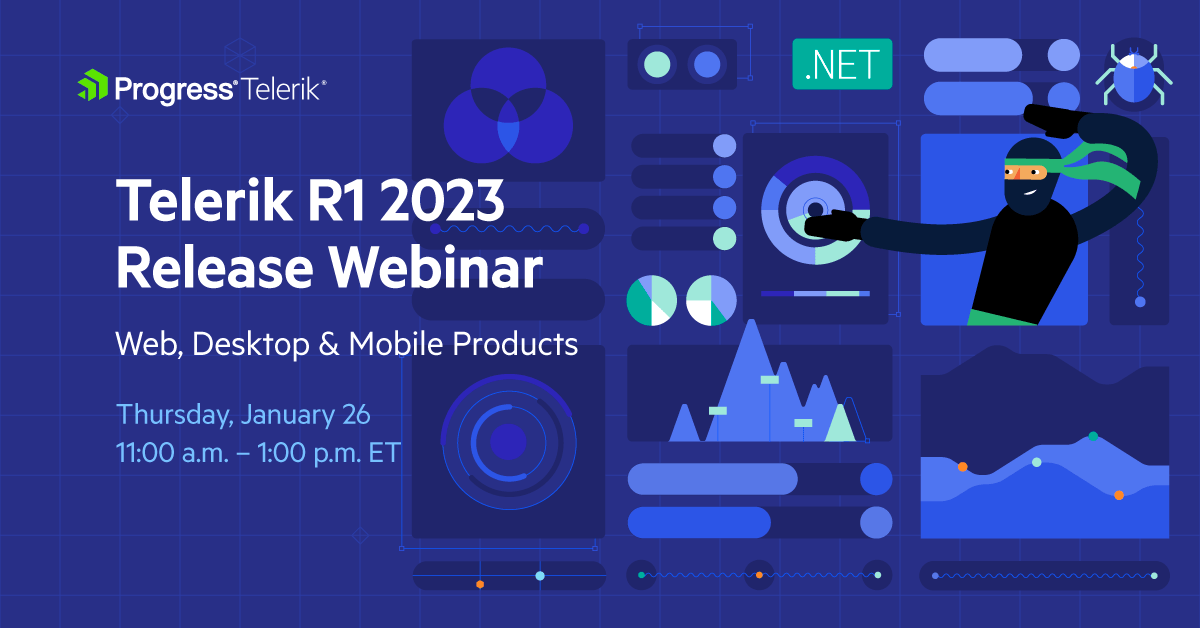
Discover all updates across Telerik UI for Blazor, UI for ASP.NET Core, UI for ASP.NET MVC, UI for ASP.NET AJAX, UI for WPF, UI for WinForms, UI for WinUI, UI for .NET MAUI and UI for Xamarin and ThemeBuilder.
Progress Telerik Reporting, Mocking and Debugging Tools R1 2023 Release Webinar | February 2
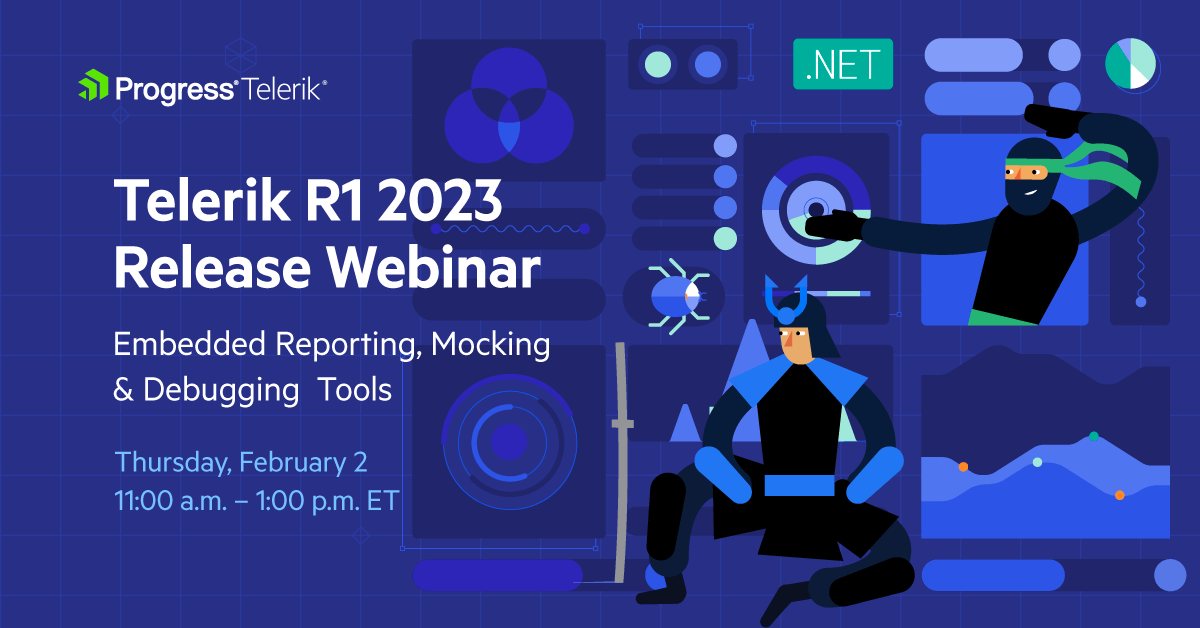
Discover all updates across Telerik Reporting, JustMock, Fiddler Everywhere and Fiddler Jam.

Maria Ivanova
Maria Ivanova is a Manager of Product Management at Progress, for Telerik and Kendo UI components and developer tooling. She joined the company in 2019 as a Product Manager for Telerik UI web components and is passionate about developing impactful and innovative software products. Maria believes that to create great products, it's important to challenge the status quo, closely collaborate with customers, and embrace a spirit of experimentation.
Related Posts
Comments
All articles
Topics
Web MobileMobile
Desktop
Design
Productivity
People
