
5 Essential KendoReact Components That Will Make Sure You Never Ask ‘How Do I Build That’ Again

Summarize with AI:
Let’s explore five essential KendoReact components that will help you streamline your UI development so you never have to ask yourself “How do I build that?” again.
A great user experience is the foundation of a successful web application. But building a user-friendly and high-performing web app can be a significant challenge. How many times have you asked yourself, “How Do I Build That?”
The good news is, there are specific solutions designed to make your life easier. Using a commercial library like Progress KendoReact could be a true game-changer, saving you a tremendous amount of time and effort. The KendoReact library includes more than 120 native UI components, equipping you with everything you need to build a modern, high-performing web app. From simple controls and navigational elements to layout tools and complex data grids—we’ve got you covered.
Let’s explore five essential KendoReact components that will help you to speed up and simplify your UI development.
1. Data Grid
Developing a complex Data Grid from scratch might take months of development, while maintaining it can take even longer. But it doesn’t have to be this way.
The KendoReact Data Grid offers everything you need in terms of functionality, styling and maintenance out of the box with just a little code. You can choose which features to utilize and completely customize the component based on your requirements.
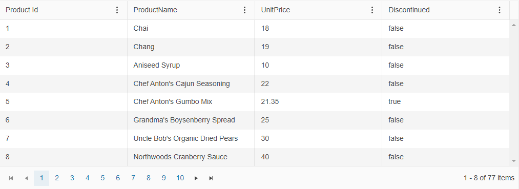
The screenshot below demonstrates many of the essential KendoReact Data Grid features in action, like paging, filtering, grouping, export, etc.—most of which can be enabled with a simple property.
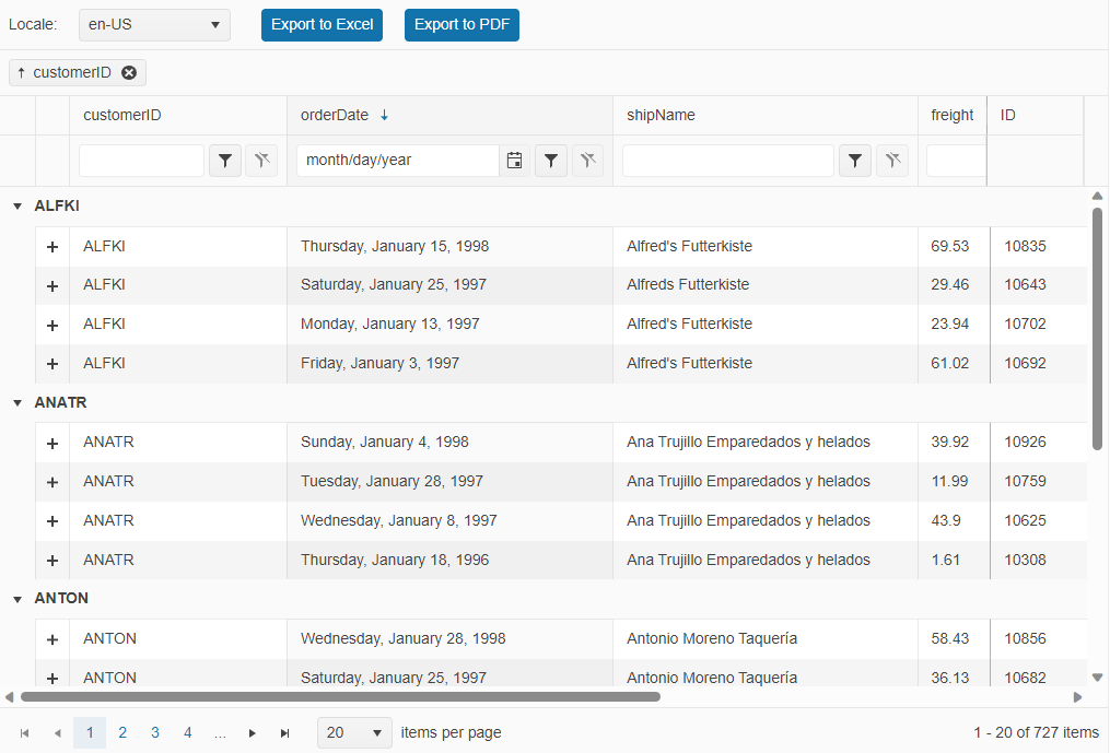
To show you how easy the implementation is, let’s look at a typical implementation scenario. In this screenshot, you can see a few popular features, including filtering and paging.
And all you need is the following code:
import * as React from "react";
import * as ReactDOM from "react-dom";
import { process } from "@progress/kendo-data-query";
import { Grid, GridColumn as Column } from "@progress/kendo-react-grid";
import { ColumnMenu, ColumnMenuCheckboxFilter } from "./columnMenu";
import products from "./products.json";
const createDataState = (dataState) => {
  return {
    result: process(products.slice(0), dataState),
    dataState: dataState,
  };
};
const App = () => {
  let initialState = createDataState({
    take: 8,
    skip: 0,
  });
  const [result, setResult] = React.useState(initialState.result);
  const [dataState, setDataState] = React.useState(initialState.dataState);
  const dataStateChange = (event) => {
    let updatedState = createDataState(event.dataState);
    setResult(updatedState.result);
    setDataState(updatedState.dataState);
  };
  return (
    <Grid
      data={result}
      {...dataState}
      onDataStateChange={dataStateChange}
      sortable={true}
      pageable={true}
      pageSize={8}
    >
      <Column
        field="ProductID"
        title="Product Id"
        filter={"numeric"}
        columnMenu={ColumnMenu}
      />
      <Column field="ProductName" columnMenu={ColumnMenuCheckboxFilter} />
      <Column field="UnitPrice" filter={"numeric"} columnMenu={ColumnMenu} />
      <Column
        field="Discontinued"
        filter={"boolean"}
        columnMenu={ColumnMenuCheckboxFilter}
      />
    </Grid>
  );
};
ReactDOM.render(<App />, document.querySelector("my-app"));
Check out the full demo here.
For more advanced scenarios, you can take a look at the KendoReact PivotGrid.
Interested in learning more?
- Getting started with the KendoReact Data Grid – Official documentation starting point
- Kendo UI Grid for React – Built from the Ground Up! – How to configure the grid with just a few lines of code
- Top 5 Features of the KendoReact Data Grid – Key features you need to know
- Sorting, Filtering and Grouping with the KendoReact Data Grid – Use cases and implementation tips and tricks
- Getting started with the KendoReact PivotGrid – Basic concepts and use cases for a pivot table
2. Charts
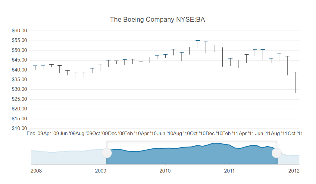
Charts play a vital role in any data visualization scenario. The KendoReact Charts library includes a wide range of charts—from simple bar charts to sophisticated financial and scientific charts, all made entirely in React with no third-party dependencies. Each chart is highly customizable, helping you to easily understand trends in data through compelling visual representations.
Here is an example of a stock chart used to visualize the price movement of a financial instrument over a certain period.
Use the following code to create the chart:
import * as React from "react";
import * as ReactDOM from "react-dom";
import {
  StockChart,
  ChartTitle,
  ChartSeries,
  ChartSeriesItem,
  ChartNavigator,
  ChartNavigatorSelect,
  ChartNavigatorSeries,
  ChartNavigatorSeriesItem,
} from "@progress/kendo-react-charts";
import "hammerjs";
import stockData from "./stock-data.json";
const from = new Date("2009/02/05");
const to = new Date("2011/10/07");
const StockChartContainer = () => (
  <StockChart>
    <ChartTitle text="The Boeing Company NYSE:BA" />
    <ChartSeries>
      <ChartSeriesItem
        data={stockData}
        type="candlestick"
        openField="Open"
        closeField="Close"
        lowField="Low"
        highField="High"
        categoryField="Date"
      />
    </ChartSeries>
    <ChartNavigator>
      <ChartNavigatorSelect from={from} to={to} />
      <ChartNavigatorSeries>
        <ChartNavigatorSeriesItem
          data={stockData}
          type="area"
          field="Close"
          categoryField="Date"
        />
      </ChartNavigatorSeries>
    </ChartNavigator>
  </StockChart>
);
ReactDOM.render(<StockChartContainer />, document.querySelector("my-app"));
Here are a few useful resources to get you started with the KendoReact Charts:
- Getting started with the KendoReact Charts – Official documentation starting point
- Data Visualization: Build React Graphs the Easy Way – An overview of how to implement the React Charts
- React Charts Made Easy – How to build beautiful and functional React Heatmap Chart in less than 50 lines of code
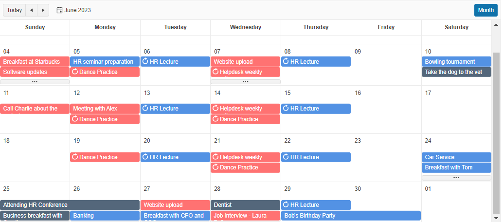
Scheduler (Event Calendar)
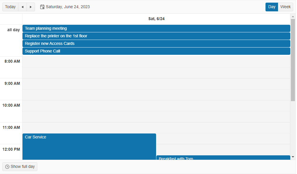
A substantial amount of web projects nowadays require a scheduling component. Whether you need to manage meetings, rooms, projects, appointments, events—or anything that requires reserving a time slot, the KendoReact Scheduler component is here to help. It provides support for time zone conversions, resource visualization, grouping, editing and recurring events, enabling you to meet complex scheduling requirements with just a few lines of code.
Here is an example of a classic calendar view built with the KendoReact Scheduler:
And this is all the code needed for its implementation:
import * as React from "react";
import * as ReactDOM from "react-dom";
import { Scheduler, DayView, WeekView } from "@progress/kendo-react-scheduler";
import { sampleData, displayDate } from "./events-utc";
const App = () => {
  return (
    <Scheduler data={sampleData} defaultDate={displayDate}>
      <DayView />
      <WeekView />
    </Scheduler>
  );
};
ReactDOM.render(<App />, document.querySelector("my-app"));
Now let’s look at a more advanced scenario, including color coding based on the event’s resources (e.g., a meeting room or a guest list).
For even more advanced scenarios, you can utilize the KendoReact Gantt Chart component.
Interested in learning more?
- Getting Started with the KendoReact Scheduler – Official documentation starting point
- 5 Built-In Views To Customize the KendoReact Scheduler Component – Most beloved usage scenarios
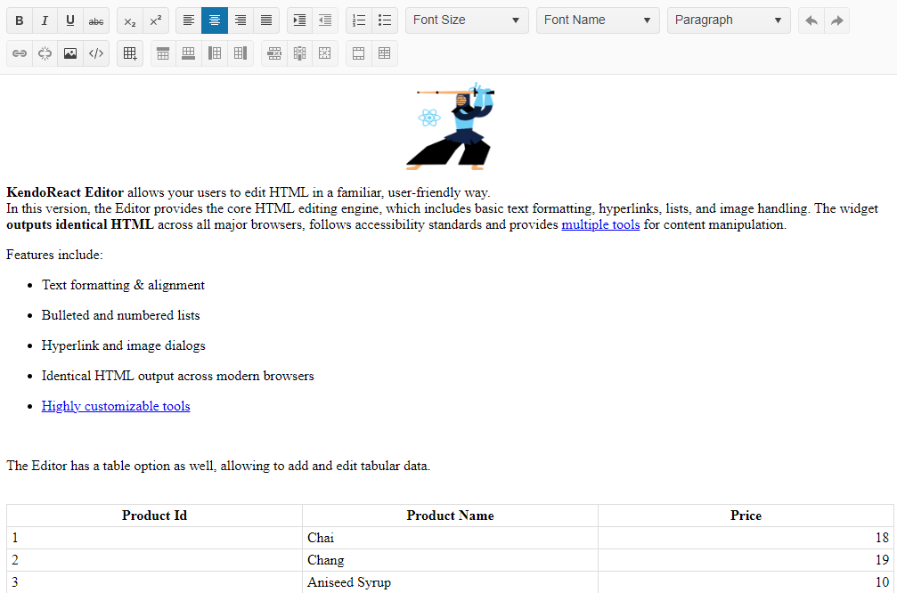
4. Rich Text Editor
Users always like to create and edit text within the web app. While some need basic text editing, others are looking for more flexibility, including formatting, styling, image editing and more.
The KendoReact Editor component supports a wide range of editing and formatting options in a single place, enabling users to create rich text within your React app. It has everything an editor can offer, including toolbar, code view and much more. Additionally, you have the option to enable or disable specific features, ensuring your users get only the functionality they need.
The screenshot below shows the majority of features enabled.
Embedding the KendoReact Editor in its default state is incredibly easy:
import * as React from "react";
import * as ReactDOM from "react-dom";
import { Editor, EditorTools } from "@progress/kendo-react-editor";
import content from "./content-overview";
const {
  Bold,
  Italic,
  Underline,
  Strikethrough,
  Subscript,
  Superscript,
  AlignLeft,
  AlignCenter,
  AlignRight,
  AlignJustify,
  Indent,
  Outdent,
  OrderedList,
  UnorderedList,
  Undo,
  Redo,
  FontSize,
  FontName,
  FormatBlock,
  Link,
  Unlink,
  InsertImage,
  ViewHtml,
  InsertTable,
  AddRowBefore,
  AddRowAfter,
  AddColumnBefore,
  AddColumnAfter,
  DeleteRow,
  DeleteColumn,
  DeleteTable,
  MergeCells,
  SplitCell,
} = EditorTools;
const App = () => {
  return (
    <Editor
      tools={[
        [Bold, Italic, Underline, Strikethrough],
        [Subscript, Superscript],
        [AlignLeft, AlignCenter, AlignRight, AlignJustify],
        [Indent, Outdent],
        [OrderedList, UnorderedList],
        FontSize,
        FontName,
        FormatBlock,
        [Undo, Redo],
        [Link, Unlink, InsertImage, ViewHtml],
        [InsertTable],
        [AddRowBefore, AddRowAfter, AddColumnBefore, AddColumnAfter],
        [DeleteRow, DeleteColumn, DeleteTable],
        [MergeCells, SplitCell],
      ]}
      contentStyle={{
        height: 630,
      }}
      defaultContent={content}
    />
  );
};
ReactDOM.render(<App />, document.querySelector("my-app"));
More useful resources:
- Getting started with the KendoReact Text Editor – Official documentation starting point
- How to use the KendoReact Editor – A step-by-step guide on getting started, implementation and customization
- Customizing the React Rich Text Editor – Comprehensive tutorial
- React Editor Demo – How to add an editor component the easy way
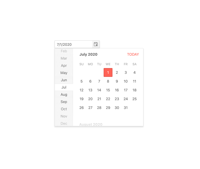
5. Date Inputs
Finally, we will look into the date input components—essential, yet often challenging, especially if you have to design a fully functional calendar inside a dropdown or adapted for a compact screen.
KendoReact offers a wide range of date inputs for any scenario, enabling users to easily select dates, times and ranges.
Let’s have a look at the popular KendoReact DatePicker. Highly customizable and extremely easy to embed, the component will save you from struggling with date formats and accessibility.
You can configure it with just a few lines of code:
import * as React from "react";
import * as ReactDOM from "react-dom";
import { DatePicker } from "@progress/kendo-react-dateinputs";
import "./styles.css";
const App = () => {
  return (
    <div className="food-demo card-container">
      <div className="k-card custom-card">
        <div className="card-row">
          <div className="card-column">
            <h4 className="k-h4">Schedule Your Visit</h4>
            <div className="component-container">
              <form className="k-form" onSubmit={(e) => e.preventDefault()}>
                <fieldset>
                  <DatePicker placeholder="Choose a date..." />
                </fieldset>
              </form>
            </div>
            <div className="skeleton-container top">
              <div className="k-skeleton skeleton-box-small" />
              <div className="k-skeleton skeleton-box-large" />
            </div>
            <div className="skeleton-container bottom">
              <div className="k-skeleton skeleton-box-medium" />
              <div className="k-skeleton skeleton-box-medium" />
            </div>
          </div>
          <div className="card-column image-container">
            <div className="k-skeleton skeleton-image">
              <span className="k-icon k-i-image" />
            </div>
          </div>
        </div>
        <div className="card-row">
          <div className="k-skeleton skeleton-box-half" />
        </div>
      </div>
    </div>
  );
};
ReactDOM.render(<App />, document.querySelector("my-app"));
Interested in learning more?
- Getting Started with the KendoReact Date Inputs - Official documentation starting point
- How to Use and Customize the KendoReact DatePicker – Deep-dive into the component’s capabilities
- 5 Most Useful Features of the KendoReact DateTimePicker – Video tutorial
Summary
There you go—five amazing KendoReact components that can help you build highly functional and beautiful UI with minimal effort. Creating great UX is made easy with our unique focus on design and related tools. Paired with the industry’s best support, detailed documentation and comprehensive library of learning resources, you have everything you need to increase productivity and speed up development.
Don’t take our word for it—try out KendoReact free for 30 days and get access to professional support while checking it out. Give it a shot and see yourself how easy it is to build stunning React apps!

Violeta Manolova
Violeta is a Product Marketing Manager for Kendo UI. She enjoys storytelling, solving different challenges and working across multiple teams on a daily basis. In her free time, Violeta loves Pilates, traveling around the world and long walks with her rescue dog.
Related Posts
Comments
All articles
Topics
Web MobileMobile
Desktop
Design
Productivity
People
