How To Use and Customize the KendoReact DatePicker

Summarize with AI:
Get out your calendar and pencil us in for this deep dive into all the features and functionality of the KendoReact DatePicker!
If you’ve ever been in the position of having to build your own date picker component, then you know it’s no easy task. There are so many situations when the default HTML date picker simply won’t cut it. You need a functionally complex date picker, that can do things like set min and max date ranges and validate the user’s selection ... but you also need it to be fully accessible and keyboard navigable, have an intuitive UX, and be easy for YOU to implement and maintain.
There are plenty of hyper-specific libraries out there that you can use to add a date picker component to your app. However, every time you add a new dependency to your code, you also take on the work of properly vetting it and handling any breaking changes in the future associated with that dependency. Can you guarantee how long will this library be actively maintained? Is it well documented? Is the component it offers fully accessible? Or is this library being thanklessly maintained by some random person in Nebraska since 2003, and just another left-pad situation waiting to happen?
You can avoid these complications by choosing a complete component library (like KendoReact) that offers you more than just a one-off solution to the problem you’re solving right now. So get out your calendar and pencil us in for the next few minutes, because we’re going to take a deep dive into all the features and functionality of the React DatePicker, which is part of the several beautiful and fully accessible components that make up the KendoReact Date Inputs Library!
The KendoReact DatePicker has a huge array of awesome features, but let’s start with just getting the basic component up and running in our application. In this example, I’m using my LKARS demo app, which you’re welcome to clone and play around with—you can find the repo here. It should be noted that this app has been heavily themed to look like the Star Trek ship menu system, so colors and fonts will look different than they do in our docs. If you’re interested in applying custom theming to your KendoReact components, take a look at this walkthrough, as well as this blog about using Sass for custom component styling.
We’re going to add the React DatePicker component to the Schedule page of our app, so the crew members of our fake starship can use the calendar to easily apply for shore leave. Because, hey, work/life balance is important.
If you'd like to code along, check out the companion video, How to Use and Customize a React DatePicker.
Getting the React DatePicker Into the App
To use the DatePicker, we first need to install and import the KendoReact Date Inputs library with npm install @progress/kendo-react-dateinputs. Once that’s ready, you can go ahead and import DatePicker into your component and use it. We’re not gonna worry about doing any config yet—let’s just get it in and see how it looks right out of the box.
import { DatePicker } from "@progress/kendo-react-dateinputs";
export default function Schedule() {
  return (
    <h1>Schedule Shore Leave</h1>
    <p>Please input your requested shore leave dates below, and your commanding officer will approve or deny your request within 5 days</p>
    <DatePicker />
  )
};

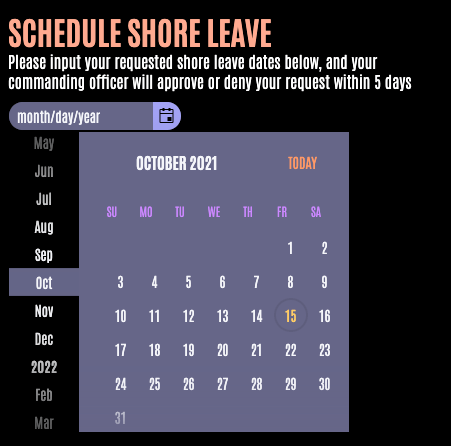
So as you can see, we’ve now got our DatePicker showing up in our Schedule component. You can click on the calendar icon to expand the view, and scroll to jump through months (or even years) on the left-hand side. And the “Today” button in the top right corner will jump us back to the current date. When we pick a date, it updates the month/day/year filler copy with the selected date to confirm selection to the user.
Restricting User Selection to a Specific Date Range
This is all well and good, but we don’t want anyone to be able to select past dates for their shore leave (time travel is generally frowned upon under the Temporal Prime Directive). And we don’t really want anyone applying for shore leave way out in the distant future, either. So we’re going to use the min and max values to set a reasonable range for our users to select from.
import { DatePicker } from "@progress/kendo-react-dateinputs";
export default function Schedule() {
  const max = new Date(2021, 11, 31);
  const today = new Date();
  return (
    <h1>Schedule Shore Leave</h1>
    <p>Please input your requested shore leave dates below, and your commanding officer will approve or deny your request within 5 days</p>
    <DatePicker min={today} max={max} />
  )
};
The DatePicker expects JS Date objects when passing in these min and max properties. If you need a little brushing up on those (and who doesn’t; zero-indexed months just feel weird), I recommend the MDN docs.
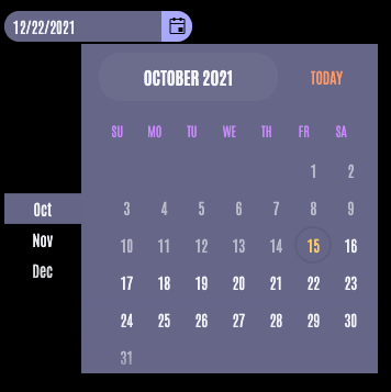
In this case, we’ve allowed our crew to take off days between today’s date and the end of the year. You can see that our calendar automatically makes some really nice UX adjustments to reflect this—the past, un-selectable dates have been grayed out, and the month scroller on the left-hand side now only shows the months in our available window.

And, if any of my fictional crew members try to get smart and manually type in a date outside the available range, you’ll see a red border that appears around the DatePicker component to indicate an error to the user.

Validating User Selection in KendoReact DatePicker
If we’ve got a full form set up on our page wrapping our DatePicker component (which we should do anyway, because it’s a good accessibility practice), then there’s a validationMessage tooltip built right into the component that we can take advantage of! So all I have to do is pass in the copy I want to show on error, and if the user input doesn’t validate correctly, that tooltip will automatically show on form submit.
This is one of those things that feels small, but is actually huge—both to the user, and for us as developers. It’s definitely a pain to set that stuff up manually for every form input element, but also ... it’s so helpful for the user! How many times have you been stuck scrolling through a form you filled out, trying to guess where you messed up because it won’t let you submit? The built-in validation and messaging in the DatePicker component makes it easy to implement these best practices.
<DatePicker validationMessage={ formState.shoreLeave === null ? "Date is required!" : "Date cannot be in the past!" } /> 
Disabling User Interaction in KendoReact DatePicker
Similarly, sometimes we want to prevent people to be able to use the DatePicker at all—maybe this crew member has already used up all their allotted shore leave. In that case, we’ll want to disable the entire component. This can be done easily by just setting the disabled prop to true. This fades out the entire component, and stops the user from being able to input dates or expand the calendar view.
<DatePicker disabled={true} /> 
Setting a Default Date
Additionally, there are times when we’ll want to suggest dates to the user. In this case, we can use the defaultValue prop to have the component load with a default selection in place—for example, I’d like to set the default value to today’s date. If we don’t set a default value, we’ll get the month/day/year placeholder instead.


const today = new Date(); <DatePicker defaultValue={today} /> Setting a Default Focused Date
The KendoReact DatePicker also allows you to set a focused date, which is the date that’s automatically highlighted when the user expands the calendar view. If no focused date is set, it will default to focusing on today’s date, but you can overwrite it to be something else by changing the focusedDate property.
const focused = new Date(2021, 11, 31); <DatePicker focusedDate={focused} /> Changing the Date Format
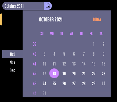
If you’re working in an environment that needs to support multiple date localization formats (like, say, a starship), then good news—you can easily do that as well, since the DatePicker allows you to pass in several different format options. You can see all the various date formats that KendoReact supports in the kendo-intl GitHub repo. You can also adjust the calendar to show the numbers of each week on the left-hand side by setting weekNumber to true. Both of these allow you to adjust the DatePicker to match whatever date format will be most recognizable for your users.
<DatePicker format={"MMMM yyyy"} weekNumber={true} /> 
Summary
And, there you have it! One beautiful, customizable and fully accessible React DatePicker—implemented in our application in less than 10 minutes. If you’ve ever tried to customize the default HTML date picker, or (even worse) built one completely from scratch, then you know what a huge time-saver a plug-and-play DatePicker component is!
For more information about this component and everything it can do, check out the KendoReact DatePicker docs, and check out KendoReact for more info on what a professionally maintained complete component library can do for you! Happy coding! 🙂

Kathryn Grayson Nanz
Kathryn Grayson Nanz is a developer advocate at Progress with a passion for React, UI and design and sharing with the community. She started her career as a graphic designer and was told by her Creative Director to never let anyone find out she could code because she’d be stuck doing it forever. She ignored his warning and has never been happier. You can find her writing, blogging, streaming and tweeting about React, design, UI and more. You can find her at @kathryngrayson on Twitter.
