React Dashboard Tutorial—How To Build an Interactive Dashboard

Summarize with AI:
Create a React dashboard with useful overviews, customizable by the user with drag and toggle widgets and configurable tiles.
Dashboards are a great way to quickly provide users with an overview of relevant information and metrics related to their accounts, applications or products.
In this React dashboard tutorial, we are going to cover how to build an interactive dashboard to display job applications metrics using the React TileLayout component offered by KendoReact. The dashboard will allow users to drag, order and toggle dashboard widgets through dynamically configurable tiles.
The full code example for this React UI template can be found in this GitHub repo. You can also see what we are going to build in the CodeSandbox below. Make sure to expand the browser panel when viewing it.
Project Setup for Our React UI Template
First, we need to set up a new React project. To quickly scaffold one, you can use Create React App or Vite. For this demo, we are going to use Create React App. You can create a React project by running one of the below commands in your terminal.
npx create-react-app my-kendo-react-interactive-dashboard
cd my-kendo-react-interactive-dashboard
npm start // or yarn start
Now install a few KendoReact packages we need.
npm install @progress/kendo-licensing @progress/kendo-react-animation @progress/kendo-react-charts @progress/kendo-drawing @progress/kendo-react-grid @progress/kendo-data-query @progress/kendo-react-buttons @progress/kendo-react-dateinputs @progress/kendo-react-treeview @progress/kendo-react-dropdowns @progress/kendo-react-inputs @progress/kendo-react-popup @progress/kendo-react-data-tools @progress/kendo-react-intl @progress/kendo-react-progressbars @progress/kendo-react-layout @progress/kendo-react-charts @progress/kendo-react-animation @progress/kendo-theme-material hammerjs
Note: KendoReact is a commercial UI component library, and as a part of this you will need to provide a license key when you use the components in your React projects. You can snag a license key through a free trial or by owning a commercial license. For more information, you can head over to the KendoReact Licensing page.
Next, replace the contents of App.js and App.css files.
src/App.js
import "@progress/kendo-theme-material/dist/all.css";
import "./App.css";
function App() {
  return <div className="App"></div>;
}

export default App;
src/App.css
.App {
  max-width: 70rem;
  margin: 2rem auto;
}
That’s it for the project setup. Let’s build our interactive dashboard.
Setting Up the React TileLayout
The TileLayout component offers a two-dimensional CSS Grid that can be used to render components in a grid layout. The components within the TileLayout can be positioned either manually by specifying the initial position or dynamically using the auto-flow algorithm. We will go with the former one. Now, let’s create a basic dashboard with two widgets that display a sample text.
src/App.js
import "@progress/kendo-theme-material/dist/all.css";
import { TileLayout } from "@progress/kendo-react-layout";
import { useState } from "react";
import "./App.css";

const WidgetOne = () => <div>Widget one</div>;
const WidgetTwo = () => <div>Widget two</div>;

const initialPositions = [
  {
    col: 1,
    colSpan: 2,
    rowSpan: 2,
  },
  {
    col: 3,
    colSpan: 1,
    rowSpan: 1,
  },
];


function App() {
  const [positions, setPositions] = useState(initialPositions);

  const widgets = [
   	{
      header: "Widget one header",
      body: <WidgetOne />,
    },
    {
      header: "Widget two header",
      body: <WidgetTwo />,
    },
  ];

  const handleReposition = e => {
    setPositions(e.value);
  };

  return (
    <div className="App">
      <h1>Jobs dashboard</h1>
      <TileLayout
        className="tileLayout"
        columns={4}
        rowHeight={255}
        gap={{ rows: 10, columns: 10 }}
        positions={positions}
        items={widgets}
        onReposition={handleReposition}
      />
    </div>
  );
}

export default App;
The TileLayout component accepts a few different props. We can define the number of columns in the grid by passing a number to the columns prop. The height of rows is defined by passing another number via the rowHeight prop, and the spacing between columns and rows is configured with the gap prop.
The positions array consists of objects that can have row, col, rowSpan, colSpan and order properties. The first two are used to specify at which row and column a tile should be placed. The rowSpan and colSpan properties determine how many rows and columns should be taken. The order property can be used to define the order index of each tile. For this example we don’t need to use the row or order properties.
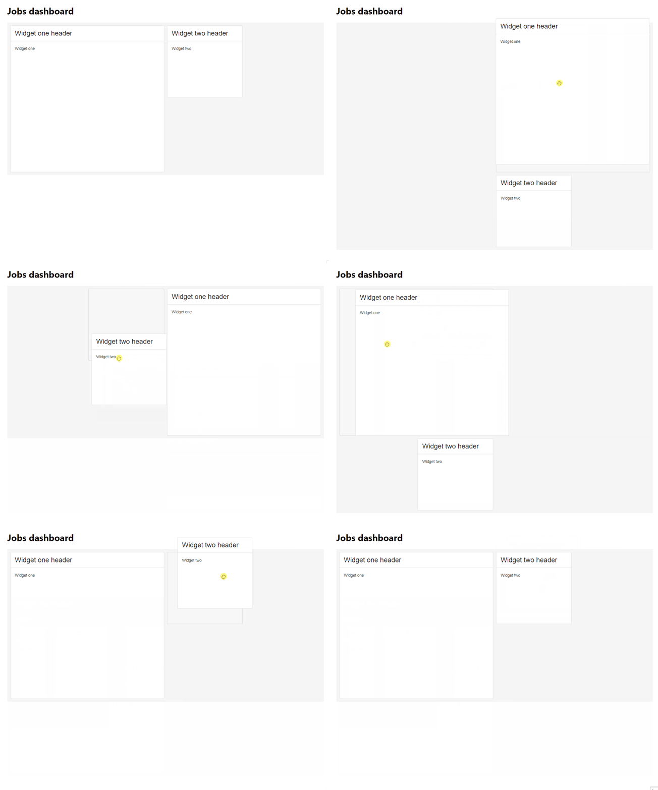
Further, we have the items prop that receives an array with details and components that will be rendered in the layout grid. Last but not least, the onReposition handler that sets new positions data after a user manipulates the position of the widgets. Below you can see the result.

As the gif above shows, we can already drag and reorder the widgets. However, the two widgets we have at the moment aren’t anything special, so let’s create a few that will provide some useful information regarding job applications’ statuses.
Creating Widgets
We will create four different widgets that show the number of active jobs, job credits, total job views and stats for the most popular job. You can create files and copy the code shown below.
src/components/ActiveJobs.js
const ActiveJobs = props => {
  return (
    <div className="activeJobs">
      <div className="activeJobsContainer">
        <span className="activeJobsNum">5</span>
      </div>
    </div>
  );
};

export default ActiveJobs;
The ActiveJobs components, as the name suggests, displays a number of currently active jobs. At the moment, it’s five.
src/components/JobCredits.js
const JobCredits = props => {
  return (
    <div className="jobCredits">
      <div className="jobCreditsContainer">
        <span className="jobCreditsNum">850</span>
      </div>
    </div>
  );
};

export default JobCredits;
The JobCredits component works in a similar way to the ActiveJobs component. If you would like, you can create a generic component for both of these.
src/components/TotalJobViews.js
const jobViews = [
  {
    id: 1,
    job: "Full-Stack Developer",
    views: 150,
  },
  {
    id: 2,
    job: "Mobile Android Developer",
    views: 25,
  },
  {
    id: 3,
    job: "JavaScript Developer",
    views: 69,
  },
  {
    id: 4,
    job: "Python Developer",
    views: 45,
  },
];

const TotalJobViews = props => {
  return (
    <div>
      <div className="">
        <ul className="totalJobViewsGrid">
          {jobViews.map((job) => {
            return (
              <li className="jobViewsBlock" key={job.id}>
                <span className="jobTitle">{job.job}</span>

                <div className="jobViewsContainer">
                  <span className="jobViews">{job.views}</span>
                </div>
              </li>
            );
          })}
        </ul>
      </div>
    </div>
  );
};

export default TotalJobViews;
The TotalJobViews component loops through active jobs and displays how many times each job has been viewed.
src/components/MostPopularJob.js
import {
  Chart,
  ChartTitle,
  ChartLegend,
  ChartTooltip,
  ChartSeries,
  ChartSeriesItem,
  ChartSeriesLabels,
} from "@progress/kendo-react-charts";

const COLORS = {
  rejected: "#B91C1C",
  applied: "#D97706",
  interviewing: "#2563EB",
};

const getPercentage = (num, total) =>
  Math.round((num / total) * 100).toFixed(2);

const numApplied = 75;
const numInterviewing = 24;
const numRejected = 46;
const totalApplicants = numApplied + numInterviewing + numRejected;

const applicants = [
  {
    status: "Applied",
    value: getPercentage(numApplied, totalApplicants),
    color: COLORS.applied,
  },
  {
    status: "Interviewing",
    value: getPercentage(numInterviewing, totalApplicants),
    color: COLORS.interviewing,
  },
  {
    status: "Rejected",
    value: getPercentage(numRejected, totalApplicants),
    color: COLORS.rejected,
  },
];

const renderTooltip = context => {
  const { category, value } = context.point || context;
  return (
    <div>
      {category}: {value}%
    </div>
  );
};

const MostPopularJob = props => {
  return (
    <div>
      <div className="k-mb-4">
        Your most popular job is "Full-Stack Developer"
      </div>

      <Chart style={{ minHeight: "20rem" }}>
        <ChartTitle text="Applications status - this month" />
        <ChartLegend visible={false} />
        <ChartTooltip render={renderTooltip} />
        <ChartSeries>
          <ChartSeriesItem
            type="donut"
            data={applicants}
            categoryField="status"
            field="value"
          >
            <ChartSeriesLabels
              color="#fff"
              background="none"
              content={e => e.category}
            />
          </ChartSeriesItem>
        </ChartSeries>
      </Chart>
    </div>
  );
};

export default MostPopularJob;
The MostPopularJob component displays the most popular job with a donut chart that contains information about how many applicants applied, are being interviewed and were rejected.
If you would like to learn more about how to build graphs the easy way with KendoReact, I’ve got just the article for you!
Finally, let’s update App.js and App.css files to include the four widgets we just created and add styles for them.
src/App.js
import "@progress/kendo-theme-material/dist/all.css";
import { TileLayout } from "@progress/kendo-react-layout";
import { useState } from "react";
import "./App.css";
import ActiveJobs from "./components/ActiveJobs";
import TotalJobViews from "./components/TotalJobViews";
import MostPopularJob from "./components/MostPopularJob";
import JobCredits from "./components/JobCredits";

const initialPositions = [
  {
    col: 1,
    colSpan: 2,
    rowSpan: 2,
  },
  {
    col: 3,
    colSpan: 1,
    rowSpan: 1,
  },
  {
    col: 4,
    colSpan: 1,
    rowSpan: 1,
  },
  {
    col: 3,
    colSpan: 2,
    rowSpan: 2,
  },
];

const getPositions = initialPositions => {
  // Try to get positions from local storage
  // If we have none in the storage then default to initial positions
  return (
    JSON.parse(localStorage.getItem("dashboard-positions")) || initialPositions
  );
};

function App() {
  const [positions, setPositions] = useState(getPositions(initialPositions));

  const widgets = [
    {
      header: "Total job views",
      body: <TotalJobViews />,
    },
    {
      header: "Active jobs",
      body: <ActiveJobs />,
    },
    {
      header: "Job Credits",
      body: <JobCredits />,
    },
    {
      header: "Most popular job",
      body: <MostPopularJob />,
    },
  ];

  const handleReposition = e => {
    setPositions(e.value);
    localStorage.setItem("dashboard-positions", JSON.stringify(e.value));
  };

  return (
    <div className="App">
      <h1>Job dashboard</h1>
      <TileLayout
        className="tileLayout"
        columns={4}
        rowHeight={255}
        positions={positions}
        gap={{ rows: 10, columns: 10 }}
        items={widgets}
        onReposition={handleReposition}
      />
    </div>
  );
}

export default App;
All the widgets are imported and passed inside of the widgets array. The initialPositions array now has positions for all four widgets. Besides that, the positions state will try to get the initial positions from the local storage, or it will default to the initialPositions array. What’s more, the handleReposition handler will save new positions in the local storage. Normally, this would be saved in the database, but it will suffice for this example.
Last but not least, we need to add new classes in the App.css file.
src/App.css
.App {
  max-width: 70rem;
  margin: 2rem auto;
}

.activeJobs,
.jobCredits {
  height: 100%;
}

.activeJobs,
.activeJobsContainer,
.jobViewsContainer,
.jobViewsBlock,
.jobCredits,
.jobCreditsContainer {
  display: flex;
  justify-content: center;
  align-items: center;
}

.jobViewsContainer,
.activeJobsContainer,
.jobCreditsContainer {
  padding: 1rem;
  border-radius: 50%;
  width: 5rem;
  height: 5rem;
}

.jobViewsContainer {
  border: 1px solid #7c3aed;
  background-color: #ede9fe;
  color: #7c3aed;
}

.activeJobsContainer {
  border: 1px solid #2563eb;
  background-color: #dbeafe;
  color: #2563eb;
}

.jobCreditsContainer {
  color: #b45309;
  border: 1px solid #b45309;
  background-color: #fef3c7;
}

.activeJobsNum,
.jobViews,
.jobCreditsNum {
  font-size: 3rem;
  font-weight: 600;
}

.jobViewsBlock {
  flex-direction: column;
}

.jobTitle {
  margin-bottom: 1rem;
  font-weight: 500;
  display: block;
}

.totalJobViewsGrid {
  list-style: none;
  display: grid;
  grid-template-columns: 1fr 1fr;
  grid-template-rows: 1fr 1fr;
  gap: 2rem;
  padding: 0;
}

.tileLayout {
  width: 100%;
}

.dashboardAside {
  width: 15rem;
}
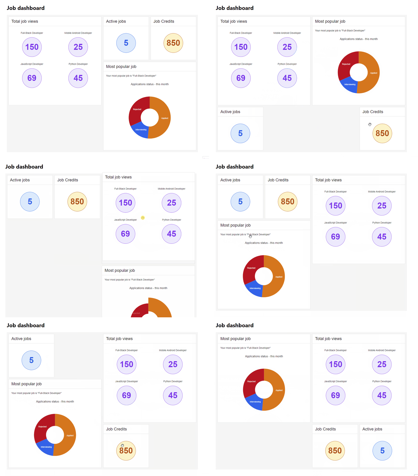
You can see the result in the gif below.

We have a nice-looking interactive dashboard with tiles (widgets) that can be reordered. Let’s add functionality to reset the positions and toggle which widgets are active next.
Reset TileLayout Positions
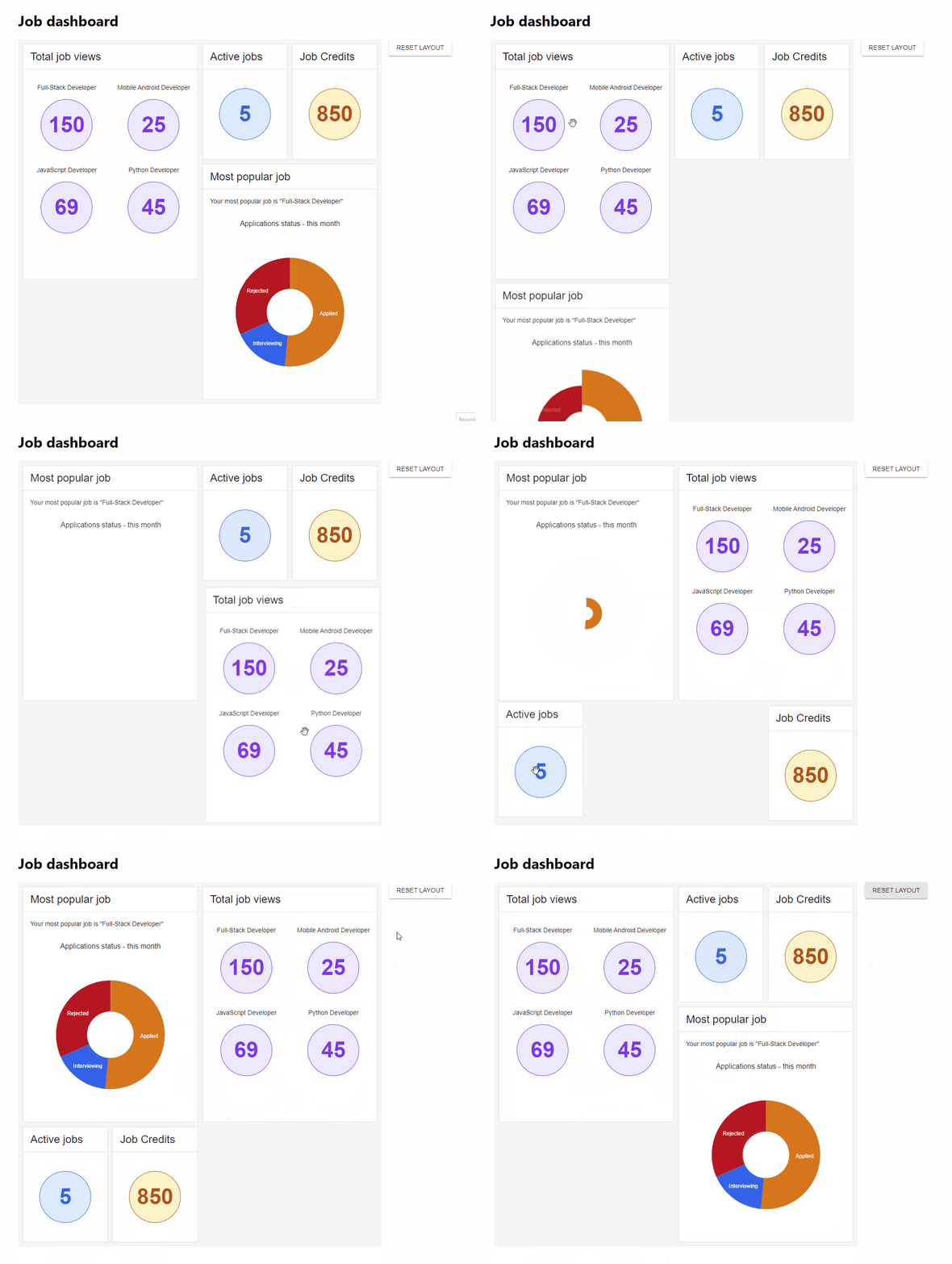
Adding reset functionality is very simple. We need a button and a handler that will set the positions to the initialPositions array. Add the onResetLayout handler and update the JSX markup as shown below.
src/App.js
const onResetLayout = () => {
  setPositions(initialPositions);
  localStorage.setItem(
    "dashboard-positions",
    JSON.stringify(initialPositions)
  );
};

return (
  <div className="App">
    <h1>Job dashboard</h1>
    <div className="k-display-flex">
      <TileLayout
        columns={4}
        rowHeight={255}
        positions={positions}
        gap={{ rows: 10, columns: 10 }}
        items={widgets}
        onReposition={handleReposition}
        />
      <div className="k-ml-4">
        <button className="k-button" onClick={onResetLayout}>
          Reset layout
        </button>
      </div>
    </div>
  </div>
);
Below you can see the reset functionality in action.

Great, let’s add one more functionality that will be a bit more complex—toggling widgets.
Toggle Widgets
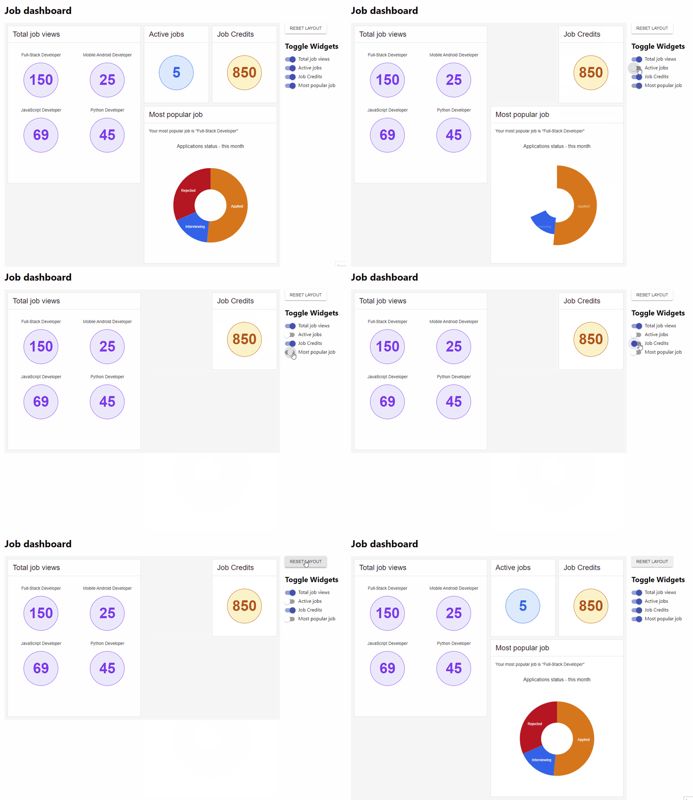
At the moment, the tiles are defined in an array called widgets. However, we need the UI to update whenever we change the active status of each widget. Therefore, we need to add a useState for the widgets and then filter it to get only active widgets.
We need to do the same for positions because if a widget is not passed to the TileLayout component, the position for it also should not be included. Below you can see the final implementation.
src/App.js
import "@progress/kendo-theme-material/dist/all.css";
import { TileLayout } from "@progress/kendo-react-layout";
import { useMemo, useState } from "react";
import "./App.css";
import ActiveJobs from "./components/ActiveJobs";
import TotalJobViews from "./components/TotalJobViews";
import MostPopularJob from "./components/MostPopularJob";
import JobCredits from "./components/JobCredits";
import { Switch } from "@progress/kendo-react-inputs";

const initialPositions = [
  {
    widgetId: "1",
    col: 1,
    colSpan: 2,
    rowSpan: 2,
  },
  {
    widgetId: "2",
    col: 3,
    colSpan: 1,
    rowSpan: 1,
  },
  {
    widgetId: "3",
    col: 4,
    colSpan: 1,
    rowSpan: 1,
  },
  {
    widgetId: "4",
    col: 3,
    colSpan: 2,
    rowSpan: 2,
  },
];

const getPositions = initialPositions => {
  // Try to get positions from local storage
  // If we have none in the storage then default to initial positions
  return (
    JSON.parse(localStorage.getItem("dashboard-positions")) || initialPositions
  );
};

const widgetsConfig = [
  {
    id: "1",
    header: "Total job views",
    body: <TotalJobViews />,
    active: true,
  },
  {
    id: "2",
    header: "Active jobs",
    body: <ActiveJobs />,
    active: true,
  },
  {
    id: "3",
    header: "Job Credits",
    body: <JobCredits />,
    active: true,
  },
  {
    id: "4",
    header: "Most popular job",
    body: <MostPopularJob />,
    active: true,
  },
];

function App() {
  const [positions, setPositions] = useState(getPositions(initialPositions));
  const [widgets, setWidgets] = useState(widgetsConfig);

  // Filter out widgets that are inactive
  const activeWidgets = useMemo(() => {
    return widgets.reduce((acc, widget) => {
      // Bail out if widget is not active
      if (!widget.active) return acc;
      // Widget is active, so add it
      acc.push(widget);
      return acc;
    }, []);
  }, [widgets]);

  // Get positions only for active widgets
  // We use position.widgetId to get only active widgets
  const filteredPositions = useMemo(() => {
    return positions.filter(position => {
      // Find a matching widget using the id in the position id and return its active value
      return activeWidgets.find(widget => widget.id === position.widgetId)
        ?.active;
    });
  }, [activeWidgets, positions]);

  const handleReposition = e => {
    setPositions(e.value);
    localStorage.setItem("dashboard-positions", JSON.stringify(e.value));
  };

  const onResetLayout = () => {
    setPositions(initialPositions);
    localStorage.setItem(
      "dashboard-positions",
      JSON.stringify(initialPositions)
    );
  };

  const onToggleWidget = e => {
    const { id } = e.target.props;
    const { value } = e.target;
    const updatedWidgets = widgets.map(widget => {
      if (widget.id === id) {
        return {
          ...widget,
          active: value,
        };
      }
      return widget;
    });

    setWidgets(updatedWidgets);
  };

  return (
    <div className="App">
      <h1>Job dashboard</h1>
      <div className="k-display-flex">
        <TileLayout
          columns={4}
          rowHeight={255}
          positions={filteredPositions}
          gap={{ rows: 10, columns: 10 }}
          items={activeWidgets}
          onReposition={handleReposition}
          className="tileLayout"
        />
        <aside className="k-ml-4 dashboardAside">
          <div className="k-mb-6">
            <button className="k-button" onClick={onResetLayout}>
              Reset layout
            </button>
          </div>
          <div>
            <h2 className="k-mb-4">Toggle Widgets</h2>
            <div>
              {widgets.map(widget => {
                return (
                  <div className="k-mb-2" key={widget.id}>
                    <Switch
                      checked={widget.active}
                      onChange={onToggleWidget}
                      id={widget.id}
                    />
                    <label className="k-ml-3">{widget.header}</label>
                  </div>
                );
              })}
            </div>
          </div>
        </aside>
      </div>
    </div>
  );
}

export default App;
Below you can see the final product.

Wrap-up
That’s it! We have used the KendoReact TileLayout component to build an interactive dashboard for job application metrics with items that can be dragged, reordered and toggled. I hope you enjoyed this tutorial.
KendoReact is a great tool for developing complex functionality. It provides a lot of feature-rich components out of the box and allows us to create sophisticated features quite easily and quickly. You can check out the entire functionality of the library with a free trial, which also gives you access to technical support if you ever get stuck.

Thomas Findlay
Thomas Findlay is a 5-star rated mentor, full-stack developer, consultant, technical writer and the author of “React - The Road To Enterprise” and “Vue - The Road To Enterprise.” He works with many different technologies such as JavaScript, Vue, React, React Native, Node.js, Python, PHP and more. Thomas has worked with developers and teams from beginner to advanced and helped them build and scale their applications and products. Check out his Codementor page, and you can also find him on Twitter.
