Data Visualization: Build React Graphs the Easy Way

Summarize with AI:
Web applications often have to help the end user make sense of different kinds of data. One of the best ways to show data in a nice and easy to understand way is to visualize it using graphs (charts).
This article will demonstrate an efficient approach to creating React graphs by using the KendoReact Charts library, and we will implement Donut, Bar, Line and Sparkline graphs. We’re going with the React graph library that is part of KendoReact, as it is feature-rich and highly customizable. As part of a complete React UI components library, where this data visualization library really shines is its integration with the 90+ components within KendoReact, enabling developers to implement consistent styling and sleek design across an entire project.
Now, let’s get started!
Project Setup
Before we dive into implementation of our React graphs, let’s scaffold a new React project using Create React App. You can do so by running the command below in your terminal.
npx create-react-app kendo-react-graphs
After the project is scaffolded, we need to install a few packages to use the KendoReact charts library.
With npm
npm install @progress/kendo-react-charts @progress/kendo-theme-material hammerjs
With Yarn
yarn add @progress/kendo-react-charts @progress/kendo-theme-material hammerjs
The first package is kendo-react-charts library, which contains a variety of chart components for React. Next, we have kendo-theme-material. For this example, we will use the Material theme. KendoReact also offers Default (created by the team’s internal UX experts) and Bootstrap themes, but you can easily customize them or even build your own. Finally, we need to install Hammer.js, an open-source library for recognizing gestures made by touch, mouse and pointer events.
After installing new dependencies, let’s clean up the project. First, replace the contents of App.js and App.css files.
src/App.js
import "@progress/kendo-theme-material/dist/all.css";
import "hammerjs";
import "./App.css";

function App() {
  return (
    <div className="App">
      <div className="container">
        <h1>Build React Graphs The Easy Way</h1>
      </div>
    </div>
  );
}

export default App;
src/App.css
.container {
  max-width: 1080px;
  margin: 0 auto;
}

.section {
  padding: 50px 0;
}
In the App.js, we removed the default code created by Create React App and instead imported KendoReact Material theme and Hammer. We also have two classes in the App.css file to add a bit of space between graphs that we will implement in a moment.
That’s it for the setup. Start the development server by running either npm run start or yarn start, and you should see a blank screen. Let’s add some graphs.
Creating React Graphs (Charts)
Imagine you are working on a job applications manager platform. This platform allows companies to create job postings to which job seekers can apply. Employees working at a company that created a job posting should be able to see a variety of details, such as how many candidates applied, the status of applications, how many applications were accepted or rejected, and so on. As I mentioned before, we are going to implement four types of graphs:
-
React Donut chart – to show applications status for the current month
-
React Bar chart – to show applications status for the last three months
-
React Line chart – to show how many positions were fulfilled and how many are still left
-
React Sparkline – to show how many applications are left to process to reach the minimum target
React Donut Chart
First, we need to create two new files. The first file, constants.js, contains colors that are used for the graphs.
src/constants.js
export const COLORS = {
  accepted: "#059669",
  rejected: "#B91C1C",
  pending: "#6366F1",
  interviewing: "#2563EB",
  total: "#D97706",
};
In the second file, we will implement the Donut chart. In the src directory, create a new folder called charts, and inside of it, create a file called Donut.js.
src/components/charts/Donut.js
import {
  Chart,
  ChartTitle,
  ChartLegend,
  ChartSeries,
  ChartSeriesItem,
  ChartSeriesLabels,
} from "@progress/kendo-react-charts";
import { COLORS } from "../../constants";

// Graph data
const applicationsStatusThisMonth = [
  {
    status: "Accepted",
    value: 14,
    color: COLORS.accepted,
  },
  {
    status: "Interviewing",
    value: 14,
    color: COLORS.interviewing,
  },
  {
    status: "Rejected",
    value: 40,
    color: COLORS.rejected,
  },
  {
    status: "Pending",
    value: 32,
    color: COLORS.pending,
  },
];

// Show category label for each item in the donut graph
const labelContent = e => e.category;

const Charts = props => {
  return (
    <Chart>
      <ChartTitle text="Applications status - this month" />
      <ChartLegend visible={false} />
      <ChartSeries>
        <ChartSeriesItem
          type="donut"
          data={applicationsStatusThisMonth}
          categoryField="status"
          field="value"
        >
          <ChartSeriesLabels
            color="#fff"
            background="none"
            content={labelContent}
          />
        </ChartSeriesItem>
      </ChartSeries>
    </Chart>
  );
};

export default Charts;
As you can see, we import a few different React components from the KendoReact library. These are used to compose the Donut chart.
The <Chart> component is a container for all other components. <ChartTitle>, as the name suggests, is used to display a title for the graphic. The <ChartLegend> component can be used to indicate if a chart should display a legend for the categories. In this example, we have the visible prop set to false, but you can switch it to true to display it.
<ChartSeries*> are the main components, as they are responsible for rendering the data. In this case, we specify that we want the donut chart by passing type="donut" prop to the <ChartSeriesItem> component. For a full list of available options, you can check out the documentation.
Before we can see the Donut graph on the screen, we need to update the App.js file, so it imports and renders the <Donut> component.
src/App.js
import "@progress/kendo-theme-material/dist/all.css";
import "hammerjs";
import "./App.css";
import Donut from "./components/charts/Donut";

function App() {
  return (
    <div className="App">
      <div className="container">
        <h1>Build React Graphs The Easy Way</h1>
        <div className="section">
          <Donut />
        </div>
      </div>
    </div>
  );
}

export default App;
Now you should see the graph below on your screen.
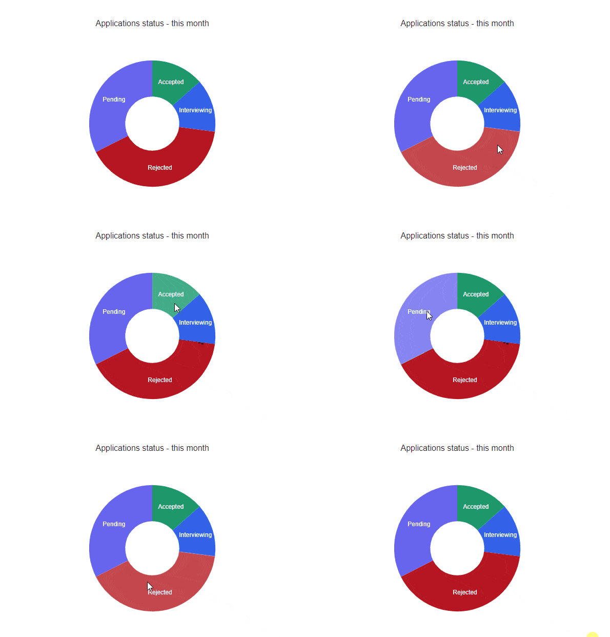
That was quick and easy, and the graphs look great. However, we can’t see the actual percentages. Let’s update the chart and add a tooltip that will show the percentage distribution for each application status. Let’s head back to the Donut.js file and make the following changes:
- Add ChartTooltip import.
import {
  Chart,
  ChartTitle,
  ChartLegend,
  ChartTooltip, // <-- Add this line
  ChartSeries,
  ChartSeriesItem,
  ChartSeriesLabels,
} from "@progress/kendo-react-charts";
- Below imports, create a function called
renderTooltipthat renders the markup, which will be displayed in a tooltip. This function will be passed to the<ChartTooltip>component.
// imports

const renderTooltip = context => {
  const { category, value } = context.point || context;
  return (
    <div>
      {category}: {value}%
    </div>
  );
};

// other code
- Render the
<ChartTooltip>component.
<Chart>
 	<ChartTitle text="Applications status - this month" />
  <ChartLegend visible={false} />
  <ChartTooltip render={renderTooltip} />
  {/* ChartSeries components */}
</Chart>
Below you can see the tooltips in action.
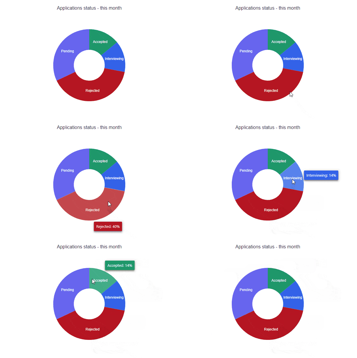
We have the first graph done. However, what if we would like to see results for the last few months? We can deal with that by implementing a React Bar chart.
React Bar Chart
As we’ve done previously, we need to create a new file for the graph—Bar.js.
src/components/charts/Bar.js
import {
  Chart,
  ChartTitle,
  ChartLegend,
  ChartSeries,
  ChartSeriesItem,
  ChartCategoryAxis,
  ChartCategoryAxisTitle,
  ChartCategoryAxisItem,
} from "@progress/kendo-react-charts";
import { COLORS } from "../../constants";

// Graph data
const series = [
  {
    status: "Total",
    data: [43, 30, 59],
    color: COLORS.total,
  },
  {
    status: "Pending",
    data: [25, 15, 30],
    color: COLORS.pending,
  },
  {
    status: "Interviewed",
    data: [3, 5, 1],
    color: COLORS.interviewed,
  },
  {
    status: "Rejected",
    data: [14, 10, 25],
    color: COLORS.rejected,
  },
  {
    status: "Accepted",
    data: [1, 3, 2],
    color: COLORS.accepted,
  },
];

const categories = ["Jan", "Feb", "Mar"];

const seriesLabels = {
  visible: true,
  padding: 3,
  font: "normal 16px Arial, sans-serif",
  position: "center",
};

const Bar = props => {
  return (
    <Chart>
      <ChartTitle text="Applications status - last 3 months" />
      <ChartLegend visible={true} />
      <ChartCategoryAxis>
        <ChartCategoryAxisItem categories={categories}>
          <ChartCategoryAxisTitle text="Months" />
        </ChartCategoryAxisItem>
      </ChartCategoryAxis>
      <ChartSeries>
        {series.map((item, idx) => (
          <ChartSeriesItem
            key={idx}
            type="bar"
            gap={2}
            spacing={0.25}
            labels={seriesLabels}
            data={item.data}
            name={item.status}
            color={item.color}
          />
        ))}
      </ChartSeries>
    </Chart>
  );
};

export default Bar;
You might have spotted that a lot of things are similar, for example, Chart components. The Bar graph is specified by passing type="bar" prop to the <ChartSeriesItem> component.
We also have new components—<ChartCategoryAxis*>. These are used for modifying the content of a bar on each axis. In this case, we are providing months for categories, as well as the “Months” label on the Y-axis. We’ve also set the <ChartLegend> to be visible, as, in comparison to the Donut graph, we do not have status labels. Nevertheless, by providing the labels prop we can tell the ChartSeriesItem component to display values on each bar line.
Before we can see the Bar chart on the screen, we need to add it to the App.js file.
src/App.js
/* other imports */
import Bar from "./components/charts/Bar";
function App() {
  return (
    <div className="App">
      <div className="container">
        <h1>Build React Graphs The Easy Way</h1>
        {/* other graphs */}
        <div className="section">
          <Bar />
        </div>
      </div>
    </div>
  );
}

export default App;
The image below shows how the Bar chart should look now.
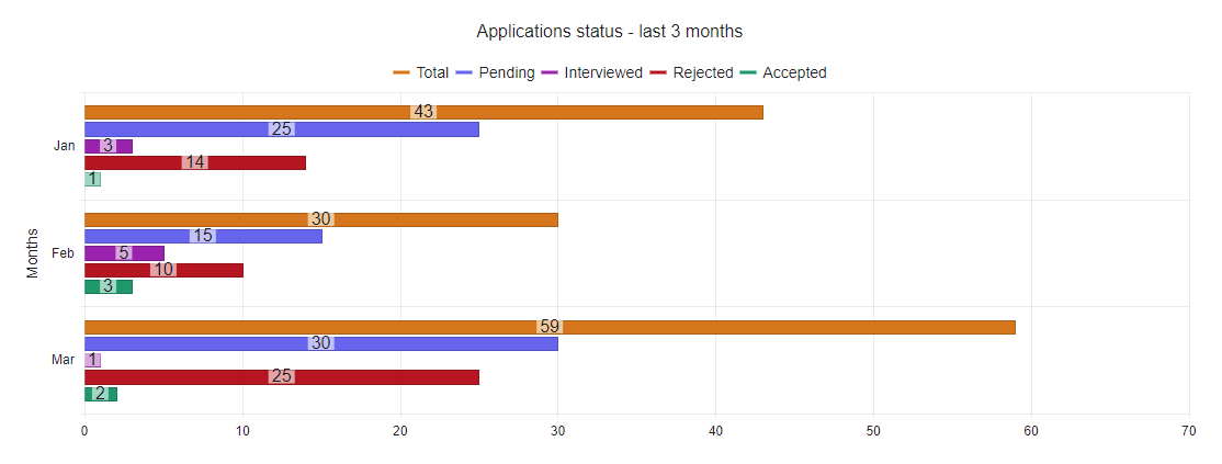
We can see the status of applications for the last three months. A great thing about React graph library part of KendoReact is that the graphs can be made interactive. For instance, we can make them pannable and zoomable by adding zoomable and pannable props to the <Chart> like this:
<Chart zoomable pannable>
	{/* chart components */}
</Chart>
What’s more, it’s also possible to export KendoReact graphs to different formats such as image or PDF. This can be very useful if you want to allow users to create reports with charts. Let’s have a look at how we can add an export PDF functionality.
How to Export a React Graph
We can add export functionality by taking advantage of kendo-drawing and kendo-file-saver packages. Let’s install them.
With npm
npm install @progress/kendo-drawing @progress/kendo-file-saver
With Yarn
yarn add @progress/kendo-drawing @progress/kendo-file-saver
The next step is to update the Bar.js file. First, we need to import exportVisual method from @progress/kendo-react-charts, exportPDF from @progress/kendo-drawing and saveAs from @progress/kendo-file-saver. We also need to import useRef hook as we need to get access to the instance of the <Chart> component. This instance will be passed to the exportVisual method. See the updated code below.
src/components/charts/Bar.js
Imports
import { useRef } from "react";
import {
  Chart,
  ChartTitle,
  ChartLegend,
  ChartSeries,
  ChartSeriesItem,
  ChartCategoryAxis,
  ChartCategoryAxisTitle,
  ChartCategoryAxisItem,
  exportVisual,
} from "@progress/kendo-react-charts";
import { exportPDF } from "@progress/kendo-drawing";
import { saveAs } from "@progress/kendo-file-saver";
import { COLORS } from "../../constants";

// Other code
Bar component
// Other code

const Bar = props => {
  // Store reference to the Kendo <Chart> component
  const chartRef = useRef(null);

  // Create a PDF and download it
  const onPDFExportClick = async () => {
    const chartVisual = exportVisual(chartRef.current);
    if (!chartVisual) return;
    const dataURI = await exportPDF(chartVisual, {
      paperSize: "A4",
      landscape: true,
    });
    await saveAs(dataURI, "chart.pdf");
  };

  return (
    <div>
      <button onClick={onPDFExportClick}>Export as PDF</button>
      <Chart ref={cmp => (chartRef.current = cmp)} pannable zoomable>
        {/* Chart components */}
      </Chart>
    </div>
  );
};

export default Bar;
We’ve added a button that calls onPDFExportClick function. The onPDFExportClick function first prepares chart information that has to be exported. It is then passed to the exportPDF method that prepares the file and converts it into a dataURI. Last but not least, the dataURI is passed to the saveAs method, which triggers the file download.
You can apply this logic to other KendoReact charts as well. If you would like to read more about available export options, you can visit the detailed documentation.
React Line Chart
So far, we have implemented two types of graphs: Donut and Bar. Let’s look at how we can utilize a Line chart to display information about the number of fulfilled and pending jobs during the last three months. Again, we need to create a new file, this time called Line.js.
src/components/Line.js
import {
  Chart,
  ChartSeries,
  ChartSeriesItem,
  ChartValueAxis,
  ChartValueAxisItem,
  ChartCategoryAxis,
  ChartCategoryAxisItem,
  ChartTitle,
  ChartLegend,
} from "@progress/kendo-react-charts";
import { COLORS } from "../../constants";

export const series = [
  {
    name: "Total",
    data: [19, 9, 20],
    color: COLORS.total,
  },
  {
    name: "Pending",
    data: [12, 6, 15],
    color: COLORS.pending,
  },
  {
    name: "Fulfilled",
    data: [7, 3, 5],
    color: COLORS.accepted,
  },
];

const categories = ["January", "February", "March"];

const Line = props => {
  return (
    <Chart pannable zoomable style={{ height: 350 }}>
      <ChartTitle text="Application status - last 3 months" />
      <ChartLegend position="top" orientation="horizontal" />
      <ChartValueAxis>
        <ChartValueAxisItem title={{ text: "Job Positions" }} min={0} max={30} />
      </ChartValueAxis>
      <ChartCategoryAxis>
        <ChartCategoryAxisItem categories={categories} />
      </ChartCategoryAxis>
      <ChartSeries>
        {series.map((item, idx) => (
          <ChartSeriesItem
            key={idx}
            type="line"
            tooltip={{ visible: true }}
            data={item.data}
            name={item.name}
          />
        ))}
      </ChartSeries>
    </Chart>
  );
};

export default Line;
We are using the same components as in previous charts, with an addition of the <ChartValueAxis> component, which is used to add a title text and specify minimum and maximum values to display in the graph. Finally, import the Line component in App.js.
src/App.js
/* other imports */
import Line from "./components/charts/Line";

function App() {
  return (
    <div className="App">
      <div className="container">
        <h1>Build React Graphs The Easy Way</h1>
        {/* other graphs */}
        <div className="section">
          <Line />
        </div>
      </div>
    </div>
  );
}

export default App;
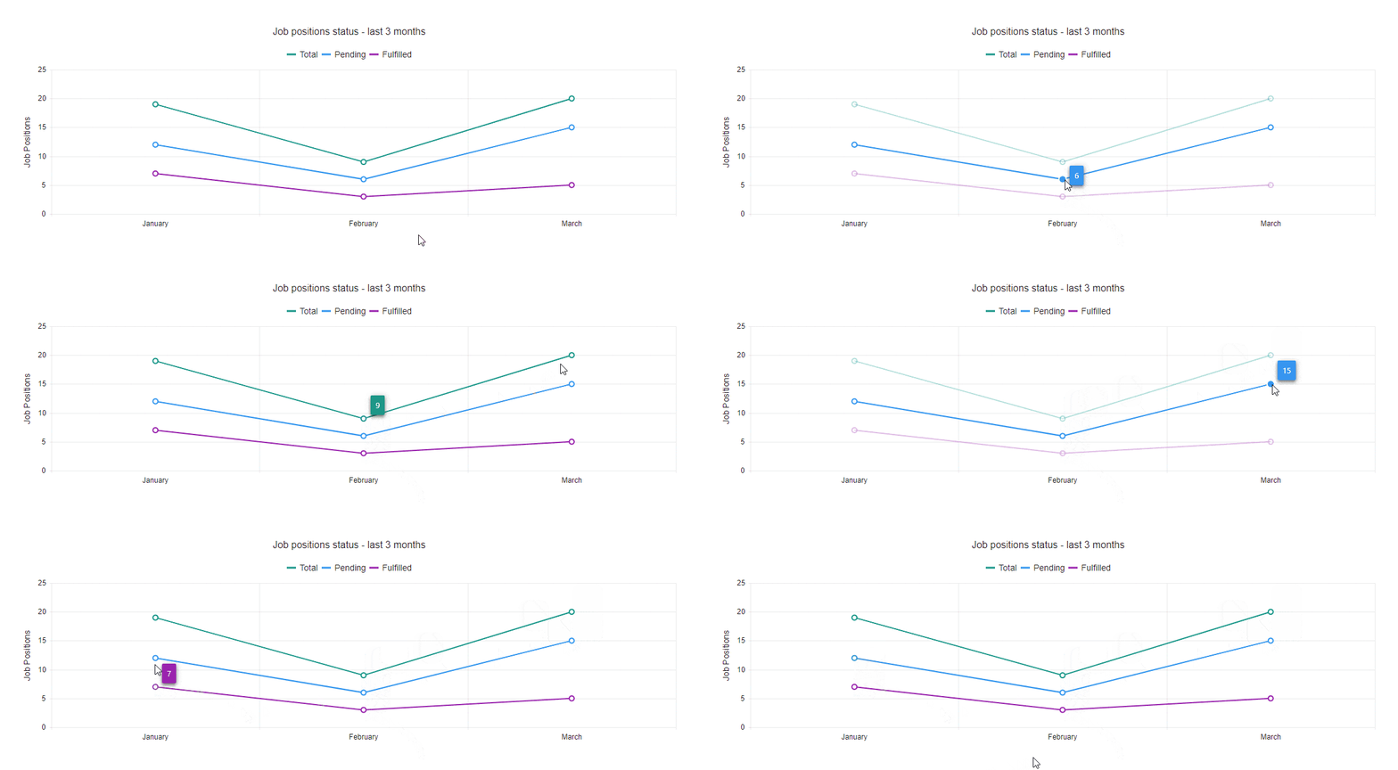
Below you can see a gif that showcases the Line graph comparing the total number of jobs as well as how many are pending and fulfilled.
React Sparklines
Sparklines are simple small graphs that can be embedded in tables, headlines or text. We will use a bullet sparkline to show how many applications were processed, as well as the monthly target. As you will see in the code below, the Sparkline graph implementation is a bit different from previous graphs, as it does not use <Chart*> components, but rather the <Sparkline> and <ChartValue*> components.
src/components/charts/Sparkline.js
import {
  Sparkline,
  ChartValueAxis,
  ChartValueAxisItem,
} from "@progress/kendo-react-charts";

const bulletData = [15, 75];
const bulletValueAxis = {
  min: 0,
  max: 100,
  plotBands: [
    {
      from: 0,
      to: 100,
      color: "#787878",
      opacity: 0.15,
    },
  ],
};

const SparklineContainer = () => (
  <div>
    <p>Applications this month</p>
    <Sparkline data={bulletData} type="bullet">
      <ChartValueAxis>
        <ChartValueAxisItem {...bulletValueAxis} />
      </ChartValueAxis>
    </Sparkline>
  </div>
);

export default SparklineContainer;
You can configure the look of the graph by modifying props passed to the <ChartValueAxisItem> component. In this case, we are spreading the bulletValueAxis object. The last thing to do is to import the Sparkline component and render it in the App.js file.
src/App.js
// Other imports
import Sparkline from "./components/charts/Sparkline";

function App() {
  return (
    <div className="App">
      <div className="container">
        <h1>Build React Graphs The Easy Way</h1>
        {/* other graphs */}
        <div className="section">
          <Sparkline />
        </div>
      </div>
    </div>
  );
}

export default App;
Below you can see how the final result looks.
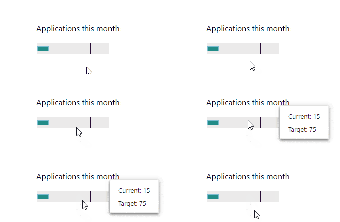
To see a full list of chart types that a Sparkline can render, you can check the KendoReact Sparkline documentation page.
Summary
We have covered how to create React graphs using as an example these four graph types from the KendoReact UI and data visualization library: Donut, Bar, Line and Sparkline. Building graphs with KendoReact is very easy, as it provides a lot of ready-made components that are feature-rich and easy to customize.
If you would like to access the full code example for this article, you can find it in this GitHub repository.

Thomas Findlay
Thomas Findlay is a 5-star rated mentor, full-stack developer, consultant, technical writer and the author of “React - The Road To Enterprise” and “Vue - The Road To Enterprise.” He works with many different technologies such as JavaScript, Vue, React, React Native, Node.js, Python, PHP and more. Thomas has worked with developers and teams from beginner to advanced and helped them build and scale their applications and products. Check out his Codementor page, and you can also find him on Twitter.
