Make Your React Apps Pop with Data Visualizations

Summarize with AI:
Spicing up your apps with data visualizations doesn't have to be hard. Here are a few ways you can get started making your apps more visually appealing and intuitive for your end users.
Many of the applications that we write end up dealing with data. Whether it is displaying, modifying, or manipulating it in some way - data is usually the core of our apps. Usually it might be enough to just display raw data on a page and let the user draw conclusions from it, but many of us are visual learners and a simple way to get people's attention is through some sort of visual medium. Enter data visualization.
There are many solutions out there to add a graphic representation of your data, but some of them can be pretty complex. There should be a way to get advanced data visualizations without advanced configuration! That's why this post was created; to spend some time to go through how adding the KendoReact data visualization components (charts and gauges) can make your application truly pop with just a few lines of code. Easy configuration for the easy win! Let's get right to it.
Installation
First, let's go ahead and make sure that we can use any of the code we find in this blog post and any documentation by running a quick npm install for a few packages. This way our project is prepped and ready to go.
npm install --save @progress/kendo-react-charts @progress/kendo-drawing @progress/kendo-react-intl hammerjs
What we've installed above is the overall kendo-react-charts package, which contains all of the KendoReact charts, the kendo-drawing framework which helps us actually render the charts (makes sense from the name, right?), the kendo-react-intl package (to help with any localization or globalization scenarios), and finally hammerjs which we have as a dependency to assist with the interactivity and events of the KendoReact charts.
Also, we shouldn't forget to install our favorite theme to work with our components! In this case we'll be using the Material theme and following the directions in this documentation article gives us a way to install the theme that is the most natural to our existing process around CSS.
With the installation taken care of, let's go ahead and check out what we can do with some of these data visualizations!
Adding our First Chart
Before actually start rendering charts on a page, let's figure out what kind of data that we may want to display. In this particular case we want to highlight daily sales for an imaginary product. Since we have seven days of the week to work with let's set up an array that looks something like this:
state = {
  salesPerDay: [12, 9, 13, 7, 10, 8, 12]
}
Alright, let's take this excellent data and make some sort of visualization out of it!
To start we will need to import pieces of the KendoReact chart, specifically
import {
    Chart,
    ChartSeries,
    ChartSeriesItem,
} from '@progress/kendo-react-charts';
This will put us in a good spot as we can now define a chart, as well as any number of series within said chart. The KendoReact charts support having multiple series, of the same or different types, and with these three imports here we can lay out anything we'd like for our charts in a declarative way.
The chart component can be set up in our JSX using the following:
<Chart>
  <ChartSeries>
    <ChartSeriesItem
      type="column"
      data={this.state.salesPerDay} />
  </ChartSeries>
</Chart>
As we can see from the above code snippet we define a <Chart>, then define that we want to have some sort of series through <ChartSeries>, with <ChartSeriesItem> being an individual series. The configuration of this series is pretty basic, so let's set our type as column (there's a ton of other types to chose from!) and pass in our data. This gives us a chart that already looks pretty good:
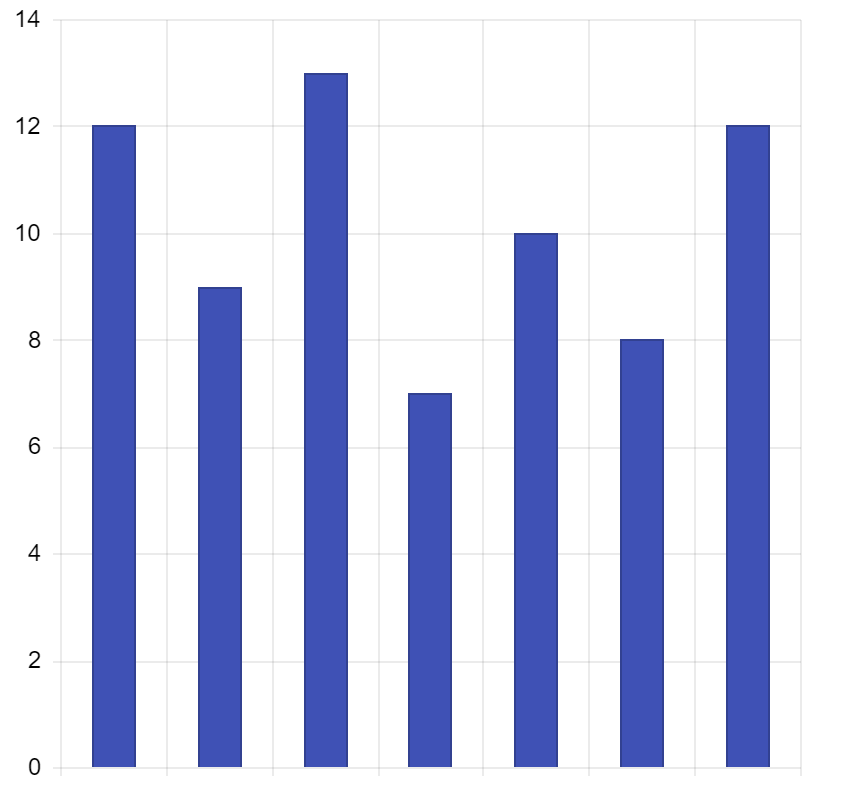
Maybe a column structure like this isn't the best for tracking daily sales, so with a quick modification of setting type="line" we update our chart.
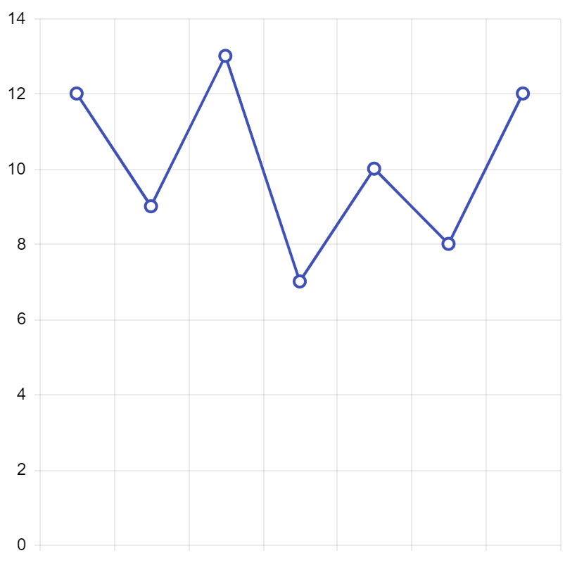
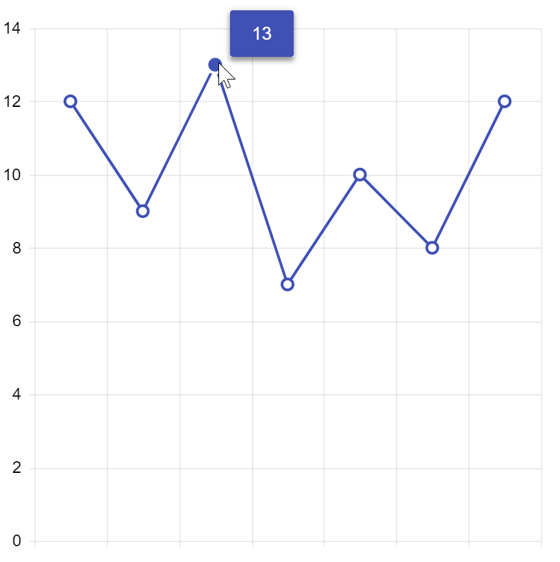
To add some more interactivity to the chart, and to make it more apparent what the value of each of our markers might be, let's go ahead and add some tool tips to the party.
The tool tip can be defined on a series-by-series basis and is defined by importing and using ChartSeriesItemTooltip. This is the defined within each ChartSeriesItem component that the tool tip should be used with.
In our case with everything updated the whole component looks like this.
import React from 'react';
import ReactDOM from 'react-dom';

import { process } from '@progress/kendo-data-query';

import {
    Chart,
    ChartSeries,
    ChartSeriesItem,
    ChartSeriesItemTooltip,
} from '@progress/kendo-react-charts';

import  "hammerjs";

class App extends React.Component {
  state = {
    salesPerDay: [12, 9, 13, 7, 10, 8, 12]
  }

  render() {
    return (
      <div>
        <Chart>
          <ChartSeries>
            <ChartSeriesItem
              type="line"
              data={this.state.salesPerDay}>
                <ChartSeriesItemTooltip visible="true" />
            </ChartSeriesItem>
          </ChartSeries>
        </Chart>
      </div>
        );
    }
}

ReactDOM.render(
    <App />,
    document.querySelector('my-app')
);
The way this was added in was to not have our ChartSeriesItem be self-closing and instead add in a <ChartSeriesItemTooltip>, with the visibility defined as true. There are a ton of options, including defining templates for generic HTML to be displayed, for these tool tips. Beyond just the initial display we have plenty that can be done to tweak things to your liking.
The last thing we may want to do with this is add in values to our X-axis to make sure we know what this data represents. Since we call this data salesPerDay it makes sense to try to add in some connection to the days of the week. Monday - Sunday makes a lot of sense here (sorry all "the week starts on Sunday" advocates 😉). We can expand our sales array entries and have them be objects with sales and day fields. This leaves us with an array of objects connected to our chart.
salesPerDay: [
    { sales: 12, day: "Mon" },
    { sales: 9, day: "Tues" },
    { sales: 13, day: "Wed" },
    { sales: 7, day: "Thurs" },
    { sales: 10, day: "Fri" },
    { sales: 8, day: "Sat" },
    { sales: 12, day: "Sun"}
  ]
If we immediately look over on our page a problem that pops up now is that we don't see our data points any more. Have no fear, this is very easy to "fix" by defining which fields are tied to what in the chart with some quick binding. Specifically we can update our ChartSeriesItem to have field="sales" and "categoryField="day" props added. In the KendoReact chart we can remember that the categoryField (and axis) is generally tied to the X-axis in these cases, while the field (or value field) tends to be on the Y-axis.
With just a few lines of code we end up with chart that is ready to wow our users! We're also now binding to fields which means we can open this up to more advanced scenarios pretty easily. For reference, here's the full code in action that you can run in StackBlitz to see the end result:
A New Color of Paint
The chart above looks pretty good, but specifically follows our standard Material theme. What if we want to take full control over how this chart looks? We all have custom designs and colors that we need to stick to (perhaps a company-wide UX design standard) and we of course want to make our chart fit in to this.
The easiest way would be to follow the customization guidelines for the KendoReact Material theme. Since this is done via Sass variables it can be pretty easy to tweak this theme to fit in to your design criteria. There's even a chart-specific section that goes in to specific variables for the chart.
We also can take a declarative or programmatic approach, defining styles within each part of our component, which is the way we will continue throughout this article.
Let's start with our end-goal of the design of our chart. Sales in general tend to mean a business is going well, and is associated with money, so let's stick with a green theme for the chart, with the primary green color being #4EA952.
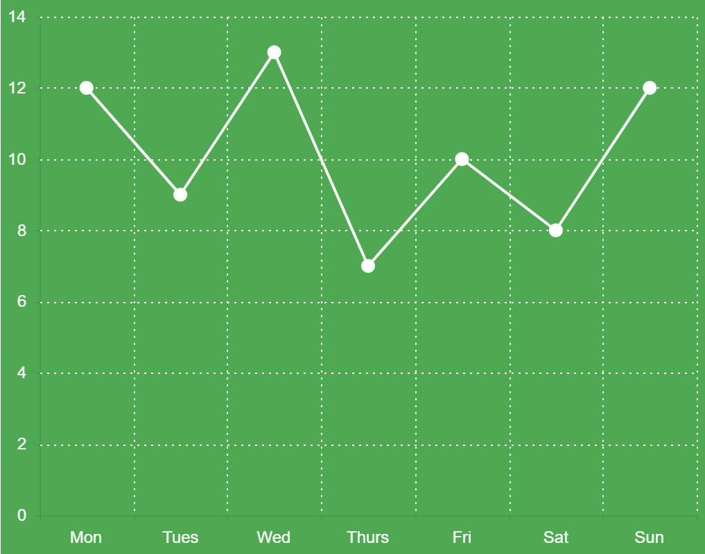
A logical place to start is to set the green background of the chart. We will need to introduce a new part of the chart here, the ChartArea. This element gives us control over things like the width and height of the chart, and also lets us define the background color. This will be added in to our chart configuration as an element that is self-closing, so we will just add <ChartArea background="#4EA952" /> under our <Chart> tag.
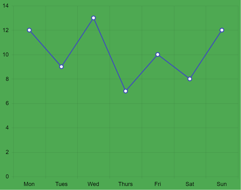
Alright, maybe not the best looking (yet!) so let's continue to tweak some things. The default blue of our series might be a bit odd here, so let's make this in to something close to white (but not quite) like #F9FCF9.
<ChartSeriesItem
  type="line"
  color="#F9FCF9"
  data={this.state.salesPerDay}
  field="sales"
  categoryField="day">
    <ChartSeriesItemTooltip visible={true} />
</ChartSeriesItem>
We should also address the color we have on the X-axis and Y-axis here. We mentioned this earlier when we talked about displaying the Mon-Sun at the bottom of our chart. This will be done by setting up ChartValueAxis and ChartCategoryAxis elements. Importing these from our chart package lets us define specifics around the X and Y axes, like default font color in our case, along quite a few other things.
Let's take a look at our implementation first and then explain what has been done to set up the default colors of these axis items.
<ChartValueAxis>
  <ChartValueAxisItem labels= />
</ChartValueAxis>
<ChartCategoryAxis>
  <ChartCategoryAxisItem labels= />
</ChartCategoryAxis>
As we see in the snippet above, we've also added in ChartValueAxisItem and ChartCategoryAxisItem which is actually where we are defining if the labels are visible to begin with (default is true here by the way) and what color they should be.
Right now all that we're doing is setting colors, but these AxisItems are very important when we want to customize our chart. For example, the ChartValueAxisItem lets us define max and min values so we don't always have 0 as the lowest value. This is useful where the values start very high to begin with, or we want to see negative values as well. The ChartCategoryAxisItem provides us with the means of changing the default binding level for dates (day, week, month, year) as well as intervals for where in the data we want to display points. Great in scenarios where performance is of a concern and we may not want to display absolutely every data point initially.
That being said, in this case we are just setting the color to be that of our series item to be consistent.
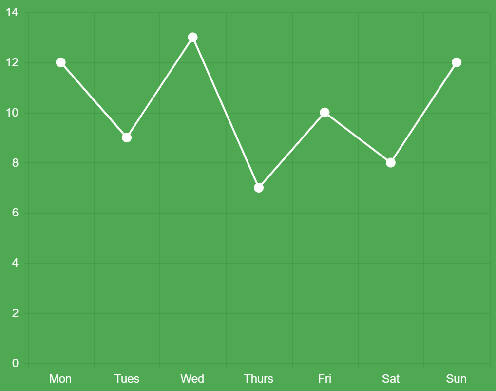
Looking much better! The last detail would be to address the lines we have in the background since these make it easier to identify what value we might be dealing with at an initial glance.
In the KendoReact chart we have the majorGridLines and minorGridLines properties that we can work with. In this particular case we only have majorGridLines as we only have lines associated with every regular tick, but if we wanted to be even more granular with our data we could also set up minor tick values to highlight data items between our larger/more important values (major).
To set these up we could work with our existing ChartValueAxisItem and ChartCategoryAxisItem elements, but a super useful item to cover here would also be ChartAxisDefaults. The great thing about this component is that it lets us configure defaults that we want all or our axis items to inherit from and we would only need to define some additional axis values when we have a very specific change for one (or both) axes item(s). In fact, we could even remove the previous ChartCategoryAxis and ChartValueAxis sections of our Chart component if we wanted to since they would inherit from this element. We may want to extend this later so we can leave them in for now.
The ChartAxisDefaults component can be included in our <Chart> component directly and be self-closing. We should define the majorGridLines property when we do this as well, giving us <ChartAxisDefaults majorGridLines= />. the dashType prop is by default a line, and while there are a lot of variations the "dot" version is what we had in our original image.
If we run this code we will see that we have successfully implemented the design we originally set out to achieve!

Here's the full source code for what we just did.
Quick and Simple Data Visualizations
Sometimes a chart may not be the best way to display information. Say you want to highlight a percentage value from 0-100, or maybe some sort of progress bar. This is where the KendoReact Gauges come in to play. These type of visualizations, combined with the charts, give us quite a range of visuals to deal with.
All of these components can be found in same package so installing them is a breeze with npm install --save @progress/kendo-react-gauges @progress/kendo-drawing @progress/kendo-react-intl.
A huge hit is the ArcGauge component, which can be added to any React component by using import { ArcGauge } from '@progress/kendo-react-gauges';.
The quickest way to render this component is to add a variable to our state like the following:
this.state = {
  value: 78
};
And within our render we can throw in the ArcGauge and bind it to said value.
render()  {
  return  (
    <ArcGauge value={this.state.value} />
   );
}
The resulting gauge looks like this:
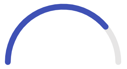
Which, while it looks nice, is missing a way for us to see what the actual value might be. This can easily be achieved by setting the arcCenterRender prop, which can be passed a function and return pretty much whatever we want. This gives us the potential to either pass a simple string of a particular format, or we can have some fun customization with the gauge label changing formatting or colors along with the ArcGauge itself.
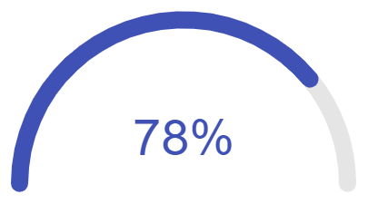
For our particular sample, let's say that we are dealing with percentages so we want to have our value followed by "%" displayed in the arc of our ArcGauge. We can start by defining the arcCenterRender prop to a function (we'll write the function in a bit) giving us something like arcCenterRender={this.centerLabelRenderer}. Then, within the constructor of our React component we can define centerLabelRenderer.
this.centerLabelRenderer = (value,color) => {
  return (<h3 style=>{value}%</h3>);
}
The convenient thing here is that value and color will always be passed down from what we've already set on the ArcGauge itself. So, if the value or color of our gauge changes, so can the label inside. Since this is a template that accepts HTML elements we can really return whatever we want. In this case, let's just make this a simple h3 and bind to both color and value.
Here's everything put together.
Once we've set this up we end up with a clean and easy-to-read visualization.
Adding Visualizations to Anything
Last but not least there's another type of visualization we can cover, and that's the Sparkline component.

These little visualizations are great as their main purpose is to be injected in places where a quick visualization might make sense, but we don't need to see things like axes, coordinates, legends, titles, or other surrounding elements. As seen in the image above it works out very well in scenarios where we may want to display our chart within the cell of a data grid which would end up being quite cumbersome from a UX perspective if we added in the full chart.
Even though it is a small component in size, it still packs a powerful punch! We can call it the "noisy cricket" of the KendoReact data visualization package. Currently the Sparkline supports the following types, all with built-in tool tips and other helpful features.
- Line (default if no type is set)
- Bar
- Column
- Area
- Pie
- Bullet
To get started with this component we simply have to import the Sparkline component from our kendo-react-charts package:
import { Sparkline } from '@progress/kendo-react-charts';
From there we can just work with our original salesPerDay data (without the dates) and bind this to the Sparkline component.
class App extends React.Component {
  state = {
    salesPerDay: [ 12, 9, 13, 7, 10, 8, 12 ]
  }

  render() {
    return (
      <div>
        <Sparkline data={this.state.salesPerDay} />
      </div>
    );
  }
}
That's it! Now we have a Sparkline component rendered in our page. Of course, it will probably make more sense when integrating in to other components, but this is where a custom render can come in to play.
As usual, here's the full source code for this sample:
Visualize All the Things!
Spicing things up in our applications can sometimes seem like a bit of a daunting task, but it doesn't have to be that way! By working with our existing data and simply binding it to a chart, gauge, or even a little sparkline visualization we can very easily start taking our application to the next level and make our applications even more intuitive for our end users to understand and interact with. Hopefully this post inspired you to get some ideas around how data visualizations can be added to your own applications!For More Info on Building Apps with React
Check out our All Things React page that has a great collection of info and pointers to React information – with hot topics and up-to-date info ranging from getting started to creating a compelling UI.
Carl Bergenhem
Carl Bergenhem was the Product Manager for Kendo UI.
