
How to Add and Customize Card Elements in KendoReact

Summarize with AI:
Cards are a popular design pattern for displaying information in a concise, organized manner. See how to use the KendoReact Card component for customized cards in your React app.
A card element is a UI element that displays a collection of related information and typically contains a header, an image, a title and a body. Cards are a popular design pattern that allows developers to display information in a concise and organized manner.

The Progress KendoReact Card component is a versatile UI element that can be used to display a card element in a variety of different ways. In this article, we’ll take a deep dive into the component’s features and we’ll explore how it can be used to create engaging card elements.
The KendoReact Card Component
The KendoReact <Card /> component is distributed through the kendo-react-layout library and consists of the following building blocks:
- Card
- CardHeader
- CardTitle
- CardSubtitle
- CardBody
- CardActions
- CardFooter
- CardImage
These building blocks can be used to customize the look and feel of a card element. To get started, we’ll import most of these card building blocks as well as the Avatar component we’ll use for our first example.
import {
  Avatar,
  Card,
  CardTitle,
  CardSubtitle,
  CardHeader,
  CardImage,
  CardFooter,
} from "@progress/kendo-react-layout";
We’ll use the Card component to create a card element that displays information about a certain user. We’ll have the Card component wrap around all the individual card elements which include the header, image and footer.
import React from "react";
import {
  Avatar,
  Card,
  CardTitle,
  CardSubtitle,
  CardHeader,
  CardImage,
  CardFooter,
} from "@progress/kendo-react-layout";

const App = () => {
  return (
    <div>
      <Card
        style={{
          minWidth: 350,
          width: 350,
          height: "auto",
        }}
      >
        <CardHeader className="k-hbox">
          <Avatar type={"image"} shape={"circle"}>
            <img alt="User Avatar" src="./images/avater" />
          </Avatar>
          <div>
            <CardTitle>Hassan Djirdeh</CardTitle>
            <CardSubtitle
              style={{
                marginTop: 0,
              }}
            >
              2 hours ago
            </CardSubtitle>
          </div>
        </CardHeader>
        <CardImage src="./images/card-image" />
        <CardFooter>Check out this view of downtown TO!</CardFooter>
      </Card>
    </div>
  );
};

export default App;
With the above code example, we’re presented with a card element on our webpage.
The KendoReact component also contains a series of key features that allow us to arrange our card elements in different ways.
Card Orientation
By default, the <Card /> component vertically renders content. We can use the orientation property of the component to instead render content horizontally. This is done by providing
a "horizontal" value to the orientation prop.
Here’s an example of rendering the contents of a card horizontally while rearranging the card component building blocks to make it more presentable in this new orientation.
import React from "react";
import {
Card,
CardBody,
CardTitle,
CardSubtitle,
CardHeader,
CardImage,
CardFooter,
} from "@progress/kendo-react-layout";
const App = () => {
return (
<div>
<Card orientation="horizontal">
<CardImage src="./images/card-image" />
<div className="k-hbox">
<CardHeader>
<CardTitle>Hassan Djirdeh</CardTitle>
<CardSubtitle
style={{
marginTop: 0,
}}
>
2 hours ago
</CardSubtitle>
<CardBody
style={{
paddingLeft: 0,
}}
>
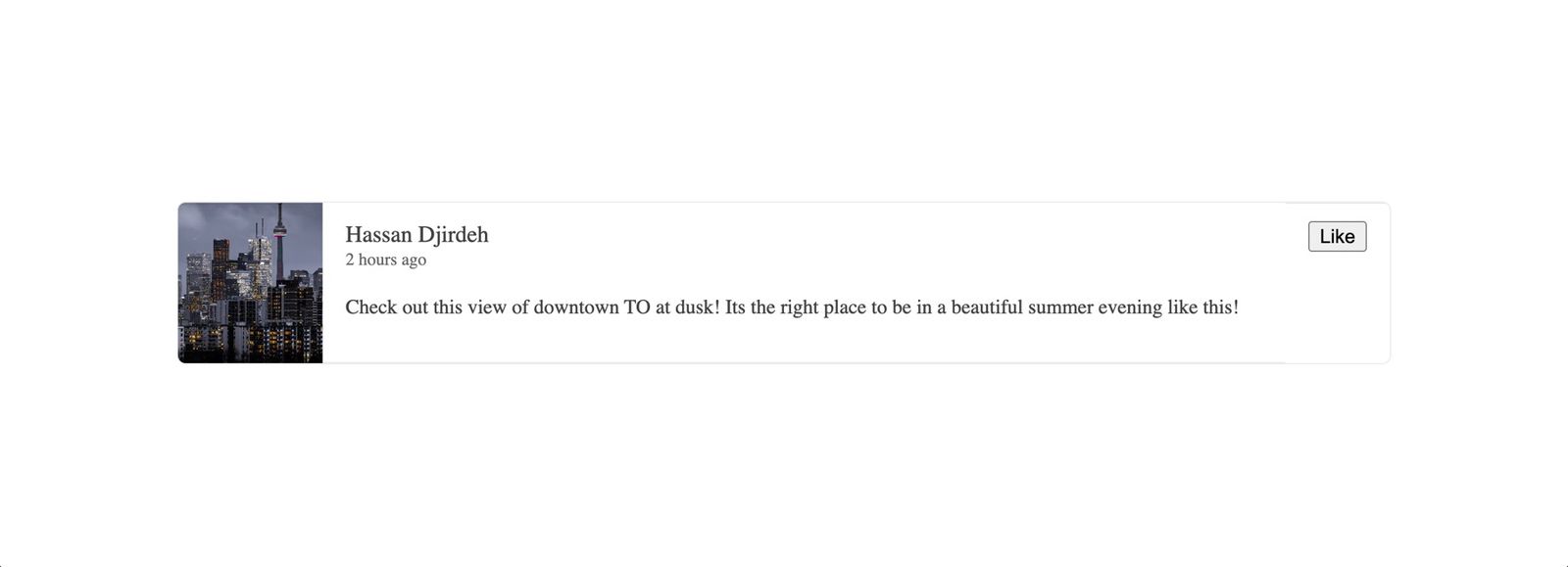
Check out this view of downtown TO at dusk! It's the right place
to be on a beautiful summer evening like this!
</CardBody>
</CardHeader>
<CardFooter>
<button>Like</button>
</CardFooter>
</div>
</Card>
</div>
);
};
export default App;
With this change, we’re now presented with a card element where contents are arranged horizontally.
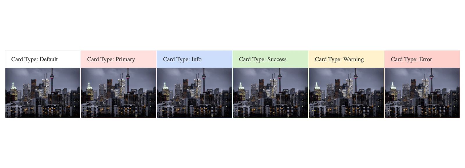
Card Type
The Card component also allows us to use a type property that determines the appearance of the card to render. Six types of cards can be shown:
- Default
- Primary
- Info
- Success
- Warning
- Error
Here’s an example of rendering each of the different types of cards in a list.
import React from "react";
import { Card, CardHeader, CardTitle, CardImage } from "@progress/kendo-react-layout";

const App = () => {
  return (
    <div
      style={{
        display: "flex",
        justifyContent: "space-evenly",
      }}
    >
      <div className="k-card-group">
        {/* Default */}
        <Card
          style={{
            width: 200,
          }}
        >
          <CardHeader className="k-hbox">
            <div>
              <CardTitle>Card Type: Default</CardTitle>
            </div>
          </CardHeader>
          <CardImage src="./images/card-image" />
        </Card>

        {/* Primary */}
        <Card
          style={{
            width: 200,
          }}
          type="primary"
        >
          <CardHeader className="k-hbox">
            <div>
              <CardTitle>Card Type: Primary</CardTitle>
            </div>
          </CardHeader>
          <CardImage src="./images/card-image" />
        </Card>

        {/* Info */}
        <Card
          style={{
            width: 200,
          }}
          type="info"
        >
          <CardHeader className="k-hbox">
            <div>
              <CardTitle>Card Type: Info</CardTitle>
            </div>
          </CardHeader>
          <CardImage src="./images/card-image" />
        </Card>

        {/* Success */}
        <Card
          style={{
            width: 200,
          }}
          type="success"
        >
          <CardHeader className="k-hbox">
            <div>
              <CardTitle>Card Type: Success</CardTitle>
            </div>
          </CardHeader>
          <CardImage src="./images/card-image" />
        </Card>

        {/* Warning */}
        <Card
          style={{
            width: 200,
          }}
          type="warning"
        >
          <CardHeader className="k-hbox">
            <div>
              <CardTitle>Card Type: Warning</CardTitle>
            </div>
          </CardHeader>
          <CardImage src="./images/card-image" />
        </Card>

        {/* Error */}
        <Card
          style={{
            width: 200,
          }}
          type="error"
        >
          <CardHeader className="k-hbox">
            <div>
              <CardTitle>Card Type: Error</CardTitle>
            </div>
          </CardHeader>
          <CardImage src="./images/card-image" />
        </Card>
      </div>
    </div>
  );
};

export default App;
With the above changes saved, we’ll be presented with a list of card elements where each of the card elements has a different type and appearance.
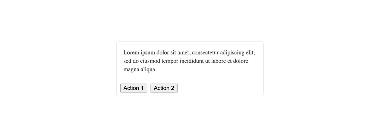
Card Actions
Finally, the Card component provides the <CardActions /> building block to help arrange how action buttons can be displayed within a card.
When rendering card action buttons like the following:
import React from "react";
import { Card, CardActions, CardBody } from "@progress/kendo-react-layout";

const App = () => {
  return (
    <div>
      <Card
        style={{
          minWidth: 350,
          width: 350,
          height: "auto",
        }}
      >
        <CardBody>
          Lorem ipsum dolor sit amet, consectetur adipiscing elit, sed do
          eiusmod tempor incididunt ut labore et dolore magna aliqua.
        </CardBody>
        <CardActions>
          <button>Action 1</button>
          <button>Action 2</button>
        </CardActions>
      </Card>
    </div>
  );
};

export default App;
The card action buttons are arranged as follows:
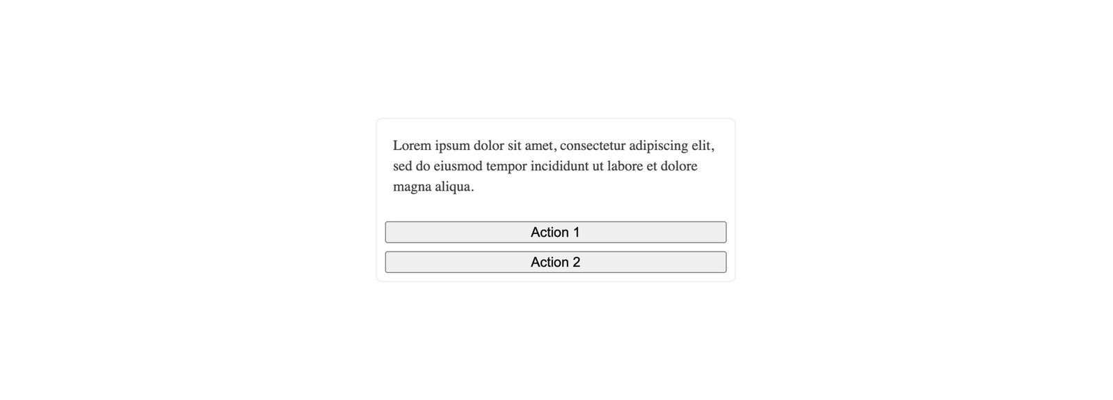
We can have the card action buttons arranged vertically by using the orientation prop available to us in the <CardActions /> sub-component and setting its value to "vertical".
import React from "react";
import { Card, CardActions, CardBody } from "@progress/kendo-react-layout";

const App = () => {
  return (
    <div>
      <Card
        style={{
          minWidth: 350,
          width: 350,
          height: "auto",
        }}
      >
        <CardBody>
          Lorem ipsum dolor sit amet, consectetur adipiscing elit, sed do
          eiusmod tempor incididunt ut labore et dolore magna aliqua.
        </CardBody>
        <CardActions orientation="vertical">
          <button>Action 1</button>
          <button>Action 2</button>
        </CardActions>
      </Card>
    </div>
  );
};

export default App;
This will have our card actions arranged in a vertical manner.
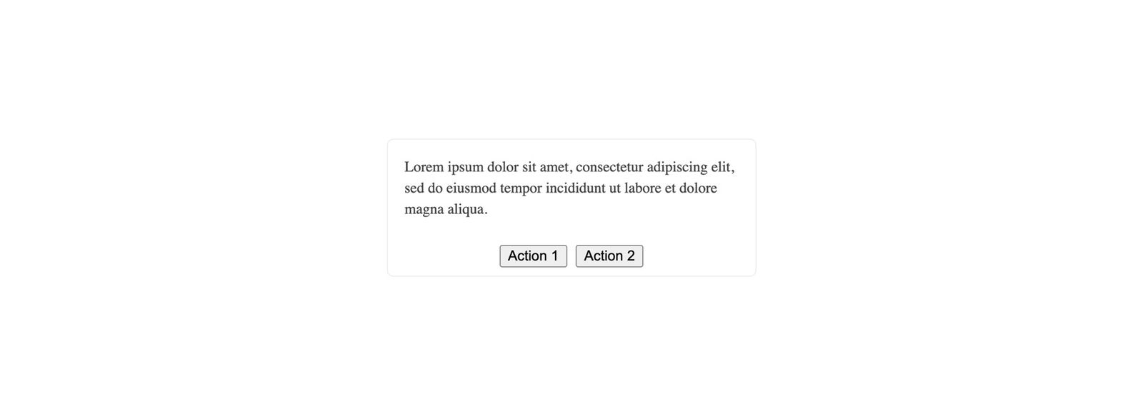
The <CardActions /> sub-component also contains a layout prop to dictate the horizontal position of the card action buttons. If we were to provide a layout value of "center":
import React from "react";
import { Card, CardActions, CardBody } from "@progress/kendo-react-layout";

const App = () => {
  return (
    <div>
      <Card
        style={{
          minWidth: 350,
          width: 350,
          height: "auto",
        }}
      >
        <CardBody>
          Lorem ipsum dolor sit amet, consectetur adipiscing elit, sed do
          eiusmod tempor incididunt ut labore et dolore magna aliqua.
        </CardBody>
        <CardActions layout="center">
          <button>Action 1</button>
          <button>Action 2</button>
        </CardActions>
      </Card>
    </div>
  );
};

export default App;
The card actions will be positioned in the horizontal center of the card.
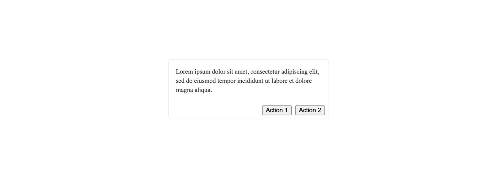
If we were to provide a layout value of "end":
import React from "react";
import { Card, CardActions, CardBody } from "@progress/kendo-react-layout";

const App = () => {
  return (
    <div>
      <Card
        style={{
          minWidth: 350,
          width: 350,
          height: "auto",
        }}
      >
        <CardBody>
          Lorem ipsum dolor sit amet, consectetur adipiscing elit, sed do
          eiusmod tempor incididunt ut labore et dolore magna aliqua.
        </CardBody>
        <CardActions layout="end">
          <button>Action 1</button>
          <button>Action 2</button>
        </CardActions>
      </Card>
    </div>
  );
};

export default App;
The card actions will be positioned at the horizontal end of the card (i.e., the right side of the card).
Wrap-up
In conclusion, the Card component from KendoReact provides a wide range of sub-components to help developers create visually appealing card elements. The component provides additional configuration options to allow us to customize and create card elements in different ways.
You can find the code we’ve written in this article in the following public Gist, and for more details, be sure to check out the official Card component documentation!

Hassan Djirdeh
Hassan is a senior frontend engineer and has helped build large production applications at-scale at organizations like Doordash, Instacart and Shopify. Hassan is also a published author and course instructor where he’s helped thousands of students learn in-depth frontend engineering skills like React, Vue, TypeScript, and GraphQL.
Related Posts
Comments
All articles
Topics
Web MobileMobile
Desktop
Design
Productivity
People
