
Case Study: Building a Design System with KendoReact

Summarize with AI:
Take a look at all the tools I’ve used to build and maintain my design system and how I implement it seamlessly with the KendoReact library.
If you’ve read some of my previous blogs or seen a KendoReact Release Livestream anytime in the last year, you might already be familiar with LKARS—the design system I use for my KendoReact demo app, created in loving homage to one of the most famous sci-fi user interfaces.
Based on Michael Okuda’s fantastic designs for LCARS, the Star Trek: The Next Generation Enterprise-D computer system, I’ve used LKARS (the K is for Kendo UI, of course) as an ongoing example of how easily style-able and adaptable the KendoReact component library is. Suffice it to say, it looks markedly different than the default design of the KendoReact components.
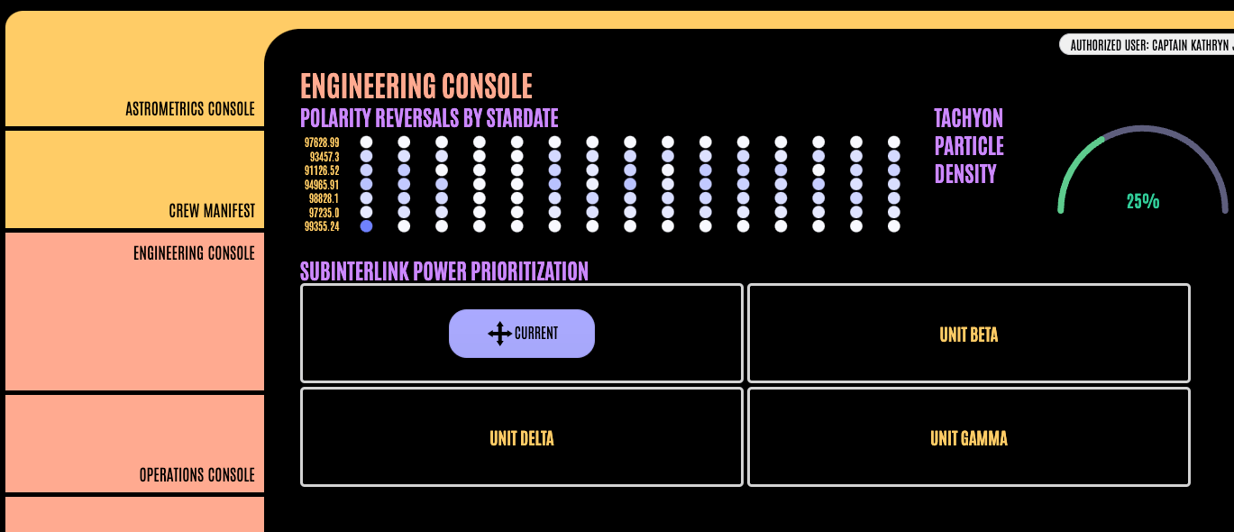
LKARS gets used in all my demos and examples, but we’ve never actually taken a close look at LKARS itself—what an oversight! In this blog, let’s break down all the tools I’ve used to build and maintain this design system and how I implement it seamlessly with the KendoReact library.
‘Computer: Identify Primary Styles of LKARS’
Creating a full design system is a complicated and technical process—this blog is not meant to walk you through the design process of creating such a system. In fact, because LKARS is an homage, most of those design choices were already made by designer Michael Okuda.
In a real-world situation, this work would be done by a designer, creating a unique look and feel for your brand and/or application. But in my situation, my job was to work in reverse—identifying the primary design aspects that made LCARS stand out.
This was a really interesting task, because how often do you get to reverse-engineer a system like this? Often, as a designer, my job is to build up rather than break down design systems. Working backward, however, was enlightening. It was a repeated experiment, asking: ”What makes this design system different from all other design systems?” Here’s what I found:
- For LCARS, the iconic purple and gold color palette was a huge distinguishing factor. To create LKARS, I reviewed screenshots from the show and put together a collection of colors.
- The fonts used in LCARS, of course, play into its unique sci-fi style—but I also noticed that quite a bit of that industrial style is coming from the fact that the text is most often entirely in uppercase!
- The shapes of the UI elements in the LCARS design system are incredibly rounded, with the corners on buttons being so round that they become pill-shaped. The only time we see sharp corners is when they are subsections within a larger (rounded) shape.
- Pretty much every layout in the LCARS system is bounded by some kind of container, usually with a sidebar along the left-hand side. While this isn’t something that I could capture in a design token, the same way as the colors, typography and border radii, it did need to be considered when creating templates for my pages.
It’s worth noting that no single one of these elements is carrying the entire design system. For those of you who might also be huge Star Trek nerds, perhaps you’ve noticed that the LCARS user interface is back in Star Trek: Picard … with an updated color scheme! Michael Okuda has revamped the design system for the new show, with the color palette now primarily using a stunning gray, teal and orange-red color scheme. Although the colors were changed significantly from the 1980/90s LCARS, the interface is still clearly identifiable because the other aspects remained the same or similar.

‘Input Coordinates for Destination’
Now that I had a pretty good idea of what styles defined the look and feel, it was time to start applying them to the component library. There are a few different ways to do this with KendoReact—I chose to use a combination of the Figma Kits and the ThemeBuilder.
Figma Kits
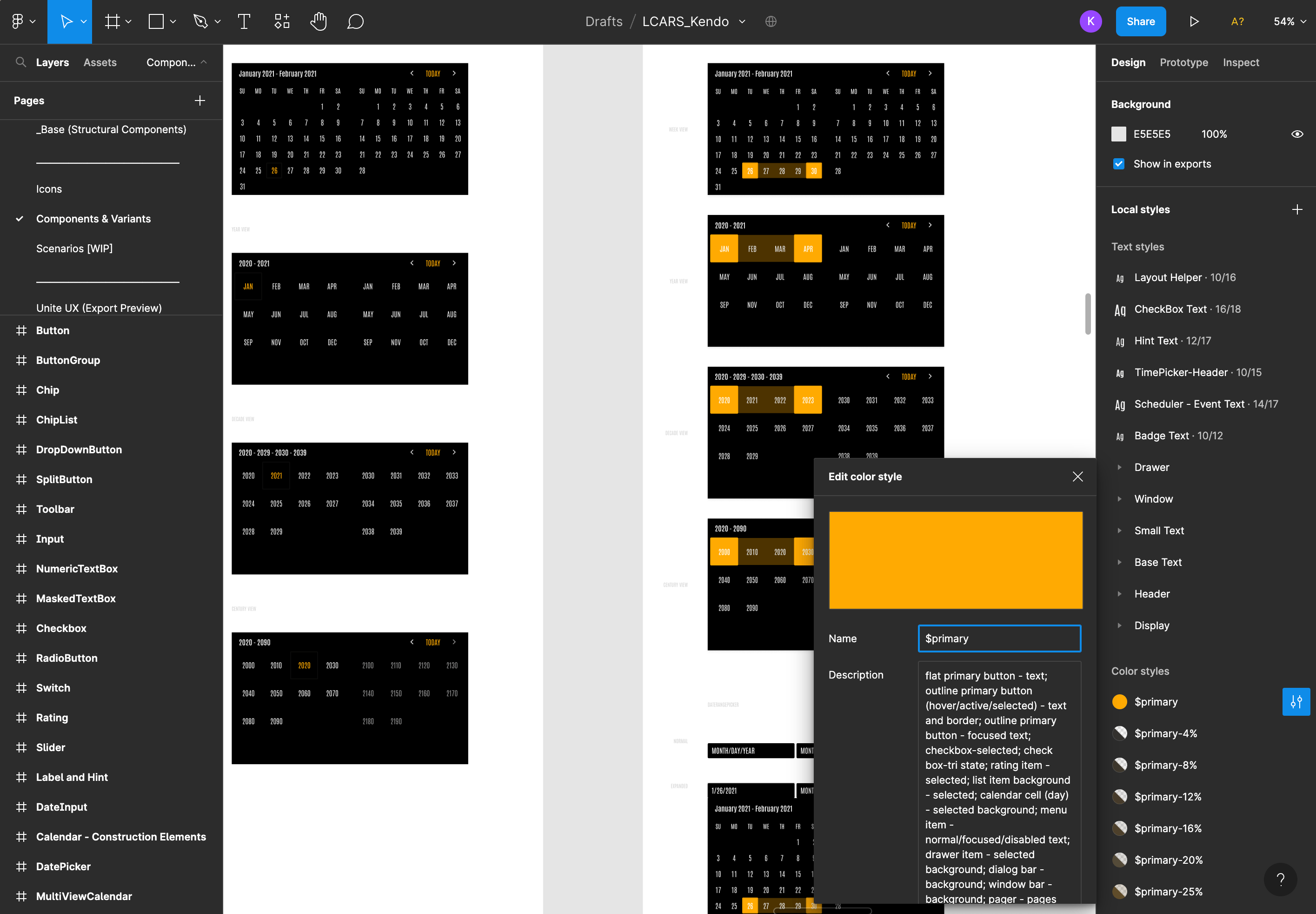
Because I wanted to be able to quickly create design templates and prototypes using my custom-styled components, I needed the KendoUI Figma Kits. I took the list of theme colors that I had identified and assigned them to design tokens via the panel on the right-hand side. I was also able to adjust my border-radius values across the entire suite of components from here and set my default typography.
One of the best parts about using this Figma Kit is that you already have all the documentation about where each token is used. For example, here I’m updating the $primary color, and in the text box under the name,
I get a rundown of every place that will be affected by that change. All of this is editable, of course; I could always go find one of those elements and relink them to a different color token if needed. It really speeds things up to have all of this
already documented, though.
Because the design tokens are used all across the Figma Kits, when I update the fonts and colors in the sidebar here, it will be reflected across all the components. That allows me to preview the design choices quickly and easily, so I can evaluate what’s working and what’s not.
When I was done loading in the styles, I had a completely customized suite of KendoReact components that I could use to mockup future designs for my applications!
Theme Builder
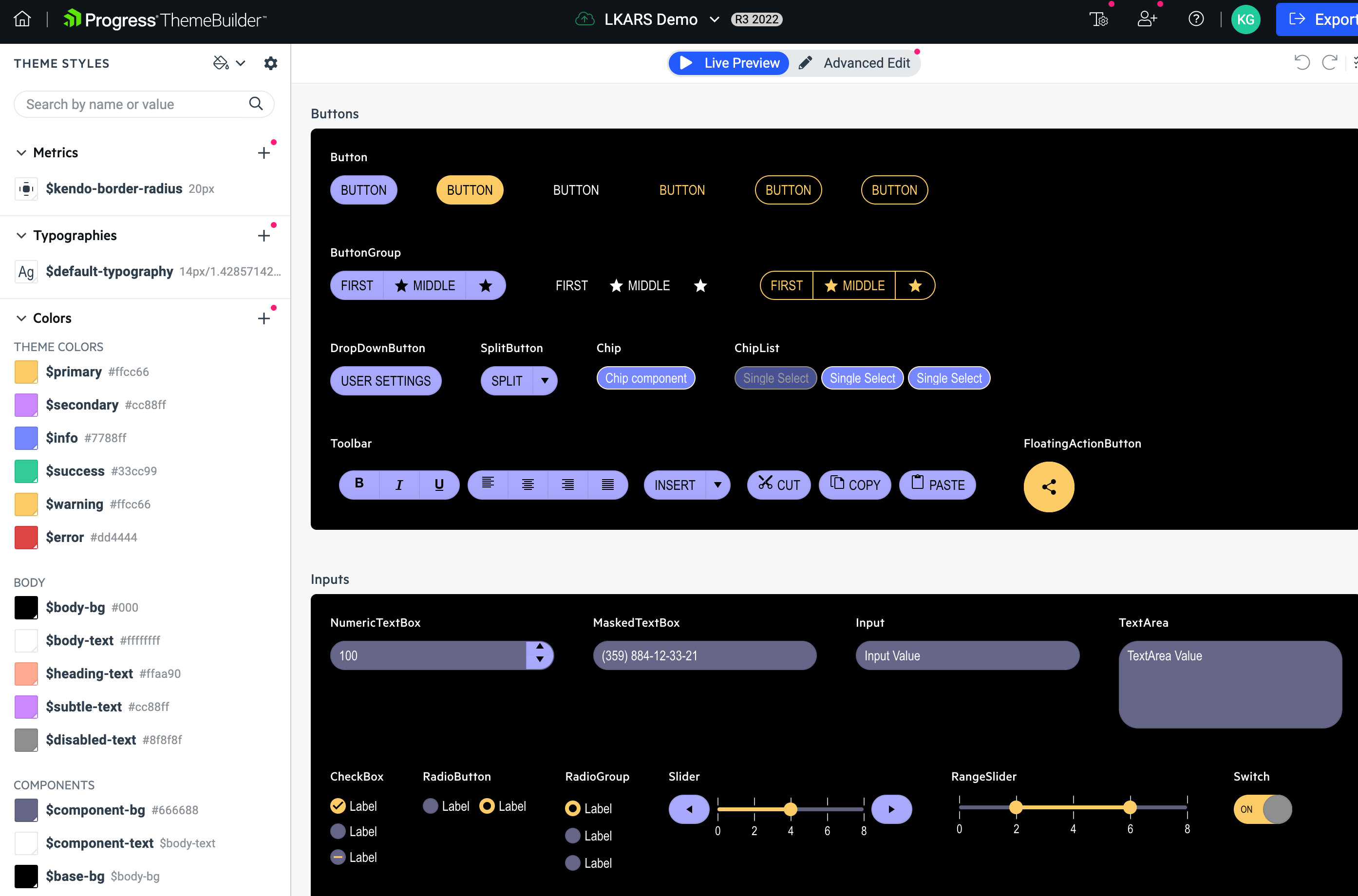
My primary goal in using the ThemeBuilder was to have it do all the hard work of creating the custom stylesheet for me. Because I had already customized the Figma Kit, it was a piece of cake copying over the styles into the ThemeBuilder Theme Styles panel—all the variable names in the KendoReact library match up one-to-one with the design tokens in the Figma Kit!
There were only a few small tweaks that I needed to make after that (mostly around text alignment in specific components since I changed up the typography system so drastically), so I cleaned those up using the Advanced Edit panel. Since I could see the components update in real time as I worked, thanks to the Live Preview panel, it was easy to make those little tweaks and adjustments to get it looking just right.
Once that was aligned with my design choices in the Figma Kit, I just clicked the Export button in the top-right corner and … done. Stylesheets are exported, without needing to write a single line of CSS!
‘Captain’s Log: Stardate 100782.93’
The Figma Kits help provide documentation on the design side, but what about the development side? Since I’m using a custom design system, I’d really like to document how I want each component used within the context of my application—as well as my color and typography systems. It would also be really nice to be able to have a place where my components were isolated so I could run accessibility tests and unit tests on them.
And what about sharing all this outside the design and development teams? What I really needed was a single source of truth that anyone could easily access to see all the pieces of my design system together.
Enter: Storybook. Storybook is a tool for building and documenting UI components—it’s become integral to the creation and maintenance of both component libraries and design systems. Because Storybook offers an interface for non-developers, allowing anyone to explore, play with and manipulate the components (as well as read the documentation), it’s perfect for collaboration.
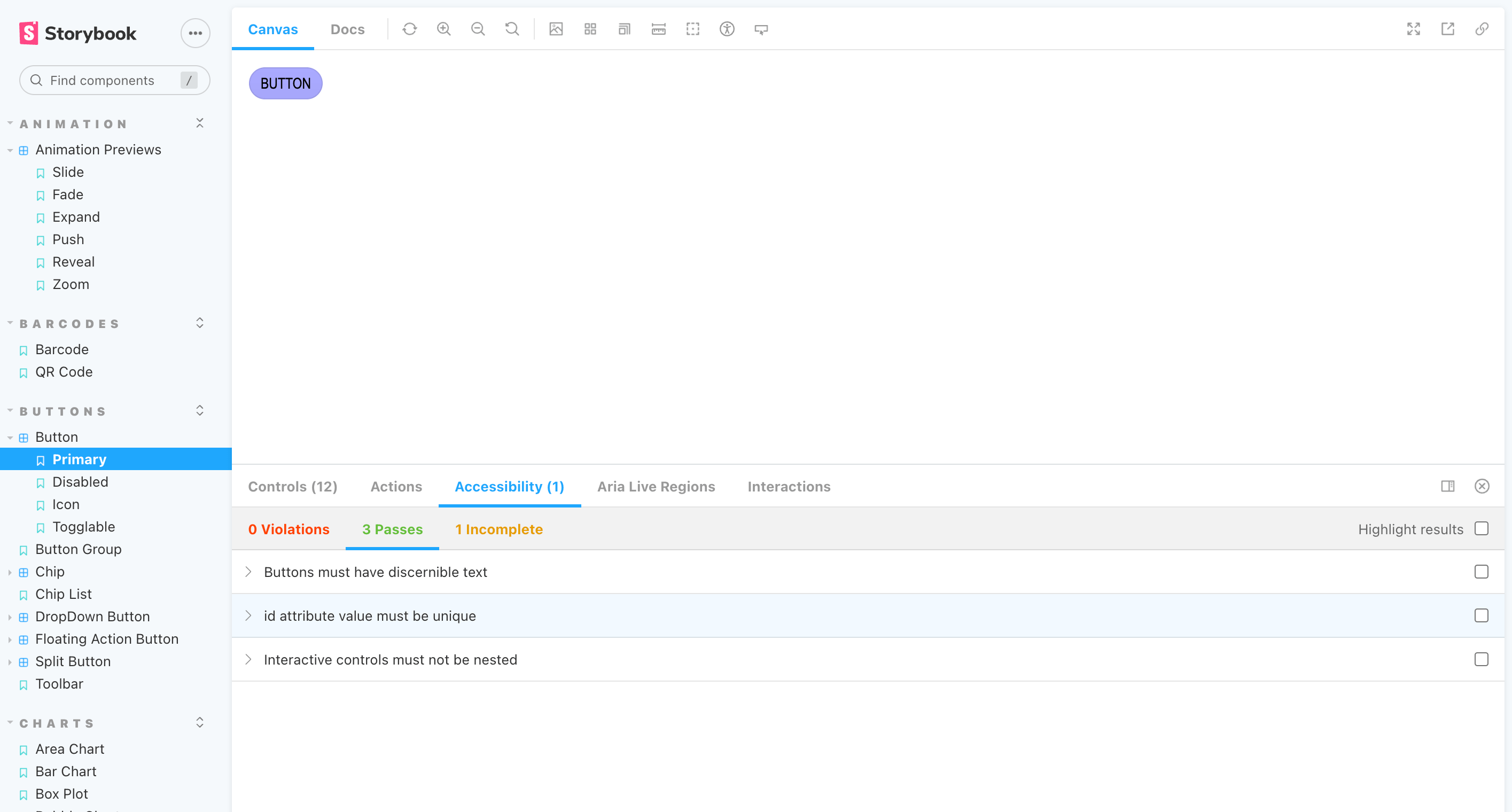
I loaded all the KendoReact components into a Storybook instance. Then, I took the exported CSS from the ThemeBuilder and literally dragged
and dropped it over into my Storybook assets folder to apply my LKARS theme to the entire suite of components. Finally, I installed accessibility and testing addons for Storybook, to ensure that none of my customization adjustments impacted the functionality
of the core components.
‘Engage!’
There you have it! The system I used to create, document, maintain and implement LKARS. Interested in re-creating this setup? Here’s a list of all the tools I used to make it come together:
- KendoReact component library: If you’re not already using it, you can try out the entire KendoReact library, free for the first 30 days. Fully accessible, intuitive for developers and users, and (obviously) design-friendly!
- Kendo UI Figma Kits: The Kendo UI Figma Kits are completely free, so you can download one and start exploring right away—even if you aren’t using KendoReact yet!
- ThemeBuilder: ThemeBuilder Pro is available for KendoReact, Kendo UI for Angular, Kendo UI for Vue and Telerik UI for Blazor. Support for Kendo UI for jQuery, Telerik UI for ASP.NET MVC, Telerik UI for ASP.NET Core, Telerik UI for PHP and Telerik UI for JSP is launching in early 2023. Try it out with a free 7-day trial!
- Storybook: Storybook is a wonderful piece of open-source software. You can always create your own, but we’ve made it extra easy for you— fork the KendoReact Storybook instance, apply your own custom styles and you’re good to go!

Kathryn Grayson Nanz
Kathryn Grayson Nanz is a developer advocate at Progress with a passion for React, UI and design and sharing with the community. She started her career as a graphic designer and was told by her Creative Director to never let anyone find out she could code because she’d be stuck doing it forever. She ignored his warning and has never been happier. You can find her writing, blogging, streaming and tweeting about React, design, UI and more. You can find her at @kathryngrayson on Twitter.
Related Posts
Comments
All articles
Topics
Web MobileMobile
Desktop
Design
Productivity
People
