
Figma for Developers

Summarize with AI:
If you thought Figma was only for designers, think again! Figma is a powerful tool, with tons of great features for developers to take advantage of as well.
If you’re a developer who works with designers, you’re already familiar with the infamous “handoff”—that point in the workflow when you start turning wireframes and mockups into code. Even if you’re not personally familiar with the process, it’s probably unsurprising to hear that this is often a real pain point. This pain can be lessened, however, when both sides have an understanding of what the other will be looking for in the handoff process.
Designers are expected to have a pretty thorough understanding of the frontend web: HTML elements, the CSS box model, how responsive resizing works, component-based structure, etc. And yet, when we flip the script, developers are rarely expected to have an understanding of design basics—what’s up with that?
Teams work better and create better products when both parties have a high level understanding of each others’ tools and priorities. Not to mention all the ways having access to the design source files can make your own job easier.
With that in mind, I’d love to introduce my developer friends to Figma, one of the most popular and widely used UI design tools. It’s free for individual use, so I’d encourage you to go make an account and start playing around! It’s the best way to learn.
Like any specialized software, a Figma file can be a little overwhelming to navigate if you’re not familiar with it. So let’s start from the top and take a look at the the basics, along with the Figma features that will be most useful for developers.
Figma File Organization
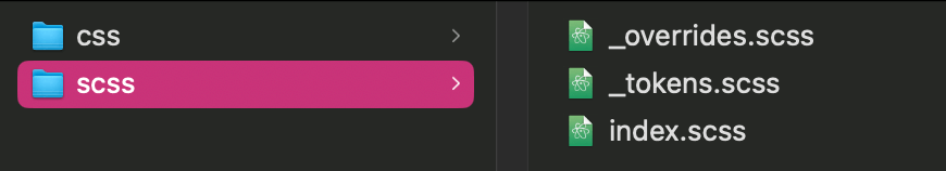
Figma files are organized by Pages (think screens of your application), which each contain Frames (subpages, often used to organize mockups of Pages in various user interaction states). Each Frame is made up of Elements—shapes, text, vectors, etc. Elements (or groups of Elements) can be saved as reusable Components. Elements are customized with Styles, like colors or fonts. Styles (or groups of Styles) can be saved as Design Tokens and organized into shareable Libraries for easy reuse.

Getting Oriented
When you first open a Figma file, this is what you’ll see:
- The center panel shows the current Page contents. Clicking on any Element will select it, in both the left and right sidebars.
- The left sidebar is where you’ll find the document structure, organized into a nested and layered view.
- The right sidebar has three main sections—Design, Prototype and Inspect.
- Design allows the designer to adjust the Styles on each Element. The contents of this tab will change based on which Element is selected (colors, borders, etc. for shapes, font choices, sizes, etc. for text).
- Prototype allows the designer to hook all the Frames together into a clickable prototype.
- Inspect summarizes the selected content into CSS properties and code.

Why Should Developers Care? The Prototype tool is a great way to do user testing and validate ideas before devs write a single line of code. This not only saves dev time by allowing designers to make adjustments to the UI before the development phase (and what’s not to love about that?), but user testing at this stage also offers devs the opportunity to sit down with a designer and a user before they start building.
When devs can see user motivations and pain points happening in real time and be involved in user conversations early in the process, it makes for a much more intuitive and cohesive product. This helps shift the development cycle from reactive (“We have to fix this thing we got a lot of negative feedback about”) to proactive (“We saw during testing that users struggled with this task, so let’s put extra attention into streamlining it”). Not to mention, just being able to explore the prototype whenever you like means you never have to wonder, “Wait, what’s supposed to happen when they click this button?”
If you want to take a closer look at the details of a mockup, you can turn on the Grids with Ctrl+G, which will help you get a feel for the spacing and structure of what you’re building. You can also toggle on Rulers with Shift+R, and show spacing values between elements by selecting the Element and holding down the Option key while you hover over the items around it.
Exporting Assets
All right, so you’ve explored the file and you feel like you’ve got a solid understanding of what needs to be built and why. Time to start writing some code. Good news—Figma also makes this easier!
For defining your high-level styles, you’ll want the contents of the Libraries—those Design Tokens are the recurring CSS values that you’ll want to turn into variables and/or assign to properties in your global stylesheet. If you select the highest level Page from the left-hand sidebar, the Design Tokens will appear in the right-hand sidebar. You can click on the knobs icon of each one to inspect it and see all the details you’ll need to recreate it in your CSS files.

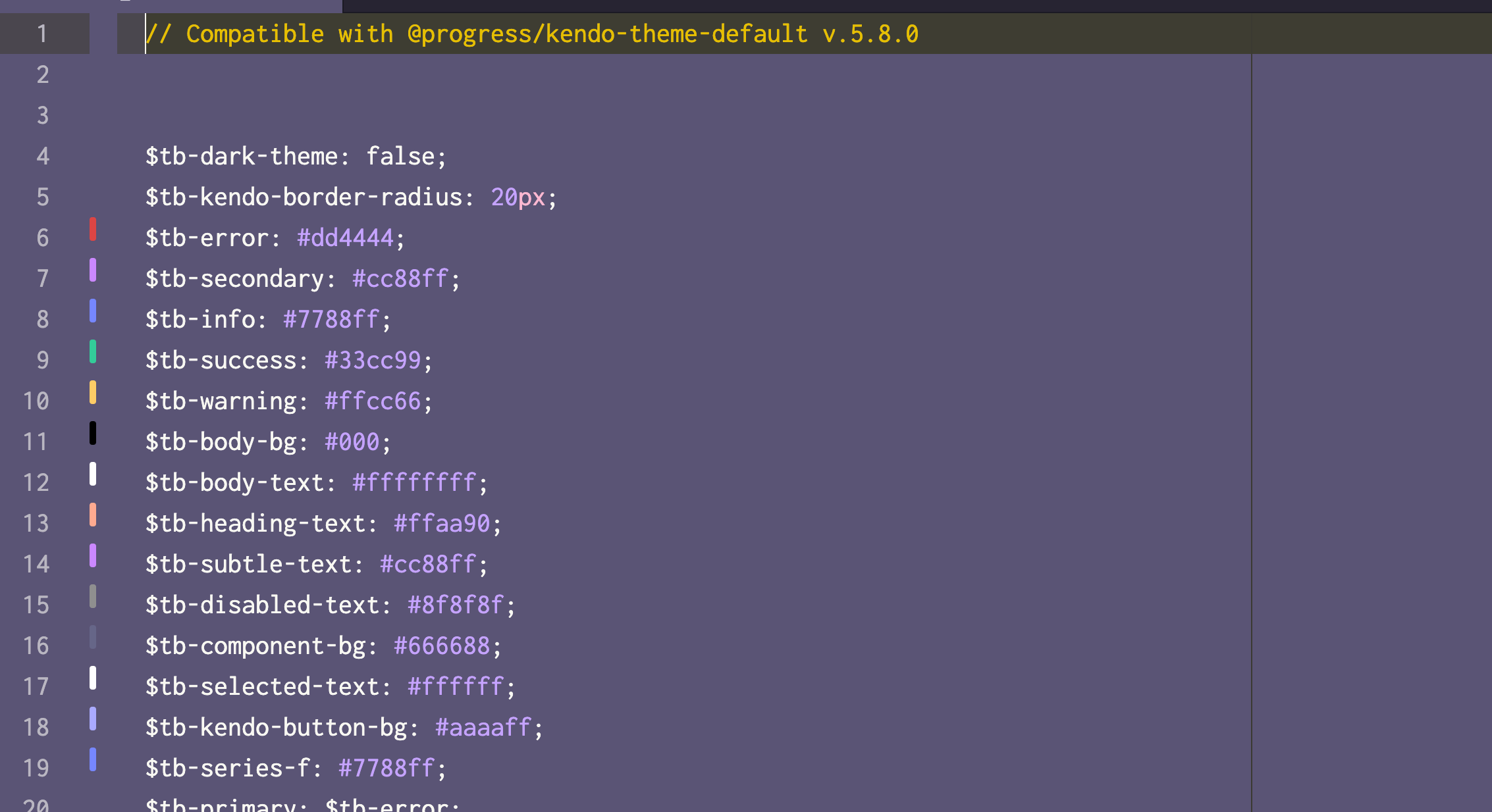
Unfortunately, there's no native way in Figma for you to export those Libraries ... fortunately, ThemeBuilder Pro makes it a piece of cake! If you download the ThemeBuilder plugin, you can export all the data from the Figma file into ThemeBuilder, then export again from ThemeBuilder. That export package will include a ton of useful SASS files (one of which being _tokens.scss) that you can add directly to your project. Boom, done.
Why Should Developers Care? No more copying and pasting styles! No more trying to come up with unique variable names, only to find out the design team is calling the same thing something completely different! No more trying to match padding values just by staring back and forth between some exported PDF and your browser until they start to look similar! Whew, I’m exhausted just writing all that.
Once you get past the high-level styles and into the nitty-gritty, that's where Dev Mode is going to be your new best friend. By toggling the switch with the </> icon in the upper right hand corner, you can turn on Dev Mode and start
looking at designs from a development perspective.
Much like the inspect tool in every major browser, Dev Mode lets you drill down on a single Element and get all the details, helpfully formatted into CSS and with a quick copy option. There are also a number of Plugins available in the Community that can integrate tools from various other software you might be using as part of the development or project management process—including Storybook, GitHub, Anima, Jira, and more!
While not as flashy as some of the other features, Dev Mode also allows designers to mark various sections as “ready for development” and allows developers to see previous versions to easily identify what needs to be updated. It’s not quite the same level of granular version control that we’re used to with something like Git, but it’s still incredibly helpful.
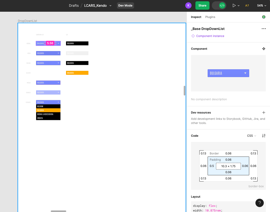
Why Should Developers Care? Dev Mode is where Figma really shines for devs, by summarizing styles into code snippets and design tokens, integrating other dev-focused tools, tracking changes, and more! Just remember—as always, it's not wise to blindly copy and paste machine-generated code. Dev Mode CSS is super useful as a jumping off point to tweak and adjust, but you should always review it before dropping it directly into your app. Still, it’s absolutely leaps and bounds better than starting from scratch, using some kind of color-picker tool, or (shudder) attempting to match values by eye.
Finally, if there are any images or custom icons in the mockup, you’ll want those exported as well. Ideally, your designers will have marked the assets you need as Exportable—if this is the case, then you can select the Page or Frame that you want to export items from, open the Export Panel with Cmd+Shift+E (Ctrl+Shift+E), and export everything that they’ve marked from one place. If not, you’ll have to export assets one at a time. Select whatever you want to export and scroll down in the right sidebar until you see the Export section. There, you can customize your size and export file type (PNG, SVG, JPG or PDF), and click the Export button right below.

Why Should Developers Care? How many times have you had to put a project on hold in order to DM designers (who are probably busy with something else) and ask them to send you the assets you need? And then when you finally get those assets, you discover that they’re not high enough resolution, or you’re still missing something, or they’ve been exported as JPGs instead of ... well, literally anything else? Forget the back and forth, and instead feel confident getting what you need, when you need it, straight from the source files.
Ease the Pain of Handoff
The design/dev handoff doesn’t have to be a pain point if both groups are willing to meet each other halfway. There are plenty of great products that have taken strides toward bridging this gap, but at the end of the day, even the best tool is only useful if you have a contextual understanding of what you’re doing with it. You don’t need to have a deep understanding of design concepts to benefit from getting comfortable with Figma. When developers are empowered to explore and work with the actual design source files, everybody wins.

Kathryn Grayson Nanz
Kathryn Grayson Nanz is a developer advocate at Progress with a passion for React, UI and design and sharing with the community. She started her career as a graphic designer and was told by her Creative Director to never let anyone find out she could code because she’d be stuck doing it forever. She ignored his warning and has never been happier. You can find her writing, blogging, streaming and tweeting about React, design, UI and more. You can find her at @kathryngrayson on Twitter.
Related Posts
Comments
All articles
Topics
Web MobileMobile
Desktop
Design
Productivity
People
