From Figma to React—Reusable Components

Summarize with AI:
Delivering great user experiences across apps suggests strong collaboration between designers and developers and strictly following UI/UX requirements. Let’s see how to achieve this while standardizing building blocks and cutting time at each stage by converting Figma to React reusable components.
In the process of developing customer-facing applications, designers and developers have a common goal—delivering great apps customers love. But they work in different environments. Designers construct the UI and the user journey in their design tool of choice. Developers translate the UI and design into a fully working application using various technologies and tools.
Let’s face it—it is not uncommon that the implementation fails to hit the design intent. A missing shadow here and there, a color tone mismatch or a font size just a pixel away.
But what if, from the very start, designers and developers built perfectly matching UI on both sides? These matching building blocks would ensure that there is smoother team collaboration, built-in reusability and consistent user experience. Like a backbone system of standardized, ready-to-use components, it would minimize discrepancies, drastically cut development time, allow software teams to focus on the customer journey and functionality, and bring designers and developers closer to their common goal.
So, let’s set some context and dive into the process of how you can achieve this dreamed unified building blocks ecosystem with Figma and React.
The Context—Awesomeness Inc.
Let’s say I am part of the Awesomeness Inc. company. UI/UX folks, developers and the business made the decision to standardize all components and widgets used in our applications. This makes sense because it is scalable, maintainable, reusable, consistent and cheaper. And users always appreciate a good UX, consciously or not.
So, the task is clear. The main indicators for success we agreed on are consistency, reusability and time to develop.
For the purposes of this tutorial and for brevity, let’s just focus on the primary call-to-action (CTA) button. The same process could then be applied to the rest of the components.
Toolbox
As the title already suggests, the technology stack and toolbox I will be using includes Figma for building our awesome designs, and React for building awesome customer-facing web applications. Here is what I will need.
Figma—Figma is a free, cloud-based design tool that has been dominating the design world recently with its powerful features and easy collaboration for the entire team. If you have not checked it out yet, now is the time.
React—React is a component-based JavaScript library for building rich and dynamic user interfaces. Built by Facebook, React proved to be the tool of choice for thousands, if not millions, of web applications of all sizes.
To further facilitate the process and meet our success criteria, I will use three additional tools. They will allow me to drastically reduce the time it takes to develop, while maintaining high consistency and reusability, as this is what I aim for now.
KendoReact—KendoReact is a complete React UI suite that delivers ready-to-use, fully functional React components. It is a lifesaver when it comes to productivity. It also goes with the identical Kendo UI Kits for the designer in Figma, which will make both our lives easier.
Kendo UI Figma Kits—The Kendo UI Figma Kits are a set of Figma-native design files representing the Kendo UI components in every possible state. This includes their detailed anatomy, colors, metrics, and icons. All these elements enable the seamless handover of the design to the developers.
ThemeBuilder—ThemeBuilder is a design-to-development collaboration tool. It helps your team to quickly import UI variables from Figma, apply them to KendoReact components, live preview the components with the new styles applied, and export ready-to-use CSS or Sass files.
The Figma-to-React Journey
Now that we’ve decided on our toolset, let’s go through the complete process of creating Figma-to-React reusable components step by step.
Create Awesomeness Inc. Primary Button in Figma
Here, we have two approaches. The first one is to start from scratch in Figma. The second is to use the Kendo UI Kits for Figma as a starting point.
As we aim for fast results without compromising the outcome, the second choice is an easy pick. The Kendo UI Kits will bring several benefits.
First, the kits contain Figma reusable components for the whole KendoReact suite. Once we are ready with the button, we will have a good starting point to continue with the rest we need.
Second, the kits are built with the atomic design principle in mind. This means that more complex components consist of the basic ones—so once we are done with the button, the rest of the components that contain a button will inherit that design.
And third, we have a more holistic overview of the components as the kits include all components’ states. In that way, we can design the interaction states too, not just the static normal state.
So, let’s get some work done. First, we need to choose one of the three Kendo UI kits themes (based on which one looks closer to our end goal) and duplicate it. This project will store our Figma reusable components. I will go with the Material theme.
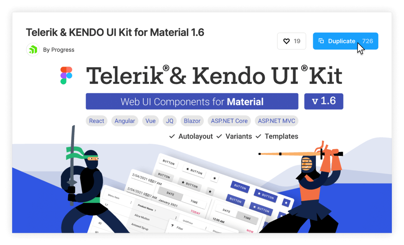
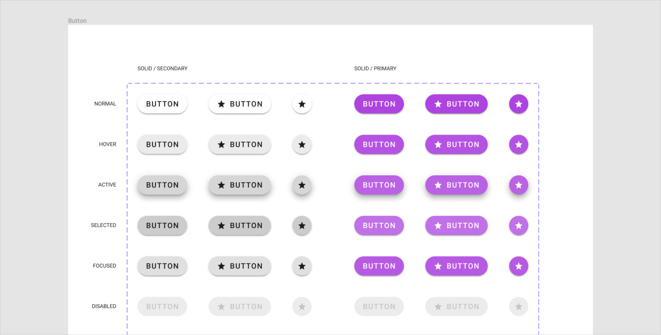
Once opened in Figma, I will navigate to the “Components & Variants” page and locate the SOLID / PRIMARY button.
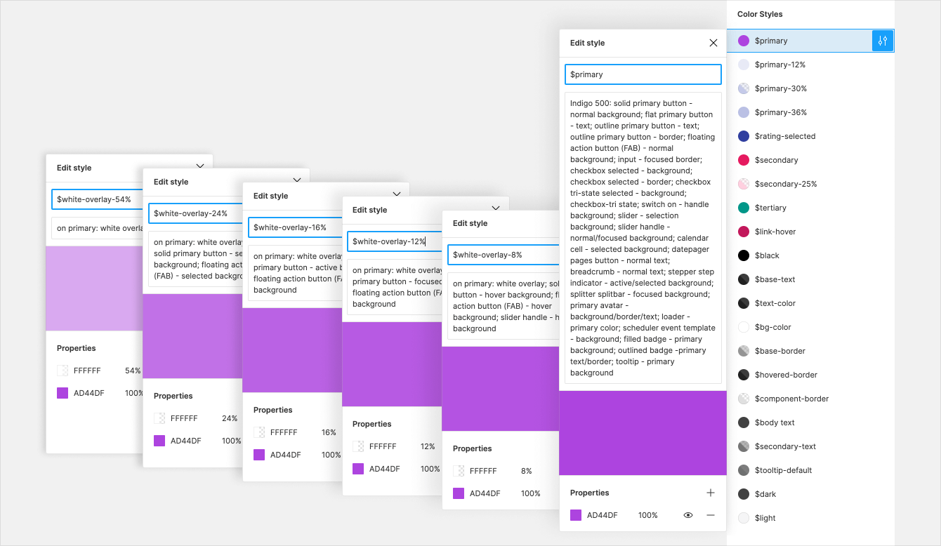
Kendo UI Kits use design tokens—variables for colors, effects or typography. Change style under a token, and all components that use this token will have the new style applied.
The solid primary button states’ background is set using the $primary and On Primary/White Overlay/$white-overlay-* color tokens. Change their solid colors to #AD44DF and check the result.
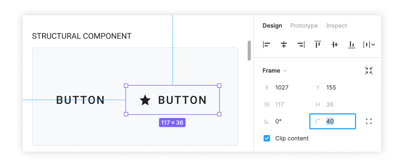
The last thing I’ll do is to change the border radius to 40 to get a nice, rounded button with an eye-catching background. To do this just once and apply it to each button, I would change the border radius of the “_Base Button” structural component.
That’s it! We have designed the awesome primary button in no time. Now, it’s time to hand off the design to the developers to convert the Figma components to React.
Handoff to Developers
This is the step where ThemeBuilder comes in. I will export the ready design with the ThemeBuilder plugin for Figma, which I have installed already.
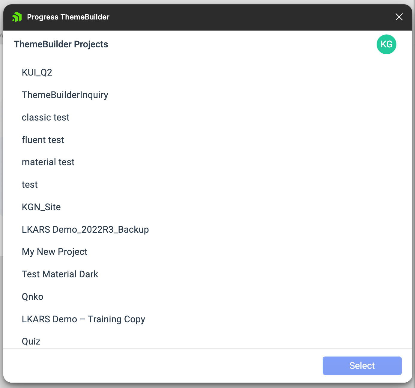
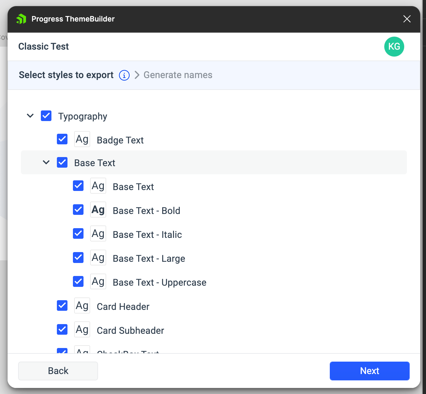
I will navigate to “Export styles” from the menu. After logging in, I’m given a list of my current ThemeBuilder projects into which I can export the styles. I’ll choose the one I’m working on, and hit “Select”. From there, I can choose specific tokens to export from Figma—this is helpful for situations where you only made specific changes, like to the typography. But in this case, I’ll go ahead and export everything (which is the default, anyway).
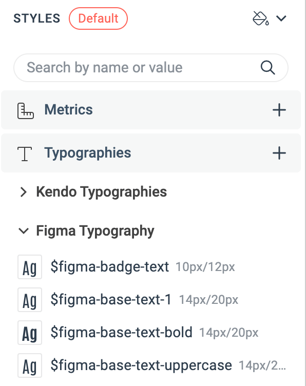
After the export process completes, I can switch over to ThemeBuilder and see all the new tokens in the left-hand Styles sidebar. We can tell, because all the new tokens will have the “$figma-” prefix. These can then easily be assigned to existing Kendo variables, or new ones you create in ThemeBuilder. As we make changes, we can see the Kendo components update in the Live Preview window. This allows us to test everything—open dropdowns, hover on buttons, toggle switches, and more—to make sure it all looks and behaves exactly as we designed. If anything isn’t perfect, we can swap over to the Advanced Edit panel to make tweaks using the WYSIWYG editing options.

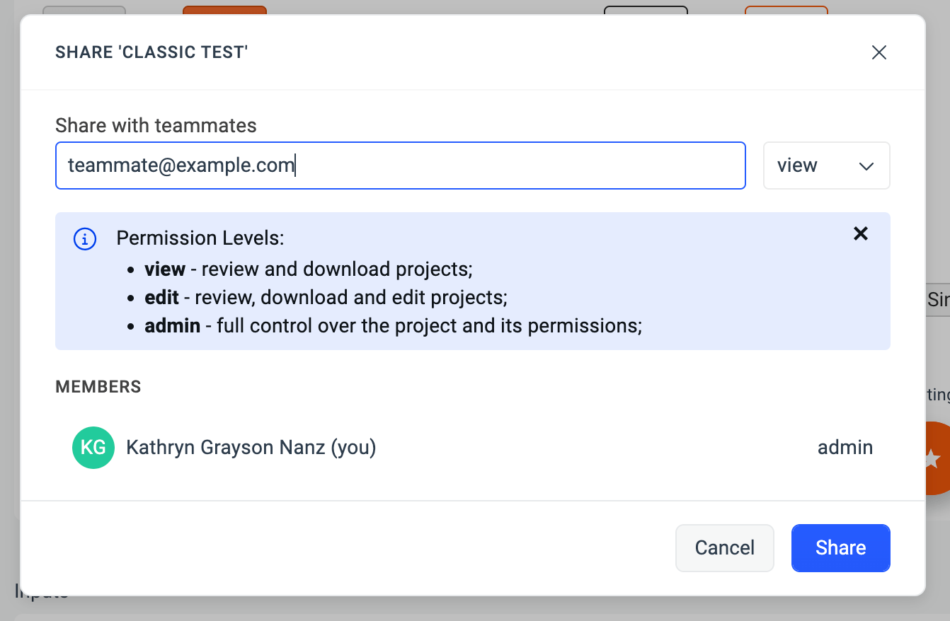
When it’s all looking just the way we want, we’re ready for handoff! We can send the ThemeBuilder project to our developer using the Share function, and even decide whether to give them view, edit, or admin permissions.
Apply Styles to React Components
At this point, we have this awesome primary button designed and specs shared with the developers. We can now start transferring the design from Figma to the real React components. To apply these styles to the React UI components, it's time to export from ThemeBuilder.

The content is a ready-to-use npm package containing all the styles and assets that would make the conversion from Figma to React components possible—CSS, SCSS and any custom fonts that may have been added.

Now, let us get to the last step and use the awesome button you have just designed and styled. First, copy the package into your project directory. Then, install the React Button library from KendoReact (it's on npm: @progresss/kendo-react-buttons). Import the index.(s)css file in your main React component (App by default), and you’re good to go!
Summary
Aaaand that’s it. We’ve completed the Figma to React journey and met all our goals—short time to develop, consistency between Figma design and real React components, and high built-in reusability.
Try it out yourself.
Happy coding!

Ventsislav Staykov
Ventsislav Staykov is a Principal Software Engineer on the Unite UX team. Over the years he has been part of several JavaScript and .NET teams delivering developer tools, web and desktop applications, and high-quality codebases. Off work, he enjoys traveling, watching movies, and spending time outdoors with his dog.

