
Sleek and Customizable UI for Any Design System and Technology
 by Eric Rohler

Summarize with AI:
With the rise of cross-platform applications, the goal is to write once and deliver everywhere. Telerik and Kendo UI provide the same capability for styling controls across various form factors and platforms.
Portions of this article are out of date since we have changed our styling solutions. Check out our Design System Kit page and our new and improved ThemeBuilder for up to date information.
Series Outline
This is the first post in a series aggregating how styling in our Telerik and Kendo UI suites works at the 10,000-foot view across the various platforms. Conceptually, the platforms are web, desktop, mobile and reporting. The later posts will be a review of a demo illustrating how it works across the suites. The links are below and can be used to skip ahead at your leisure.
- Sleek and Customizable UI for Any Design System and Technology (this post)
- Telerik and Kendo UI Theme Customization: Web and Desktop Demo
- Telerik Reporting Modern UI: Report Viewer Demo
Introduction
There is a collective understanding that people make judgments. If we have any of the five senses and a brain, we will always reason, question and deduce. This applies to the applications we use as well.
It takes about 50 milliseconds (0.05 seconds) for users to choose whether they like your web, desktop and mobile applications or not.
This short window of opportunity makes creating applications with a sleek and modern user interface (UI) design system important. It also makes understanding what makes a sleek and modern UI important too.
Features of a Modern UI Design System
The concept of modern UI design is fluid and contradictory. It is abstraction and rigidity working in a constant change. Design has always evoked emotion and can promote action or inaction. These tenets of modern design formulate the complexity of it.
Inspirational and Purposeful UI Design
The complexity of modern UI design is why two people interact with the same design system and can form fundamentally different feelings and opinions about it. This makes modern UI design inspirational.
However, to be inspirational means to have a purpose of some kind. Purpose-driven design can derive from anything—most notably, an executive summary from a business plan or a mission statement of a non-profit agency. A more recent example is Windows Metro, which was inspired by signs commonly found in public transportation systems.
Easy-To-Use Design
Because of general complexity of a UI design system, it should be easy to use. For example, a modern UI design system should be simple enough that anyone without a design background can easily get going.
The idea of “easy to use” is also complex because it is relative to the user and each user’s skill level varies. This means that a modern design system should be able to work across this variability. To put it simply, it should start simple and be able to evolve to the needed changes.
Logically Structured UI Design
Logically structured elements are a common approach for handling complexity in systems. This happens in many complex systems, from designing manufacturing systems to web design.
A good example of handling complexity is recent advancements in CSS like the Flexible Box (flexbox) and the Grid. These changes have made it possible to adapt to the growing complexity of designing for the web.
Inspiration, simplicity and logic are features of modern UI design systems today. These design systems range across several types, and our concern is design systems for applications that users interact with directly. In this case, it is also important to understand what the essentials of a sleek UI are. We will discuss that next.
Essentials of a Sleek UI
Essentials of a sleek UI involve the more aesthetic characteristics. These include things like color, shapes, layouts, styling flexibility and current trends.
Colors, Shapes and Layouts
The first and most obvious elements of a sleek UI is always the aesthetic features. This is because we see colors and shapes, and we use an application based on its layout.
There are an infinite number of options for color, shapes and layout variations. To provide the best options for creating a sleek UI, a modern design system needs to give the designers the best capabilities to do so.
Adaptive and Flexible Styling
Building on the unlimited number of options for colors, shapes and layouts is the ability to adapt to design changes quickly. This is considered flexible styling because, as goals and desires changes, a design system should be able adapt as necessary.
Another important aspect of flexible styling is using the same styling across different devices. On the web, this is known as responsive styling. For the desktop, there are platforms that target different devices like Xamarin and Universal Windows Platform (UWP).
Current Trends
This section needs little discussion, as current trends will always drive modern UI design. Just look at websites designed in the ’90s compared to now.
A full-featured UI design system should provide the developers with the capability to design with different trends. For example, some Windows users will stand by the Windows 7 design (fig. 1), while others may prefer the Windows 8 Metro design (fig. 2). In this case, one theoretical design decision would be to target the Windows 7 style and the other can target Windows 8 Metro without issue.
 Figure 1: Windows 7 Aero UI
 Figure 2: Windows 8 Metro UI
Modern and sleek user interfaces encompass many elements. So many that it would require a book to capture all of them, which is outside of the scope of this post. Instead, reviewing the features of a modern UI design system and the essential elements of a sleek UI will provide enough background to understand Telerik and Kendo UI styling.
A part of the power of using Telerik and Kendo UI is in the ability to get a fully functioning application to market faster. This is no different with styling and appearance. The built-in and custom styling options make it an excellent choice to meet the modern UI design needs.
Over the rest of the post, we will learn how easily Telerik and Kendo UI components create high-quality, modern and beautiful user interfaces and experiences across a wide range of devices without requiring too much investment of time, thus enabling more focus on business logic. To get started, we will review the Telerik and Kendo UI design systems.
The Telerik and Kendo UI Design Systems
This section covers styling and appearance across the entire product line of Telerik and Kendo UI, which is a lot. To organize this, we will break it down into web, desktop and mobile.
Additionally, we will focus on the more well known and stable products. However, it will be enough information to work with every product because there is some technical overlap. The following outline illustrates how the suites are organized.
Product Hierarchy
- Web
- Desktop
- Mobile
Note: An important distinction or caveat to take into consideration for styling across all platforms is that, because they are separate platforms and technologies, it is challenging to have single code base for each. For example, our desktop products use a different styling mechanism than the web products, and this is because of the technologies used in the applications.
Styling and Appearance for the Web
The web suites contain the most technical overlap because of the shared web technologies. For example, UI for ASP.NET AJAX, UI for ASP.NET Core, UI for ASP.NET MVC, UI for Blazor, Kendo UI for jQuery and Kendo UI for Angular each share the same approach for styling the controls.
From a technical perspective, shared styling derives from the jQuery Sass-Based Themes. Let us review each of these below, starting with the Telerik web component styling implementations.
Telerik UI Web Components
The best way to understand how styles can be shared across the Telerik web frameworks is to use the Progress ThemeBuilder (fig. 3).
 Figure 3: Sass Web UI ThemeBuilder
As shown in the above screenshot, the Sass ThemeBuilder allows styling for each of our web components. The Telerik web suites use this more modern approach for styling—UI for ASP.NET AJAX, UI for ASP.NET MVC and UI for ASP.NET Core each use the Sass Web UI ThemeBuilder, with AJAX only having minor differences.
The power behind the Sass Web UI ThemeBuilder is in the ability to choose between using the built-in themes or customizing them. Alternatively, we provide a Content Delivery Network (CDN) that can be used for the base theming in a Telerik web application as well.
Kendo UI Web Components
Our JavaScript Components can also use the Sass ThemeBuilder or the CDN. However, because these are more front-end centric frameworks, i.e., HTML, CSS and JavaScript, other tools can be used.
For built-in styling, we ship pre-built CSS with the Kendo UI distributions or the Node package manager (npm) can also be used. For custom styling, the recommended approach is to use the build process of your client-side application.
From the Sass ThemeBuilder, the CDN and the custom build process, our Telerik and Kendo UI web component suites provide numerous ways for achieving the sleek and modern UI as desired. Next, we will discuss the desktop styling features.
Styling and Appearance for the Desktop
The desktop styling is slightly different. As mentioned previously, creating for the web and desktop require different methods. I should mention that a Progressive Web App (PWA) is one option for creating identical web and desktop styling, but that is not a pure desktop application because it cannot interact directly with the OS.
Furthermore, there have also been some changes in the Windows desktop APIs and architecture over the last decade. These include recent technologies like XAML and the Universal Windows Platform. In any case—from WinForms to WPF to WinUI—Telerik provides several options for creating sleek and modern user interfaces in desktop application development.
Telerik UI Desktop Components
Desktop applications use a similar approach to styling as web, where Telerik components include base themes that can be customized. This is true for UI for WinForms and UI for WPF. The major difference is there are more shared built-in themes for the desktop components than there are for the web components.
Similarly, UI for WinForms and UI for WPF include tooling to help with customizing the built-in themes. For WinForms this is the Visual Style Builder (fig. 4), and for UI for WPF this is Color Theme Generator (fig. 5).
 Figure 4: WinForms Visual Style Builder
 Figure 5: WPF Color ThemeBuilder
While the styling for the desktop is a complex process, Telerik UI makes it much simpler to begin with the built-in themes and provides tools for further customization. The final platform to review is the mobile suite. Let’s do that next.
Styling and Appearance for Mobile
In comparison to the web and desktop, the mobile space is different. The web and Windows desktop are unified platforms. In mobile, this is not the case. Android and iOS are the major platforms, and both have distinct design methodologies.
This makes styling on mobile a different mechanism as well. In this case, the mobile platforms have a simpler approach to styling and appearance. Where the web and desktop platforms enable styling button shapes and other interface features, the mobile platform allows for styling simplified design elements like text color, background color, etc.
Telerik UI Mobile Components
Telerik’s mobile suite is Xamarin, which uses XAML as the markup language. This works similarly to WPF with some differences. The Xamarin styling does not include tooling to aid in customization. Instead, we simplify it by providing a single built-in theme (fig. 6) and make it quite simple to customize.

Figure 6: Xamarin Blue Theme
The previous sections outlined styling across the different component suites. We reviewed how a sleek and modern UI can be achieved for each platform. However, these are just ways to achieve the same thing. The main concept for Telerik and Kendo UI styling is how easy it is to use either a built-in or custom theme. Let’s review the pros and cons of this next.
Built-In vs. Custom Styling
Each of our component suites includes a way to use built-in styling or to customize the entire style. Obviously, choosing either approach has its own benefits and drawbacks. Understanding these are paramount for making any design decision.
Built-In Design Systems
This is the simplest of approaches. The design language and assets are provided for the application. It is as simple as including it in the application and then reaping the benefits.
Pros and Cons of Built-In Design Systems
The most recognizable benefit of this is simplicity. It is quite easy to include a pre-built and configured design system. This is the equivalent to hiring an entire design team to create, build and ship the design, which makes it cost-effective too.
However, the drawback of using a vanilla design system is that many sites will appear similar. Bootstrap had this effect early on in its adoption. Another drawback is that there may be limited customization options available in the built-in system.
Custom Design Systems
For custom design systems, the most notable benefit is customization. The design is not locked into a specific look and feel. The designers and developers have freedom to design how they want.
The obvious drawback to this is the cost to design a custom system. It requires hiring a design team and cross-team collaboration for integration into the software development lifecycle. This can become technically and monetarily expensive.
The Best of Both Worlds
A potentially better approach to styling and appearance would be to start with a vanilla design and then adopt more customization as requirements are defined. This is a similar approach to agile and minimal viable product development.
This is a great option, as it leaves room for growth and evolution without needing to have the design completely worked out at the beginning of development. However, it can be difficult to find systems that offer enough flexibility to design in this way.
Telerik and Kendo UI styling is perfect for any of the above scenarios. If an application does not require a full design, then any of the built-in design systems can be used. Additionally, if a company requires all its application to adhere to a set of design standards, then each component suite can be customized too. Furthermore, a design system can also evolve over time from a vanilla design to a more hybrid design, which Telerik and Kendo UI can do as well.
To understand Telerik and Kendo UI styling capabilities, it will take conceptualizing how to achieve a sleek and modern UI design across the platforms. Let’s review how a styling approach can be applied across the control suites next.
Styling Across Telerik and Kendo UI Controls
If we want to hit every platform, we will need to target web, desktop, mobile and I will add in reporting as well. The goal is to achieve a consistent look and feel. Unfortunately, we cannot build a sample during this post, but armed with the information we should be able to conceptualize it. Let us begin with the web.
Web UI Design
To keep the exercise modern, assume we are using an Angular application with an ASP.NET Core WebAPI backend. The WebAPI backend will be useful with the desktop, mobile and reporting implementations as well. As mentioned above, all our web components can use the Kendo UI styling through the Sass ThemeBuilder. Let’s start there.
Choosing a Web Base Theme
We can start with a base theme that will get us ramped up quickly with little time investment. The base themes in the Sass ThemeBuilder are Default, Bootstrap v4 and Material (fig. 7).
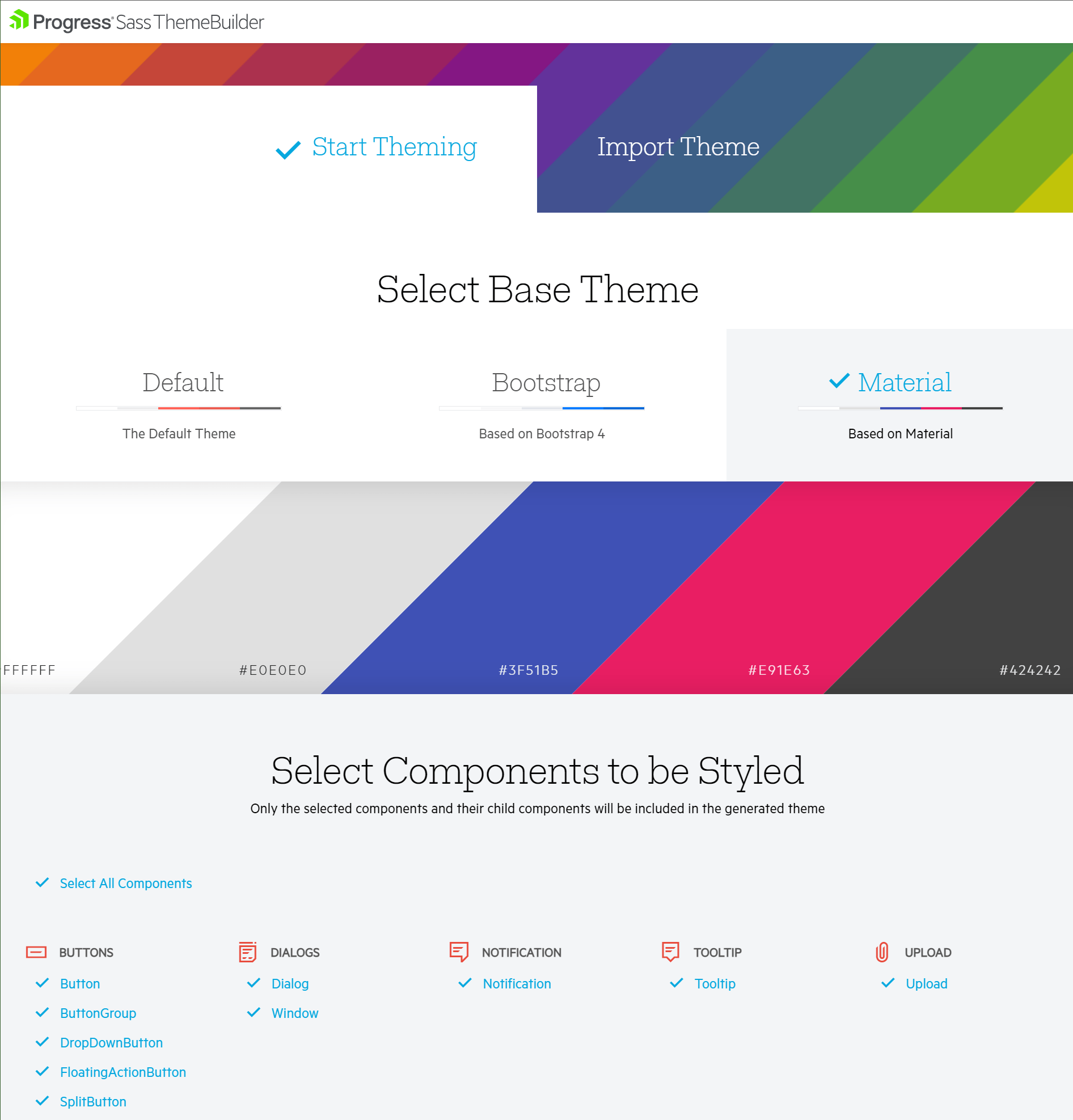 Start Theming > Select Base Theme > Material: a white, a light gray, a bright blue, a pink, and a warm dark brown that's near black. Next it says, 'Select components to be styled.' Buttons, dialogs, notification, tooltip, upload lists are all selected." title="Material Web Base Theme" data-openoriginalimageonclick="true" sfref="[images|OpenAccessDataProvider]4c6e94b7-0a61-459d-ad28-26855dfe4891">
I like the Material theme and have selected all components in the base theme to get started. This will cover everything for the web. To get up and running quickly, we can use the VS Code Kendo UI Template Wizard (fig. 8).
 Figure 8: Visual Studio Code Kendo UI Extension
With that out of the way, let us move on to the desktop.
Desktop UI Design
Since we want to keep a consistent look and feel on the desktop application, I will use WPF in .NET Core for the desktop application. Out of the box, it includes a Material style, which can be previewed and tweaked using the Telerik Color Theme Generator (fig. 9).
Figure 9: Material Theme in WPF Color Theme Generator
Choosing a Desktop Base Theme
Creating the sample application is quick using the Telerik UI for WPF (.NET Core) Visual Studio project template. If we select the NoXaml source (fig. 10), then the only thing we need to do is change the theme in the App.xaml page (fig. 11).
 Figure 10: WPF .NET Core Version Selection
 Figure 11: Change Theme in App.xaml Page
Mobile UI Design
For the mobile applications, we will use Xamarin. We cannot match the styling one-for-one unless it is Android. This is because Material is the Google’s design language, and it is baked into the OS.
Choosing a Mobile Base Theme
The default blue theme is simple enough that we can adjust the colors per control, as necessary. This is like the desktop approach. This is also done as a merged resource like in WPF. For a full walk-through, see the Customizing Colors article.
Reporting UI Design
Telerik Reporting also uses the Kendo UI styling approach and we will deliver reports through the Angular application and the WPF application. The ASP.NET Core Reporting REST Service will deliver the reports to the client applications.
Choosing a Reporting Base Theme
Using the Angular and WPF base theme implementations already works with the Telerik Report Viewers in the same way as the hosting application. This makes styling for Reporting quite simple, as shown in the screenshot below (fig. 12).
 Figure 12: Telerik Reporting Report Viewer Material Theme
Conceptually, the above approach would be a wonderful way to get started creating a sleek and modern UI across the many different platforms. It uses modern technology and delivers styling to the web, desktop, mobile and includes a reporting component.
Conclusion
In closing, this post intentionally covers a lot of ground at a very high level. In the first section, we reviewed some features and concepts that make up a sleek and modern UI design system. Following this, we provided a breakdown of the Telerik and Kendo UI design systems by each platform, web, desktop and mobile. Then we reviewed the pros and cons of using a built-in or a custom design system. Finally, we wrapped up with a conceptual overview of how a consistent look and feel could be achieved across the various platforms.
This information solidifies that using Telerik and Kendo UI components makes it easy to create high-quality, modern and beautiful user interfaces and experiences across a wide range of platforms.
Try DevCraft!
Get started with a Telerik DevCraft trial today! Our DevCraft tooling is the most powerful collection of Telerik .NET and Kendo UI JavaScript developer tools. It includes modern, feature-rich and professionally designed UI components for web, desktop and mobile applications; embedded reporting and report management solutions; document processing libraries; automated testing and mocking tools.
DevCraft will arm your developers with everything needed to deliver outstanding applications in less time and with less effort. With award-winning technical support delivered by the developers who built the products and a ton of resources and trainings, you can rest assured that you have a stable provider to rely on for your everyday challenges along your software development journey.
Eric Rohler
Eric was a Technical Support Engineer at Progress.
Related Posts
Comments
All articles
Topics
Web MobileMobile
Desktop
Design
Productivity
People
