Is the Mobile Checkout Process Costing Your Website Sales?

Summarize with AI:
Where did Hootsuite, Apple and The New York Times go wrong? Let’s examine these mobile checkout experiences and see how your own checkout process can avoid pitfalls and optimize mobile sales.
Monetate’s Ecommerce Quarterly Benchmarks report tells us that not a lot has changed in how consumers use their devices to shop online.
Since we can’t use data from 2020 as an accurate reflection of normal consumer behavior, let’s take a look at what went down in Q4 2019:
| Desktop | Mobile | |
|---|---|---|
| Add-to-cart rate | 7.74% | 8.55% |
According to this, mobile shoppers are more likely to fill up their carts than those on desktop. That said, mobile shoppers don’t convert nearly as much as those on desktop do:
| Desktop | Mobile | |
|---|---|---|
| Conversion rate | 4.32% | 2.02% |
In fact, twice as many conversions take place on desktop than they do on mobile. To make matters worse, desktop shoppers spend more, too:
| Desktop | Mobile | |
|---|---|---|
| Average order value | $113.99 | $96.65 |
It’s a shame really. Consumers have these super convenient devices that they use to load up their shopping carts. Yet, they don’t feel confident enough to make purchases when they’re on them.
So, what happens? Those who won’t pull the trigger on mobile have two choices. Either they abandon the purchase completely or they find a desktop computer (or tablet) to complete the purchase on. It’s not the ideal outcome, to say the least.
Today, I’d like to try and work out the kinks in the mobile checkout process. There are so many websites that get some of it right and others that completely miss the mark. Let’s walk through a few examples and try to narrow down what exactly it is your mobile visitors need in order to confidently convert on their smartphones.
Repairing Hootsuite’s Checkout Process
Hootsuite is a freemium social media management software. Although new users get a free trial to start, they still have to go through the standard checkout process.
Account Creation
This is the first screen new Hootsuite users see when they start the signup process:

This is good. It gets the basic account setup out of the way before tackling billing.
Now, notice how the labels and placeholders are handled? The labels are well done. They sit outside and directly above the corresponding fields. However, those placeholders need to go.
According to NNG, placeholders inside form fields only belong there if they provide additional information on how to fill out the field (e.g. “(xxx) xxx-xxxx” within the Phone field). Even then, pertinent information should always sit outside of the field because:
- Fields with text (even if it’s light gray and italicized) may be misinterpreted as an already-filled-in field.
- They are more likely to get missed when there’s content already in them.
- It’s bad for accessibility. In this case, the screen reader would read the field labels twice because the placeholders are duplicates of them.
Breadcrumbs
Take another look at the screenshot above. The listing out of the steps is a good start (Step 1: create your account; Step 2: enter your billing info). However, it would be much more useful if there were four steps here and they stuck to the top of the screen as progress-tracking breadcrumbs:
- Create your account
- Choose your plan
- Enter your billing information
- Review
Here’s why I suggest this:
After users create their account, they see this note about their free trial at the top of the Billing page:
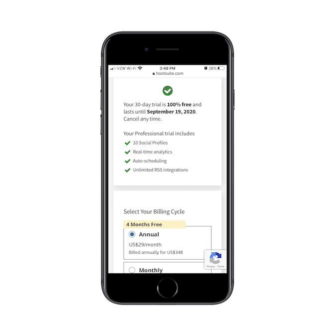
This isn’t the right place for this message. When users are trying to get through a form, just let them get it done and over with. You should display any purchase summaries (including about the free trial) on the final Review/Summary page as one final gut check.
Also, by placing this message here, followed by the plan selection and then the billing section, it makes the page a bit too long.
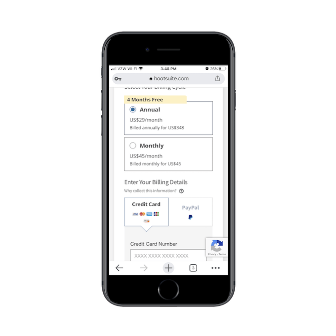
Always break up your forms into logical sections and keep users informed of their progress throughout at all times. The simpler you make each of the steps, the easier it’ll be for them to get through it.
Filling Out the Forms
All that aside, Hootsuite has done a nice job with the technical setup of its forms.
For starters, let’s look at how the keyboards change as users tab through the fields. Alpha fields display the alpha keyboard while numeric fields like “Credit Card Number” display the numeric keypad:

The form always provides pre-written selections when it makes sense to do so, like when selecting Month or Year:
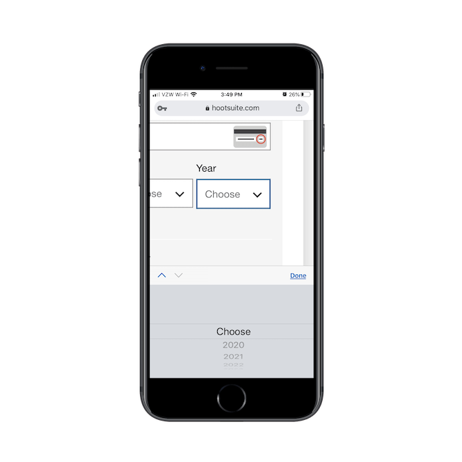
This way, Hootsuite users aren’t required to type out every value. They simply have to scroll through to find the right response. With the scroll bar’s placement in the thumb zone, this makes it very easy for them to quickly move through the list, too.
Error Handling
Another area that Hootsuite’s form excels in is how errors are displayed:
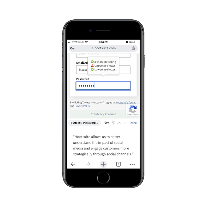
When users incorrectly fill out a field, they’re immediately prompted to fix it and are told what they need to do, as in the example of the weak password above. This saves them the frustration of discovering there’s an error after they’ve submitted the form.
There’s another example of this later on when users enter their billing details:

As users tab through the fields and the cursor lands on “ZIP Code”, an error message appears. This isn’t the best way to handle it since the user hasn’t even filled in the field yet. However, it’s still nice to see how immediately responsive the form is.
I’d recommend fixing the timing of the error message and also the consistency with how it’s displayed. Either use the pop-up error message (like the password example) or display it in-line with the field (like the ZIP Code one).
Repairing Apple’s Checkout Process
Thankfully, Apple customers aren’t required to visit their always-busy stores in order to buy their products. They can do so from the comfort and convenience of their devices.
As for how well the checkout process goes on smartphones, it’s got its pros and cons.
Order Review Page
Once a customer finishes customizing their product and places it in their “Bag” (Apple’s version of a cart), they can begin the checkout process.
Apple displays a “Review Order” page, though it’s really just a front for pushing its other products on customers:
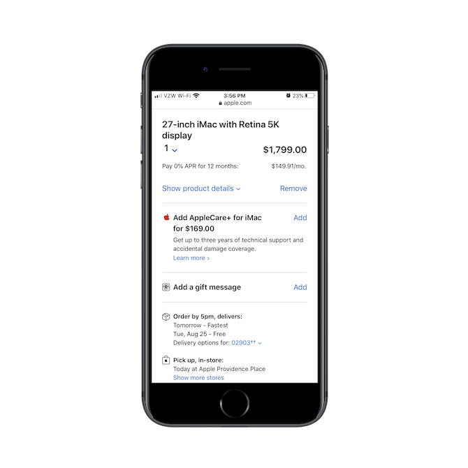
The “Add AppleCare+ for iMac” add-on is displayed in-line with otherwise standard details about an Apple order. Although the price is displayed alongside the add-on, the way it’s built into the page is definitely a dark pattern as it’s meant to deceive those who don’t pay attention to details like that.
Just past the information about delivery or pickup, customers find the actual “Check Out” button (or the alternative option if they want to pay over time rather than in one lump sum).
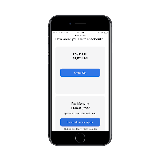
Because these two options don’t fully fit on the mobile screen, users might feel compelled to keep scrolling to see if there are any other options. Instead, what they find are more Apple upsells:
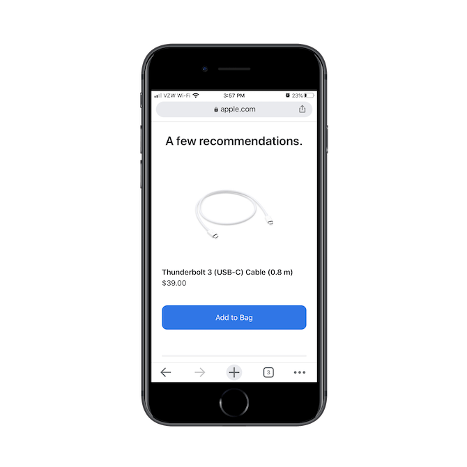
Checkout is not the time to upsell your products. And by making the page twice as long as it needs to be, you’re likely to frustrate your customers once they realize that the only information they needed was within the first two scrolls of the page.
They’ve already decided to buy from you. Don’t push it.
Breadcrumbs
The first official Checkout step is a page that enables users to log in with their Apple ID or to check out as a guest. It’s a typical sign-in page:

One of the nice things about this page is that, if the shopper arrives here on an iPhone, the Apple website detects this and opens a pop-up that asks:
“Do you want to sign in to store.apple.com with your Apple ID?”
For existing Apple customers, this is useful as it allows for one-click sign-in. Your website might not be able to leverage this type of telephony-enabled login, but you can provide other one-click sign-in options through services like Facebook or Google login.
Now let’s focus on the big problem here: Customers have no idea what’s to come in the checkout process. If they’ve been through it enough, they will, but that’s not the case for newcomers.
Breadcrumbs never appear during checkout. Instead, the next step in the process swaps out the Apple website header for a sticky “Checkout” header whenever the shopper scrolls down the page:
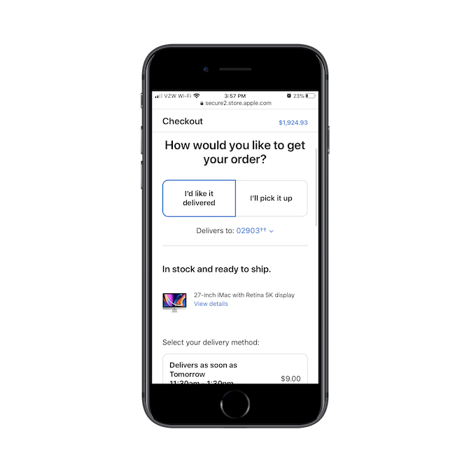
This leaves users without a reliable way to back out of the checkout process without returning to the Apple homepage and starting over. It also gives them no guidance about what’s to come. All they see is how much they’re about to spend on Apple products.
Considering how lengthy each of the pages is, often asking for multiple bits of information at a time, this header really should be swapped out for something more useful.
Shipping Notes
There’s a lot to be nervous about when buying something online, from a mobile device or a desktop computer. Privacy and security, for one. Transparency when it comes to shipping timelines and costs are another. And now there are no-contact concerns, thanks to COVID-19.
This is something that Apple handles well:
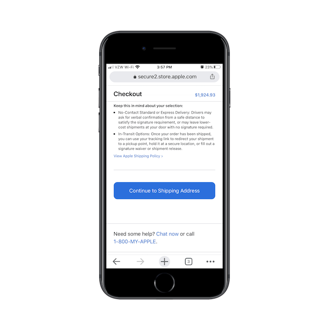
The best time to display any shipping- or pickup-related notice to a customer is when they’re thinking about it. And, in Apple’s case, this is perfectly timed.
While there are three other pages in the Apple checkout process—1) entering contact details, 2) entering billing information and 3) reviewing the order—they’re not worth revisiting here. There’s a lot of overlap between Hootsuite’s and Apple’s checkout forms, so feel free to use the lessons we pulled from Hootsuite as your reference.
Repairing The New York Times’ Checkout Process
I’m including The New York Times’ subscription checkout process here because it’s nearly flawless, and I want you to see how painless a simplified checkout can be.
Account Setup
New subscribers are first asked to create an account. Notice the breadcrumbs at the top that detail how many more steps are to come:
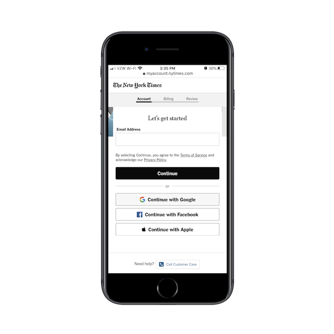
This is always an important first step if you want customers to be able to log in and control their subscriptions, track their orders, buy more products and so on.
The New York Times provides subscribers with a variety of options for account creation:
- Sign up with their email address./li>
- Log in through Google
- Log in through Facebook
- Log in with their Apple ID
Notice the line just above “Continue” that provides subscribers with links to the Terms of Service and the Privacy Policy. Just as we saw with Apple, this is a great example of delivering relevant notices at the right time.
Billing Setup
This is the second step of the checkout process:

Again, The New York Times provides subscribers with a shortcut through the process. This time, it’s by using the express PayPal Checkout option.
If they don’t want to or can’t use that option, they can easily enter their credit card details into the short form below.
Just as you’d want it to, the keyboard changes based on the field the user currently has selected. For instance, this is what appears for filling in “First Name”:

And when they tab over to the “Credit or Debit Card” field, the numeric keypad appears:

For the most part, this is a well-designed form. I’d move the placeholder text out of the “Credit or Debit Card” line (per the NNG guidance we reviewed earlier). I’d also merge “First Name” and “Last Name” into a single field. There’s no reason someone should have to tap their screen an extra time in order to input their surname. Plus, it’s more inclusive to use a single “Full Name” field.
Error Handling
Now, here’s the big flaw I mentioned:
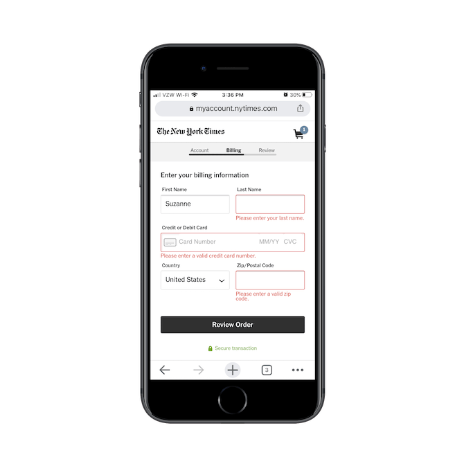
It’s only when subscribers click “Review Order” that these error messages appear. This is no good.
The rest of the form does such a good job of quickly moving subscribers quickly and painlessly through this checkout process. Granted, they can see each of these fields at all times, so it’s unlikely that they’d miss filling one of them out (unless they get distracted by the gray placeholder text). But if there’s any other error in filling the form out, an error could be thrown.
It might not be enough to keep them from converting, but you never know. The New York Times has been around since 1851, so subscribers know what they’re getting into with it. If they can’t say the same for your subscription service, a frustrating checkout hiccup like this could be enough for them to give up.
Order Review
The final step in the checkout process is the order review page:
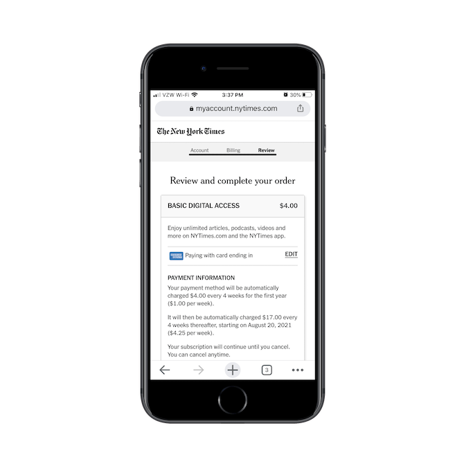
This gives subscribers the opportunity to review their order details once more. They also receive a bit more information about how much they’ll be charged and when.
Just beneath this box, subscribers get further details about the Terms of Sale as well as the Cancellation and Refund Policy:
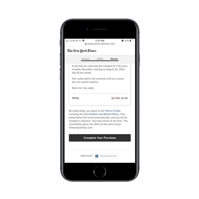
Again, The New York Times only provides subscribers with this information when it makes the most sense to do so. And it does so in a succinct and user-friendly fashion (i.e. linking out to relevant pages instead of bogging down the review page with the details).
Wrap-up
I think the biggest lesson we can take away from this is that, on the surface, your checkout process needs to appear easy to get through. Perception is a big deal with consumers. Think of it like standing in line to check out at the grocery store.
There are signals that might have you wanting to put your item back on the shelf and leave the store for good (like endless lines that don’t move). Or that have you questioning why you’re standing in this line and not the next one over (because the cashier keeps having to ask for assistance).
If your checkout process sends any of the wrong signals, you can expect your shoppers to react similarly.

Suzanne Scacca
A former project manager and web design agency manager, Suzanne Scacca now writes about the changing landscape of design, development and software.
