3 Ways to Improve the Mobile App Experience with Animation

Summarize with AI:
When done right, animations can add a whole lot of value to the user experience—serving as their guide, cheerleader and entertainer. Here are some tips on how you can improve mobile app animations (and some things to stay away from).
There are so many reasons to build animation—no matter how subtle or overt—into a mobile app. It can:
- Make transition screens more tolerable to sit through
- Bring life to a logo, mascot or other branded element
- Add movement to otherwise static elements, like buttons, progress bars and navigation
- Call attention to secondary elements you’re hoping visitors will engage with
- Provide feedback after a desirable or undesirable action has been taken
- Offer a detailed onboarding process that ensures that users engage with it the right way
- Celebrate your users’ progress and wins as they move through the experience
Just keep in mind that animation should always serve a purpose. It should not be the thing that users look forward to most inside the app. It should be the thing that captures their attention for just a bit longer and then drives them to move deeper within the app.
In the following post, we’re going to look at some ways you can improve mobile app engagement and retention with the right kind of animation choices.
How to Improve the Mobile App Experience with Animation
When it comes to the technical side of creating animations for your mobile app, I’m going to let Telerik help you with that.
As far as deciding how and when you’re going to use them, though, let’s look at some apps that seem to have that all figured out:
Tip 1: Bring Your Brand to Life
If there’s ever a point in the mobile app when it’s okay to make users wait for a screen to load, it’s on the intro splash screen. Obviously, you don’t want them waiting too long, but it’s not a terrible idea to give them a couple seconds to acquaint themselves with your branding.
That said, your brand logo alone won’t be enough to wow them or to hold their attention. That’s why this is the perfect opportunity to introduce animation into your app.
Let’s look at the difference between an un-animated splash screen and an animated one.
This is the splash screen for the Asana Rebel fitness app:
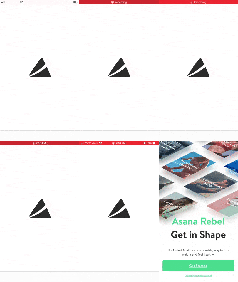
This splash screen is completely static. Users have to sit and stare at the logo for five seconds before the screen quickly cuts to an introduction.
Now, let’s compare that with one of its competitors: Aaptiv.
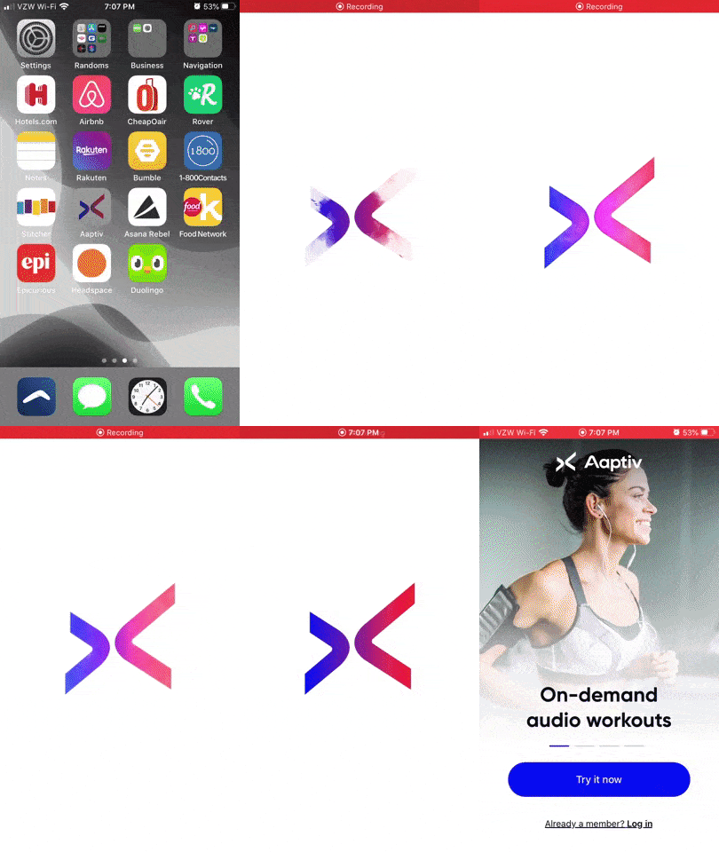
Not only does this splash screen only last about three seconds, but it beautifully introduces users to Aaptiv with vibrant colors that slowly ease in to fill the logo.
If you want to make a memorable connection with your users, animating your branding on the splash screen is a great place to do it. And if it makes sense to, consider animating other branded elements along the way.
Duolingo, for example, uses an animated mascot to keep users engaged. This is the first introduction they get to the Duolingo owl:
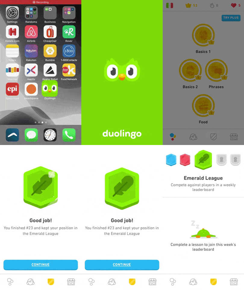
This app is chock-full of animations (mostly for the sake of gamification), but it’s the owl animations that help users form an emotional attachment to the app as it’s both their guide and their cheerleader:
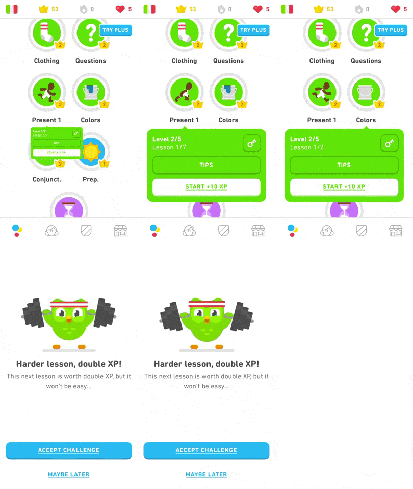
In this particular example, the Duolingo owl encourages users to work harder as it tackles its own challenge of lifting weights.
While it’s great to have an animation that can mask the initial wait time of an app, carrying that animated branding throughout the app can also encourage more engagement when it’s needed.
Tip 2: Don’t Call Attention to Screen Transitions If You Don’t Have To
When covering up a loading screen, you obviously want the animation to make the wait time feel like nothing.
That said, just because you can use animation to stealthily hide a screen that’s queuing up doesn’t mean it’s always needed.
A good way to know whether or not it’s worth adding an animation to your transitions is how easy it is to perceive the animation.
According to the human processor model, the average eye movement time is 230 ms. While some people’s eyes respond more quickly than that (70 ms is the low end), there are some that take a lot longer to notice change on a page (up to 700 ms).
If you’re trying to fill a space that’s closer to 70 ms, it’s probably not worth it to include an animation. Let me show you an example.
This is the Food Network Kitchen mobile app:

Notice how between the chicken and yogurt recipe pages the hamburger icon starts to split apart. However, between the yogurt and asparagus recipe pages, the icon is just an icon.
This animation is inconsistent between pages. Sometimes you can see all of the burger’s components pull apart. Other times, it’s just a random red icon.
In this case, it just seems a waste of server resources. Users aren’t having to wait very long from page to page, so the animated icon might as well be dropped.
Now, travel sites, on the other hand, do have an issue with longer wait times. Users have come to expect this, so it’s generally accepted that they’ll have to wait.
That said, rather than display a boring loading screen or bar, you can make this transition more exciting to watch as in the example of CheapOair:
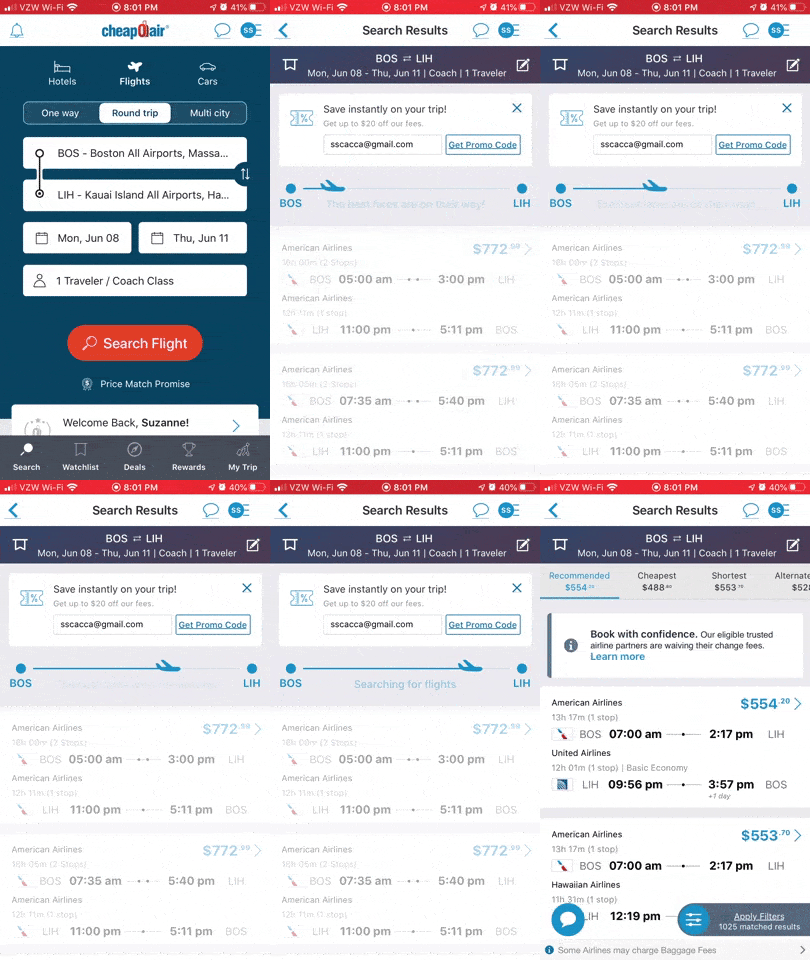
CheapOair users don’t have to sit through a lifeless transition screen while they wait for matching flight options to appear. The app immediately moves them to the flights page, with an animated airplane progress bar to keep them company while they wait for everything to fully load.
If you’re going to make users wait for the next page or for search results to appear, why not make it fun to watch?
Tip 3: Call Attention to Valuable Additional Elements
One of the reasons we use animation is to call attention to elements we want users to engage with. But it’s like Spider-Man’s Uncle Ben used to say:
If you’re going to ask users to pause what they’re doing and “look over here,” it better be of value to them—and not just something you (or the app owner) profits from.
Dating and gaming apps tend to be the most guilty of using self-serving animations. Not all of the time, but some of the time anyway.
Take Bumble, for instance:

The app has some innovative and beautifully executed gestures. That said, do you see that bouncing blue button in the bottom-right side of the screen? Right in the thumb zone?
That animated button serves no purpose to the user in terms of deciding whether they want to match with the other user onscreen. Instead, it’s a distraction—and one that I bet is accidentally clicked often—that tries to pressure users into spending money on the otherwise free app.
If you want to keep your users happy, make sure you’re calling attention to extra elements that improve the experience and don’t just put more money in your pocket.
For example, this is the Daily Themed Crossword Puzzle app:
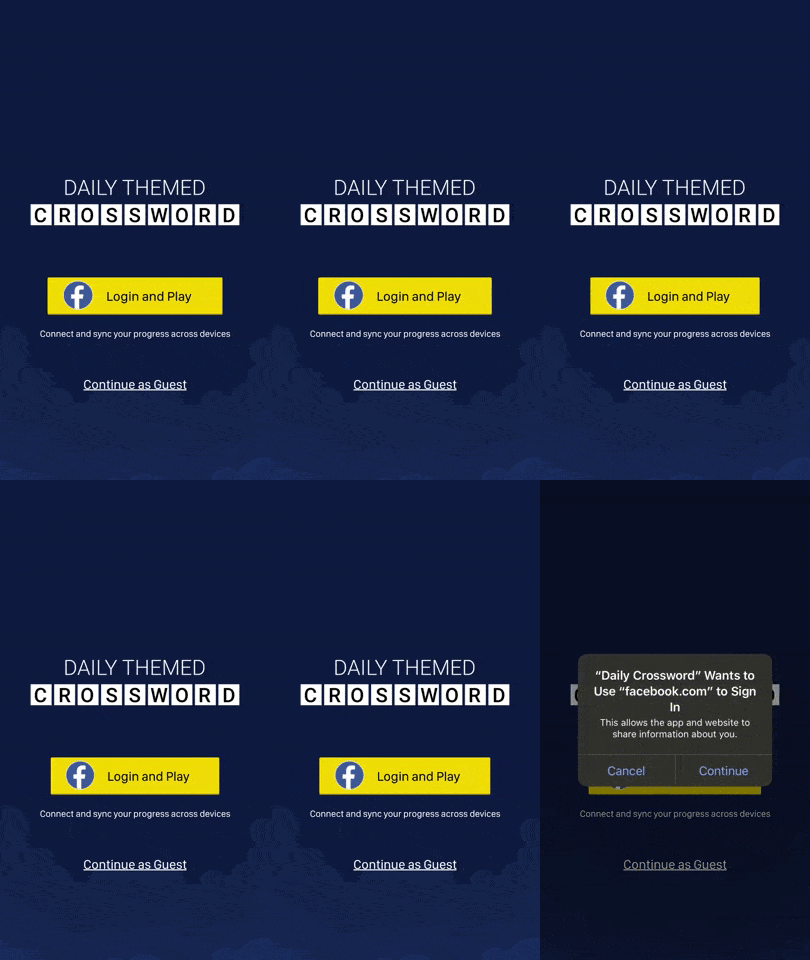
This is the screen new users see when they open the app. The options are simple:
- Login with Facebook
- Continue as a guest
But if users login with Facebook, they get the added benefit of being able to play alongside their friends and to save their gaming progress. This is why the Facebook button option is animated. It’s the more valuable option of the two.
You can also animate secondary buttons in your app the way Epicurious does:
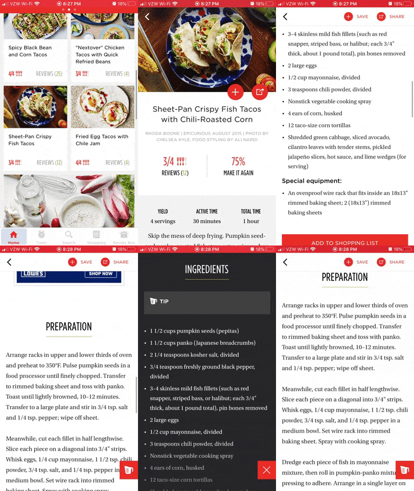
When a user enters one of the recipe pages, they see the cover image, title and start of the recipe. When they start moving down the page, however, three useful (but secondary) buttons are gently eased into view.
The first two move out from underneath the cover image and stick to the top of the page (“Save” and “Share”). The third is the ingredient button that moves into view in the bottom-right corner of the page, making it easy for users to quickly get the list of ingredients to create the recipe.
Because it’s so gently done, these buttons might not get noticed right away. However, they’re there and within convenient reach for anyone who wants to use them.
Wrap-up
Bottom line? Animation can do great things for app engagement and user retention. However, if that animation doesn’t serve a purpose, it’ll most likely have the opposite effect.
When considering animation for your mobile app, really think about:
What it adds to the user experience and…
What it might possibly take away from the experience.
If the benefits outweigh the drawbacks (like slower loading times, negative brand perception, wasted UI, etc.), give it a go!

Suzanne Scacca
A former project manager and web design agency manager, Suzanne Scacca now writes about the changing landscape of design, development and software.
