Design Mistakes You’re Making with Your Mobile Forms (and How To Fix Them)

Summarize with AI:
Mobile visitors are still reluctant to take action. Redesign your mobile forms and remove the friction and ensuing frustration that keep your visitors from reaching out or buying something.
More and more users are gravitating toward the mobile web, both in the form of mobile websites and progressive web apps. And while Google keeps telling us to build mobile-first web experiences, there’s just one problem:
Mobile users continue to be reluctant when it comes to converting on mobile.
Today, I’d like to look at how you can improve the design of your forms on mobile. Perhaps if we can speed up and otherwise improve the way mobile users connect with brands (or buy from them), we can fix this issue of low mobile conversion rates.
Designing Better Forms for Mobile
Although Kibo’s quarterly benchmark reports only measure ecommerce performance, I still consider it a good reference for what’s happening on the web today. And in its latest report, Kibo continues to report an alarming trend.
Consumers are flocking to mobile websites and PWAs in droves—more than ever before. That’s the good news.

In Q4 2020, only 32.49% of visits were on desktop. Mobile, on the other hand, was responsible for a much larger share of traffic, with 53.55% of visitors coming from smartphones.
Unfortunately, conversion rates don’t reflect the same trend. Although it’s clear that consumer trust in the mobile experience is growing, they can’t quite get over that final hurdle, as evidenced by the following data:

Sadly, conversion rates are much lower on mobile, despite the much larger number of mobile visitors than desktop.
There are probably a number of factors that contribute to this disparity. One is slower speeds and greater security risks on mobile. That said, the development of PWAs has done a much better job of dealing with those problem areas.
Honestly, it’s more likely that it’s just too difficult or tedious to convert on a smaller screen.
So, here are some things you can do to make the act of filling out forms to contact, schedule, try or buy easier on mobile:
1. Make the Form Easy to Find
Instead of focusing solely on fostering email relationships with paying customers, brands can use other forms to strategically build relationships with visitors and leads through email. One of the most popular ways to do this is by offering a newsletter.
But what happens when the form is hard to find?
Take this one on the Entrepreneur website:
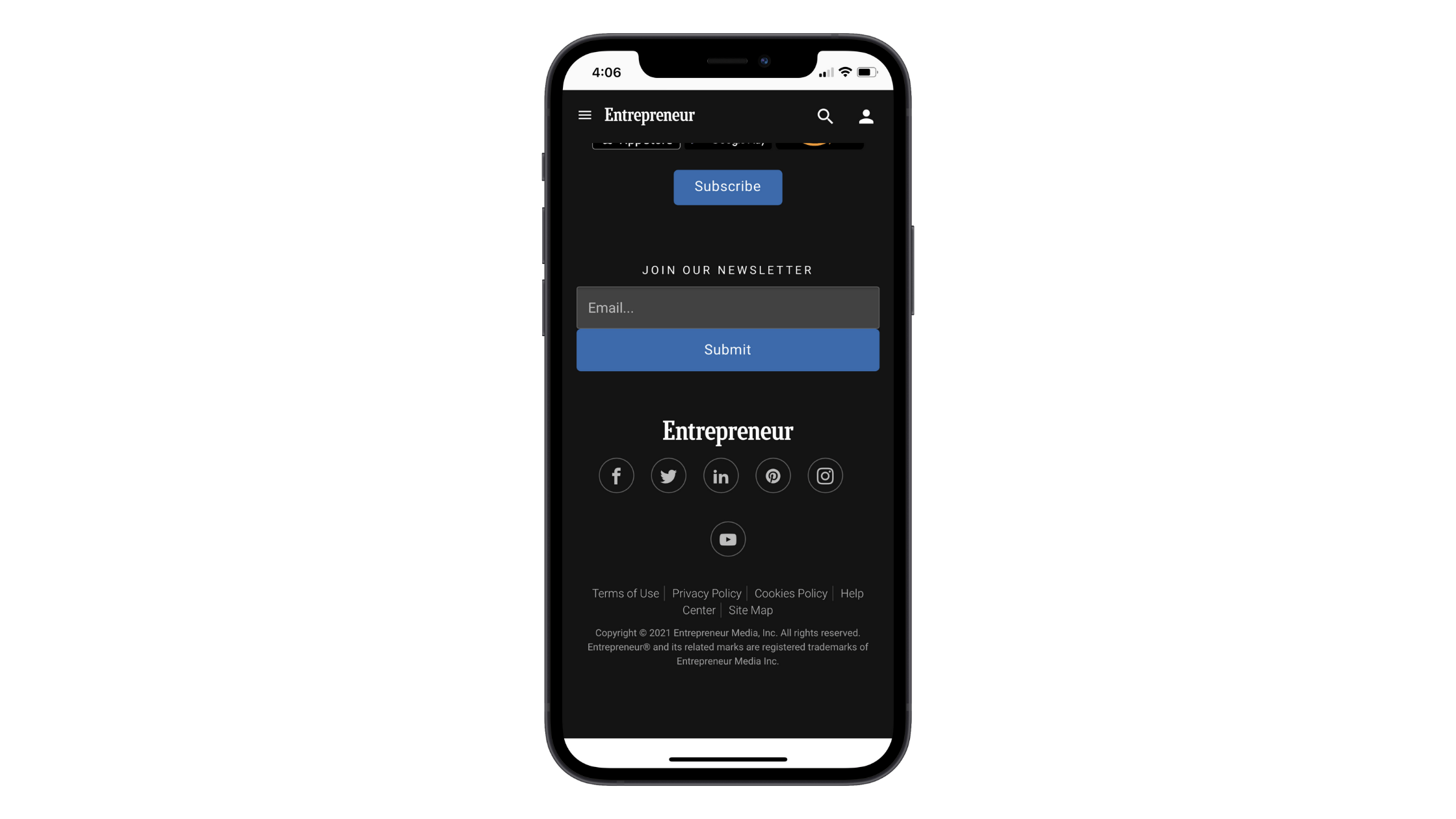
While the big blue button may help visitors spot the form, I worry that it blends too much into the dark theme. What’s more, this form appears in the footer of the mobile website—which takes a lot of scrolling to get to. If your mobile form signup rates are low, the issue could be as simple as placement.
You’ll find a better example of the same kind of subscription form on the Moz mobile website:

This newsletter form actually gets its own page. That doesn’t need to happen with every form on your mobile site, as you could just as easily place this particular screenshotted section into a dedicated space on the home page. However, this option shows you how much more inviting this form is when given space to breathe.
Moz takes the time to make this form a warm and welcoming invitation. It then makes it perfectly clear where the form field and button are. There’s no blending or hiding of the form elements. It’s all out in the open.
2. Assume That You Have to Spell Everything Out
It’s very easy to disrupt the mobile experience. Show a pop-up at the wrong time. Place a button too high up on the page. Use low-contrast colors. Sometimes, it’s just the tiny hiccups that create friction in the mobile experience. And your forms are full of tiny “things.”
Let’s look at the way text is presented and how that might slow someone down while filling out a form or create frustration when there shouldn’t be any.
This is a newsletter subscription form on the Pure Formulas site:
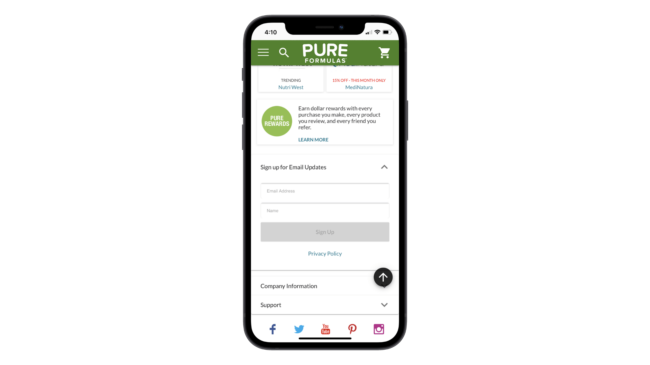
There are a couple of issues with the text. But let’s focus on the lack of context for now.
To start, there’s no description. In other words, what will subscribers get when they sign up:
- Email updates about new products?
- Personalized recommendations?
- Exclusive discounts?
All it takes is just a sentence or two to explain why it’s worth it to exchange one’s contact information for these emails. Without that, it’s much easier to pass on this offer.
There’s the matter of how the labels are handled. They should never be inside the fields, but rather directly above them. That way, there’s no risk of someone placing their cursor within the field, losing sight of the label and forgetting what they needed to fill out in the first place. Granted, this is a simple enough form, so that’s not likely to happen here, but you never know.
The Vitamin Shoppe has a better example to follow:
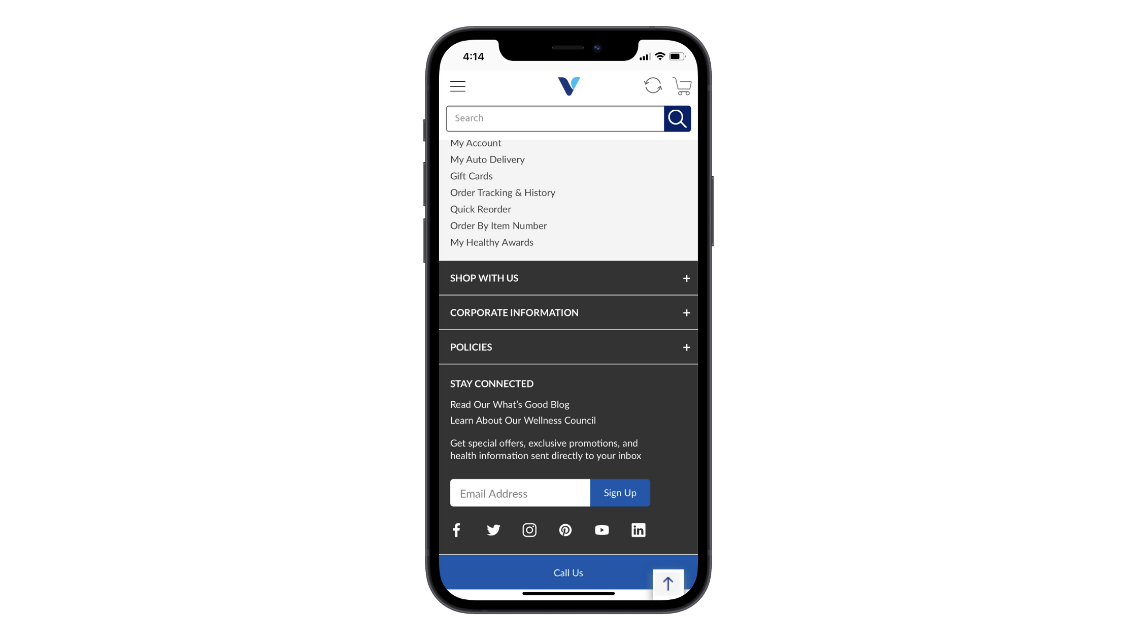
Granted, The Vitamin Shoppe puts the “Email Address” label inside the field. That said, it provides useful information above the form that lets visitors know what they get in return.
As a best practice, I’d recommend providing some context for any of your mobile forms. It’s not as though your visitors don’t know how to fill out online forms. However, there are certain elements of a form that differ from site to site. Plus, it’s never a bad idea to set expectations and let them know what will happen after they click the button and send their submission through.
3. Strengthen Error Validation
It’s annoying when you take the time to fill something out only to realize you missed a field or did something wrong. No one has time for poor error validation when it comes to forms, mobile or otherwise.
Yet, when someone fills out the subscription form on the Nielsen Norman Group website and something’s gone wrong, they never hear about it.
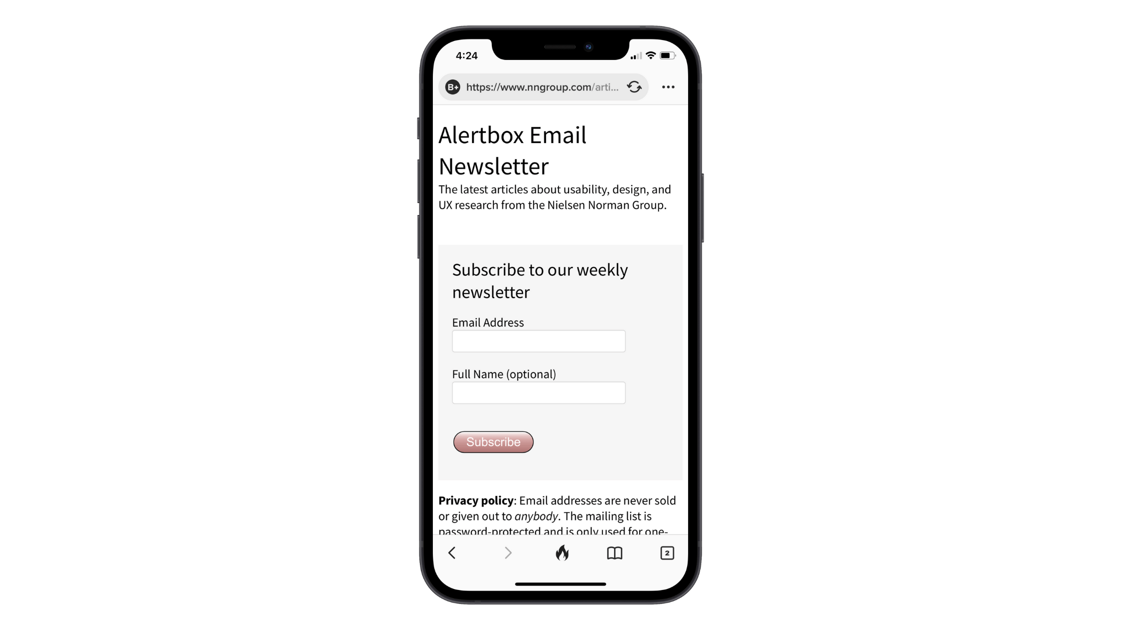
When a visitor fills out the form, there’s no validation provided. In the example above, the only info I provided was a single letter in the “Name” field. When I clicked the “Subscribe” button, the submission went through without issue and without a confirmation message either. To be honest, I’m not even sure if this form works … and that’s not the response you want anyone to have to any of your forms.
Instead, your form should always provide validation while the form is being filled out. If you want, you can model your form’s validation after Salesforce’s:
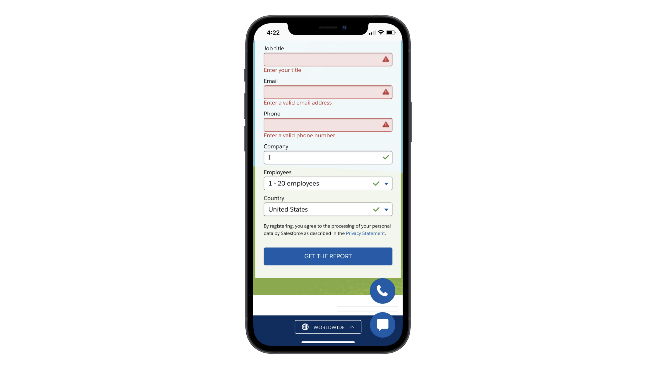
This is a signup form for a Salesforce report. When a field is skipped or improperly filled in, it turns red, shows a warning icon and displays a message that prompts the visitor to fix the issue. When a field is correctly filled in, a green checkmark appears.
This strategy is great since it not only uses color to provide quick validation to visitors, but it also uses text and icons for accessibility purposes.
For more time-consuming forms, you might want to build in a failsafe as well.
To do this, you’ll need to make the submit button inactive until all fields are correctly filled in. The second all fields are completed and issues fixed, the button will go from an inactive design (usually gray or faded and unclickable) to active (brightly colored and clickable).
4. Oversimplify with Automation
The less work your visitors have to do—clicking, scrolling, backtracking, etc.—the more confident they’ll be when it comes time to click the button at the end of the form.
When possible, use automation and other simplification steps to help them along.
For example, this is a form on the Booking.com website:
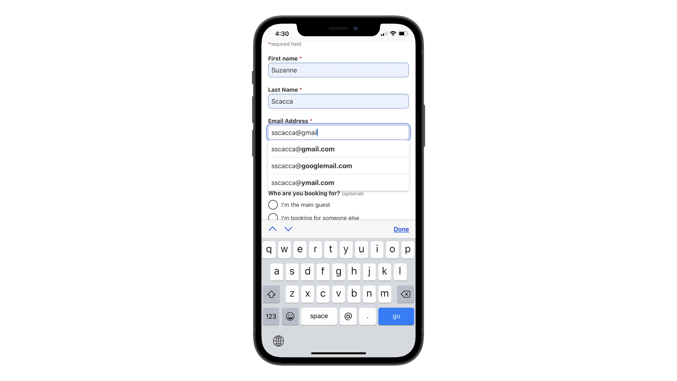
With the “Email Address” field selected, I began to type my email address. When I got to the “@”, it gave me a number of autofill options, which spared me the trouble of having to type out the rest of it.
Automatically switching the keyboard per field is another crucial feature to include in every form you design. That way, users don’t have to worry about capitalizing names, locating the number pad for phone numbers or typing out “@gmail.com” every single time.
There’s another way to simplify the way your mobile forms get filled out.
When you have something with a time/date component, you can do as Massage Envy has done:
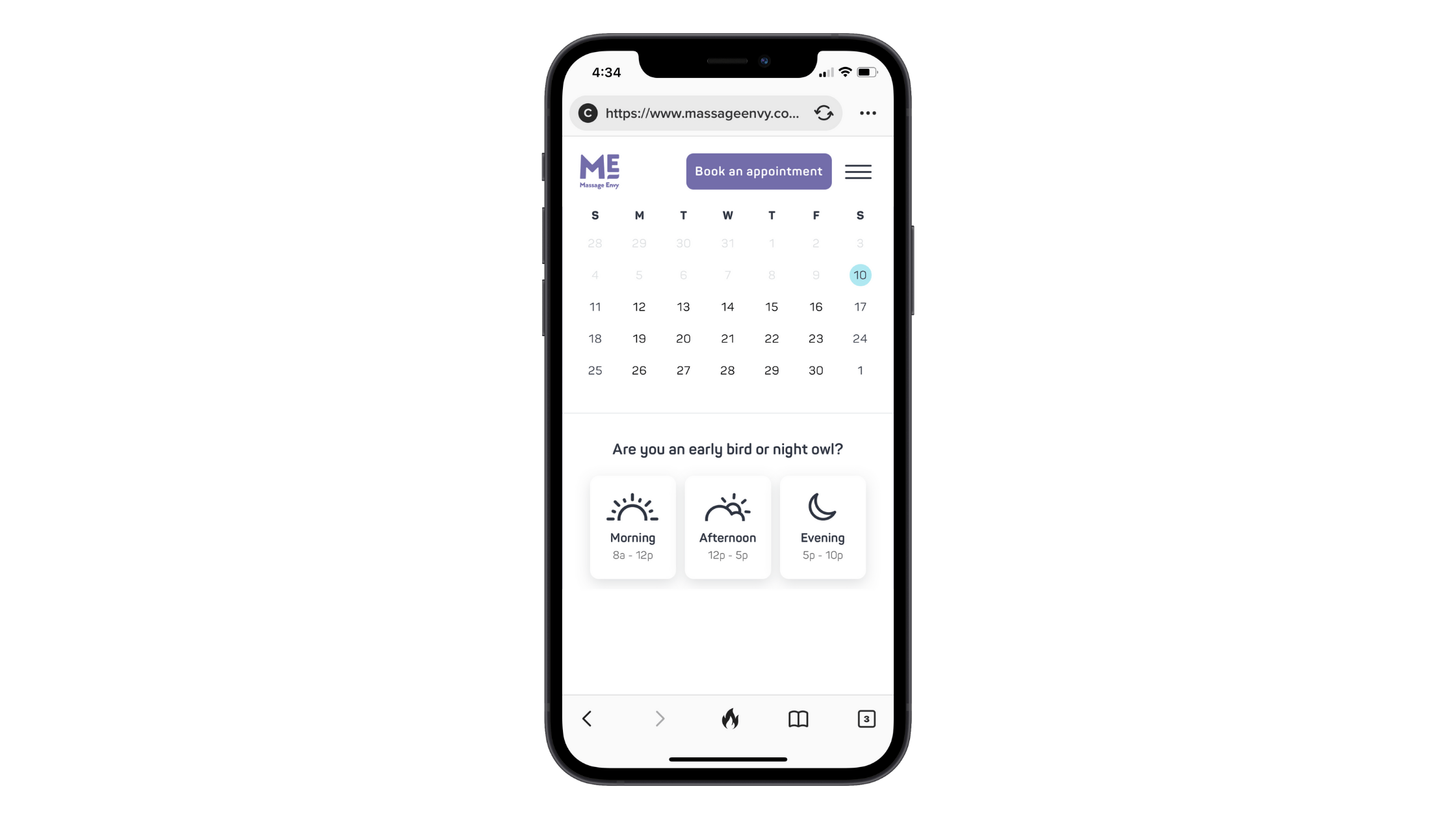
This form does away with traditional fields altogether. When asking guests to choose a date, a calendar is presented to them with available options. And, below that, there are buttons with available time ranges.
This way, guests don’t have to switch between their own calendar and this app in order to make a reservation. It’s built directly into the form for them. What’s more, the time slot buttons and the filters/sorting available on the next page reduce the number of options they have to choose from:
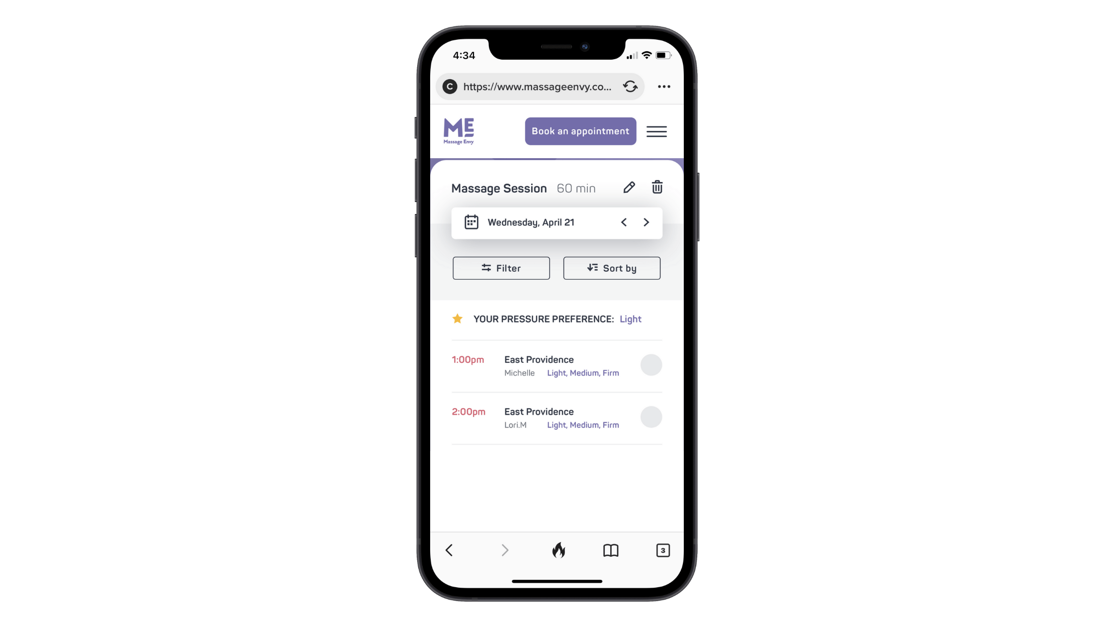
There are, of course, other ways to simplify how much your users have to input into your mobile forms. Take checkout forms, for instance. Rather than force them to type out their billing and mailing address since they’re likely to be the same, just include a checkbox that duplicates the information.
Bottom line: Give your visitors and customers a helping hand whenever you can. While it’s definitely important to start with a great-looking form, none of that will mean anything if they’re constantly wasting clicks and time with an inefficient form.
Wrap-up
With users so reluctant to convert on mobile, we must do everything we can to remove the obstacles standing in their way. Think about what a big difference that would make for visitors who would otherwise enter your site on mobile and finish the experience on desktop (if they even remember to do so).
By designing your forms to be as easy to fill out as they are on larger devices, you’ll only add to the growing list of reasons why mobile is best for the user experience.

Suzanne Scacca
A former project manager and web design agency manager, Suzanne Scacca now writes about the changing landscape of design, development and software.

