
Component Development with Storybook and KendoReact

Summarize with AI:
Storybook provides a great environment for experimenting with UI components in isolation and through a variety of different configurations. In this article, I'll show you how to get started with Storybook, highlight a few add-ons, and showcase a Storybook built for KendoReact.
I've been working with Storybook for the past few months. I've found it to be an excellent environment to test UI components in an isolated manner. But, what exactly is Storybook? From Learn Storybook:
Storybook is a user interface development environment and playground for UI components. The tool enables developers to create components independently and showcase components interactively in an isolated development environment.
It's understandable why you would choose a tool like Storybook when working with components – especially if you're building components yourself. Assume a typical web application built with a number of components:

In an application like this, many components work together. In some cases, there's some underlying data that's shared by these components. In other cases, there are messages being passed between them. The application represents a concert symphony with components playing different roles.
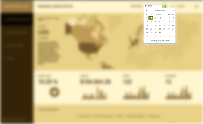
In a scenario where you're building an application like this, it can be difficult to work with components in isolation. Perhaps you're interested in seeing how a component might work with invalid data? Or, you'd like to see how components work with difficult cultures? It's often difficult to pull out these components after the fact. Let's assume you wish to examine a calendar component you have integrated in your application:
How would you go about doing this? Even more, is there an environment that's available that allows you to explore these and other areas of interest that may arise in your examination? As it turns out, the answer is yes. This is where Storybook comes in.
Let's explore how Storybook works. To start, we'll build a Storybook for the Button component of KendoReact. The Button component is easy to understand so it's great for demonstrating how to formulate stories in Storybook.
Getting Started with Storybook
First, we'll use Create React App (CRA) to generate a project that will serve as the basis of the Storybook we'll build:
npx create-react-app storybook-for-kendoreact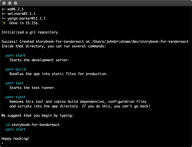
Tip: If you've never used KendoReact before, check out the Get Started page that provides a step-by-step guide, which includes how to start your project by using Create React App.
The next step is to install Storybook into our project through its automated command line tool:
cd storybook-for-kendoreact
npx -p @storybook/cli sb init
The command line tool will inspect package.json, detect that we're using React, and install all React-related dependencies for Storybook:
Once installed, you can run Storybook via yarn:
yarn storybook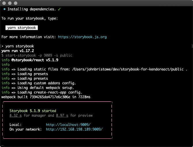
This will load Storybook in the browser at localhost:9009:
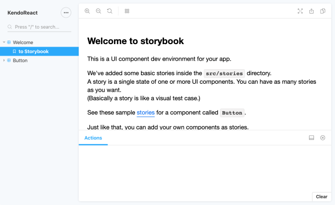
The Storybook User Interface
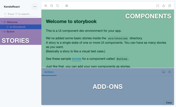
The Storybook user interface is comprised of three (3) primary areas: components, stories, and add-ons:
There are other areas and elements in the Storybook interface but we'll cover those later in this article.
Components render in a separate and isolated area. They are represented through stories, which are like permutations of a component. That is, they are able to represent a component in various states aside from its default one, such as being uninitialized, disabled, bound to an empty data set, and so forth. A robust implementation of a component will consider these states ahead of time.
This is where the value of Storybook starts to become apparent; by constructing stories that target edge cases. Each story that's written is listed in a tree view and can be categorized in groups. Users select stories to see components in various states. Add-ons are a powerful extensibility feature of Storybook and can provide insights into components and users greater control over the Storybook environment.
Storybook includes a set of predefined stories that target an <input type="button" /> element. These stories are listed in the node labelled “Button” of the tree view.
Let's Write a Story for KendoReact
KendoReact is a UI library that's been designed and built specifically for React. It features a huge set of components that are native to React.
For this article highlighting Storybook, let's build out an example of a story using the Button component of KendoReact.
To kick things off, we'll add the @progress/kendo-react-buttons package to the project, which contains many different components, including the Button component:
yarn add @progress/kendo-react-buttons
yarn add @progress/kendo-theme-default
Please refer to the KendoReact Buttons Overview for information and demos featuring the components in the
@progress/kendo-react-buttonspackage.
Now, let's create a story for the Button component of KendoReact. This is accomplished by defining a set of stories that represent various states for the Button component of KendoReact:
import React from 'react';
import { storiesOf } from '@storybook/react';
import { Button } from '@progress/kendo-react-buttons';
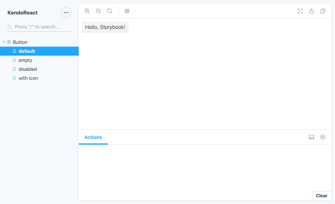
storiesOf('Button', module)
.add('default', () => <Button>Hello, Storybook!</Button>)
.add('empty', () => <Button />)
.add('disabled', () => <Button disabled={true}>Disabled</Button>)
.add('with icon', () => <Button icon="refresh">Refresh</Button>);Here, the storiesOf() function registers the component and uses the first parameter (i.e. 'Button') as the display name in the Storybook. This parameter also allows for delimiters which can be
used by Storybook to structure the treeview that's displayed. (More on this later.) The add() function is used to define a story with a name (i.e 'With Text) and a function that's used to
create the story in Storybook. This function supports an additional argument for a list of parameters but we'll ignore that for now.
Storybook will update itself and display these stories through its user interface:
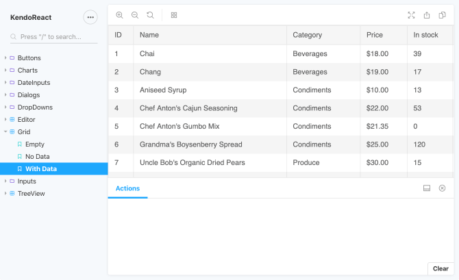
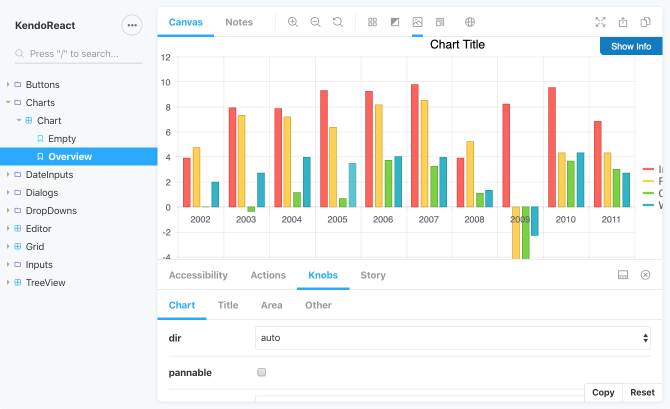
After you've gained some experience with Storybook, you'll be able to build an extensive set of stories that can highlight different many aspects of a component library. Here's an example of a Storybook that features many of the components in KendoReact:
Add-Ons: The Secret Sauce of Storybook
As mentioned earlier, the Storybook user interface is comprised of three (3) primary areas: components, stories, and add-ons. Add-ons are a powerful extensibility feature of Storybook and can provide insights into components and users greater control over the Storybook environment.
Before an add-on can be used, it must be registered in addons.js. This file is located in the .storybook directory which is created by the Storybook command line tool. Registering an add-on is
simple:
// import '@storybook/addon-[name]/register';The Storybook command line tool adds the Actions and Links add-ons to this file by default:
import '@storybook/addon-actions/register';
import '@storybook/addon-links/register';
After an add-on is registered, it may be added to an individual story or globally across all stories in a Storybook. The configuration of global add-ons is done through config.js and varies from add-on to add-on.
Let's take a look at three (3) adds-on to see how they work: Actions, Knobs, and Backgrounds.
Storybook Add-On: Actions
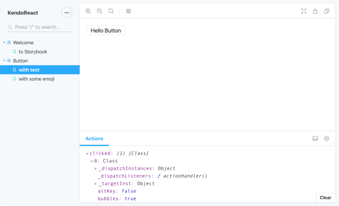
The Actions add-on captures data through event handlers. It provides a similar logging capability to what you'll find in the developer tools for browsers like Chrome. Actions are available through the @storybook/addon-actions module, which provides function for routing data to this add-on.
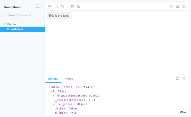
Here's an example using the story defined earlier for the Button component of KendoReact:
import React from 'react';
import { storiesOf } from '@storybook/react';
import { action } from '@storybook/addon-actions';
import { Button } from '@progress/kendo-react-buttons';

storiesOf('Button', module).add('With Text', () =>
  <Button onClick={action('buttonClicked')}>This is the text...</Button>
);
Before it can be used, the Actions add-on must be registered in addons.js of the .storybook folder:
import '@storybook/addon-actions/register';By default, this add-on is registered by the Storybook command line tool.
Storybook Add-On: Knobs
One of my favorite add-ons for Storybook is the Knobs add-on. This add-on allows you to interact with component inputs dynamically through a section of the Storybook user interface. Knobs are available through the @storybook/addon-knobs module and provide a number of functions for different kinds of values.
Defining a knob is easy. Here's an example using the story defined earlier for the Button component of KendoReact:
import React from 'react';
import { storiesOf } from '@storybook/react';
import { text } from '@storybook/addon-knobs';
import { Button } from '@progress/kendo-react-buttons';

storiesOf('Button', module).add('With Text', () =>
  <Button>{text('text', 'This is the text...')}</Button>
);
Before it can be used, the Knobs add-on must be registered in addons.js of the .storybook folder:
import '@storybook/addon-knobs/register';Finally, the Knobs add-on can be applied across the entire Storybook through addDecorator() in config.js:
import { addDecorator } from '@storybook/react';
import { withKnobs } from '@storybook/addon-knobs';

addDecorator(withKnobs);

// additional configuration here...
Decorators are wrapper components that will wrap the stories you write. In this case, we're configuring Storybook to use the Knobs add-on across all stories.
Once the Knobs add-on has been registered and configured to be applied across the entire Storybook, it will appear in the add-ons area of the Storybook user interface:
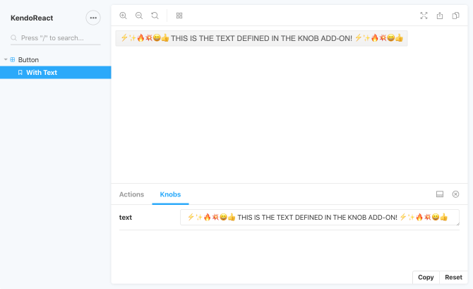
Any updates made to this value will be reflected in the component. This allows users to tinker with various properties of a component and to see how certain values will affect its behavior.
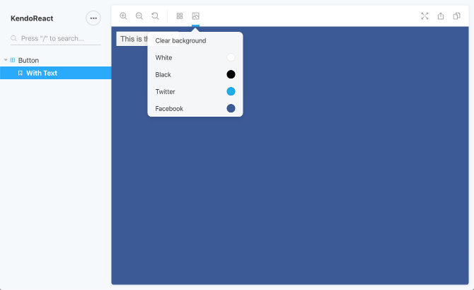
Storybook Add-On: Backgrounds
This add-on adds the capability to change background colors of Storybook and to see the affect those changes have on components. Just like the Knobs add-on, the Backgrounds add-on must be registered in addon.js of the
.storybook folder:
import '@storybook/addon-backgrounds/register';The Backgrounds add-on is configured a little differently than the Knobs add-on:
import { addParameters } from '@storybook/react';

addParameters({
  backgrounds: [
    { name: 'White', value: '#fff' },
    { name: 'Black', value: '#000' },
    { name: 'Twitter', value: '#00aced' },
    { name: 'Facebook', value: '#3b5998' },
  ]
  // additional configuration here...
});
The addParameters() function is part of the Storybook API. It's used to control aspects of Storybook for initialization and runtime configuration. It takes an object literal that can be annotated with a collection of background
definitions. In the snippet above, I've defined four (4) backgrounds by a name and value property that denotes a color. These appear through the Storybook user interface through a separate
element:
Introducing Storybook for KendoReact
Over the past couple of months, customers building applications with React asked to see a Storybook hosting our KendoReact components. Storybook provides a great environment for experimenting with these components in isolation and through a variety of different configurations. And while we provide a , it's not the same kind of environment for testing out features like the one Storybook provides. Thus, Storybook for KendoReact was created:
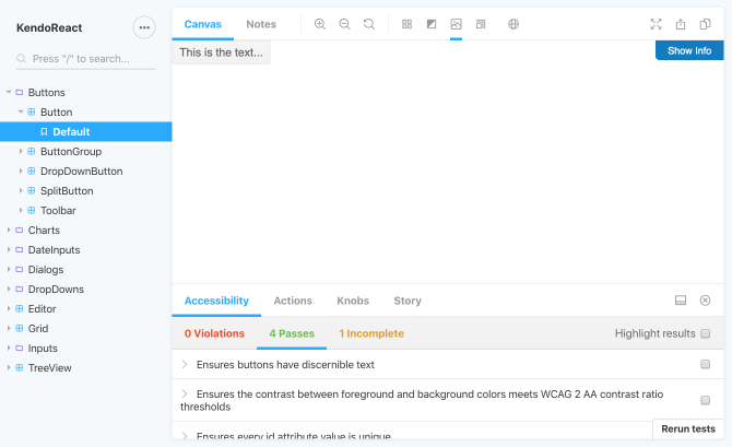
The Storybook features the add-ons highlighted above as well as others like the Accessibility add-on for testing a11y compliance:
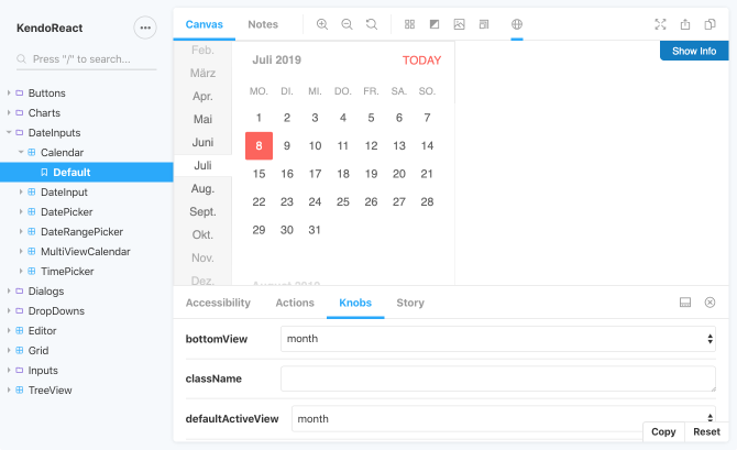
This Storybook hosts many of the components in KendoReact and has a number of integrated add-ons for users to experiment with. For example, there are four (4) locales integrated into the Storybook, which allows you to see how the components respond given
different culture inputs. Here's the Calendar component with a de-DE culture specified:
A live example of this Storybook is available at kendoreact-storybook.netlify.com. The source code for this project is available on GitHub: kendoreact-storybook.

John Bristowe
John Bristowe is a member of the Developer Relations team at Progress. He specialises in web and mobile app development.