
Getting Started with the KendoReact PivotGrid

Summarize with AI:
Pivot tables combine the functions of a data grid with the display of graphs and charts, allowing users an interactive way to explore data. Learn how to get started with the KendoReact PivotGrid today!
The PivotGrid is one of the most powerful components included in the Progress KendoReact library—and with over 100 incredible, accessible components, that’s really saying something!
However, getting up and going with the PivotGrid can feel a little overwhelming at first glance. This is most often the case when developers aren’t familiar with pivot tables in general. Understanding the base concept and use case for a pivot table will greatly help us when it comes to implementation of the specific component. So, let’s break it down!
What is a Pivot Table?
Pivot tables are a kind of complex data grid that allows users to group, aggregate and compare data for specific categories within a larger data set. Because it’s interactive, users can hide, show, filter and otherwise adjust the displayed data using a familiar graphical user interface. This empowers even less technically savvy users to manipulate a large data set in a variety of different ways, so that they can extract the exact information that they need.
Features of the KendoReact PivotGrid
Specifically, the KendoReact PivotGrid was created to support the following user needs:
- Filtering: Users can filter the data in a PivotGrid to display only what’s most relevant to them. This includes not only standard filtering by values, but also filtering with operators (i.e., “contains” or “starts with”), time periods and more.
- Sorting: Users can sort single or multiple columns in the KendoReact PivotGrid, then easily organize the data in ascending or descending order.
- Easy data manipulation via the configurator: Because pivot tables can range from relatively straightforward to extremely complex, the KendoReact PivotGrid comes with the configurator: a list of fields through which users can apply their modifications via an intuitive and user-friendly UI. Developers can customize the configurator to further improve the UX by only showing those tools which are relevant and useful to the users within the context of their specific application.
- Exporting data: Data in the KendoReact PivotGrid can be easily exported by users into either an Excel file or a PDF for quick sharing.
- Visualization of data: It can be challenging to fully understand and see connections in data when it’s exclusively presented in grid form. For that reason, the KendoReact PivotGrid and KendoReact Charts library were created to work in perfect harmony. When a developer integrates the chart of their choice with the PivotGrid, the chart will automatically update as various filters, sorts and other manipulations are applied to the data in the PivotGrid.
Data Binding
Developers can bind data to the KendoReact PivotGrid in two ways: binding to an OLAP cube accessible via HTTP, or binding to local data. For more information on the specifics of binding data to the KendoReact PivotGrid, check out our extensive documentation.
What is an OLAP Cube?
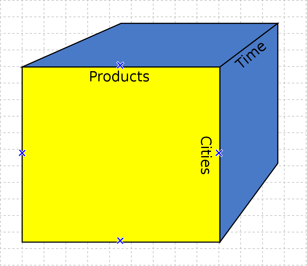
At the core of the pivot table concept is the OLAP cube. OLAP (Online Analytical Processing) cubes are a specific type of multi-dimensional data array. Think of it like a spreadsheet with extra axes. For example, in a traditional spreadsheet the y-axis might be “Products” and the x-axis “Cost,” but what if we also want to cross-compare both of those things over a period of time?
Because OLAP cubes are multi-dimensional, we can add additional “dimensions” of information that couldn’t be represented in a standard spreadsheet. In fact, an OLAP cube doesn’t actually have to be a cube—the “sides” aren’t required to be even and we can have as many as we like.
Setting up the KendoReact PivotGrid
If this is all sounding like the perfect solution for your application, then good news—adding it to your React app is a piece of cake!
Install and import the component.
npm installthekendo-react-pivotgridlibrary, along with the other KendoReact dependencies needed for the PivotGrid.npm install --save @progress/kendo-react-pivotgrid @progress/kendo-data-query @progress/kendo-react-buttons @progress/kendo-react-treeview @progress/kendo-react-data-tools @progress/kendo-react-form @progress/kendo-react-indicators @progress/kendo-react-intl @progress/kendo-react-labels @progress/kendo-svg-iconsThen, import the
PivotGrid,PivotGridContainerandPivotGridAxisinto your React component.import { PivotGrid, PivotGridContainer, PivotGridAxis, } from "@progress/kendo-react-pivotgrid";Define the axes of your pivot table:
 const defaultColumnAxes: PivotGridAxis[] = [
    { name: ['[Date].[Calendar]'], expand: true },
    { name: ['[Product].[Category]'] },
    ];
    const defaultRowAxes: PivotGridAxis[] = [{ name: ['[Geography].[City]'] }];
    const defaultMeasureAxes: PivotGridAxis[] = [
    { name: ['[Measures].[Reseller Freight Cost]'] },
    ];
Define the
catalog,cubeandurl:const catalog = 'Adventure Works DW 2008R2'; const cube = 'Adventure Works'; const url = 'https://demos.telerik.com/olap/msmdpump.dll';Add the component to your JSX and add/define any additional props you might require. The component should look something like this:
 <PivotOLAPService
   catalog={catalog}
   cube={cube}
   url={url}
   defaultRowAxes={defaultRowAxes}
   defaultColumnAxes={defaultColumnAxes}
   defaultMeasureAxes={defaultMeasureAxes}
   >
   {({ pivotProps }) => (
     <PivotGridContainer>
       <PivotGrid {...pivotProps} />
     </PivotGridContainer>
   )}
 </PivotOLAPService>
With just those four steps, you’ll be up and running! After that, you can add one of our themes (or create your own) to style the component, or customize the PivotGrid further if you like. The world is your oyster!
The Data Your Users Need, However They Need It
The KendoReact PivotGrid is a powerful component that allows users to group, aggregate and compare data for specific categories within a larger data set—and then visualize that data in a connected chart or export it to Excel or PDF file formats. While the concept of the OLEP cube can be challenging for those who haven’t worked with it before, taking the time to master it can offer a whole new world of data to your users.
As always, if you aren’t already using the KendoReact library, you can try it out completely free for 30 days. Give it a shot, and see how the user experience of your app could benefit—and how fast your development time could be when complex components like the PivotGrid are ready to use right out of the box!

Kathryn Grayson Nanz
Kathryn Grayson Nanz is a developer advocate at Progress with a passion for React, UI and design and sharing with the community. She started her career as a graphic designer and was told by her Creative Director to never let anyone find out she could code because she’d be stuck doing it forever. She ignored his warning and has never been happier. You can find her writing, blogging, streaming and tweeting about React, design, UI and more. You can find her at @kathryngrayson on Twitter.
Related Posts
Comments
All articles
Topics
Web MobileMobile
Desktop
Design
Productivity
People
