

Summarize with AI:
Learn what R2 2023 release brings to our Progress Kendo UI component libraries.
We’re going to dive right in! Feel free to jump to your favorite library updates:
- Common Release Items
- Kendo UI for jQuery
- Kendo UI for Angular
- Kendo UI for Vue
- KendoReact
- Webinar details for June 9
Common Release Items
Font Icons to SVG Icons
With R2 2023, we performed a change in the default type of icons in Telerik and Kendo UI libraries and components from font to SVG. As part of our ongoing commitment to enhancing product quality, theming mechanisms and Content Security Policy (CSP) compliance, we are gradually transitioning from Font icons to SVG icons.
By eliminating the font icon inline scripts present in themes, we reduced the security risk and improved overall CSP compliance.
Depending on the products you are currently using, you can review details in the listed articles below related to switching to SVG icons or continuing to use font icons if you prefer:
- Kendo UI for Angular Migrating from Font Icons to SVG Icons
- Kendo UI for jQuery Core Migrating from Font Icons to SVG Icons
- KendoReact Core Migrating from Font Icons to SVG Icons
- Kendo UI for Vue Core Migrating from Font Icons to SVG Icons
To learn more, visit the dedicated icon blog post, where we have shared the upcoming changes to Kendo UI products’ themes and icon system, along with the expected benefits and timeline of these changes along with preparation resources.
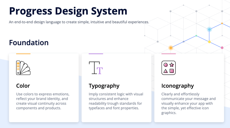
Design System Documentation
One of the standout release items in R2 2023 is the introduction of a design system documentation site, which offers a wealth of resources, design assets and frontend documentation specifically tailored for the Telerik and Kendo UI libraries.
With this initial release, we have included related design and frontend documentation for nearly 20 of the most crucial components. Our ongoing commitment is to continually expand this site, with the ultimate objective of equipping you with all the necessary tools to craft seamless and visually stunning digital experiences and design systems utilizing the power of Telerik and Kendo UI component libraries.
Within the design system documentation site, you will also find documented the initial version of the CSS Utils package, which
is a library of HTML classes scoped to a relevant CSS property. It provides the possibility to style a page layout without writing CSS. For example, if you would like to add a border radius, you just add the class .k-rounded-md to the
element. This will apply styles for medium border radius.
The CSS utils package is built into our Telerik and Kendo UI themes, so when you install one of our themes, you will get CSS Utils package as well. In the case you want to get only the Utils package for styling a page layout, you can also install it separately. You can learn more about installing the package in the dedicated article.
The package capabilities will continue to grow and we plan to add other CSS Utilities such as adding color system, typography or extending our sizing map.
ThemeBuilder Pro
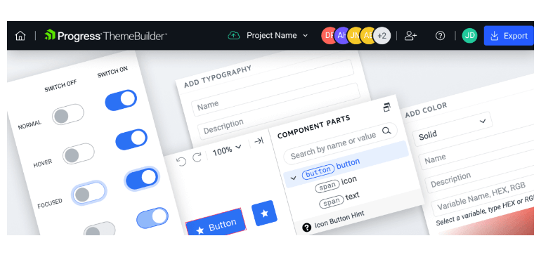
ThemeBuilder Pro brings exciting updates and new features that will enhance your development experience. In this release, we are introducing full customization support for Kendo UI for jQuery and Telerik UI for ASP.NET Core and MVC, allowing you to tailor the UI of your web application to suit your specific needs.
Additionally, we are excited to announce seamless integration with Figma, enabling you to seamlessly collaborate between design and development teams. Our automatic migration feature ensures effortless transition to the latest version of themes, saving you time and effort.
With support for effect variables, custom variable groups and smart linking between variables, managing and editing variables is more intuitive and efficient than ever before.
Moreover, we now provide single sign-on (SSO) support, streamlining access to our platform and enhancing user experience. Lastly, we have introduced granular project permissions, allowing for view, edit and admin access, enabling you to tailor access levels for improved project management. This release is a testament to our commitment to empowering developers and designers with powerful tools and enhanced capabilities. Read more in the dedicated ThemeBuilder blog post.
Adaptive Rendering in Multiple Components
We put a strong emphasis on the adaptive rendering of the Kendo UI components, and in this release, we ensured mobile-friendly rendering of dropdown components in Kendo UI for Angular, Kendo UI for jQuery and KendoReact.
The components that receive this feature include date and time pickers as well as select-type components such as: DropDownList, ComboBox, AutoComplete, MultiSelect, MultiColumnComboBox, DropDownTree, MultiSelectTree, DatePicker, DateTimePicker, DateRangePicker and TimePicker.
Stock Chart Navigator Position
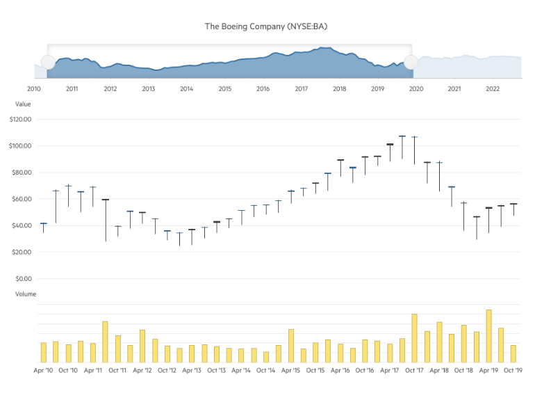
The StockChart UI component has been enhanced with a new property allowing you to position its navigator on top (in addition to the existing bottom position). The feature is available in the following products:
- Kendo UI for Angular StockChart Navigator Top Position
- Kendo UI for jQuery StockChart Navigator Top Position
- KendoReact StockChart Navigator Top [Position]
Accessibility Enhancements, Demos and VPAT
Throughout 2023 we have placed a strong focus on raising the accessibility level of compliance and available resources for all Kendo UI libraries. In R2 2023, we have implemented multiple enhancements in the WAI-ARIA attributes, keyboard navigation, online demos and documentation, as well as VPAT templates for all flavors of Kendo UI—jQuery, Angular, React and Vue. Our next goal is to provide out-of-the box compliance of Kendo components with the new WCAG 2.2 accessibility standard, so stay tuned for more.

Enhanced Forms Rendering
Kendo UI brings a fresh and modernized approach to forms rendering and layout. With this latest update, we have revamped the forms rendering and layout in multiple UI components, including the Data Grid, TreeList, Scheduler, DateTimePicker and more.
The enhanced forms rendering delivers a seamless and visually appealing experience to your users. By incorporating modern design principles and best practices, we have focused on improving the overall aesthetics and usability of forms within these components.
The enhanced forms rendering is available in Kendo UI for Angular, Kendo UI for jQuery and KendoReact.
Kendo UI for jQuery
Data Grid Enhancements
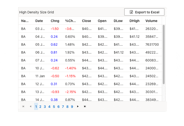
Compact Data Grid Mode
Enhance the visibility and adaptability of the jQuery Data Grid with the newly introduced size parameter. This parameter allows you to customize the DataGrid for smaller devices or handle larger data volumes
effortlessly. By selecting either Small or Medium, not only does the Data Grid resize accordingly, but the inner components such as the Toolbar, Pager and editors also adjust to maintain consistency with the overall styling.
See a demo of the Data Grid sizing option in Kendo UI for jQuery.
Data Grid Enhancements
Row Resizing
The UI for jQuery DataGrid has been enhanced with the option to adjust the row height of the component. By setting the resizable.rows configuration option to true you can enable end users to perform resizing of one or multiple selected rows.
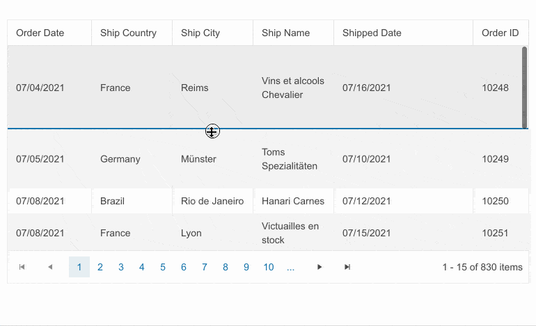
See a demo of the Kendo UI for jQuery DataGrid row resizing feature.
Gantt Component Enhancements
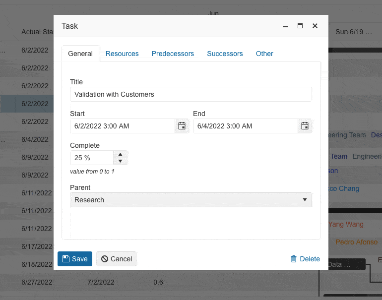
The latest release brings exciting updates to our Gantt UI component, offering enhanced editing and customization capabilities:
- Reorganized edit popup: The Gantt edit popup form now includes tabs for easy navigation and editing of different sections, providing a smoother user experience.
- Full data field configuration: Customize and edit all data fields within the Gantt component, giving you complete control over the displayed information.
- Direct parent task editing: Edit parent tasks directly from the task’s edit form, eliminating the need to navigate to a separate section and simplifying the editing process.
- Integrated dependencies editing: Edit task dependencies seamlessly within the edit form, removing the need for a separate popup window and saving time and effort.
- Custom field management: A new “Other” tab in the Gantt edit popup allows users to find and edit all custom fields, ensuring a cleaner and more organized editing experience.
See the Kendo UI for jQuery Gantt component demo.
Styling and Customization Support of the UI Components Within ThemeBuilder Pro
We’re excited to announce that the latest release of Kendo UI for jQuery includes full customization support within ThemeBuilder Pro! Now, you can take your customization of Kendo UI for jQuery to the next level.
With custom variables for colors, typography, metrics and more, you have the power to create unique designs that truly stand out. From button icons to grid header padding, you can customize every detail of your UI components. Elevate your projects with custom fonts and icons, ensuring consistent and memorable brand identity. Collaboration and sharing options make it easy for you and your team to create beautiful UI components together.
Enhancements in Editor Table Wizard
The table configuration in Kendo UI for jQuery Editor has been enhanced and now provides a smart mode—when users are within the context of a selected table, they can launch either a table wizard or a cell configuration dialog.
The table configuration wizard in the Editor component has been improved and reorganized for convenience of end users into General and Advanced tabs. The General tab includes table, columns, rows and new granular cell properties, plus a new table alignment configuration option allowing tables to be positioned left, right or center. The Advanced tab of the editor table wizard exposes configurations for id and CSS, plus accessibility settings for the table caption, header rows and columns.
The cell configuration dialog provides an option to set cell width, height, margins, paddings, borders and more. Users also have a handy option where they can apply the selected settings to one specific or all table cells.
See a demo of the Kendo UI for jQuery Editor Table Wizard.
Date Editing UX Enhancements
In R2 2023, we introduced multiple enhancements and features related to the date and time UI components for jQuery, namely the DateInput, DatePicker, DateRangePicker, DateTimePicker and TimePicker. In the section below we will review in detail what’s new on a per feature basis.
Auto-Tabbing Improvements
As user preferences and behavior differ when working with dates, we implemented multiple configuration options that allow customizing the behavior of the components when editing and validating datetime values.
Using the new autoSwitchParts option, you can easily enable the auto-tab behavior when editing year, month and date values. You can further specify designated separator, for example slash, dash or column, allowing users to easily tab between the date segments when typing.
Another enhancement is the option enable auto-tabbing by using the mouse wheel. Last but not least, when editing values you can now specify incremental step for increasing/decreasing the date and time values for each of the segments and allow users to adjust them using a mouse wheel.
Auto-Correction of Invalid Dates
Until recently, the default behavior was when a user types in a date like “31/January/2023” and then changes the month to February, the day would automatically switch to February 1. However,
we received feedback from you that there are cases when you need to disable this automatic correction so that the user can continue editing the date and manually change the day part of February. Optionally, you can enable auto-switch to show the last
day of the next month, i.e., February 28.
The new property autoCorrectParts gives you control over the date auto-correction UX. Its value specifies whether the date parts should be automatically corrected to show a valid date or not. The default value is “true,” meaning that the automatic correction will occur. By setting it to “false,” you will allow users to be able to see “31/Feb/2023” in the input field, but the component value can not be set to this and will be either null or default to the value for the DateTime.
To see all new configuration options of the date editing and validation, check out the dedicated jQuery DateInput Date Editing demo.
DateTimePicker Start and End Values
With the latest release, you can also take advantage of the startTime and endTime configuration options in DateTimePicker components, allowing you specify ranges of allowed values.
See a demo of the new settings for start and end date in the jQuery DateTimePicker.
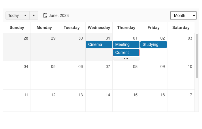
Scheduler Enhancements
Highlight Real-Time Events
We are excited to introduce a new feature in Kendo UI for jQuery Scheduler that will enhance the clarity and visual emphasis of your appointments. With this latest update, you have the ability to highlight
ongoing events by enabling the ongoingEvents.enabled option.
This new feature allows you to easily distinguish events that are currently happening, providing a clear visual representation of ongoing activities within the Scheduler. By enabling the “ongoingEvents.enabled” option, you can ensure that ongoing events stand out prominently, making it easier for users to identify and prioritize their schedule.
Whether you are managing complex project timelines, scheduling team meetings or organizing personal appointments, highlighting ongoing events brings an intuitive and efficient experience to your scheduling tasks.
See an example of highlighting real-time events in Kendo UI for jQuery Scheduler.
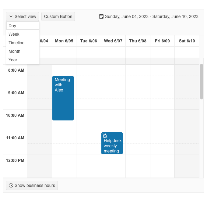
Scheduler Custom Toolbar
R2 2023 brings one more new capability in Kendo UI for jQuery Scheduler that enables you to have full control over the Scheduler’s Toolbar. With the latest release, you can now effortlessly customize
the Toolbar to perfectly align with your application’s requirements using the toolbar configuration option.
Whether you want to add new buttons, rearrange existing ones or customize their appearance, the toolbar configuration option empowers you to effortlessly achieve your desired layout. Simply define the buttons, their order and associated functionalities, and the Scheduler will reflect your custom Toolbar configuration.
See an example custom toolbar within the Kendo UI for jQuery Scheduler component.
Enhanced Demos with Adaptive Behavior
Adaptiveness and responsiveness of the UI components for jQuery has been an important topic within the R2 2023 release and in addition to the built-in settings we shipped, we also were sure to demonstrate the adaptiveness of the components within our demos. You can take a look at the mobile-friendly behavior of the Autocomplete, ComboBox, DropDownList, DropDownTree, MultiColumnBox, MultiSelect, MultiSelectTree, DateInput, TextBox, MaskedTextBox, NumericTextBox and TextArea components.
See a demo of the Kendo UI for Angular Charts drill-down feature.
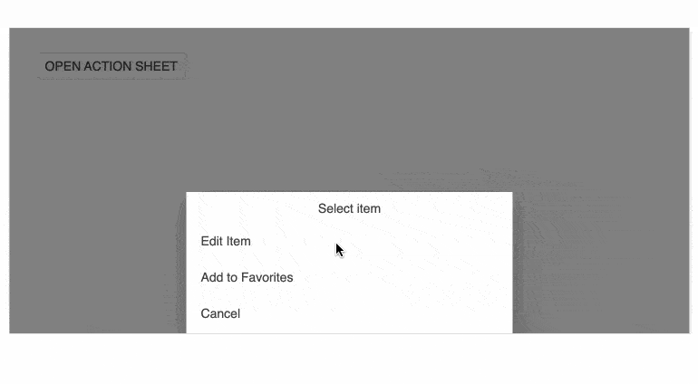
ActionSheet Component Enhancements
The Kendo UI for jQuery ActionSheet component brings a pack with new capabilities to elevate your web application development. In this release, we have focused on expanding the flexibility and customization options for the Actionsheet component, empowering you to create stunning interfaces effortlessly. The new features include:
- Footer template: Allows you to customize the footer of your ActionSheet by adding interactive elements, additional information or action buttons that align perfectly with your application’s workflow.
- Body template: You can effortlessly create visually appealing and informative content within the body of the ActionSheet. Render dynamic data, incorporate rich media elements or even embed custom components to enhance the overall user experience.
- Adaptive behavior: The ActionSheet UI component now includes adaptive design features, ensuring that your action sheets adjust seamlessly to different screen sizes and orientations.
- Fullscreen mode: In certain scenarios, you may want to maximize the impact of your ActionSheet by occupying the entire screen.
- Subtitle support: To provide clearer context and enhance usability, we have introduced subtitle support for the ActionSheet component. Include subtitles for each action to provide additional information or instructions, making it easier for users to understand the purpose of each action.
- Action buttons: Allows you to include interactive elements that trigger specific actions or operations and with the ability to customize the appearance and behavior of these buttons.
- Close Button: We have introduced a close button option for the ActionSheet. Users can now dismiss the ActionSheet easily, allowing them to focus on other elements of your application.
End of Support Announcements
As we continue to evolve and adapt to the ever-changing technology landscape, we want to ensure that we provide you with the most modern and efficient solutions possible.
With that in mind, we have made the decision to deprecate three building parts from the Kendo UI family: Kendo Hybrid, Kendo LESS themes and Kendo components for SharePoint.
LESS Themes Retirement
As announced last year in January 2022, we are confirming that with the current release Kendo UI for jQuery is moving completely to the Sass-based Default, Bootstrap, Material and Fluent themes, and we are sunsetting the LESS-based themes.
With this month’s release, we have officially ended support for LESS themes and they will no longer be included in the distribution of Kendo UI for jQuery, Telerik UI for ASP.NET Core and UI for ASP.NET MVC libraries.
While most of you have migrated to Sass themes, we understand that some are still using LESS themes in their projects. If this is the case, you can continue to use them with your existing packages up until R1 2023 (version 2023.1.117), which is the latest stable version that supports and ships LESS themes. However, if you decide to update to any newer version, please note that starting with the current version onward, our jQuery, ASP.NET Core and ASP.NET MVC libraries will no longer include LESS theme files.
We remain committed to providing a top-notch theming experience for our customers and believe that Sass themes offer superior flexibility and performance. We strongly recommend that customers who are using LESS themes migrate to Sass themes as soon as possible. To assist with this transition, we have provided a detailed guide on why and how to migrate to Sass themes in our documentation.
Kendo Hybrid Retirement
We want to inform you that starting with the R2 2023 release, Kendo UI will no longer ship Hybrid UI components. This means that the current release will be the last one to include Kendo Hybrid in the Kendo UI package.
Our goal has always been to provide you with a comprehensive set of tools and features that cater to your needs. However, as we evaluated the landscape and listened to your feedback, we realized that there is now full parity between components and features offered in Kendo Hybrid and Kendo UI for jQuery. Additionally, we have made significant adaptive and responsive enhancements to the UI for jQuery components.
We understand that technology evolves, and as a result, our customers have expressed a stronger interest in utilizing more modern and current tech stacks such as jQuery, Angular, React and Vue.
We highly recommend planning your migration from Kendo Hybrid to one of the preferred frameworks mentioned above, utilizing the respective libraries: Kendo UI for jQuery, Kendo UI for Angular, KendoReact and Kendo UI for Vue. These libraries offer a wide range of features and components that will meet your application development needs.
If you decide to continue using Kendo Hybrid, you can still do so, but please note that we will no longer provide updates or new features for this component. The latest stable distribution versions of Kendo Hybrid components and themes are available in the R3 2022 release. You can find the necessary package link on our website.
While we will not be actively fixing bugs or addressing issues related to Kendo Hybrid, we will provide one year of support, which includes answering support tickets and assisting with any questions or concerns you may have during this transitional period.
If you encounter any questions or face challenges, please feel free to reach out to our technical support team.
Kendo UI for Angular
New Angular PDFViewer Component
With R2 2023, we bring you a powerful PDFViewer UI component that is designed to enhance the display and interaction of PDF files within your Angular applications, eliminating the need to rely on browser tools for PDF handling.
The Angular PDFViewer component empowers end users with a range of powerful tools to seamlessly interact with displayed PDF files. From intuitive paging mechanisms to robust search capabilities and flexible zoom options, users can effortlessly navigate and explore PDF content right within your Angular application.
By integrating the PDFViewer component into your Angular projects, you can provide a seamless experience for your users, enabling them to effortlessly view and interact with PDF files without ever leaving your application.
See a demo of the Kendo UI for Angular PDFViewer UI component.
Data Grid Aggregation Values Selection
The Kendo UI for Angular Data Grid introduces a powerful new feature that takes data analysis to the next level: Selected Data Aggregates. This functionality allows you to select single or multiple cells or rows within the Grid and calculate various metrics based on the selected data, providing you with valuable insights at a glance.
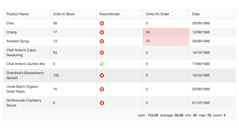
With the ability to select specific data points, you can now leverage the Grid’s built-in approach to display important aggregates conveniently at the bottom of the Grid or create your own elements to showcase the selected data metrics. The Grid supports an extensive range of built-in aggregates for all selected cells, including max, min, sum, average, count, earliest and latest. These aggregates enable you to derive meaningful metrics from your data, such as the highest and lowest numeric values, total sum and average, count of cells, earliest and latest dates.
By incorporating Selected Data Aggregates into your data analysis workflow, you gain a deeper understanding of your data and unlock valuable insights with ease. Whether you require quick summaries or more nuanced calculations, this feature empowers you to extract meaningful information from your selected data effortlessly.
See a demo of the Kendo UI for Angular DataGrid selection aggregates feature.
Data Grid Tabbed Column Menu
The Kendo UI for Angular Data Grid now provides an option for tabbed column menu, providing enhanced flexibility and improved user experience when managing column settings within the grid.
We introduced the view property to the ColumnMenuSettings. By default, the view property is set to “list,” which is the current rendering mode. However, we have now added a second option called “tabbed,” which unleashes the power of the new tabbed view for the column menu.
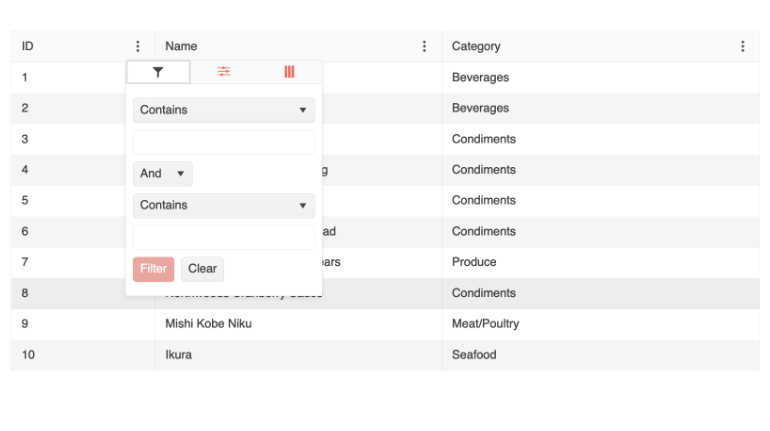
When the view property is set to “tabbed,” the column menu will showcase a sleek and intuitive design with three tabs, each offering specific functionality:
- Filter: This tab provides an advanced filtering menu, empowering users to apply custom filters and refine their data precisely.
- Columns Visibility: This tab offers a convenient column chooser, allowing users to control the visibility of each column and customize their grid layout.
- More: Under this tab, you can configure additional data grid operations, including sorting in ascending or descending order, autosizing columns individually or all at once, rearranging column order and more.
See a demo of the Kendo UI for Angular DataGrid tabbed column menu.
Data Grid Selection Enhancements
Now, you can enjoy increased flexibility by performing range selection in the Kendo Angular Data grid:
- Perform range selection when not all items that should be selected are currently rendered and/or available on the client
- Customize the shift-click range selection behavior
- Enable adding items to the current selection through the keyboard
DataGrid and TreeList Row Reordering
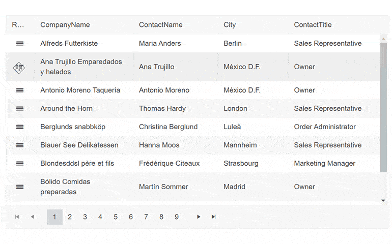
The row reordering feature enhances the rows of the Grid and TreeList components allowing them to be shuffled on demand with a drag and drop of a specified hint element. To enable the row reordering, set the rowReorderable property of the Grid/TreeList to true and define a RowReorderColumn.
See a demo of the Kendo UI for Angular row reordering in DataGrid or in TreeList.
Data Grid Printing Demo
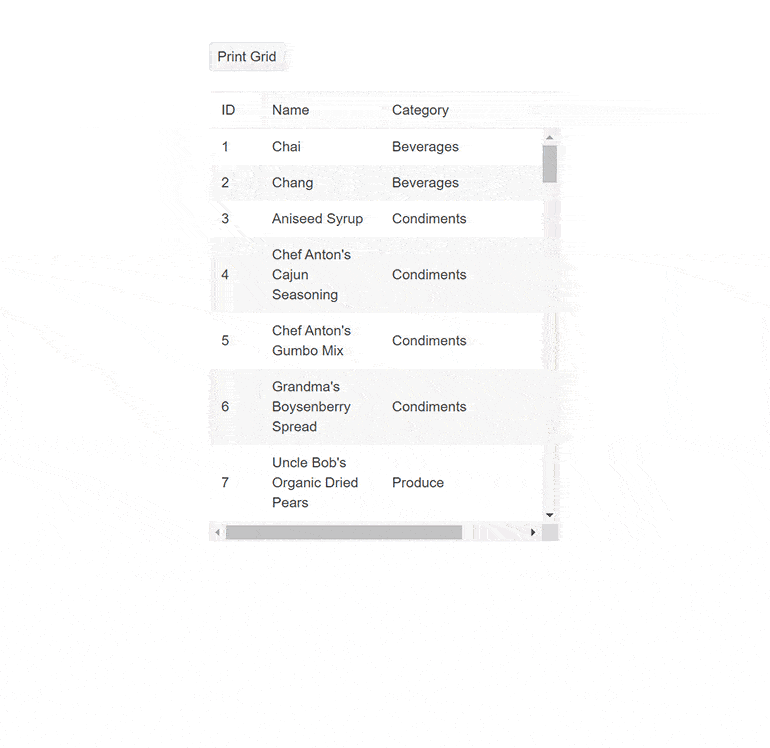
The printing demo shows you how to build a printer-friendly Data Grid component. It works with both scrollable and pageable grids—you’ll have to disable the corresponding scrollable or pageable parameters and remove any predefined grid sizing. The demo code modifies the grid styling for print and then reverts it back once printing is done.
See a demo of the Kendo UI for Angular built-in print in Grid.
Drill-Down Data in Kendo Angular Charts
Another highlight from R2 2023 for Kendo UI for Angular is the new built-in feature Drill-Down in Charts. This powerful capability allows you to delve into multi-level data by simply clicking on a point in the chart, you can seamlessly navigate to the next level of data, unlocking deeper insights and uncovering hidden patterns.
With the chart drill-down feature, you have the freedom to explore data hierarchies effortlessly. Imagine starting with a chart displaying data at the “Country” level, and with a single click, you can drill down to explore data at the “Region” level, and further down if needed. This seamless navigation enables you to dig deeper into your data and gain a comprehensive understanding of complex relationships.
To enhance the user experience, the Drill-Down feature incorporates a navigation control, typically represented by a stylized breadcrumb. This navigation element provides shortcuts for easily traversing back and up to the top-level chart, allowing you to effortlessly navigate through the various levels of data exploration.
To ensure clear visual cues, the Drill-Down feature includes an indicator that highlights clickable points within the chart. This indicator intuitively communicates to users that they can interact with specific data points to drill down and access deeper levels of information.
See an example of the drill-down option in Kendo UI for Angular Charts.
ActionSheet Component Enhancements
The Kendo UI for Angular ActionSheet component has received exciting updates, enhancing its flexibility and customization options. The latest features include the ActionSheetTemplate, allowing complete content override for greater control over appearance and functionality. With the cssClass input property, you can now customize the component’s styling to seamlessly blend with your application’s design. The addition of animations brings a visually appealing and engaging experience for users.
The expanded input property enables you to set the initial state of the ActionSheet as expanded or collapsed, while the expandedChange event notifies any changes in the expanded state. Take advantage of the expand/collapse events to trigger custom actions when the ActionSheet expands or collapses. Moreover, the new toggle method allows programmatically toggling the expanded state of the ActionSheet.
Gantt Component Popup Edit Form Enhancements
The UI for Angular Gantt popup editing form of the component endured some quality-of-life improvements and refreshed UX related to its command buttons, alignment and usage of icons.
See a demo of the Kendo UI for Angular Gantt popup editing form.
Updated Actions Layouts in Dialog Component
In the Dialog component, we’ve updated the behavior of the actionLayout by modifying the existing options from: normal, end, stretched to start, center, end, stretched. This adds the new center option and changes the “normal” option to “start,” keeping the same behavior.
Drag and Drop Utility Upgrade—Drag and Drop Targets
Drag and Drop Utility now allows you to specify DragTargetContainer to a container element, enabling you to configure multiple elements within а container as drag targets. Correspondingly, you can apply DropTargetContainer, which would enable you to set multiple elements within a container as drop targets.
See a demo of the Kendo UI for Angular Drag and Drop Drag targets.
Enhanced Demos with Adaptive Behavior
Adaptiveness and responsiveness of the UI components for Angular has been an important topic within the R2 2023 release and in addition the built-in settings we shipped, we also ensured to demonstrate the adaptiveness of the components within our demos. You can take a look at the mobile-friendly behavior of the DateInput, TextBox, MaskedTextBox, NumericTextBox and TextArea components.
Support for Angular 16

We are delighted to announce that Kendo UI for Angular has taken a leap forward by adding support for the highly anticipated Angular 16. With this exciting release, we empower developers to leverage the latest features and enhancements introduced in Angular’s newest version while enjoying the rich and robust UI components of Kendo UI.
Angular 16 brings a host of exciting improvements, including enhanced performance, new capabilities and improved developer experience. By extending our support to Angular 16, we ensure that you can take full advantage of these advancements and deliver cutting-edge applications with ease.
Kendo UI for Vue
New Native Vue Components: GridLayout and StackLayout
The Kendo UI for Vue shipped two powerful layout components that simplify the process of organizing and aligning elements within web applications: GridLayout and StackLayout.
The GridLayout component provides developers with a convenient solution for arranging components on a grid structure comprised of rows and columns. By utilizing the grid’s coordinate system, developers can precisely position components within individual cells, making it straightforward to create well-structured layouts.
This component is especially beneficial for developers transitioning from desktop application development to the web, as it emulates the functionality of Windows’ GridPanel component. With its intuitive interface and flexibility, the GridLayout component enables developers to effortlessly create visually appealing and responsive web application layouts.
On the other hand, the StackLayout component, also known as Telerik StackLayout, focuses on aligning multiple elements in a stack, either horizontally or vertically. This component offers various orientation options, allowing developers to easily customize the arrangement of elements to meet their specific layout requirements.
Additionally, the StackLayout component provides features such as alignment and spacing options, enhancing its versatility in streamlining web application layouts. With its comprehensive set of tools, developers can create cohesive and visually pleasing stacks of elements, ensuring a seamless user experience.
In summary, the Kendo Vue framework offers both the GridLayout and StackLayout components, providing developers with powerful and user-friendly tools for organizing and aligning elements within their web applications. Whether it’s the precise positioning of components on a grid or the alignment of elements in a stack, these components empower developers to create visually appealing and responsive layouts effortlessly.
See a demo of the Kendo UI for Vue GridLayout component or the StackLayout component.
New Native Vue DropDownTree and MultiSelectTree Components
The Kendo UI for Vue DropDownTree is a form component that renders data in a tree-like structure and lets you choose a single predefined value. Similar to the DropDownTree, the Kendo UI for Vue MultiSelectTree is a form component that renders data in a tree-like structure with the difference that it allows for multiple selection.
Both DropDownTree and MultiSelectTree come with a large number of built-in features including:
- Data Binding: Allows you to effortlessly connect your data sources and bind them to the dropdown tree.
- Filtering: Finding the desired items in a large dataset is made effortless with built-in filtering functionality and users to quickly search and filter the tree nodes, narrowing down the options and enabling efficient navigation within the hierarchical data structure.
- Forms support: Allows you to use the components with HTML form elements or with the Kendo UI for Vue Form component.
- Custom rendering: You can customize the rendering of the dropdown tree elements.
- Keyboard Navigation: Offers seamless keyboard navigation support, allowing users to interact with the tree using familiar keyboard shortcuts.
- Accessibility: Built-in accessibility for screen readers and supports WAI-ARIA attributes.
See a demo of the Kendo UI for Vue MultiSelectTree component or DropDownTree component.
Popup Selection Event in AutoComplete Component
The AutoComplete component in Kendo UI for Vue now exposes a new Popup Selection event, which is triggered when a user selects an item from the AutoComplete’s dropdown menu. This event allows you to respond to the user’s selection and perform any necessary actions, such as updating other UI elements, making API calls or handling data manipulation.
New Events in DateTimePicker Components
With the newly added Open/Closed events in the DatePicker, DateTimePicker, TimePicker and DateRangePicker components, you now have even more control over user interactions and can create dynamic and intuitive date and time pickers in your Vue applications.
These events provide you with the flexibility to tailor the behavior of the picker to meet your specific requirements. You can now easily implement complex logic, perform API calls, update UI elements or trigger other related events when the picker opens or closes.
Enhancements in DropDowns
Our latest release introduces support for displaying grouped data in Kendo UI for Vue DropDowns, allowing you to organize and present information in a more structured and intuitive manner. Additionally, we have added support for disabled items in the dropdown list, giving you greater control over user interactions.
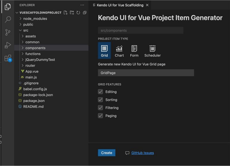
Visual Studio Code Scaffolders for Kendo UI for Vue
The Kendo UI productivity tools have been enhanced with scaffolding option for Kendo UI for Vue components. The scaffolding feature will create new pages in your Vue.js apps with the most used data-bound Kendo UI for Vue components: the Data Grid, Scheduler, Chart and Form components.
When adding a new project item, the scaffolder will prompt you to input the service and model names and will allow you to configure multiple component-specific properties. For example, if you scaffold a new page with the UI for Vue Data Grid, you will be able to set its sorting, filtering, grouping, column resizing and more features.
KendoReact
New React Spreadsheet Component
We are excited to announce the addition of the Spreadsheet UI component to KendoReact, enhancing our suite of powerful UI tools. The Spreadsheet is a feature-rich component that empowers developers to build dynamic and interactive Excel-like applications. With a wide array of functionalities, it enables users to effectively manage and manipulate data in a spreadsheet-like interface. The Spreadsheet component includes undo/redo buttons, allowing users to easily revert or redo changes with a simple click.
The Home tab offers essential formatting features, such as bold, italic and underline, along with a font name and size dropdown list and color pickers for both text and background. Alignments and the ability to wrap text make it easy to customize the appearance of data. Users can toggle gridlines for better visibility and utilize formatting options to enhance the visual representation of their data.
The Insert tab allows users to effortlessly add or delete columns and rows in different positions, ensuring flexibility in data management. The name box and formula bar provide convenient tools for navigating specific cells and entering formulas for advanced calculations.
The content grid enables users to resize rows and columns for optimal data presentation. Additionally, users can select rows, columns or individual cells for efficient data manipulation. The component also supports the input of formulas directly into cells, which automatically calculates results.
See a demo of the KendoReact Spreadsheet UI component.
New React ContextMenu Component
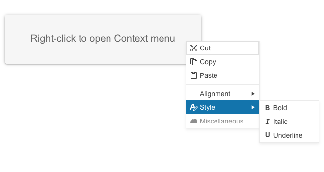
The new KendoReact ContextMenu UI component will allow you to easily configure common and often-used commands for end users. It represents a vertical Menu rendered in a Popup. The ConextMenu extends the Menu properties including: “children,” “className,” “customCloseItemIds,” “dir” and also provides an “offset” property that specifies the opening coordinates and accepts “Top” and “Left” values similar to the Popup component.
See a demo of the KendoReact ContextMenu UI component.
New React Timeline Component
The Timeline UI component is designed to display a list of events in chronological order, making it ideal for showcasing company history or visualizing important milestones.
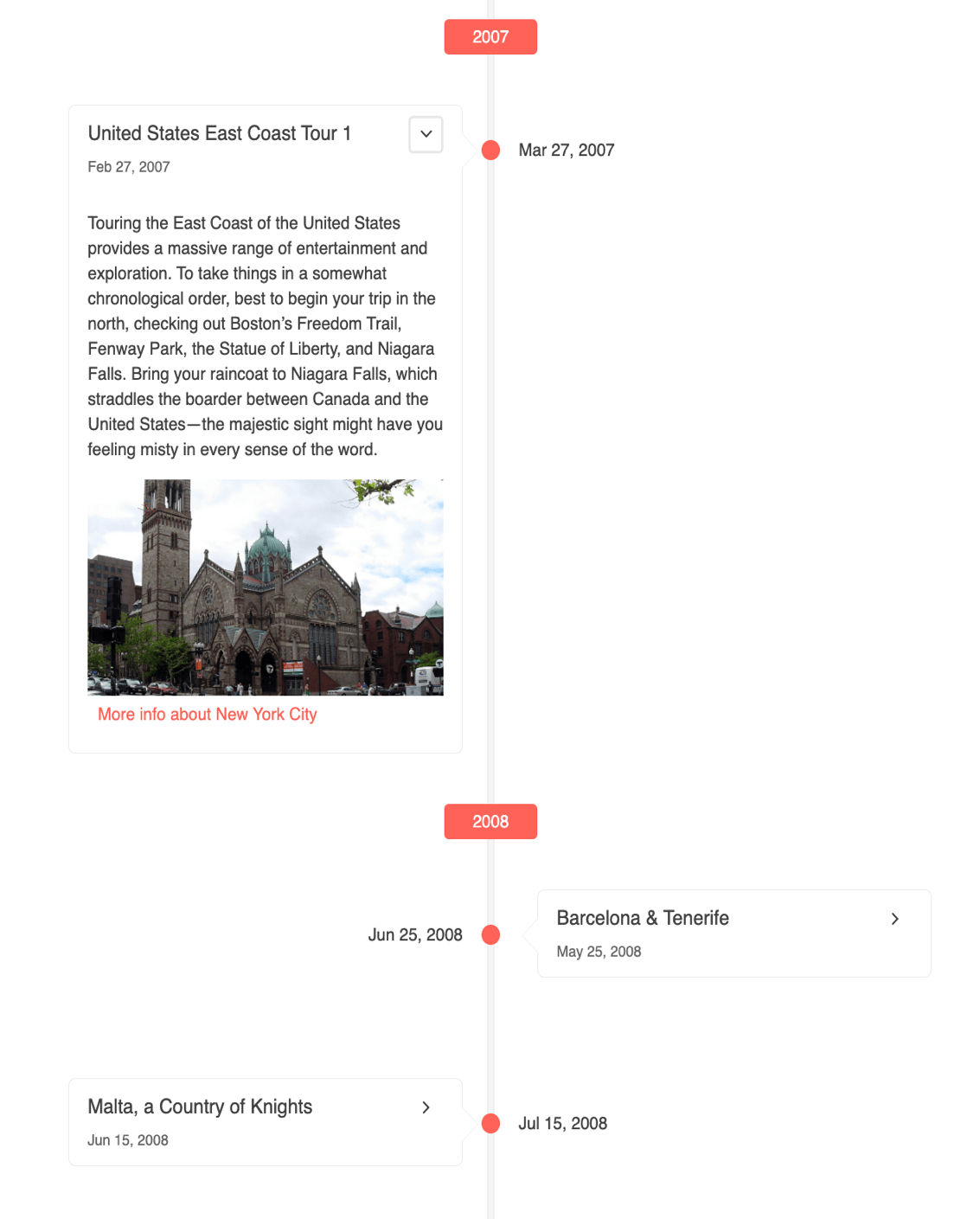
In its initial version, the Timeline support vertical mode, in which events can be collapsed, providing a neat and organized view. Each event is rendered through the Card component, allowing you to define custom templates with images, buttons, links or any other elements necessary to effectively communicate the event.
See a demo of the KendoReact Timeline component.
Multiple React DataGrid Enhancements
Integrated ContextMenu in Data Grid
The KendoReact Data Grid enables you to display a context menu by using the newly added ContextMenu component. The GridRow now exposes an onContextMenu event that allows you to setup a context
menu with any Grid command. You can configure the context menu to show any cell operations (such as copy cell content), any row operations (such as move up or delete), or export to file features.
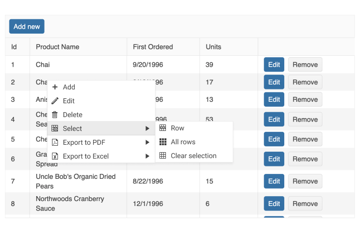
See a demo of the KendoReact Data Grid with integrated ContextMenu.
Data Grid Pager All Option
The new KendoReact Pager dropdown list “All” option is made available in the Grid as well. It is controlled by the respective pageable options, more specifically the pageSizes.
Data Grid Virtualization Improvements
The virtualization feature of the KendoReact Data Grid has undergone significant stability improvements. These improvements are related to the specification of metrics about row size, which
enables us to make accurate calculations of rendered rows in the Grid and the scroll position of the content.
Now, the virtualization can work with both all data and sliced data by setting the required field rowHeight. In cases where there are details, another required field is detailRowHeight, and all data must be passed to the Grid. For grouping scenarios, it’s important to pass all data.
To showcase these enhancements, we’ve provided some examples:
Scroll to Index Helper Method
We shipped a further enhancement in the scrolling experience of the KendoReact DataGrid component. In addition to the option to scroll to a specific item, users can now easily check if a selected
row is currently visible within the Grid, and, if not, scroll it to the top.
This new functionality is particularly useful in scenarios where users need to quickly locate and interact with a specific row, even when working with a large dataset. With this feature, users can simply select the desired row, and the Grid will automatically check if it is currently visible. If the row is not visible, it will be smoothly scrolled to the top, ensuring that the user can quickly and easily interact with the selected row.
It is worth noting that the feature has been designed to ensure that rows are only scrolled to the top when necessary. Specifically, if 90% of the row’s height is currently visible, it will be considered “visible” and will not be scrolled to the top. Additionally, the rowHeight parameter should be set to match the height of the row according to the design, to ensure that the scrolling behavior is accurate.
See a demo of the KendoReact ScrollIntoView Data Grid feature.
New Configuration Options in Pager Component
The KendoReact Pager UI component can now be configured to show all items in a single page. The feature can be enabled initially, or through the PageSize DropDownList. The PageSize and PageSizeValue option of the pager now accept string “All.”
Enhancements in DropDowns
The data grouping features provide the option to display data in groups inside a component. The grouping can be used and queried by filtering the component. To enable Data Grouping, you need to define the groupField property. The Data Grouping feature is now available for AutoComplete, DropDownList, MultiSelect, ComboBox and MultiColumnComboBox.
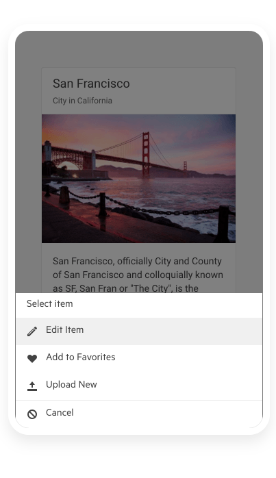
ActionSheet Component Improvements
ActionSheet Keyboard Navigation
The KendoReact ActionSheet component now provides out-of-the box keyboard navigation.
See a demo of the available keyboard shortcuts that the KendoReact ActionSheet supports.
ActionSheet Animation
The other enhancement we shipped in the ActionSheet is a smoother animation when the component appears on the screen (enabled via the new animation prop which accepts a Boolean value).
TabStrip Enhancements
The KendoReact TabStrip component now allows you to change the direction of the content when scrolling tabs to right-to-left using its dir property.
See a demo of the RTL support in KendoReact TabStrip component.
Enhancements in FlatColorPicker and ColorGradient
The FlatColorPicker component now includes the following props:
- defaultValue: This prop allows you to set a default color value, ensuring a consistent starting point for color selection.
- format: You can now specify the default input format for the gradient input editor. Choose between “rgb,” “hex” or “rgba” to match your preferred color format.
- opacity: This prop offers more flexibility by providing the option to display the opacity slider. Enable this feature to allow users to select transparency alongside their color choices.
In addition to the prop enhancements, we have also introduced a new method called onChange. This method triggers an event handler whenever the user edits the color value. Use this feature to capture and respond to any changes made by the user.
Moreover, we have made improvements to the ColorGradient component, which is integral to the FlatColorPicker. The ColorGradient component now includes the “format” prop, allowing you to set the default input format in the gradient input editor.
Progress Kendo UI R2 2023 Release Webinar | June 9

Discover all updates across KendoReact and Kendo UI for Angular, Vueand jQuery, as well as ThemeBuilder.
Join Us on Twitch
Join the Livestream Release Party on release day, June 7, 11 a.m. – 12:30 p.m. ET to hear the release news and hang out with dev friends. We hope to see you!
And the Best Part About the Release Webinars?
The live webinars and Twitch sessions are a great opportunity for you to ask questions before and during the webinars. We’ll be waiting to hear from you on Twitter—just use the #heyTelerik and #heyKendoUI hashtags. Another great option is the live chat during our release session on CodeItLive, our Twitch channel.

Maria Ivanova
Maria Ivanova is a Manager of Product Management at Progress, for Telerik and Kendo UI components and developer tooling. She joined the company in 2019 as a Product Manager for Telerik UI web components and is passionate about developing impactful and innovative software products. Maria believes that to create great products, it's important to challenge the status quo, closely collaborate with customers, and embrace a spirit of experimentation.
Related Posts
Comments
All articles
Topics
Web MobileMobile
Desktop
Design
Productivity
People
