
What’s New in Telerik Web UI Component Libraries with R2 2023

Summarize with AI:
See what R2 2023 delivers to the .NET UI libraries for web from Progress Telerik for Blazor, ASP.NET Core, ASP.NET MVC and ASP.NET AJAX.
Announcing the much-awaited R2 2023 update of Telerik UI for Blazor, ASP.NET Core and MVC and ASP.NET AJAX!
In this blog post, we’ll delve into the exciting new features and enhancements that will elevate your web development projects to a whole new level. Get ready to unlock the full potential of the latest Telerik UI release.
Feel free to jump to your favorite section:
- Common Release Items
- Telerik UI for Blazor
- Telerik UI for ASP.NET Core/MVC
- Telerik UI for ASP.NET AJAX
- Webinar details for June 8
Common Release Items
Font Icons to SVG Icons
In the R2 2023 update, a significant change was introduced to the default icon type in Telerik and Kendo UI libraries and components. We have shifted from font icons to SVG icons as part of our continuous efforts to improve product quality and theming mechanisms, and to ensure compliance with Content Security Policy (CSP). This transition allows us to enhance the visual experience and align with evolving web standards.
For more information, be sure to check out the dedicated icon blog post on this topic. It’s packed with valuable insights to help you learn more.
Compatibility with .NET 8 Preview 4

The Telerik UI for Blazor and UI ASP.NET Core libraries are now compatible with Microsoft’s .NET 8 preview 4, released in mid-March. This exciting development enables developers to leverage the cutting-edge features and performance enhancements of .NET 8 while harnessing the robust UI components offered by Telerik.
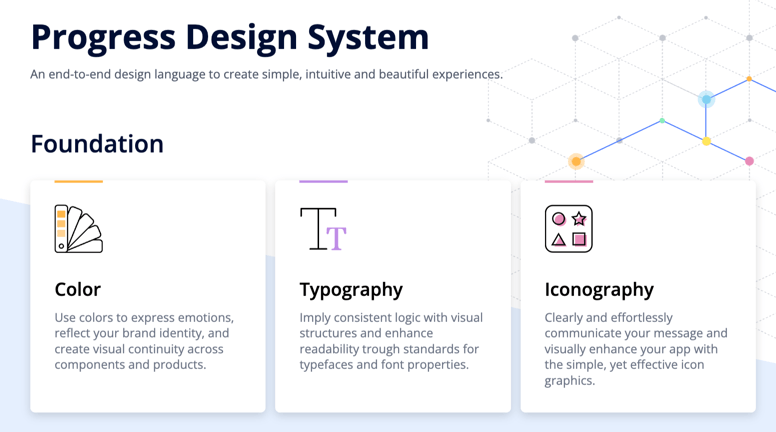
Design System Documentation
An exciting addition in R2 2023 is the launch of a design system documentation site dedicated to the Telerik and Kendo UI libraries. This site provides a comprehensive collection of design assets, frontend documentation and valuable resources. Initially, we have included documentation for nearly 20 essential components. Our goal is to continuously expand this site, empowering you with the necessary tools to create visually impressive digital experiences and design systems using the robust capabilities of Telerik and Kendo UI.
The design system documentation site now includes the initial version of the CSS Utils package, a convenient library of HTML classes tailored for CSS properties. This package allows you to effortlessly style page layouts without writing extensive CSS
code. For example, adding a border radius is as simple as applying the .k-rounded-md class to the element.
The CSS Utils package is integrated within our Telerik and Kendo UI themes. When you install any of our themes, you automatically get the CSS Utils package. However, if you only require the Utils package for page layout styling, you can install it separately.
We have plans to expand the package’s capabilities, including adding a color system and typography options, and expanding the sizing map. Stay tuned for future updates!
LESS Themes Deprecation
In accordance with the previous announcement made in January 2022, starting from R1 2023, we will discontinue support for LESS themes in our Telerik and Kendo UI products. We recommend that any customers currently using LESS themes transition to an equivalent theme based on SASS. For detailed information on the reasons behind this change and its potential impact on you, please refer to titled “Future Plans for the Telerik and Kendo UI LESS Themes”.
ThemeBuilder Pro Support
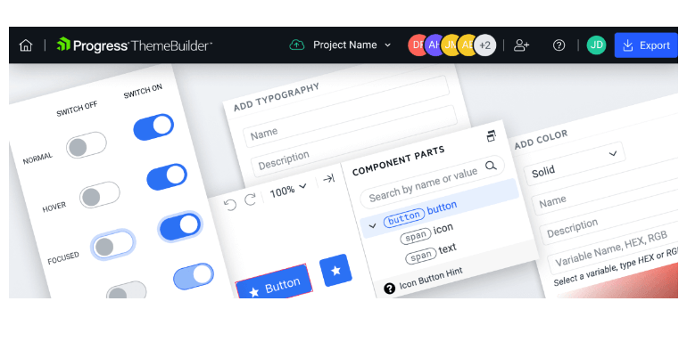
ThemeBuilder Pro is here with exciting updates and new features for enhanced development. This release introduces full customization support for Kendo UI (jQuery) and Telerik UI (ASP.NET Core/MVC), giving you complete control over your web application’s appearance. You can now seamlessly integrate with Figma for smooth collaboration between design and development teams.
The automatic migration feature ensures a hassle-free transition to the latest theme version. Improved variable management, SSO support, and granular project permissions further empower developers and designers. ThemeBuilder Pro is dedicated to providing powerful tools and capabilities for an exceptional development experience.
Read more in the dedicated ThemeBuilder blog post.
Web Installer FIPS Compliance
Our recent upgrade to the Web installer (Telerik Control Panel), includes support for Federal Information Processing Standards (FIPS) compliance. This improvement is designed to provide our clients with enhanced security, meeting the high standards required by industries and government agencies.
By implementing specific cryptographic algorithms and security protocols approved by the National Institute of Standards and Technology (NIST), FIPS compliance ensures the protection, integrity and confidentiality of your valuable data. We can now deliver a more secure installation process, giving you peace of mind and confidence in the safety of your information.
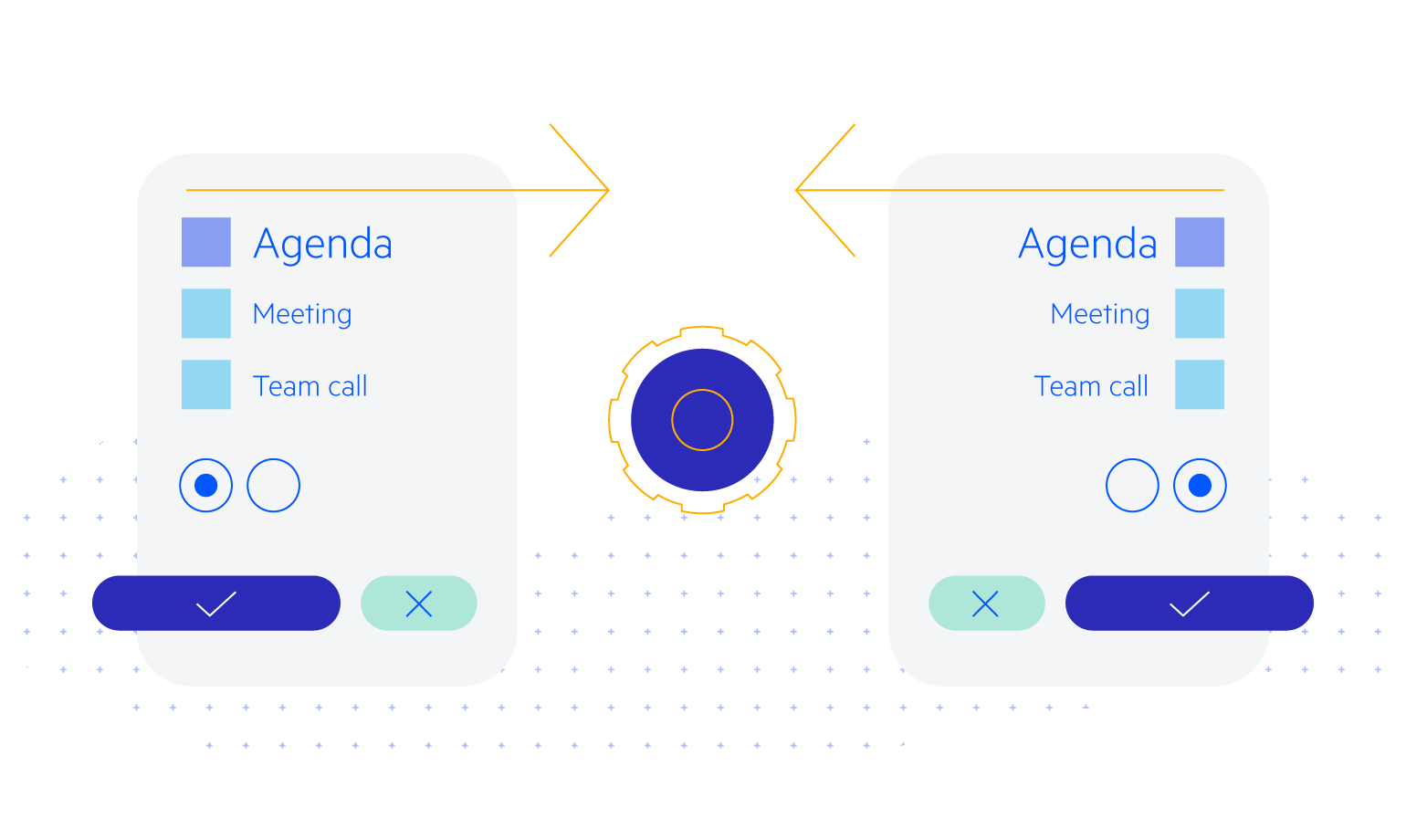
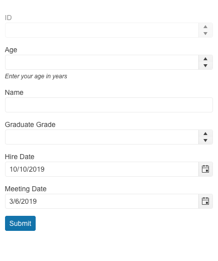
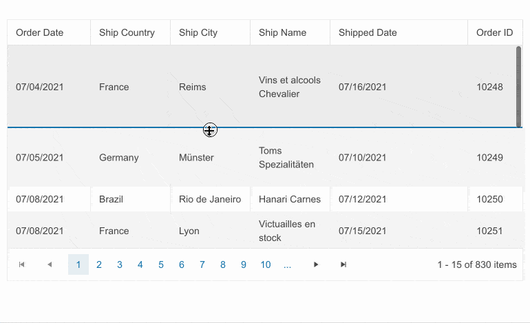
Enhanced Forms Rendering
Telerik UI brings a fresh and modernized approach to forms rendering and layout. With this latest update, we have revamped the forms rendering and layout in multiple UI components, including the Data Grid, TreeList, Scheduler, DateTimePicker and more.
The enhanced forms rendering delivers a seamless and visually appealing experience to your users. By incorporating modern design principles and best practices, we have focused on improving the overall aesthetics and usability of forms within these components.
Telerik UI for Blazor
Stay ahead of the curve with our latest release of Telerik UI for Blazor, empowering you to create robust and visually stunning applications.
Introducing Blazor Hybrid: Uniting Web and Native Client Development

We’re happy to announce the official support for Blazor Hybrid in our upcoming R2 2023 release. Now, you can effortlessly create mobile and desktop applications while incorporating Telerik UI for Blazor components into your hybrid apps. Blazor Hybrid apps utilize HTML, CSS, C# and JavaScript, allowing for code sharing between web, desktop and mobile clients. Additionally, Blazor applications can be adapted for use with .NET MAUI, enabling integration with desktop and mobile platforms.
Explore the following materials to learn how you can seamlessly integrate Telerik UI for Blazor into your hybrid apps and take your development to the next level:
- Telerik UI: Blazor Hybrid
- eBook: Blazor Hybrid and Web in One Solution
- Blazor Power Hour: A look at BlazorHybrid
- The Blazor Power Hour: Testing Blazor Hybrid
- Telerik Blazor UI in Native Apps
New Blazor PivotGrid Component
We’re excited to announce the Telerik UI for Blazor PivotGrid component—an Excel-like experience for effortlessly processing, aggregating, visualizing and analyzing tabular and multi-dimensional data. This feature-rich UI component supports both local and remote data binding, along with essential functionalities like filtering, sorting and a configuration panel. Let’s explore the key features:
Organize and Summarize Pivot Data:
- Deliver an Excel-like experience by processing and analyzing tabular and multi-dimensional data.
- Supports data binding to an OLAP service, enabling interactive analysis.
- Offers extensive customization options for a tailored user experience.
Local and Remote Binding to OLAP Data Sources:
- Bind data to a local source or remote OLAP service via HTTP.
- Access aggregated and organized data from multidimensional structures (cubes).
Configuration Panel:
- Intuitive and customizable configuration panel like Microsoft Excel.
- Allows users to modify fields, apply filters and define pivot fields.
- Highly adaptable to match design needs, including custom component integration.
Sorting:
- Enable single or multiple column sorting in ascending or descending order.
- Supports sorting various data types.
Filtering:
- Provide flexible data display by enabling filtering based on specific criteria.
- Swift response with various filtering options, operators and predefined fields.
- Supports filtering via XMLA access to the OLAP Cube service.
See a demo of the UI for Blazor PivotGrid component.
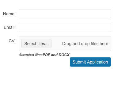
New Blazor DropZone Component
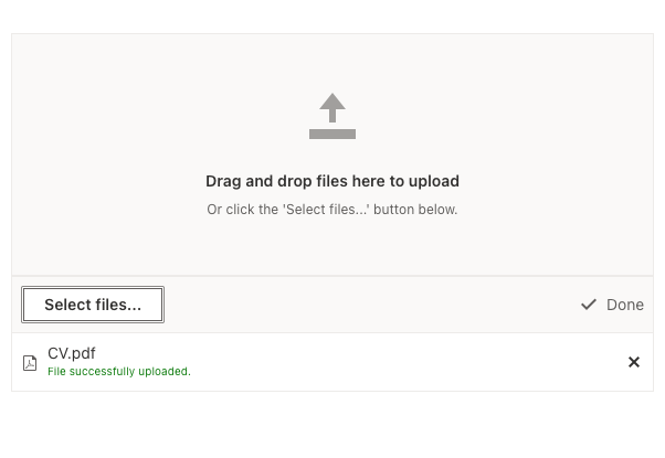
Introducing the addition of the DropZone component to our Blazor toolkit. This component offers a user-friendly way for file uploads in Blazor applications. Users can easily drag and drop files onto a designated area on their screen, and the files will be automatically transferred to the file select/upload feature. Say goodbye to complicated file uploads and enjoy the simplicity and convenience of our new DropZone component.
See a demo of the UI for Blazor DropZone component.
Right-to-Left Support
We are happy to announce that Telerik UI for Blazor components now support right-to-left (RTL) languages! This feature is available in the latest 4.2.0 release of Telerik UI for Blazor and brings a range of benefits to developers building applications for audiences that read and write in RTL languages.
With the new RTL support, developers can easily create applications that cater to the needs of RTL language users, without having to manually modify the layout or styles. This means that components like grids, charts and dropdowns will automatically adjust their layout to support RTL languages. Additionally, text alignment, text direction and other layout features will be optimized for RTL languages, making it easier for users to navigate and interact with the application.
The RTL support in UI for Blazor can be turned on with a single property EnableRtl once at the TelerikRootComponent and that will let all of the components take advantage of the feature. More details and specifics for popups can be found in the UI for Blazor RTL support documentation article.
Enhancements in the FileSelect & Upload UI Components
Built-in Drag and Drop
The FileSelect and Upload components now have built-in drag-and-drop file support, courtesy of the new DropZone component. Enjoy the convenience of seamlessly dragging and dropping files, right from the
start.
See a demo of the UI for Blazor FileSelect drag and drop support.
Data Grid & TreeList Enhacements
The R2 2023 release of Telerik UI for Blazor brings exciting updates to the DataGrid and TreeList components. These enhancements include new customization options and expanded configuration capabilities. Let’s dive into the key highlights:
Pager Template
Customize the appearance of pagers with ease. Utilize the Pager Template to replace the default pager with your own custom markup, tailored to your clients’ needs.
See how to customize the UI for Blazor TreeList component pager.
Popup Edit Form Template
Elevate the data entry experience by leveraging the Popup Edit Form Template. Enable GridEditMode.Popup for the Data Grid and TreeListEditMode.Popup for the TreeList to create custom content within the
edit form. Customize form fields, validation rules and more.
DataGrid, TreeList, TreeView Performance Bump
We are delighted to share that our Blazor Data Grid, TreeList and TreeView components have undergone a remarkable performance enhancement. In the latest release, we have significantly minimized the re-rendering of content cells, ensuring it occurs only when absolutely required. As a result, our tests have shown a significant 40% reduction in component refresh time.

Although template cells will continue to re-render since they can contain arbitrary markup, we are confident that this improvement will have a tangible impact on the overall performance of the Blazor component’s usability.
Chart Enhancements
The latest release of Telerik UI for Blazor brings exciting enhancements to the Charts component, offering improved customization options and new features. Let’s explore the key additions briefly.
Position Configuration
Users can now position the Stock Chart navigator on top, providing a fresh appearance option alongside the existing bottom position.
See the Telerik UI for Blazor StockChart navigator demo.
Chart and StockChart Subtitle
The new subtitle property enables developers to add secondary or explanatory subtitles below the main chart title and style them differently for enhanced customization.
See the Telerik UI for Blazor Subtitle Property in Charts demo.
Format and Template Parameters for Axes in Blazor StockChart
The introduction of format and template options allows effortless customization of labels for ValueAxis, CategoryAxis and NavigatorCategoryAxis in the Blazor StockChart.
These enhancements in Telerik UI for Blazor Charts offer developers greater control over the appearance and functionality of their charts, enabling them to create visually stunning and interactive experiences.
Globalization and Localization
As part of this update, we are adding a new label to the components, displaying the text: “Drag and drop files here to upload.” To support localization and globalization, two new resource keys have been introduced: Upload_DropZoneHint and FileSelect_DropZoneHint.
Custom Content in SelectFiles Button
In this release, we’ve added templating support for the SelectFiles button in FileSelect and Upload components. Now clients can fully customize the button’s appearance, including the option to render icons, providing more flexibility and visual appeal.
FileSelect New Methods
The latest release of the Blazor FileSelect component introduces two new methods: ClearFiles and OpenSelectFilesDialog. ClearFiles enables removing files from the list programmatically, providing more control over the selection process. OpenSelectFilesDialog allows for opening the browser file selection dialog with a single API call.
Exposing Selected Items in File Manager
We have enhanced the Telerik UI for Blazor File Manager component to provide you with more flexibility in customization. With the latest update, the Blazor FileManager component now supports two-way binding of the selected items.
See the Telerik UI for Blazor FileManager expose selected items demo.
Window: Support for Footer
The footer section of the Telerik UI for Blazor Window component can now be customized according to your needs. Take advantage of the following parameters to fully utilize the Window footer:
- The WindowFooter parameter adds a new section at the bottom of the window.
- The FooterLayoutAlign parameter allows you to apply different styles to the buttons in the footer. Select from the available options (Start, Center, End and Stretched) and observe how they enhance the appearance of your application.
Combine Autogenerated & Custom Fields in the Form Component
This enhanced feature within the UI for Blazor Form component enables the simultaneous utilization of autogenerated form items alongside manually defined ones. It allows developers to make use of the autogenerated fields for the majority of their model fields, while still providing the flexibility to customize specific fields as needed.
See a demo of autogenerated and custom fields in the UI for Blazor Form component.
Customize the Map Component Marker Appearance
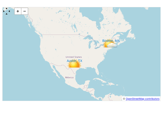
The Blazor Map component’s user interface (UI) now includes a templating functionality that simplifies the process of customizing the appearance of markers on the map. Developers have the ability to define their own HTML markup to style the markers according to their preferences.
See how to customize the UI for Blazor Map component marker.
Visible Parameter TileLayout Component Items

We have exposed a new parameter named Visible to control whether a given TileLayout item is visible or not.
See a demo of the items visibility in the UI for Blazor TileLayout component.
Print Method in the PDF Viewer Component
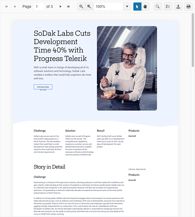
The UI for Blazor PDFViewer component now provides the ability to print the current document programmatically. By introducing the Print() method, developers now have a straightforward means to incorporate printing functionality into their Blazor applications that utilize the PDF Viewer component.
Add ThemeColor Parameter for Window & Dialog
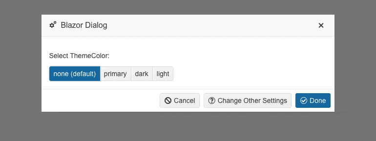
A new parameter named ThemeColor has been added to the UI for Blazor Window and Dialog components. This feature enables easy customization of the title bar color for both components. It provides a range of selectable values such as “Primary,” “Dark,” “Light” or even an empty option for no color.
See an example the UI for Blazor Dialog ThemeColor options.
Refresh Method for All Select-Type Components
In this latest release, we are introducing a new method called Refresh to enhance our select-type UI components, including AutoComplete, ComboBox, DropDownList, MultiColumnComboBox and MultiSelect. The method allows you to easily refresh the popup of the selects and comes in handy when the popup remains open, but changes need to be applied.
Deprecation of .NET 3 and .NET 5 in Telerik UI for Blazor
Starting from R1 2024, we will no longer provide support for .NET 3 and .NET 5 in Telerik UI for Blazor. To ensure uninterrupted support and leverage the latest advancements, we highly recommend planning and initiating the migration of your projects to .NET 6 or later.
This strategic decision allows us to stay ahead of the curve, providing you with a robust and future-proof component library that keeps pace with the rapid advancements in web application development. Stay tuned for exciting updates as we embark on this journey together!
Telerik UI for ASP.NET Core and MVC
Discover the latest features and elevate your development experience with Telerik UI for ASP.NET Core and MVC!
New Template Component (CSP-Compatible)

Introducing the Template component in the Telerik UI for ASP.NET Core and MVC UI libraries! This new feature can be incorporated it into UI controls, which require complex layout templates like the Grid or the TreeList. Deliver smooth integration and strengthen security of your applications.
HTML and Tag Helpers
The Telerik UI for ASP.NET Core Template component provides support for both HTML and Tag Helper modes. The HTML Helper Template introduces these two options:
- AddComponent(), which is a method accepting any Telerik UI for ASP.NET Core HTML Helper component declaration
- AddHtml(), which is a method that accepts HTML code
If you’re leveraging the Tag Helper mode, you can easily integrate the UI control and HTML code within the <{parentTagName}-{templateOption}> tag.
See the documentation for the Telerik UI for ASP.NET Core Template component or the Telerik UI for ASP.NET MVC Template component.
DataGrid Enhancements
The latest release of Telerik UI for ASP.NET Core and MVC brings exciting enhancements to the DataGrid component, offering improved usability options and new features.
New Row Resizing Feature
Introducing the highly anticipated feature in the latest release of our Data Grid component: row resizing! Now, end users can resize rows and adjust their heights effortlessly. This new functionality
allows for better visibility of cells with larger values while maintaining the integrity of the remaining rows in the Data Grid. Stay in control of your data presentation and provide a seamless user experience with the row resizing feature.
Compact Data Grid Mode
Introducing the Compact Grid, a new feature in the Telerik UI for ASP.NET Core and MVC Grid components! By utilizing the Size parameter configuration, the Compact Grid optimizes screen space by reducing
padding and margins, resulting in a condensed and efficient data table. Now you can display more information at once, maximizing productivity.
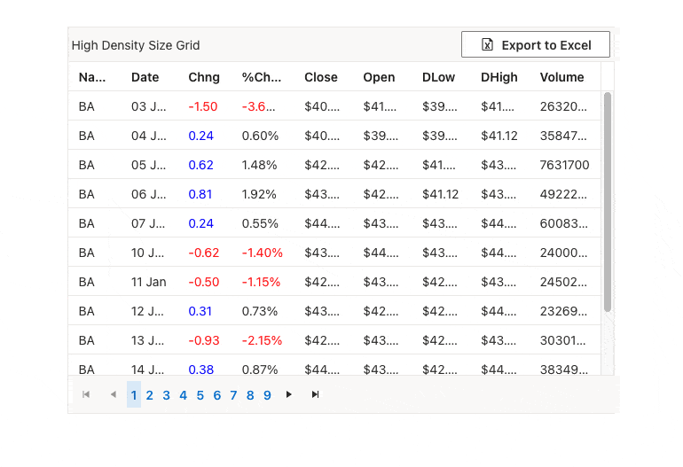
The Compact Grid seamlessly integrates with our Default, Bootstrap, Material and Fluent themes, providing flexibility in design choices. Experience the power of data density with the Compact Grid feature.
See the demo for Telerik UI for ASP.NET Core Compact Grid or Telerik UI for ASP.NET MVC Compact Grid demo.
Scheduler Enhancements
Highlight Ongoing Events
We are pleased to announce the addition of the “highlight current events” functionality to our Scheduler component! Elevate your application’s user experience by easily indicating ongoing
events in a visually distinct manner. With the simple configuration method of OngoingEvents, enabling this feature and customizing the refresh interval is effortless.
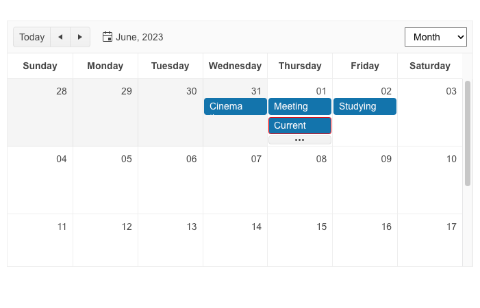
See the Telerik UI for ASP.NET Core Scheduler highlight ongoing events demo or the Telerik UI for ASP.NET MVC Scheduler highlight ongoing events demo.
Google Calendar Integration Demo
Many of you have been curious about how to incorporate our Scheduler component into Google Calendar, so we have prepared a demonstration. To assist you in implementing this integration, we have
created a comprehensive how-to article and a sample project.
DateTimePicker Enhancement: StartTime and EndTime Options
R2 2023 welcomes the enhanced DateTimePicker component in Telerik UI for ASP.NET Core and MVC! Effortlessly configure start and end date/time values and easily manage time ranges.
See the start and end times demo for Telerik UI for ASP.NET Core DateTimePicker or for Telerik UI for ASP.NET MVC DateTimePicker.
Data Editing UX: Enhancements
We are delighted to introduce improved date editing options in the Telerik UI for ASP.NET Core DateInput component. These options offer greater flexibility and control when configuring the behavior of the component during date editing. Take advantage of the following configuration options:
- AutoSwitchParts: Automatically moves to the next segment after entering a valid value.
- AutoSwitchKeys: Configures a custom key to trigger moving to the next segment.
- EnableMouseWheel: Increases or decreases segment values using the mouse wheel.
- AutoCorrect: Automatically corrects the value if it falls out of range.
- Steps: Defines the increment and decrement steps for each available date segment.
See the editing demo for Telerik UI for ASP.NET Core DateInput or for Telerik UI for ASP.NET MVC DateInput.
Gantt: Popup Edit Form Improvements
In our latest release, we’ve made several updates to enhance the editing and customization capabilities of our Gantt UI component. Now you can fine-tune every aspect of the Gantt to meet your users’ preferences. Notable changes include:
- Reorganized Gantt edit popup form with tabs for easier navigation and editing of different sections.
- Expanded capabilities to configure and edit all data fields present in the Gantt.
- Streamlined editing of parent tasks directly from the task’s edit form, eliminating the need for separate sections.
- Integrated dependencies editing into the edit form, eliminating the need for a separate popup window.
- A new “Other” tab in the Gantt edit popup for editing custom fields, providing a cleaner and more organized experience.
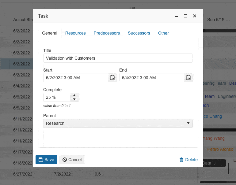
See an example of the improved Gantt editing experience:
Enhanced Demos with Adaptive Behavior
In the R2 2023 release, we focused on improving the UI components for ASP.NET Core and MVC to be more adaptable and responsive. Along with introducing new built-in settings, we made sure to showcase the adaptiveness of the components through our demos.
Telerik UI for ASP.NET AJAX
We are thrilled to share the new components and enhancements in Telerik UI for ASP.NET AJAX R2 2023 release.
New ArcGauge and CircularGauge Components
Easily represent value ranges on an arc shape using the powerful Telerik UI for ASP.NET AJAX ArcGauge component. This data visualization tool allows you to showcase progress toward a goal by defining minimum and maximum angles, ranging from 0 to 360 degrees.
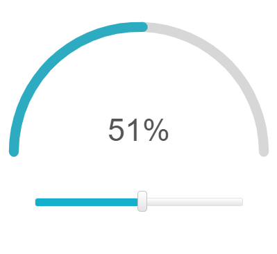
Or enhance your data visualization with the Telerik UI for ASP.NET AJAX CircularGauge component. This versatile AJAX control allows you to represent values within a full-scale, 360-degree arc. It offers a compact and intuitive solution that seamlessly integrates into any web application.
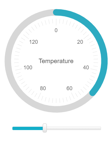
Explore the features of these component through these demos:
- Center template: Customize the appearance and behavior of the center label within the arc/circle using templates.
- Scale customization: Tailor the visual properties of the component to meet your specific application requirements.
- Color ranges: Assign different fill colors to values based on their significance, enhancing the meaning of the visualization.
See the Telerik UI for ASP.NET AJAX ArcGauge and CircularGauge in action.
Fixes and Improvements
In this release, we have made several enhancements in the Ajax, AutoCompleteBox, Button, Calendar, Captcha, Combobox, Editor, ListView, Signature and Treeview components. These improvements include adding support for the latest Chrome browser on iOS mobile devices and updating the W3C validator in the XHTML Validator dialog of RadEditor to the latest version.
Single Line RadAutoCompleteBox
Responding to customer feedback, we have introduced an additional mode for the RadAutoComplete component. Alongside the multiline option, you can now utilize the SingleLineEntries property to
configure the AutoComplete feature. This new setting enables the display of all input provided in a single line input field with a horizontal scroll.
See a demo of the single line mode of the UI for ASP.NET AJAX AutoComplete component.
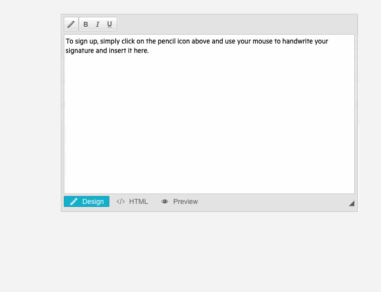
Integration demo for RadEditor and RadSignature
Take a look at the Signature Dialog demo to understand how you can incorporate handwritten signatures into a WYSIWYG (what you see is what you get) editor. This demo presents a signature pad that allows users to draw their signatures. Once users finish creating their signature, they
can click on the “Store on Server as PNG and Insert” button. This action saves the signature as a PNG file and seamlessly inserts the image into the editor.
End of .NET 3.5-4.0 Support
Please note that R2 2023 SP1 on March 15 is the last version to provide support and assemblies for .NET Framework 3.5 and 4.0.
As of R2 2023, we will continue shipping assemblies compatible with .NET 4.5-4.8 versions of the framework. You can read more at: End of .NET Framework 3.5 and 4.0 Support for Telerik UI for ASP.NET AJAX.
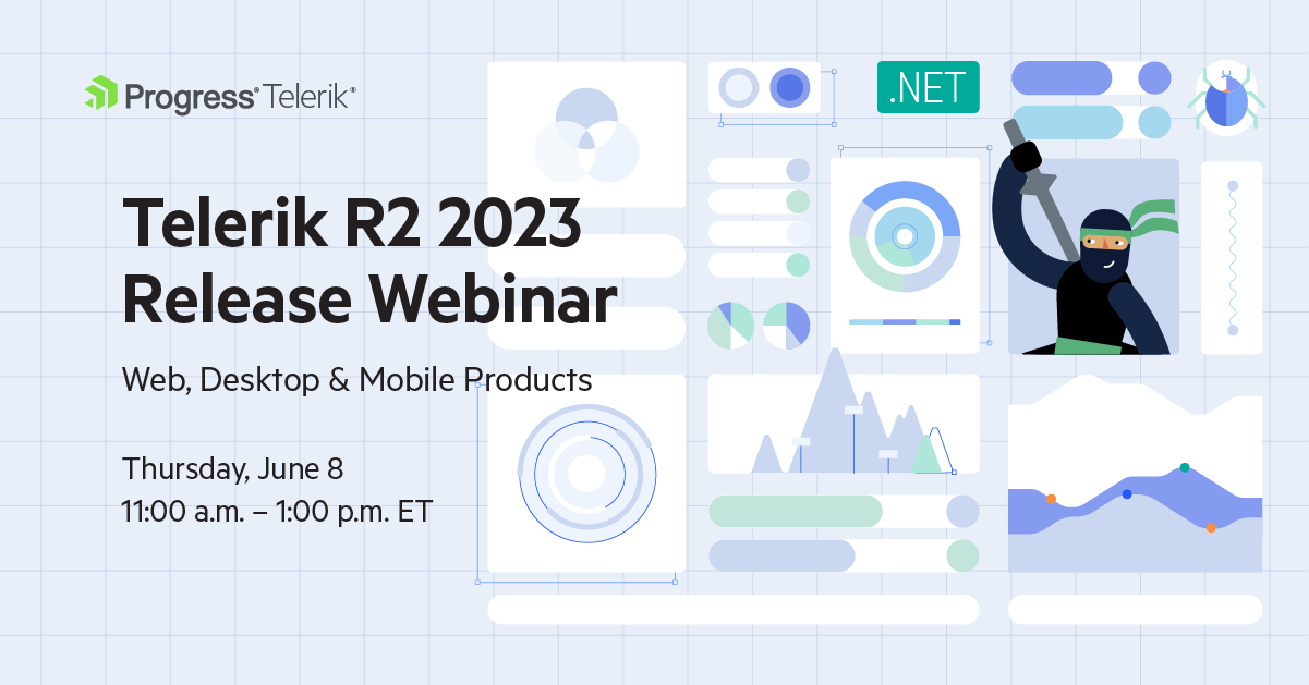
Progress Telerik .NET Web, Desktop & Mobile Products R2 2023 Release Webinar | June 8
Discover all updates across Telerik UI for Blazor, UI for ASP.NET Core, UI for ASP.NET MVC, UI for ASP.NET AJAX, UI for WPF, UI for WinForms, UI for WinUI, UI for .NET MAUI and UI for Xamarin and ThemeBuilder.
Join Us on Twitch
Join the Livestream Release Party on release day, June 7, 11 a.m. – 12:30 p.m. ET to hear the release news and hang out with dev friends.
The live webinars and Twitch sessions are a great opportunity for you to ask questions before and during the webinars. We’ll be waiting to hear from you on Twitter—just use the #heyTelerik and #heyKendoUI hashtags. Another great option is the live chat during our release session on CodeItLive, our Twitch channel.

Lyubomir Atanasov
Lyubomir Atanasov is a Product Manager with a passion for software development, UI design, and design thinking. He excels in creating impactful and innovative software products by challenging the status quo, collaborating closely with customers, and embracing a spirit of experimentation. His dedication to delivering exceptional UI solutions makes him an invaluable asset, providing immense value through his expertise and innovative approach. Follow him on LinkedIn.
Related Posts
Comments
All articles
Topics
Web MobileMobile
Desktop
Design
Productivity
People
