Date Formats Cheat Sheet—How To Format Dates in a React DatePicker

Summarize with AI:
Today we will break down common date and time formats and share some handy tips for using KendoReact DatePicker.
Did you know that some countries have different date formats than others? I was a bit surprised too when I first got to know about it. For instance, in the US, the commonly used date format is MM/DD/YYYY, but a lot of countries in Europe, such as the United Kingdom, use the DD/MM/YYYY format. Some Arabic countries use DD/YYYY/M, while China uses YYYY/MM/DD.
Providing correct date and time formatting can get quite tricky if your application serves users in many different countries. To provide a better user experience, it’s a good idea to display dates in a format that users are most accustomed to.
Let’s have a look at how we can implement the aforementioned formats in a React DatePicker. To illustrate how we can deal with different date formats, we will use KendoReact DatePicker. Besides that, we will use the KendoReact DateTimePicker to illustrate how to format times.
If you’re interested in other possible date formats, check out this page.
The full code example is available in this GitHub repository. Below is an interactive example of what we are going to implement:
Project Setup
To set up a new React project, you can run the npx create-react-app my-react-datepicker command in your terminal.
After the project is created, install these dependencies:
$ npm install --save @progress/kendo-react-dateinputs @progress/kendo-theme-material @progress/kendo-react-intl cldr-core cldr-dates-full @progress/kendo-licensing
Next, replace the contents of App.js and App.css files, as we need to clean up the default code and import the theme we installed.
src/App.js
import '@progress/kendo-theme-material/dist/all.css';
import "./App.css";

function App() {
  return <div className="App"></div>;
}

export default App;
src/App.css
.App {
  max-width: 40rem;
  margin: 2rem auto;
}
That’s it for the project setup. Let’s add a React DatePicker with a few different date formats.
Note: KendoReact is a commercial UI component library, and as a part of this you will need to provide a license key when you use the components in your React projects. You can snag a license key through a free trial or by owning a commercial license. For more information, you can head over to the KendoReact Licensing page.
Formatting Dates With a React DatePicker
A great thing about the KendoReact DatePicker component is that it provides out-of-the-box support for formatting dates. We can easily specify the date format we want by providing the format prop to the DatePicker component. The code below shows four date pickers showing US, UK, Arabic and Chinese date formats.
src/components/DatePickers.js
import { DatePicker } from "@progress/kendo-react-dateinputs";

export default function DatePickers() {
  return (
    <>
      <h2>React DatePicker</h2>
      <form className="k-form k-mb-8">
        <div className="k-my-4">
          <label className="k-form-field">
            US Date Format
            <DatePicker format="MM-dd-yyyy" />
          </label>
        </div>
        <div className="k-my-4">
          <legend>UK Date Format</legend>
          <DatePicker format="dd-MM-yyyy" />
        </div>
        <div className="k-my-4">
          <legend>Arabic Date Format</legend>
          <DatePicker format="dd-yyyy-M" />
        </div>
        <div className="k-my-4">
          <legend>Chinese Date Format</legend>
          <DatePicker format="yyyy-MM-dd" />
        </div>
      </form>
      <h2>Custom date format</h2>
      <form className="k-form k-my-8"></form>
    </>
  );
}
Now update the App.js file to render the DatePickers component.
src/App.js
import "@progress/kendo-theme-material/dist/all.css";
import "./App.css";
import DatePickers from "./components/DatePickers";

function App() {
  return (
    <div className="App">
      <h1>Date formats examples using DatePicker</h1>
      <DatePickers />
    </div>
  );
}

export default App;
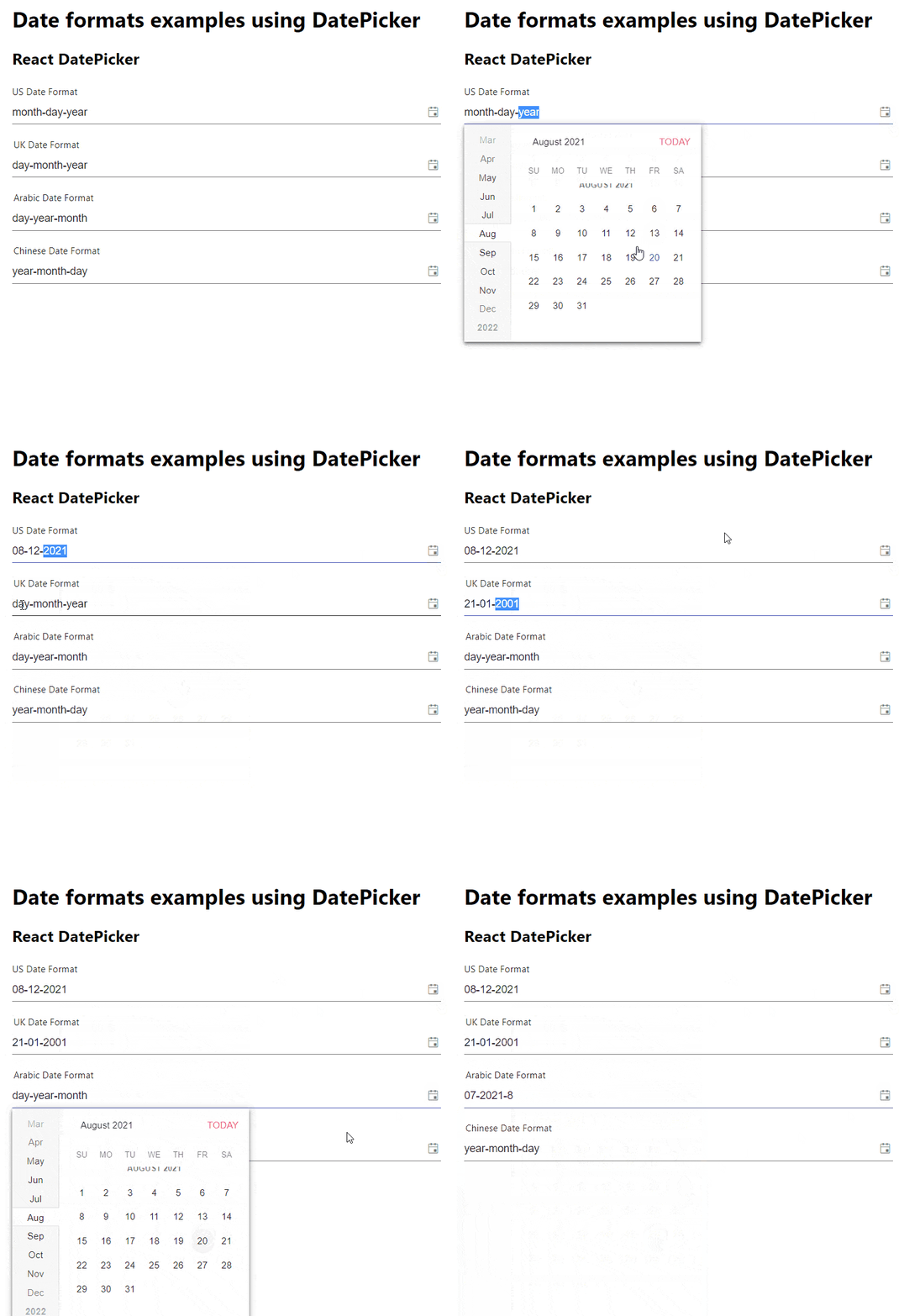
Getting the KendoReact DatePicker component to work with custom date formats was a breeze. What’s more, the DatePicker component has great accessibility, so it can be fully controlled just by using a keyboard.
If you would like to explore KendoReact’s date formats, you can find the documentation here.
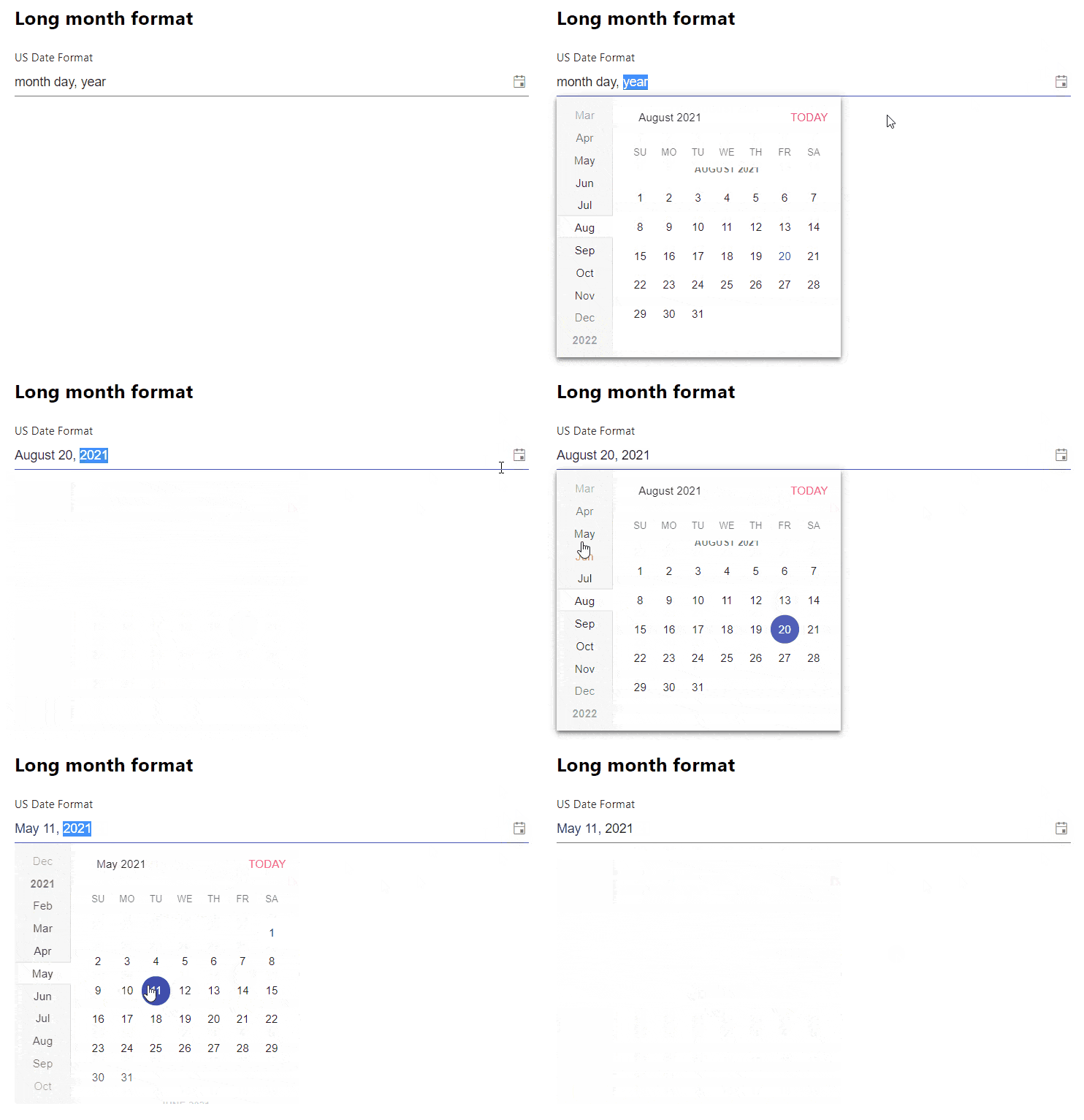
Now, what if we wanted a bit different format? Let’s say we wanted to display a full month name instead of just numbers. We can do that by providing an object to the format prop. Create a new component called LongMonthFormatPicker.
src/components/LongMonthFormatPicker.js
import { DatePicker } from "@progress/kendo-react-dateinputs";

export default function LongMonthFormatPicker() {
  return (
    <>
      <h2>Long month format</h2>
      <form className="k-form k-mb-8">
        <div className="k-my-4">
          <label className="k-form-field">
            US Date Format
            <DatePicker
              format={{
                day: "numeric",
                year: "numeric",
                month: "long",
              }}
            />
          </label>
        </div>
      </form>
    </>
  );
}
And update the App.js file to include our newly created component.
src/App.js
import "@progress/kendo-theme-material/dist/all.css";
import "./App.css";
import DatePickers from "./components/DatePickers";
import LongMonthFormatPicker from "./components/LongMonthFormatPicker";
function App() {
  return (
    <div className="App">
      <h1>Date formats examples using DatePicker</h1>
      <DatePickers />
      <LongMonthFormatPicker />
    </div>
  );
}

export default App;
You can see the result in the gif below. The date displayed starts with the full month name and then is followed by the day and year, for instance, August 20, 2021.
React Month Picker
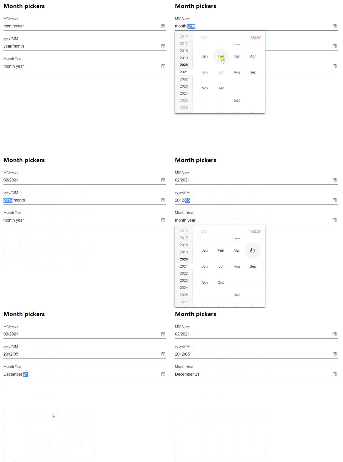
We have covered how to use different date formats when selecting a specific day, month and a year. But what if we don’t want to select a day, but only a month and year and display them in a format like 11/2021 or August 21? We can do that as well.
By default, the DatePicker calendar requires users to select a day, month and year. However, we can provide a custom calendar component. We wrap the KendoReact Calendar and pass year as bottomView and topView props.
src/components/MonthPickers.js
import { Calendar, DatePicker } from "@progress/kendo-react-dateinputs";

function CustomCalendar(props) {
  return (
    <Calendar
      {...props}
      topView="year"
      bottomView="year"
    />
  );
}

export default function MonthPickers() {
  return (
    <>
      <h2>Month pickers</h2>
      <form className="k-form k-mb-8">
        <label className="k-form-field mb-4">
          MM/yyyy
          <DatePicker width="100%" format="MM/yyyy" calendar={CustomCalendar} />
        </label>
        <label className="k-form-field mb-4">
          yyyy/MM
          <DatePicker width="100%" format="yyyy/MM" calendar={CustomCalendar} />
        </label>
        <label className="k-form-field">
          Month Year
          <DatePicker
            width="100%"
            format={{
              year: "2-digit",
              month: "long",
            }}
            calendar={CustomCalendar}
          />
        </label>
      </form>
    </>
  );
}
src/App.js
import "@progress/kendo-theme-material/dist/all.css";
import "./App.css";
import DatePickers from "./components/DatePickers";
import LongMonthFormatPicker from "./components/LongMonthFormatPicker";
import MonthPickers from "./components/MonthPickers";
function App() {
  return (
    <div className="App">
      <h1>Date formats examples using DatePicker</h1>
      <DatePickers />
      <LongMonthFormatPicker />
      <MonthPickers />
    </div>
  );
}

export default App;
Locale-Based React DatePicker
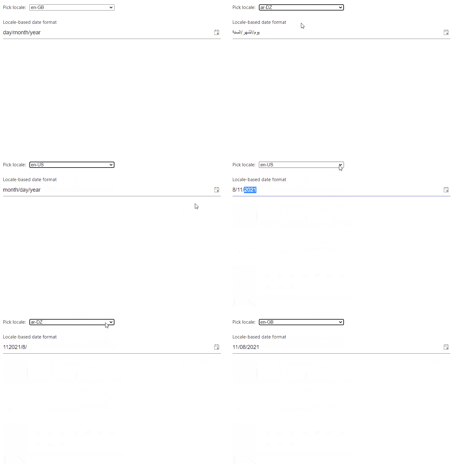
If your application serves users in many different countries, then you probably need to get the user’s default locale and allow a user to specify their own locale. The KendoReact DatePicker component has first-class support for globalization. Let’s implement a DatePicker that will change its format and calendar language based on the currently selected locale. The four locales mentioned at the start of this article will be used.
First, we need a SelectLocale component that will do three things:
- Get the default locale
- Allow a user to select a locale from the list of
locales - Provide currently selected locale via
children
src/components/SelectLocale.js
import { useState } from "react";

const locales = ["en-US", "en-GB", "ar-DZ", "zh-Hans"];

const getDefaultLocale = () => {
  return navigator.languages?.[0] || locales[0];
};

export default function SelectLocale(props) {
  const [locale, setLocale] = useState(getDefaultLocale());
  return (
    <>
      <form className="k-form">
        <label>
          Pick locale:
          <select
            style={{ width: 150, marginLeft: 10, height: 40, padding: 5 }}
            value={locale}
            onChange={e => {
              setLocale(e.target.value);
            }}
          >
            {locales.map((option, key) => (
              <option key={key} value={option}>
                {option}
              </option>
            ))}
          </select>
        </label>
      </form>
      {props.children({ locale })}
    </>
  );
}
We need to provide the locale to the children, as we need to pass it to the KendoReact IntlProvider component. In the App.js file, we need to add a few imports. First, we will import the SelectLocale component we just created and DynamicLocaleDatePicker we will create in a moment. However, we also need to import data with calendar information for different locales. This data is coming from cldr-core and cldr-dates-full packages we installed at the start.
src/App.js
import "@progress/kendo-theme-material/dist/all.css";
import "./App.css";
import DatePickers from "./components/DatePickers";
import LongMonthFormatPicker from "./components/LongMonthFormatPicker";
import MonthPickers from "./components/MonthPickers";
import SelectLocale from "./components/SelectLocale";
import { IntlProvider, load } from "@progress/kendo-react-intl";
import DynamicLocaleDatePicker from "./components/DynamicLocaleDatePicker";

import weekData from "cldr-core/supplemental/weekData.json";
import usCaGregorian from "cldr-dates-full/main/en/ca-gregorian.json";
import usDateFields from "cldr-dates-full/main/en/dateFields.json";
import gbCaGregorian from "cldr-dates-full/main/en-GB/ca-gregorian.json";
import gbDateFields from "cldr-dates-full/main/en-GB/dateFields.json";
import zhCaGregorian from "cldr-dates-full/main/zh-Hans/ca-gregorian.json";
import zhDateFields from "cldr-dates-full/main/zh-Hans/dateFields.json";
import arCaGregorian from "cldr-dates-full/main/ar-DZ/ca-gregorian.json";
import arDateFields from "cldr-dates-full/main/ar-DZ/dateFields.json";

load(
  weekData,
  usCaGregorian,
  usDateFields,
  gbCaGregorian,
  gbDateFields,
  zhCaGregorian,
  zhDateFields,
  arCaGregorian,
  arDateFields
);

function App() {
  return (
    <div className="App">
      <h1>Date formats examples using DatePicker</h1>
      <DatePickers />
      <LongMonthFormatPicker />
      <MonthPickers />
      <SelectLocale>
        {({ locale }) => (
          <IntlProvider locale={locale}>
            <DynamicLocaleDatePicker />
          </IntlProvider>
        )}
      </SelectLocale>
    </div>
  );
}

export default App;
Last but not least, we need to create the DynamicLocaleDatePicker component.
src/components/DynamicLocaleDatePicker.js
import { DatePicker } from "@progress/kendo-react-dateinputs";

export default function DynamicLocaleDatePicker(props) {
  return (
    <>
      <form className="k-form k-mb-8">
        <div className="k-my-4">
          <label className="k-form-field">
            Locale-based date format
            <DatePicker />
          </label>
        </div>
      </form>
    </>
  );
}
The DatePicker format and calendar language will now update according to the selected locale, as shown in the gif below.
React DateTimePicker
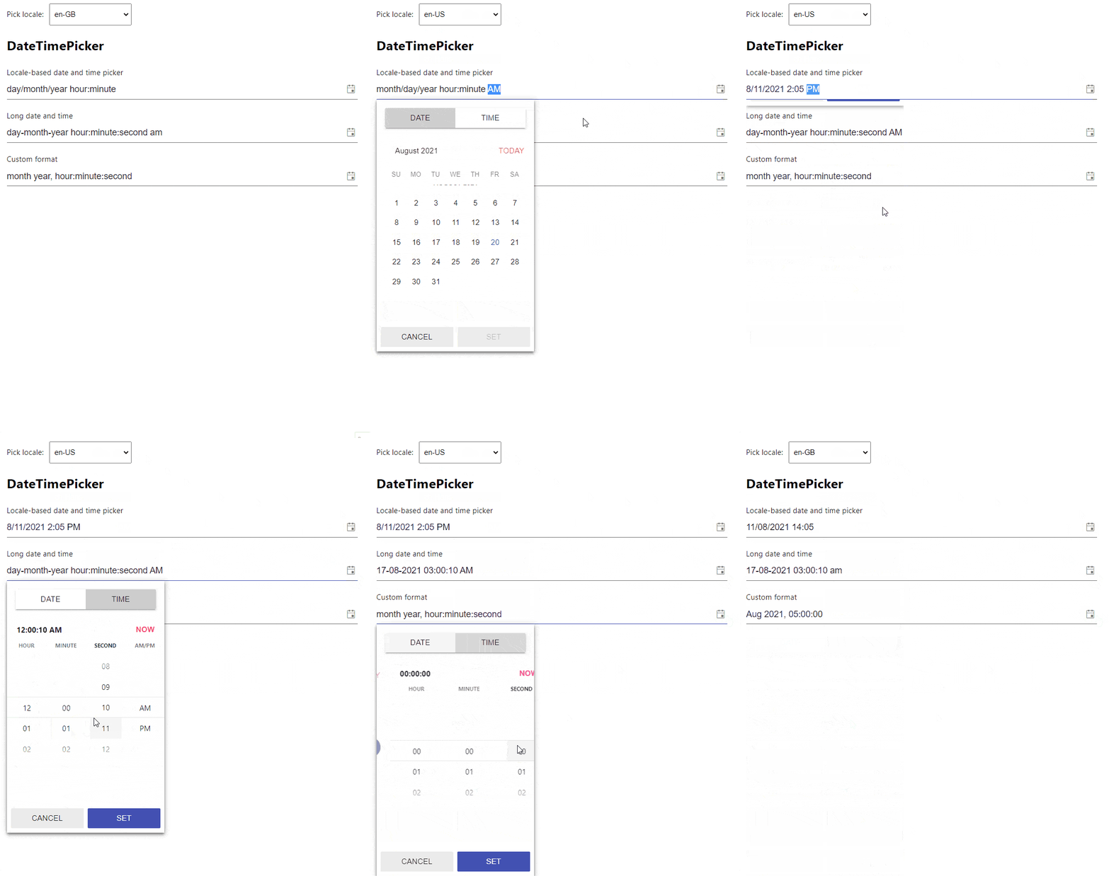
So far we have covered a few different ways to format the date. Now let’s have a look at formatting time. KendoReact offers a React DateTimePicker component which is an enriched version of the DatePicker. Besides selecting a date, it also allows users to select the time.
We will take advantage of the locale selection we implemented previously for the DatePicker component, but also provide our own custom formats. Now, create a new component called DateTimePickerWithLocale.
src/components/DateTimePickerWithLocale.js
import { DateTimePicker } from "@progress/kendo-react-dateinputs";

export default function DateTimePickerWithLocale() {
  return (
    <form className="k-form k-mb-8">
      <div className="k-my-4">
        <label className="k-form-field">
          Locale-based date and time picker
          <DateTimePicker />
        </label>
      </div>
      <div className="k-my-4">
        <label className="k-form-field">
          Long date and time
          <DateTimePicker format={"dd-MM-yyyy hh:mm:ss a"} />
        </label>
      </div>

      <div className="k-my-4">
        <label className="k-form-field">
          Custom format
          <DateTimePicker
            format={{
              year: "numeric",
              month: "short",
              hour: "2-digit",
              minute: "2-digit",
              second: "2-digit",
            }}
          />
        </label>
      </div>
    </form>
  );
}
Finally, import and render the Kendo DateTimePicker component in the App.js file.
src/App.js
import "@progress/kendo-theme-material/dist/all.css";
import "./App.css";
import DatePickers from "./components/DatePickers";
import LongMonthFormatPicker from "./components/LongMonthFormatPicker";
import MonthPickers from "./components/MonthPickers";
import SelectLocale from "./components/SelectLocale";
import { IntlProvider, load } from "@progress/kendo-react-intl";
import DynamicLocaleDatePicker from "./components/DynamicLocaleDatePicker";
import DateTimePickerWithLocale from "./components/DateTimePickerWithLocale";

import weekData from "cldr-core/supplemental/weekData.json";
import usCaGregorian from "cldr-dates-full/main/en/ca-gregorian.json";
import usDateFields from "cldr-dates-full/main/en/dateFields.json";
import gbCaGregorian from "cldr-dates-full/main/en-GB/ca-gregorian.json";
import gbDateFields from "cldr-dates-full/main/en-GB/dateFields.json";
import zhCaGregorian from "cldr-dates-full/main/zh-Hans/ca-gregorian.json";
import zhDateFields from "cldr-dates-full/main/zh-Hans/dateFields.json";
import arCaGregorian from "cldr-dates-full/main/ar-DZ/ca-gregorian.json";
import arDateFields from "cldr-dates-full/main/ar-DZ/dateFields.json";

load(
  weekData,
  usCaGregorian,
  usDateFields,
  gbCaGregorian,
  gbDateFields,
  zhCaGregorian,
  zhDateFields,
  arCaGregorian,
  arDateFields
);

function App() {
  return (
    <div className="App">
      <h1>Date formats examples using DatePicker</h1>
      <DatePickers />
      <LongMonthFormatPicker />
      <MonthPickers />
      <h2>Locale-based DatePicker</h2>
      <SelectLocale>
        {({ locale }) => (
          <IntlProvider locale={locale}>
            <DynamicLocaleDatePicker />
            <h2>DateTimePicker</h2>
            <DateTimePickerWithLocale />
          </IntlProvider>
        )}
      </SelectLocale>
    </div>
  );
}

export default App;
You can see the final result in the gif below.
Wrap-up
That’s it. As you now know, date and time formats may vary across different countries. It can be quite tricky to create a React DatePicker that supports date and time formatting with locales. Fortunately, we can use KendoReact, which provides many feature-rich and accessible components that can be easily configured and customized.

Thomas Findlay
Thomas Findlay is a 5-star rated mentor, full-stack developer, consultant, technical writer and the author of “React - The Road To Enterprise” and “Vue - The Road To Enterprise.” He works with many different technologies such as JavaScript, Vue, React, React Native, Node.js, Python, PHP and more. Thomas has worked with developers and teams from beginner to advanced and helped them build and scale their applications and products. Check out his Codementor page, and you can also find him on Twitter.
