
Top 5 Features of the KendoReact Data Grid (We Asked 100 People)

Summarize with AI:
See the contenders for the top five features in performance, data organization, column and row interaction, editing and customization, and exporting in the KendoReact Data Grid.
Disclaimer 1: The subtitle has nothing to do with the Family Feud TV show’s 100-member survey mini-game, but it got your attention, right? Also, we did not ask 100 people, although honestly I was that close to unleash a little poll in Reddit’s React Community and Reactiflux Discord (by the way, along with others of course, two great spots for React best practices discussions and chats).
Disclaimer 2: I am pretty sure that these top five features would be a bit of a stretch, especially if you’re dealing with a robust, functionality-rich data grid, suitable for a line of business enterprise-grade applications. That said, most probably you’ll get a few bonuses more as this blog progresses, so let’s shake hands on listing the top five+ features of KendoReact Data Grid.
First things first, the Progress KendoReact library is distributed through npm packages, and the Data Grid is available as @progress/kendo-react-grid. Constructed entirely using React and free from any dependencies, it is the brainchild of a company with almost 20 years of expertise in development. And since we are on the “top 5” topic, I’d recommend these five reasons not to create your JavaScript Data Grid from scratch.
As the KendoReact Data Grid (table) provides 100+ ready-to-use features, I was thinking how to organize the most popular (or highly rated, or utilized, or beneficial if you wish) ones. Eventually I settled with forming a logical separation by the following tiers:
- Performance
- Data Organization
- Columns and Rows Interaction
- Editing and Custom Cell Manipulation
- Export
Then I’d pick the top functionalities/techniques from each tier and unify them under a broader category that emphasizes their common purpose and value, thus presenting them as a single top feature.
Spoiler alert: Sorting, filtering and grouping will be framed as a single top feature under the Data Organization tier, emphasizing how they collectively contribute to a more holistic and effective data management experience. Each will be explained in detail, and you’ll be able to access the API documentation and runnable demos.
Enjoy the screenshots as well. KendoReact ships by default the following themes: Default, Bootstrap, Material and Fluent.
1. Performance Techniques
Performance is a critical factor in any software. In the context of a component used for displaying and managing tabular data, it becomes even more crucial. A smooth and responsive UI, stability under large data load, efficient real-time updates, optimized rendering and layout calculations, cleaner codebase, accessibility are the fundamental principles that could enhance overall performance.
To handle extensive datasets containing millions of records and numerous fields in KendoReact Data Grid, check out these techniques:
Column Virtualization
By reducing the DOM elements on the page, this feature dynamically renders only the visible columns during horizontal scrolling. Multi-column headers are supported as well. Example of column virtualization here.
Row Virtualization
Row virtualization is also known as virtual scrolling. Initial rendering covers a fraction of the data, with dynamic rendering of the remaining content based on scroll position. This is particularly valuable for large datasets, as it displays only a small data subset at a time. Row virtualization example here.
Paging
Similar to virtual scrolling, this feature renders a portion of data for the selected page. It serves as an alternative to virtual scrolling, catering to various user experience scenarios. Paging example here.
dataItemKey
This KendoReact Data Grid property associates each row with a dataset field, such as an ID. Utilizing dataItemKey enhances performance by updating only changed rows in React, minimizing
DOM operations after state updates.
Example of dataItemKey here.
Performance Testing
On GitHub, you can find a sample app that uses React.Profiler to test the actual performance numbers of the KendoReact Data Grid. This sample application allows you to see how the different features impact the performance.
It is more than recommended to test with a production build, which might render results up to six times performance improvement compared to a development one.
2. Data Organization Techniques
I’d like to quote my great co-worker Kathryn Grayson Nanz in her 2021 spot-on post:
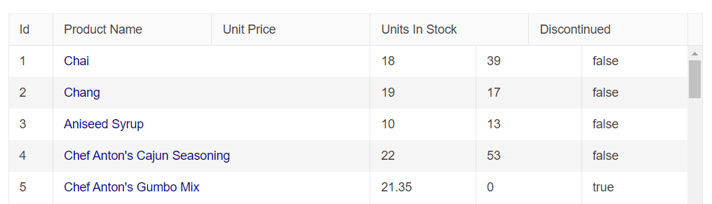
When you’ve got a grid with a lot of data, then Filtering, Sorting and Grouping are key features for your users to be able to make sense of all that information. If you just want to display your data in a way that’s easily readable, then a good ol’ HTML
<table>is probably all you need—but if you’re looking at KendoReact Data Grid components, then it’s because you already know you have a complex use case that requires more than what a basic table has to offer.
Here are some of the key data organization features to know:
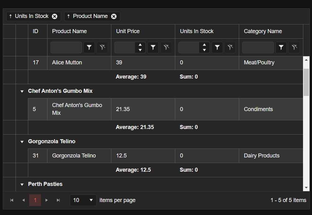
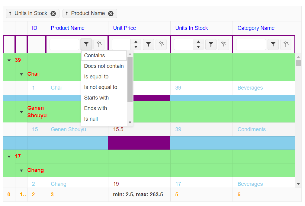
Filtering
Set the following prop filterable={true} which will enable a filter row under the column headers. Complete guide on how to get started with filtering can be found here or, if you enjoy educational blog posts, I’d recommend how to filter your data inside a React Grid using KendoReact Data Grid.
When filtering is activated, the Grid automatically includes a filter row within its header. It presents filtering elements within each column header, tailored to the data type contained in the respective column. You can utilize these components to filter string, numeric, boolean or date data types. Example here.
If you’d like to have a menu like filtering inside a popup container for a column, you can use columnMenu with GridColumnMenuFilter or the GridColumnMenuCheckboxFilter like this one.
Even external filters like the KendoReact Filter component can be used, as shown here.
To customize, you could use the filterCell prop of the GridColumn to create, for example, a KendoReact DropDownList component like this one.
The operators for the numeric, text and date filter types can be also customized by using the filterOperators property, which accepts GridFilterOperators. The first operator from each type is the default one. Check out custom filter operators here.
Grouping
Set groupable={true} and group={group} to get enable rendering of grouped table data and refer to the full example here.
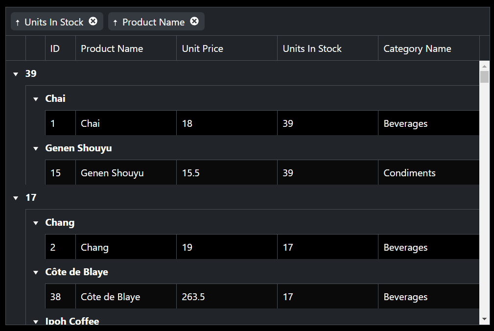
By default, all columns can be grouped multiple times. To group specific columns and implement dynamic grouping to a column, use a function or a variable for the groupable property like shown here.
You can also persist groups collapsed state or add button to expand or collapse all groups in the Grid.
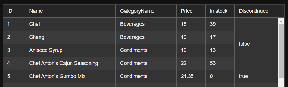
Another cool perk is the ability to display the aggregates for the grouped data in the respective column group footer:
In addition to all of the above, you could lock the group headers of the Grid, using its lockGroups prop. Setting the locked prop of the desired columns will allow you to freeze them as well, with the locked headers like here.
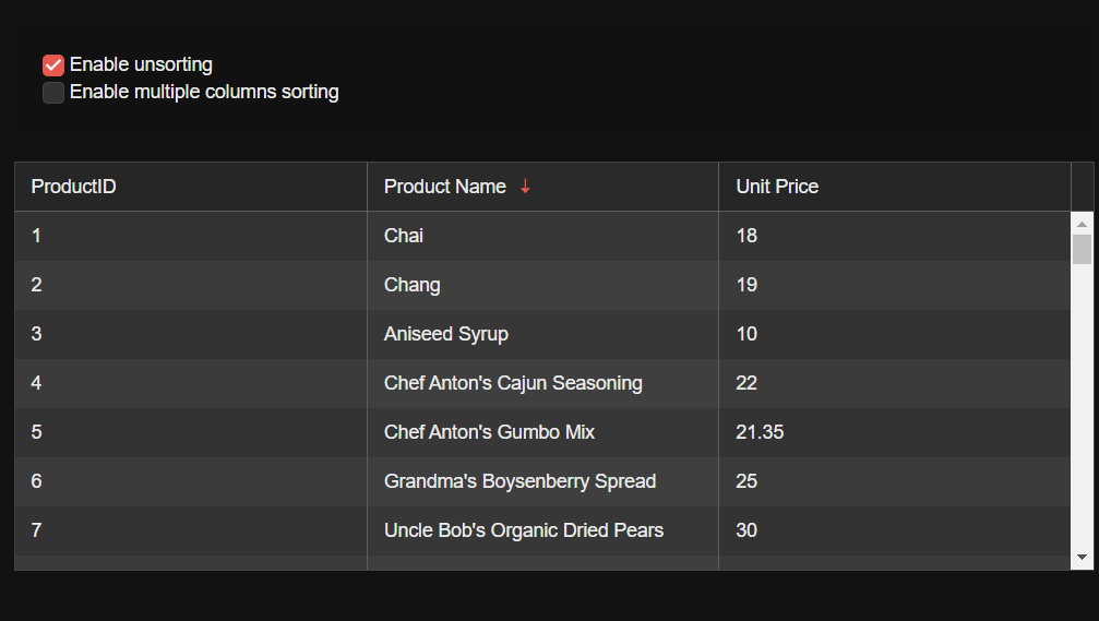
Sorting
Set sortable={true} to get started and make sure to check out the sorting example for the needed configs. You can also unsort the columns and sort the records by multiple columns or reverse the sorting order.
3. Columns and Rows Interaction Techniques
Resizing, reordering, freezing, etc. of rows and columns empower users to optimize data visibility and entry, arrange information according to relevance, and create personalized views that enhance data analysis and decision-making. Let’s look at these techniques:
Column Width
KendoReact Data Grid is inherently responsive and lacks a fixed width. Operating as a block-level element, the component automatically stretches to 100% width, matching its parent element. This results in adjusting its size according to the available space.
It is possible to dynamically change the width of the Grid columns and set a minimum width value
by subscribing to the window.resize event.
In addition you can set the Grid column widths in percentage by using a function that will calculate the real width based on the passed % value or if the Grid has no width specified and it resizes based on the available space, the width of the column could be set in percentage using CSS.
Sticky Columns
Also known as locked or frozen, sticky columns are visible at all times while the user scrolls the Grid horizontally. You can use columnMenu to display button to lock and unlock a specific column on click or use the locked columns with a custom cell.
Spanned Columns
This feature allows content within rows to span across multiple data cells while preserving individual header and footer cells. This is done by using the cells and adding the desired colSpan to the returned cell as shown here.
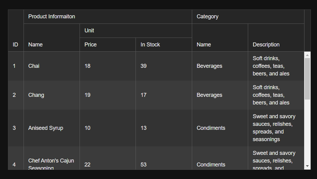
Multi-Column Headers
Available out of the box, multi-column headers are shown as set here.
Resize and Reorder Columns
By default, column-resizing is disabled, but you can set resizable={true}, so that you can resize the columns by dragging the edges of the header cells. In addition, you can auto-resize columns to fit their content by
double-clicking on the resize handle.
As its name implies, setting reorderable={true} will allow reordering of the columns by dragging the header cells.
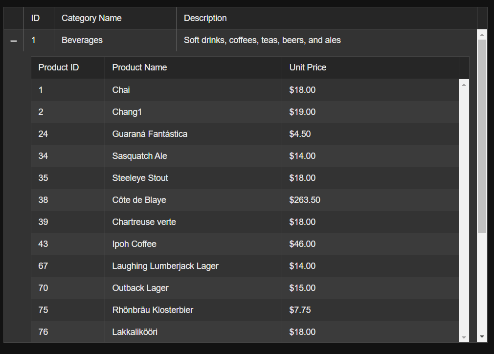
Detail and Master-Detail Rows
The detail rows of the Grid enable you to provide additional details about a row of data by expanding or collapsing its content, while the master-detail allows you to visualize the relations between its parent and child records by displaying the table data in a hierarchical order:
Sticky Rows
You can pin rows at the top of the Grid to make them always visible during scrolling.
Spanned Rows
Rows can span the same as with the columns:
Reorder Rows
Rows can be enabled for reordering by using the KendoReact Drag&Drop, built-in browser APIs or third-party libraries. Handy examples here.
4. Editing and Cell Manipulation Techniques
This category was tough, I must admit, as it includes functionalities spanning from cell editing and validations to customization of each individual cell.
Editing
The following options are available as part of the built in functionalities of the KendoReact Data Grid:
- Inline editing
- Inline editing with custom editors
- In-cell editing
- In-cell editing of all cells
- Editing with external popup form
- Editing with external Redux form
Validation
The edited data can be validated using the Grid cells.edit property and via custom editor, showing an error message when the chosen data does not match your defined validation conditions. The validation demo is here.
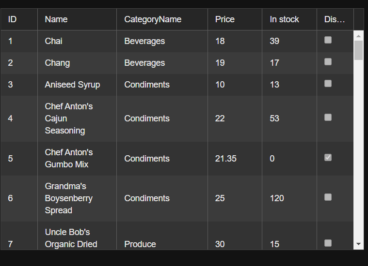
Custom Cells
Via the cells property, you have the option to add a template to every single cell in the Grid separately. There are properties exposed for customizing:
The edit property allows you to customize the numeric, boolean, text and date of cells.
The hierarchy prop allows you to customize group header, group footer and data cells of the detail component.
The group property allows you to do the same for each group, while the select property is for each selected cell.
Readily available examples for all these are here.
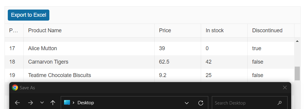
5. Export Techniques
Exporting from a Data Grid adds versatility to the usage of the data, supports collaboration and analysis, and ensures data availability in various contexts beyond the confines of the original application.
PDF Export
Using the GridPDFExport component provides options for exporting the content of the KendoReact Data Grid.
To initiate the PDF export, use the save method as shown here. What’s cool about that is you can dynamically import the PDF export component only when it is needed—i.e., apply lazy loading.
I am listing here all the functionalities you can use for PDF export:
- Exporting all Grid pages
- Fitting content within the paper size
- Customizing exported columns
- Using page template
- Saving generated files
- Embedding custom fonts
Excel Export
Similar to above, using the ExcelExport component provides options for exporting the KendoReact Data Grid content to Excel. Getting started implementation can be found here.
In addition, you can:
- Wrap the Grid in an ExcelExport component
- Pass the Grid columns to the ExcelExport component
- Export specific data
- Customize the exported columns of the Grid
Bonus: Data Operations
I promised the team manager behind the KendoReact Data Grid, Elena, to include one of her top features as a bonus. You can page, filter, sort and group the data locally or via OData service.
Bonus: Accessibility
Apps are accessible when they provide full control over their features by enabling users with disabilities to access their content through assistive technologies or keyboard navigation. Still wondering how to build an accessible React Data Grid? Check out this blog post.
And if you haven’t already, you can try KendoReact today for free!
Happy coding!
.jpg?sfvrsn=44cd23a2_1 "Petar Grigorov headshot (2)")
Petar Grigorov
Petar is a Principal Sales Engineer at Progress with equal sympathy in coding and automation testing. In his spare time he turns into a DIY guy who can successfully setup and use anything from IoT gadgets to paintbrushes and a trowel. When not dreaming of piloting the Millennium Falcon, he is a fan of any engine that is close enough and runs on two or four wheels.
Related Posts
Comments
All articles
Topics
Web MobileMobile
Desktop
Design
Productivity
People
