Sorting, Filtering and Grouping With the KendoReact Data Grid

Summarize with AI:
Filtering, Sorting and Grouping are three important tools you can give your users to help them parse the data presented in a KendoReact Data Grid. Learn how to implement these configurations, as well as which use cases each one is most suited for!
When you’ve got a grid with a lot of data, then Filtering, Sorting and Grouping are key features for your users to be able to make sense of all that information. If you just want to display your data in a way that’s easily readable, then a
good ol’ HTML <table> is probably all you need—but if you’re looking at React Data Grid components, then it’s because you already know you have a complex use case that requires more than what a basic table
has to offer. The KendoReact Data Grid is an extremely powerful component for displaying and organizing data, but first you’ll
need to configure it in order to allow your users to make the most of the available features. Luckily, that’s why we’re here today, so let’s get started!
In this situation, we’ll be working from the assumption that your Data Grid is already installed, placed in your React application and populated with data. If that’s not the case yet, check out our docs for guidance on getting started, and come back here when you’re ready to take a deeper dive!
Or, if you’re just looking for an example to play with, you’re welcome to clone and play around with our kendo-demo app, LKARS Menu System—you can find the repo here. It should be noted that this app has been heavily themed to look like the Star Trek ship menu system, so colors and fonts will look different than they do in our docs. If you’re interested in
applying custom theming to your KendoReact components, take a look at this walkthrough, as well as this blog about using SASS for custom component styling.
If you’d like to code along, check out the companion video, React Data Grid (Table) Sorting, Filtering and Grouping: KendoReact Grid Demo.
We’re going to add and configure various filtering and sorting features for the Data Grid component used in the Astrometrics section of our app, so the crew members of our fake starship can easily review all the recently logged astrological objects of interest. So, without further ado, let’s set our course for Data Grid expertise, and... engage!
Our Current Setup
The basic version of the React Data Grid in your JSX will look like this:
<Grid
  style={{ height: "90%" }}
  data={astroData}
>
  <Column field="name" title="Name" />
  <Column field="astronomicalObjectType" title="Object Type" />
  <Column field="location.name" title="Location"/>
</Grid>
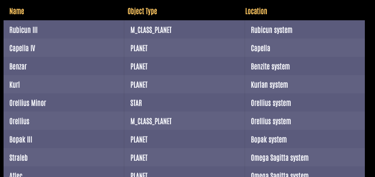
In our Data Grid component, I’ve specified a height of 90% (so that the component will scroll instead of overflowing) and populated it with data from a .json file I imported. I’ve also specified that the Grid should
have three columns: Name, Object Type and Location. Otherwise, this Data Grid doesn’t look too different from your average table.
And this is okay, I suppose, but one of my fictional crew members needs to run a report on recently encountered M-Class planets. Right now, she’d have to scroll all the way through the entire Data Grid content to do so, but it would be a lot easier if she could sort the Object Type column so all the M-Class type planets were together. And hey, we have the technology, so let’s do it!
Enabling Sorting in the React Data Grid
Step one is to set the
sortableprop on our React Data Grid component totrue.<Grid style={{ height: "90%" }} data={astroData} sortable={true} > <Column field="name" title="Name" /> <Column field="astronomicalObjectType" title="Object Type" /> <Column field="location.name" title="Location"/> </Grid>Next, we’ll want to set up a hook that will handle our state management for the current state of the sorted Grid. At the top of our component, I’ve added a new hook that sets
sortas the current sort state,setSortas what we’ll be calling when the user updates the sort method, andinitialSortas the default configuration for sorting on load.const [currentSort, setSort] = React.useState(initialSort);I’ve set
initialSortto sort the Name column in ascending alphabetical order.const initialSort = [ { field: "name", dir: "asc", }, ];Once that’s ready, let’s add it to our component. We’ll use the
sortprop to tell the Grid that we want it sorted according to thesortwe defined above. And we’ll use theonSortChangeprop to update the state every time the user changes the sort method.<Grid style={{ height: "90%" }} data={astroData} sortable={true} sort={sort} onSortChange={(e) => {setSort(e.sort)}} > <Column field="name" title="Name" /> <Column field="astronomicalObjectType" title="Object Type" /> <Column field="location.name" title="Location"/> </Grid>Now, if we look over at our application, we can see that when we click on the Column headers, we get an arrow to indicate the current sort status... however, the data itself isn’t actually being sorted, yet. That’s because we need to actually, well, do the sorting!
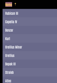
To do this, we’ll need toimport { orderBy } from "@progress/kendo-data-query"as well as update ourdataprop to callorderByand pass in our base data along with oursort.
So our final code for the Table component looks like this!
<Grid
style={{ height: "90%" }}
  data={orderBy(astroData, sort)}
  sortable={true}
  sort={sort}
  onSortChange={(e) => {setSort(e.sort)}}
>
  <Column field="name" title="Name" />
  <Column field="astronomicalObjectType" title="Object Type" />
  <Column field="location.name" title="Location"/>
</Grid>
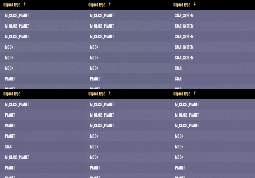
And now, our Ensign can quickly sort all the M-Class type planets to the top and compile her list. Watch out bridge crew, this girl’s about to be promoted!
Configuring Table Sorting Options
There are also a few ways you can customize the way your React Table can be sorted. You can disable unsorting of columns by setting sortable.allowUnsort to false, and you can allow the user to sort multiple columns at the same
time by setting sortable.mode to multiple. Our sortable.mode will accept either multiple or single as options, and defaults to single.
<Grid
  style={{ height: "90%" }}
  data={orderBy(astroData, sort)}
  sortable={{
        allowUnsort: false,
        mode: "multiple"
    }}
  sort={sort}
  onSortChange={(e) => {setSort(e.sort)}}
>
  <Column field="name" title="Name" />
  <Column field="astronomicalObjectType" title="Object Type" />
  <Column field="location.name" title="Location"/>
</Grid>
When users can sort multiple columns at the same time, a number will appear in the column UI to indicate the sorting preference order.

Enabling Filtering for the KendoReact Data Grid
Right now, our Ensign can sort the grid in order to move all the M-Class planets to the top of the list, but it sounds like what she really needs is not to sort, but rather to filter the grid contents in order to remove every astrological object that’s not an M-Class planet. Here’s how we enable React Data Grid filtering in our React app:
First, we’ll add a
filterableprop to our Grid component and set it to betrue.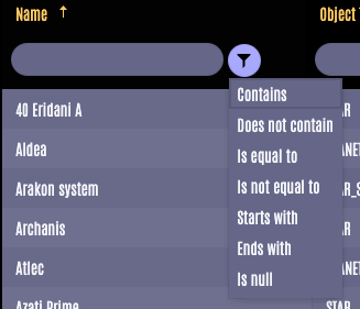
As soon as you do this, you’ll see that there’s a new section at the top of each Column in your Data Grid, with a field for user input and a button to change the filter type based on how they want to structure their filter. You’ll also notice that it’s not working yet—that’s because we still need to hook it into our state and handle the changes from the user’s choices.
In order to do that, we’ll need to create a hook that allows us to set the filter based on the user’s choice:
const [filter, setFilter] = React.useState(initialFilter);Then, we’ll define that
initialFilterto return whatever filter state we want on component load. In this case, I’ve set it to be blank:const initialFilter = { logic: "and", filters: [ { field: "name", operator: "contains", value: "", }, ], };Then, we’ll connect that to our Grid component by setting the
filterandonFilterChangeprops. We’ll setfilterto ourfiltervariable, and useonFilterChangeto callsetFilterto update the state whenever the user changes the filtering method.<Grid style={{ height: "420px", }} data={filterBy(sampleProducts, filter)} filterable={true} filter={filter} onFilterChange={(e) => setFilter(e.filter)} >Now, when we check back in on our application, we can test the filter input and see the contents of the Grid immediately start filtering the data as we type. Now, our crewmate can quickly and easily filter the Grid to only return those M-Class planets she was looking for.
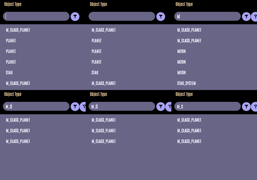
Configuring Filtering Options
The default setting for the Data Grid Filtering UI is to add that user input field immediately below the Column header. However, if you’re trying to conserve space as much as possible in your UI, there’s another layout you can choose that nests the Filtering inputs in a dropdown menu. Although it is worth noting that this method does change the UX slightly, in that it will no longer filter as the user types—instead, the user must click the "Filter" button before the Grid updates.
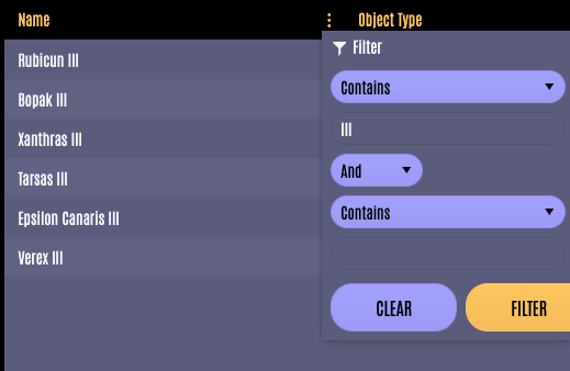
In order to set up the menu, we’ll want to import GridColumnMenuFilter from @progress/kendo-react-grid and use it to create a new component. We’ll call this component ColumnMenu, and it should should
look like this:
import { Grid, GridColumn as Column, GridColumnMenuFilter } from "@progress/kendo-react-grid";

export const ColumnMenu = (props) => {
  return (
    <div>
      <GridColumnMenuFilter {...props} expanded={true} />
    </div>
  );
};
Then, we’ll adjust our Table component to add the new menu to each column where we want it to appear:
<Grid
  style={{ height: "90%" }}
  data={filterBy(astroData, filter)}
  filter={filter}
  onFilterChange={(e) => setFilter(e.filter)}
>
  <Column columnMenu={ColumnMenu} field="name" title="Name" />
  <Column columnMenu={ColumnMenu} field="astronomicalObjectType" title="Object Type" />
  <Column columnMenu={ColumnMenu} field="location.name" title="Location"/>
</Grid>
Sometimes you know in advance how your users will need to filter the information in your Data Grid. In these cases, you can improve the UX of your application by removing the filter selection step from the process, and having the Grid only display the
the filter type relevant to that Column. For example, if you have a Column displaying the number of times a particular Astronomical Object has been encountered, you can specify in the Column component filter={"numeric"} , and the filter
cell will be updated to specify numeric input.
<Grid
  style={{ height: "90%" }}
  data={filterBy(astroData, filter)}
  filter={filter}
  onFilterChange={(e) => setFilter(e.filter)}
>
  <Column field="name" title="Name" />
  <Column field="astronomicalObjectType" title="Object Type" />
  <Column field="location.name" title="Location"/>
    <Column field="encounters" title="Encounters" filter={"numeric"}/>
</Grid>

Finally, if you know that your users will want to filter in specific ways (like our Ensign who would always be filtering from a list of preset types) you can optimize your UI to make that process clearer to your users by using the filterCell prop in the <Column> child component. This will allow you to replace the default filtering UI beneath the Category header with fully custom content—anything you like.
To do this, you’ll use the same approach as above, where you create a new component to handle the filtering request. But then, instead of passing that into columnMenu, you’ll use filterCell instead. Note that your
custom component will need to handle all user inputs (onClick events, etc.) since this is an addition to the standard KendoReact component functionality.
<Column filterCell={MyCustomFilter} field="name" title="Name" />
Enabling Grouping for the KendoReact Data Grid
For the third time, we’re approached by this crewmate. “Please,” they say, “I know before I said I wanted to sort, and then to filter, but what I really need is a way to group the data by type but still be able to see all of it!” Well, why didn’t you say so in the first place? Of course we can do Data Grid Grouping with KendoReact!
First, we’ll set the
groupableprop of the Grid component totrue<Grid style={{ height: "90%" }} data={filterBy(astroData, filter)} groupable={true} onFilterChange={(e) => setFilter(e.filter)} > <Column field="name" title="Name" /> <Column field="astronomicalObjectType" title="Object Type" /> <Column field="location.name" title="Location"/> </Grid>Once you’ve done that, you’ll see the change reflected in our UI, with a new line above the Column headers with instruction on how to group. It won’t work yet, but let’s fix that!

In order to get that drag-and-drop working, we’ll need to set up our
onGroupChangehandler to update the state. This follows the same pattern as the Filtering and Sorting approaches, so you’re probably familiar with it by now! So, let’s create our hook withgroup,setGroupandinitialGroup. In this case, I’m going to set up myinitialGroupto start by grouping the Grid contents by Object Type.const initialGroup = { field: "astronomicalObjectType", }; const [group, setGroup] = React.useState(initialGroup);Now, we’ll use those with
onGroupChangeto update the group settings when the user drags and drops those Column headers.<Grid style={{ height: "90%" }} data={groupBy(astroData, group)} groupable={true} group={group} onGroupChange={(e) => setGroup(e.group)} > <Column field="name" title="Name" /> <Column field="astronomicalObjectType" title="Object Type" /> <Column field="location.name" title="Location"/> </Grid> </div>
As you can see in the example gif, all Columns can be grouped multiple times. The order in which the Columns are grouped is based on the order in which the user drags them into the header section. You can disable any Column from being able to be grouped
by setting grouped={false} in the Column component. When this is set, the user will not be able to drag and drop that specific Column, but can still group based on the others.
Combining Sorting, Filtering and Grouping in the KendoReact Data Grid
Sometimes, we need more than one method of organization enabled on our Grid together. When this is the case, there are some changes that need to be made to the code in order to handle these multiple forms of processing.
To begin, we’ll need to change out the process-specific pieces we were using. Instead of
sort/setSortorfilter/setFilter, you’ll want to use the more genericdataStateandsetDataState. We also need to add another state management piece forresultStateandsetResultState. These handle two different aspects of the Grid:dataStatehandles the current configuration of the Grid settings, andresultStatehandles what’s actually being displayed in the Grid currently.const [dataState, setDataState] = React.useState(); const [resultState, setResultState] = React.useState( process(astroData, initialDataState) );If you were previously importing
sortByorfilterBy, you’ll need to replace that withprocess, a more general method that can handle updating all 3 types of organization.import { process } from "@progress/kendo-data-query";Now, we need to add a new function to handle when users change the filtering, grouping or sorting settings. I’ve called mine
onDataStateChange, and it will update both thedataStateand theresultStatewhen called.const onDataStateChange = React.useCallback((e) => { setDataState(e.dataState); setResultState(process(astroData, e.dataState)); }, []);Now, we take a look at our Grid component. We should still have
sortable,filterableandgroupableset to true (assuming you want them all turned on at once), but we should replace thefilterandsortproperties with the more genericdataand set it to{ data: resultState.data }. We also need to add ouronDataStateChangefunction, so that gets called anytime the user updates the state of the Grid configurations. You can see that at the bottom, set to{onDataStateChange}{...dataState}.<Grid style={{ height: "90%" }} data={{ data: resultState.data }} filterable={true} sortable={true} groupable={true} onDataStateChange={onDataStateChange}{...dataState} >
And there you have it! Now your Data Grid can handle any combination of Sorting, Filtering and Grouping settings input by your users. If you want to see it all together, check out this StackBlitz example. But how do you decide which combination of these features is right for your application?
How Do I Choose What to Enable for My Data Grid? Should I Just Enable Everything?
In that last example, we walked through three very powerful features—Sorting, Filtering and Grouping—and enabled all of them. However, this all-in approach isn’t always the best UX for your application.
While it can be tempting to see a list of features like this and say, “Turn everything on!!” I’d actually encourage you to enable only those features that will be the most beneficial for your users and leave out the ones you think would be less used. Enabling every feature (and every configuration of every feature) can be an overwhelming experience for your users, and could create a complex UI.
If you know your userbase is made up of “power users” who will feel comfortable manipulating complex Data Grids like this, then absolutely give them full freedom! But if the majority of your users aren’t at that level, you can improve their experience by being thoughtful about how you configure your Grid component.
Sorting is ideal for situations when your users will need to compare your data, or see all of it in a specifically organized way. For example, being able to compare the prices on different offerings by sorting cost from low to high, or looking through all your employees alphabetically organized by name. This is a great way to organize data that’s already all in a similar category.
Filtering is best for when your users only need to see a certain subset of your data, and not all of it at once. For example, only showing the products within a certain category, or only the employees with a specific title. This is good when you have several different subsets of data included in your Grid, but your users won’t need to view all of it at once. This can be especially powerful when combined with Sorting, allowing your users to filter down to a specific subset of data, and then organize it in a progressive way.
Grouping should be used when your users need to see the entirety of the data, but broken up into smaller categories. It’s kind of a blend between the filtering and sorting features, from a UX perspective. It allows your users to create those same subsets as filtering, but without removing the data from the view the way filtering does. This allows your users to still see the other categories for comparison purposes, but in a more visually differentiated way than a sorted list may offer. This is especially good when you’ve got a lot of data, but it all needs to remain in the view. Breaking it up into smaller categories makes it easier for your users to parse through, but ensures that the entirety of the data is still available to them in one view.
I recommend taking a little time to think about what your users will be doing with the data in your Grid. What are their goals? What conclusions are they trying to draw? What problems are they trying to solve? What kinds of connections are they attempting to make? The answers to these questions can help guide you toward whether Sorting, Filtering, Grouping or some combination thereof is the best fit for your application.
We provide everything in one component for your convenience as a developer, so that you can use the same KendoReact Data Grid in multiple different contexts and scenarios within your application—but this doesn’t necessarily mean that your users will also benefit from an all-in-one solution in the UI. When you combine your knowledge and expertise about your own userbase with the power of the KendoReact Data Grid, the possibilities are truly endless!

Kathryn Grayson Nanz
Kathryn Grayson Nanz is a developer advocate at Progress with a passion for React, UI and design and sharing with the community. She started her career as a graphic designer and was told by her Creative Director to never let anyone find out she could code because she’d be stuck doing it forever. She ignored his warning and has never been happier. You can find her writing, blogging, streaming and tweeting about React, design, UI and more. You can find her at @kathryngrayson on Twitter.
