
How to Implement Filtering in Your React Data Grid

Summarize with AI:
Learn how to filter your data inside a React grid using KendoReact Data Grid.
Data filtering is a commonly used functionality in data-intensive web applications. It allows users to find specific information quickly based on the search criteria provided. Thanks to that, users can easily find what they need without having to sieve through large amounts of data.
In this article, we are going to cover how to implement filtering functionality in React. We will use KendoReact Data Grid to create a table with recipes dataset and then start adding more complex filters to find specific data.
What’s KendoReact Grid?
The Grid from Progress KendoReact is a powerful React table component that provides over a hundred ready-to-use features which comprise pagination, sorting, filtering, editing, grouping rows and columns, exporting data to various formats, and more. Thanks to the support for virtualized rows and columns, it allows users to easily work with large datasets.
Project Setup
If you want to follow this article, clone the following repository and switch to the start branch. The main branch contains the final code for this part of the series.
$ git clone git@github.com:ThomasFindlay/kendo-react-how-to-implement-filtering-in-data-grid.git
$ cd kendo-react-how-to-implement-filtering-in-data-grid
$ git checkout start
$ npm install
$ npm run dev
The npm install command will install all dependencies, and npm run dev starts the development server.
The sample app was scaffolded with Vite. If you never heard of or used it before, I’ve written an article about it—What Is Vite: The Guide to Modern and Super-Fast Project Tooling.
You can find the full code example for this article in this GitHub repository. Below you can also find an interactive StackBlitz example.
KendoReact Data Grid Default Setup
Let’s start by creating a new file called RecipesTable.jsx in the src/components directory. We will start by importing a few things.
src/components/RecipesTable.jsx
import { useState } from "react";
import { Grid, GridColumn as Column } from "@progress/kendo-react-grid";
import { filterBy } from "@progress/kendo-data-query";
import originalRecipes from "../assets/recipes.json";
const recipes = originalRecipes.slice(0, 100);
Furthermore, the useState hook will be used to hold the filters’ state.
Next, we import Grid and GridColumn components from the @progress/kendo-react-grid library. We will use these components to create a table.
Further, the filterBy method provided by @progress/kendo-data-query will handle filtering the data.
Last but not least, recipes is an array of objects that contain information about recipes. This dataset was taken from kaggle and it might have some typos,
etc., but that’s not relevant to this project. We just need a lot of data for the table.
Next, let’s configure the initial state for the filters and render a table with the recipes data.
src/components/RecipesTable.jsx
import { Grid, GridColumn as Column } from "@progress/kendo-react-grid";
import originalRecipes from "../assets/recipes.json";
const recipes = originalRecipes.slice(0, 100);

export const RecipesTable = () => {
  return (
    <Grid
      style={{
        height: "420px",
      }}
      data={recipes}
      pageSize={20}
    >
      <Column field="recipe" title="Recipe" width="250px" />
      <Column field="numIngredients" title="Ingredients" width="150px" />
      <Column field="cuisine" title="Cuisine" width="120px" />
      <Column field="course" title="Course" width="120px" />
      <Column field="servings" title="Servings" width="120px" />
      <Column field="cookTime" title="Cooking Time" width="150px" />
      <Column field="prepTime" title="Prep Time" width="120px" />
      <Column field="totalTime" title="Total Time" width="120px" />
    </Grid>
  );
};

export default RecipesTable;
The RecipesTable component is quite simple. We utilize the Grid and GridColumn components from the @progress/kendo-react-grid package and render a table with the following columns:
- Recipe
- Ingredients
- Cuisine
- Course
- Servings
- Cooking Time
- Prep Time
- Total Time
Finally, we need to add the RecipesTable component in the App.jsx file.
src/App.jsx
import "./App.css";
import RecipesTable from "./components/RecipesTable.jsx";

function App() {
  return (
    <div className="App">
      <h1>KendoReact Data Grid Filtering</h1>
      <h2>Default Table</h2>
      <RecipesTable />
    </div>
  );
}

export default App;
The image below shows what the table looks like.
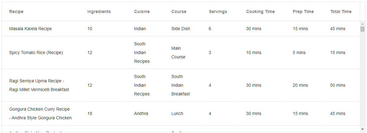
We didn’t need to write a lot of code, and we have a nice-looking table with multiple columns. Next, let’s add filtering functionality.
Default Column Filters
Adding filters for each column in KendoReact Data Grid is very straightforward. First, we need to start by defining an object that will serve as the initial state for the filters. Let’s call it initialFilter. The initialFilter object needs two properties—logic and filters:
logic: Configures the logical operator used when combining multiple filters. It should be “and” or “or.”filters: Holds filters that will be applied based on the logical operator specified in thelogicvalue.
Below you can see the basic filter config without any filtering logic.
const initialFilter = {
  logic: "and",
  filters: [],
};
There are scenarios which might require some filters to be set for users upfront. For instance, a page could have a table of users that initially should show only active users. Suppose a user object has a status property that can be either
Active or Inactive. Showing only active users could be achieved by defining the following filter:
const initialFilter = {
  logic: "and",
  filters: [
    {
      field: 'status',
      operator: 'eq',
      value: 'Active'
    }
  ]
}
Note that more than just one filter can be added. We use recipes in our examples, so we could configure the table to show only Asian recipes that contain the word “chicken.”
const initialFilter = {
  logic: "and",
  filters: [
    {
      field: "recipe",
      operator: "contains",
      value: "Chicken",
    },
    {
      field: "cuisine",
      operator: "Contains",
      value: "Asian",
    },
  ],
};
The initialFilter will be passed to the useState hook, as the Grid component needs to be able to update it.
const [filter, setFilter] = useState(initialFilter)
The next steps comprise passing a few props to the Grid and Column components.
Specifically, the Grid component needs to receive filterable, filter and onFilterChange props, and the Column components need filter and an optional format prop.
The filterable prop enables filtering functionality, while the filter prop passed to the Grid component is the filter object returned by the useState hook above. Again, it specifies what
kind of filters should be applied.
However, the filter prop passed to the Column component is different, as it is used to specify what kind of filter should be used for a column. It can be one of the following: text, numeric, boolean or date. The optional format prop can be used to format the column text. Let’s create a new component for the recipes grid that will contain column filters.
src/components/RecipesGridWithColumnFilters.jsx
import { Grid, GridColumn as Column } from "@progress/kendo-react-grid";
import { filterBy } from "@progress/kendo-data-query";
import { useState } from "react";
import originalRecipes from "../assets/recipes.json";
import { useEffect } from "react";

const recipes = originalRecipes.slice(0, 100);
const initialFilter = {
  logic: "and",
  filters: [],
};

const gridStyle = {
  height: "420px",
};

export const RecipesGridWithColumnFilters = () => {
  const [filter, setFilter] = useState(initialFilter);

  return (
    <Grid
      style={gridStyle}
      data={filterBy(recipes, filter)}
      pageSize={20}
      filterable
      filter={filter}
      onFilterChange={e => setFilter(e.filter)}
    >
      <Column field="recipe" title="Recipe" width="250px" filterable />
      <Column
        field="numIngredients"
        title="Ingredients"
        width="240px"
        filter="numeric"
      />
      <Column field="cuisine" title="Cuisine" width="240px" />
      <Column field="course" title="Course" width="240px" />
      <Column
        field="servings"
        title="Servings"
        width="240px"
        filter="numeric"
      />
      <Column
        field="cookTime"
        title="Cooking Time"
        width="240px"
        filter="numeric"
        format="{0} mins"
      />
      <Column
        field="prepTime"
        title="Prep Time"
        width="240px"
        filter="numeric"
        format="{0} mins"
      />
      <Column
        field="totalTime"
        title="Total Time"
        width="240px"
        filter="numeric"
        format="{0} mins"
      />
    </Grid>
  );
};

export default RecipesGridWithColumnFilters;
It needs to be added in the App component as well.
src/App.jsx
import "./App.css";
import RecipesTable from "./components/RecipesTable.jsx";
import RecipesGridWithColumnFilters from "./components/RecipesGridWithColumnFilters.jsx";

function App() {
  return (
    <div className="App">
      <h1>KendoReact Data Grid Filtering</h1>
      {/* <h2>Default Table</h2>
      <RecipesTable /> */}
      <h2>Grid with column filters</h2>
      <RecipesGridWithColumnFilters />
    </div>
  );
}

export default App;
The GIF below shows how to use the column filtering functionality.
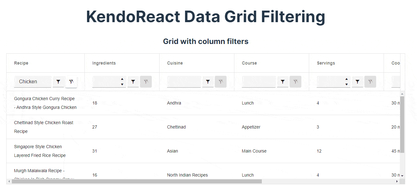
We can type in whatever value we want to search for and modify the filter’s operator as needed. E.g., if we want to find recipes that can be done within 2 hours, we can set the total time filter to 120 and the operator to is less than or equal to,
or if we fancy a meal from the Indian cuisine, we just change the Course filter.
In the next section, we will have a look at how to add custom column filters.
Custom Column Filters
Suppose we would like to be able to specify the minimum and maximum amount for cooking, prep and total time. We can’t do it with the default column filters, but fortunately we can provide our own custom filter component. Let’s create a component
called RangeFilterCell.
src/components/RangeFilterCell.jsx
import { NumericTextBox } from "@progress/kendo-react-inputs";

export const RangeFilterCell = props => {
  let minTextBox;
  let maxTextBox;

  const inRange = (current, { min, max }) =>
    (min === null || current >= min) && (max === null || current <= max);

  const onChange = event => {
    props.onChange({
      value: {
        min: minTextBox.value,
        max: maxTextBox.value,
      },
      operator: inRange,
      syntheticEvent: event.syntheticEvent,
    });
  };

  const onClearButtonClick = event => {
    event.preventDefault();
    props.onChange({
      value: null,
      operator: "",
      syntheticEvent: event,
    });
  };

  const value = props.value || null;

  return (
    <div className="k-display-flex k-align-items-end">
      <div className="k-display-flex k-flex-column">
        <span>Min:</span>
        <span
          style={{
            margin: "0 16px 0 2px",
          }}
        >
          <NumericTextBox
            width="80px"
            value={value && value.min}
            ref={numeric => {
              minTextBox = numeric;
            }}
            onChange={onChange}
          />
        </span>
      </div>
      <div className="k-display-flex k-flex-column">
        <span>Max:</span>
        <span
          style={{
            margin: "0 8px 0 4px",
          }}
        >
          <NumericTextBox
            width="80px"
            value={value && value.max}
            ref={numeric => {
              maxTextBox = numeric;
            }}
            onChange={onChange}
          />
        </span>
      </div>
      <button
        className="k-button k-button-md k-rounded-md k-button-solid k-button-solid-base k-button k-button-md k-rounded-md k-button-solid k-button-solid-base-icon k-clear-button-visible"
        title="Clear"
        disabled={!value}
        onClick={onClearButtonClick}
      >
        <span className="k-icon k-i-filter-clear" />
      </button>
    </div>
  );
};
Let’s digest what’s happening in the RangeFilterCell component.
The minTextBox and maxTextBox variables are used to store references to min and max input fields. The inRange function checks whether the provided value is within the min and max filters
specified by a user.
Next, we have onChange and onClearButtonClick functions that are used to update the filters’ state. The former retrieves the values from min and max inputs and passes the inRange function as the operator.
Since we have a custom filter and value, we also need a custom operator to filter data. We also need to forward the synthethicEvent object. If it’s the first time you’re hearing about synthetic events in React, make sure to check
out the new React docs on this topic here.
The onClearButtonClick, as the name suggests, resets the min-max filter. The RangeFilterCell component renders two numeric inputs and a button to reset the filter. Now we can use it and pass it to the Column components.
Again, let’s create a new component for the data grid.
src/components/RecipesGridWithCustomCellFilter.jsx
import { Grid, GridColumn as Column } from "@progress/kendo-react-grid";
import { filterBy } from "@progress/kendo-data-query";
import { useState } from "react";
import { RangeFilterCell } from "./rangeFilterCell";
import originalRecipes from "../assets/recipes.json";
const recipes = originalRecipes.slice(0, 100);

const initialFilter = {
  logic: "and",
  filters: [],
};

export const RecipesGridWithCustomCellFilter = () => {
  const [filter, setFilter] = useState(initialFilter);
  return (
    <Grid
      style={{
        height: "420px",
      }}
      data={filterBy(recipes, filter)}
      pageSize={20}
      filterable
      filter={filter}
      onFilterChange={e => setFilter(e.filter)}
    >
      <Column field="recipe" title="Recipe" width="250px" />
      <Column
        field="numIngredients"
        title="Ingredients"
        width="320px"
        filter="numeric"
        filterCell={RangeFilterCell}
      />
      <Column field="cuisine" title="Cuisine" width="260px" />
      <Column field="course" title="Course" width="260px" />
      <Column
        field="servings"
        title="Servings"
        width="320px"
        filter="numeric"
        filterCell={RangeFilterCell}
      />
      <Column
        field="cookTime"
        title="Cooking Time"
        width="320px"
        filter="numeric"
        format="{0} mins"
        filterCell={RangeFilterCell}
      />
      <Column
        field="prepTime"
        title="Prep Time"
        width="320px"
        filter="numeric"
        format="{0} mins"
        filterCell={RangeFilterCell}
      />
      <Column
        field="totalTime"
        title="Total Time"
        width="320px"
        filter="numeric"
        format="{0} mins"
        filterCell={RangeFilterCell}
      />
    </Grid>
  );
};

export default RecipesGridWithCustomCellFilter;
The RangeFilterCell component is passed as a value to the filterCell prop.
Again, let’s render the new component.
src/App.jsx
import "./App.css";
import RecipesTable from "./components/RecipesTable.jsx";
import RecipesGridWithColumnFilters from "./components/RecipesGridWithColumnFilters.jsx";
import RecipesGridWithCustomCellFilter from "./components/RecipesGridWithCustomCellFilter.jsx";

function App() {
  return (
    <div className="App">
      <h1>KendoReact Data Grid Filtering</h1>
      {/* <h2>Default Table</h2>
      <RecipesTable /> */}
      {/* <h2>Grid with column filters</h2>
      <RecipesGridWithColumnFilters /> */}
      <h2>Grid with custom column cell filter</h2>
      <RecipesGridWithCustomCellFilter />
    </div>
  );
}

export default App;
Here’s what it looks like.
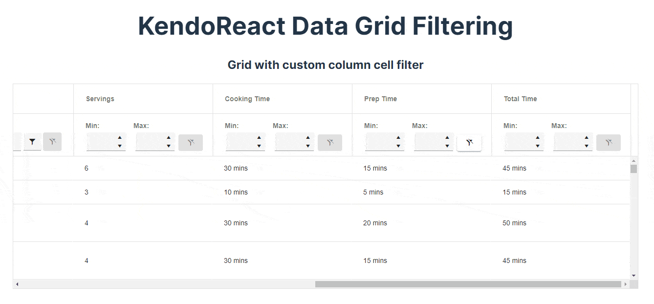
A few columns now use a custom range filter with min and max inputs. That’s how a custom filter can be added.
Column Menu Filters
So far, we have covered how to add default and custom column filters. However, all filters are visible immediately and displayed for every single column.
Wouldn’t it be nice to hide the filters and show them only when a user actually wants to add a filter? This can be achieved by providing a component to the Column’s columnMenu prop. Instead of displaying the filters in the second
row under the table headers, the filters will be hidden in a popup that can be shown by clicking on a menu button.
Here’s how we can implement that. First, let’s create a component called ColumnMenu that will provide two components—ColumnMenu and ColumnMenuCheckboxFilter. Both of these render components that
are provided by the @progress/kendo-react-grid package.
src/components/ColumnMenu.jsx
import {
  GridColumnMenuFilter,
  GridColumnMenuCheckboxFilter,
} from "@progress/kendo-react-grid";
import recipes from "../assets/recipes.json";

export const ColumnMenu = props => {
  return (
    <div>
      <GridColumnMenuFilter {...props} expanded={true} />
    </div>
  );
};

export const ColumnMenuCheckboxFilter = props => {
  return (
    <div>
      <GridColumnMenuCheckboxFilter {...props} data={recipes} expanded={true} />
    </div>
  );
};
Next, we can use the components we just created to add new filters.
src/components/RecipesGridWithColumnMenuFilters.jsx
import { Grid, GridColumn as Column } from "@progress/kendo-react-grid";
import { filterBy } from "@progress/kendo-data-query";
import { useState } from "react";
import { ColumnMenu } from "./columnMenu";
import originalRecipes from "../assets/recipes.json";

const recipes = originalRecipes.slice(0, 100);
const initialFilter = {
  logic: "and",
  filters: [
    {
      field: "recipe",
      operator: "contains",
      value: "Chicken",
    },
  ],
};

export const RecipesGridWithColumnMenuFilters = () => {
  const [filter, setFilter] = useState(initialFilter);
  return (
    <Grid
      style={{
        height: "420px",
      }}
      data={filterBy(recipes, filter)}
      pageSize={20}
      filter={filter}
      onFilterChange={e => setFilter(e.filter)}
    >
      <Column
        field="recipe"
        title="Recipe"
        width="250px"
        columnMenu={ColumnMenu}
      />
      <Column
        field="numIngredients"
        title="Ingredients"
        width="180px"
        filter="numeric"
        columnMenu={ColumnMenu}
      />
      <Column
        field="cuisine"
        title="Cuisine"
        width="180px"
        columnMenu={ColumnMenu}
      />
      <Column
        field="course"
        title="Course"
        width="180px"
        columnMenu={ColumnMenu}
      />
      <Column
        field="servings"
        title="Servings"
        width="180px"
        filter="numeric"
        columnMenu={ColumnMenu}
      />
      <Column
        field="cookTime"
        title="Cooking Time"
        width="180px"
        filter="numeric"
        format="{0} mins"
        columnMenu={ColumnMenu}
      />
      <Column
        field="prepTime"
        title="Prep Time"
        width="180px"
        filter="numeric"
        format="{0} mins"
        columnMenu={ColumnMenu}
      />
      <Column
        field="totalTime"
        title="Total Time"
        width="180px"
        filter="numeric"
        format="{0} mins"
        columnMenu={ColumnMenu}
      />
    </Grid>
  );
};

export default RecipesGridWithColumnMenuFilters;
Finally, add the RecipesGridWithColumnMenuFilters component to the App.jsx file.
src/App.jsx
import "./App.css";
import RecipesTable from "./components/RecipesTable.jsx";
import RecipesGridWithColumnFilters from "./components/RecipesGridWithColumnFilters.jsx";
import RecipesGridWithCustomCellFilter from "./components/RecipesGridWithCustomCellFilter.jsx";
import RecipesGridWithColumnMenuFilters from "./components/RecipesGridWithColumnMenuFilters";

function App() {
  return (
    <div className="App">
      <h1>KendoReact Data Grid Filtering</h1>
      {/* <h2>Default Table</h2>
      <RecipesTable /> */}
      {/* <h2>Grid with column filters</h2>
      <RecipesGridWithColumnFilters /> */}
      {/* <h2>Grid with custom column cell filter</h2>
      <RecipesGridWithCustomCellFilter /> */}
      <h2>Grid with column menu filters</h2>
      <RecipesGridWithColumnMenuFilters />
    </div>
  );
}

export default App;
The GIF below shows what the filters look like.
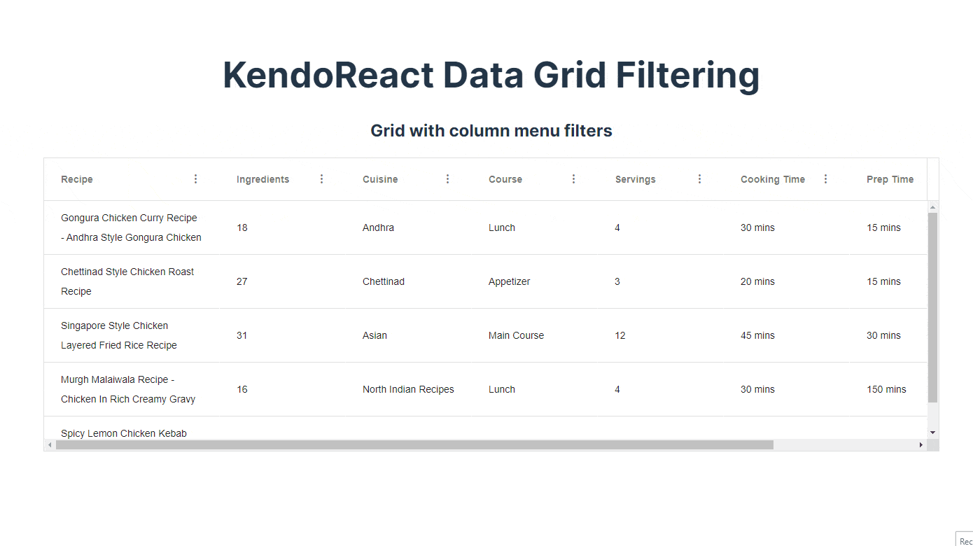
The ColumnMenu filter allows text filtering, while ColumnMenuCheckboxFilter provides all available options as checkboxes, and users can pick which ones they want to see.
Summary
In this article, we have explored the filtering functionality of the KendoReact Grid, which allows you to easily filter, sort and paginate large datasets in your React applications.
We have covered the basics of column filtering and how to add our own custom filters. With this knowledge, you should be able to build powerful and efficient data grids that meet your application’s requirements.

Thomas Findlay
Thomas Findlay is a 5-star rated mentor, full-stack developer, consultant, technical writer and the author of “React - The Road To Enterprise” and “Vue - The Road To Enterprise.” He works with many different technologies such as JavaScript, Vue, React, React Native, Node.js, Python, PHP and more. Thomas has worked with developers and teams from beginner to advanced and helped them build and scale their applications and products. Check out his Codementor page, and you can also find him on Twitter.
Related Posts
Comments
All articles
Topics
Web MobileMobile
Desktop
Design
Productivity
People
