
Let’s Build a React Admin Dashboard Sample App—Part 1

Summarize with AI:
In this two-part series, we’ll build an admin dashboard app using KendoReact. In the first part, we’ll look at how to build a side drawer.
Dashboards are a popular type of applications that are commonly implemented when users need quick and easy access to many different features and pages. A lot of dashboard apps share similar layouts and functionality. For example, they can have a header with a few navigation options, notifications and an account menu.
However, the most notable feature is the side drawer, which usually serves as the primary navigation. This is the first article out of two in which we will cover how to build a sample admin dashboard application.
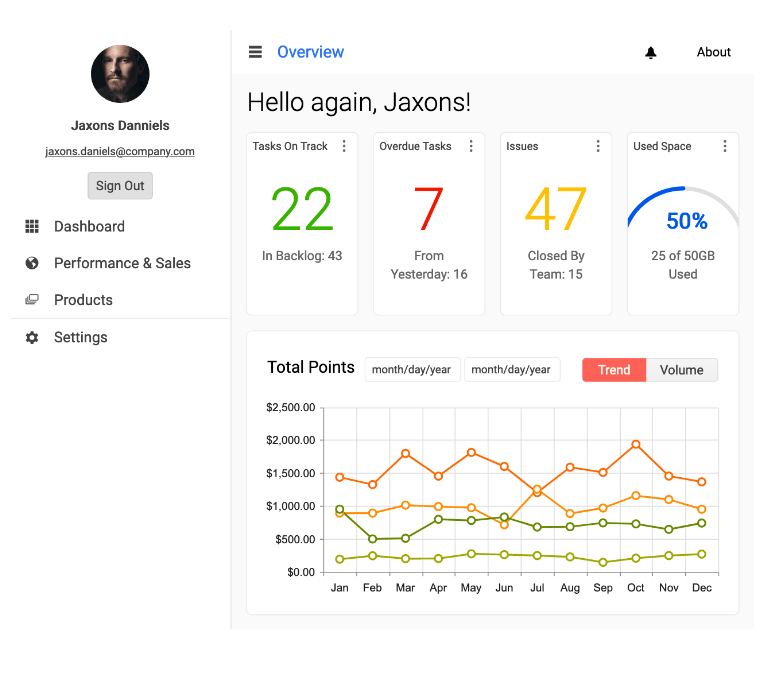
The app will comprise features that are often found in dashboard applications, such as a top header with a search input, collapsible side drawer, account dropdown, charts and breadcrumbs. To demonstrate how these can be implemented, we will use Progress KendoReact, which is a UI library that provides a lot of feature-rich components, so we won’t have to reinvent the wheel.
In R1 2023, KendoReact unveiled a dashboard demo app that brings together many of the elements that will be covered in this two-post series and more. The source code freely available, so you can start experimenting with it right away.
Project Setup
If you want to follow this article, clone the following repository and switch to the part-1/start branch. The part-1/final branch contains the final code for this part of the series.
$ git clone git@github.com:ThomasFindlay/lets-build-an-admin-dashboard-sample-app.git
$ cd lets-build-an-admin-dashboard-sample-app
$ git checkout part-1/start
$ npm install
$ npm run dev
The npm install command will install all dependencies, and npm run dev starts the development server.
The sample app was scaffolded with Vite. If you never heard of or used it before, I’ve written an article about it—What Is Vite: The Guide to Modern and Super-Fast Project Tooling.
You can find the full code example for this article in this GitHub repository. Below you can also find an interactive StackBlitz example.
Here’s the initial list of libraries we will need for this project.
$ npm install react-router-dom clsx @progress/kendo-react-form @progress/kendo-react-inputs @progress/kendo-drawing @progress/kendo-react-layout @progress/kendo-react-indicators @progress/kendo-react-progressbars @progress/kendo-licensing @progress/kendo-react-intl @progress/kendo-theme-material
clsx– a tiny utility for buildingclassNamestringsreact-router-dom– routing and navigation@progress/kendo-*– KendoReact libraries for the dashboard
Before we proceed further, let’s have a quick walkthrough of the project. The src/main.jsx files import and render routes and components from the src/views folder. Links to these pages will be present in the drawer navigation
we will create later.
In the src/layouts folder, we have a DashboardLayout component that renders Sidebar, Header, Suspense and Outlet components. The Outlet component renders one of
the route components passed as children in the src/main.jsx file.
<Route element={<DashboardLayout />}>
  <Route index element={<WhatIsKendoReact />} />
  <Route path="components">
    {/* components routes */}
  </Route>
  <Route path="styling-and-themes">
    {/* styling and themes routes */}
  </Route>
   <Route path="common-features" element={<CommonFeatures />} />
</Route>
React Router 6 is used in this tutorial. The latest version was released not long ago, so if you’ve never worked with it, make sure to check React Router 6 documentation.
Layout components that are used by the DashboardLayout component are placed in the src/layouts/components directory. This approach makes it easier to keep layout components together rather than mixing them with other components
in different directories that are responsible for something else.
Dashboard Header—Search and Account Menu
Let’s start by adding a header comprising a search input, a notification bell, and an account avatar with an account menu.
src/layouts/components/Header.jsx
import {
  AppBar,
  AppBarSection,
  AppBarSpacer,
  Avatar,
  Menu,
  MenuItem,
} from "@progress/kendo-react-layout";
import { Badge, BadgeContainer } from "@progress/kendo-react-indicators";
import { Form, Field, FormElement } from "@progress/kendo-react-form";
import { Input } from "@progress/kendo-react-inputs";
import style from "./Header.module.css";
import clsx from "clsx";

const kendokaAvatar =
  "https://demos.telerik.com/kendo-ui/content/web/Customers/RICSU.jpg";

const FormInput = props => {
  return (
    <div className="k-relative">
      <span
        className={clsx(
          "k-absolute k-icon k-i-search k-ml-2 k-middle-start",
          style.searchIcon
        )}
      />
      <Input className={style.searchInput} {...props} />
    </div>
  );
};

const Header = props => {
  const onSearch = q => {
    console.log("on search", q);
  };

  return (
    <div>
      <AppBar>
        <AppBarSpacer
          style={{
            width: 32,
          }}
        />

        <AppBarSection>
          <Form
            initialValues={{
              query: "",
            }}
            onSubmit={onSearch}
            render={formRenderProps => {
              return (
                <FormElement>
                  <fieldset className="k-form-fieldset">
                    <Field
                      id="search"
                      name="search"
                      placeholder="Search"
                      value={formRenderProps.valueGetter("search")}
                      component={FormInput}
                    />
                  </fieldset>
                </FormElement>
              );
            }}
          />
        </AppBarSection>

        <AppBarSpacer />

        <AppBarSection className="actions">
          <button className="k-button k-button-md k-rounded-md k-button-flat k-button-flat-base">
            <BadgeContainer>
              <span className="k-icon k-i-bell" />
              <Badge
                shape="dot"
                themeColor="info"
                size="small"
                position="inside"
              />
            </BadgeContainer>
          </button>
        </AppBarSection>

        <AppBarSection>
          <span className="k-appbar-separator" />
        </AppBarSection>

        <AppBarSection>
          <Menu>
            <MenuItem
              render={() => {
                return (
                  <Avatar type="image">
                    <img src={kendokaAvatar} alt="Avatar" />
                  </Avatar>
                );
              }}
            >
              <MenuItem text="Account" />
              <MenuItem text="Settings" />
              <MenuItem text="Logout" />
            </MenuItem>
          </Menu>
        </AppBarSection>
      </AppBar>
    </div>
  );
};

export default Header;
A number of KendoReact components are used to create the header—AppBar, AppBarSpacer and AppBarSection, Badge and BadgeContainer, Avatar, Menu and MenuItem.
Let’s not forget about the styles for the header.
src/layouts/components/header/Header.module.css
.title {
  font-size: 18px;
  margin: 0;
}

.navList {
  font-size: 14px;
  list-style-type: none;
  padding: 0;
  margin: 0;
  display: flex;
}
.navListItem {
  margin: 0 10px;
}
.navListItem:hover {
  cursor: pointer;
  color: #84cef1;
}

.searchIcon {
  z-index: 1;
}

.searchInput {
  padding-left: 2.25rem !important;
  width: 14rem !important;
}
Here’s what the Header component should look like. The search input is on the left side, while the notification bell and the avatar with the account menu are on the right side.

We have a good-looking dashboard header without a need to write a lot of our own custom code. KendoReact does a lot of heavy lifting and provides nice UI components out of the box. Next, let’s implement another functionality which is a staple in dashboards—the side drawer, also known as a sidebar.
Dashboard Drawer
Sidebars are often used in dashboard applications, as they can contain a lot of easily accessible navigation links. Below you can see what the side drawer will look like.

The drawer navigation comprises four main sections:
- What is KendoReact
- Components
- Styling & Themes
- Common Features
Two of these sections are collapsible and can reveal more navigation links. Collapsible menu sections are a great way of grouping and hiding some links, so the navigation is not overwhelming and doesn’t contain too many visible links from the start. This approach is especially useful for navigations that contain dozens of links.
Before we start creating sidebar components, let’s set up an array with configuration for the navigation items.
src/layouts/components/drawer/config/drawerItems.js
export const drawerItems = [
  {
    text: "What is KendoReact",
    route: "/",
    icon: "k-i-home",
  },
  {
    icon: "k-i-folder",
    text: "Components",
    route: "/components",
    items: [
      {
        text: "Animation",
        route: "animation",
        items: [
          {
            text: "Overview",
            route: "overview",
          },
          {
            text: "Getting Started",
            route: "getting-started",
          },
        ],
      },
      {
        text: "Buttons",
        route: "buttons",
        items: [
          {
            text: "Overview",
            route: "overview",
          },
          {
            text: "Getting Started",
            route: "getting-started",
          },
        ],
      },
      {
        text: "Charts",
        route: "charts",
        items: [
          {
            text: "Overview",
            route: "overview",
          },
          {
            text: "Getting Started",
            route: "getting-started",
          },
        ],
      },
    ],
  },
  {
    icon: "k-i-paint",
    text: "Styling & Themes",
    route: "styling-and-themes",
    items: [
      {
        text: "Overview",
        route: "overview",
      },
      {
        text: "Customizing Themes",
        route: "customizing-themes",
      },
      {
        text: "Default Theme",
        route: "default-theme",
        items: [
          {
            text: "Overview",
            route: "overview",
          },
          {
            text: "Getting Started",
            route: "getting-started",
          },
        ],
      },
    ],
  },
  {
    icon: "k-i-overlap",
    text: "Common Features",
    route: "common-features",
  },
];
The drawerItems array contains navigation items that consist of objects with text, route, icon and items properties. The icon is a class name that is responsible for displaying
icons in the navigation menu. The text value is used as a label for the links, while the route, as the name implies, is a value used for routing and switching to other pages.
Next, let’s add styles for the navigation drawer.
src/layouts/components/drawer/Drawer.module.css
.drawer {
  min-height: inherit;
}

.drawerTogglerBtn {
  min-height: 48px;
}

.drawerTogglerIcon {
  transition: transform 0.25s;
}

.drawerTogglerIconOpen {
  transform: rotate(180deg);
}

.titleContainer {
  display: flex;
  justify-content: space-between;
  align-items: center;
  min-height: 48px;
}

.title {
  font-size: 1.25rem;
  margin: 0rem 1rem;
}
Now that we have styles for the drawer, we can finally create a component for it.
src/layouts/components/drawer/Drawer.jsx
import { useState } from "react";
import {
  Drawer,
  DrawerContent,
  DrawerNavigation,
} from "@progress/kendo-react-layout";
import clsx from "clsx";
import DrawerItem from "./components/DrawerItem";
import { drawerItems } from "./config/drawerItems";
import style from "./Drawer.module.css";

const AppDrawer = props => {
  const [isDrawerExpanded, setIsDrawerExpanded] = useState(true);

  const toggleDrawer = () =>
    setIsDrawerExpanded(isDrawerExpanded => !isDrawerExpanded);

  return (
    <Drawer
      className={style.drawer}
      expanded={isDrawerExpanded}
      position={"start"}
      mode={"push"}
      mini={true}
    >
      <DrawerNavigation>
        <div className={style.titleContainer}>
          {isDrawerExpanded ? (
            <h1 className={style.title}>KendoReact</h1>
          ) : null}
          <button
            className={clsx(
              "k-button k-button-md k-rounded-md k-button-flat k-button-flat-base",
              style.drawerTogglerBtn
            )}
            onClick={toggleDrawer}
          >
            <span
              className={clsx(
                `k-icon k-i-arrow-chevron-right`,
                style.drawerTogglerIcon,
                isDrawerExpanded && style.drawerTogglerIconOpen
              )}
            />
          </button>
        </div>
        <ul className="k-drawer-items">
          {drawerItems.map((item, idx) => {
            return (
              <DrawerItem
                key={`${item.text}-${idx}`}
                isDrawerExpanded={isDrawerExpended}
                {...item}
              />
            );
          })}
        </ul>
      </DrawerNavigation>
      <DrawerContent>{props.children}</DrawerContent>
    </Drawer>
  );
};

export default AppDrawer;
A great thing about using UI libraries is that a lot of functionality is provided out of the box. For instance, KendoReact provides drawer components that incorporate transitions, expandable drawer, position, mode and more functionality.
In the code above, we are using Drawer, DrawerNavigation and DrawerContent components. The React Drawer is the root component that encapsulates all the drawer functionality and content. We can pass various props to it, and here we’re using:
expanded– indicates whether the drawer should be fully open or minimized.position– configures where the drawer should be displayed. Thestartandendvalues can be used to configure the drawer to show on the left or right side.mode– this prop specifies how the drawer should behave when it’s open. Thepushmode pushes the rest of the content, while theoverlaymode renders the drawer on top of other content.
You can read more about the React Drawer component and what props it accepts here.
Inside the Drawer component, we have DrawerNavigation and DrawerContent. Any content that is passed as children to the DrawerNavigation component is rendered inside of the drawer, while markup passed to the DrawerContent component is rendered outside of the drawer. The image below shows what it looks like.

All the menu links are rendered inside the DrawerNavigation by the DrawerItem component. We will create it in a moment. We loop through the drawerItems imported from the drawerItems.js file we created earlier. What’s more,
the
KendoReact heading is rendered conditionally based on the isDrawerExpanded state. Let’s take care of the DrawerItem component.
First, let’s add styles that we will need for the DrawerItem component.
src/layouts/components/drawer/components/DrawerItem.module.css
.drawer {
  min-height: inherit;
}

.drawerTogglerBtn {
  min-height: 48px;
}

.drawerTogglerIcon {
  transition: transform 0.25s;
}

.drawerTogglerIconOpen {
  transform: rotate(180deg);
}

.titleContainer {
  display: flex;
  justify-content: space-between;
  align-items: center;
  min-height: 48px;
}

.title {
  font-size: 1.25rem;
  margin: 0rem 1rem;
}
After we are finished with the styles, it’s time for the DrawerItem component.
src/layouts/components/drawer/components/DrawerItem.jsx
import DrawerItemHeader from "./DrawerItemHeader";
import { NavLink } from "react-router-dom";
import style from "./DrawerItem.module.css";
import clsx from "clsx";

const DrawerItem = props => {
  const { text, icon, route, items, depth = 0, isDrawerExpanded } = props;

  if (items) {
    return (
      <DrawerItemHeader
        {...props}
        depth={depth + 1}
        isDrawerExpanded={isDrawerExpanded}
      />
    );
  }

  return (
    <NavLink
      className={({ isActive }) => {
        return clsx(
          "k-drawer-item k-text-left k-d-flex k-border-0 k-pr-4 k-py-4 k-w-full",
          style.drawerItem,
          isActive && style.drawerItemActive
        );
      }}
      to={route}
      style={{
        paddingLeft: `${1 + (depth > 1 ? (depth + 5.5) * 0.25 : 0)}rem`,
      }}
    >
      {icon ? (
        <span className={clsx("k-icon k-mr-4 k-display-inline-flex", icon)} />
      ) : null}
      <span>{text}</span>
    </NavLink>
  );
};

export default DrawerItem;
There are two different things the DrawerItem component can render. If the current nav item (defined in the drawerItems config) doesn’t have any nested links in the items prop, the DrawerItem component will render the NavLink
component.
However, if there are any nested links, the DrawerItemHeader component is rendered instead. This component is responsible for handling open and closed states of nested navigation links. For example, as shown in the GIF below, the Components and Animation are rendered by the DrawerItemHeader component.

Here’s the implementation for the DrawerItemHeader component.
src/layout/components/drawer/components/DrawerItemHeader.jsx
import React, { useState } from "react";
import { useLocation } from "react-router-dom";
import style from "./DrawerItem.module.css";
import clsx from "clsx";
import DrawerItem from "./DrawerItem";

const resolveLinkPath = (parentTo, childTo) => `${parentTo}/${childTo}`;

const DrawerItemHeader = props => {
  const { text, icon, items, route, depth, isDrawerExpanded } = props;
  const location = useLocation();

  const [isNavItemExpanded, setIsNavItemExpanded] = useState(
    location.pathname.includes(route)
  );

  const onExpandChange = e => {
    e.preventDefault();
    setIsNavItemExpanded(isNavItemExpanded => !isNavItemExpanded);
  };

  return (
    <>
      <button
        className={clsx(
          "k-drawer-item k-text-left k-d-flex k-border-0 k-pr-4 k-py-4 k-w-full",
          style.drawerItem
        )}
        style={{
          paddingLeft: `${1 + (depth > 1 ? (depth + 5.5) * 0.25 : 0)}rem`,
        }}
        onClick={onExpandChange}
      >
        {icon ? <span className={clsx("k-icon k-mr-4", icon)} /> : null}
        <div className="k-display-flex k-flex-grow k-justify-content-between">
          <span>{text}</span>
          <span
            className={clsx(
              "k-icon k-i-chevron-down",
              style.drawerItemArrow,
              isNavItemExpanded && "k-rotate-180"
            )}
          />
        </div>
      </button>

      {isNavItemExpanded && (
        <div
          className={clsx(
            style.navChildrenBlock,
            !isDrawerExpanded && "k-display-none"
          )}
        >
          {items.map((item, index) => {
            const key = `${item.text}-${index}`;
            return (
              <DrawerItem
                key={key}
                {...item}
                depth={depth + 1}
                route={resolveLinkPath(props.route, item.route)}
                isDrawerExpanded={isDrawerExpanded}
              />
            );
          })}
        </div>
      )}
    </>
  );
};

export default DrawerItemHeader;
Let’s digest what is happening in the DrawerItemHeader component. After the required imports, we have the resolveLinkPath function. This function is responsible for concatenating route strings. Each object
in the
drawerItems config has a route property. For instance, the object for the Components item has a route set to /components, and the nested items have animation, overview and getting-started, as shown below.
{
    icon: "k-i-folder",
    text: "Components",
    route: "/components",
    items: [
      {
        text: "Animation",
        route: "animation",
        items: [
          {
            text: "Overview",
            route: "overview",
          },
          {
            text: "Getting Started",
            route: "getting-started",
          },
        ],
      },
   ],
}
// other nav items
Did you spot that the DrawerItem component renders the DrawerItemHeader, which in turn can render DrawerItem as well? We are creating nested navigation recursively. Each item in the navigation config has a chunk
of the final route that is used for the furthest grandchild navigation item. Thus, the Overview link will lead to /components/animation/overview, and the Getting Started will link to /components/animation/getting-started.
Besides handling the open and closed states for the nested items, another important thing that the DrawerItemHeader deals with is showing its children when a user visits the website on a matching URL. For example, if a user visits /components/animation/getting-started URL, the navigation items in the drawer should open accordingly, and the Getting Started link should be highlighted. See the GIF below.

This behavior is handled by setting the isNavItemExpanded state by checking if the current URL contains the value of the route prop.
const { text, icon, items, route, depth, isDrawerExpanded } = props;
const location = useLocation();

const [isNavItemExpanded, setIsNavItemExpanded] = useState(
  location.pathname.includes(route)
);

const onExpandChange = e => {
  e.preventDefault();
  setIsNavItemExpanded(isNavItemExpanded => !isNavItemExpanded);
};
Great, we have a working drawer navigation.
Summary
We have successfully created the layout for a dashboard application. Similar to a lot of applications of this type, it contains a header with a search input, an account dropdown and a drawer with navigation items. Thanks to KendoReact, creating all this functionality was straightforward, as it provided a number of useful components.
In the next part of the series, we will add functionality to automatically open and close the drawer when it’s in a collapsed state, as well as a few other features.

Thomas Findlay
Thomas Findlay is a 5-star rated mentor, full-stack developer, consultant, technical writer and the author of “React - The Road To Enterprise” and “Vue - The Road To Enterprise.” He works with many different technologies such as JavaScript, Vue, React, React Native, Node.js, Python, PHP and more. Thomas has worked with developers and teams from beginner to advanced and helped them build and scale their applications and products. Check out his Codementor page, and you can also find him on Twitter.
Related Posts
Comments
All articles
Topics
Web MobileMobile
Desktop
Design
Productivity
People
