
Let’s Build a React Admin Dashboard Sample App—Part 2

Summarize with AI:
In this two-part series, we’ll build an admin dashboard app using Progress KendoReact. In this second part, we’ll add navigation breadcrumbs and some charts and graphs.
Welcome to the second part of the series on how to build a simple admin dashboard app. In the previous part, which you can find here, we created barebones for a dashboard app using React and KendoReact. In this part, we will:
- Preserve the open state of the drawer on page reload
- Make the collapsed drawer open and close automatically on hover
- Add navigation breadcrumbs
- Add charts and graphs
In R1 2023, KendoReact unveiled a dashboard demo app that brings together many of the elements that will be covered in this two-post series and more. The source code freely available, so you can start experimenting with it right away.
Below you can find the commands required to follow this part of the series. We need to clone the project repository, install dependencies, switch to the branch for this part and start the development server.
$ git clone git@github.com:ThomasFindlay/lets-build-an-admin-dashboard-sample-app.git
$ cd lets-build-an-admin-dashboard-sample-app
$ git checkout part-2/start
$ npm install
$ npm run dev
You can find the full code example for this article in this GitHub repository. Below you can also find an interactive StackBlitz example.
How to Preserve Drawer Open State on Page Reload
At the moment, users can collapse and expand the drawer as they like, but there is a little problem. Whenever the page is reloaded, the drawer always starts with the expanded state. There are a few ways to solve this problem, but here are the main ones:
- Save the information about the drawer’s collapsed state locally, e.g., in the local/session storage or IndexedDB.
- Use a database to store information about users’ preferences regarding the drawer’s collapsed state and update it via API requests.
Both approaches have their pros and cons. The first one, which utilizes local storage, is much simpler to implement, but it will only work on the specific device that a user is using. If a user accesses the website on their PC and collapses the drawer, it still will be expanded when a user uses a different device. The second approach can solve this problem, but it’s much more complex, as it would require a database and a server that could provide users’ preferences and handle updating the database accordingly.
We don’t have a server, and to keep things simple, we will use the first approach and preserve drawer state information locally.
Preserving React State in the Local Storage with Rooks
We have two options to preserve the state in local storage:
- Write all the logic ourselves
- Use a ready-made hook to handle that for us
There is a great collection of React hooks called Rooks that provides a hook called useLocalstorageState. We will take advantage
of it to preserve the drawer’s expanded state. It can be installed by running npm install rooks command in the terminal. After it’s installed, update the useDrawerState.js file.
src/layouts/drawer/hooks/useDrawerState.js
import { useState, useEffect, useRef, useCallback } from "react";
import { useLocalstorageState } from "rooks";

export const useDrawerState = () => {
  const [isDrawerExpanded, setIsDrawerExpanded] = useLocalstorageState(
    "dashboard-app:drawer-expanded",
    true
  );
  const drawerRef = useRef(null);

  const openDrawer = useCallback(() => {
    setIsDrawerExpanded(true);
  }, []);

  const closeDrawer = useCallback(() => {
    setIsDrawerExpanded(false);
  }, []);

  const toggleDrawer = useCallback(() => {
    setIsDrawerExpanded(!isDrawerExpanded);
  }, [isDrawerExpanded]);

  return {
    isDrawerExpanded,
    openDrawer,
    closeDrawer,
    toggleDrawer,
    drawerRef,
  };
};
The first change is that the isDrawerExpanded state now comes from the useLocalstorageState rather than useState. The useLocalstorageState hook accepts two arguments. The first one is the key used for the local storage, and the second one is the initial value. We also need to update the toggleDrawer function, as the setter method provided by the
useLocalstorageState doesn’t accept a function as an argument.
You can now check the drawer functionality by collapsing it and reloading the page. The drawer should stay in the collapsed state.
Opening Collapsed Drawer on Hover
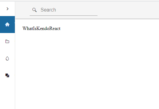
The drawer can be displayed in two different states—expanded and collapsed. When it is collapsed, only navigation items’ icons are visible, and the text is fully hidden, as shown on the image below.
While we can click on some of the links in the collapsed state, clicking on the Components or Styling & Themes won’t really do much, as these are not links but headers that open
nested items. So, how can we deal with that? We can assume that if a user moves their mouse over the drawer, it means they want to see the navigation items and possibly go to a different page. Therefore, we can automatically open the drawer when a
user hovers over it.
First, we need to add a new state that will track whether a user is hovering over the drawer. Since we now have two different states to track for the drawer and we also need methods to update them, let’s extract the current logic and combine it with the new one into a custom hook.
src/layout/drawer/hooks/useDrawerState.js
import { useState, useEffect, useRef, useCallback } from "react";
import { useLocalstorageState } from "rooks";

export const useDrawerState = () => {
  const [isDrawerExpanded, setIsDrawerExpanded] = useLocalstorageState(
    "dashboard-app:drawer-expanded",
    true
  );

  const [isHoveringDrawer, setIsHoveringDrawer] = useState(false);
  const drawerRef = useRef(null);

  const openDrawer = useCallback(() => {
    setIsDrawerExpanded(true);
  }, []);

  const closeDrawer = useCallback(() => {
    setIsDrawerExpanded(false);
  }, []);

  const toggleDrawer = useCallback(() => {
    setIsDrawerExpanded(!isDrawerExpanded);
  }, [isDrawerExpanded]);

  const startHoveringDrawer = useCallback(() => {
    setIsHoveringDrawer(true);
  }, []);
  const stopHoveringDrawer = useCallback(() => {
    setIsHoveringDrawer(false);
  }, []);

  useEffect(() => {
    if (!drawerRef.current) return;
    const { element } = drawerRef.current;
    element.addEventListener("mouseenter", startHoveringDrawer);
    element.addEventListener("mouseleave", stopHoveringDrawer);
    return () => {
      element.removeEventListener("mouseenter", startHoveringDrawer);
      element.removeEventListener("mouseleave", stopHoveringDrawer);
    };
  }, []);

  return {
    isDrawerExpanded,
    openDrawer,
    closeDrawer,
    toggleDrawer,
    isHoveringDrawer,
    drawerRef,
  };
};
Besides the new states and methods to update them, we also have some important logic in the useEffect hook. When it runs, two event listeners are added for mouseenter and mouseleave.
When the callback for mouseenter is fired, the drawer will open, and on mouseleave it will close. The useEffect returns a cleanup function that removes
event listeners, so we avoid potential memory leaks.
If you’re interested in learning more about cleaning up listeners and why it is important, check out one of my other articles—How to Clean Up after Yourself and Why It’s Important (Vue/React).
Let’s update the Drawer component and take advantage of the newly created useDrawerState hook.
src/layout/components/drawer/Drawer.jsx
import {
  Drawer,
  DrawerContent,
  DrawerNavigation,
} from "@progress/kendo-react-layout";
import clsx from "clsx";
import DrawerItem from "./components/DrawerItem";
import { drawerItems } from "./config/drawerItems";
import style from "./Drawer.module.css";
import { useDrawerState } from "./hooks/useDrawerState";

const AppDrawer = props => {
  const { isDrawerExpanded, toggleDrawer, isHoveringDrawer, drawerRef } =
    useDrawerState();

  return (
    <Drawer
      className={style.drawer}
      expanded={isDrawerExpanded || isHoveringDrawer}
      position={"start"}
      mode={"push"}
      mini={true}
    >
      <DrawerNavigation ref={drawerRef}>
        <div className={style.titleContainer}>
          {isDrawerExpanded || isHoveringDrawer ? (
            <h1 className={style.title}>KendoReact</h1>
          ) : null}
          <button
            className={clsx(
              "k-button k-button-md k-rounded-md k-button-flat k-button-flat-base",
              style.drawerTogglerBtn
            )}
            onClick={toggleDrawer}
          >
            <span
              className={clsx(
                `k-icon k-i-arrow-chevron-right`,
                style.drawerTogglerIcon,
                isDrawerExpanded && style.drawerTogglerIconOpen
              )}
            />
          </button>
        </div>
        <ul className="k-drawer-items">
          {drawerItems.map((item, idx) => {
            return (
              <DrawerItem
                key={`${item.text}-${idx}`}
                {...item}
                isDrawerExpanded={isDrawerExpanded}
                isHoveringDrawer={isHoveringDrawer}
              />
            );
          })}
        </ul>
      </DrawerNavigation>
      <DrawerContent>{props.children}</DrawerContent>
    </Drawer>
  );
};

export default AppDrawer;
The isHoveringDrawer value is now used to compute the value for the expanded prop and to figure out whether the logo should be rendered. It is also passed to the DrawerItem component, as
the DrawerItemHeader component uses it to establish if the nested items should be opened or not. Now, let’s update both DrawerItem and DrawerItemHeader components.
src/layout/components/drawer/components/DrawerItem.jsx
import DrawerItemHeader from "./DrawerItemHeader";
import { NavLink } from "react-router-dom";
import style from "./DrawerItem.module.css";
import clsx from "clsx";

const DrawerItem = props => {
  const {
    text,
    icon,
    route,
    items,
    depth = 0,
    isDrawerExpanded,
    isHoveringDrawer,
  } = props;

  if (items) {
    return (
      <DrawerItemHeader
        {...props}
        depth={depth + 1}
        isDrawerExpanded={isDrawerExpanded}
        isHoveringDrawer={isHoveringDrawer}
      />
    );
  }

  return (
    <NavLink
      className={({ isActive }) => {
        return clsx(
          "k-drawer-item k-text-left k-d-flex k-border-0 k-pr-4 k-py-4 k-w-full",
          style.drawerItem,
          isActive && style.drawerItemActive
        );
      }}
      to={route}
      style={{
        paddingLeft: `${1 + (depth > 1 ? (depth + 5.5) * 0.25 : 0)}rem`,
      }}
    >
      {icon ? (
        <span className={clsx("k-icon k-mr-4 k-display-inline-flex", icon)} />
      ) : null}
      <span>{text}</span>
    </NavLink>
  );
};

export default DrawerItem;
src/layout/components/drawer/components/DrawerItemHeader.jsx
import React, { useState } from "react";
import { useLocation } from "react-router-dom";
import style from "./DrawerItem.module.css";
import clsx from "clsx";
import DrawerItem from "./DrawerItem";

const resolveLinkPath = (parentTo, childTo) => `${parentTo}/${childTo}`;

const DrawerItemHeader = props => {
  const {
    text,
    icon,
    items,
    route,
    depth,
    isDrawerExpanded,
    isHoveringDrawer,
  } = props;
  const location = useLocation();

  const [isNavItemExpanded, setIsNavItemExpanded] = useState(
    location.pathname.includes(route)
  );

  const onExpandChange = e => {
    e.preventDefault();
    setIsNavItemExpanded(isNavItemExpanded => !isNavItemExpanded);
  };

  return (
    <>
      <button
        className={clsx(
          "k-drawer-item k-text-left k-d-flex k-border-0 k-pr-4 k-py-4 k-w-full",
          style.drawerItem
        )}
        style={{
          paddingLeft: `${1 + (depth > 1 ? (depth + 5.5) * 0.25 : 0)}rem`,
        }}
        onClick={onExpandChange}
      >
        {icon ? <span className={clsx("k-icon k-mr-4", icon)} /> : null}
        <div className="k-display-flex k-flex-grow k-justify-content-between">
          <span>{text}</span>
          <span
            className={clsx(
              "k-icon k-i-chevron-down",
              style.drawerItemArrow,
              isNavItemExpanded && "k-rotate-180"
            )}
          />
        </div>
      </button>

      {isNavItemExpanded && (
        <div
          className={clsx(
            style.navChildrenBlock,
            !isDrawerExpanded && !isHoveringDrawer && "k-display-none"
          )}
        >
          {items.map((item, index) => {
            const key = `${item.text}-${index}`;
            return (
              <DrawerItem
                key={key}
                {...item}
                depth={depth + 1}
                route={resolveLinkPath(props.route, item.route)}
                isDrawerExpanded={isDrawerExpanded}
                isHoveringDrawer={isHoveringDrawer}
              />
            );
          })}
        </div>
      )}
    </>
  );
};

export default DrawerItemHeader;
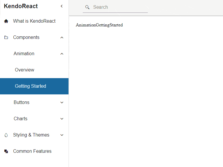
You can try hovering over the drawer when it’s in the collapsed state. It should open and close automatically, as shown in the GIF below.
In the next section, we will add navigation breadcrumbs.
Breadcrumbs
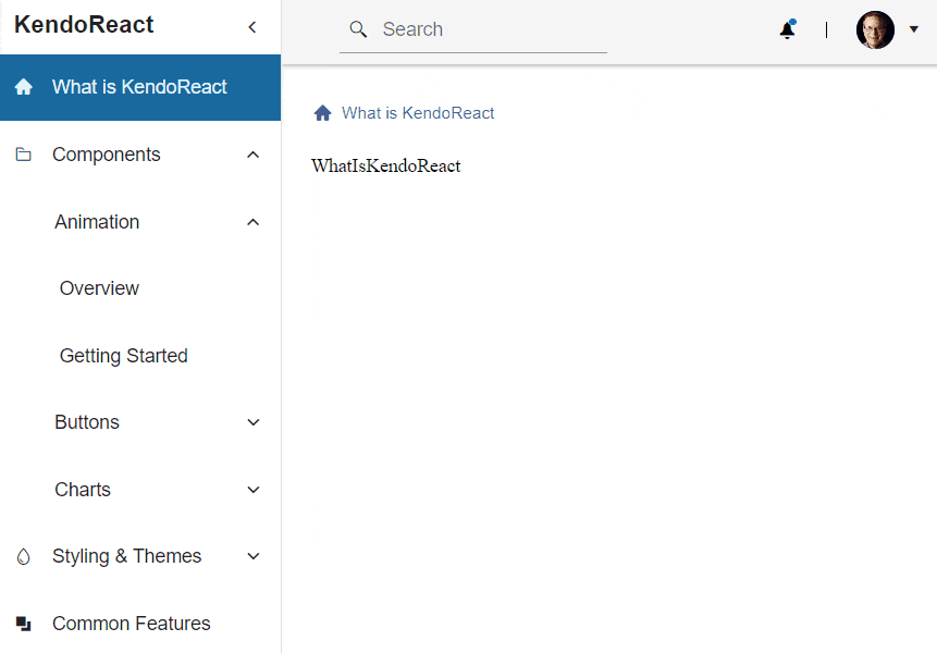
In the past, breadcrumbs were commonly used in forum applications, as forums could have sections, threads, sub-threads and so on. However, they also became popular in more complex dashboards. Breadcrumbs are used to show the depth of the navigation state, and they make it easier for a user to figure out where exactly they are. Moreover, breadcrumbs can also be used to navigate between different subsections. Let’s add breadcrumbs that show the current navigation state of the drawer navigation. We will use the Breadcrumb component provided by KendoReact. The GIF below shows what the breadcrumbs will look like.
First, we must create two new files—Breadcrumbs.jsx and useBreadcrumbs.js. Below we have the code for the Breadcrumbs component.
src/layouts/components/breadcrumbs/Breadcrumbs.jsx
import { Breadcrumb } from "@progress/kendo-react-layout";
import { drawerItems } from "../drawer/config/drawerItems";
import { useBreadcrumbs } from "./hooks/useBreadcrumbs";

const Breadcrumbs = props => {
  const { breadcrumbs } = useBreadcrumbs(drawerItems);

  return (
    <div {...props}>
      <Breadcrumb data={breadcrumbs} />
    </div>
  );
};

export default Breadcrumbs;
The component is quite simple, as it really just renders a div and the Breadcrumb component from the @progress/kendo-react-layout package. The Breadcrumb component expects the data prop that should be an array with items for the breadcrumbs. All the logic for creating the data array is in the custom useBreadcrumbs hook, which receives the drawerItems config as an argument. Extracting correlated logic into custom hooks is a good way to keep components leaner and cleaner.
You can find more details about the Breadcrumb component in the KendoReact documentation.
Next, let’s create the useBreadcrumbs hook. It will take advantage of the useLocation hook provided by the React Router to get access to the current pathname.
The pathname corresponds to the URL path after the origin domain. For example, if the current URL is http://localhost:3000/components/animation/overview, the pathname will
have a value of components/animation/overview. The pathname will be used to generate an array of breadcrumbs. Here’s the code for it.
src/layouts/components/breadcrubs/hooks/useBreadcrumbs.js
import { useLocation } from "react-router-dom";
import { useMemo } from "react";

export const useBreadcrumbs = navConfig => {
  const { pathname } = useLocation();
  const breadcrumbs = useMemo(() => {
    const pathParts = pathname.split("/").filter(Boolean);

    // If there are no path parts, it means we are on the home page.
    // Therefore, we can skip all the logic and just return the first drawer item.
    if (!pathParts.length) {
      const home = navConfig[0];

      return [
        {
          id: home.route,
          text: home.text,
          iconClass: home.icon,
        },
      ];
    }

    const breadcrumbsList = [];
    let currentPathPart;
    let currentDrawerItem;

    // We need to loop through all the url parts to find the correct drawer items.
    while (pathParts.length) {
      // During each loop, we remove the first url part
      currentPathPart = pathParts.shift();

      // Find the root drawer item
      if (!breadcrumbsList.length) {
        currentDrawerItem = navConfig.find(
          item => item.route === `/${currentPathPart}`
        );
      } else {
        // The currentDrawerItem is a drawer item header so we need to find the matching drawer item inside of the `items` array
        currentDrawerItem = currentDrawerItem.items.find(
          item => item.route === currentPathPart
        );
      }

      // Add config for the current url path part
      breadcrumbsList.push({
        id: currentDrawerItem.route,
        text: currentDrawerItem.text,
        // Include the icon class if one is present
        ...(currentDrawerItem.icon && {
          iconClass: currentDrawerItem.icon,
        }),
      });

      // If the current drawer item doesn't have any nested items
      // it means we need to stop, as we have reached the last navigation item
      if (!currentDrawerItem.items) {
        break;
      }
    }

    return breadcrumbsList;
  }, [navConfig, pathname]);

  return {
    breadcrumbs,
  };
};
The useMemo hook is used to memoize the generated breadcrumbs to make sure that they are recreated only when the current location pathname or passed navConfig changes. As I mentioned before, the breadcrumbs array is generated by splitting the pathname by the forward slash and then looping through the result.
If we don’t have any items in the breadcrumbsList array yet, we need to find the root drawer item for the current navigation tree. If we have one, then we need to search through the items array. If the current drawer item doesn’t have any nested items, it means we reached the last item we needed.
Last but not least, we need to render our Breadcrumbs component.
src/layouts/DashboardLayout.jsx
import { Suspense } from "react";
import { Outlet } from "react-router-dom";
import Header from "./components/header/Header";
import Drawer from "./components/drawer/Drawer";
import Breadcrumbs from "./components/breadcrumbs/Breadcrumbs";

const breadcrumbsContainerStyle = { transform: "translateX(-0.5rem)" };

const DashboardLayout = props => {
  return (
    <Drawer>
      <Header />
      <main className="k-m-6">
        <div className="k-mb-4" style={breadcrumbsContainerStyle}>
          <Breadcrumbs />
        </div>
        <Suspense>
          <Outlet />
        </Suspense>
      </main>
    </Drawer>
  );
};

export default DashboardLayout;
That’s it for adding drawer navigation breadcrumbs. In the next section, we will have a look at how to add charts using KendoReact.
Dashboard Charts
Before we start adding charts, we need to install the React Charts package that provides chart components and the hammerjs library, which is used under the hood for handling touch gestures. You don’t have to do that
if you are on the
part-2/start branch, as they should have already been installed. Otherwise, you can run the command below.
$ npm install @progress/kendo-react-charts hammerjs
Let’s start by creating a file with colors that will be used for the charts.
src/constants/colors.js
export const COLORS = {
  accepted: "#059669",
  rejected: "#B91C1C",
  pending: "#6366F1",
  interviewing: "#2563EB",
  total: "#D97706",
};
We already have page components for charts that are available under Components / Charts route. We will make a use of the ChartsOverview component. But first, let’s create components that showcase donut and
bar chars. Here’s the code for the Donut component.
src/views/dashboard/kendo-components/charts/components/Donut.jsx
import {
  Chart,
  ChartTitle,
  ChartLegend,
  ChartSeries,
  ChartSeriesItem,
  ChartSeriesLabels,
} from "@progress/kendo-react-charts";
import { COLORS } from "../../../../../constants/colors";

// Chart data
const applicationsStatusThisMonth = [
  {
    status: "Accepted",
    value: 10,
    color: COLORS.accepted,
  },
  {
    status: "Interviewing",
    value: 24,
    color: COLORS.interviewing,
  },
  {
    status: "Rejected",
    value: 25,
    color: COLORS.rejected,
  },
  {
    status: "Pending",
    value: 32,
    color: COLORS.pending,
  },
];

// Show category label for each item in the donut graph
const labelContent = e => e.category;

const DonutChart = props => {
  return (
    <Chart>
      <ChartTitle text="Applications status" />
      <ChartLegend visible={false} />
      <ChartSeries>
        <ChartSeriesItem
          type="donut"
          data={applicationsStatusThisMonth}
          categoryField="status"
          field="value"
        >
          <ChartSeriesLabels
            color="#fff"
            background="none"
            content={labelContent}
          />
        </ChartSeriesItem>
      </ChartSeries>
    </Chart>
  );
};

export default DonutChart;
As you can see, we use a few components from the @progress/kendo-react-charts package to build the donut chart. The kendo-react-charts provides building pieces that can be composed to create
complex charts.
Next, let’s create the Bar component.
src/views/dashboard/kendo-components/charts/components/Bar.jsx
import {
  Chart,
  ChartTitle,
  ChartLegend,
  ChartSeries,
  ChartSeriesItem,
  ChartCategoryAxis,
  ChartCategoryAxisTitle,
  ChartCategoryAxisItem,
} from "@progress/kendo-react-charts";
import { COLORS } from "../../../../../constants/colors";

// Graph data
const series = [
  {
    status: "Total",
    data: [43, 30, 59],
    color: COLORS.total,
  },
  {
    status: "Pending",
    data: [25, 15, 30],
    color: COLORS.pending,
  },
  {
    status: "Interviewed",
    data: [3, 5, 1],
    color: COLORS.interviewed,
  },
  {
    status: "Rejected",
    data: [14, 10, 25],
    color: COLORS.rejected,
  },
  {
    status: "Accepted",
    data: [1, 3, 2],
    color: COLORS.accepted,
  },
];

const categories = ["Jan", "Feb", "Mar"];

const seriesLabels = {
  visible: true,
  padding: 3,
  font: "normal 16px Arial, sans-serif",
  position: "center",
};

const BarChart = props => {
  return (
    <Chart>
      <ChartTitle text="Applications status - last 3 months" />
      <ChartLegend visible={true} />
      <ChartCategoryAxis>
        <ChartCategoryAxisItem categories={categories}>
          <ChartCategoryAxisTitle text="Months" />
        </ChartCategoryAxisItem>
      </ChartCategoryAxis>
      <ChartSeries>
        {series.map((item, idx) => (
          <ChartSeriesItem
            key={idx}
            type="bar"
            gap={2}
            spacing={0.25}
            labels={seriesLabels}
            data={item.data}
            name={item.status}
            color={item.color}
          />
        ))}
      </ChartSeries>
    </Chart>
  );
};

export default BarChart;
Finally, let’s update the ChartsOverview component and incorporate Donut and Bar components.
src/views/dashboard/kendo-components/charts/ChartsOverview.jsx
import BarChart from "./components/Bar";
import DonutChart from "./components/Donut";

const ChartsOverview = props => {
  return (
    <div>
      <h1>Kendo React Charts Overview</h1>

      <p>
        Kendo React provides a number of useful components that can be used to
        create charts.
      </p>

      <div className="k-display-flex k-gap-16" style={{ maxWidth: 1000 }}>
        <div className="k-flex-grow">
          <h2>Donut</h2>
          <DonutChart />
        </div>
        <div className="k-flex-grow">
          <h2>Bar</h2>
          <BarChart />
        </div>
      </div>
    </div>
  );
};

export default ChartsOverview;
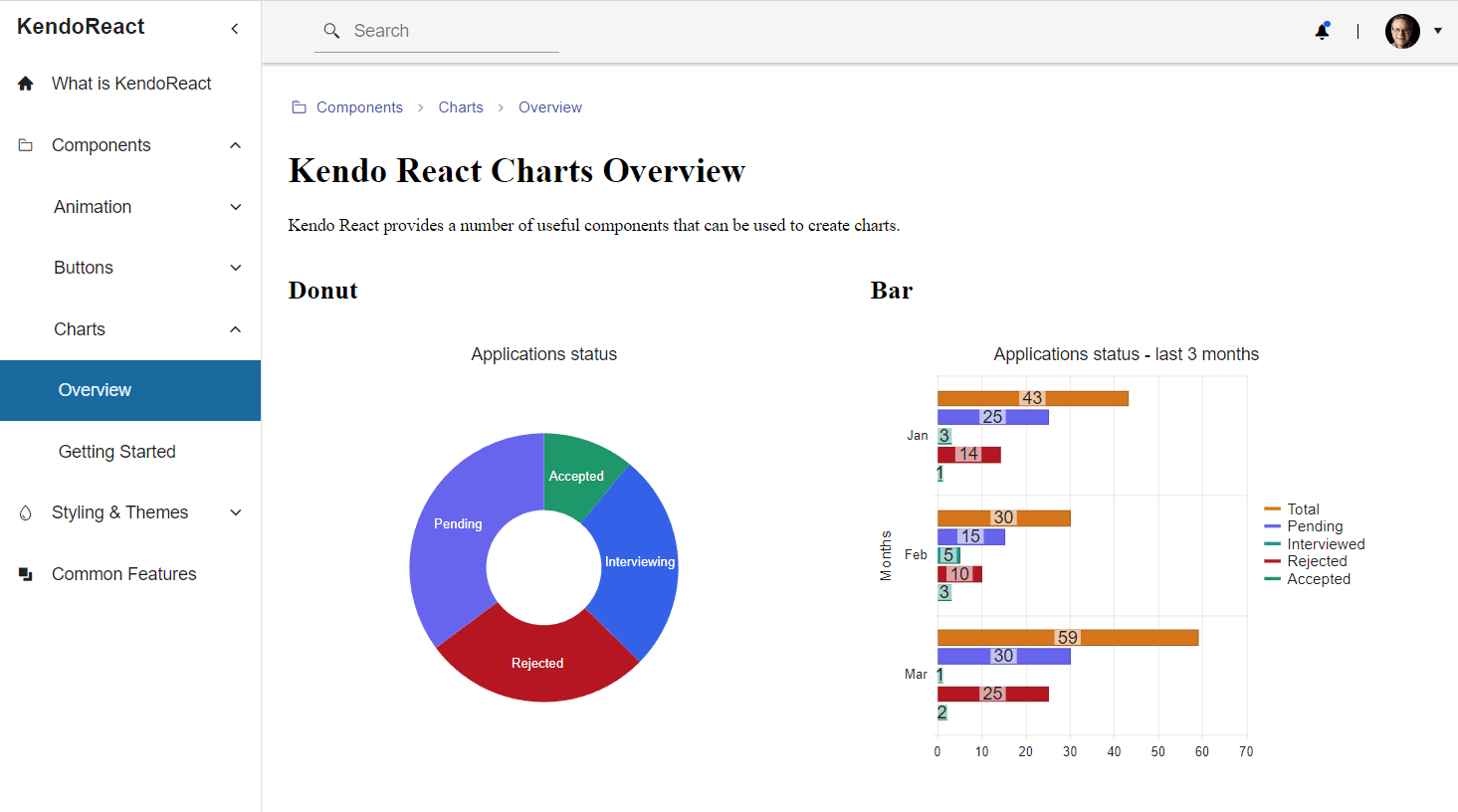
The image below shows what the two charts in the charts overview page should look like.
If you would like to learn more about how to use KendoReact to create charts and graphs, I have just the article for you.
Summary
That’s it for this series. We finished a simple React dashboard application with common features, such as a navigation drawer, header with a search input and account menu, breadcrumbs and charts. There are other features that can be added to dashboard apps, such as grids, tables and widgets. KendoReact did a lot of heavy lifting for us, and it can do even more. You can check out the full documentation to see what else it offers, download a free trial today to start exploring KendoReact yourself.

Thomas Findlay
Thomas Findlay is a 5-star rated mentor, full-stack developer, consultant, technical writer and the author of “React - The Road To Enterprise” and “Vue - The Road To Enterprise.” He works with many different technologies such as JavaScript, Vue, React, React Native, Node.js, Python, PHP and more. Thomas has worked with developers and teams from beginner to advanced and helped them build and scale their applications and products. Check out his Codementor page, and you can also find him on Twitter.
Related Posts
Comments
All articles
Topics
Web MobileMobile
Desktop
Design
Productivity
People
