
Getting to Know the KendoReact DateRangePicker

Summarize with AI:
Let’s be honest, date selection isn’t the most interesting or glamorous software engineering problem to solve—which is why we’ve solved it for you, with the KendoReact DateRange Picker!
Ideally, date picker tools should be so completely frictionless that a user doesn’t even really notice they’re there at all. I’d even go so far as to say that if a user actively notices a date range selection tool … there’s probably something wrong with it. Good design, as they say, is invisible. But just because the user shouldn’t be thinking about it, doesn’t mean that we (the developers) have the same luxury.
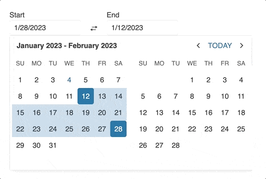
Enter: the DateRangePicker React component from Progress KendoReact. It’s a tool for—you guessed it—quickly and easily selecting a range of dates. It’s also a highly customizable component that provides a great user experience as well as a great developer experience. It has a variety of options for customizing its appearance and behavior, including minimum and maximum dates, default values, disabled dates, and more.
Features
The Date Range Picker component is absolutely packed with features. Of course, it includes all the stuff you’d expect: validation, default values, and more … but it also includes advanced features (such as reverse selection and full keyboard support) that you won’t find in just any component. Let’s take a look at a few of my favorite, more unique features from this component.
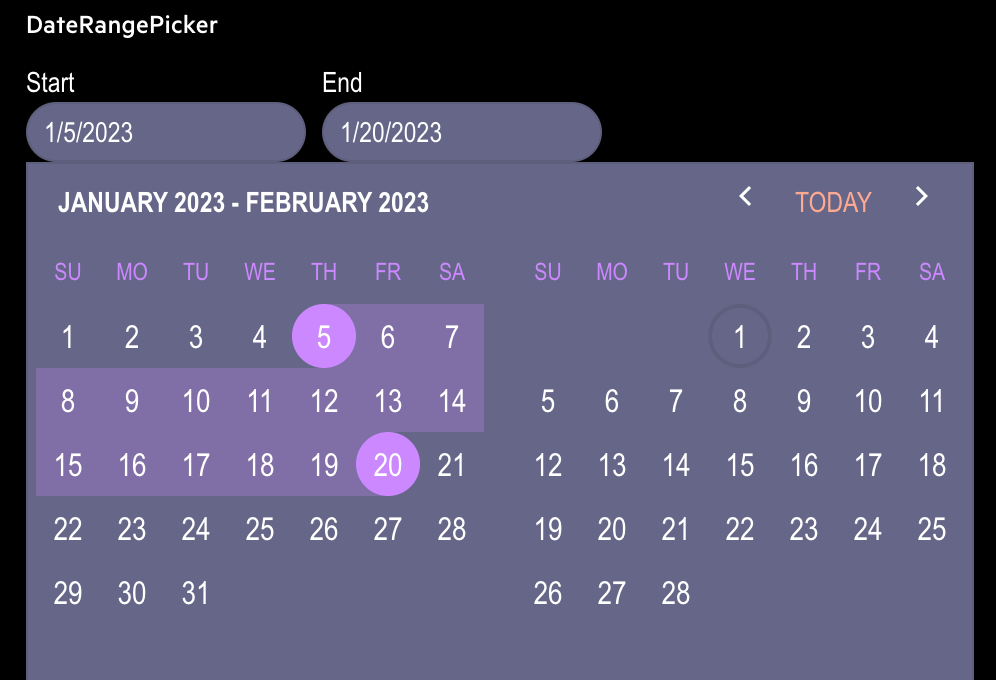
Reverse Date Selection and Date Swapping
Most of the time, when we’re dealing with date range selection, we’re making the assumption that the end date will come after the start date. Sometimes, though, we’re working on something a little bit different and we need our users to be able to select dates where the end date comes before the start date. It’s one of those weird little quirks that you wouldn’t think about … until you’re dealing with a situation where you need it, and you’ve spent hours fighting with your components trying to make it happen.
Fortunately, the DateRangePicker component makes it easy! Just set the allowReverse property to true, and you’re ready to go! Along with the reverse selection logic, you can also render a button to swap the start and
end date values. To display the swap button, set both the swapButton and
allowReverse properties to true. This will add a new button
between the date input boxes that allows the user to quickly toggle the selected start and end dates back and forth, with just a click!
Customization and Styling
The DateRangePicker (along with all the KendoReact components) is also super easy to customize and style.
You can replace the following DateRangePicker components with custom ones:
- Start and end Date Inputs, which renders the inputs for the
startandendrange selection of the DateRangePicker Calendar, which renders the MultiViewCalendar inside the popup of the DateRangePicker- Popup, which renders the popup which contains the MultiViewCalendar
This allows you to create a truly unique and personalized user experience. Additionally, the DateRangePicker also supports full theming support, so you can easily match the look and feel of your application, no matter what design system you’re using! Components can be easily themed via the KendoReact built-in themes (Material, Fluent, Bootstrap and our Default theme), custom CSS or ThemeBuilder.
Accessibility
When it comes to input tools, accessibility is absolutely crucial … and yet, it’s something that’s difficult to do on your own, and often lacking from other component libraries.
The KendoReact DateRangePicker, however, includes complete accessibility support—making it easy for all of your users to easily navigate your application. It has a built-in role and aria-label attributes, and provides full keyboard navigation support.
The aria-valuemin, aria-valuemax, and aria-valuenow properties define the accessibility values when the user enters a value or interacts with the DateRangePicker. It also follows the WAI-ARIA best practices for implementing the keyboard navigation for its component
role, and it has been tested with several popular screen readers, so you can rest assured that you’re providing the best for your users.
Conclusion
The DateRangePicker component is an essential tool for quickly and easily selecting a range of dates in a React application. Its wide range of features and customizable options ensure a great user experience, and its full accessibility support means that it’s intuitive for everyone to use. With its advanced features and capabilities, it is a powerful tool for an input that can feel deceptively simple.
As always, if you aren’t already using the KendoReact library, you can try it out completely free for 30 days! Give it a shot, and see just how simple it makes React application development.

Kathryn Grayson Nanz
Kathryn Grayson Nanz is a developer advocate at Progress with a passion for React, UI and design and sharing with the community. She started her career as a graphic designer and was told by her Creative Director to never let anyone find out she could code because she’d be stuck doing it forever. She ignored his warning and has never been happier. You can find her writing, blogging, streaming and tweeting about React, design, UI and more. You can find her at @kathryngrayson on Twitter.
Related Posts
Comments
All articles
Topics
Web MobileMobile
Desktop
Design
Productivity
People
