
How to Create Toast Notifications with KendoReact’s Notification Component

Summarize with AI:
Toast notifications are short, non-modal elements that are used to convey certain messages to a user. Learn how the KendoReact Notification component can be used to quickly and easily create Toast notification elements with customizable type, color and position.
Toast notifications are brief, non-intrusive messages that appear on the screen to provide the user with information or alerts about an event or action.
They are commonly used in applications to show the status of an operation or to provide additional context for an action performed by the user. Toast notifications typically disappear after a short period of time, or when the user interacts with them.

The KendoReact Notification Component
The Progress KendoReact Notification component is a UI component built on top of the KendoReact UI library that provides a set of pre-built configurations for creating toast notifications in React applications.
The KendoReact <Notification /> component is distributed through the kendo-react-notification npm package and can be imported directly from this package.
import {
  Notification,
  NotificationGroup,
} from "@progress/kendo-react-notification";
The <NotificationGroup /> component is often used with the <Notification /> component since it serves as a container and can provide the ability to control the styling, position
and behavior of multiple notification elements.
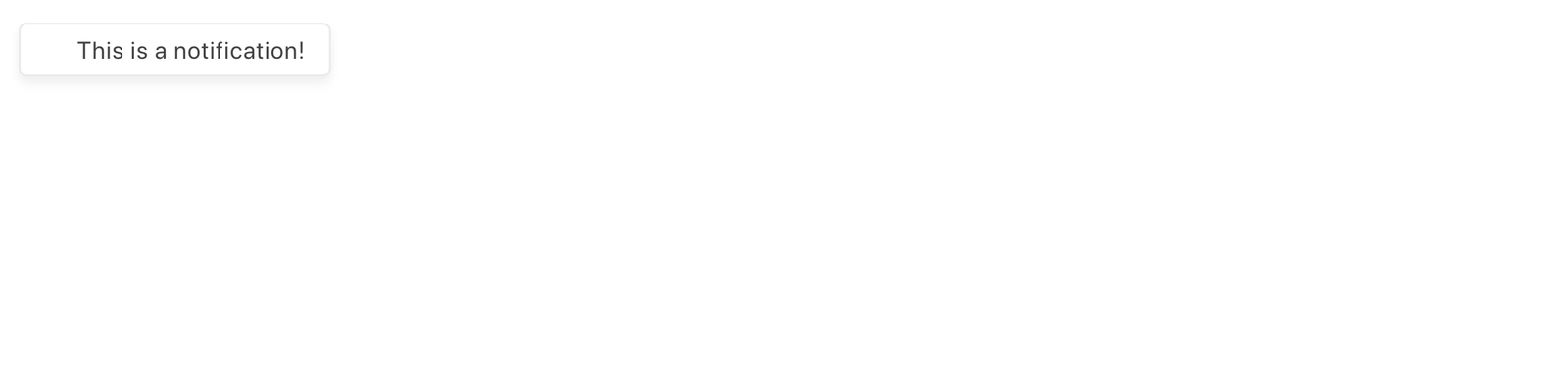
We can use the Notification and NotificationGroup components like the following:
import React from "react";
import {
  Notification,
  NotificationGroup,
} from "@progress/kendo-react-notification";

function App() {
  return (
    <div>
      <NotificationGroup>
        <Notification>This is a notification!</Notification>
      </NotificationGroup>
    </div>
  );
}
export default App;
With the above code example, we’re presented with a notification element on our webpage.
A key element of toast notifications, as mentioned earlier, is to appear on the screen to provide the user with information or alerts about an event or action that has occurred. To mimic this behavior, we can have the toast notification appear when a button is clicked.
First, we’ll initialize a state property labeled showNotification that controls if the notification should be displayed or not.
import React from "react";
import {
  Notification,
  NotificationGroup,
} from "@progress/kendo-react-notification";

function App() {
  const [showNotification, setShowNotification] = React.useState(false);

  return (
    <div>
      <NotificationGroup>
        {showNotification && (
          <Notification>This is a notification!</Notification>
        )}
      </NotificationGroup>
    </div>
  );
}
export default App;
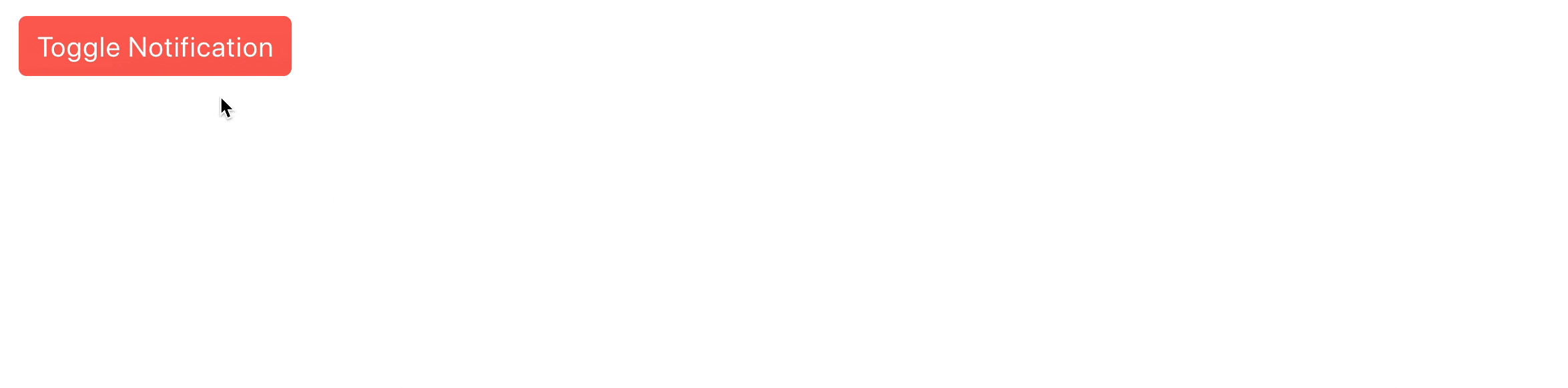
Next, we’ll place a button element, created with the KendoReact Button component, in our markup. When this button is clicked,
it toggles the value of the showNotification state property.
import React from "react";
import { Button } from "@progress/kendo-react-buttons";
import {
  Notification,
  NotificationGroup,
} from "@progress/kendo-react-notification";

function App() {
  const [showNotification, setShowNotification] = React.useState(false);

  return (
    <div>
      <Button
        themeColor="primary"
        onClick={() => {
          setShowNotification(!showNotification);
        }}
      >
        Toggle Notification
      </Button>
      <NotificationGroup>
        {showNotification && (
          <Notification>This is a notification!</Notification>
        )}
      </NotificationGroup>
    </div>
  );
}

export default App;
We’ll want to have our notification element displayed in the bottom-right corner of our webpage. To do this, we’ll add a few style properties to the <NotificationGroup /> component to position any notification
element in its children to the bottom-right corner of the webpage.
import React from "react";
import { Button } from "@progress/kendo-react-buttons";
import {
  Notification,
  NotificationGroup,
} from "@progress/kendo-react-notification";

function App() {
  const [showNotification, setShowNotification] = React.useState(false);

  return (
    <div>
      <Button
        themeColor="primary"
        onClick={() => {
          setShowNotification(!showNotification);
        }}
      >
        Toggle Notification
      </Button>
      <NotificationGroup
        style={{
          right: 5,
          bottom: 5,
          alignItems: "flex-start",
          flexWrap: "wrap-reverse",
        }}
      >
        {showNotification && (
          <Notification>This is a notification!</Notification>
        )}
      </NotificationGroup>
    </div>
  );
}

export default App;
When we click the “Toggle Notification” button in our app, we’ll notice our toast notification appear on the bottom-right corner of the page.
Types of Toast Notifications
Toast notifications can be used to convey a message to a user for a variety of different reasons. For example, they can be used to inform a user about a successful action, such as saving a file or completing a task.
They can also be used to alert a user to an error, such as an incorrect input or failed operation. The use of colors to indicate the type of notification (success, error, warning, etc.) provides the user with immediate visual cues about the status or outcome of an action, without having to fully understand the contents of the notification.
The KendoReact Notification component allows us to specify the type of notification by allowing us to use a type property, which in turn determines the color of the notification.
Here are the different types of notifications that can be surfaced:
type="success"helps indicate a successfully completed action.type="info"indicates an informative notification, typically used to provide additional information to the user.type="error"indicates a failed or unsuccessful action and is used to alert the user to an error.type="warning"indicates a potential issue or problem that the user should be aware of but is not necessarily an error.type="none"specifies that no type is assigned to the notification. This can sometimes be useful when we want to create our own custom styles for a notification.
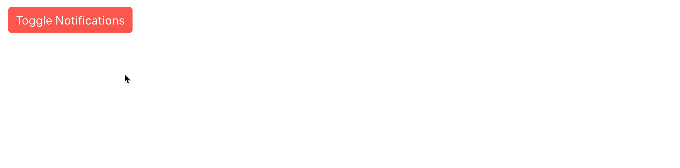
The type property of the component also allows us to dictate if we want an icon to show alongside the notification message. Here’s an example of having the button in our app toggle all the different types of notifications
when clicked.
import React from "react";
import { Button } from "@progress/kendo-react-buttons";
import {
  Notification,
  NotificationGroup,
} from "@progress/kendo-react-notification";

function App() {
  const [showNotifications, setShowNotifications] = React.useState(false);

  return (
    <div>
      <Button
        themeColor="primary"
        onClick={() => {
          setShowNotifications(!showNotifications);
        }}
      >
        Toggle Notifications
      </Button>
      <NotificationGroup
        style={{
          right: 5,
          bottom: 5,
          alignItems: "flex-start",
          flexWrap: "wrap-reverse",
        }}
      >
        {showNotifications && (
          <>
            <Notification
              type={{
                style: "none",
                icon: true,
              }}
            >
              This is a type="none" (i.e. default) notification!
            </Notification>
            <Notification
              type={{
                style: "warning",
                icon: true,
              }}
            >
              This is a warning notification!
            </Notification>
            <Notification
              type={{
                style: "error",
                icon: true,
              }}
            >
              This is an error notification!
            </Notification>
            <Notification
              type={{
                style: "info",
                icon: true,
              }}
            >
              This is an info notification!
            </Notification>
            <Notification
              type={{
                style: "success",
                icon: true,
              }}
            >
              This is a success notification!
            </Notification>
          </>
        )}
      </NotificationGroup>
    </div>
  );
}

export default App;
When we click the “Toggle Notifications” button, we’ll see all the different types of notifications surfaced in the bottom-right corner.
Toast Animation Options
The React Notification component can be enhanced by using animations from the KendoReact animations library (kendo-react-animations).
The KendoReact animations library provides many different ways to animate elements that appear, enter or exit the viewport. For example, we can use the <Slide /> component from the KendoReact animations library to
have a notification “slide” into or out of the viewport.
import React from "react";
import { Button } from "@progress/kendo-react-buttons";
import {
  Notification,
  NotificationGroup,
} from "@progress/kendo-react-notification";
import { Slide } from "@progress/kendo-react-animation";

function App() {
  const [showNotification, setShowNotification] = React.useState(false);

  return (
    <div>
      <Button
        themeColor="primary"
        onClick={() => {
          setShowNotification(!showNotification);
        }}
      >
        Toggle Notification
      </Button>
      <NotificationGroup
        style={{
          right: 5,
          bottom: 5,
          alignItems: "flex-start",
          flexWrap: "wrap-reverse",
        }}
      >
        <Slide direction={showNotification ? "up" : "down"}>
          {showNotification && (
            <>
              <Notification
                type={{
                  style: "success",
                  icon: true,
                }}
              >
                This is a success notification!
              </Notification>
            </>
          )}
        </Slide>
      </NotificationGroup>
    </div>
  );
}

export default App;
In the code sample above, we import the Slide component and wrap the Notification component that is used to render a success notification.
We dictate the direction of how the notification element should slide into view based on if the notification is being shown or hidden. If the notification is being shown, we slide the notification element up and if the notification is being hidden, we have the notification element slide down.

<Slide /> is just one component that exists from the KendoReact animations library. We could have our notifications be animated with any of the components the animations library provides—<Push />,
<Expand />,
<Fade />, <Zoom />, etc. Be sure to check out the KendoReact Animation Overview documentation for more details on this topic.
Close Icon
The Notification component also provides us the capability to display a close icon beside the notification message. We can display the icon with the closable prop and we can use the onClose() function prop to dictate what happens when the close icon is clicked.
To test this in our example, we can have the onClose() function set the showNotification state property back to false.
// ...

function App() {
  const [showNotification, setShowNotification] = React.useState(false);

  return (
    <div>
      // ...
      <Notification
        type={{
          style: "success",
          icon: true,
        }}
        closable
        onClose={() => setShowNotification(false)}
      >
        This is a success notification!
      </Notification>
      // ...
    </div>
  );
}

export default App;
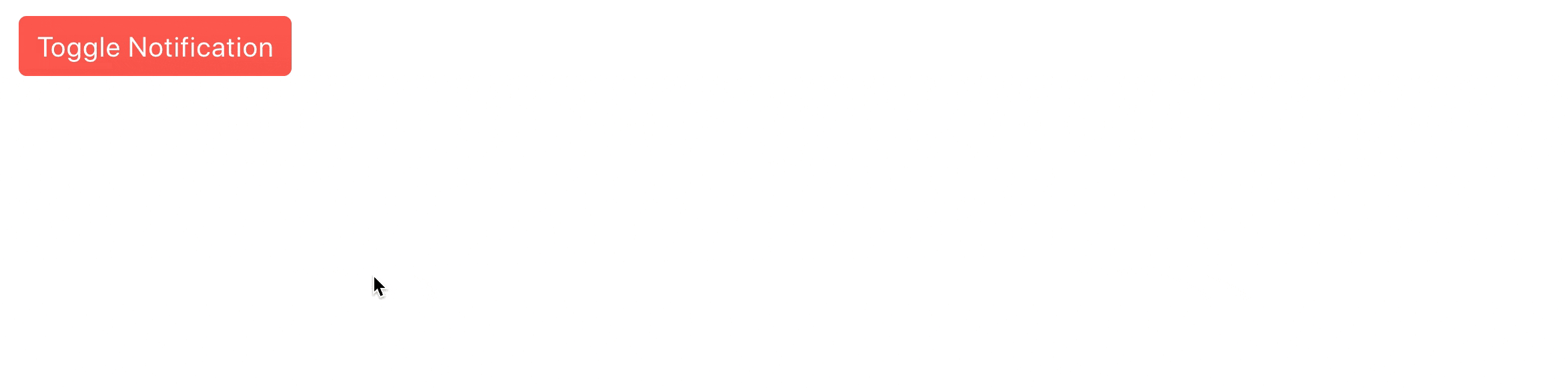
When the close icon is clicked, we’ll notice the notification will disappear.
Wrap-up
In conclusion, toast notifications are a great way to provide users with quick, non-intrusive feedback on the status of an action they have taken or on important information they need to know.
Whether you’re indicating a successful action, alerting the user to an error, or warning them of something important, the Notification component makes it simple to add this type of functionality to your app.
For more details, be sure to check out the official Notification component documentation! And if you haven’t already done so, try the whole KendoReact library for free.

Hassan Djirdeh
Hassan is a senior frontend engineer and has helped build large production applications at-scale at organizations like Doordash, Instacart and Shopify. Hassan is also a published author and course instructor where he’s helped thousands of students learn in-depth frontend engineering skills like React, Vue, TypeScript, and GraphQL.
Related Posts
Comments
All articles
Topics
Web MobileMobile
Desktop
Design
Productivity
People
