
Kendo UI Grid for React – Built from the Ground Up!
 by Vasil Raev

Summarize with AI:
We've built the Grid component of Kendo UI for React from the ground up specifically to take advantage of the latest technology and to make your life easier. Read on to learn more and see how you can get started quickly.
If you are just starting your React project, and you want to show some data in a table, you can use the powerful Kendo UI Grid component to place a grid in your app and configure it with just a few lines of code. Our data grid component is easy to use, yet highly configurable and extensible.
In this article, I am going to show you how quickly you can enable data management operations in your app with it, and explain its key features. Be sure to read till the end to see all the exciting stuff the future holds, and how you can influence the Grid's roadmap.
A Very Quick and Easy Grid
Here's how to bind our first grid to a simple array:
<Grid data={ 'Hello, world!'.split(' ') } />And this is the result:

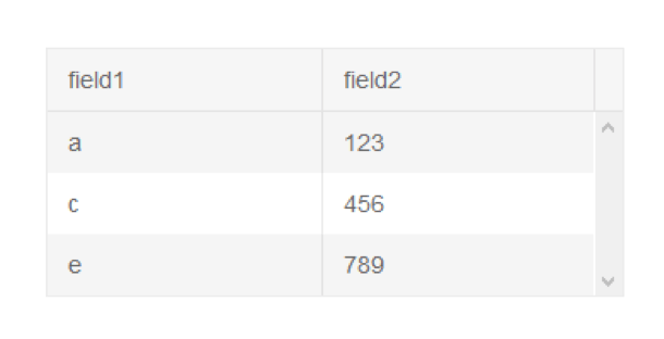
As you already noticed, the grid automatically guessed its columns. For the sake of simplicity, let us see some more practical and obvious usage:
<Grid data={[
    {field1:'a', field2: 123},
    {field1:'c', field2: 456},
    {field1:'e', field2: 789}
  ]}
/>
A Few Basics
Here are a few things that you need to know when starting out and choosing vendors:
- The Grid, as well as all components in our React suite, are built from the ground up, and designed especially as React components.
- All Telerik React components are written in TypeScript. So, to make life easier for all TypeScript developers that are building React apps, you natively get the typings.
- For all the JavaScript developers, we have carefully set the PropTypes in each component, so that should make their lives as easier as much as possible as well.
- The Grid behaves as fully controlled Component, meaning you can change the configuration runtime at any point.
- We have adopted the continuous delivery practice which allows the community to take advantage of all the bug fixes and new features as soon as they are ready, with no need to wait for a quarterly release.
Inheritance and Nesting
The grid is written entirely using React elements. This means that it can:
- Be composited or inherited inside different React components in your application
- Be part of a higher-order component (HOC)
- Render custom React components as cells and detail rows
Speed and Performance
Everything is as fast as it can be. The grid does linear operations per columns and rows. The speed depends entirely on the React framework, the browser and your machine. Basically, the grid renders at the speed a normal <table /> would be rendered with React as well.
The Kendo UI for React components are built in pure React, and can take full advantage of the faster re-rendering introduced with React Fiber. This also eliminates some of the reasons for memory leaks in components which are still based on libraries like jQuery.
Combining Features
Features are independent from each other, which means they can be used in all combinations without side effects. Let's say you need virtualization with hierarchy - no problem. As a demonstration, look at this live example with virtualization, hierarchy and filtering:
Communication with the App Logic
The Grid can be fully controlled from the application level (because you can change the configuration runtime at any point) and its events inform the developer of any user action. This allows you, for example, to store the settings of the Grid at any point, and then load them again, or to easily achieve functionality like Back and Forward. You can see a live example of this in action here.
The Grid allows the nesting of other components, including other Kendo UI React components. For example, the DropDownList component can be used as custom editor in the Grid cell.
The components are built following the best practices and their values can be controlled using props, which eliminates the need for specifics only to the component methods. This will allow the components to be used like any other standard React component, it makes integration with third party libraries like Redux much easier and fluent, and it reduces library incompatibility.
The Grid supports transferring data using the React context, which can allow easy localization and can let you translate all the Kendo UI for React components together.
Appearance and Themes
The Kendo UI for React components come with very beautiful and responsive Sass themes which can be easily integrated with popular libraries like Bootstrap.
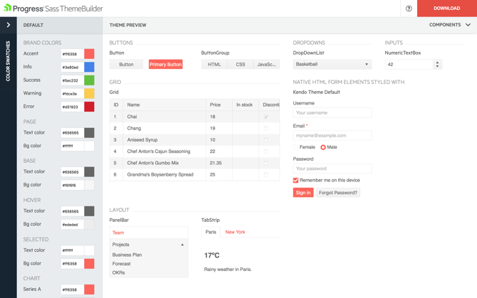
In addition to that, we have the amazing Sass Theme Builder Tool that allows you to make limitless variations of the built-in themes, so the components can fit in every design.
What's Next: Roadmap
We always strive to put the most commonly requested features in the Grid. If you do not find something you are looking for, please check our React Roadmap. It lets you see what we have planned to release in the future, so you can know if the most critical feature for your business is already in the making.
You can influence our priorities by casting your vote for the features you need the most in our Feedback Portal.
If you encounter any issues while using the components, please submit a ticket in our support system or log an issue in our GitHub repo.
If you're already excited to try the Kendo UI for React components you can start a free 30-day trial of Kendo UI for React.
Start My Kendo UI for React Trial
Happy coding, and enjoy our high-performing React components that we've built for you from the ground up!
Vasil Raev
Vasil Raev was a Software Developer at Telerik's ASP.NET AJAX divisions.