5 Built-In Views To Customize the KendoReact Scheduler Component

Summarize with AI:
Check out the 5 different built-in views in the KendoReact Scheduler component as we go over common usage scenarios.
The KendoReact Scheduler is one of our most flexible and adaptable React components. Designed to help your users easily plan events, the React Scheduler includes out-of-the-box time zone conversion, grouping, editing and recurring events.
Among the most-beloved features, though, are the five different built-in views that support the wide variety of calendar visualization options. This high level of flexibility lets you, the developer, configure this component in whichever way makes the most sense for your application, as well as gives your users the choice of views that will be most useful to them.
Check out the companion video, React Scheduler Tutorial: When to Use Different Views and How to Customize Them
Let’s look at all the available views you can use with this powerful component and the flexibility they offer you in meeting your clients’ needs, no matter how they’re using the Scheduler:
React Scheduler Day View
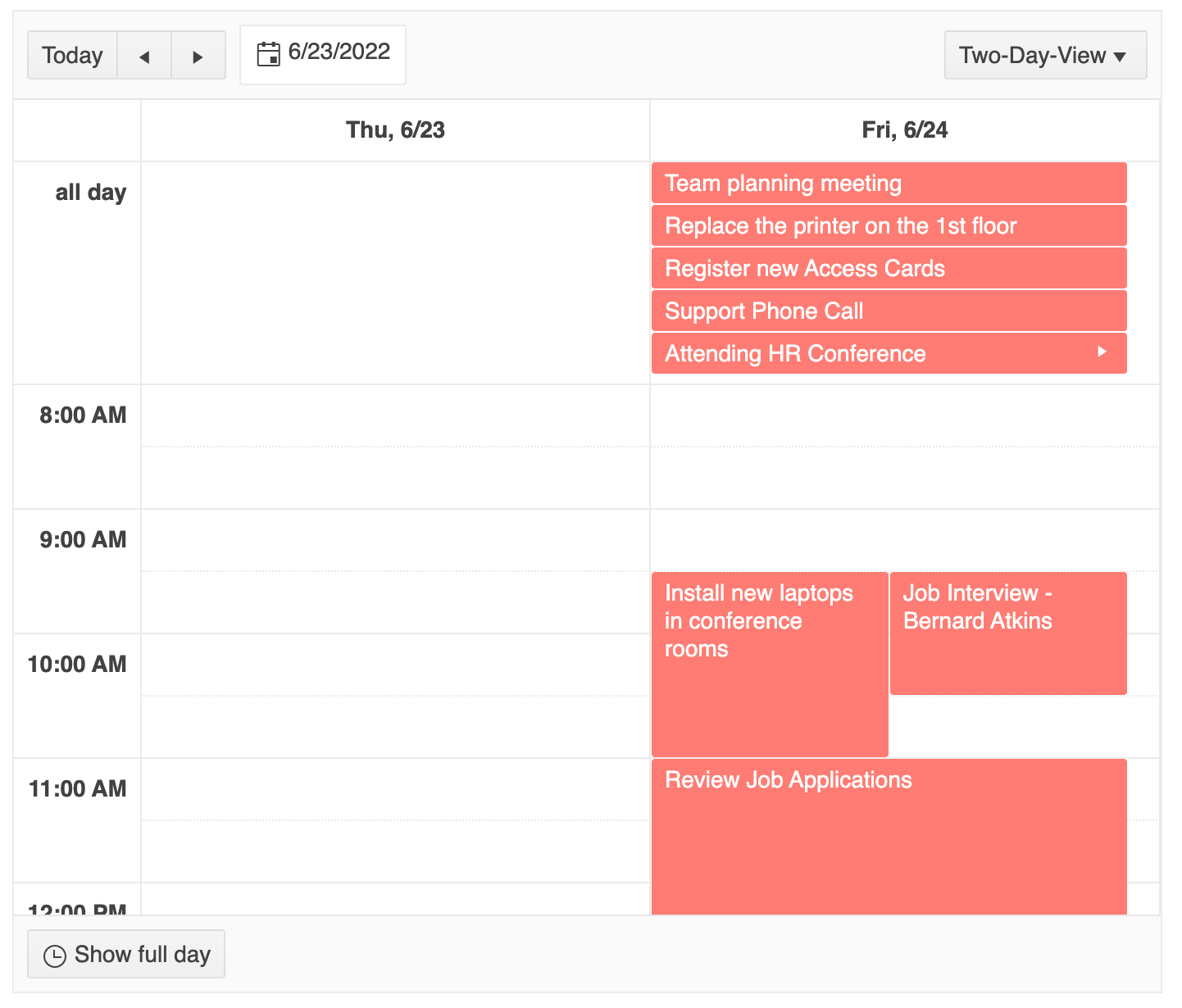
The KendoReact Scheduler Day view displays the events of a single day, broken down into an hour-by-hour format. You can configure the definitions for when the day begins and ends using the startTime and endTime properties, allowing your users to toggle between seeing the full day or the workday.
You can also show or hide a line designating the current time by setting currentTimeMarker to true or false. If you really want to get granular, you can even adjust the number of divisions in each time slot and how long those time slots are with slotDivisions and slotDuration.
This Day view is perfect for users who want to see a high-level, visual overview of their day. The block-style view of events makes it easy to see how much time you have available and what items are taking up the largest parts of your day. This is also a great option for coordinating the booking of shared resources, like a conference room or piece of equipment.
React Scheduler Week View
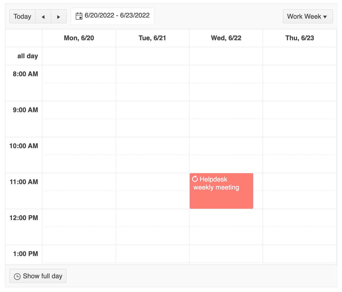
The KendoReact Scheduler Week view shows your users their week—or their workweek—at a glance. Technically, the Week view is just a specific set of configurations applied to the Day view: setting the number of days visible, the number of days that the scheduler “steps” forward when users click the next button, and the date range.
This approach makes it incredibly customizable and adjustable, no matter how your users define their workweek. Do your users start the week on Monday, not Sunday? We support that—just change the locale! Or maybe you’re lucky enough to be working for a company that’s adopted the four-day workweek? No problem—you can set custom workWeekStart and workWeekEnd values to match whatever schedule your users have adopted.
This view combines the benefits of the Day view (easy to see at a glance what’s available vs. booked, great for seeing what takes up most of the time) with the longer-term view of a calendar. Being able to look ahead at the week can help your users target which days they have free to focus on big projects and which days they know will be packed with other commitments. Since we naturally break our work schedule into workweeks, this is an incredibly practical view to offer to your users.
React Scheduler Month View
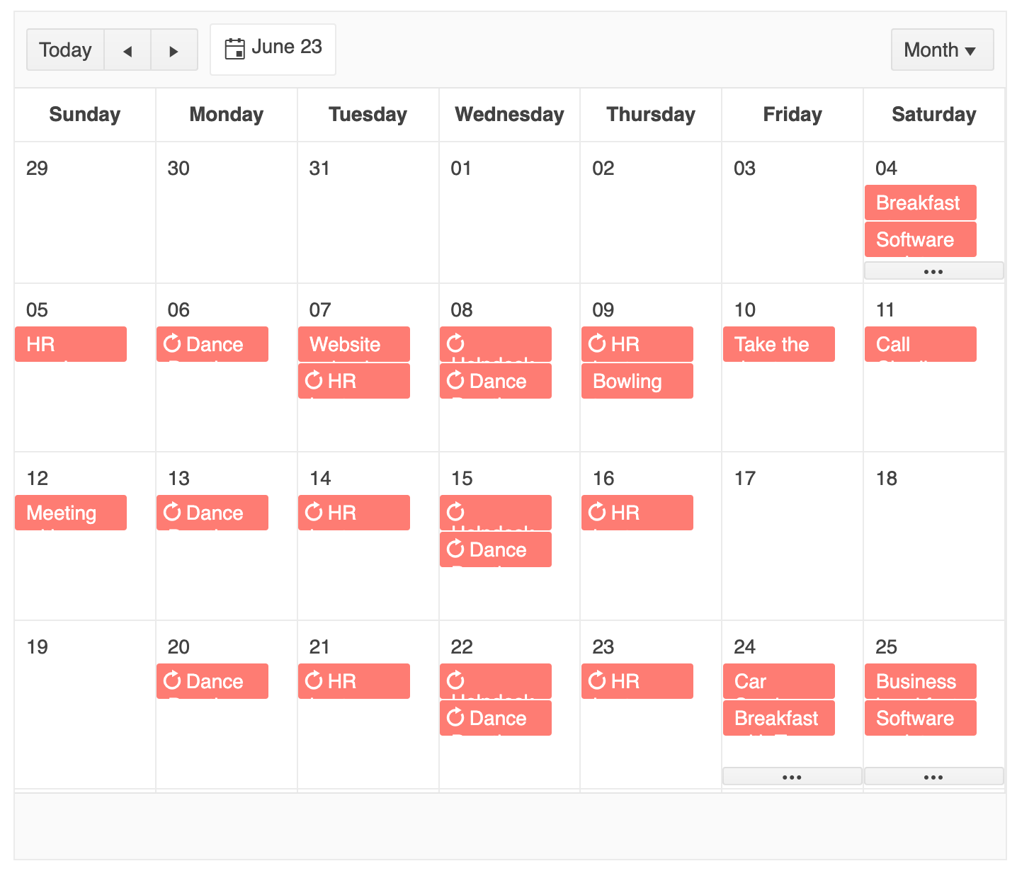
The KendoReact Scheduler Month view offers a more traditional calendar-style layout—a high-level view of several weeks, allowing your users to get a feel for what’s coming up. As with the other views, you can customize the day the week begins, or even group your view based around a resource! For example, this view below uses an alternate configuration of the Month view to show the days that various conference rooms are booked on two individual schedules:
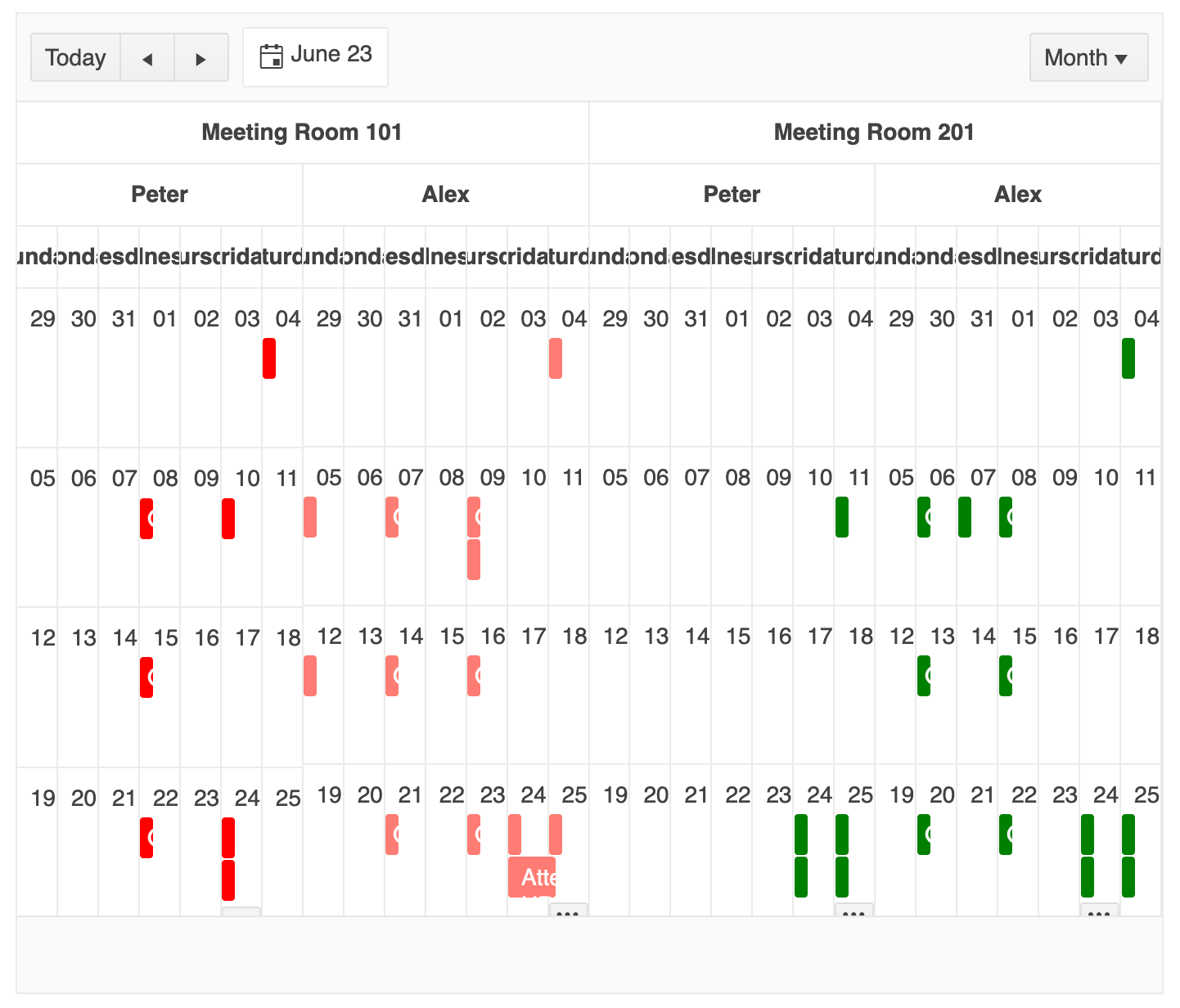
Being able to take a look at the upcoming schedule from a birds-eye view is great for doing high-level planning, like setting deadlines on long-term projects or taking vacation days. Offer this view as an option for your users when you know they’ll be more concerned with the big picture than the day-to-day minutia.
React Scheduler Agenda View
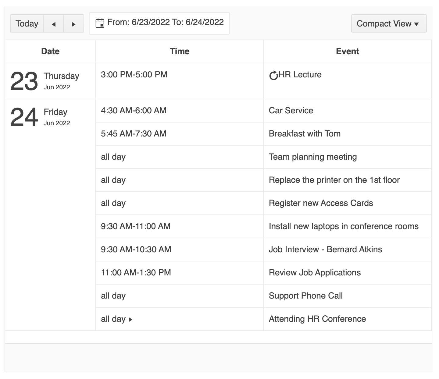
The KendoReact Scheduler Agenda view shows your users their upcoming events in a list format, with the earliest event at the top. This is a nice option that’s kind of in between the Day and Week views. Adjust the dateRange property to change your available range, or the numberOfDays option to specify the number of days that the view will render.
The look and feel of the events can also be changed by customizing the styles of the SchedulerTask sub-component. For example, here we’ve applied a background color to events so the user can distinguish their all-day events from their shorter events with just a glance. You can apply background images, set colors and font styles—the sky’s the limit! This styling can be applied to all our available views, but it’s especially nice in the Agenda view where there’s lots of space for each Event title.
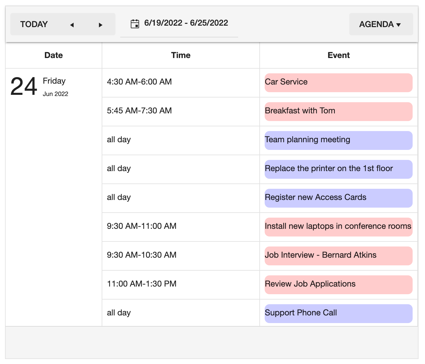
The Agenda view is best for your very practical users who just want as much information as possible in the smallest amount of space. They don’t need to look too far ahead, and they don’t need the visual representations of time that we offer with the Day view.
Offering the Agenda and Day views together as two ways of formatting the same information can be a great way to allow your users to personalize their Scheduler—not everyone works in the same way, and they shouldn’t have to! Meet your users where they are and allow them to work most efficiently by giving them multiple view options to choose from.
React Scheduler Timeline View
The KendoReact Scheduler Timeline view offers a side-scrolling, hour-by-hour look at the user’s schedule. This is an especially useful view for identifying possible overlaps or conflicts in scheduling or getting a more accurate visual representation of how long an event is.
You can customize the widths of each hourly column by adjusting the columnWidth property, which will otherwise default to 100 px. You can also apply any of the previously mentioned customizations to this view: showing or hiding the current time marker, changing the date range and number of days, customizing the beginning and end of the workday, and more.

Timeline views are great for assessing deadlines and situations where events will be ongoing for a while and overlapping with other events. The side scrolling view makes the visualization of events very intuitive, and it’s a great way to capture a whole day in just a little bit of space. If you’re looking for a way to track deadlines and projects that are dependent on each other, though, you might also be interested in the Gantt Chart component. Check it out and choose the one that best fits your users’ needs!
Which Views To Use in Your Application?
With so many good options, you’ll never have to compromise on a Scheduler component for your React application. However, sometimes more than one solution can be valid. In that case, it’s best to leave it to the user’s personal preference, so they can pick the one that works best for them.
With the KendoReact Scheduler, you can just import whichever view options you’d like to offer in your app, nest them within the parent Scheduler component, and—just like that—your users will be able to toggle them using the dropdown menu in the top right corner of the component. Choose a standardized view for all your users, allow them to swap between just a few options, or let them have their choice of all five—you make the UX decisions, we make them easy to implement!
import { Scheduler, DayView, WeekView } from '@progress/kendo-react-scheduler';

const App = () => {
  return (
    <Scheduler data={sampleData} defaultDate={displayDate}>
      <DayView />
      <WeekView />
    </Scheduler>
  );
};
Make Time To Explore Everything the Scheduler Can Do
The React Scheduler, part of KendoReact, is a complex and extensible component—and what we’ve seen in this blog is only one small facet of everything it can do! You’ll want to block off some time on your calendar to really dig deep into this component and get a feel for all the ways you can customize it to suit your application.
If you want to take a deeper look into the React Scheduler, signing up for the 30-day KendoReact trial will not only give you a chance to explore the component and get technical support while you do it, but you will also get access to the full KendoReact library. So, relax and take your time fitting us into your busy schedule!

Kathryn Grayson Nanz
Kathryn Grayson Nanz is a developer advocate at Progress with a passion for React, UI and design and sharing with the community. She started her career as a graphic designer and was told by her Creative Director to never let anyone find out she could code because she’d be stuck doing it forever. She ignored his warning and has never been happier. You can find her writing, blogging, streaming and tweeting about React, design, UI and more. You can find her at @kathryngrayson on Twitter.
