
Kendo UI for Vue
What's New R2 2022
What's New HistoryNew Native Component: Vue ScrollView
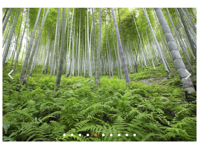
The Vue ScrollView displays a horizontal collection of content or images with built-in navigation tools, automatic scrolling and visual indicators to help users keep track of their location in the collection at any time.
See the Vue ScrollView demo
New Native Component: Vue PanelBar
The Vue PanelBar, also known as the Vue Accordion, showcases hierarchical or multi-level content in collapsible panes, or panels. The PanelBar provides many configuration options to help with customization and integrates with Vue routing to facilitate further navigation. It is typically used as a layout tool but is also useful for side navigation.

All Components: Vue Source Code Now Available
Starting with this release, we are making source code for all Kendo UI for Vue native components available. Every license holder now has access. Simply follow the instructions mentioned in our “Obtaining Source Code” documentation article.
New Vue Wizard Example
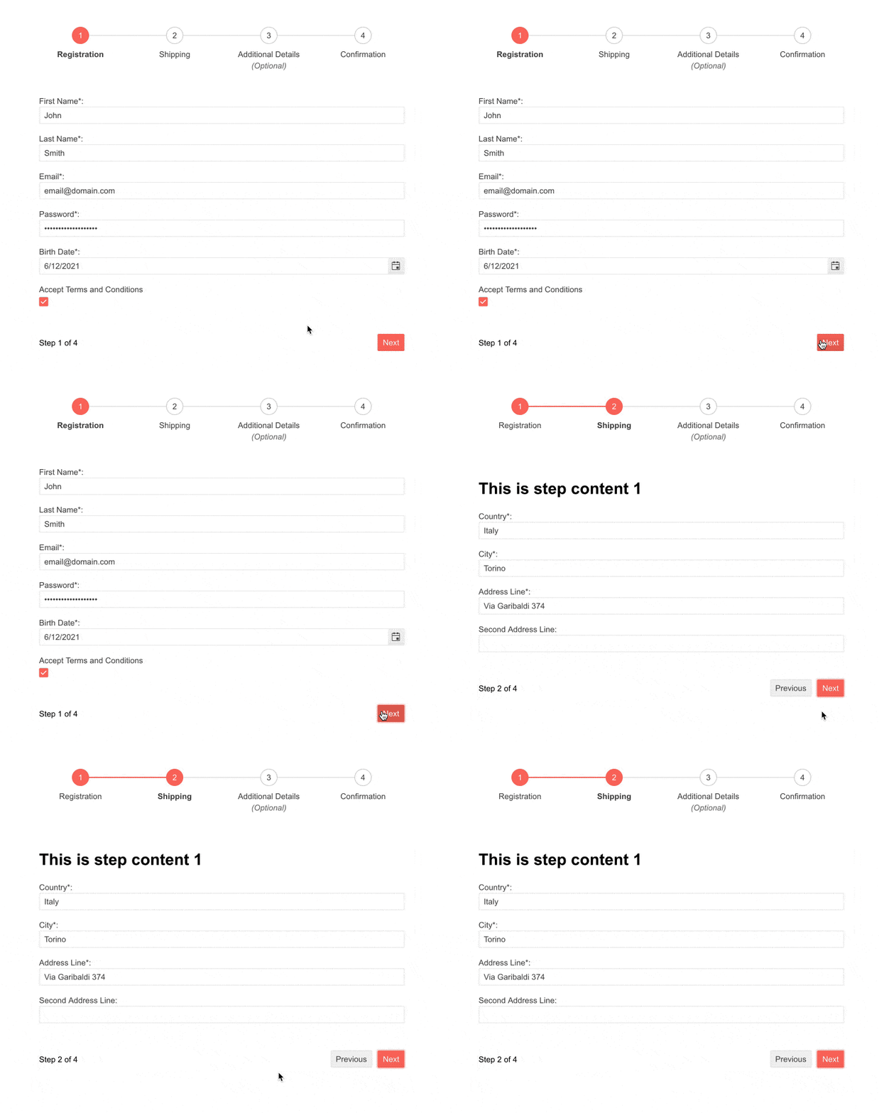
Vue Form and Stepper are commonly combined to create a customized Vue Wizard. We have added examples to the documentation that show you how to put these components together to create your own Wizard. You will see how to create layout and navigation and handle validation and submission.
Dark Mode for Vue Docs and Demos
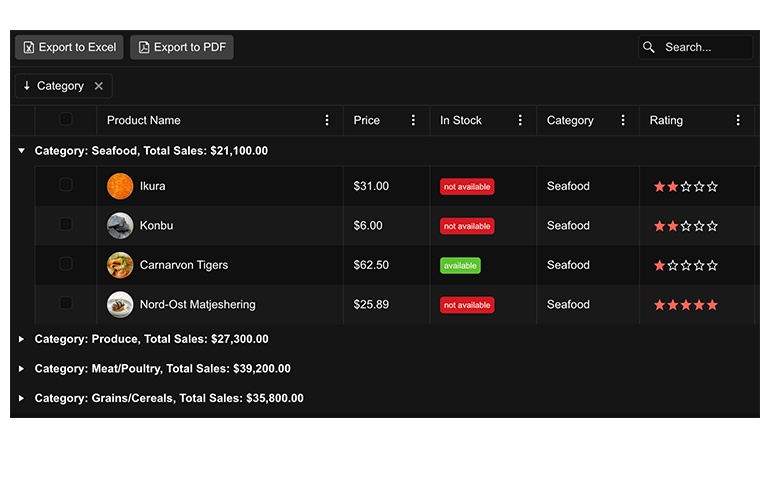
Giving users the option to choose between dark and light modes in their UI is a popular and growing trend. Kendo UI for Vue supports it and to show you how easy it is, we have added a switch toe toggle the two modes in our docs and demos.
Visit the Vue Grid Demo to toggle between modes and see for yourself
New Vue Data Grid Examples: OData Binding and CRUD Operations
To help you get into production as quickly as possible, we have added documentation around binding the grid to OData endpoints and performing CRUD operations. You will find instructions, sample code, and live examples by following the link below.
See the Vue Data Grid OData CRUD Examples
New Component: Vue Skeleton
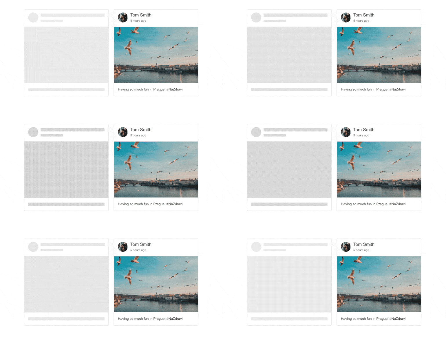
The Vue Skeleton component displays a placeholder on the screen while content loads. The default design is a grey box, but you can choose from other shapes and add animations. Use the Skeleton wherever you need to load large data and other complex content including other Kendo UI for Vue components!
New Native Component: Vue RangeSlider
The Vue RangeSlider gives users an interactive tool for selecting numeric ranges rather than providing ordinary text boxes or spinners. This component was previously available as a wrapper and is now fully native.

New Native Component: Vue Splitter
The Vue Splitter allows you to divide a page into two or more panes in a row and/or column structure. Each pane can be resized with by dragging a handle up and down or side to side.
See the Vue Splitter demo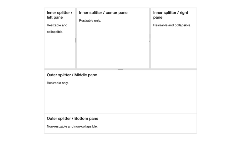
New Native Component: Vue Notification
The Vue Notification component displays a brief message to inform users about the status of a particular process, such as a successful update of data or an error message. The component will handle multiple notifications at once, control the position of the notification container, and includes several predefined styles for common notification scenarios.
See the Vue Notification demo

New Blue Ocean Color Swatch for Improved Accessibility
The goal of the Kendo UI Default theme is to give you modern and accessible UI that you can use right out of the box. This new swatch has an updated look and feel and its colors are chosen for optimized contrast to improve accessibility beyond levels we have already achieved. This new color swatch is the default for the Kendo UI Default theme.
See the new Blue Ocean Swatch by visiting the Data Grid demo

New Native Component: Vue TreeView
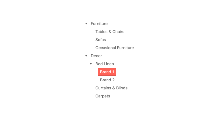
Previously available as a wrapper, the Kendo UI for Vue TreeView component is now truly native. It is perfect for scenarios that require hierarchical data to be displayed in a tree structure, either as related data items or as navigation.
See the Vue TreeView demo
New Native Component: Vue Scheduler
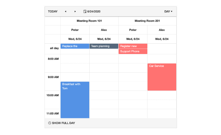
Previously a wrapper, we are introducing the native Vue version of the Scheduler. This component allows you to add full-featured scheduling to your Vue apps with as little as a line of code. Its experience is much like Microsoft Outlook or Google Calendar. Bind your date-based data to show events and allow editing. This is the initial release of the component and will included only the primary features. We will quickly round out the feature set in upcoming releases.
Kendo UI for Vue - R2 2022
- New Native Component: Vue ScrollView
- New Native Component: Vue PanelBar
- All Components: Vue Source Code Now Available
- New Vue Wizard Example
- Dark Mode for Vue Docs and Demos
- New Vue Data Grid Examples: OData Binding and CRUD Operations
- New Component: Vue Skeleton
- New Native Component: Vue RangeSlider
- New Native Component: Vue Splitter
- New Native Component: Vue Notification
- New Blue Ocean Color Swatch for Improved Accessibility
- New Native Component: Vue TreeView
- New Native Component: Vue Scheduler


