Kendo UI for Vue
What's New R2 2021
What's New HistoryNew Vue Button Component: Button
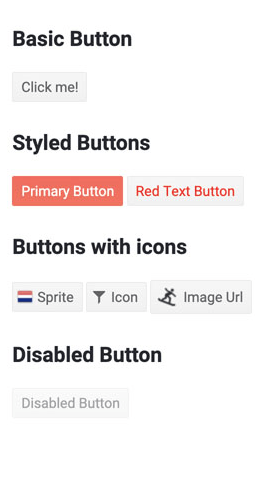
The Vue Button component is an essential UI element that allows you to show buttons with text only, icons and/or images. These buttons will automatically fit with your chosen theme, so creating consistent and beautiful UI is easy.

New Vue Button Components: ButtonGroup
The ButtonGroup component is a convenient container for two or more buttons. With this component, buttons that belong together can easily be positioned and repositioned as a group. Buttons can share configurations or be configured separately.

New Vue Button Components: FloatingActionButton
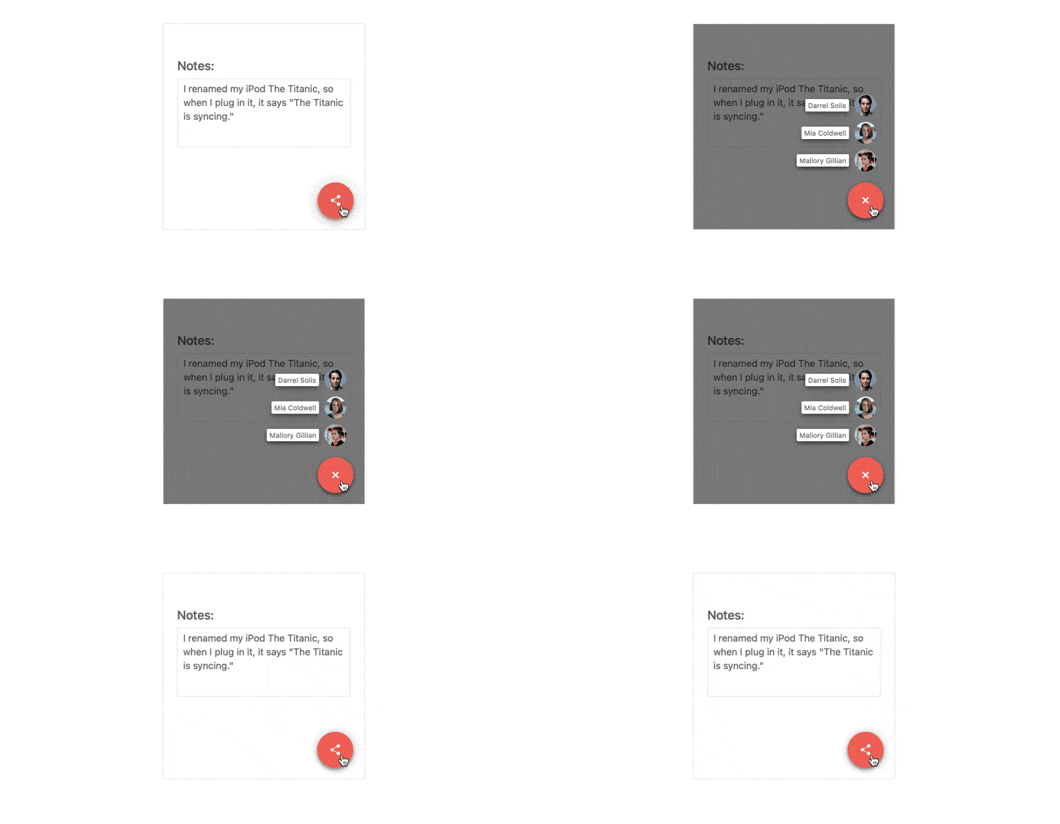
A popular element in mobile applications, the Floating Action Button presents users with the primary action on a screen by appearing in front of all other content. When clicked, it can either perform a single action or show additional options on a dial. It is commonly used to create new items, such as emails or records.
See the Vue FloatingActionButton demo

New Vue Layout Components: Chip
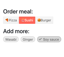
The Kendo UI for Vue Chip component shows text, a close or delete icon and images. Often used in social media platforms or email clients to indicate the different users in the recipient’s field of a message, the Vue Chip component is perfect for listing selected items.

New Vue Layout Components: ChipList
A companion to the Chip component, ChipList organizes several individual chips in a list and provides features to manage the list, including adding and removing items and maintaining the selected chips.

New Vue File Management Component: Upload
The Kendo UI for Vue Upload component enables users to upload files from their local systems in any Vue-based application. It offers several features, including batch and chunk upload modes, and dragging and dropping files from the file system.

New Vue Data Grid Feature: Infinite Scrolling
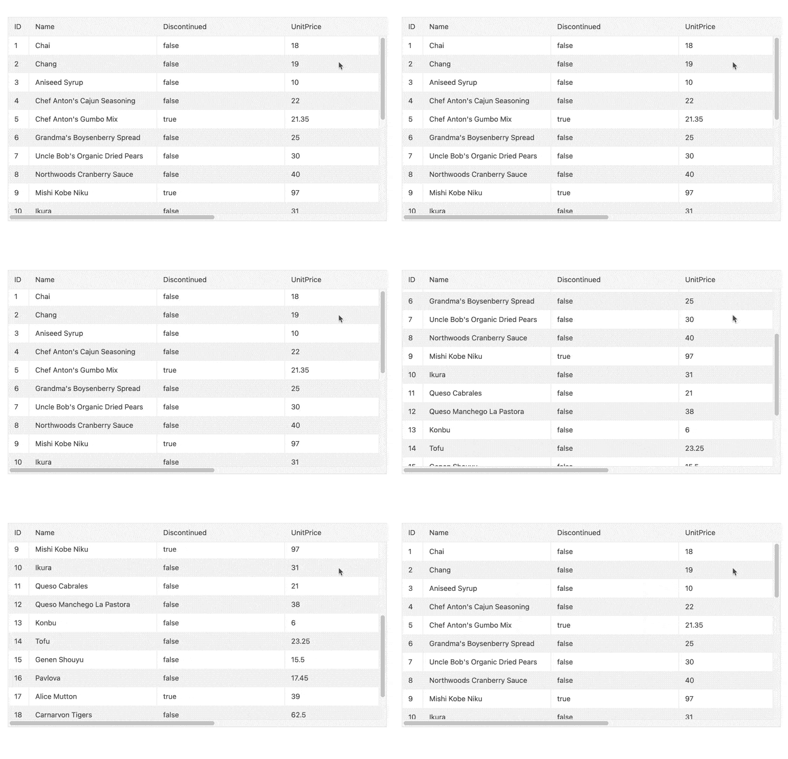
Performance is a top priority for any developer who needs to show large amounts of data in grid format. With that in mind, the Vue Data Grid now supports infinite scrolling. With this feature enabled, records are initially loaded into the grid’s viewable area and additional records are loaded as the user scrolls, giving the illusion that content can scroll infinitely.
See the Vue Data Grid infinite scrolling demo


