Kendo UI for Vue
What's New R1 2021
What's New HistoryNew Native Component: Vue MultiSelect
The Kendo UI for Vue MultiSelect native component offers users an intuitive user experience for selecting multiple values within a drop down. Selected values can appear as a list of entries made of strings or tokens. Kendo UI for Vue MultiSelect is perfect for scenarios that require the look-and-feel of a simple input, while giving users the ability to select multiple values.
See the Vue MultiSelect demo

Vue Grid Improvement: MultiSelect in the Column Menu
The Kendo UI for Vue Grid now offers more control over the view. The column menu will now show a list of available columns in the current dataset and provide checkboxes to show or hide columns.
See the Vue Grid demo
New Native Component: Vue TimePicker
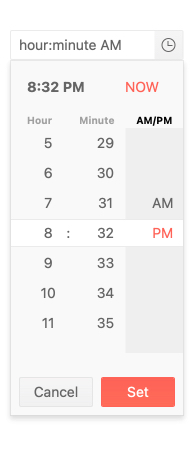
The Kendo UI for Vue TimePicker native component allows users to select a time from an available drop-down list or input their desired time using the keyboard. Built-in validation prevents characters not related to time from being input.
See the Vue TimePicker demo

New Native Component: Vue Window
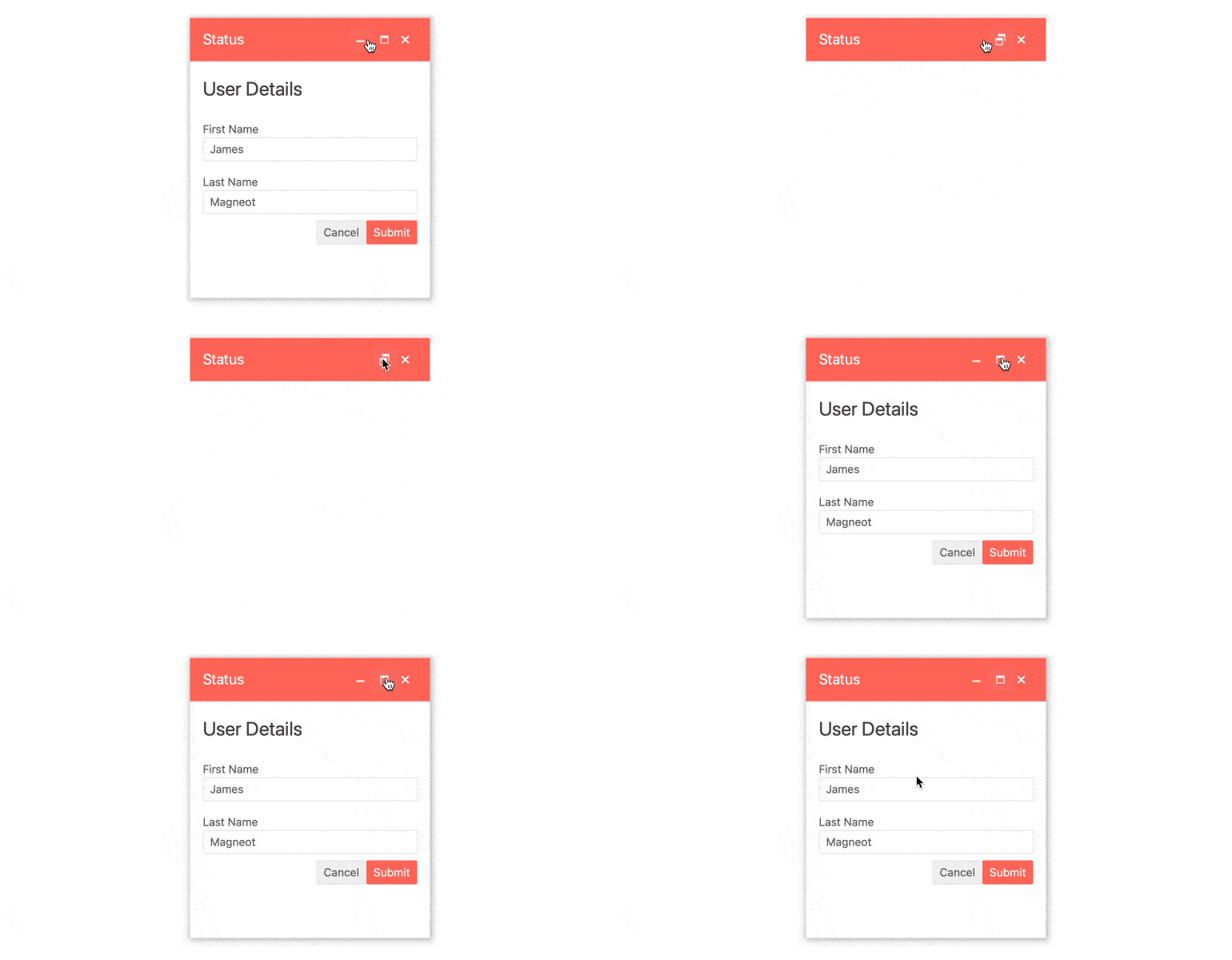
With the new Kendo UI for Vue Window native component, developers can easily add a desktop-like window experience to any Vue application. Properties such as the window title, minimizing and maximizing action items and content can all be configured using the Kendo UI intuitive API.
See the Vue Window demo

Vue Grid Improvement: Keyboard Navigation
The Kendo UI for Vue Grid component now has expanded keyboard navigation capabilities to cover more scenarios using the keyboard. This drastically improves accessibility by enabling keyboard-only users to perform actions such as editing, selection, paging
and more through keyboard shortcuts.
See the Vue Grid accessibility demo
New Native Component: Vue DateTimePicker
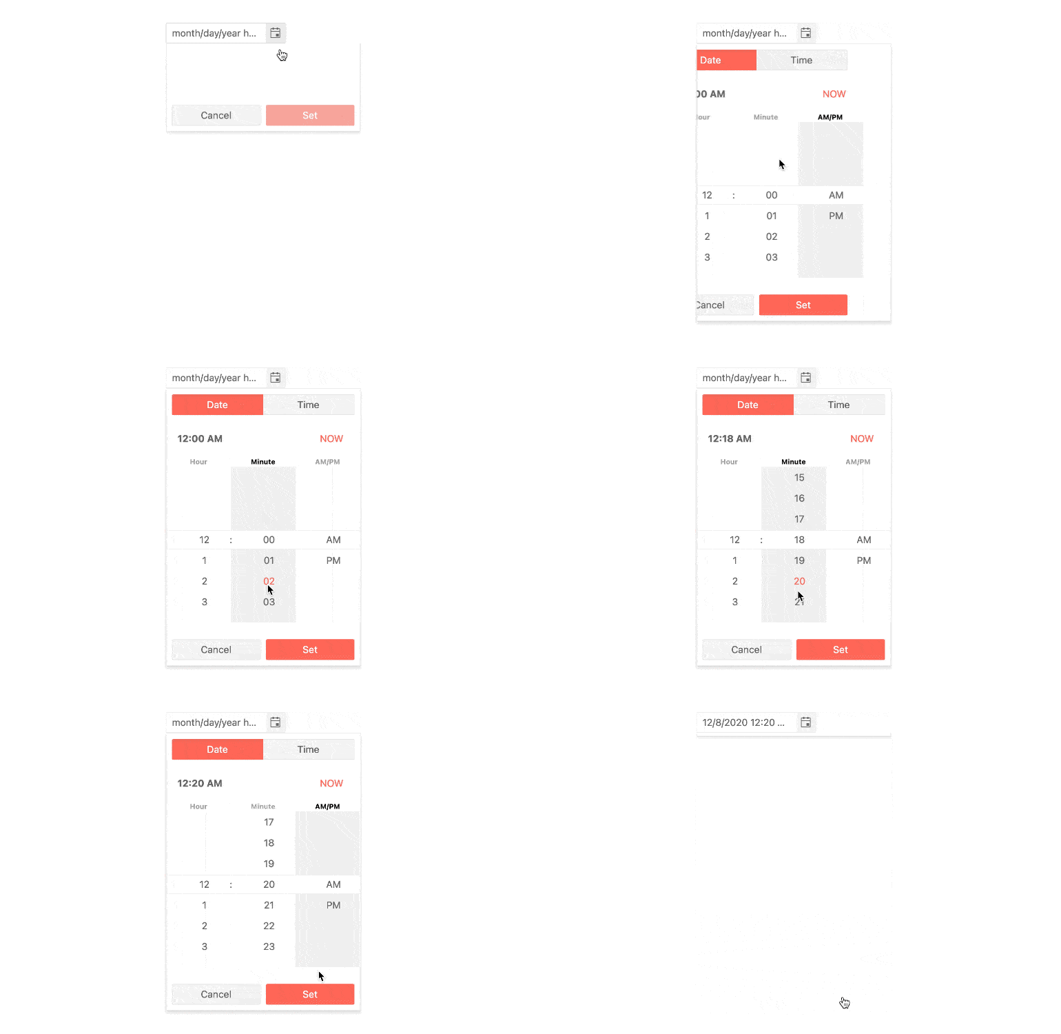
The Kendo UI for Vue DateTimePicker native component combines the Vue DatePicker and TimePicker components into a single interface, streamlining the user experience. Users select the date and time using the provided drop down which will display a Vue Calendar. Alternatively, users can input both the date and time using their keyboard.
See the Vue DateTimePicker demo

New Native Component: Vue Slider
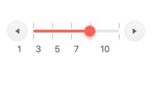
The Kendo UI for Vue Slider native component allows users to select a value within a range by dragging a single handle along a bar. This improves the user experience by giving users an alternative to simple inputs. Developers can set the minimum and maximum values of the range through a single configuration option for each.
See the Vue Slider demo


