
Kendo UI for Vue
What's New R3 2021
What's New HistoryNew Component: Native Vue Charts
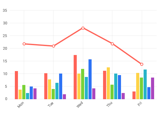
Previously available as a wrapper, the Vue Charts component has been rebuilt natively from the ground up for Vue. The Charts component delivers every chart type you will need, from ordinary line and bar charts to complex stock charts and everything in between. Like the rest of the components in Kendo UI, each chart is built with performance, theming, customizability and accessibility in mind.
New Component: Native Vue Sparkline
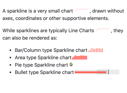
Also previously available as a wrapper, the Vue Sparkline component has been rebuilt natively for Vue. These tiny charts are perfect for dashboards and grid views and can be rendered as line, bar, column, area, pie and bullet types.
New Component: Native Vue Drawing Library
The new Vue Drawing Library is the basis for all Vie data visualizations. It contains a low-level API for building and manipulating visual scenes that can be rendered as SVG or canvas elements, PNG images, as well as PDF documents.
New Component: Native Vue PDF Export Library
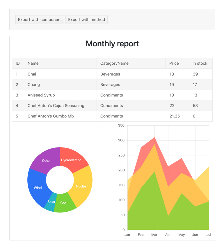
The Vue PDF Export library enables you to export an entire HTML page or part of it as a PDF file. There are several features available to customize the exported file, including scale the content to better fit on the page, customize the paper size, change the page orientation, work with templates and more.
See the Vue Export to PDF demo
New Component: Native Vue Data Query Library
The Vue Data Query package assists with handling common in-memory data operations like grouping, filtering, paging and sorting data. It also serializes the data descriptors according to the OData v4 URI specification..
New Component: Native Vue Date Math Library
The Vue Date Math package has the sole purpose of assisting with JavaScript Date manipulations. The Date Math library offers many functions that support various date manipulation tasks like getting a week number and adding or removing days from a particular date.
New Component: Native Vue File Saver Library
Vue File Saver uses a saveAs method to allow users to save files to their local machine. The Vue File Saver component is integrated into the Kendo UI for Vue library as a standalone package and consumed using TypeScript or JavaScript.
New Component: Native Vue TabStrip
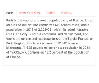
Previously available as a wrapper, the TabStrip is now built natively in Vue. It displays a collection of tabs, each with their own associated content. It is a great way to organize, fit and navigate content in a single frame as it allows users to switch between the different tabs inside the component.
See the Vue TabStrip Overview demo
New Component: Native Vue Pager
Previously available as a wrapper, this component the Pager now built natively in Vue. It splits content into pages to prevent long loading times and to show manageable segment of content. You can set the page size, maximum number of buttons, show the user where they are, and more.
See the Vue Pager Overview demo

New Component: Native Vue Form
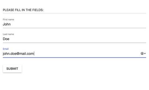
The Vue Form component allows you to generate and manage forms. Through a variety of configuration options, it makes creating and customizing forms a seamless experience. Achieve the desired form appearance by using default or custom editors, choose the layout and orientation, display the editors in groups and columns and configure validation.
See the Vue Form Overview demo
New Component: Native Vue Hint
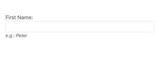
The Vue Hint component integrates with the Kendo UI for Vue Form to help you build forms in Vue in accordance with best practices. The hint is displayed underneath an input element and provides the user with an example of the value they should enter into the field.
See the Vue Hint Overview demo
New Component: Native Vue Error
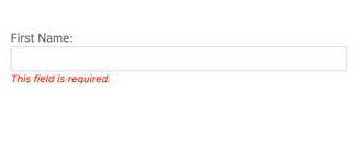
The Vue Error component displays additional text under Vue components to help deliver error messages. They are often used to indicate required fields when validating form submissions.
New Component: Native Vue Avatar
The Vue Avatar component is a quick and impactful way to represent people and other entities with image, icons or initials.
See the Vue Avatar Overview demo
New Component: Native Vue Card
The Vue Card component represents a common layout item used in most modern apps. This layout tool contains content and actions about a single subject. While it can work well on its own, it is typically combined with components to display a collection of cards. Each Card comes with content, title and subtitle and action button areas, images and footers.
See the Vue Card Overview demo

New Native View Component: Label
The Vue Label component enables you to associate labels with other Vue components or HTML elements. Beyond the standard HTML label, the Vue label supports richer features such as configuring optional text as part of the label text.
See the Vue Label Overview demo
New Component: Native Vue Checkbox
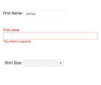
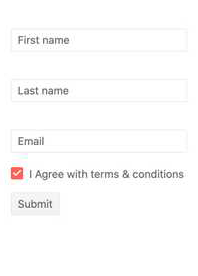
The Vue Checkbox moves beyond the traditional HTML input element and provides styling that fits with all Kendo UI for Vue themes, allowing users to maintain a consistent look and feel throughout their entire application. The Checkbox supports a variety of states that can be easily set to match your requirements.
See the Vue Checkbox Overview demo
New Component: Native Vue RadioButton
The Vue RadioButton component goes beyond traditional HTML radio button inputs by automatically applying the theme you are using to the rest of your application.
See the Vue RadioButton Overview demo

New Component: Native Vue RadioGroup
The Vue RadioGroup serves as a container for two or more radio buttons. This helps you manage the current values available for users, input validation, and how to display the group of RadioButtons on the page.
See the Vue RadioGroup Overview demo

New Component: Native Vue FloatingLabel
Floating labels were first popularized by Material Design and are now an important part of many modern designs. Floating labels start as a placeholder in an input element and, upon focusing the input, the label floats to the top of the input element. The Vue FloatingLabel component allows developers to add a floating label to an HTML input, their own input components or other Kendo UI for Vue components.
See the Vue FloatingLabel Overview demo

New Vue Design Tools: Kendo UI Kits for Figma
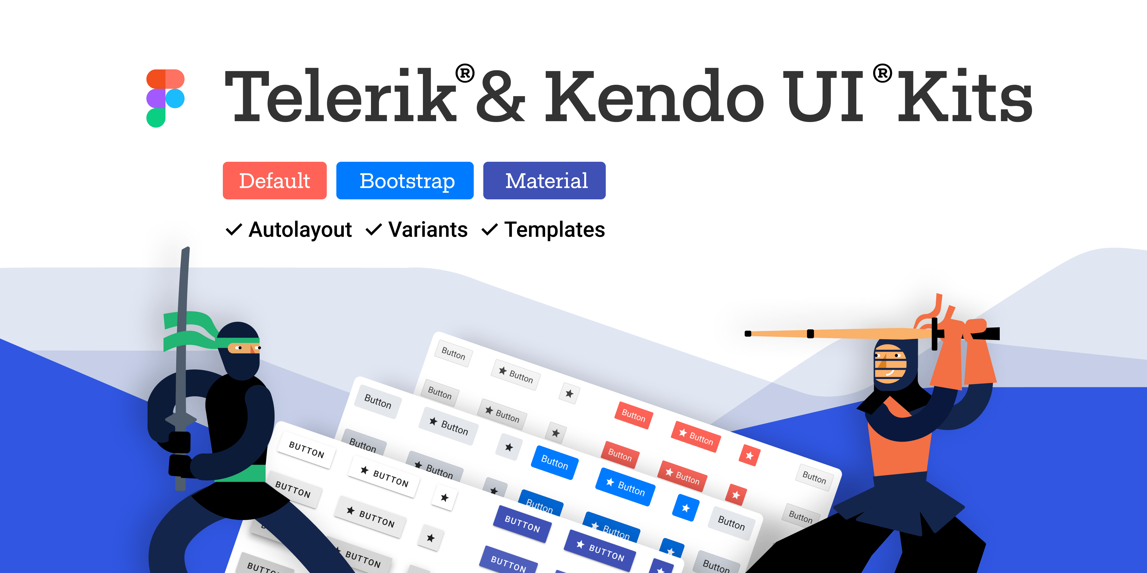
The Kendo UI Kits for Figma are design files that make the collaboration between application developers and designers easier. Each UI kit is a precise visual representation of the Kendo UI for Vue components. You can choose between three Kendo UI Kits for Figma, one for each of the themes that come with the Kendo UI for Vue component library: Default, Bootstrap and Material. The purpose of the Kendo UI Kits is to enable the seamless handover of the interface design to the developers.
New Vue Demo Global Feature: Theme and Color Swatch Picker
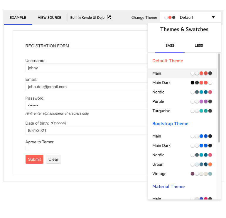
Every demo now includes a drop-down menu that allows you to choose to apply the Material, Bootstrap or Kendo Default themes and one of their built-in color swatches. This enables you to easily preview what these selections will look like for each component.
See the Vue Data Grid demo for an example
New Vue Data Grid Feature: Keyboard Navigation
Keyboard navigation is important for enhancing the UX and accessibility of a web application. The Vue Data Grid now allows developers to configure keyboard or keyboard and mouse combinations to perform navigation, selection, data operations, editing and more.
Bootstrap 5 Support
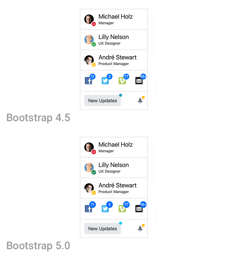
As part of our commitment to supporting industry standards as they are updated, Kendo UI for Vue supports Bootstrap 5 the latest version of Bootstrap.
Documentation Improvements
We recognize that good documentation is key to your success with Kendo UI for Vue. As a result, we have added new documentation for some of the most commonly requested (and newly available) tasks. These include various Grid articles and advanced topics such as export to PDF, date math, data query, globalization and many more.
Kendo UI for Vue - R3 2021
- New Component: Native Vue Charts
- New Component: Native Vue Sparkline
- New Component: Native Vue Drawing Library
- New Component: Native Vue PDF Export Library
- New Component: Native Vue Data Query Library
- New Component: Native Vue Date Math Library
- New Component: Native Vue File Saver Library
- New Component: Native Vue TabStrip
- New Component: Native Vue Pager
- New Component: Native Vue Form
- New Component: Native Vue Hint
- New Component: Native Vue Error
- New Component: Native Vue Avatar
- New Component: Native Vue Card
- New Native View Component: Label
- New Component: Native Vue Checkbox
- New Component: Native Vue RadioButton
- New Component: Native Vue RadioGroup
- New Component: Native Vue FloatingLabel
- New Vue Design Tools: Kendo UI Kits for Figma
- New Vue Demo Global Feature: Theme and Color Swatch Picker
- New Vue Data Grid Feature: Keyboard Navigation
- Bootstrap 5 Support
- Documentation Improvements


