
Kendo UI for Vue
What's New R1 2022
What's New HistoryNew Native Vue Component: Rich Text Editor
New to Kendo UI for Vue is a fully native WYSIWYG editor. This fully customizable component is packed with features users expect when creating rich content, such as toolbars, table tools, image support and HTML view. Developers can also take advantage of the ability to easily enable and disable features, programmatically modify or store content and much more.
See the Vue Rich Text Editor demo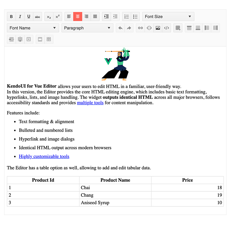
New Native Vue Component: Filter
Provide users with an interface to build complex filters for data sets of any size. Also referred to as a query builder, the Filter component is a point-and-click too for creating and editing filter rules one by one to ultimately end up with an expression. It can be bound to any existing data model, provides a growing list of parameters, and supports custom parameters.
See the Vue Filter demo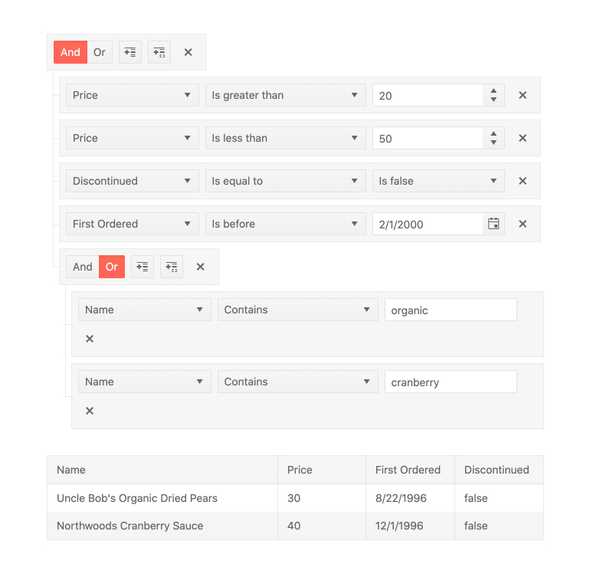
New Native Vue Component: Gauge
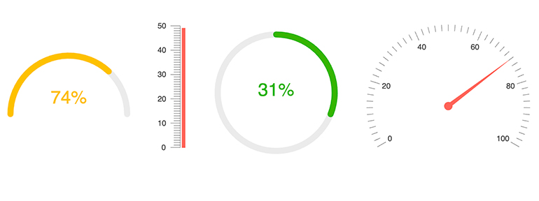
These components were previously available as wrappers but are now fully native. The Vue gauges are a set of modern data visualization tools that show a data value on a linear or circular scale. Each is highly customizable with options for colors, scales, pointers, etc. There are three gauge components available:
New Native Vue Component: Toolbar
The Toolbar component takes the tedium out of creating toolbars while giving you a ready-to-use modern navigation element. Creating UX akin to industry standard applications like Word and Google Docs couldn’t be easier. You can find this component at the top of our Rich Text Editor, but it can also be used on its own.

New Native Vue Component: SplitButton
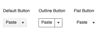
The SplitButton adds to our growing list of buttons. This component is a combination of a regular button that offers a default behavior when clicked and an arrow that can be clicked to display a dropdown, which will provide a list of additional predefined actions in a list.
New Native Vue Component: DropDownButton
Provide your users with a button that, when clicked, will display a dropdown list of action items that the user can select from. The Vue Button can use text, icons, or a mix of both when defining the look-and-feel of the button element.
See the Vue DropDownButton demo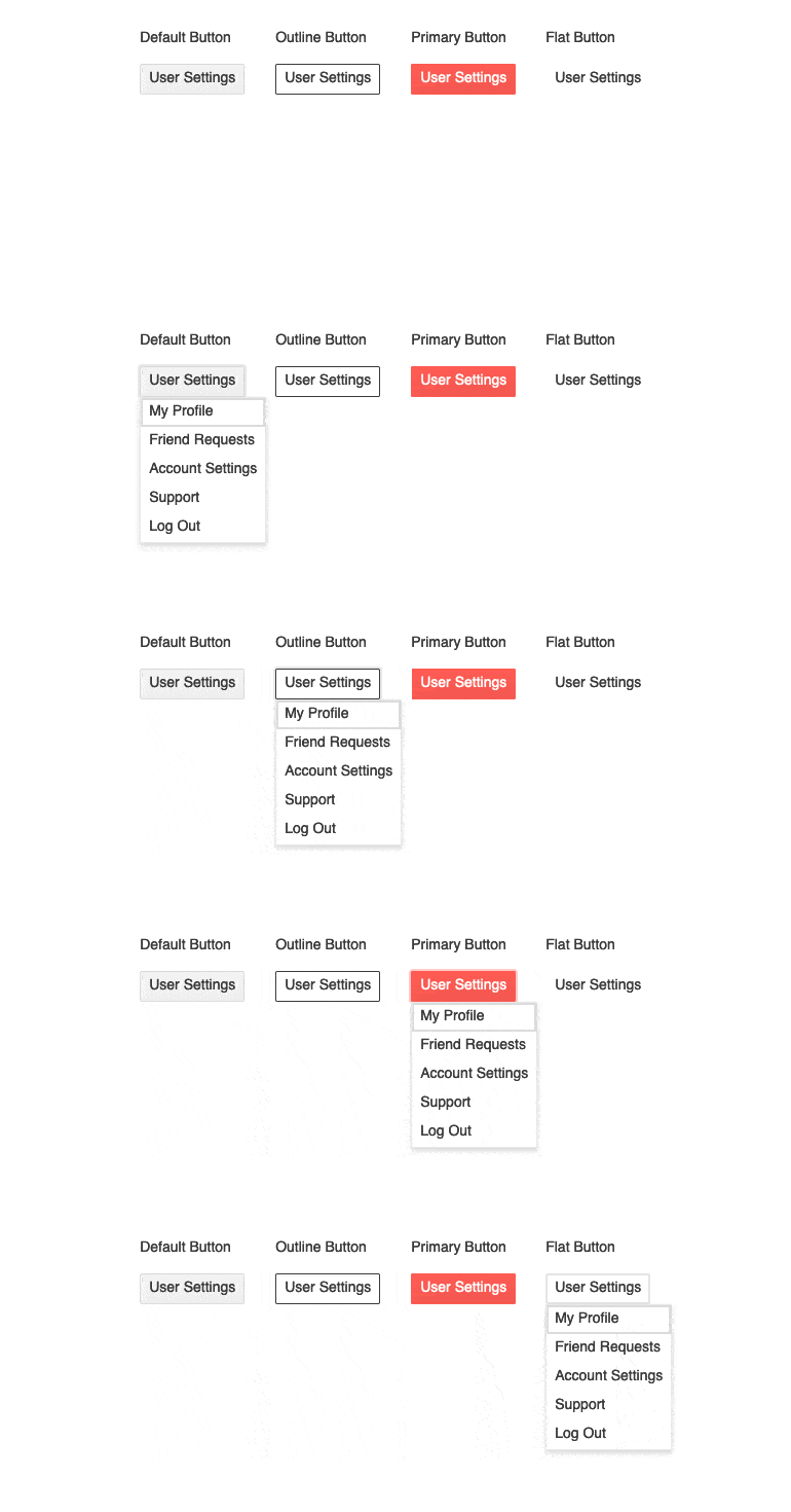
New Native Vue Component: Menu
This component was previously available as a wrapper but is now fully native. It provides your users with a multi-level navigational element. Your main pages will be displayed horizontally or vertically across the screen and their child pages will be rendered in associated dropdowns. Context menus are also supported for an even more advanced level of UX.
See the Vue Menu demo
New Native Vue Component: ProgressBar
The Vue ProgressBar component displays and tracks the progress of a task or process in your applications. Enjoy various configuration options to control the orientation and direction of the component and built-in styling options to help make it your own.

New Native Vue Component: Loader
Help your users understand when your Vue app is busy by showing an animated indicator of an ongoing process. This is commonly used when the app is loading a page or submitting a form.
See the Vue Loader demo
New Native Vue Component: Drawer
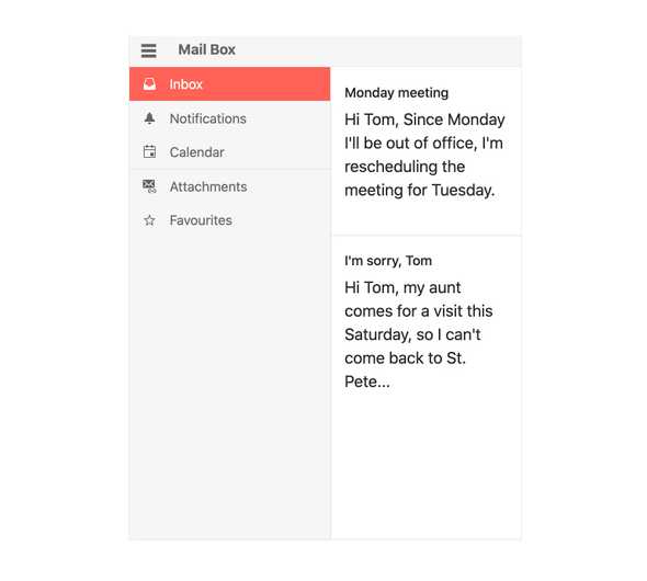
A staple as a navigation element in many modern applications, the Vue Drawer offers a side navigation element that can be slid open and closed, often with a hamburger menu. Each menu item can be represented as an image and text combination, just text, just an image or you can utilize templates for a custom layout.
New Native Vue Component: Stepper
The Vue stepper visualizes the progress of a process by dividing it into chronological steps. You get several built-in features, including the ability to define the appearance of each step, validation of content at each step, strict linear flow and templates

New Native Vue Component: DateRangePicker
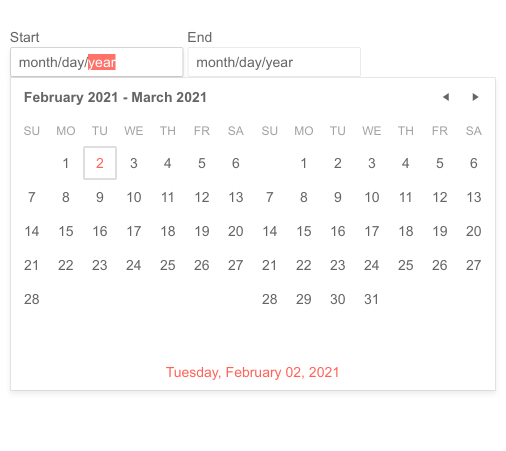
This component was previously available as a wrapper but is now fully native. It provides users with a sleek and intuitive interface to select a range of dates using side-by-side calendars. The side-by-side calendars display when the user focuses the component.
See the Vue DateRangePicker demo
New Native Vue Component: TextArea
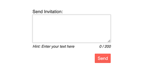
This component extends the ordinary TextArea HTML element. It gives you a highly configurable text area input that helps to ensure a consistent UI by supporting the themes you are using.
New Native Vue Component: Tooltip
This component gives you a very easy way to show contextual information upon hover, focus, or click. It is customizable and supports the themes you use application wide, so it will fit nicely into your applications.
See the Vue Tooltip demo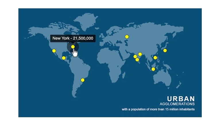
New Native Vue Component: Switch
The Switch has become the default element to use when offering users the ability to toggle between two values, most commonly on and off. This component helps you implement a modern version with custom labels, styling, and other configurations to ensure it integrates nicely into your UI.

New Theme Rendering Options for Various Vue Components
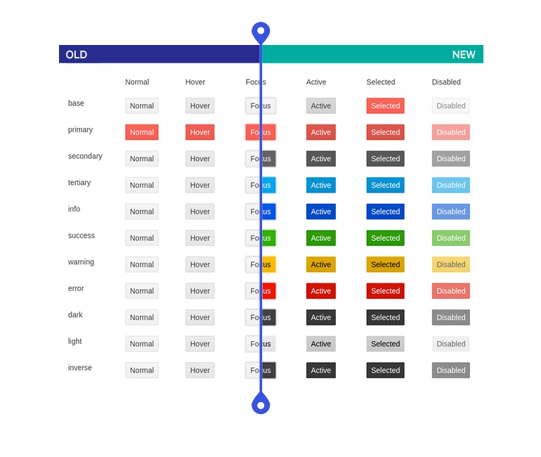
As UI design requirement become more complex, our users need more customizability in our themes on the component level. Throughout 2022, we will be introducing enhancements to the way individual components work with themes to make it easier to use your own design system. These will be a set of common options that will help define colors, size, and shape of individual components. This release delivers updates for Buttons, Inputs, DateInputs, and DropDowns.
Vue Charts Enhancement: Updated Default Colors
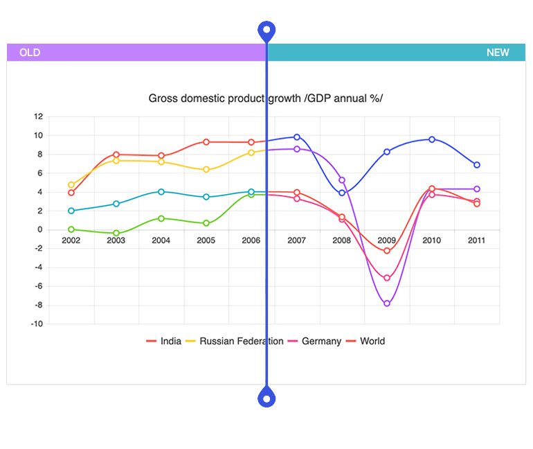
When there is no color set for charts, Kendo UI for Vue uses a default color set for each series. Until now, that set was limited and if the limit was reached, colors would recycle. We have now expanded that color set, so that case will no longer exist. We have also updated the palette to make your Charts more modern.
Kendo UI for Vue - R1 2022
- New Native Vue Component: Rich Text Editor
- New Native Vue Component: Filter
- New Native Vue Component: Gauge
- New Native Vue Component: Toolbar
- New Native Vue Component: SplitButton
- New Native Vue Component: DropDownButton
- New Native Vue Component: Menu
- New Native Vue Component: ProgressBar
- New Native Vue Component: Loader
- New Native Vue Component: Drawer
- New Native Vue Component: Stepper
- New Native Vue Component: DateRangePicker
- New Native Vue Component: TextArea
- New Native Vue Component: Tooltip
- New Native Vue Component: Switch
- New Theme Rendering Options for Various Vue Components
- Vue Charts Enhancement: Updated Default Colors


