
Kendo UI
What's New R3 2020
What's New HistoryAngular Updates in R3 2020
New Component: Angular ListView
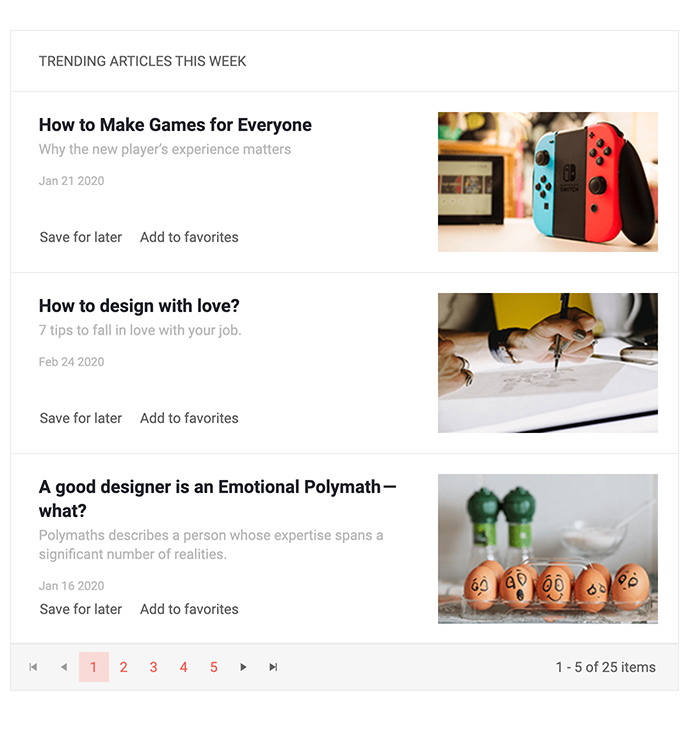
The new Kendo UI for Angular ListView component is the perfect component to display and manage a list of data which may not fit into the regular row and column structure found within a grid. Each item is rendered according to a provided Angular template and the ListView provides additional features such as a built-in pager to help the end-user navigate and manage the displayed data.
See the Angular ListView demo.
New Component: Angular Loader

Adding to a growing list of Angular UI components that make your application stand out, the new Kendo UI for Angular Loader component is a powerful and gorgeous new UI component responsible for showcasing a loading indicator in an Angular application. With several built-in styles, the Loader can be imported and provide loading animations with just a single line of code or be customized through the available configuration options to create truly unique loading animations that can make any application pop.
See the Angular Loader demo.
New Component: Angular AppBar

The Kendo UI for Angular AppBar component is designed to function as an application header that is fully customizable by Angular developers. The component can be customized to contain anything you'd need from a header, including contextual action items, navigation items, and additional features such as search boxes and drawer icons to integrate with other navigation UI components such as the Kendo UI for Angular Drawer.
See the Angular AppBar demo.
New Component: Angular TextBox

The new Kendo UI for Angular TextBox component brings the consistent look-and-feel of the available Kendo UI themes to the text input element. Beyond the basic capabilities of a TextBox element the component allows for decorators before and after the input which could host elements like icons, buttons, text, and more. The Angular TextBox also comes with built-in validation icons for invalid and valid data.
See the Angular TextBox demo.
New Component: Angular Breadcrumb

For websites that have a large number of pages or a deep hierarchy of pages, the new Kendo UI for Angular Breadcrumb component is an intuitive way to let end-users quickly navigate to any higher-level pages. The Angular Breadcrumb can also integrate with the Angular router to help facilitate navigation throughout an Angular application.
See the Angular Breadcrumb demo.
New Component: Angular RangeSlider

The Kendo UI for Angular RangeSlider component lets users quickly and intuitively select a range of values by sliding indicators responsible for both the minimum and maximum values.
See the Angular RangeSlider demo.
New Component: Angular Badge

With the Kendo UI for Angular Badge component developers have a super flexible component that can be used in various ways. Whether it is to showcase a notification indicator on an existing HTML element, an unread notification indicator with the total number of items displayed within the badge, or to implement it as a standalone component, the usages for this component are too many to count! The Angular Badge has extensive configuration options enabling developers to define shape, size, color, content, alignment and positioning, and more!
See the Angular badge demo.
New Component: Angular Icon & SVGIcon
The new Icon and SVGIcon components allow you to display Font Icons or SVG Icons, respectively. Combined with the icons available with the Kendo UI themes, these new components give access to over 400 different icons.
See Angular Icon demo.
Angular Data Grid Improvements: Cell Selection
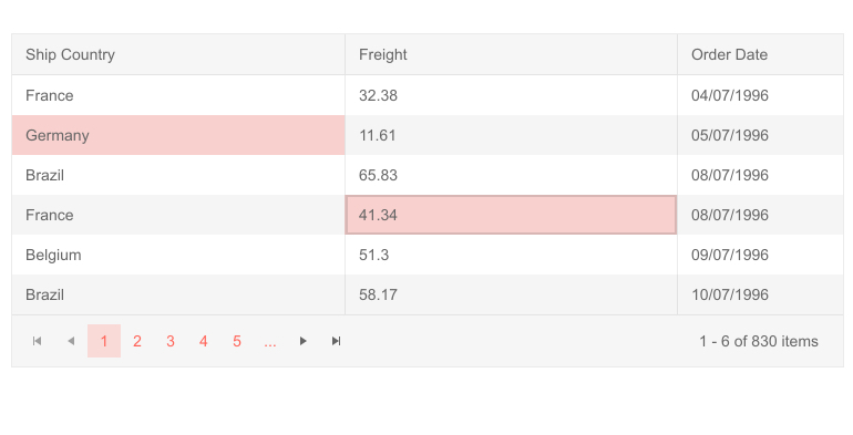
The Kendo UI for Angular Grid now supports cell selection as part of its growing list of ways to select information within the Grid. These include single or multiple cell selection, as well as selection via dragging the mouse over the data table interface.
See Angular Grid selection demo.
Updated Forms in Various Components
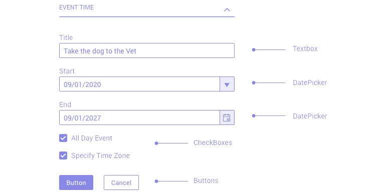
Building on top of the Forms Guideline documentation, a resource which provides industry best-practices for designing and building forms, the Kendo UI for Angular team has updated all applicable Angular UI components that contain a built-in form to follow the Forms Guideline.
React Updates in R3 2020
New Component: React Gantt Chart
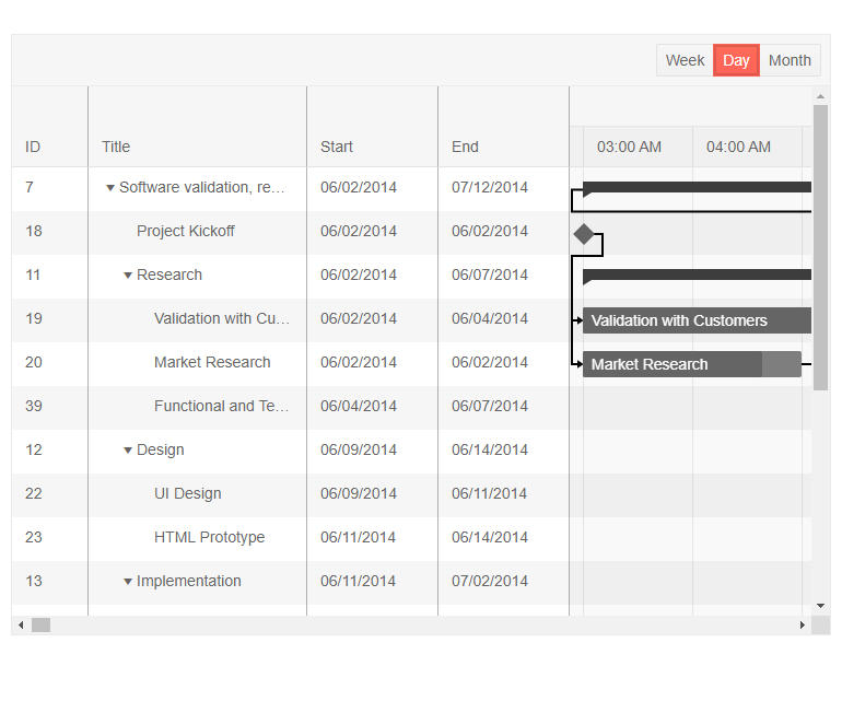
One of the most anticipated UI components of the R3 2020 release is the new React Gantt Chart. The Gantt is a type of bar chart that illustrates a project schedule. It allows users to plan, organize and track various tasks, see how they are related and how long each task should take to complete. Tasks have a visual bar to indicate their start and end date, how far along a particular task is, whether the task is on-time or late and much more.
See React Gantt demo
New Component: React AppBar

The AppBar has become a staple for many web applications, targeting both desktop and mobile devices. Тhe React AppBar component serves as the main area of action for header of your application, containing navigation elements, the title of the application or current page, and also allowing you to add several action buttons and change available action items to ensure the perfect fit in your applications modify the look and feel of the component. The KendoReact team designed this component to be as flexible as possible, giving you a plethora of customization options when adding this React UI component to your applications.
See React AppBar demo
New Component: React TextArea
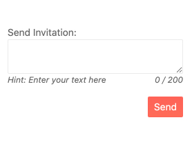
The React TextArea is another addition to the list of KendoReact form components. The new TextArea component is suitable for any scenario that requires multiple lines of text to be entered in a form field. Thanks to the various KendoReact themes, the TextArea (also known as Multi-line TextBox) component fits naturally into any design language and you can adjust its look-and-feel based on custom UX requirements.
See React TextArea demo
New Component: React Rating

The new React Rating UI component allows users to leave a rating in a digestible, visual way. It enables you to easily display rating values that users can choose and change through the component's interface. With its built-in support for partial steps, KendoReact Rating can accommodate round, half or partial rating values, such as a 4.9 star rating. The new Rating component works well by itself or integrated into other React UI components, such as the KendoReact Data Grid.
See React Rating demo
New Component: React Chip

The new KendoReact Chips and ChipList components let you add stylized containers, often referred to as a "pill", to your React application.
The React Chip component is responsible for a single "pill" and can contain text, an image or avatar (optional) and a built-in icon such as an "X" to indicate that an action can be taken. The Chip can be used by itself or as part of other components to showcase unique values that have been selected by the user.
See React Chip demo
New Component: React ChipList
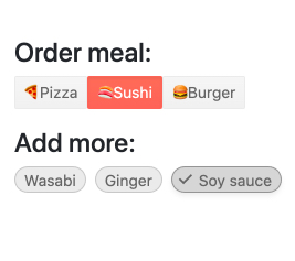
The React ChipList component takes the React Chip and provides additional functionality related to a list. This includes the ability to manage a collection of Chips, such as adding and removing items and managing currently selected items from a list of Chips.
See React ChipList demo
New Component: React Badge
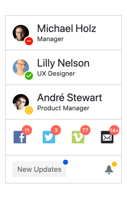
Popularized by mobile operating systems, badges represent small icons utilized to indicate unread messages or notifications. The Badge component has expanded its usage and become a popular element in web applications as well. With the new KendoReact Badge component, you can easily attach your own Badges to existing UI elements. It comes with built-in support for text and visibility, settings for size, positioning and overlap as well as the ability to just showcase a simple dot. The new React Badge component can be added to any existing user experience with a single line of code and some quick property edits.
See React Badge demo
New Component: React Loader

While KendoReact has some CSS styling for a loading indicator, the Progress Kendo UI team wanted to take this experience to the next level. With R3 2020, we are introducing the React Loader—a component perfectly suited for letting your users know that a process such as loading of remote data or fetching a view is happening in the background, while being visually pleasing. With several built-in animations and a slew of configuration options to make the KendoReact Loader your own, this component will make your application pop with its sleek UX.
To see available Loader styles, as well as get ideas for how you can customize the component to make it your own, head on over to the KendoReact Loader component section in our documentation.
See React Loader demo
React Data Grid Improvements: Row Pinning
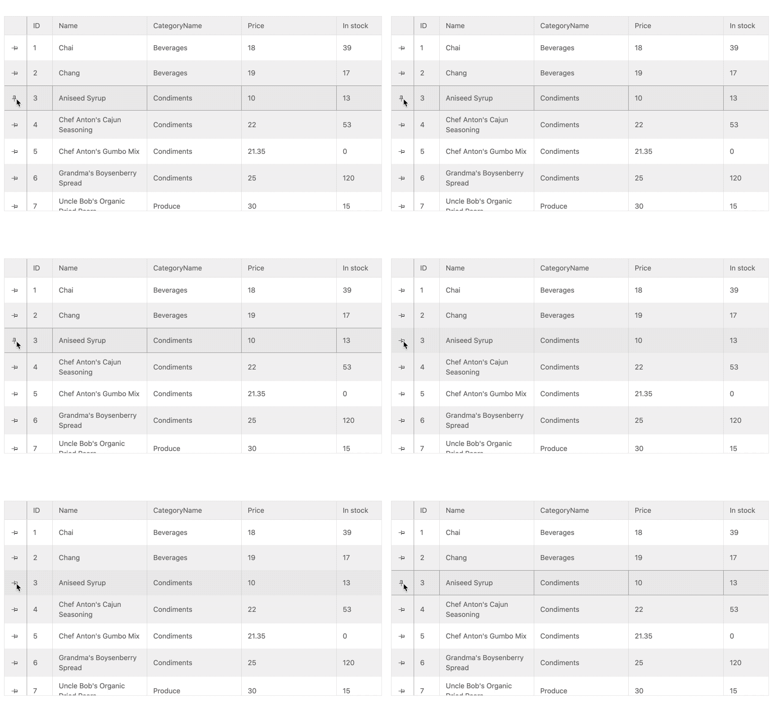
Adding to the growing list of data table features in the KendoReact Grid, the React Data Grid can now pin rows to the header and keep them always visible as users scroll through the rows of the Grid.
See React Data Grid demo: Row Pinning
Data Grid Improvements: Customizable Pager
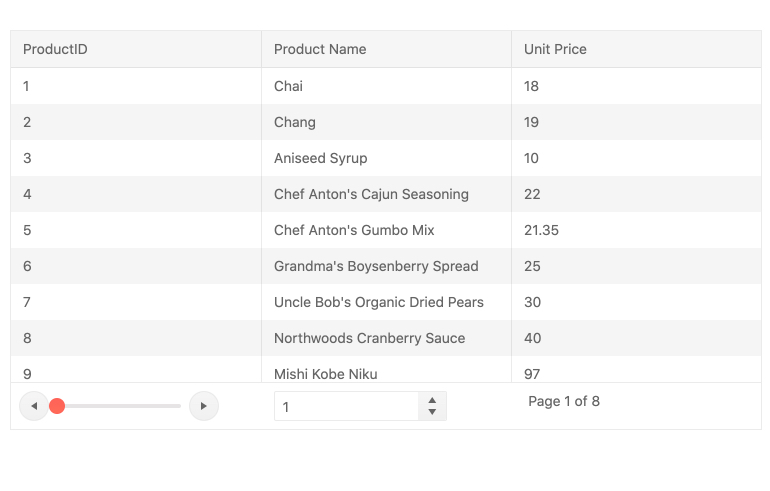
While the KendoReact Data Grid has had a built-in paging mechanism since its first release, with the introduction of the standalone KendoReact Pager component we wanted to move away from something that is purely built in and apply a more extensible model. This means that the KendoReact Grid now uses the KendoReact Pager to serve its paging mechanism.
This feature will be most useful to those of you who want full customization of the paging mechanism and the ability to override the default setup.
See React Data Grid demo: Paging
Data Grid Improvements: Pin Columns Through Column Menu
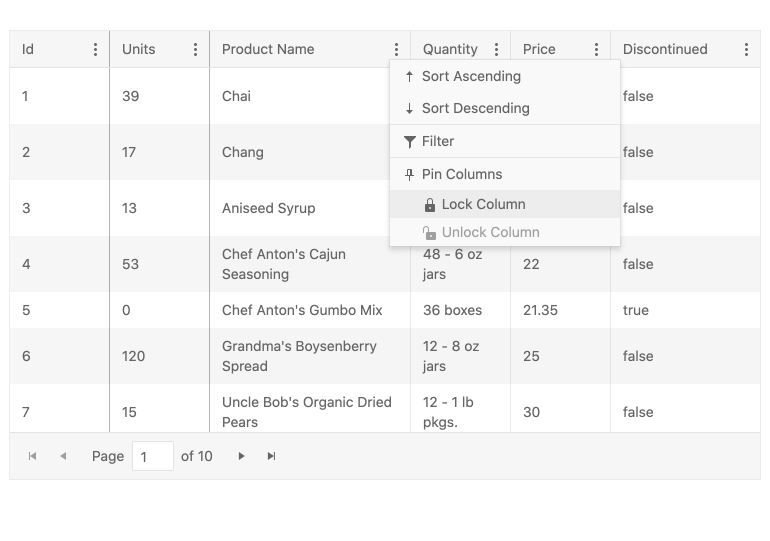
Column pinning, also known as frozen or sticky columns, is a feature that already exists in the KendoReact Grid. With this release, we are enhancing the user experience of the end user, letting them select which columns to pin (either to the left or to the right) through the already available column menu.
See React Data Grid demo: Pinned Columns
React Editor Improvements: Insert Image Dialog Updates
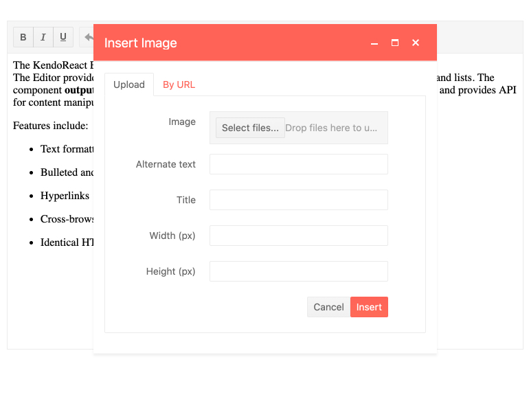
This feature allows images from the local file system to be uploaded and inserted into the content of the Editor. Previously, uploads were limited to images hosted on the web and required a URL to be added. With this new enhancement, end users can select images from their own devices and upload them into the Editor content.
See React Editor demo: Image Dialog
Editor Improvements: Font Color & Background Color Tools
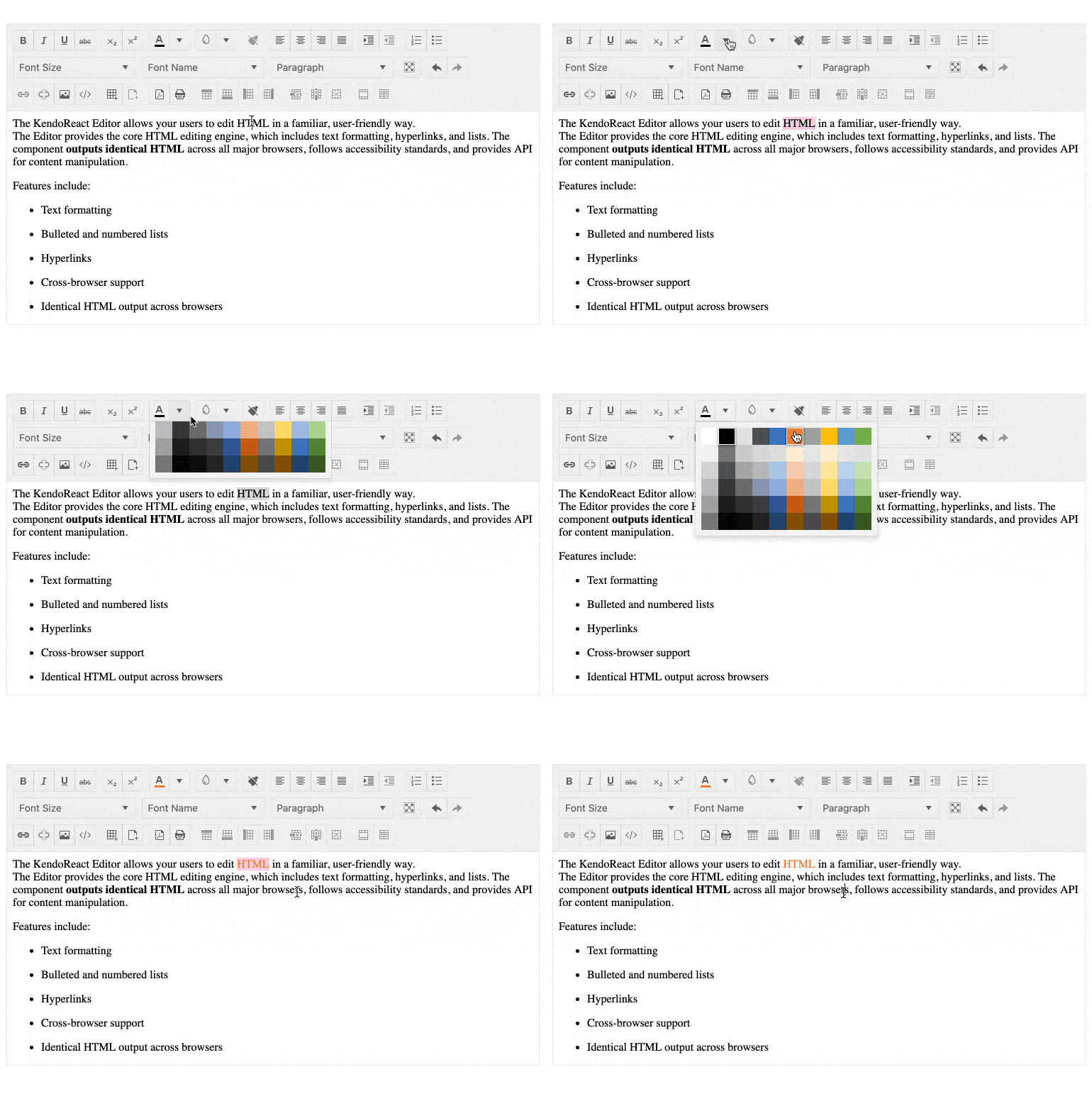
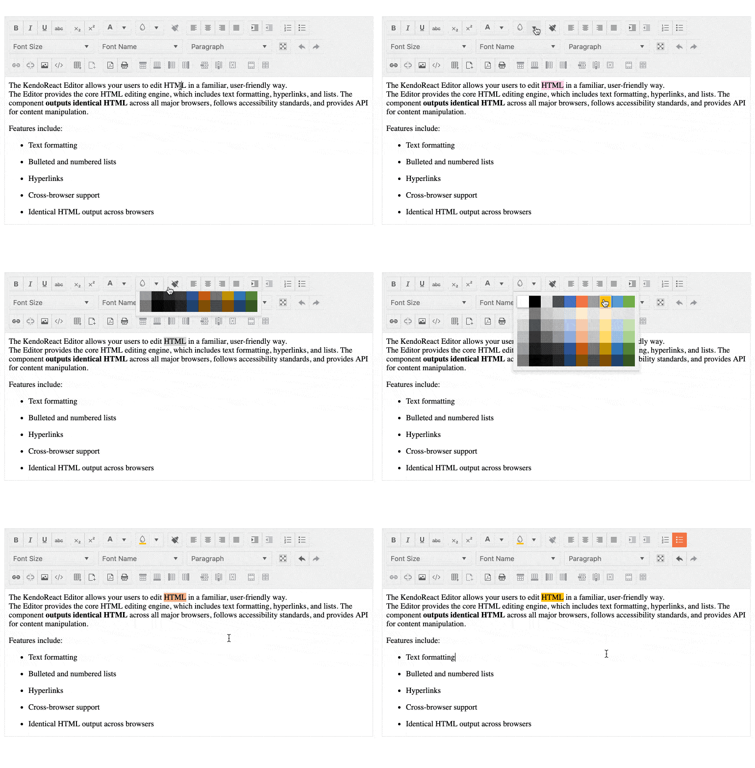
Extending the KendoReact Editor features further with R3 2020, you can now enjoy additional tools to control both the font color and the background color, much like with the equivalent tools you find in word processors today.
See React Editor demo: Built-in Tools
Editor Improvements: Find and Replace Tool
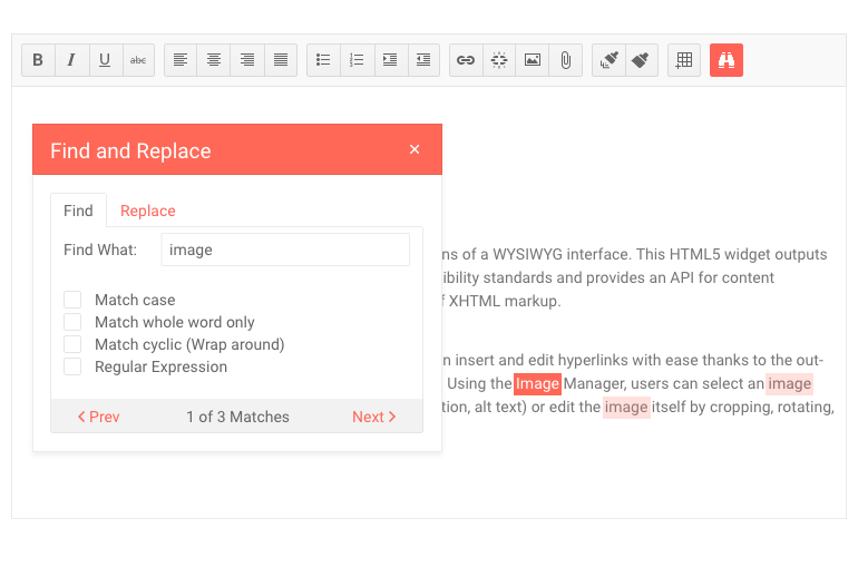
A quality-of-life update for KendoReact Editor users, the Find and Replace tool lets them search through the content of the Editor exclusively, without the necessity to rely on browser tools to search through the entire page. The tool also allows users to potentially apply a Find and Replace command throughout the entire content.
See React Editor demo: Find and Replace
New and Improved Documentation and Demos
Over the last couple of months, we have focused heavily on increasing the performance of our documentation pages. We understand that you rely on documentation daily to guide your work and that any page performance enhancements we deliver positively impact your productivity.
That's why we're excited to share that with R3 2020 we have increased the performance of the KendoReact docs across the board! We have seen the performance of some pages increase fourfold, improving the experience for desktop and mobile device users alike.
Vue Updates in R3 2020
New Component: Vue ComboBox
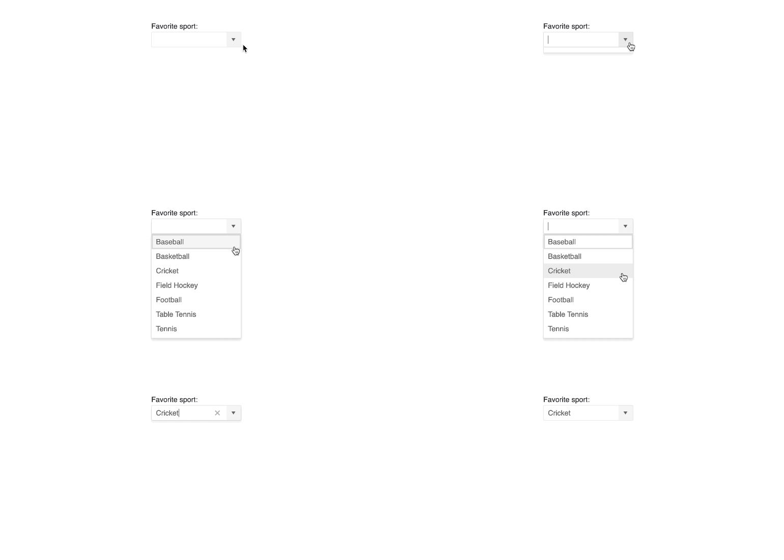
The Kendo UI for Vue ComboBox is a form component that lets users select from a list of available options. Rendered as an input element with a drop-down indicator, the Vue ComboBox is a far richer version of the native HTML select element and supports data binding, templates, filtering, and custom values.
See Vue ComboBox demo.
New Component: Vue AutoComplete
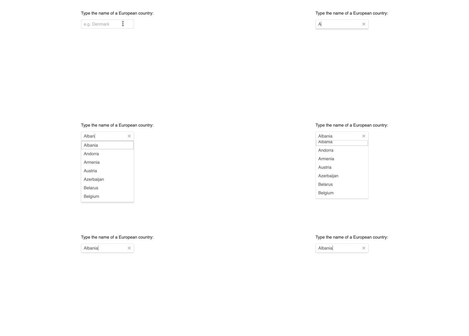
With the Kendo UI for Vue AutoComplete component developers can let end-users search through a long list of available data items, which will be filtered down as the user types. The Vue AutoComplete component initially renders as a regular input element and displays the list of potential data items in a popup as the user focuses the component - ensuring only the most minimal real estate is consumed by the component.
See Vue AutoComplete demo.
New Component: Vue MaskedTextBox

The Kendo UI for Vue native MaskedTextBox is an input element that only allows a particular format of data to be entered by the end-user. This can be a phone number, ZIP code, or anything following a custom mask. The MaskedTextBox not only helps with validating the particular mask, but also prevents certain user keyboard strokes to be inserted into the component if they do not follow the defined mask.
See Vue MaskedTextBox demo.
Vue 3.0 RC Compatibility

In preparation for the official Vue 3.0 release both the wrapped and native Kendo UI for Vue components are now compatible with the latest Vue 3.0 Release Candidate.
jQuery Updates in R3 2020
New Component: jQuery Wizard
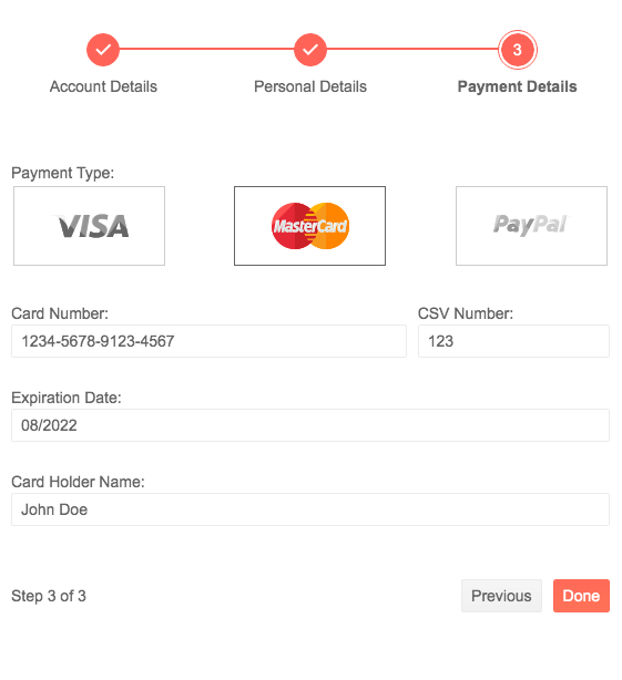
The Kendo UI for jQuery Wizard component combines the Stepper and Form components into a single component focused on breaking down any form into multiple phases. It helps guide end-users through the process from start to finish while allowing developers to control validation and when and how to submit the form.
See jQuery Wizard demo.
New Component: jQuery Image Editor
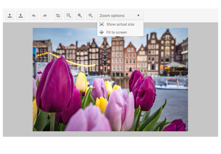
With the Kendo UI for jQuery Image Editor users can manipulate images within any jQuery-based application. The Image Editor component comes with features like uploading and downloading images, resizing, cropping, and the ability to undo and redo edits that have been done to the image.
See jQuery Image Editor demo.
New Component: jQuery Loader

The new Kendo UI for jQuery Loader component can bring a unique flare to any application by providing fun and gorgeous animations that can be displayed whenever a process is loading in an application. With several built-in styles of animations that can be customized to make them your own, the jQuery Loader component can integrate with existing Kendo UI components or work as a standalone component.
See jQuery Loader demo.
New Component: jQuery AppBar

With the new Kendo UI for jQuery AppBar component, developers get access to a header which can contain information about the page, some navigation elements, and the optional action item such as viewing notifications or quick access to their profile.
See jQuery AppBar demo.
New Component: jQuery TextArea
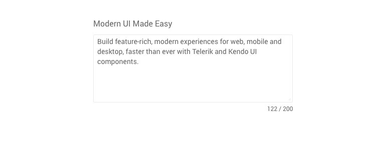
The Kendo UI for jQuery TextArea component provides users with the ability to input long-form text for scenarios where a TextBox component may be too small. Alternatively known as a Multi-line TextBox, the jQuery TextArea component expands on the readily available form components from Kendo UI and assists with standardizing on a single look-and-feel throughout any web application.
See jQuery TextArea demo.
jQuery Gantt Improvements: Column Templates
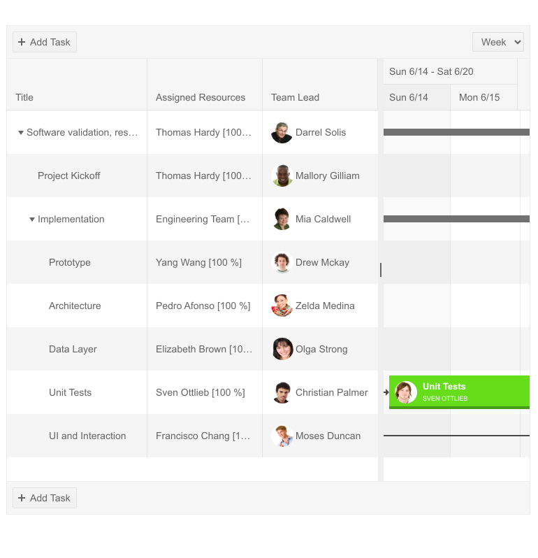
With the new Column Templates feature of the Kendo UI for jQuery Gantt component, developers can customize the available columns within the Gantt chart by providing a custom template on a column-by-column basis.
See jQuery Gantt Task Template demo.
Gantt Improvements: Planned vs. Actual Switch
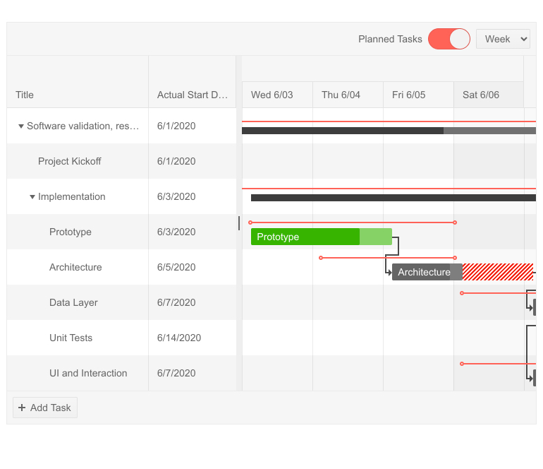
With the Planned vs. Actual feature of the Kendo UI for jQuery Gantt component users can toggle between a default view showcasing available tasks (planned) to a view that showcases the current status of each task (actual). Additional contextual styles are provided in the actual view to indicate tasks that are on track and which tasks are currently past their initial planned time frame.
See jQuery Gantt Planned vs Actual demo.
Gantt Improvements: Column Menu
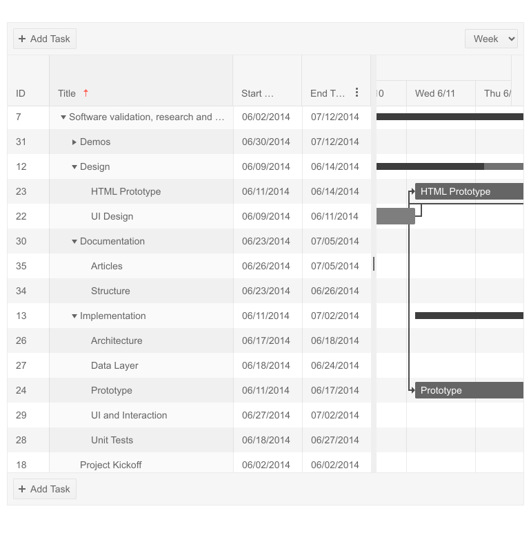
With the Kendo UI for jQuery Gantt component's new Column Menu feature end-users gain contextual actions across every column within the Gantt component. For users familiar with the Kendo UI Data Grid and TreeList components, this column menu will be very familiar, providing options such as sorting by a particular column or showing or hiding a column.
See jQuery Gantt Column Menu demo.
jQuery Data Grid Improvements: Sticky Columns
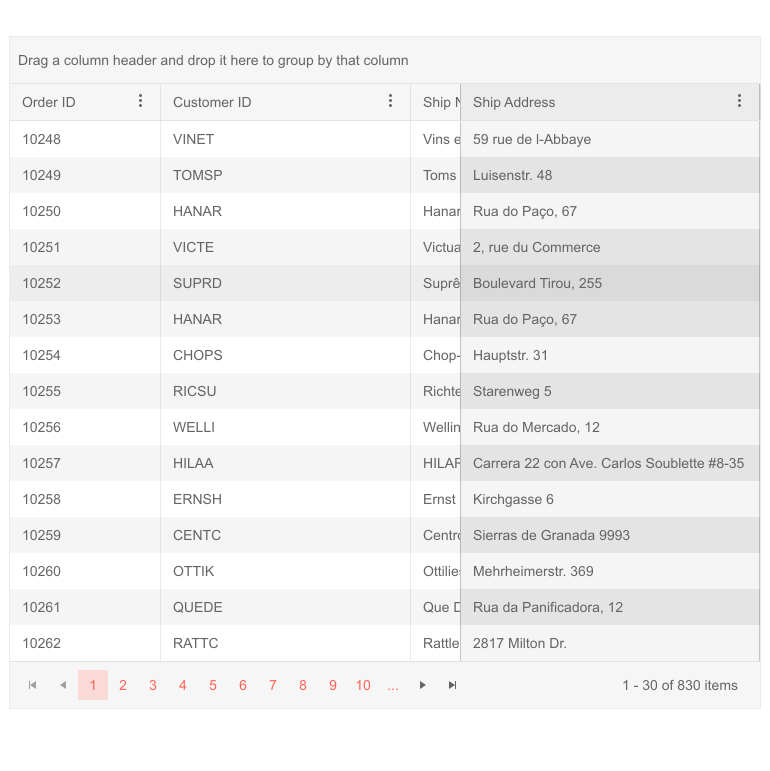
Sticky Columns within the Kendo UI for jQuery Grid allows for columns, which are initially not frozen, to be added to the list of frozen or locked columns as they are scrolled past. Once a user scrolls the opposite way and passes the original column placement the column will be removed from the frozen columns list. Whether or not a column is sticky can be defined on the column level.
See jQuery Grid Sticky Columns demo
Data Grid Improvements: Foreign Key Binding
With the new Foreign Key Binding feature in the Kendo UI for jQuery Grid, developers can fetch additional data within a field of the Grid, letting individual columns have additional data source options to request additional data outside of the original Grid DataSource configuration.
See jQuery Grid Foreign Key Binding demo.
jQuery TreeList Improvements: Drag & Drop to Reorder
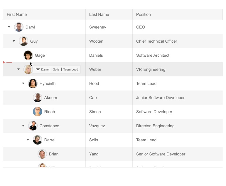
The new and improved Kendo UI for jQuery TreeList Drag and Drop feature extends on the current drag and drop functionality to allow end-users to re-order data rows within the TreeList. It provides additional intuitive UX elements and tool tips to indicate where a row will be dropped and how it will change the underlying data.
See jQuery TreeList Drag and Drop demo.
TreeList Improvements: Checkbox Selection
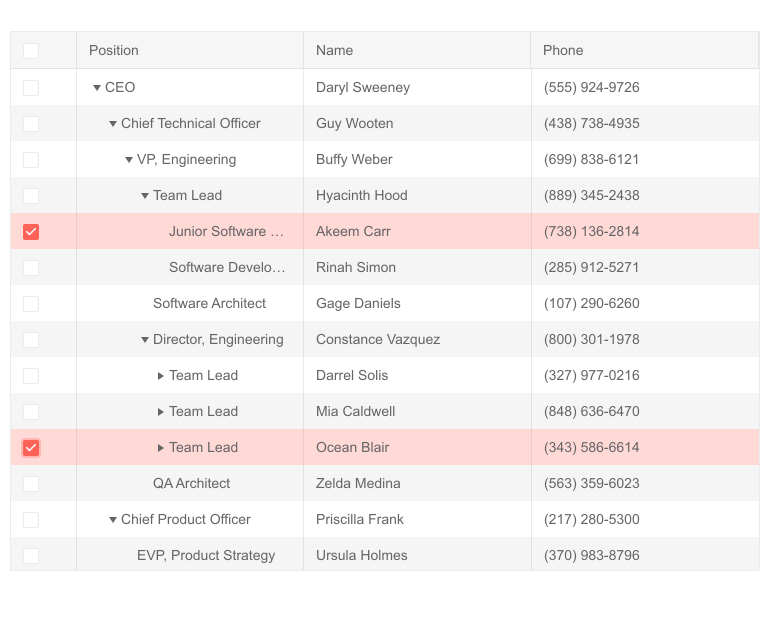
Extending on top of the built-in selection feature of the Kendo UI for jQuery TreeList component, selection can now be done with built-in checkbox elements for each row.
See jQuery TreeList with Checkbox Selection.
jQuery Spreadsheet Improvements: Custom HTML in Cells
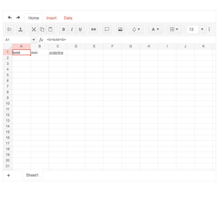
The Kendo UI for jQuery Spreadsheet component now features the ability for custom HTML to be added within its cells. This opens the opportunity to contain images, buttons, check boxes, and other HTML elements within cells throughout the Spreadsheet component.
See jQuery Spreadsheet Custom HTML in Cells documentation page.
jQuery Scheduler Improvements: Updated Accessibility
Kendo UI for jQuery follows Section 508, WCAG 2.0, and WAI-ARIA accessibility standards for all of its UI components. As a part of an ongoing effort to ensure compatibility with these standards the Recurrence Editor within the Kendo UI Scheduler component has been updated to be fully compliant with these accessibility standards.
jQuery NumericTextBox Improvements: Select All Text on Focus

The Kendo UI for jQuery NumericTextBox component will now automatically select all current text when the component is focused, providing a more intuitive user experience.
See jQuery NumericTextBox demo.
New features & Roadmap
Have a feature request?
Post your feedback via:


