
Kendo UI
What's New R3 2019
What's New HistoryAngular Updates in R3 2019
Support for Angular 8
While we have announced support for Angular 8.0.x shortly after the actual release of the framework, it should be highlighted that Kendo UI for Angular officially supports Angular 8.

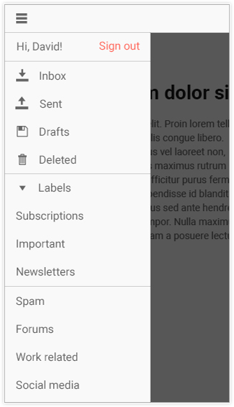
New Component: Drawer
The Angular Drawer widget provides a standard drawer with expand and collapse functionality, defining icons and text for each navigation item, and also comes with features like a mini mode to display only the icons for each item to help minimize real estate occupied by the component.
New Component: DateTimePicker
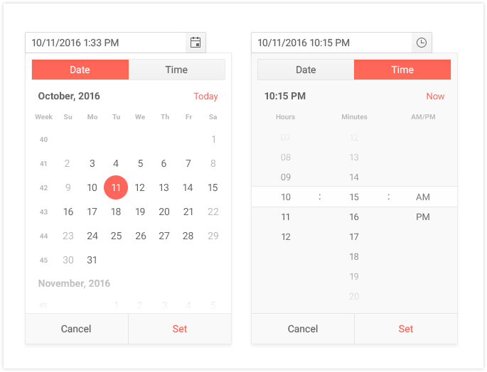
Ensuring that Kendo UI for Angular is the premiere library for form elements in Angular we will introduce the DateTimePicker component.
New Component: ProgressBar
A ProgressBar component can be very useful in building wizards, loading indicators, or just as a neat way to showcase that something is happening in your application as users are interacting with your UI. With R3 2019, the Kendo UI for Angular team put together its own iteration of a ProgressBar that can be implemented as a standalone widget or tied in closely with the other native Angular components offered by Kendo UI.

Scheduler RTM
With R3 2019 we are very excited to announce that the Kendo UI for Angular Scheduler has dropped its beta tag and is now officially launched as RTM! Along with underlying stability improvements and API updates we have gone ahead and added keyboard navigation and accessibility compliance with this new version.
Grid Improvements: Header Aggregates & Auto-sizing Columns
With the grouping feature of any data table we often want to display additional information in the header of the group. While we have had some template functionality in our headers so far, we haven't had the ability to work with aggregates. With R3 2019 we are introducing the Group Header Aggregates feature to the Angular Grid, which gives you access to calculations such as count and sum across all of the columns available in the Grid.
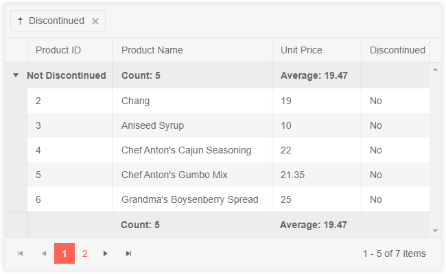
Additionally, we've provided a way to ensure that Grid columns can auto-fit to their content when you are defining your Grid in a more declarative way. With the latest version of the Angular Grid component, this is now a built-in feature!
Editor Improvements: Table Dialog
We have added the Table Dialog tool to the Angular Editor's already rich set of features. This is a big and crucial step in the evolution of the Editor to reach its RTM stage and interacting with tables has been one of the most highly-requested features so far.

DropDown Improvements: Virtualization
The latest iterations of the Kendo UI for Angular, DropDowns have built-in virtualization! We have had this in place for a while now, as it was released between R2 and R3 2019, but we wanted to highlight this crucial feature.

Toolbar Improvements: Responsive Toolbar
The Toolbar is a component that is not only useful by itself, but it is also a core part of the Kendo UI for Angular Editor. With the new responsive feature the Toolbar will adapt to the available width and provide tools that would otherwise be hidden to be available in a popup menu.
React Updates in R3 2019
New Component: Scheduler
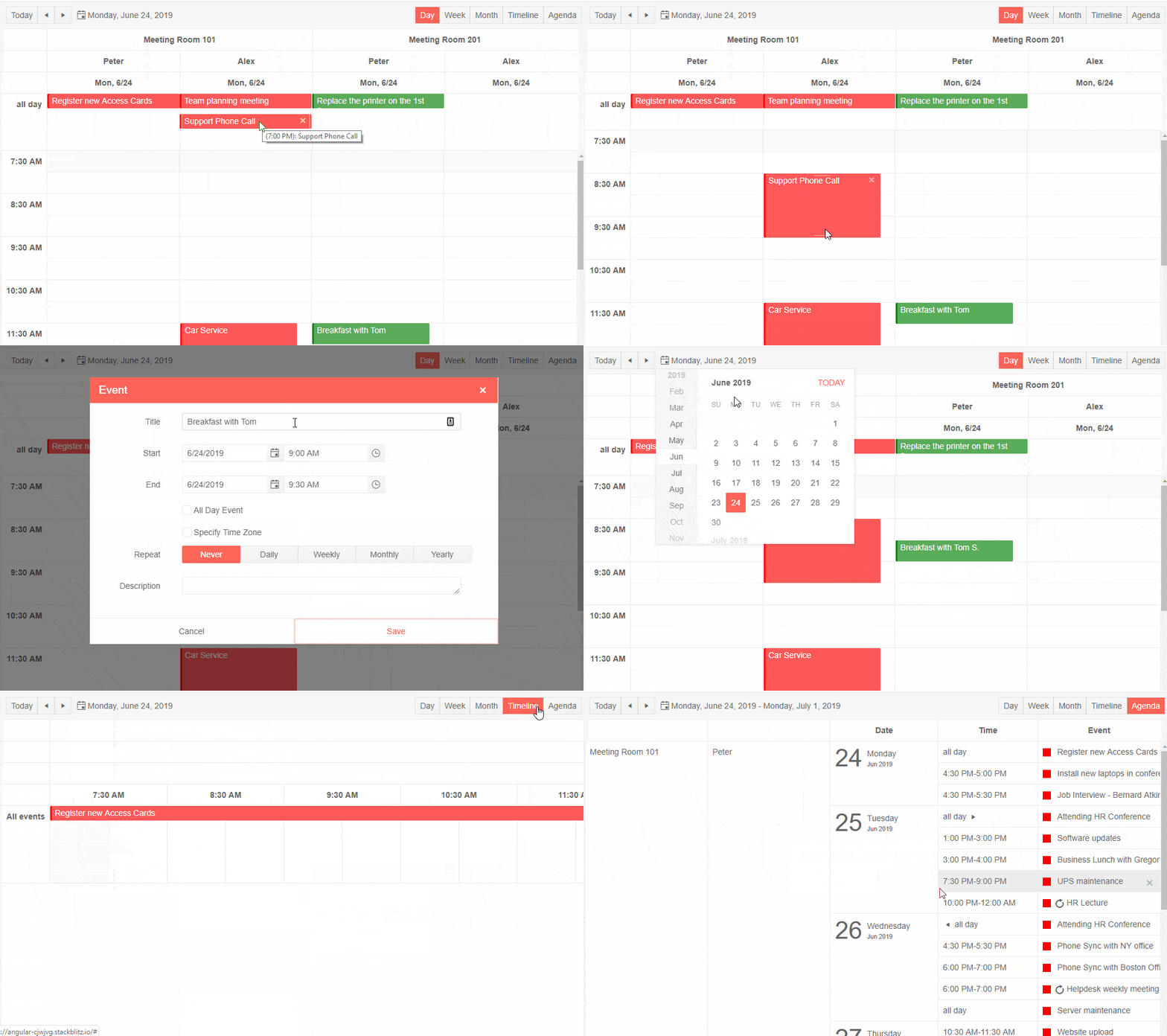
Inspired by the rich functionality and usability of the Outlook and Google Calendars, with the new KendoReact Scheduler, you can display day, week, month, timeline and agenda views, group items horizontally and vertically, and convert times into any time zone. The React Scheduler enables your users to insert or edit tasks either inline or via the advanced editor which allows them to add descriptions, set recurrences, associate resources and much more.
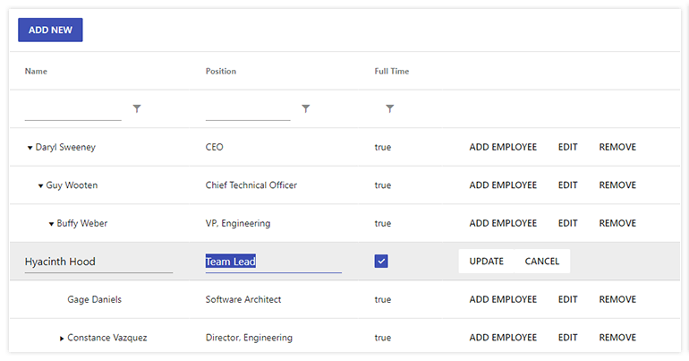
New Component: TreeList
The new React TreeList component provides the hierarchical and homogeneous layout of a TreeView with the column structure of a Grid, providing a unique data layout user experience. It supports the key data operations (filtering, sorting, editing, row selection and custom cell rendering) and globalization.
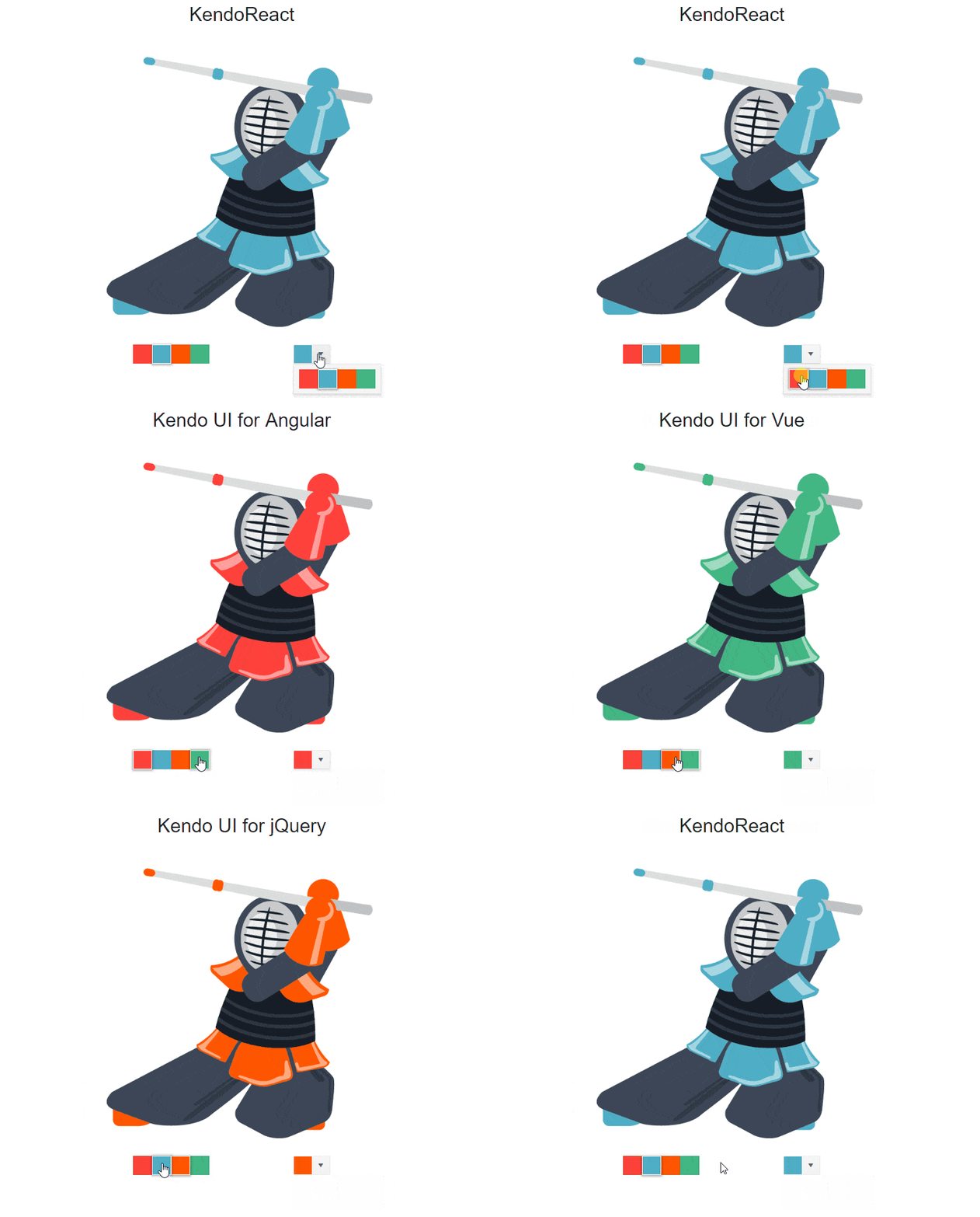
New Component: ColorPicker
The ColorPicker component enables users to select a color from a pre-defined palette or a gradient selection, supporting Hex, HSVA and RGBA colors. It comes with keyboard navigation and RTL support.
New Component: ColorGradient
The ColorGradient renders a gradient, a hue and an alpha slider, and inputs to manually enter the desired color.
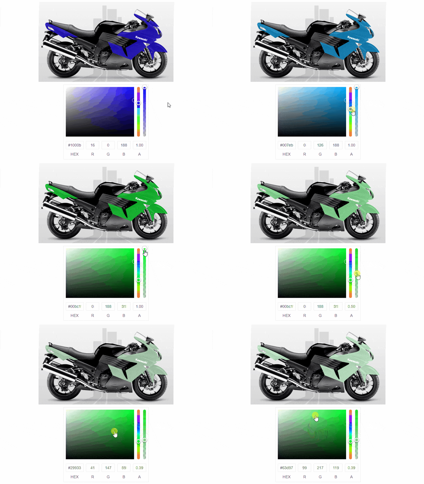
New Component: ColorPalette
The ColorPalette renders colors by using sets of predefined colors (color presets) or by implementing a custom color palette

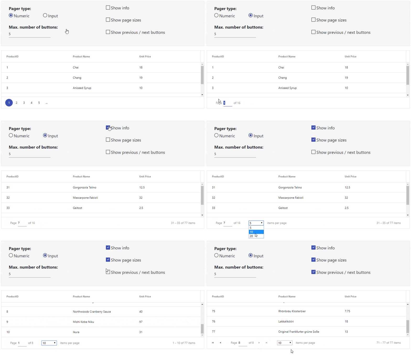
New Component: Pager
The Pager component extracts the Grid pager functionality into a standalone component, giving React developers the freedom to introduce their own paging behavior in their applications. The various options it offers include numeric or input page selection, page size dropdown, previous/next buttons and summary info.
Grid Improvements
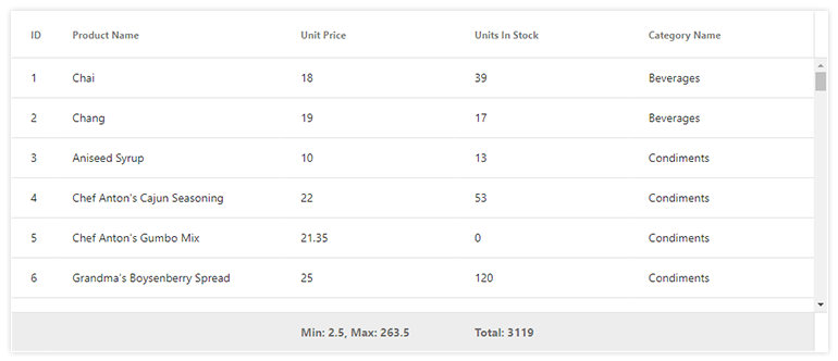
The KendoReact Grid adds a footer row feature, allowing for aggregates to be listed on a column-by-column basis in a common footer row. Additionally, we expanded our documentation to include many of our most frequently requested features and how they can be implemented.
jQuery Updates in R3 2019
New Component: Timeline
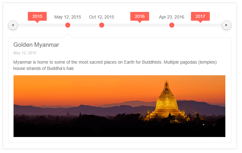
This new and unique UI component provides a sleek way to showcase events happening across a particular time frame. Need to highlight releases over the years? Maybe a history page of your company? The timeline component is perfect for this kind of scenario.
New Component: Card
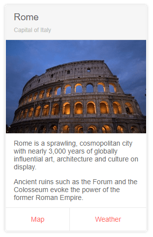
The jQuery Card widget is an additional layout element to help developers set up beautiful and modern application designs. Popularized with Bootstrap and Material Design, this layout component can be used by itself or as a part of a template for other components such as the ListView to create a compelling user experience.
New Component: Rating
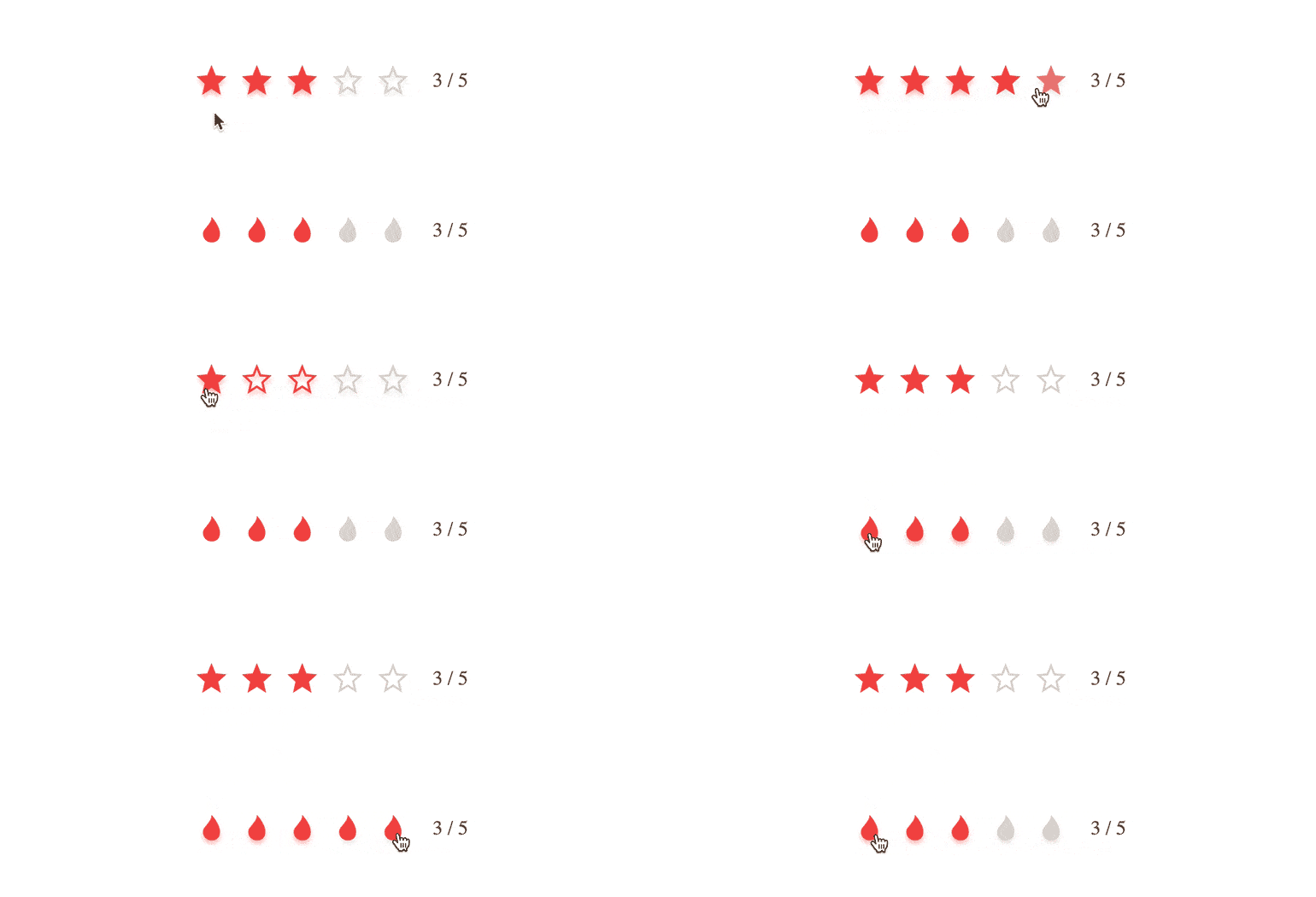
The new jQuery Rating widget provides an easy way to let your users input a particular rating or value on a scale. This component has some built-in icons that can be used, but you can also customize things to provide a template and your own icons to ensure the Rating widget fits in to the rest of your application.
New Component: Filter
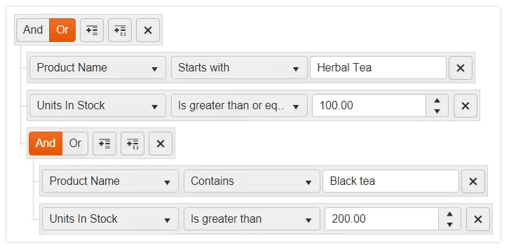
Filter mechanisms have been built-in to data-bound Kendo UI components for some time, but any external UI outside of them would need some custom-made user experience. Well, with the new Kendo UI Filter widget, your end users can create filter expressions (both simple and complex) with an intuitive user experience all through a single component.
PDF Viewer Improvements
The PDFViewer has received a lot of attention since its initial release back in May 2019 (R2). Based on feedback coming from our customers, we have implemented some of the most-requested features to ensure that developers get exactly what they need out of this new component! New features include zoom and scale functionality, the ability to configure documents to FitToWidth and FitToPage, searching within the PDF document, as well as a built-in print functionality.
Grid Improvements
While the Kendo UI Grid has had the ability to filter, and provide a custom template for the toolbar, any attempt at a search field across the entire Grid has been a custom code affair so far. While this has worked, it's not as easy as a configuration option which is why with R3 2019 we have introduced a built-in search panel for the Kendo UI jQuery Grid. This feature can be configured to define any number of fields that are filtered when a user searches.
The DataSource, the underlying framework for data binding in Kendo UI, will support the ability to set request headers as a part of its configuration. This means that you can set up something like an Authorization header when reading from your existing back-end.
Overall Accessibility Improvements
Accessibility is a big part of any one of the Kendo UI components and with R3 2019, the Kendo UI team took a deeper look into our components to implement a slew of improvements on the accessibility front.
New features & Roadmap
Have a feature request?
Post your feedback via:


