
Kendo UI
What's New R2 2019
What's New HistoryjQuery updates in R2 2019
New Component: PdfViewer
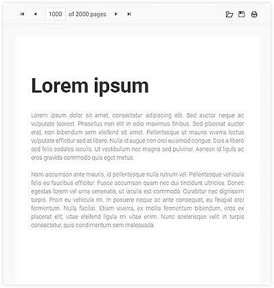
The PdfViewer is designed to allow you to host PDF files within your apps without forcing users to first download the PDF to their local machine. The component can work with both PDF.js and the Telerik Document Processing Library to process the PDF files for viewing and exporting. Additionally, we have started off the first release by adding virtualization as a feature so that even the largest PDF files can be displayed in the component.
New Component: Drawer
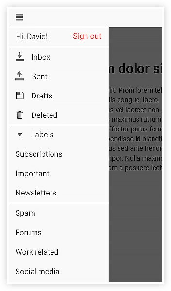
The drawer widget has more or less taken over as the de facto navigation element for web applications, which is why we wanted to introduce this widget fully in to Kendo UI. The drawer can be either overlayed on top of existing content, or can move the content over to the side.
Drawer items are also your standard icon and text combination, but can be completely customized to have their own templates for layouts. The Drawer component also features the ability to display a more compact layout, called “mini” mode, which displays only the icons for every menu item.
Spreadsheet Enhancements
The Spreadsheet widget is a very important widget within the Kendo UI component set, and with R2 2019 it received the most highly-requested features, including:
- Image Support - Images can now be added, as well as dragged between, any cell within the Spreadsheet. Any images added will also be a part of the exported documents.
- Cell Comments - End-users can now add comments to any cell, and of course if you have bound the Spreadsheet to a data end point they can also see other comments added in.
- Events - We have expanded the set of events available in the Spreadsheet to include Changing, DataBinding, DataBound, Paste, Cut, Copy events. This should give you plenty of hooks to customize the Spreadsheet widget to fit your specific requirements.
ListView Endless Scrolling Enhancements
Letting users scroll through large sets of data without having a pager at the bottom is a highly requested feature throughout all of our data bound components. The ListView is no exception to this and with R2 2019 we have added endless scrolling as a feature to the ListView.
Mobile & Adaptive Rendering Enhancements
We have improved the mobile experience across a few components, including expanding the adaptive behavior of the Grid and the Scheduler.
Adaptive behavior gives us an improved UX for more advanced components where simply making the components fit to screen may not be enough. This means creating a separate screen for column settings, filtering, and sorting with the Grid, or creating separate screens for editing in both the Grid and the Scheduler.
Beyond this we have also improved mobile support for the DateRangePicker, ensuring that this component will work well on both desktop and mobile devices alike.
Menu Data Binding Enhancements
The Menu component has now been integrated with the DataSource. This allows users to populate a menu from a remote data end point.
jQuery 3.4.0 Support
jQuery 3.4.0 was recently released and we have tested to make sure that R2 2019 is fully compatible with this release.
Angular updates in R2 2019
New Component: ColorPicker
The Angular ColorPicker lets you provide either a drop down or expanded widget to let your users select color within your Angular applications. This can be done by providing a predefined color palette for your users to chose from, or a gradient that gives some more flexibility for picking a specific color.

Scheduler Enhancements
The Scheduler is one of our most-used components and in this release we have added the following features:
- Resize events - Events can now be modified by resizing them through grabbing the top of the bottom of the event and expanding or shrinking the events.
- Drag and drop events - Similar to above, drag & drop of events allows us to modify events through mouse interactions. Users can now drag an event to a different day or time slot to update when it happens.
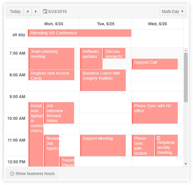
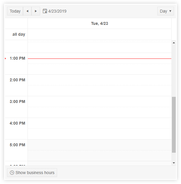
- Multi-day and work week views - While we have had a few different views of the Angular Scheduler for some time, with the latest release you can customize how many days you’d like to see in a single view. Additionally we have a work week view that you can select from.
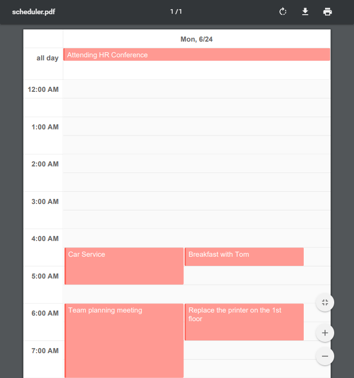
- Export to PDF - The content of the Scheduler can now be exported to PDF with the click of a single button.
- Current Time - When a user clicks on the “Today” button within the Scheduler they will automatically be placed on the current day, and a current time indicator will be displayed as a line across the scheduler.
Editor Enhancements
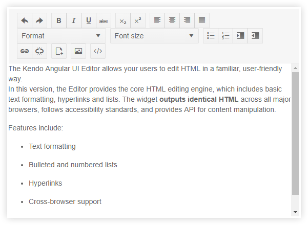
The Editor is one of the newest Angular UI components that we offer from Kendo UI. Being new, and the fact that a rich text editor needs to cover a lot of scenarios, means that there are plenty of features that we need to add to the component. With this release we have covered most of the basics, including the following tools that have been added to the available toolbar options:
- Format drop down showcases different formats
- Insert Image Dialog
- Insert File Dialog
- Subscript & Superscript
- View HTML tab
- Font Picker & Font Size Picker
- Text Align and Justify content
- Clear formatting button
- Localization
- Right-to-left (RTL) support
Drop Down Enhancements - Coming Soon
The Drop Down components have received two major new features that will be added shortly after the R2 release.
- Virtualization - Much like the Grid and other list-based components, the drop downs will often have tons of data thrown at them. Virtualization helps ensure that users can scroll through tons of data while retaining a buttery-smooth scrolling experience
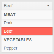
- Grouping - Organizing large lists is no easy feat, and one approach that we take with drop downs is offering the ability to group the data on a particular field to help make navigation a little bit easier.
WCAG 2.1 Support
Accessibility is always important and a pillar for any Kendo UI product, and Angular is no exception. With R2 2019 we are introducing documentation and guidelines for how to ensure compliance with WCAG 2.1 standards when using the Kendo UI Angular components. As our UI components are pretty advanced there are always considerations around what features make something more or less accessible, so this guideline should help navigate these features.
Vue updates in R2 2019
Native Data Grid Enhancements
The native Kendo UI Grid for Vue.js received a lot of attention in the last couple of months.
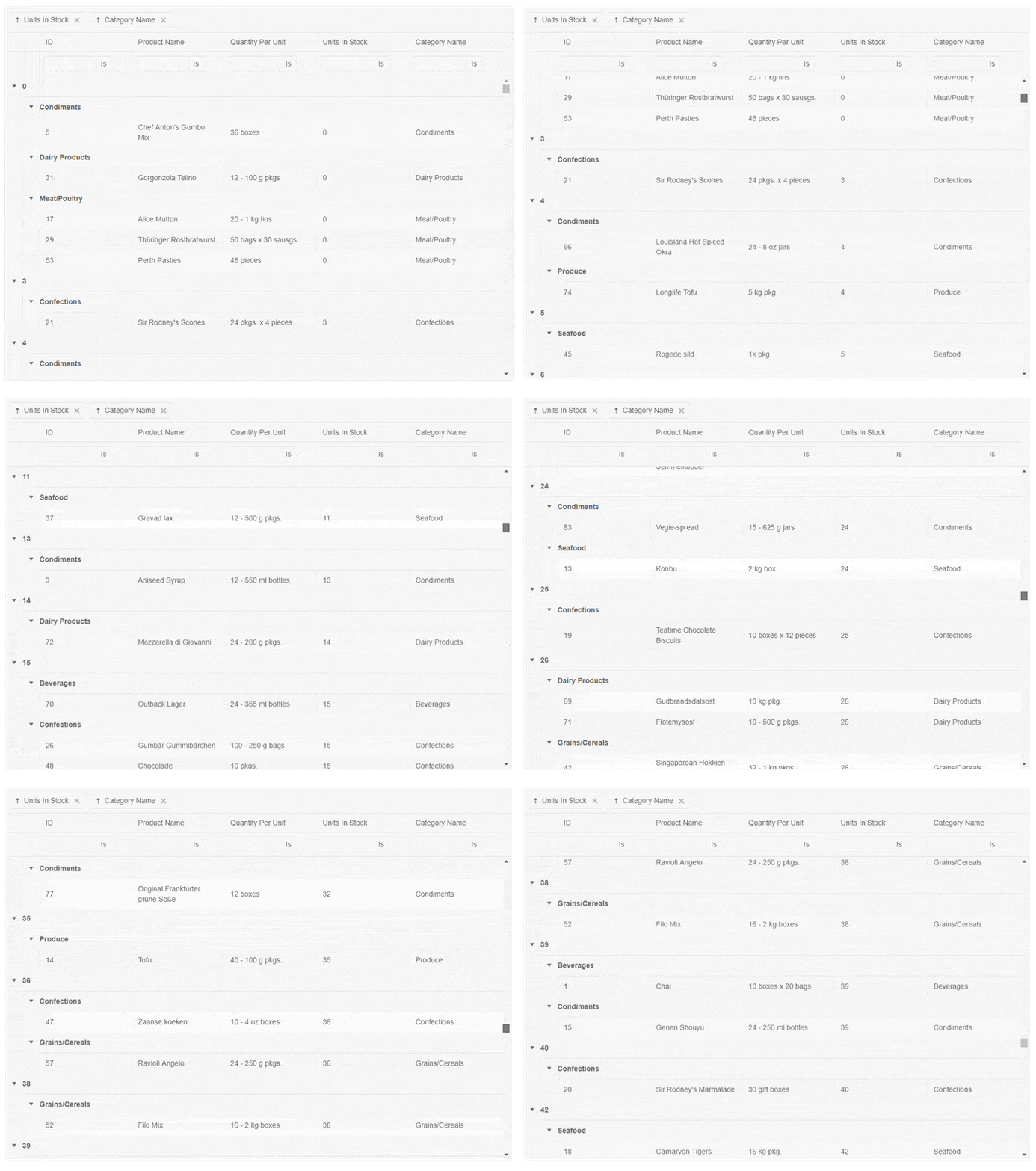
- Grouping & Virtualization - Virtualization can now be used in conjunction with grouping, meaning that there are no longer limitations for using groups along with virtualization. This can yield a huge performance gain.
- Frozen / Locked Columns - Frozen, or locked, columns provide a slick way to ensure that a column is permanently displayed as you scroll through your columns. A column doesn’t always have to be frozen and you can set up columns to only lock once they have scrolled past.
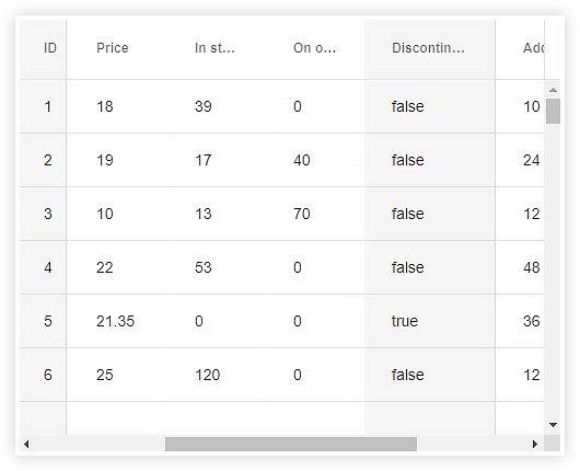
- Grid Column Menu - Being able to provide more options for interacting with columns is often a requirement for any Grid implementation. With the column menu feature developers can now set up a default menu, or a customized menu, for interacting with features like filtering, sorting, the showing and hiding of columns - all within a menu that appears when you click on the Grid’s headers.
ListView Endless Scrolling Enhancements
Having a pager at the bottom of a data bound list is sometimes far from ideal based on user requirements - end-users would like to just see a scrollbar instead. This is where Endless Scrolling comes in to play as it gives your users a way to scroll through all of your data without seeing a pager, and you as the developer receives a ton of benefits from loading pages of data rather than all data at once.
React Updates in R2 2019
New Component: Editor
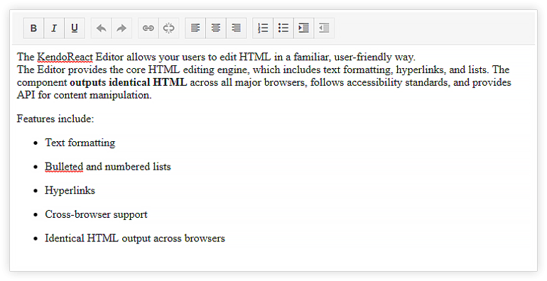
The new KendoReact rich text Editor is a full-featured, highly customizable WYSIWYG editor built to perform. It enables end-users to input free-form text, apply a large spectrum of formatting options, and insert HTML content. Custom rendering support ensures that you can integrate it seamlessly into your web app. The component allows for the creation of custom Editor tools (controls) and plug-ins, which makes it endlessly extendable. Like the rest of the KendoReact library, the Editor complies with accessibility standards and supports globalization.
New Component: DateTimePicker
The DateTimePicker component is perfect for scenarios where both date and time need to be selected by the user. Following best practices around user experience, the component works well on desktop and responsive mobile applications alike.

New Component: Notification
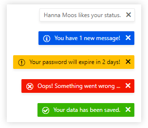
With the new Notification widget developers can easily showcase additional information on top of their existing user interface. The component has pre-built designs relating to success, warning, or error notifications, as well as the ability to completely customize the look-and-feel of the notification.
New Component: Sortable
Originally only available internally within our components, the KendoReact Sortable component is a handy utility library to help around displaying a generic list of items and re-ordering the elements by dragging and dropping them. Any updates to the list are preserved to the underlying data set.

New Component: Drag & Drop
Previously only an internal implementation, this release sees the drag & drop utility library released for any generic drag & drop scenario. Allow any UI element to be draggable and define exactly what can be dragged and where it can, or cannot, be dropped.
Grid Enhancements
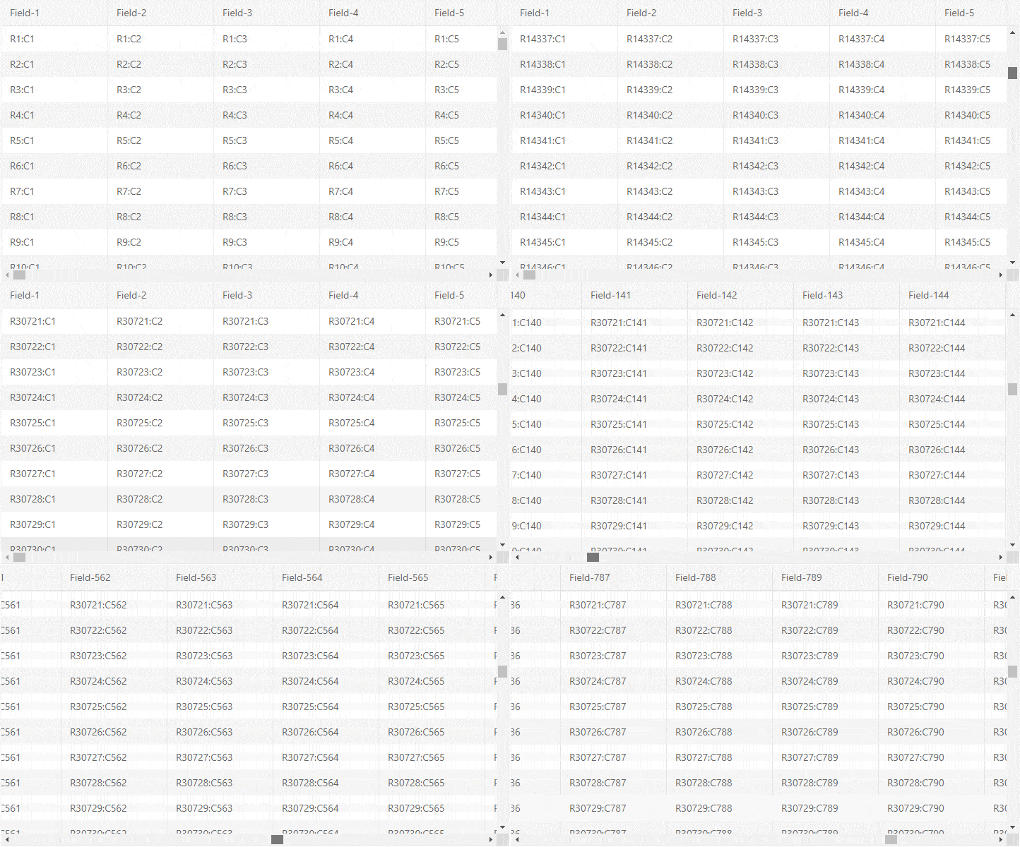
Every release usually comes with an update to the Grid, but with R2 we added a huge new performance feature with column virtualization.
- Column Virtualization - In order to provide the best possible performance, the KendoReact data Grid now provides column virtualization. No matter how many columns or rows you throw at the Grid, your end users will see a smooth scrolling experience. With the latest edition, the Grid now supports virtualization of both rows and columns.
- Context Menu - Often times end-users want to have some additional interactions with a row or a particular cell when right-clicking on the data item. Enter the context menu. This feature allows for additional interactivity options to appear in a menu whenever a data item is clicked.
TreeView Enhancements
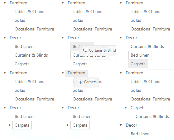
The TreeView also received some of the most frequently requested features, specifically drag & drop and checkbox selection.
- Drag & drop - Easily re-arrange the order, or at which depth data items in the TreeView are displayed, with the new built-in drag & drop feature of the KendoReact TreeView. This works for leaf nodes as well as nodes with children.
- Checkbox selection - Often times developers need to extract the selected items from a TreeView widget. This is now even easier than before with the new checkbox selection functionality which renders a checkbox next to each TreeView node.

New features & Roadmap
Have a feature request?
Post your feedback via:


