
Kendo UI
What's New R1 2020
What's New HistoryjQuery Updates in R1 2020
New Component: Breadcrumb
The new Kendo UI for jQuery Breadcrumb component gives developers a simple and intuitive interface for moving through various levels of hierarchy of navigation. Often a heavy hitter in documentation pages, a Breadcrumb can be used in just about any website to help users navigate in a hierarchy of web pages.

New Component: Badge
Popularized by icons on mobile devices to indicate unread messages or notifications, the badge component has found several usages in the general web world. With the new Kendo UI Badge widget developers can add badges to existing Kendo UI components, their own UI elements, and even display the badge by itself to provide some additional contextual information to something on the page.

New Component: File Manager
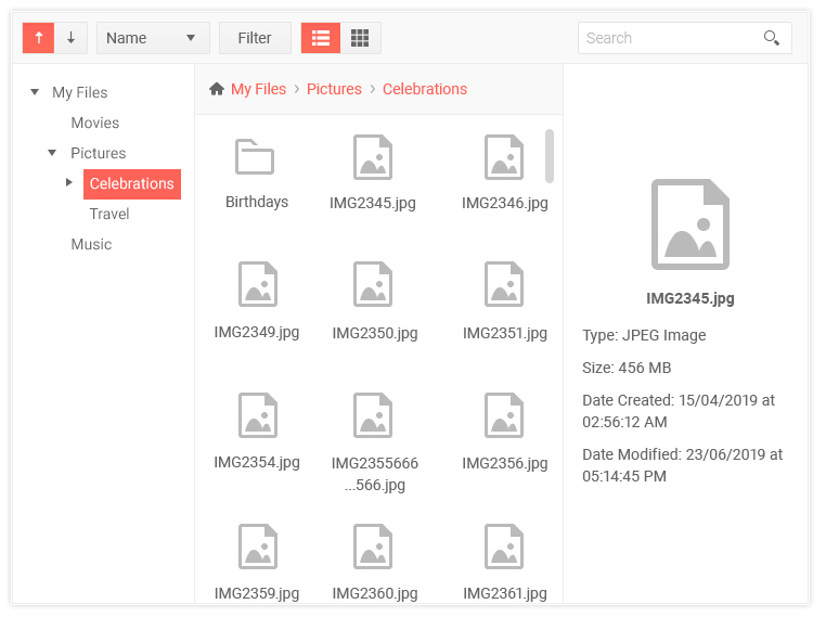
One of the most highly-requested components throughout the years, the new Kendo UI File Manager component lets end users navigate through folders and files, similar to features found within Windows Explorer, to help manage file storage within their web applications. This can be used in conjunction with components such as the Editor to select images or used as a standalone component to help users upload, download, and organizes files or folders.
Checkbox & Radio Button Updates
While we have styles available for checkboxes and radio buttons for quite some time, our approach has been a bit opinionated and not extremely flexible. This mainly comes from needing to support styling in older browsers and ensure cross-browser compatibility. However, since then many of these older browsers have phased out of use. Therefore, with R1 2020 we decided to re-evaluate how we style these two input elements and have now introduced a more modern approach to styling these components.

Grid Improvements: Column Virtualization
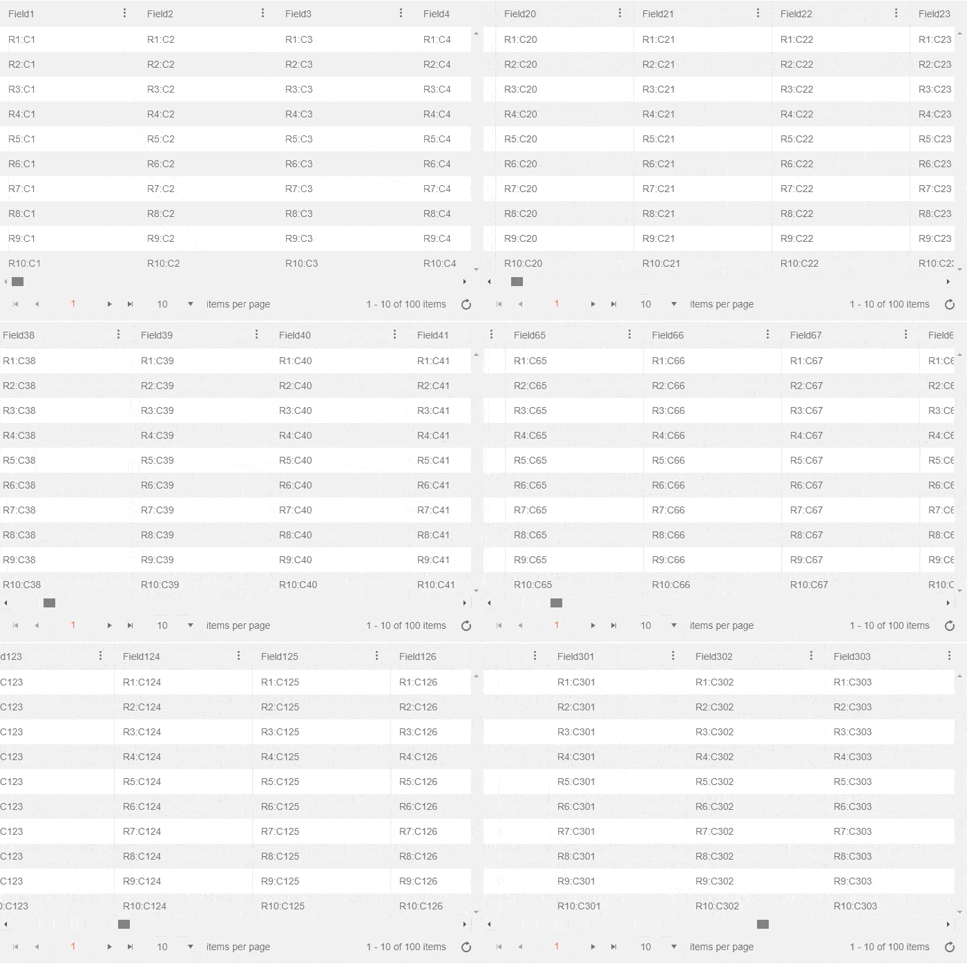
The new Column Virtualization feature of the Kendo UI for jQuery Grid lets users smoothly scroll through data sets with many columns without seeing a performance impact on rendering a large amount of extra HTML, which was the case previously. Thanks to recycling HTML elements and the cells of the Grid, users can now scroll horizontally throughout the entire column collection without any performance hiccups.
TreeList Improvements: Search Panel
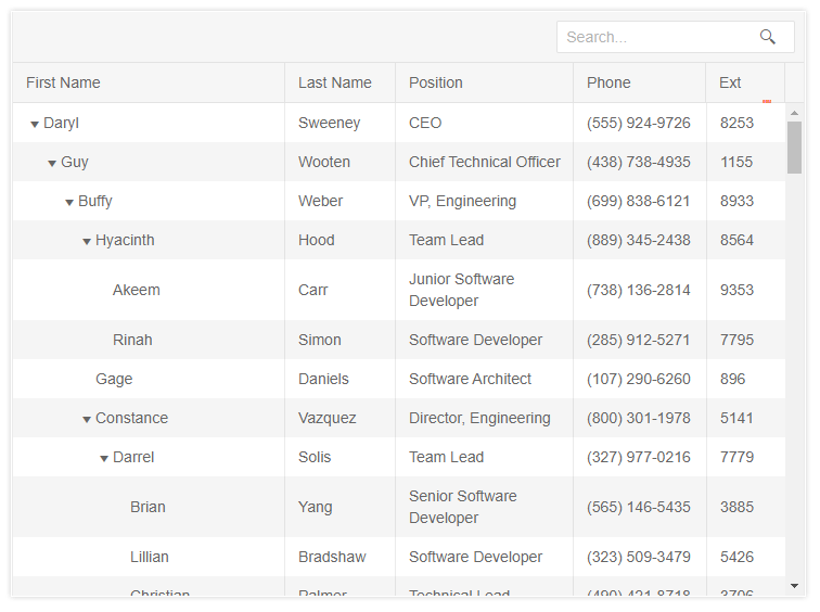
The new Search Panel feature in the Kendo UI TreeList provides a quick way for users to filter the content of the TreeList with a single text input in the top toolbar of the TreeList. How this filters, and which fields across the data end up being filters, can be configured with just a quick set of configuration options – ensuring that any search fits the requirements of your users.
Editor Improvements: Merge Table Tool
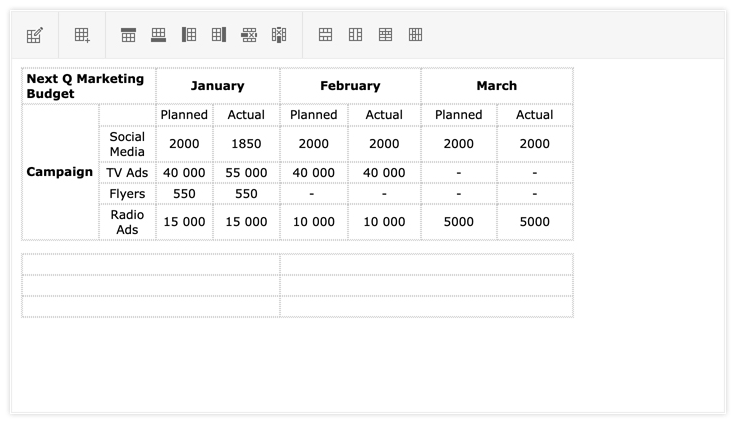
Thanks to the new Merge Table Tool for the Kendo UI Editor end-users can easily create and update the layout of any table element in the Editor’s content. This allows for interactions like merging two cells next to each other in a row, or even merging them in cells within a column – all through a single toolbar interface.
Editor Improvements: Format Painter Tool
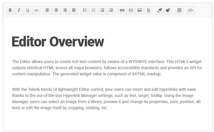
The Format Painter is a standard tool within many rich text editors. This feature allows for users to select a section of text to copy formatting (font, size, color, etc.) and apply it to another section within the content. With R1 2020 the Kendo UI for jQuery Editor now has built-in support for this feature exposed in its collection of default tool options.
Scheduler Improvements: Auto-sizing of Events
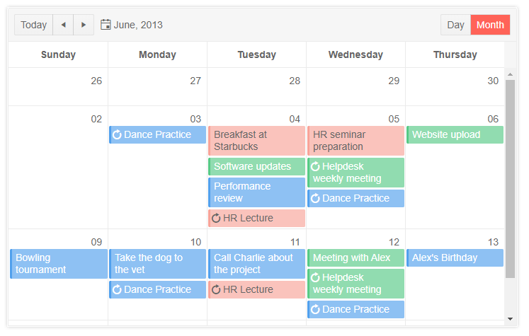
The new auto-sizing of events feature in the Kendo UI Scheduler allows for variable heights to be displayed across various events and days. This means that days with many events, and events containing additional information, end up being sized differently than days with no events displayed.
Filter Improvements: Custom Filter Function
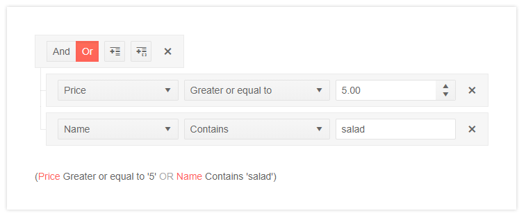
The Kendo UI filter component has received a whole slew of new features, including the ability to create custom filter functions. This enables developers to create their own custom filter operation (say, all products with even number of units in stock) outside of what the Filter component has as a default—giving a deep level of customization to this already powerful component.
Filter Improvements: Custom Operators Per Field
By default, the Kendo UI Filter component offers all filter operators (equal, not equal, contains, etc.) on every field. With the new Custom Operators feature developers can now pre-define an explicit list of available operators. This gives another level of customization to the Filter component as every field can now have a unique set of operators that make sense just for that field.
React Updates in R1 2020
New Component: Form
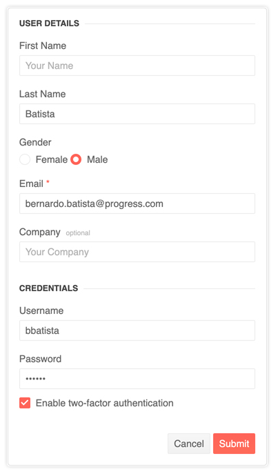
The KendoReact form component is a fast and lightweight package for form state management with zero dependencies—you can hardly find a more efficient way to build forms in React. Utilized internally by components such as the KendoReact Scheduler, the form is built to be used both with KendoReact components as well as any scenario that calls for forms in React applications. This first version supports model, validation state, focused, blurred and modified states as well as HOC for editors to provide these states. Of course, the component is fully accessible and is compliant with WCAG 2.1 and WAI-ARIA standards, like the rest of the KendoReact UI library.
New Component: Drawer
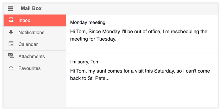
The new KendoReact Drawer widget provides a standard drawer with expand and collapse functionality for smooth navigation experience. You can define icons and text for each navigation item and make use of handy features such as mini mode when you want to display only the icons for each item to use web page real estate efficiently.
New Component: Card
The KendoReact Card widget is an additional layout element to help developers create beautiful and modern application designs. Popularized with Bootstrap and Material Design, this layout component can be used by itself or as part of a template for other components, the ListView, for example, to create a compelling user experience.

New Component: Checkbox
Until now, styling a checkbox has been possible by applying a CSS class from the KendoReact themes to an HTML input element. While this has worked OK so far, to achieve a deeper integration with React, we decided to create a new, standalone, checkbox component for React! It helps provide a uniform look-and-feel across all UI elements in a React app written with KendoReact, and of course will be used internally in other, more complex components. Beyond being integrated with various design languages, the Checkbox component provides support for checked, unchecked, indeterminate, and disabled states, as well as built-in properties to handle items such as accompanying label.

New Component: Avatar
Avatars represent many things in applications today: profile pictures in social media, chat heads in messaging platforms—even icons. With the KendoReact Avatar component, developers now have a quick and sleek way to represent people or entities in their applications by setting an image, icons, or using initials as an avatar. The shape of these items can be set as square, circle, or a general rounded shape via a quick configuration option.
New Component: Filter
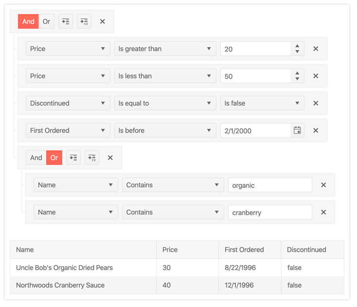
Creating filter expressions can be more than a simple “starts with” and “contains” tied to a single checkbox. While this may work in some scenarios, often users need to work with multiple filters, combining them in various ways (for example, "unit price above $18 and products in stock"). This means that filtering can quickly become quite complex. This is where KendoReact Filter (also known as a query builder) comes in. This component provides an intuitive user experience for building filter expressions ranging from simple to very complex filters. These can then be used with other KendoReact components, such as the Data Grid, or to filter any data collection.
Data Tools Package Updates
Initially introduced with the inclusion of the KendoReact Pager component, the Data Tools package continues to expand by adding more UI components (such as the Pager, Filter, and others) along with processing libraries to help manage data collections in React applications.
Scheduler Improvements: Custom Rendering
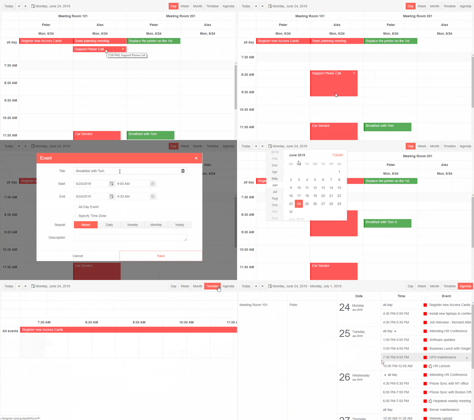
The KendoReact Scheduler provides a default design across events and other elements of the component, which changes depending on which design language is implemented along with the component. With the new Custom Rendering feature our React Scheduler allows for easy control over the look-and-feel of events, giving users the ability to deeply customize the rendering of the Scheduler.
Scheduler Improvements: Keyboard Navigation
With the new Keyboard Navigation feature, the KendoReact Scheduler has full support for navigating and interacting with its various elements by only using the keyboard as input. This is helpful both as a boost to user productivity and in accessibility scenarios where keyboard navigation is the only option for interaction with a web application.
Scheduler Improvements: Accessibility
As part of our commitment to accessibility, the KendoReact Scheduler is now compliant with accessibility standards (WCAG 2.1, Section 508, and WAI-ARIA). This is provided out-of-the-box with the component, ensuring that any React developer can increase the accessibility level of their application just by including the latest version of this React Scheduler.
TreeList Improvements: Column Virtualization
Thanks to the new column virtualization feature, the TreeList component can handle data with large sets of columns across its data set. Virtualization works by loading data as needed and recycling UI elements on the page as users scroll across columns. This leaves the impression of the full data set without the performance penalty of loading all that HTML to the page.
TreeList Improvements: Frozen Columns
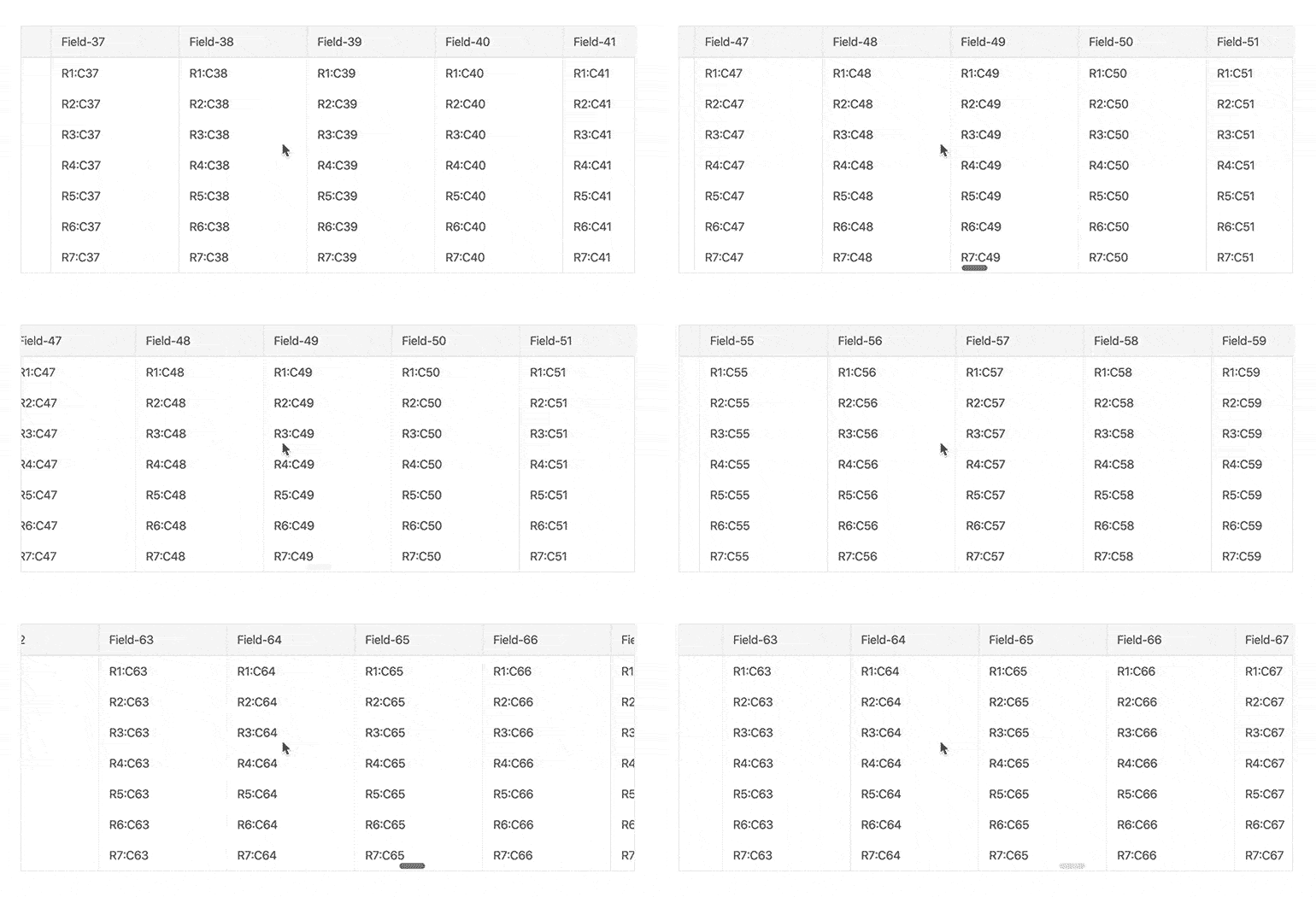
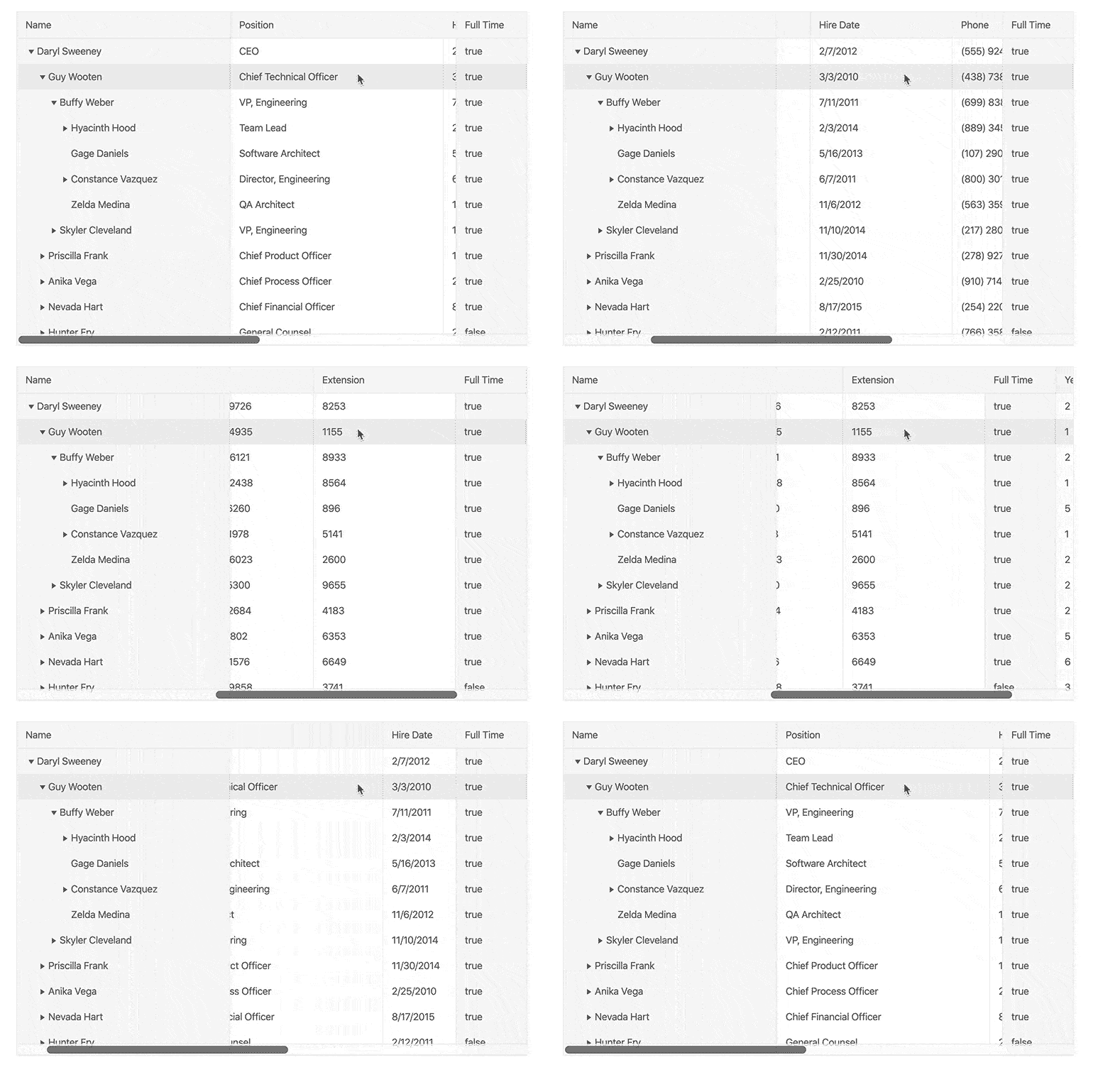
Displaying data in a column structure is crucial for the TreeList, and certain columns may need to be displayed permanently as users scroll horizontally. With the new frozen columns (locked columns) feature, the KendoReact TreeList can easily freeze/lock a column on the left or right-hand side of the component upon initial rendering, or as it is scrolled past by the end-user.
TreeList Improvements: Resize & Reorder Columns
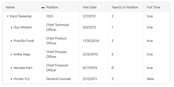
Expanding on the available column features of the React TreeList, this new release provides the ability for end-users to resize the width of the columns by dragging a resize indicator, or even reorder the sequence in which columns are displayed. This ensures that any view of their data can be customized and tweaked to fit their screen and needs.
TreeList Improvements: Multi-Column Headers
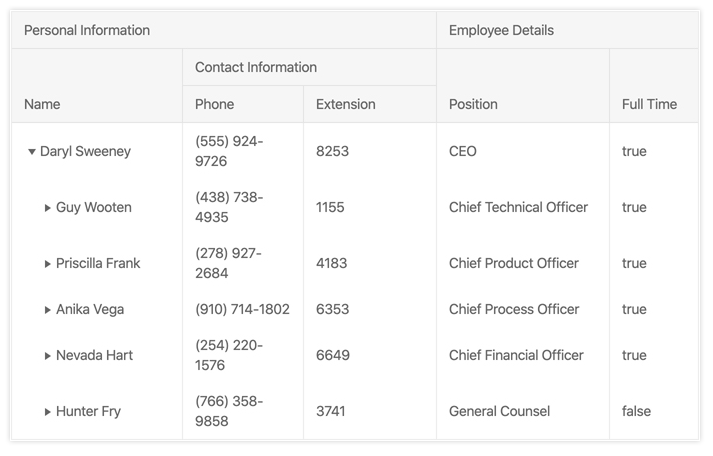
Often a column may need more context than simply its field name in the header—especially if columns are related in some way. Thanks to the KendoReact TreeList’s Multi-Column Header feature, developers can add parent headers that span across multiple column headers. These can also be reordered and resized, representing the entire group of child columns that they encompass.
New Demo: Stock Portfolio Dashboard Sample App
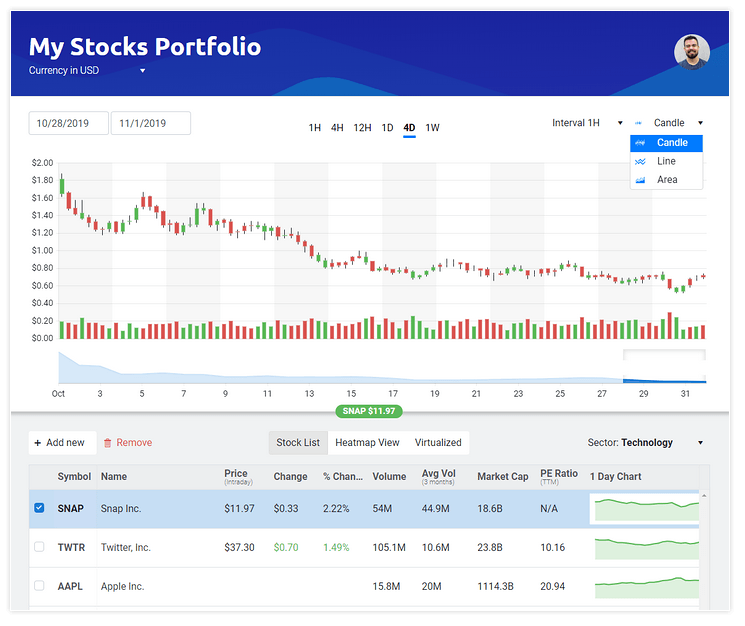
As a part of or constant ongoing effort to help KendoReact developers be more productive, we put together a sample application that highlights our most popular components in a highly requested scenario: a financial dashboard. This is why we created the Stock Portfolio sample app that provides a sleek interface for showcasing live updating data and interacting with our components to look over the history of certain stocks.
This sample includes the KendoReact Data Grid, Data Visualizations (Stock Chart is highly visible) and various Form elements to help create a pleasant UX for highlighting financial data. This is also a great way to learn the KendoReact components and how they can be used to build line of business applications.
NumericTextBox: Refreshed
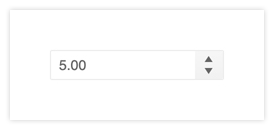
The NumericTextBox was the first KendoReact component ever written and, throughout the years, we have seen it used by developers in several interesting requirements and scenarios beyond our initial scope. That’s why we spent time on reworking the NumericTextBox to ensure that it can accommodate all the user experience scenarios that we have discovered together with our users.
Angular Updates in R1 2020
New Component: TreeList
One of the most anticipated components for Kendo UI for Angular is the TreeList component, and with R1 2020 this UI widget has been added to the already extensive list of UI components for Angular! The TreeList combines the hierarchical layout of a TreeView with the column and tabular structure of a Data Grid. This differs from a traditional hierarchy within the Grid as the data in a TreeList is completely homogeneous and the columns align between parent and child rows.
This initial version of the TreeList includes a huge set of features readily available out of the box from day one, including features like data binding, paging, sorting, filtering, editing, and export to PDF and Excel. There are also many column-specific features like reordering and resizing of columns , virtualized columns, frozen or locked columns, as well as a built-in column menu. These are just some of the features available with this initial release!
New Component: Checkbox
You may have used check boxes with Kendo UI for Angular before, but up until now it has just been through applying CSS classes. With the R1 2020 release, the Kendo UI team put together an Angular directive that can be applied to native checkbox HTML element. This provides not only the styling associated with your favorite Kendo UI theme (Default, Bootstrap, or Material, etc.), but also ensures that this checkbox just enhances what the Angular framework already provides out of the box.
New Component: Radio Button
Similar to the checkbox component above, the Kendo UI for Angular team put together a directive to help apply consistent styling across the board with any Angular application written with the Kendo UI for Angular components. As radio buttons and checkboxes are all a standard part of building forms, these two components help ensure that all aspects of a form can be built with Kendo UI for Angular.

New Component: Avatar
Avatars represent many things in applications today; profile pictures in social media, chat heads in messaging platforms—even icons. With the Kendo UI for Angular Avatar component developers can easily add a sleek way to represent people or entities in your application by setting an image, icons, or using initials. The shape of these items can be set as square, circle, or a general rounded shape via a quick configuration option.
New Component: Card
The Kendo UI for Angular Card widget is an additional layout element to help developers set up beautiful and modern application designs. Popularized with Bootstrap and Material Design, this layout component can be used by itself or as a part of a template for other components to create a compelling user experience. As part of the implementation, the component offers clean and defined sections such as header and content, as well as the ability to define card actions via buttons that can be customized to fit your interaction needs.
New Component: Chips
The Kendo UI for Angular Chip component covers a style of elements popularized in Material Design and mobile application design. The component consists of a container (often in a “pill” design), text, optional image, and remove icon. This can be used as a part of a component that provides multiple inputs or a quick way to list out predefined options which can be selected by the end user.
As part of developing the Angular Chip component, the Kendo UI for Angular team also introduced the Chip List, which gives developers an easy way to provide a list of chips. The component also provides a selection feature, allowing developers to easily maintain the set of currently selected chips.

New Component: File Select
Similar to the Upload component, the Kendo UI for Angular File Select component gives your end users an intuitive way to select a single, or multiple, file(s) from their local machine. The unique aspect of the File Select component is that it allows a developer to have full control over when, and how, the file gets uploaded.
The FileSelect comes with many configuration options out of the box, but if you need some extra control over behavior and the look and feel the component fully supports templates using the Angular framework templates. Also, like all of our UI components that target forms, the FileSelect component integrates with Reactive Forms!
New Component: Floating Label
This may need to be labeled as "newish". A Floating Label has become almost a standard aspect of input elements in today’s web design. While floating labels have existed within the Kendo UI for Angular components themselves, this standalone component gives developers the power to implement floating labels within their own input elements or enhance other Kendo UI for Angular UI components. You might have seen this referred to as the `TextBoxContainer` component in our documentation in the past, but we think that calling it the "Floating Label" component seems much better!

TreeView Improvements: Drag & Drop Nodes
This feature has been one of the most top-requested features within Kendo UI for Angular and I'm happy to announce that we added drag-and-drop capabilities within our Angular TreeView! With the new Drag & Drop feature of the TreeView end users can drag nodes to other areas of the TreeView including items within the same level of hierarchy as well as nodes in different levels of the hierarchy. If the node has any children, they will also be dragged along with the node. If you have multiple TreeViews in the same page you can even drag-and-drop nodes between the two different components!

Grid Improvements: Column Virtualization
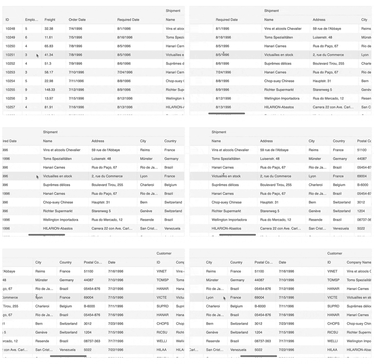
With Column Virtualization in the Kendo UI for Angular Grid, developers can throw as many columns as they need in to the Grid without worrying about performance degradation. Combine this with the pre-existing row virtualization and the Angular Data Grid can support huge data sets with countless rows and columns. As you can see in the animated gif, this operation is buttery smooth and the Kendo UI for Angular Grid doesn't break a sweat!
Grid Performance Improvements
Through the work of implementing column virtualization, the Kendo UI for Angular team went through the source code of the Angular Grid and implemented various performance-improving tweaks to ensure that the R1 2020 release of the Kendo UI for Angular Grid is the fastest yet. This includes initial load of the component and its data, as well as interactions like scrolling.
Editor Improvements: Keyboard Navigation and Accessibility
With the new Keyboard Navigation feature, the Kendo UI for Angular Editor can now be easily utilized with just a keyboard. Ideal for scenarios where productivity improvements can be made with just using the keyboard or improving accessibility.
The Editor now also comes with built-in support for accessibility out of the box. Without additional configuration options developers can rely on the Editor to be compliant with Section 508, WCAG 2.1 and WAI-ARIA standards.
Upload Improvements: Support for Chunking
When uploading files a traditional approach is to take the entire file and just start streaming the file from start to end. This is unfortunately a bit fragile as network connections can be interrupted. This is where chunking comes into play, breaking files down to smaller pieces (chunks) and uploading these chunks in a sequence. With this approach, uploads can easily be resumed after a network connection is regained and can help with pausing and resuming uploads as well. With R1 2020, Kendo UI for Angular’s Upload component now supports chunking any selected file!
New demo: Financial Sample App
The new Financial application coming from the Kendo UI for Angular team provides a great basis for any financial dashboard, or just an additional learning tool for any Kendo UI for Angular developer! This gorgeous application showcases integrations between the Kendo UI for Angular Charts and Data Grid, as well as other UI components offered within the Kendo UI for Angular component library.
Vue Updates in R1 2020
New Component: DropDownList
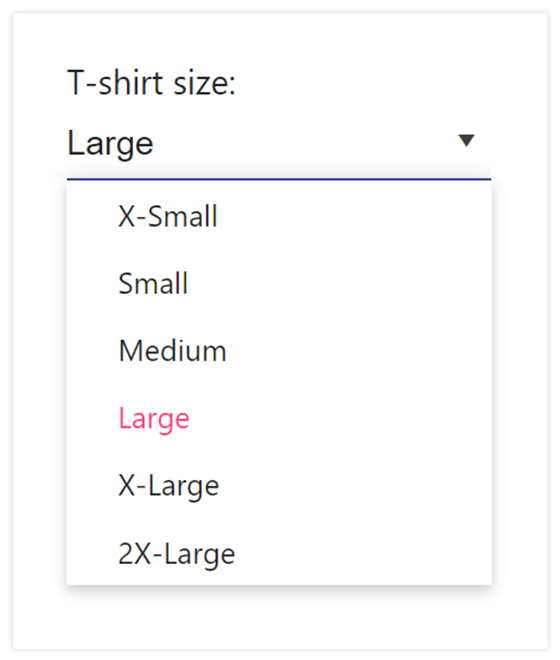
The DropDownList is a form component that lets users choose a single value from a predefined list of values. Think of it as a `select` element with enhancements such as data binding, filtering, and more!
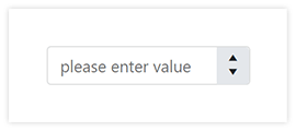
What is an application without some sort of way for users to input text? This is one of the first components that we tackle in any native UI library, and Vue is no exception. The Input component is of course fully integrated with all of the Kendo UI themes, which helps with creating a uniform look-and-feel across your entire application.

New Component: NumericTextBox
Continuing an emphasis on inputs, the NumericTextBox is perfect for any scenario that requires numbers of some kind (simple number, currency, percentage, etc.). As with any Vue component that we create, the NumericTextBox works with all of our available themes and is compliant with WCAG 2.1 and WAI-ARIA accessibility standards.
New Component: Dialog
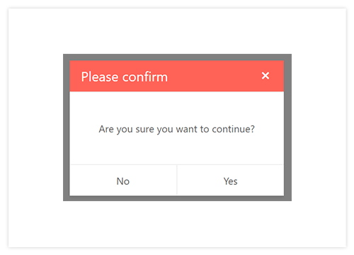
The Dialog component is very useful in scenarios where you need to showcase some specific information to users and prompt them to take an action. This is usually portrayed in a modal fashion to reduce distraction. Of course, as a developer you have full control over the content of the title, dialog box, as well as the action buttons (and their events) to ensure that the component can easily integrate to your existing applications.
New Component: Animation
Animations can be tricky to implement. The Kendo UI team needs animations throughout all components to make sure that they properly "pop" and have the great look-and-feel that comes with all Kendo UI components. Since this is a part of Kendo UI that is used across the entire library, we wanted to take this work and expose it to all Kendo UI users as well, allowing you to create your own animations and not just when working with the Kendo UI components. This package can be used to help animate just about anything in your apps.

New Component: Popup
The Kendo UI Popup component is the basis of a lot of Kendo UI components, including the DropDownList and other DropDown components. Not only does this help with having content appear on the page upon interaction (clicking a button for example) it also needs to be able to be configured to display and align in certain ways, work with boundary detection (if the popup appears outside of the current view port), and even animate. As we needed to build this out to start creating more native Vue UI components we figured it would be great to expose this functionality to our users as well!

New features & Roadmap
Have a feature request?
Post your feedback via:


