
Kendo UI for Angular
What's New R2 2022
What's New HistoryNew and Improved Kendo UI Productivity Tools for Visual Studio Code
We have given our Visual Studio Extensions a significant update to help you become more productive than ever. In addition to bootstrapping your project to add a few screens, you will find two new features:
- Code Snippets
- Code Scaffolder

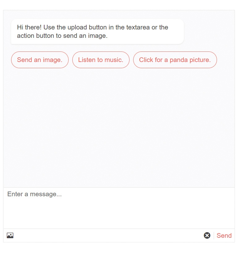
Angular Chat Enhancement: Message Box Customization
Also referred to as Conversational UI, this component had previously only allowed a single-line textbox for input. You can now use a multiline text area or fully customize it with an ng-template.
See the Angular Conversational UI Message Box demo
Angular PanelBar Enhancement: Additional Events
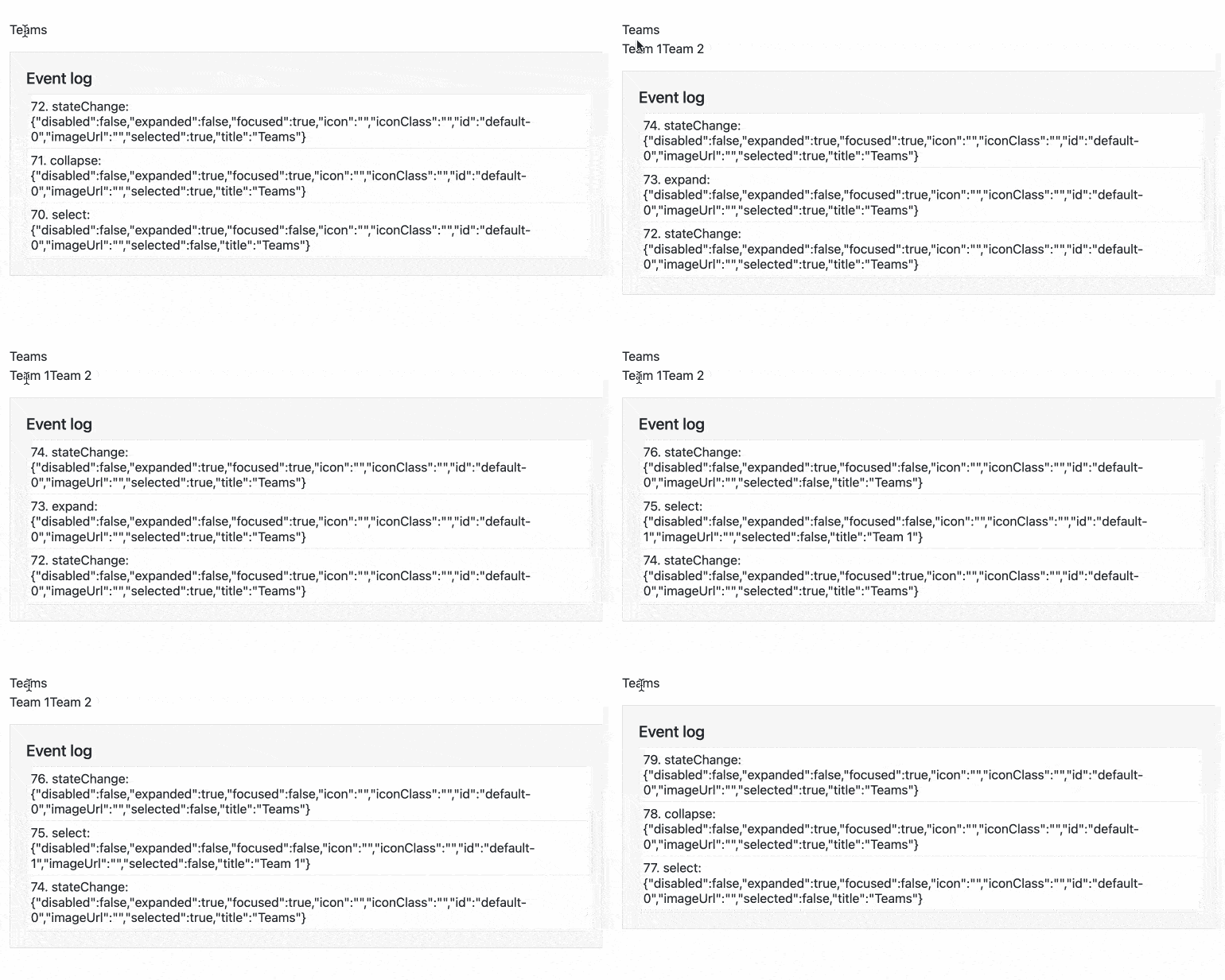
The Angular PanelBar now has four new events to help you make it more interactive. These are stateChance, select, expand, and collapse.
See the Angular PanelBar Events demo
Angular Rich Text Editor Enhancements: Table Resizing and Paste Images
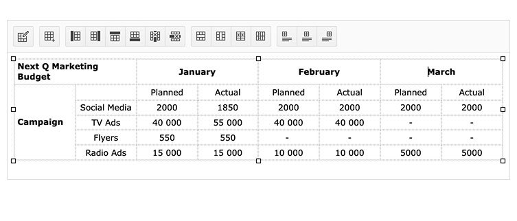
The Angular Rich Text Editor now supports two new frequently requested features that bring it on par with popular commercial editors and word processors: table resizing and paste images. Users can now select and drag to resize tables. They can also paste images from the clipboard.
See the Angular Rich Text Editor demo
New Component: Angular ListBox
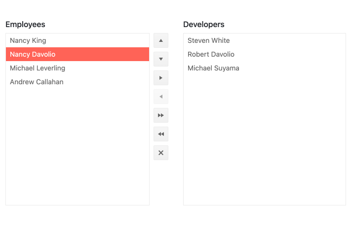
The Angular ListBox is a common way to select, reorder, and move items. Combined multiple ListBox components to move items between lists with drag and drop or buttons. This is a common way to allow users to create a new list of items from an already existing list.
See the Angular ListBox component
New Component: Angular StackLayout
Much like the GridLayout component, Angular StackLayout also helps you deliver great and consistent UX in no time. All you need to do is give it content and it will align it horizontally or vertically according to your rules. It’s a great way to quickly display anything from blacks of text to cards to data visualizations.
See the Angular StackLayout demo

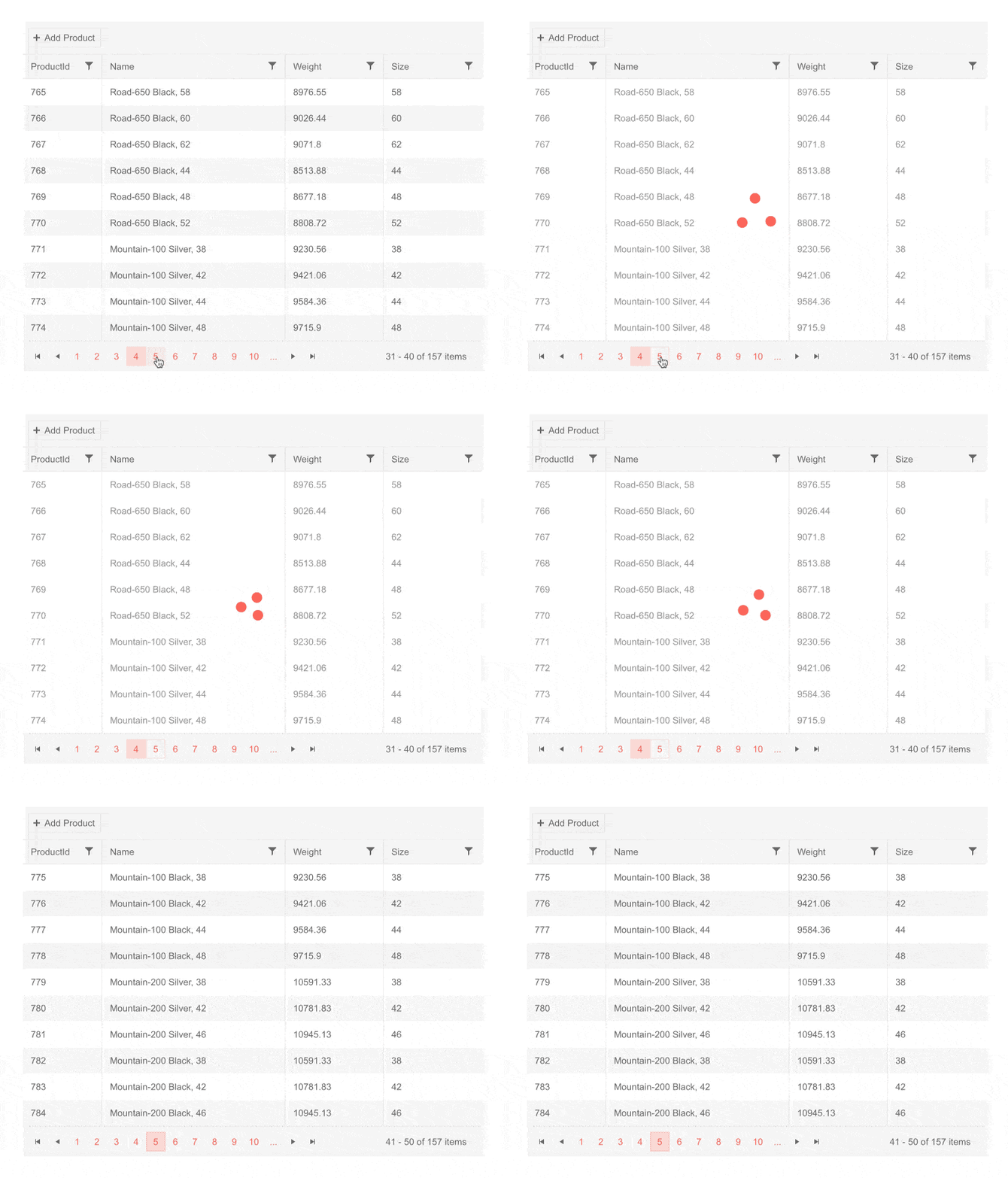
New Angular Grid Demo: Performance Overview
Performance is among the top concerns when developers implement data grids. Nothing turns users off more than slow-loading data. To both give you tips for ensuring performance and to give a quick proof of concept we have added a demo and documentation article to help.
See the Angular Data Grid Performance demo

New Blue Ocean Color Swatch for Improved Accessibility
The goal of the Kendo UI Default theme is to give you modern and accessible UI that you can use right out of the box. This new swatch has an updated look and feel and its colors are chosen for optimized contrast to improve accessibility beyond levels we have already achieved. This new color swatch is the default for the Kendo UI Default theme.
See the new Blue Ocean Swatch by visiting the Data Grid demo
Angular Data Grid Enhancement: Loading Indicator Template
The Angular Data Grid component includes a default indicator that displays when data is loading, but you can now use your own using a standard “ng-template”.
See the Angular Grid Loading Template demo
New Component: Angular PivotGrid (Beta)
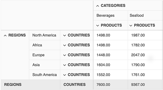
The Beta release of our Angular PivotGrid delivers the essential features to get started building pivoted data tables. This is not a feature of the Angular Data Grid, it is built from the ground up so it is a great platform for adding pivot table-specific features in the future. This version features pivoting, filtering, OLAP cube binging, client-side data binding and more. We will continue to add features leading up to the full release planned for September 2022.
See the Angular PivotGrid demo
All Angular Components: Full Migration to the Ivy Package Format
Angular 13 has reduced its reliance on ‘ngcc’ in favor of Ivy. In order to fully take advantage of this change, we have migrated every Kendo UI for Angular package to the hew Angular Package Format (APF). Take advantage of this improvement by simply upgrade to the newest versions of the packages you are using.

New Angular Data Grid Example: External Filtering
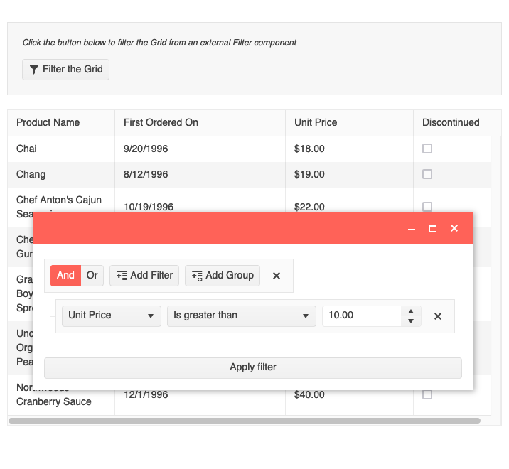
We recently released the Angular Filter, which gives users intuitive UI to create data filter expressions. To help you get the most out of both this component and the Data Grid, we have added documentation and a sample showing how to use these two together to help users show the data they need.
See the Angular Grid External Filtering example
Angular Data Grid Enhancement: Sort Multiple Columns Using a Modifier Key
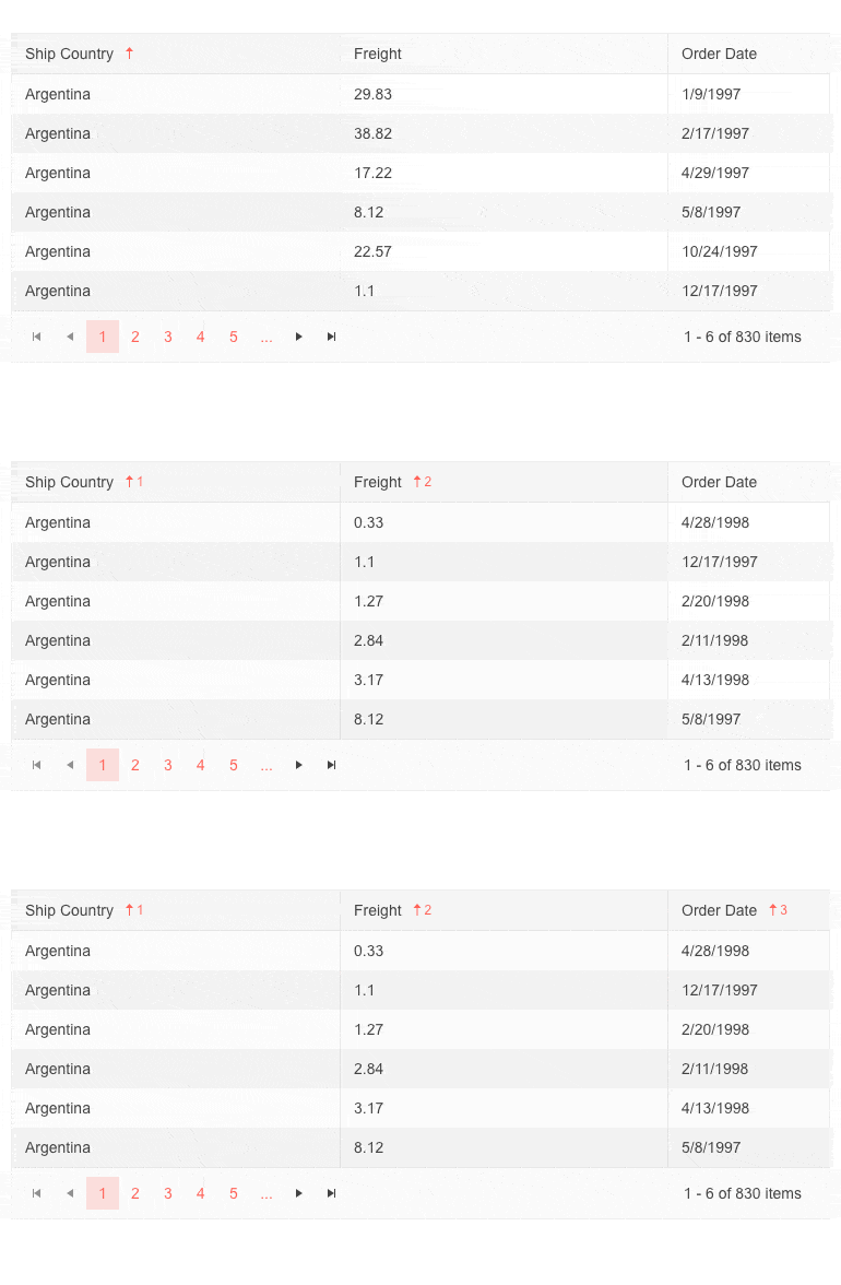
To ensure the Angular Data Grid user experience is aligned with users’ expectations, we have added a configuration option to only sort multiple columns when a modifier key is used. When this option is enabled, a will sort by multiple columns by holding down a key, such as CTRL, and clicking on each column. If the click columns without using the modifier, the sort will change to that single column on each click.
Dark Mode for Angular Docs and Demos
Giving users the option to choose between dark and light modes in their UI is a popular and growing trend. Kendo UI for Angular supports it and to show you how easy it is, we have added a switch toe toggle the two modes in our docs and demos. Just used the moon or sun button at the top of the page.
Visit the Angular Grid Demo to toggle between modes and see for yourself
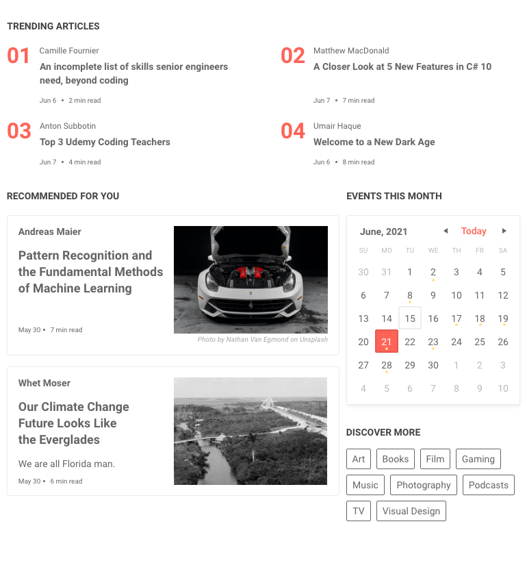
New Component: Angular GridLayout
The GridLayout component helps you deliver great UX even faster by automating one of the most tedious UI implementation tasks: CSS grid layout. This component will use a grid-like system to arrange your content in columns and rows. This will work with content from the most basic text to full components such as cards or charts.
See the Angular GridLayout demo
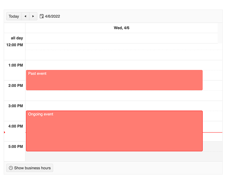
Angular Scheduler: Highlight Events in Real Time
Help users easily spot an event that is currently happening by highlighting it. With this feature enabled any event that falls on the current time will automatically have a highlight style to it. By default, the Angular Scheduler will use the built-in theme highlight style, but you can customize to your requirements.
See the Angular Scheduler Highlight Events in Real Time demo
New Angular Grid Demo: No Records Template
The Angular Data Grid will display a message when there is no data to display but many developers would like to customize their own. In this case, they can easily do so using the familiar “ng-template”.
See the Angular Grid No Records Template demo

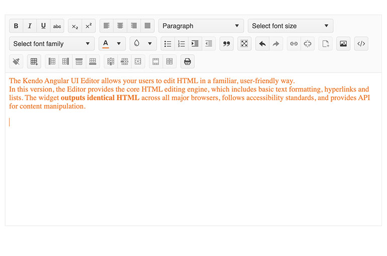
Angular Rich Text Editor Enhancement: Caret Color Corresponds to Font Color
Rather than using the default color, the caret in the editing area will now automatically match the color of the text. To see this, open the Angular Editor Tools demo and change text color.
See the Angular Editor Tools demo
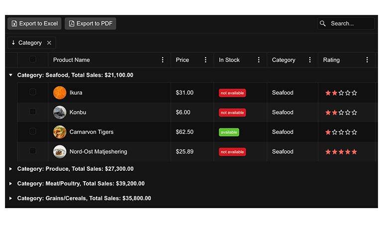
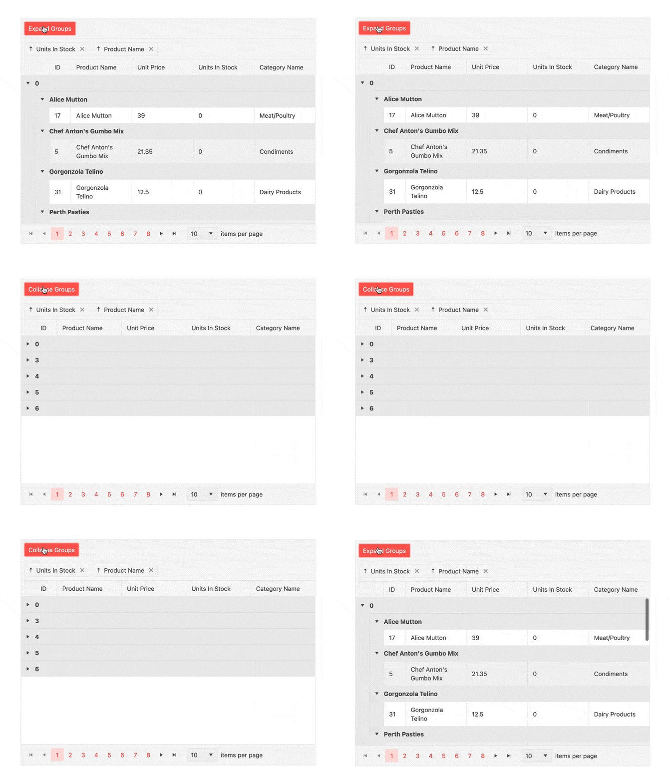
Angular Grid Enhancement: Expand and Collapse All Groups
Groups of data in the Angular Grid can be expanded or collapsed for better viewing. In cases where there are a large number of groups, users need to be able to expand or collapse all groups. This is possible with a button or you can perform the actions programmatically.
See the Angular Data Grid Grouping demo
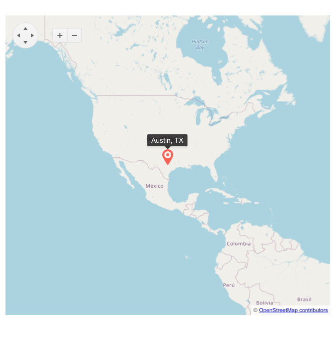
New Component: Angular Map (Beta)
The Angular Map is a great way to visualize data on a live map. Bind it to various cloud geo data providers such as OpenStreetMap and Azure Map or supply any GeoJSON source. Support for layers is included which is the key feature for displaying the overlayed markers and drawings that tell your story.
See the Angular Map demo
Kendo UI for Angular - R2 2022
- New and Improved Kendo UI Productivity Tools for Visual Studio Code
- Angular Chat Enhancement: Message Box Customization
- Angular PanelBar Enhancement: Additional Events
- Angular Rich Text Editor Enhancements: Table Resizing and Paste Images
- New Component: Angular ListBox
- New Component: Angular StackLayout
- New Angular Grid Demo: Performance Overview
- New Blue Ocean Color Swatch for Improved Accessibility
- Angular Data Grid Enhancement: Loading Indicator Template
- New Component: Angular PivotGrid (Beta)
- All Angular Components: Full Migration to the Ivy Package Format
- New Angular Data Grid Example: External Filtering
- Angular Data Grid Enhancement: Sort Multiple Columns Using a Modifier Key
- Dark Mode for Angular Docs and Demos
- New Component: Angular GridLayout
- Angular Scheduler: Highlight Events in Real Time
- New Angular Grid Demo: No Records Template
- Angular Rich Text Editor Enhancement: Caret Color Corresponds to Font Color
- Angular Grid Enhancement: Expand and Collapse All Groups
- New Component: Angular Map (Beta)


