
Kendo UI for Angular
What's New R2 2021
What's New HistoryKendo UI for Angular Now Includes Over 100 Components!
We are proud to announce that Kendo UI for Angular now includes over 100 components. This is a milestone in our commitment to helping you focus on your application’s core requirements by giving you the tools you need to implement modern and professional UI. A large part of the criteria we use to determine which components to add next is based on your requests. If you don’t see a component you need, please let us know on our feedback portal.

Support for Angular 12
The Kendo UI for Angular R2 2021 release supports Angular 12 and will continue to stay current with Angular releases to ensure that you can take full advantage of the framework’s capabilities.

New Component: Angular BottomNavigation
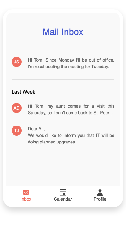
The new Angular BottomNavigation component is perfect for adding a convenient way for users to navigate between primary screens on touch devices with smaller screens. Typically used in responsive applications and Progressive Web Applications, bottom navigation places three to five items, consisting of text and an optional image, across the bottom of the screen where they are easily accessible.
See the Angular BottomNaviation demo
New Component: Angular MultiSelectTree
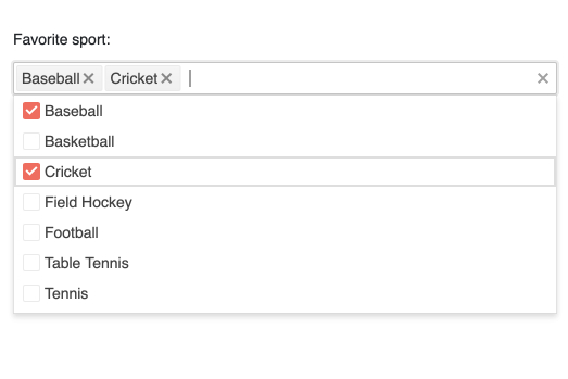
The Angular MultiSelectTree component gives you a surprisingly quick way to allow users to select one or more items from a hierarchical list of data. Much like the Angular DropDownTree, this component will automatically organize your data in a tree format and display it in a dropdown that users can easily access and select items from. The difference in the Angular MultiSelectTree is that users can select multiple values, each item displaying either token in the input element of the component. This is a valuable tool in your collection when you need on option to show complex data on limited screen space.
See the Angular MultiSelectTree demo
New Component: Angular Skeleton
The Angular Skeleton component helps you reduce perceived initial load time by displaying a placeholder on the screen while other content loads. This element’s default design is a grey box, but you can choose from other shapes and add animations. Use the Skeleton wherever you need to load large data and other complex content including other Kendo UI for Angular components!

New Component: Angular Circular Gauge Component
The new Angular CircularGauge component joins the LinearGauge, RadialGauge and ArcGauge to complete the gauge collection. This useful data visualization component display data on a circular scale, but instead of a pointer indicating the value, the Circular Gauge represents the value within a colored arc.
See the Angular Circular Gauge demo

New Angular Data Grid Feature: Sticky Columns
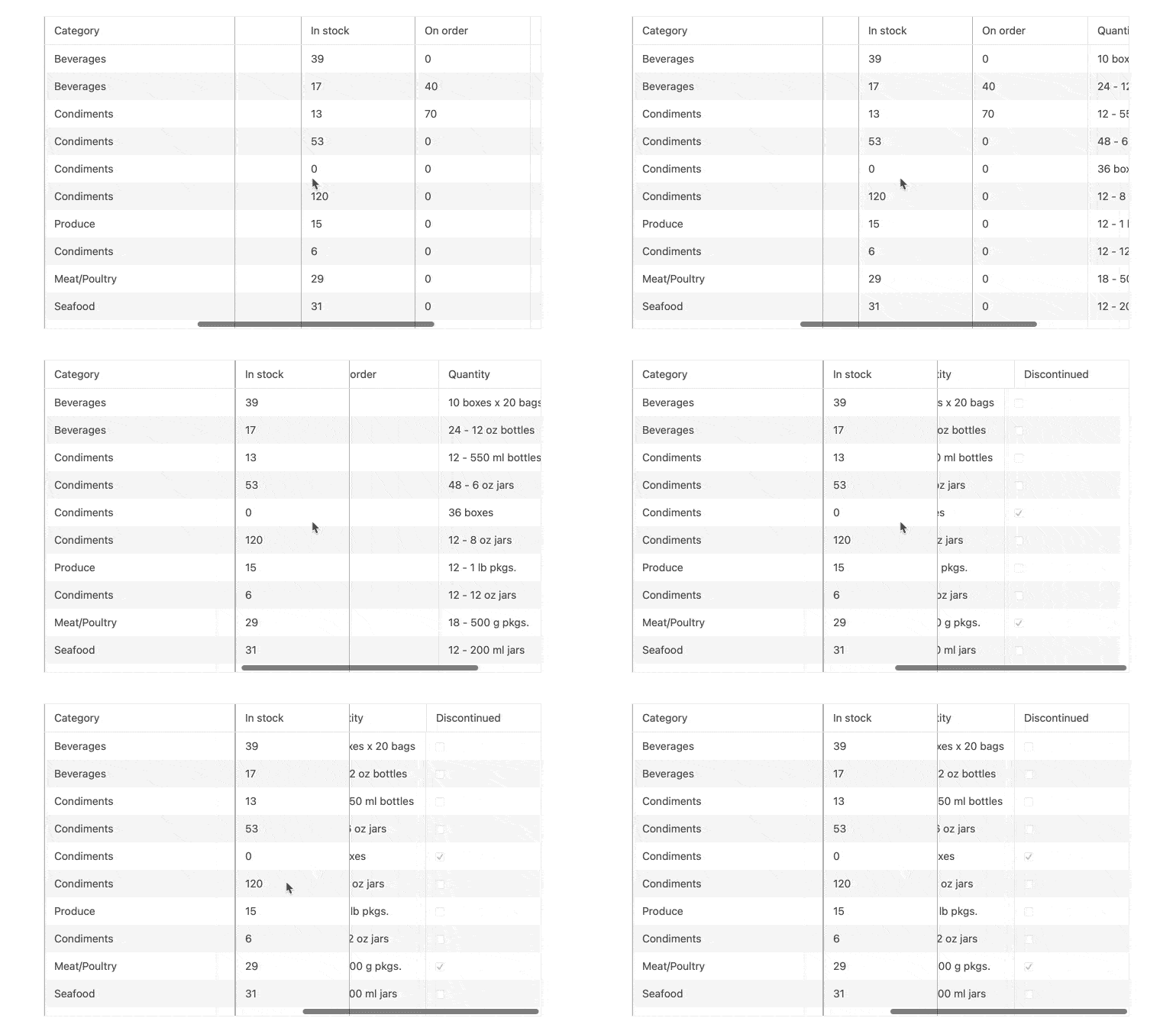
In just a few steps, you can designate one or more columns to always be visible (or stick) to the right or left side of your grid while the user scrolls. This is a great way to ensure that the most important information is visible when you have limited space.
See the Angular Data Grid sticky columns demo
New Angular Data Grid Feature: Sticky Rows
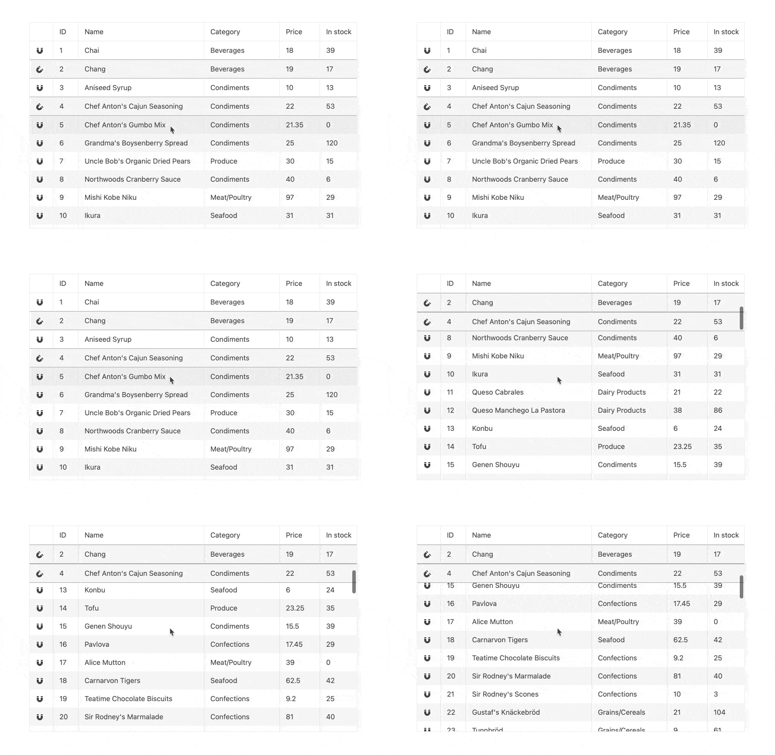
Much like the Sticky Columns feature, Sticky Rows will also make your life easier while delighting your users. In just a couple steps, you can designate one or more rows to always be visible (or stick) to the bottom or top of your grid while the user scrolls. This is also a great way to ensure that the most important information is visible when you have limited space.
See the Angular Data Grid sticky rows demo
Angular Data Grid Improvement: Persist Group Expanded State
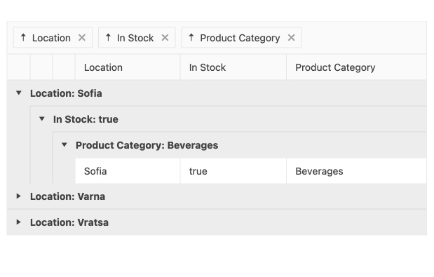
The new Persist Grouping feature of the Angular Grid ensures that the state of grouped items being expanded or collapsed will persist through data operations of the Grid. The main benefit of this feature comes from scenarios when users expand and collapse groups, moving away from the current page, and then move back to the original page. All groups will have their state persisted and things will be just like the user left them.
See the Angular Data Grid expanded state demo
Angular Data Grid Accessibility Improvements
In order to maintain our components full accessible to everyone, we often review and improve accessibility. Specifically for this release, we took a deeper look into the following features and improved accessibility in the cases they are enabled in the grid:
- Filter Row
- Filter Menu
- Column Menu
- Checkbox Column
Additionally, we have implemented keyboard navigation for the Filter and Column menus.
See the Angular Data Grid accessibility article and keyboard navigation demo
Angular Editor Feature: Placeholder Support
Use placeholders to define the initial text to be displayed in the input area of an Angular editor. A typical example is displaying “Enter text here” to direct users to add their information.
Angular Editor Improvement: Plugins Support
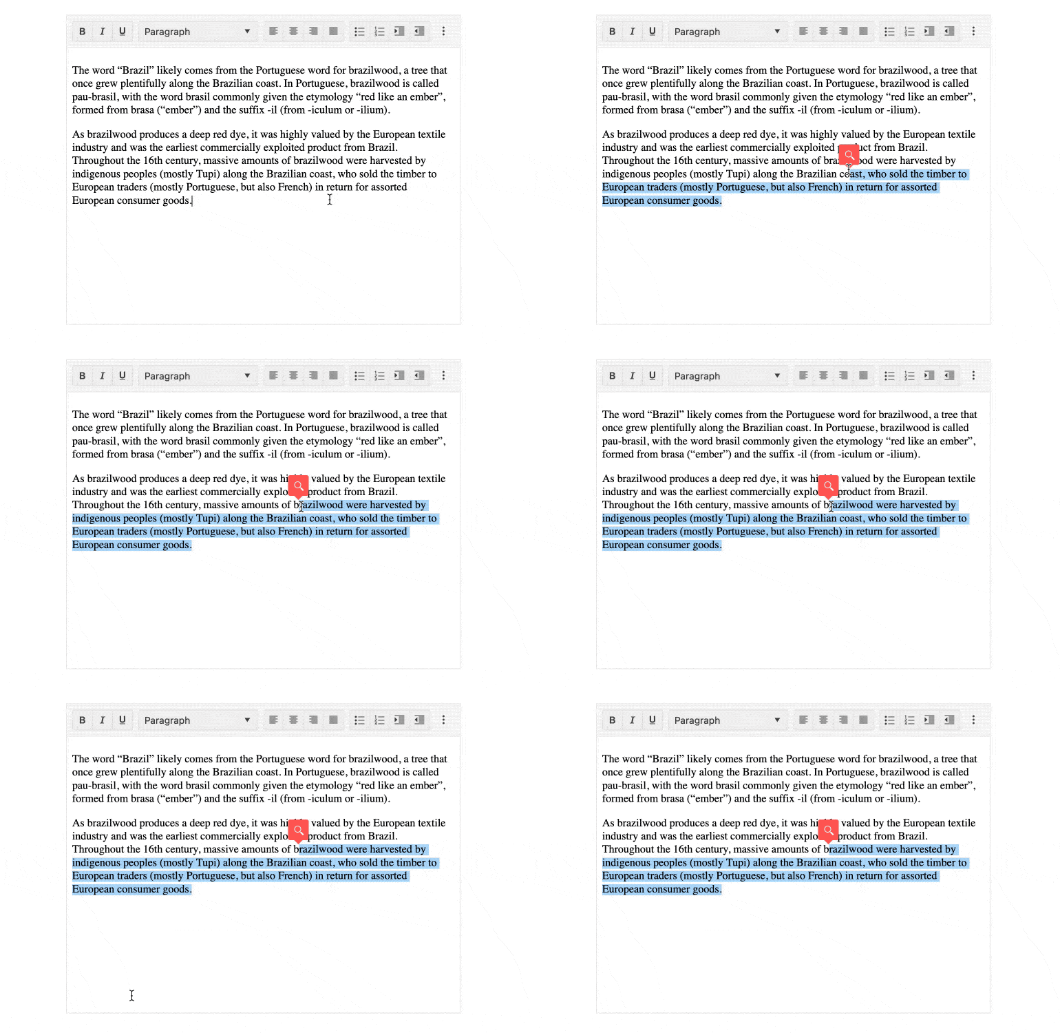
The Angular Data Grid now supports the ProseMirror plug-in system that allows you to build your own features. See the demos linked below for examples that include tools that pop up when text is highlighted and input rules that transform text when it matches conditions.
See the Angular Editor plugins demo
New Angular Calendar Feature: Multiple Date Selection
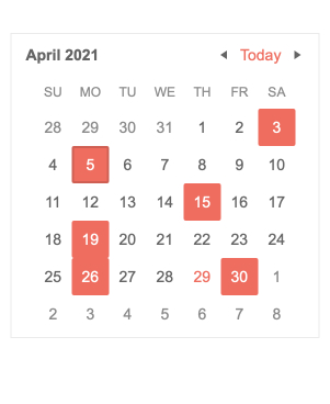
Improve the calendar user experience by allowing your users to select multiple dates. They can now perform the following tasks:
- Select multiple individual dates with CTRL + click or CTRL + ENTER.
- Select ranges with SHIFT + click, SHIFT + ENTER or mouse drag.
- Select entire weeks.
What’s best is that all you need to do is set the selectable property!
See the Angular Calendar selection demo
Angular TreeView Improvement: Directive for Checking and Unchecking Children
Provide a smooth user experience by specifying a distance an item will be dragged before an event is fired. This will avoid unwanted drag behavior when users are clicking or tapping through options.

Angular TreeView Improvement: Delay nodeDrag Event
Provide a smooth user experience by specifying a distance an item will be dragged before an event is fired. This will avoid unwanted drag behavior when users are clicking or tapping through options.
All Date Inputs Improvement: Two Digit Year Support
Many users are accustomed to typing a two-digit year, but the application has no way of knowing what century is intended. For example, “21” is meant to translate to “2021.” Now, you can specify the default century for all Angular date input components. This will avoid user frustration that comes from seeing errors or incorrect dates when entering two-digit years.
See the DateInput formats demo

Kendo UI for Angular - R2 2021
- Kendo UI for Angular Now Includes Over 100 Components!
- Support for Angular 12
- New Component: Angular BottomNavigation
- New Component: Angular MultiSelectTree
- New Component: Angular Skeleton
- New Component: Angular Circular Gauge Component
- New Angular Data Grid Feature: Sticky Columns
- New Angular Data Grid Feature: Sticky Rows
- Angular Data Grid Improvement: Persist Group Expanded State
- Angular Data Grid Accessibility Improvements
- Angular Editor Feature: Placeholder Support
- Angular Editor Improvement: Plugins Support
- New Angular Calendar Feature: Multiple Date Selection
- Angular TreeView Improvement: Directive for Checking and Unchecking Children
- Angular TreeView Improvement: Delay nodeDrag Event
- All Date Inputs Improvement: Two Digit Year Support


