Kendo UI for Angular
What's New R3 2020
What's New HistoryNew Component: Angular ListView
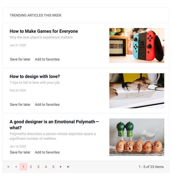
The new Kendo UI for Angular ListView component is the perfect component to display and manage a list of data which may not fit into the regular row and column structure found within a grid. Each item is rendered according to a provided Angular template and the ListView provides additional features such as a built-in pager to help the end-user navigate and manage the displayed data.
See the Angular ListView demo.

New Component: Angular Loader
Adding to a growing list of Angular UI components that make your application stand out, the new Kendo UI for Angular Loader component is a powerful and gorgeous new UI component responsible for showcasing a loading indicator in an Angular application. With several built-in styles, the Loader can be imported and provide loading animations with just a single line of code or be customized through the available configuration options to create truly unique loading animations that can make any application pop.

New Component: Angular AppBar
The Kendo UI for Angular AppBar component is designed to function as an application header that is fully customizable by Angular developers. The component can be customized to contain anything you'd need from a header, including contextual action items, navigation items, and additional features such as search boxes and drawer icons to integrate with other navigation UI components such as the Kendo UI for Angular Drawer.

New Component: Angular TextBox
The new Kendo UI for Angular TextBox component brings the consistent look-and-feel of the available Kendo UI themes to the text input element. Beyond the basic capabilities of a TextBox element the component allows for decorators before and after the input which could host elements like icons, buttons, text, and more. The Angular TextBox also comes with built-in validation icons for invalid and valid data.

New Component: Angular Breadcrumb
For websites that have a large number of pages or a deep hierarchy of pages, the new Kendo UI for Angular Breadcrumb component is an intuitive way to let end-users quickly navigate to any higher-level pages. The Angular Breadcrumb can also integrate with the Angular router to help facilitate navigation throughout an Angular application.
See the Angular Breadcrumb demo.

New Component: Angular RangeSlider
The Kendo UI for Angular RangeSlider component lets users quickly and intuitively select a range of values by sliding indicators responsible for both the minimum and maximum values.
See the Angular RangeSlider demo.

New Component: Angular Badge
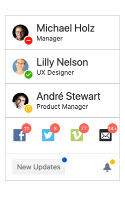
With the Kendo UI for Angular Badge component developers have a super flexible component that can be used in various ways. Whether it is to showcase a notification indicator on an existing HTML element, an unread notification indicator with the total number of items displayed within the badge, or to implement it as a standalone component, the usages for this component are too many to count! The Angular Badge has extensive configuration options enabling developers to define shape, size, color, content, alignment and positioning, and more!

New Component: Angular Icon & SVGIcon
The new Icon and SVGIcon components allow you to display Font Icons or SVG Icons, respectively. Combined with the icons available with the Kendo UI themes, these new components give access to over 400 different icons.
Angular Data Grid Improvements: Cell Selection
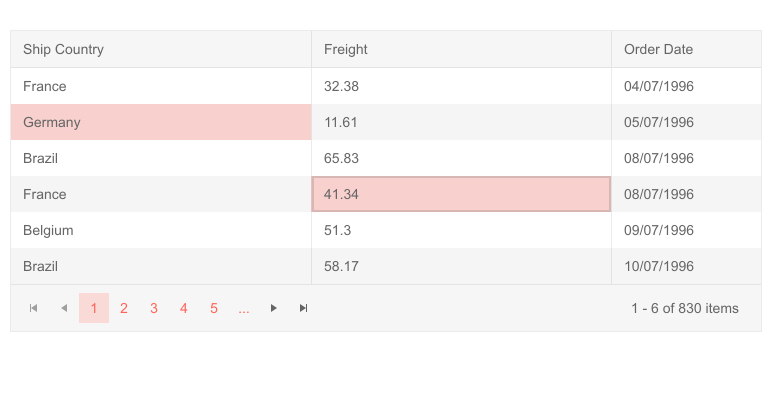
The Kendo UI for Angular Grid now supports cell selection as part of its growing list of ways to select information within the Grid. These include single or multiple cell selection, as well as selection via dragging the mouse over the data table interface.
See Angular Grid selection demo.

Updated Forms in Various Components
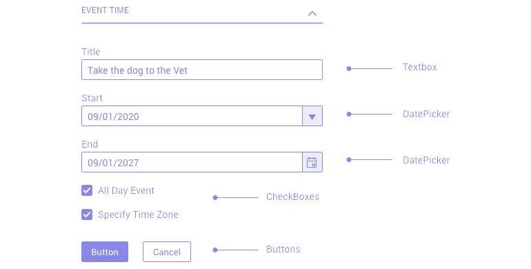
Building on top of the Forms Guideline documentation, a resource which provides industry best-practices for designing and building forms, the Kendo UI for Angular team has updated all applicable Angular UI components that contain a built-in form to follow the Forms Guideline.

Kendo UI for Angular - R3 2020
- New Component: Angular ListView
- New Component: Angular Loader
- New Component: Angular AppBar
- New Component: Angular TextBox
- New Component: Angular Breadcrumb
- New Component: Angular RangeSlider
- New Component: Angular Badge
- New Component: Angular Icon & SVGIcon
- Angular Data Grid Improvements: Cell Selection
- Updated Forms in Various Components
