
Kendo UI for Angular
What's New R1 2021
What's New HistoryNew Component: Angular TileLayout
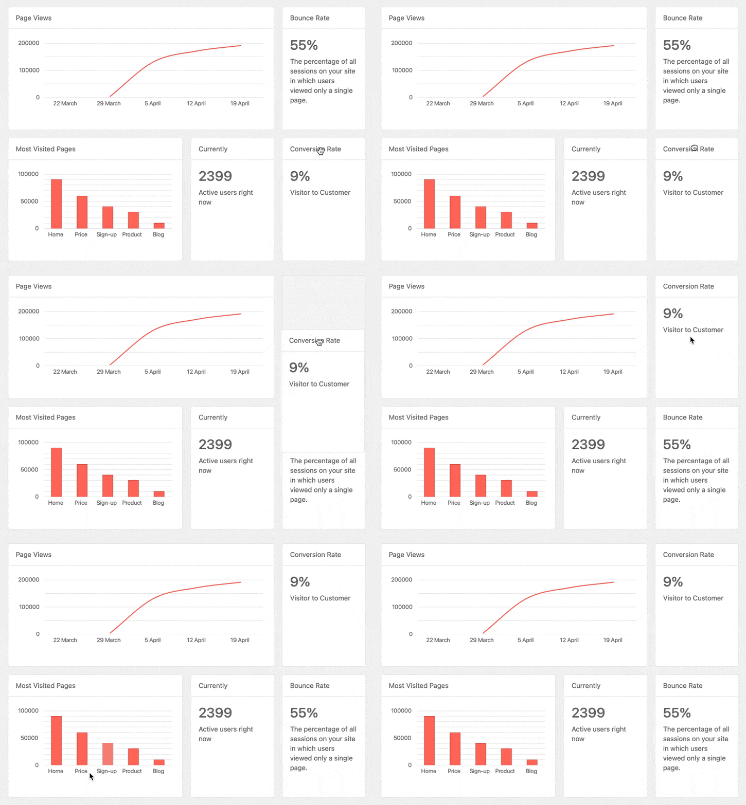
The Kendo UI for Angular TileLayout component is the easiest way to create interactive KPI dashboards. After defining columns and tile dimensions, developers can provide a UI in which users can freely drag and drop the tiles around to create their own custom layout of KPIs to view.
See the Angular TileLayout demo
New Component: Angular ExpansionPanel
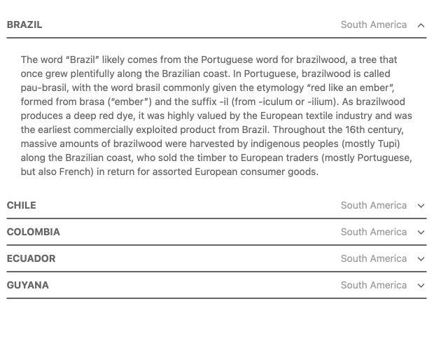
The Kendo UI for Angular ExpansionPanel component provides a layout item with a title or header that can be interacted with to expand or collapse related content underneath it. Whatever is displayed in the header or content area can be customized using Angular templates, making the Angular ExpansionPanel extremely flexible and compatible with any Angular application.
See the Angular ExpansionPanel demo
New Component: Angular FloatingActionButton
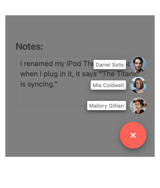
The Kendo UI for Angular FloatingActionButton component provides a floating button that performs an action contextual to the content on the page. You can also display additional action items when the button is interacted with. Often called a "speed dial", the list of available actions can be customized to fit any scenario. Each action button within the Angular FloatingActionButton includes configuration options like style and icon to ensure that the buttons make sense to the user and conforms to your UI.
See the Angular FloatingActionButton demo
New Component: Angular MultiColumnComboBox
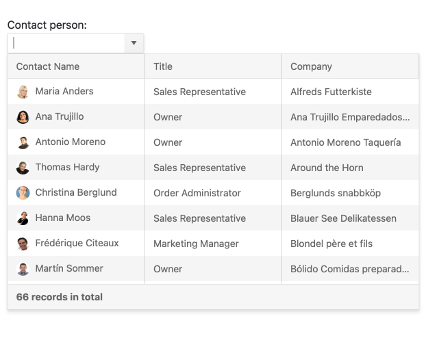
The Kendo UI for Angular MultiColumnComboBox component combines the interface of a drop down with a table structure. Rather than listing a single field of text in a long list, developers now have the option to display multiple fields as columns for each row. This is especially useful when you need a way to save screen space for a longer form. The Angular MultiColumnComboBox neatly hides the table in a drop down to be accessed when needed.
See the Angular MultiColumnComboBox demo
New Component: Angular DropDownTree
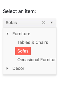
The Kendo UI for Angular DropDownTree component provides the simplicity of a drop down and the hierarchical depth of a tree view to bring a great user experience to modern web applications.
Tree views are useful UI tools that allow a user to select values from the available tree structure, but they take up valuable space. Since space is limited in modern web applications, Kendo UI for Angular DropDownTree hides the tree view in a drop down. Once the user opens the drop down and selects a value, it can be displayed in an input element or easy reference.
See the Angular DropDownTree demo
New Component: Angular TextArea
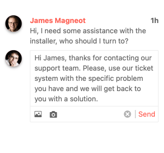
The Kendo UI for Angular TextArea component provides long-form input and is the Kendo UI for Angular equivalent of the native HTML TextArea element. The Kendo UI for Angular TextArea expands on the available components and directives that Kendo UI for Angular offers to make any UI element in your Angular application have a consistent look and feel. Features such as adornments, which let developers add elements before and after the TextArea, and validation icons are all available out of the box.
See the Angular TextArea demo
Angular 11 Support
Kendo UI for Angular components are fully compatible with Angular 11.

New Angular Grid & Angular TreeList Feature: Responsive Pager
The Kendo UI for Angular Grid and TreeList components’ built-in pager feature is now automatically responsive. This means that UI elements within the pager will dynamically change according to the available viewport and size of the Grid or TreeList.
See the Angular Grid or Angular TreeList ;demo
New Angular Charts Feature: Improved Series Highlighting
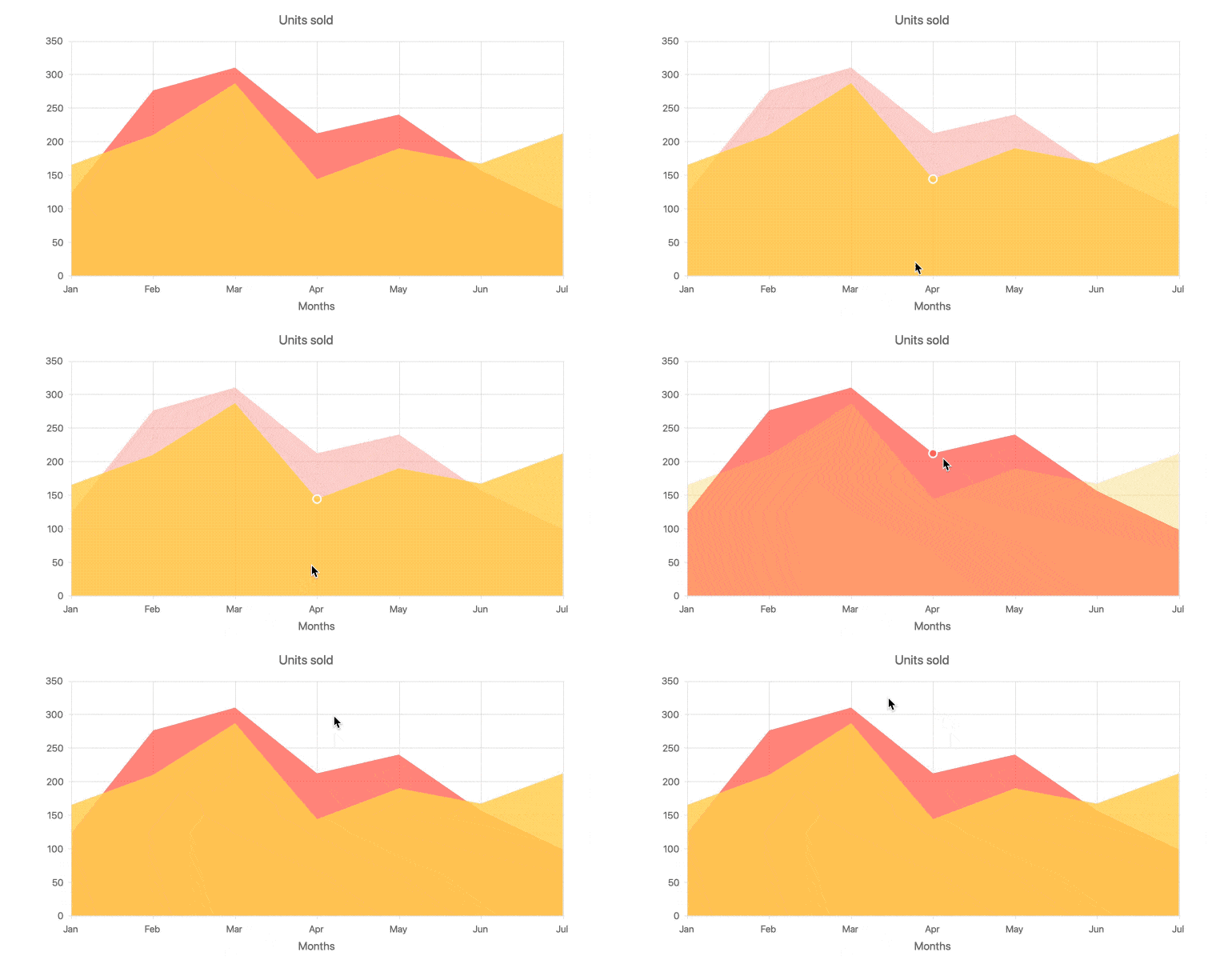
You can now make data visualization more interactive with Kendo Ui for Angular Charts. Highlight a selected data series by making all others opaque. Highlight data points according to your logic. Override default highlight behaviors and create your own custom toggles. Even create your own custom highlight visual to be whatever you like.
See the Angular Charts Highlighting demo
New Angular ListView Feature: Keyboard Navigation & Accessibility Compliance
The Kendo UI for Angular ListView component now includes built-in keyboard navigation and compliance with WCAG 2.0, Section 508 and WAI-ARIA accessibility standards.
See the Angular ListView Accessibility demo
New Angular ListView Feature: Built-In Editing
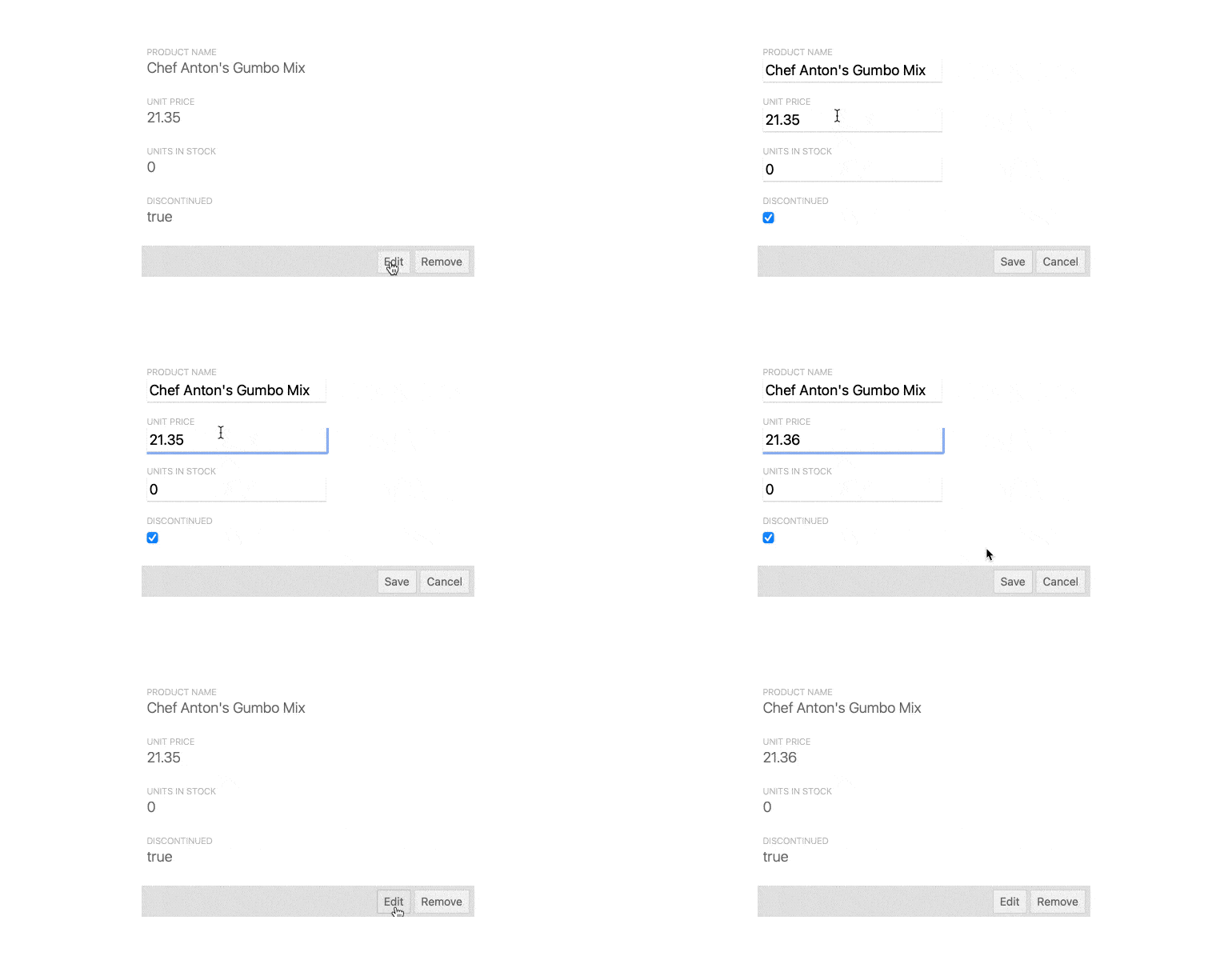
The Kendo UI for Angular ListView expands on its initial set of features by adding a built-in interface for editing items. This moves the Angular ListView beyond just displaying data via provided templates and adds more interactivity and usability out of the box.
See the Angular ListView Editing demo
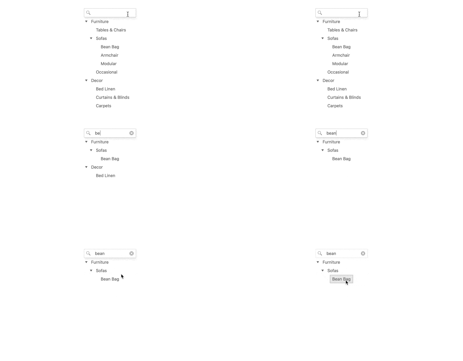
New Angular TreeView Feature: Built-In Search & Filtering
The Kendo UI for Angular TreeView now includes a built-in filtering mechanism and the ability to display a search text box above the component. Previously only possible through developers providing their own custom code, the filtering mechanism can now be implemented through a simple set of configuration options.
See the Angular TreeView demo
New Angular TimePicker & DateTimePicker Feature: Millisecond Support
The Kendo UI for Angular DateTimePicker and TimePicker components now support milliseconds as part of their input and drop-down interfaces. See the Angular TimePicker demo or the Angular DateTimePicker demo
New Angular Editor Feature: Custom Schema Support
The Kendo UI for Angular Editor now supports custom schemas, enabling you to define custom elements within the editor content. This helps Angular developers expand the available standard and custom elements that users can add in their content.
See the Angular Editor demo
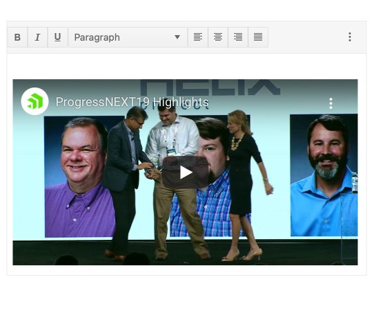
New Angular Editor Feature: Support for More HTML Elements
Developers and users alike can now add more HTML elements to the content of the Kendo UI for Angular Editor.
See the Angular Editor demo
Kendo UI for Angular - R1 2021
- New Component: Angular TileLayout
- New Component: Angular ExpansionPanel
- New Component: Angular FloatingActionButton
- New Component: Angular MultiColumnComboBox
- New Component: Angular DropDownTree
- New Component: Angular TextArea
- Angular 11 Support
- New Angular Grid & Angular TreeList Feature: Responsive Pager
- New Angular Charts Feature: Improved Series Highlighting
- New Angular ListView Feature: Keyboard Navigation & Accessibility Compliance
- New Angular ListView Feature: Built-In Editing
- New Angular TreeView Feature: Built-In Search & Filtering
- New Angular TimePicker & DateTimePicker Feature: Millisecond Support
- New Angular Editor Feature: Custom Schema Support
- New Angular Editor Feature: Support for More HTML Elements

