
Kendo UI for Angular
What's New R3 2021
What's New HistoryNew Component: Angular Gantt Chart
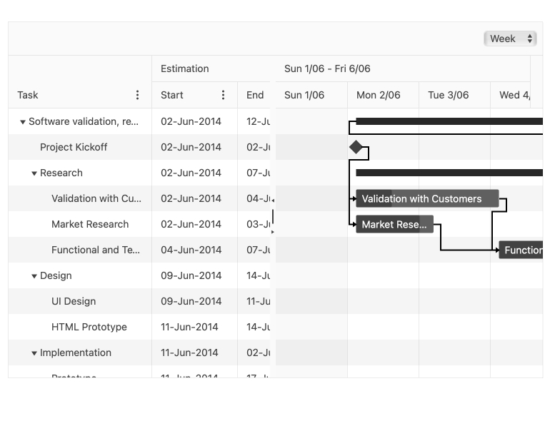
Create project plans and other schedules in no time with the Angular Gantt Chart component. This interactive, data bound, and customizable component provides a task tree list and a timeline pane. In the task list, users can edit, sort, and reorder records. In the timeline, users can resize, move, edit, and remove tasks. The timeline can also be displayed in day, week, and month views.
See the Angular Gantt Chart demo
New Component: Angular Heatmap Chart
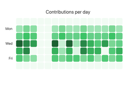
Show the relative magnitude of values as colored rectangles in a two-dimensional matrix with the new Angular Heatmap. This chart component is ready to use out of the box but contains options to customize colors, gradients, labels, axes and much more. Much like other Angular Chart components, data can be remote or local and templates can be used to customize just about anything.
See the Angular Heatmap Chart demo
New Component: Angular Typography
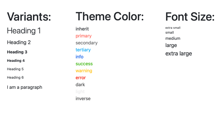
With the new Angular Typography component, ensuring text styling is consistent with your design system app-wide is easy. Set and update your text styles in one place and rules will be enforced throughout your entire project.
See the Angular Typography demo
New Angular Data Grid Feature: Choose Pager Position
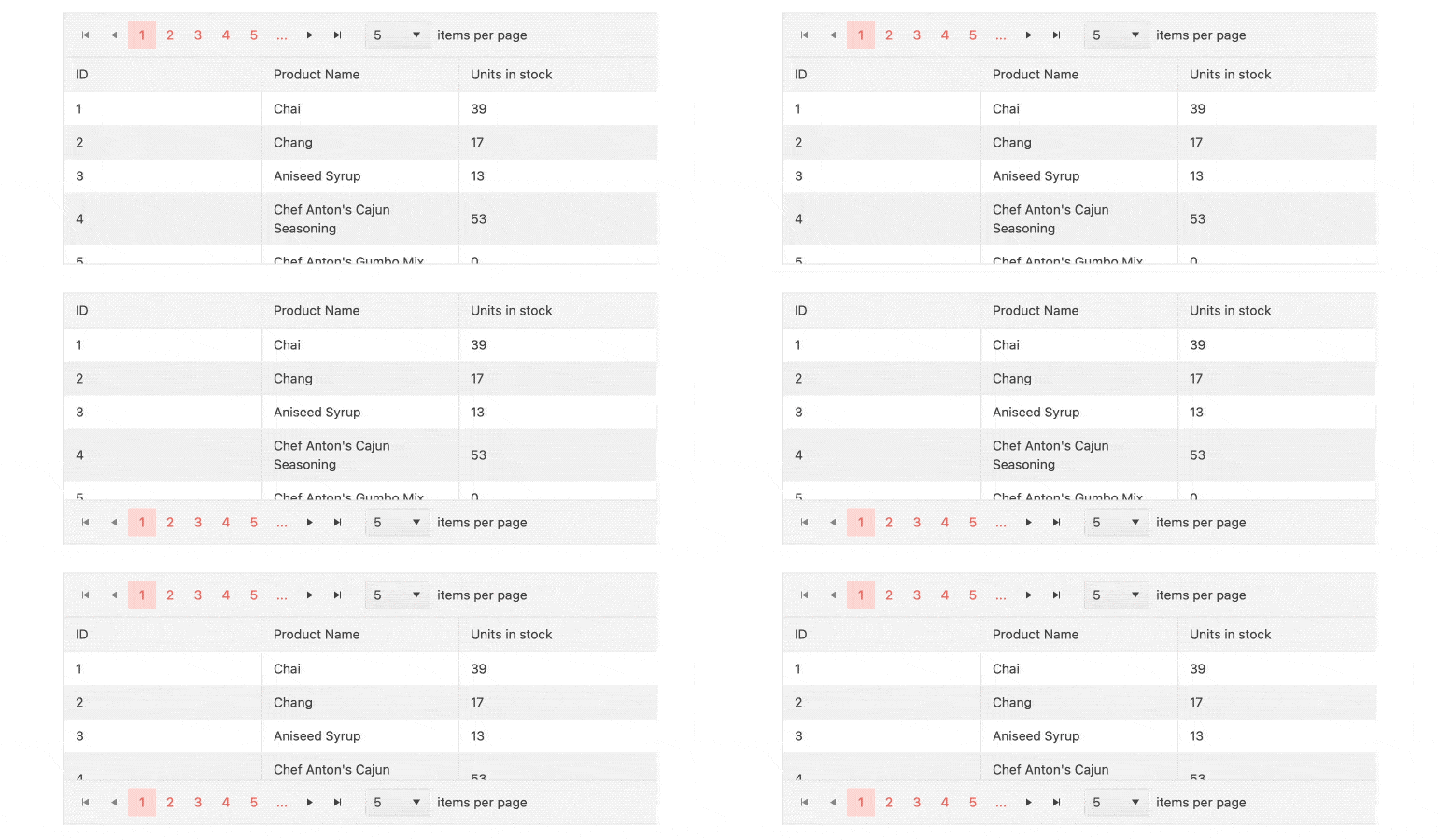
Place your pager controls where your users will most likely discover them by positioning them at the top, bottom, or top and bottom of the grid. It’s just a matter of setting a property.
See the Angular Grid Pager demo
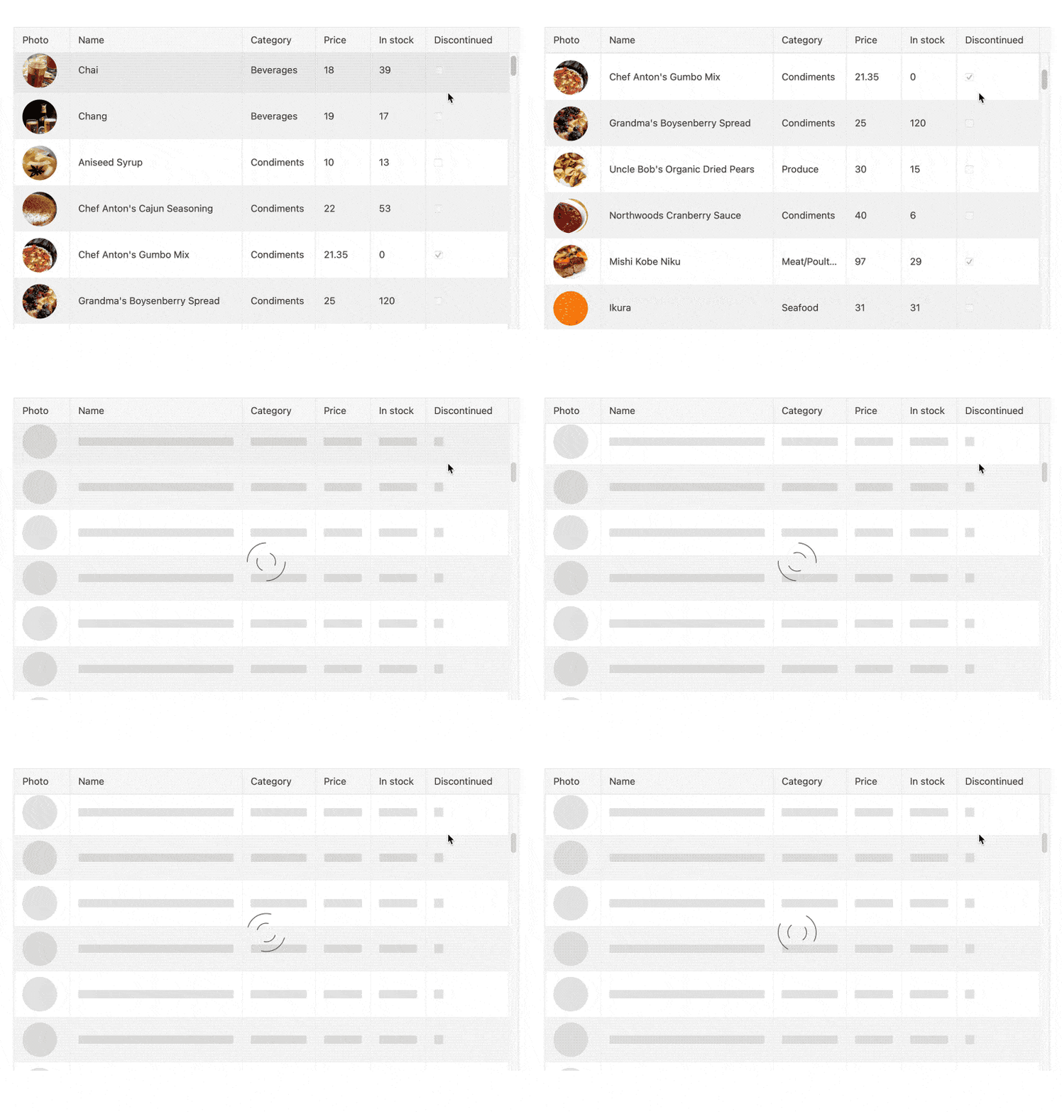
New Angular Data Grid Feature: Placeholders During Virtualization
Reduce potential user confusion or frustration when large data needs to load with virtual scrolling. With this feature enabled, the Angular Data Grid will show placeholders that indicate an operation in process for a more intuitive user experience.
See the Angular Grid Virtualization Demo
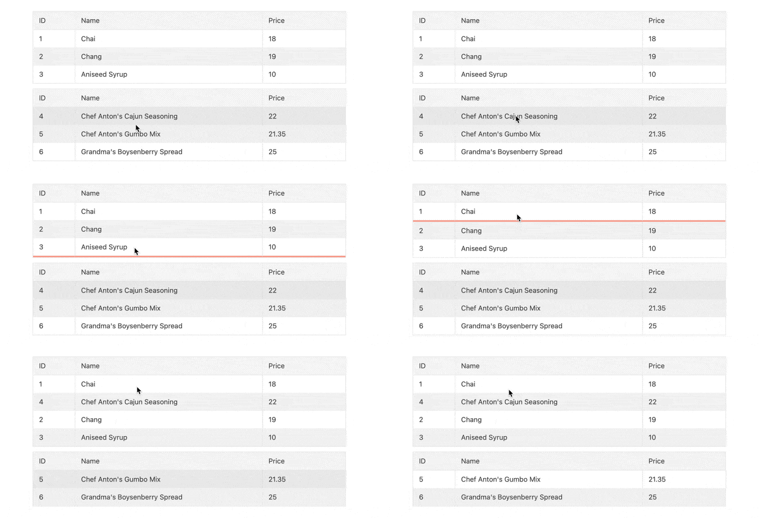
New Angular Data Grid Sample: Drag and Drop Between Grids
Learn how to Implement a feature that allows your users to drag a record from one grid and drop it into another. We have added a knowledge base article and sample that shows you how to accomplish this using the HTML Drag and Drop API.
See the Grid Drag-and-drop sample
New Angular Data Grid Feature: Pager Keyboard Navigation
To ensure maximum accessibility and great UX, keyboard interactions to navigate and interact with the data grid pager is now possible.
New Angular Data Grid Enhancements: Accessibility Improvements
With each release, we review accessibility features and compliance to ensure we are delivering the highest level of accessibility you can find so you don’t have to worry about it. With this release, we have added and enhances accessibility compliance in the Data Grid.
Read the Angular Data Grid Accessibility documentation

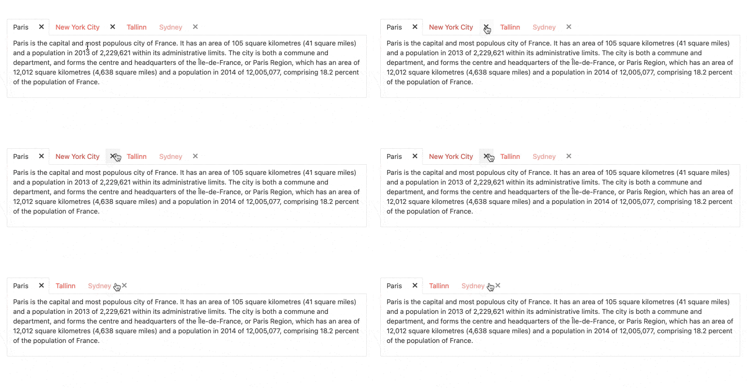
New Angular TabStrip Feature: Closable Tabs
Give your users more control over their experience by allowing them to close tabs. With this option enabled, a close button will appear on each tab.
See the Angular TabStrip Closable Tabs demo
New Angular TabStrip Feature: Scrolling Tabs
When the space your tabs occupy is greater than the width of the container, your layout can become unpleasant. To avoid this, the Angular TabStrip will automatically add scroll controls. Your layout will be intact, and your users will be pleased.
See the Angular TabStrip Scrollable tabs demo

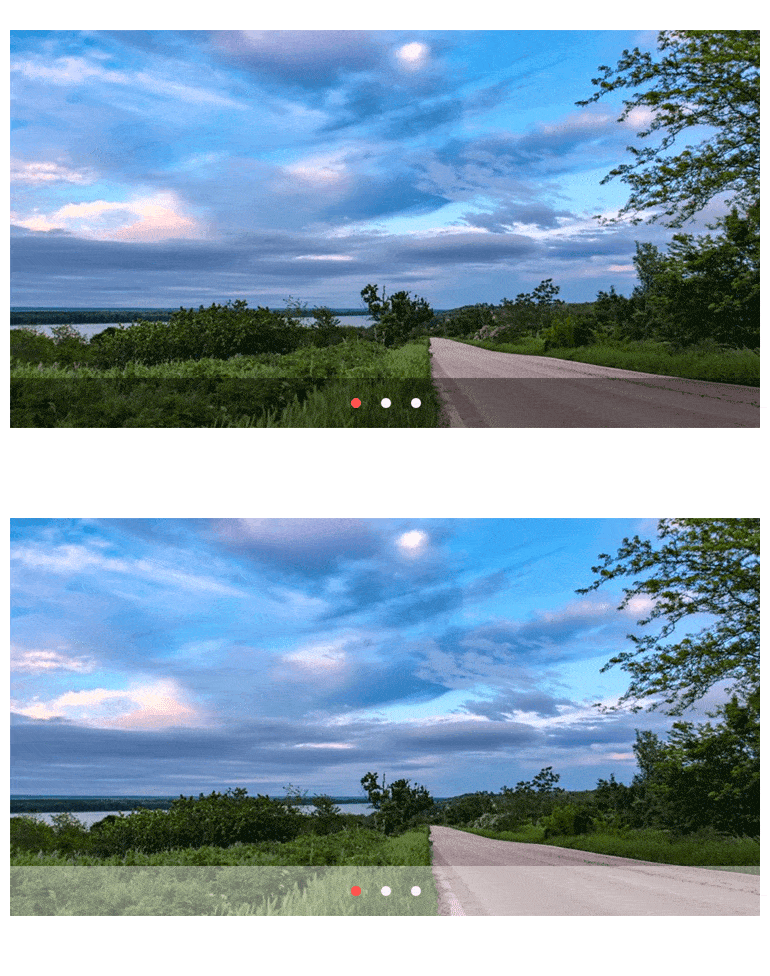
New Angular ScrollView Feature: Dark and Light Pager Modes
Make your ScrollView pager stand out against the content by choosing a dark or light appearance. This helps you pay attention to the detail of great UI, closely match today’s design trends and ensure points of interaction are visible by all users.
New Angular Rich Text Editor Feature: Focus and Blur Events
Focus and Blur Events have been added to the RichTextEditor API to give you more control over what happens when the content area is focused or blurred.
New Angular Rich Text Editor Feature: Preserve Whitespace Option
In many scenarios, users add spacing around content and that spacing gets removed when switching back and forth between code and design views. A common example is adding tabs to format code. The Angular Rich Text Editor offers the preserveWhiteSpace option to prevent that spacing from being removed.
New Angular TreeView Enhancement: Auto-Expand Nodes on Filter
Help your users find the data they need by showing it to them when they execute a filter. When a user types a filter, the tree nodes that contain matching values will automatically expand.
See the Angular Tree View Auto-Expaning Nodes demo

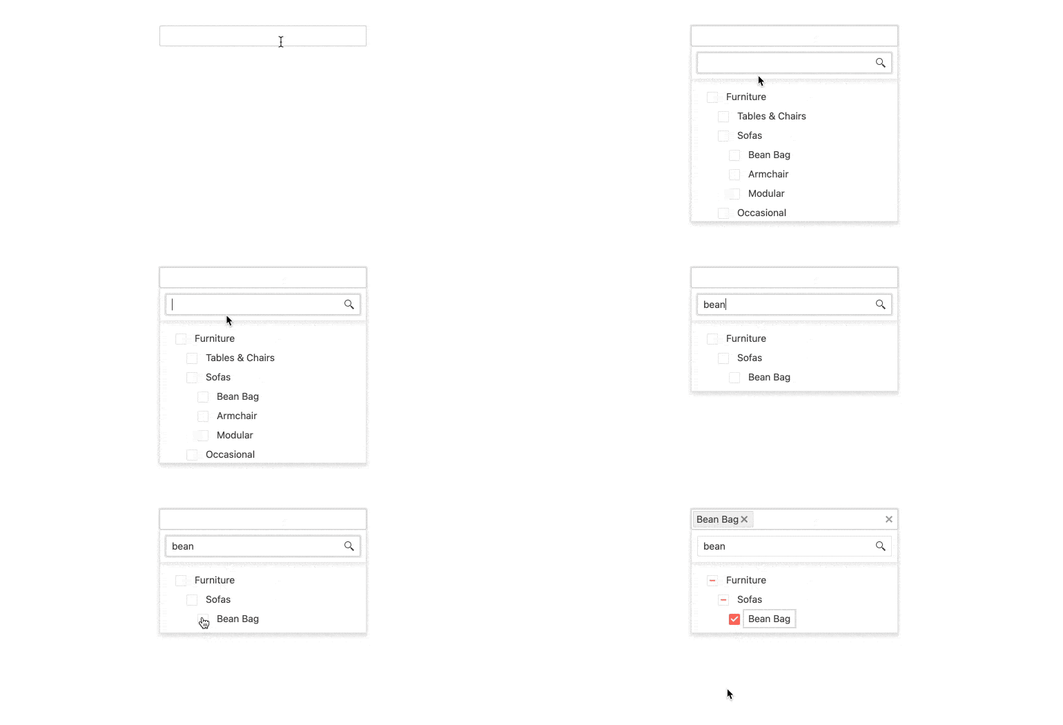
New Angular MultiSelectTree Feature: Client-Side Filtering
Help your users narrow their tree list to the information they want to see with a built-in filter. With this feature enabled, a text filter field will appear at the top of the component’s drop-down list. As the user types, the list will be filtered.
See the Angular MultiSelectTree Filtering demo
New Angular ColorPicker and ColorGradient Enhancements: Keyboard Navigation
To ensure maximum accessibility and great UX, keyboard interactions to navigate and interact with the ColorPicker and ColorGradient is now possible.
See the ColorPicker and ColorGradient Keyboard Navigation demos
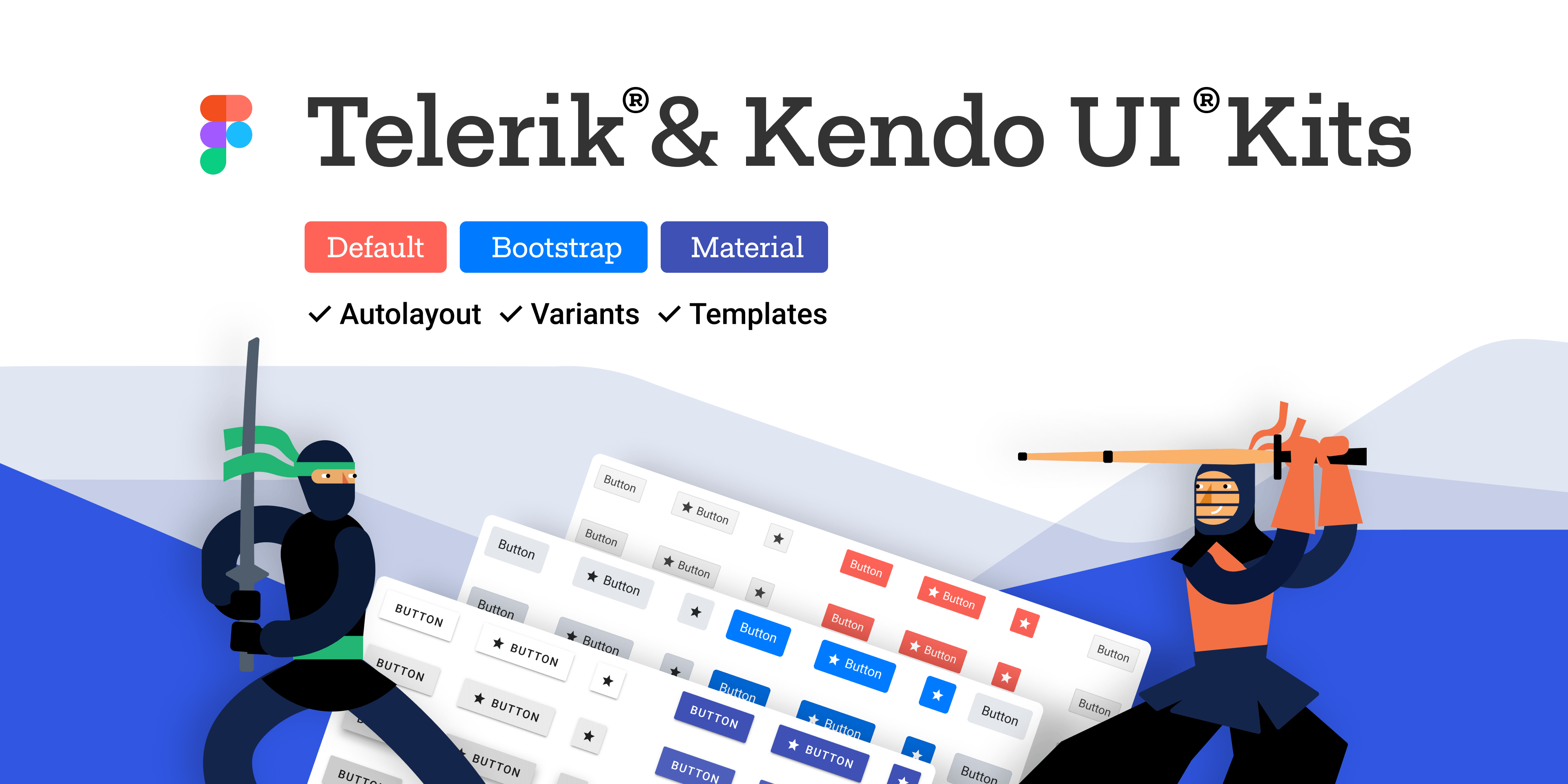
New Angular Design Tools: Kendo UI Kits for Figma
The Kendo UI Kits for Figma are design files that make the collaboration between application developers and designers easier. Each UI kit is a precise visual representation of the Kendo UI for Angular components. We offer three Kendo UI Kits for Figma, one for each of the themes that come with the Kendo UI for Angular component library: Kendo UI Kit Default, Bootstrap and Material. The purpose of the Kendo UI Kits is to enable the seamless handover of the interface design to the developers.
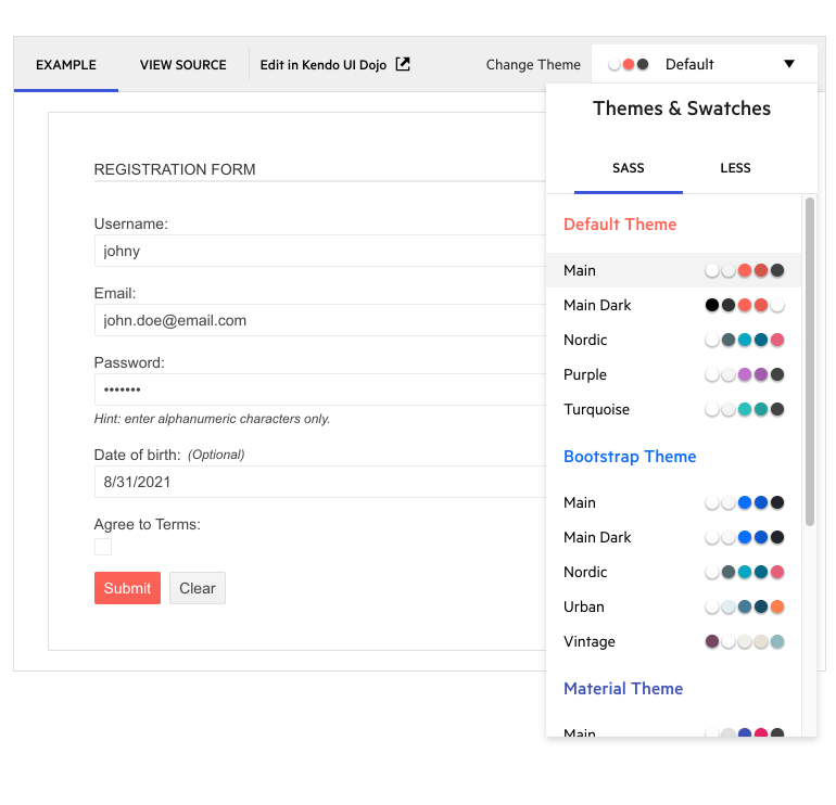
New Angular Demo Global Feature: Theme and Color Swatch Picker
Every demo now includes a drop-down menu that allows you to choose to apply the Material, Bootstrap or Kendo Default themes and one of their built-in color swatches. This enables you to easily preview what these selections will look like for each component.
See the Angular Scheduler demo for an example
Bootstrap 5 Support
As part of our commitment to supporting industry standards as they are updated, Kendo UI for Angular supports Bootstrap 5, the latest version of Bootstrap.

Kendo UI for Angular - R3 2021
- New Component: Angular Gantt Chart
- New Component: Angular Heatmap Chart
- New Component: Angular Typography
- New Angular Data Grid Feature: Choose Pager Position
- New Angular Data Grid Feature: Placeholders During Virtualization
- New Angular Data Grid Sample: Drag and Drop Between Grids
- New Angular Data Grid Feature: Pager Keyboard Navigation
- New Angular Data Grid Enhancements: Accessibility Improvements
- New Angular TabStrip Feature: Closable Tabs
- New Angular TabStrip Feature: Scrolling Tabs
- New Angular ScrollView Feature: Dark and Light Pager Modes
- New Angular Rich Text Editor Feature: Focus and Blur Events
- New Angular Rich Text Editor Feature: Preserve Whitespace Option
- New Angular TreeView Enhancement: Auto-Expand Nodes on Filter
- New Angular MultiSelectTree Feature: Client-Side Filtering
- New Angular ColorPicker and ColorGradient Enhancements: Keyboard Navigation
- New Angular Design Tools: Kendo UI Kits for Figma
- New Angular Demo Global Feature: Theme and Color Swatch Picker
- Bootstrap 5 Support


